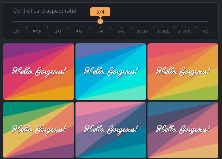
A little while back, Chris shared this nice hexagonal grid. And true to its name, it’s using —wait for it — CSS Grid to form that layout. It’s a neat trick! Combining grid columns, grid gaps, and creative clipping churns out the final result.
A similar thing could be accomplished with flexbox, too. But I’m here to resurrect our old friend float to create the same sort of complex and responsive layout — but with less complexity and without a single media query.
I know, it’s hard to believe. So let’s start with a working demo:
This is a fully responsive hexagon grid made without media queries, JavaScript, or a ton of hacky CSS. Resize the demo screen and see the magic. In addition to being responsive, the grid also scales. For example, we can chuck more hexagons in there by adding more divs, and control both the sizing and spacing using CSS variables.
Cool, right? And this is only one example among many grids we will build in the same manner.
Making a grid of hexagons
Table of Contents
First, we create our hexagon shape. This task is fairly easy using clip-path. We will consider a variable S that will define the dimension of our element. Bennett Feely’s Clippy is a great online generator for clip paths.
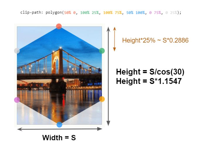
clip-pathEach hexagon is an inline-block element. The markup can go something like this:
<div class="main"> <div class="container"> <div></div> <div></div> <div></div> <!--etc. --> </div>
</div>
…and the CSS:
.main { display: flex; /* we will talk about this later ... */ --s: 100px; /* size */ --m: 4px; /* margin */
} .container { font-size: 0; /* disable white space between inline block element */
} .container div { width: var(--s); margin: var(--m); height: calc(var(--s) * 1.1547); display: inline-block; font-size: initial; /* we reset the font-size if we want to add some content */ clip-path: polygon(0% 25%, 0% 75%, 50% 100%, 100% 75%, 100% 25%, 50% 0%);
}
Nothing complex so far. We have a main element that holds a container which, in turn, holds the hexagons. Since we are dealing with inline-block, we need to fight the common white space issue (using the font-size trick) and we consider some margin (defined with the variable M) to control the space.
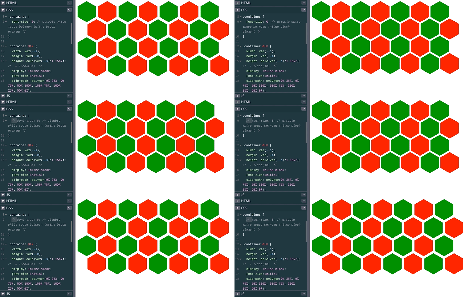
Here’s the result so far:

Every other row needs some negative offset so the rows overlap rather than stack directly on top of each other. That offset will be equal to 25% of the element height (see Figure 1). We apply that offset to margin-bottom to get the following:
.container div { width: var(--s); margin: var(--m); height: calc(var(--s) * 1.1547); display: inline-block; font-size: initial; clip-path: polygon(0% 25%, 0% 75%, 50% 100%, 100% 75%, 100% 25%, 50% 0%); margin-bottom: calc(var(--m) - var(--s) * 0.2886); /* some negative margin to create overlap */
}
…and the result becomes:

Now the real trick is how we can shift the second row to get a perfect hexagon grid. We’ve already scrunched things to the point where the rows overlap each other vertically, but what we need is to push every other row toward the right so the hexagons stagger rather than overlap. Here’s where float and shape-outside come into play.
Did you wonder why we have a .main element wrapping our container and having display: flex ? That div is also a part of the trick. In a previous article, I used float and I needed that flexbox container in order to be able to use height: 100%. I will be doing the same thing here.
.container::before { content: ""; width: calc(var(--s)/2 + var(--m)); float: left; height: 100%;
}
I am using the container::before pseudo-element to create a float element that take up all the height at the left of the grid, and that has a width equal to half a hexagon (plus its margin). We get the following result:
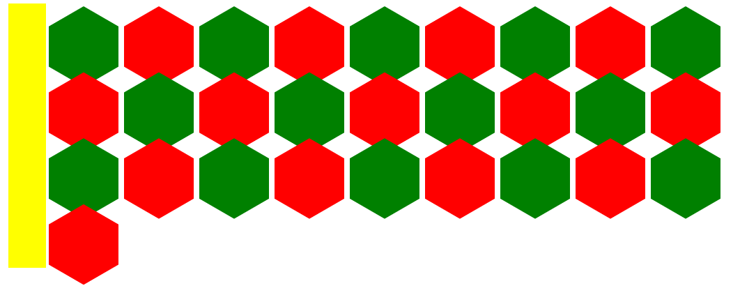
.container::before pseudo-element.Now, we can reach for shape-outside. Let’s take a quick refresher on what it does. Robin defines it nicely in the CSS-Tricks Almanac. MDN describes it nicely as well:
The
shape-outsideCSS property defines a shape—which may be non-rectangular—around which adjacent inline content should wrap. By default, inline content wraps around its margin box;shape-outsideprovides a way to customize this wrapping, making it possible to wrap text around complex objects rather than simple boxes.Emphasis mine
Notice “inline content” in the definition. This explains exactly why the hexagons need to be inline-block elements. But to understand what kind of shape we need, let’s zoom into the pattern.
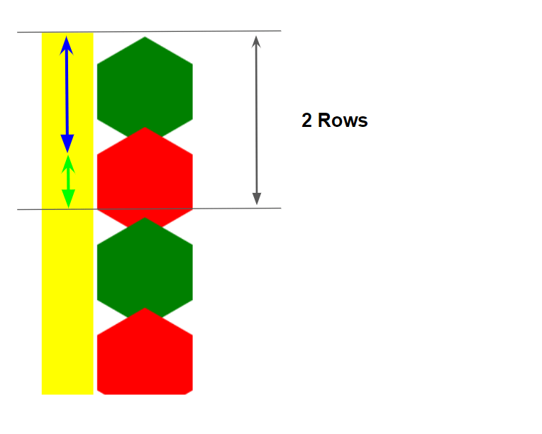
What’s cool about shape-inside is that it actually works with gradients. But what kind of gradient fits our situation?
If, for example, we have 10 rows of hexagons, we only need to shift means every even row. Seen differently, we need to shift every second row so we need a kind of repetition — perfect for a repeating gradient!
We’ll create a gradient with two colors:
- A transparent one to create the “free space” while allowing the first row to stay in place (illustrated by the blue arrow above).
- An opaque color to shift the second row to the right so the hexagons aren’t directly stacked on top of one another (illustrated by the green arrow).
Our shape-outside value will look like this:
shape-outside: repeating-linear-gradient(#0000 0 A, #000 0 B); /* #0000 = transparent */Now, let’s find the value of A and B. B will simply be equal to the height of two rows since our logic need to repeat each two rows.
The height of two rows is equal to the height of two hexagons (including their margins), minus twice the overlap (2*Height + 4*M - 2*Height*25% = 1.5*Height + 4*M ). Or, expressed in CSS with calc():
calc(1.732 * var(--s) + 4 * var(--m))That’s a lot! So, let’s hold all of this in a CSS custom property, F.
The value of A (defined by the blue arrow in the previous figure) needs to be at least equal to the size of one hexagon, but it can also be bigger. In order to push the second row over to the right, we need few pixel of opaque color so A can simply be equal to B - Xpx, where X is a small value.
We end up with something like this:
shape-outside: repeating-linear-gradient(#0000 0 calc(var(--f) - 3px),#000 0 var(--f));And the following result:
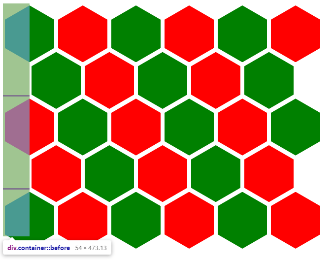
shape-outside is applied to the floated element, creating a floated area with a predating linear gradient.See that? Our repeating linear gradient’s shape is pushing every other row to the right by one half the width of a hexagon to offset the pattern.
Let’s put that all together:
.main { display:flex; --s: 100px; /* size */ --m: 4px; /* margin */ --f: calc(var(--s) * 1.732 + 4 * var(--m) - 1px); } .container { font-size: 0; /* disable white space between inline block element */
} .container div { width: var(--s); margin: var(--m); height: calc(var(--s) * 1.1547); display: inline-block; font-size:initial; clip-path: polygon(0% 25%, 0% 75%, 50% 100%, 100% 75%, 100% 25%, 50% 0%); margin-bottom: calc(var(--m) - var(--s) * 0.2885);
} .container::before { content: ""; width: calc(var(--s) / 2 + var(--m)); float: left; height: 120%; shape-outside: repeating-linear-gradient(#0000 0 calc(var(--f) - 3px), #000 0 var(--f));
}
That’s it! With no more than 15 CSS declarations, we have a responsive grid that fit nicely into all the screen sizes and we can easily adjust things by simply controling two variables.
You may have noticed that I am adding -1px to the variable F. Since we are dealing with calculation that involve decimals, the rounding may give us bad results. To avoid this we add or remove few pixels. I am also using 120% instead of 100% for the height of the floated element for similar reasons. There is no particular logic with theses values; we simply adjust them to make sure to cover most of the cases without any misaligning our shapes.
Want more shapes?
We can do more than hexagons with this approach! Let’s create a “rhombus” grid instead. Again, we start with our clip-path to create the shape:
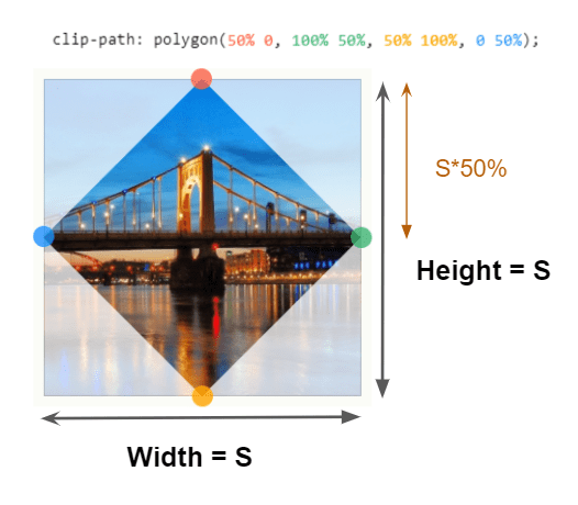
The code is basically the same. What’s changing are the calculations and values. Find below a table that will illustrate the changes.
| Hexagon grid | Rhombus grid | |
|---|---|---|
height |
calc(var(--s)*1.1547) |
var(--s) |
clip-path |
polygon(0% 25%, 0% 75%, 50% 100%, 100% 75%, 100% 25%, 50% 0%) |
polygon(50% 0, 100% 50%, 50% 100%, 0 50%) |
margin-bottom |
calc(var(--m) - var(--s)*0.2885) |
calc(var(--m) - var(--s)*0.5) |
--f |
calc(var(--s)*1.7324 + 4*var(--m)) |
calc(var(--s) + 4*var(--m)) |
And we’re done! A mere four changes to our code gets us a completely new grid but with a different shape.
Just how flexible is this?
We saw how we were able to make the hexagon and rhombus grids using the exact same code structure, but different variables. Let me blow your mind with another idea: What about making that calculation a variable so that we can easily switch between different grids without changing the code? We can certainly do that!
We’ll use an octagonal shape because it’s more of a generic shape from that we can use to create other shapes (a hexagon, a rhombus, a rectangle, etc.) simply by changing a few values.
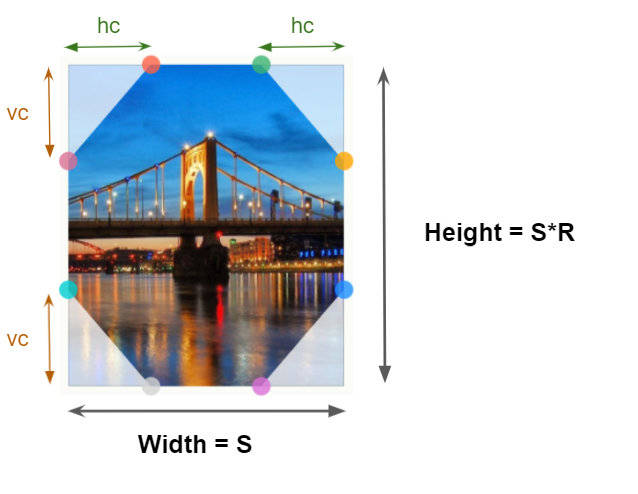
clip-path property.Our octagon is defined with four variables:
S: the width.R: the ratio that will help us defines the height based on the width.hcandvc: both of these will control ourclip-pathvalues and the shape we want to get.hcwill be based on the width whilevcon the height
I know it looks hefty, but the clip-path is defined using eight points (like shown in the figure). Adding some CSS variables, we get this:
clip-path: polygon( var(--hc) 0, calc(100% - var(--hc)) 0, /* 2 points at the top */ 100% var(--vc),100% calc(100% - var(--vc)), /* 2 points at the right */ calc(100% - var(--hc)) 100%, var(--hc) 100%, /* 2 points at the bottom */ 0 calc(100% - var(--vc)),0 var(--vc) /* 2 points at the left */
);
This is what we’re aiming for:

Let’s zoom in to identify the different values:
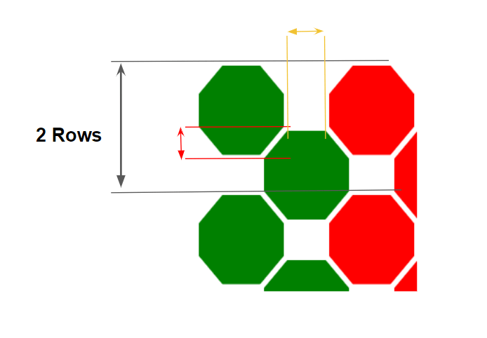
The overlap between each row (illustrated by the red arrow) can be expressed using the vc variable which gives us a margin-bottom equal to M - vc (where M is our margin).
In addition to the margin we applied between our element, we also need an additional horizontal margin (illustrated by the yellow arrow) equal to S - 2*hc. Let’s define another variable for the horizontal margin (MH) that is equal to M + (S - 2*hc)/2.
The height of two rows is equal to twice the size of a shape (plus the margin), minus twice the overlap, or 2*(S + 2*M) - 2*vc.
Let’s update our table of values to see how we’re calculating things between the different grids:
| Hexagon grid | Rhombus grid | Octagon grid | |
|---|---|---|---|
height |
calc(var(--s)*1.1547) |
var(--s) |
calc(var(--s)*var(--r))) |
clip-path |
polygon(0% 25%, 0% 75%, 50% 100%, 100% 75%, 100% 25%, 50% 0%) |
polygon(50% 0, 100% 50%, 50% 100%, 0 50%) |
polygon(var(--hc) 0, calc(100% - var(--hc)) 0,100% var(--vc),100% calc(100% - var(--vc)), calc(100% - var(--hc)) 100%,var(--hc) 100%,0 calc(100% - var(--vc)),0 var(--vc)) |
--mh |
– | – | calc(var(--m) + (var(--s) - 2*var(--hc))/2) |
margin |
var(--m) |
var(--m) |
var(--m) var(--mh) |
margin-bottom |
calc(var(--m) - var(--s)*0.2885) |
calc(var(--m) - var(--s)*0.5) |
calc(var(--m) - var(--vc)) |
--f |
calc(var(--s)*1.7324 + 4*var(--m)) |
calc(var(--s) + 4*var(--m)) |
calc(2*var(--s) + 4*var(--m) - 2*var(--vc)) |
Alright, let’s update our CSS with those adjustments:
.main { display: flex; --s: 100px; /* size */ --r: 1; /* ratio */ /* clip-path parameter */ --hc: 20px; --vc: 30px; --m: 4px; /* vertical margin */ --mh: calc(var(--m) + (var(--s) - 2*var(--hc))/2); /* horizontal margin */ --f: calc(2*var(--s) + 4*var(--m) - 2*var(--vc) - 2px);
} .container { font-size: 0; /* disable white space between inline block element */
} .container div { width: var(--s); margin: var(--m) var(--mh); height: calc(var(--s)*var(--r)); display: inline-block; font-size: initial; clip-path: polygon( ... ); margin-bottom: calc(var(--m) - var(--vc));
} .container::before { content: ""; width: calc(var(--s)/2 + var(--mh)); float: left; height: 120%; shape-outside: repeating-linear-gradient(#0000 0 calc(var(--f) - 3px),#000 0 var(--f));
}
As we can see, the code structure is the same. We simply added more variable to control the shape and extend the margin property.
And below a working example. Adjust the different variables to control the shape while having a fully responsive grid:
An interactive demo, you say? You bet!
To make things easier, I am expressing the vc and hc as percetange of the width and height so we can easily scale our elements without breaking the clip-path
From the above we can easily get the initial hexagonal grid:
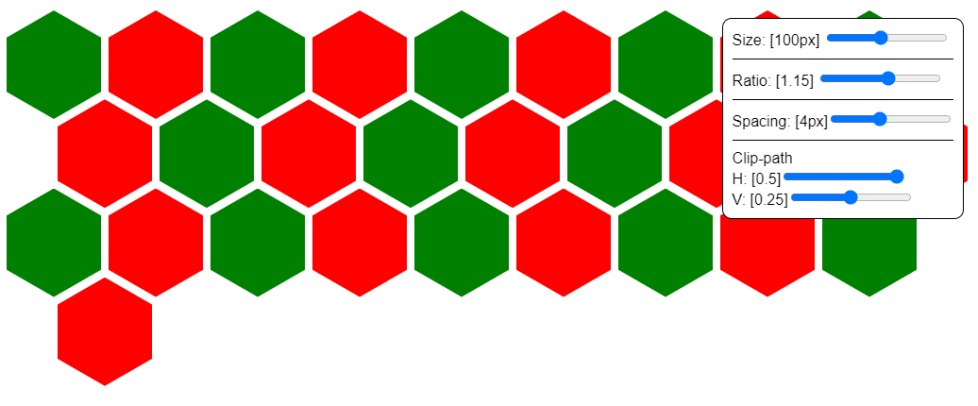
The rhombus grid:

And yet another hexagon grid:

A masonry-like grid:

And a checkerboard while we are at it:

A lot of possibilities to create a responsive grid with any kind of shape! All we have to do is adjust few variables.
Fixing the alignment
Let’s try to control the alignment of our shapes. Since we are dealing with inline-block elements, we’re dealing with default left alignment and some empty space at the end, depending on viewport width.
Notice that we alternate between two kind of grids based on the screen width:
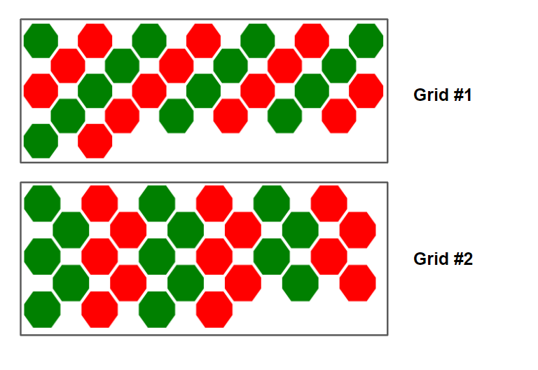
N, N-1,N, N-1, etc.)Grid #2: The same number of items per row (
N, N, N, N, etc.)It would be good to always have one of the grid all the time (either #1 or #2) and center everything so that the free space is equally divided on both sides.
In order to get the first grid in the figure above, the container width needs to be a multiplier of the size of one shape, plus its margin, or N*(S + 2*MH), where N is an integer value.
This may sound impossible with CSS, but it’s indeed possible. I made it using CSS grid:
.main { display: grid; grid-template-columns: repeat(auto-fit, calc(var(--s) + 2*var(--mh))); justify-content: center;
} .container { grid-column: 1/-1;
}
.main is now a grid container. Using grid-template-columns, I define the column width (as previously explained) and use the auto-fit value to get as many columns as possible into the available space. Then, the .container spans all of the grid columns using 1/-1 — which means that the width of our container will be a mutiplier of one column size.
All it takes to center things is justify-content: center.
Yes, CSS is magic!
Resize the demo and notice that not only do we have the first grid from the figure, but everything is perfectly centered as well.
But wait, we removed display: flex and swapped in display: grid… so how is the percentage-based height of the float still working? I had said that using a flex container was the key for that, no?
Well, turns out CSS grid sports that feature too. From the specification:
Once the size of each grid area is thus established, the grid items are laid out into their respective containing blocks. The grid area’s width and height are considered definite for this purpose.
Note: Since formulas calculated using only definite sizes, such as the stretch fit formula, are also definite, the size of a grid item which is stretched is also considered definite.
A grid item has a stretch alignment by default, so its height is definite, meaning using a percentage as a height inside it is perfectly valid.
Let’s say we instead want the second grid in the figure — we simply add an extra column with a width equal to half the width of the other columns:
.main { display: grid; grid-template-columns: repeat(auto-fit,calc(var(--s) + 2*var(--mh))) calc(var(--s)/2 + var(--mh)); justify-content :center;
}
Now, in addition to a fully responsive grid that is flexible enough to take custom shapes, everything is perfectly centred!
Fighting the overflow
The use of negative margin-bottom on the last items and the float element pushing our items will create some unwanted overflow that may affect the content placed after our grid.
If you resize the demo, you will notice an overflow equal to the negative offset and sometimes it’s bigger. The fix is to add some padding-bottom to our container. I will make the padding equal to the height of one shape:
I have to admit that there isn’t a perfect solution to fight that overflow and to control the space below our grid. That space depends on a lot of factors and we may have to use a different padding value for each case. The safest solution is to consider a big value that covers most of the cases.
Wait, one more: a pyramidal grid
Let’s take everything we’ve learned and build another amazing grid. This time, we’ll transform the grid we just made into a pyramidal one.
Consider that, unlike the grid we’ve made so far, the number of elements is important especially for the responsive part. It’s required to know the number of elements and more precesily the number of rows.

It doesn’t mean we need a bunch of hardcoded values; rather we use an extra variable to adjust things based on the number of rows.
The logic is based on the number of rows because different numbers of elements may give us the same number of rows. For example, there are five rows when we have between 11 and 15 elements, even if the last row is not fully occupied. Having between 16 and 21 elements gives us six rows, and so on. The number of rows is our new variable.
Before digging into the geometry and the math here is a working demo:
Notice that most of the code is the same as what we’ve done in the previous examples. So let’s focus on the new properties that we’ve added:
.main { --nr: 5; /* number of rows */
} .container { max-width: calc(var(--nr)*(var(--s) + 2*var(--mh))); margin: 0 auto;
} .container::before ,
.container i { content: ""; width: calc(50% - var(--mh) - var(--s)/2); float: left; height: calc(var(--f)*(var(--nr) - 1)/2); shape-outside: linear-gradient(to bottom right, #000 50%, #0000 0);
} .container i { float:right; shape-outside: linear-gradient(to bottom left, #000 50%, #0000 0);
}
NR is our variable for the number of rows. The width of the container needs to be equal to the last row of the pyramid to make sure it hold all the elements. If you check the previous figure, you’ll see that the number of the items contained in the last row is simply equal to the number of rows, which means the formula is: NR* (S + 2*MH).
You may have also noticed that we also added an <i> element in there. We did that because we need two floating elements where we will apply shape-outside.
To understand why we need two floating elements let’s see what is done behind the scenes:
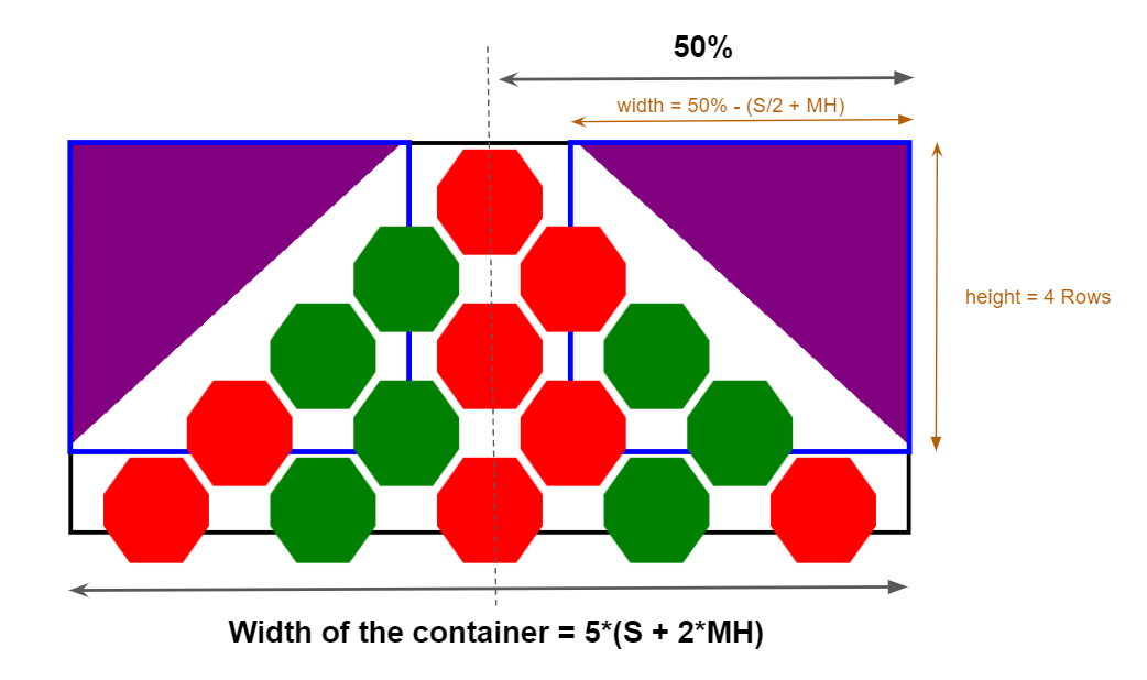
The blue elements are our floating elements. Each one is having a width equal to half the container size, minus half a shape size, plus margin. The height is equal to four rows in our case, and to NR - 1 in a more generic case. Earlier, we defined the height of two rows, F, so the height of one row is F/2. That’s how we landed at height: calc(var(--f)*(var(--nr) - 1)/2.
Now that we have the size of our elements, we need to apply a gradient to our shape-outside.
The purple coloration in the figure above is the restricted area for our elements (it need to be an opaque color). The remaining area is the free space where the elements can flow (it need to be a transparent color). This can be done using a diagonal gradient:
shape-outside: linear-gradient(to bottom right, #000 50%, #0000 0); We simply change right with left for the other floated element. You have probably noticed that this is not responsive. In fact, go ahead and adjust the viewport width of the demo and see just how unresponsive this is.
We have a couple of options to get responsive:
- We can fall back to the first grid when the container width is smaller than the viewport width. It’s a bit tricky to code, but it allows us to preserve the same size for our elements.
- We can reduce the size of our elements in order to keep the pyramidal grid. This is easier to code using the percentage-based value trick, but that could result in super tiny elements on smaller screen sizes.
Let’s go with the first solution. We like a good challenge, right?
To get the pyramidal grid, we needed two floated element. The initial grid needed just one floated element. Luckily, our structure allows us to have three floated elements without needing to add more elements to the markup, thanks to pseudo-elements. We will use container::before, i::before, i::after:
/* Same as before... */ /* The initial grid */
.container::before { content: ""; width: calc(var(--s)/2 + var(--mh)); float: left; height: 120%; shape-outside: repeating-linear-gradient(#0000 0 calc(var(--f) - 3px),#000 0 var(--f));
} /* The pyramidal grid */
.container i::before ,
.container i::after { content: ""; width: calc(50% - var(--mh) - var(--s)/2); float: left; height: calc(var(--f)*(var(--nr) - 1)/2); shape-outside: linear-gradient(to bottom right,#000 50%,#0000 0);
} .container i::after { float:right; shape-outside: linear-gradient(to bottom left,#000 50%,#0000 0);
}
Now we need a trick that lets us use either the first floated element or the other two, but not all of them at the same time. This condition should be based on the width of our container:
- If the container width is bigger than the width of the last row, we can have our pyramid and use the floated elements inside of
<i>. - If the container width is smaller than the width of the last row, we switch to the other grid and use the first floated element.
We can use clamp() for this! It’s sort of like a conditional function that sets a minimum and maximum range and, within that range, we provide it an “ideal” value to use between those points. This way, we can “switch” between grids using our formulas as clamped values, and still avoid using media queries.
Our code will look like this:
.main { /* the other variables won't change*/ --lw: calc(var(--nr)*(var(--s) + 2*var(--mh))); /* width of last row */
} .container { max-width: var(--lw);
} /* The initial grid */
.container::before { width: clamp(0px, (var(--lw) - 100%)*1000, calc(var(--s)/2 + var(--mh)));
} /* The pyramidal grid */
.container i::before,
.container i::after { width: clamp(0px, (100% - var(--lw) + 1px)*1000, calc(50% - var(--mh) - var(--s)/2));
}
On larger screens, the width of the container (LW) is now equal to its max-width, so 100% == LW. That means that the width of .container::before is equal to 0px (and results in this floated element becoming disabled).
For the other floating elements, we clamp the width:
width: clamp(0px, (100% - var(--lw) + 1px)*1000, calc(50% - var(--mh) - var(--s)/2));…where the middle value ((100% - LW + 1px)*1000) is equal to (0 + 1px)*1000 = 1000px (an intentionally large, but arbitrary value). It gets clamped to calc(50% - var(--mh) - var(--s)/2). In other words, these floated elements are enabled with the correct width (the one we defined previously)
Voilà! we have a pyramidal shape on large screen.
Now, when the container width get smaller, LW is going to be greater than 100%. So, (LW - 100%) will be positive. Multiplied by a big value, it’s clamped to calc(var(--s)/2 + var(--mh)), which enables the first floated element. For the other float elements, (100% - LW + 1px) resolves to a negative value and is clamped to 0px, which disables the float elements.
Resize the below demo and see how we switch between both grids
Let’s try adding more elements:
See that? Things are scaling perfectly. Let’s toss more elements at it just for kicks:
Still great. Notice that the last row isn’t even full. Just shows that this approach covers a bunch of cases. We can also combine this with the CSS grid alignment trick we used earlier:
Do you think “float” is such a bad thing now?
Want invert the pyramid?

Like illustrated with the above figure, two changes to the previous code can invert our pyramid:
- I change the direction of the gradient from
to bottom left|righttoto top left|right, - I add a
margin-topequal to the height of one row.
And, hey, we can swap between both pyramid easily:
Isn’t this beautiful? We have a responsive pyramidal grid with custom shapes that we can easily invert and that fallback to another responsive grid on small screen while everything is perfectly centred. All this without a single media query or JavaScript, but instead using the often overlooked float property.
You will probably notice some missalignment in some particular cases. Yes, it’s again some rounding issue related to the calculation we are doing and the fact that we are trying to make this generic with the interactive demos. To rectify this, we simply adjust few values manually (epsecially the percentage of the gradient) until we get back a perfect alignment.
That’s a float wrap!
There we have it: combining float with shape-outside can help us make complex, flexible and responsive layouts — long live float!
The article ends here but this is only the beginning. I provided you with the layout and now you can easily put any content inside the divs, apply a background, shadows, animations, etc.


