Why would we need to apply shadows to SVG?
- Shadows are a common design feature that can help elements, like icons, stand out. They could be persistent, or applied in different states (e.g.
:hover,:focus, or:active) to indicate interaction to users. - Shadows happen in real life, so they can be used on screens to breathe some life into your elements and add a touch of realism to a design.
Since we’re making lists, there are two primary ways we can apply shadows to an SVG:
- Using the CSS
filter()property - Using an SVG
<filter>
Yes, both involve filters! And, yes, both CSS and SVG have their own types of filters. But there is some crossover between these as well. For example, a CSS filter can refer to an SVG <filter>; that is, if we’re working with an inline SVG instead of, say, an SVG used as a background image in CSS.
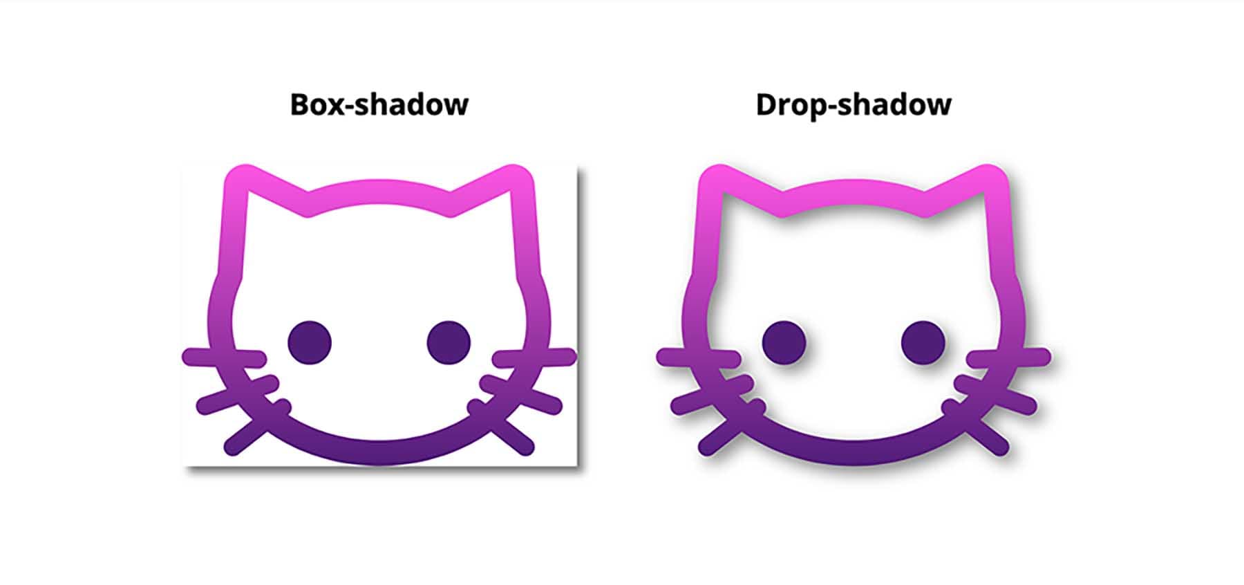
What you can’t use: the CSS box-shadow property. This is commonly used for shadows, but it follows the rectangular outside edge of elements, not the edges of the SVG elements like we want. Here’s Michelle Barker with a clear explanation:
If you’re using an SVG icon font, though, there is always text-shadow. That will indeed work. But let’s focus on those first two as they’re in line with a majority of use cases.
Shadows with CSS filters
Table of Contents
The trick to applying a shadow directly to SVG via CSS filters is the drop-shadow() function :
svg { filter: drop-shadow(3px 5px 2px rgb(0 0 0 / 0.4));
}
That will apply a shadow that starts at 3px horizontally, 5px down, with 2px of blur, and is 40% black. Here are some examples of that:
Desktop
| Chrome | Firefox | IE | Edge | Safari |
|---|---|---|---|---|
| 18* | 35 | No | 79 | 6* |
Mobile / Tablet
| Android Chrome | Android Firefox | Android | iOS Safari |
|---|---|---|---|
| 91 | 89 | 4.4* | 6.0-6.1* |
Call an SVG filter inside a CSS filter
Say we have an SVG filter in the HTML:
<svg height="0" width="0"> <filter id='shadow' color-interpolation-filters="sRGB"> <feDropShadow dx="2" dy="2" stdDeviation="3" flood-opacity="0.5"/> </filter> </svg>We can use a CSS filter to call that SVG filter by ID instead of values we saw earlier:
svg { filter: url(#shadow);
}
Now that filter is taken from the HTML and referenced in the CSS, which applies it.
Using SVG filter primitives
You might be wondering how we got that SVG <filter> to work. To make a drop shadow with an SVG filter, we make use of a filter primitive. A filter primitive in SVG is an element that takes some sort of image or graphic as an input, then outputs that image or graphic it when it’s called. They sort of work like filters in a graphic editing application, but in code and can only be used inside an SVG <filter> element.
There are lots of different filter primitives in SVG. The one we’re reaching for is <feDropShadow>. I’ll let you guess what to does just by looking at the name.
So, similar to how we had something like this did this with a CSS filter:
svg { filter: drop-shadow(3px 5px 2px rgb(0 0 0 / 0.4));
}
…we can accomplish the same with the <feDropShadow> SVG filter primitive. There are three key attributes worth calling out as they help define the appearance of the drop shadow:
dx— This shifts the position of the shadow along the x-axis.dy— This shifts the position of the shadow along the y-axis.stdDeviation— This defines the standard deviation for the drop shadow’s blur operation. There are other attributes we can use, such as theflood-colorfor setting the drop shadow color, andflood-opacityfor setting the drop shadow’s opacity.
That example includes three <filter> elements, each with their own <feDropShadow> filter primitives.
Using SVG filters
SVG filters are very powerful. We just looked at <feDropShadow>, which is very useful of course, but there is so much more they can do (including Photoshop-like effects) and the subset of stuff we get just for shadows is extensive. Let’s look at some, like colored shadows and inset shadows.
Let’s take the SVG markup for the Twitter logo as an example :
<svg class="svg-icon" viewBox="0 0 20 20"> <path fill="#4691f6" d="M18.258,3.266c-0.693,0.405-1.46,0.698-2.277,0.857c-0.653-0.686-1.586-1.115-2.618-1.115c-1.98,0-3.586,1.581-3.586,3.53c0,0.276,0.031,0.545,0.092,0.805C6.888,7.195,4.245,5.79,2.476,3.654C2.167,4.176,1.99,4.781,1.99,5.429c0,1.224,0.633,2.305,1.596,2.938C2.999,8.349,2.445,8.19,1.961,7.925C1.96,7.94,1.96,7.954,1.96,7.97c0,1.71,1.237,3.138,2.877,3.462c-0.301,0.08-0.617,0.123-0.945,0.123c-0.23,0-0.456-0.021-0.674-0.062c0.456,1.402,1.781,2.422,3.35,2.451c-1.228,0.947-2.773,1.512-4.454,1.512c-0.291,0-0.575-0.016-0.855-0.049c1.588,1,3.473,1.586,5.498,1.586c6.598,0,10.205-5.379,10.205-10.045c0-0.153-0.003-0.305-0.01-0.456c0.7-0.499,1.308-1.12,1.789-1.827c-0.644,0.28-1.334,0.469-2.06,0.555C17.422,4.782,17.99,4.091,18.258,3.266" ></path>
</svg>
We’re going to need a <filter> element to do these effects. This needs to be within an <svg> element in the HTML. A <filter> element is never rendered directly in the browser — it is only used as something that can be referenced via the filter attribute in SVG, or the url() function in CSS.
Here is the syntax showing an SVG filter and applying it to a source image :
<svg width="300" height="300" viewBox="0 0 300 300"> <filter id="myfilters"> <!-- All filter effects/primitives go in here --> </filter> <g filter="url(#myfilters)"> <!-- Filter applies to everything in this group --> <path fill="..." d="..." ></path> </g> </svg>The filter element is meant to hold filter primitives as children. It is a container to a series of filter operations that are combined to create a filter effects.
These filter primitive perform a single fundamental graphical operation (e.g. blurring, moving, filling, combining, or distorting) on one or more inputs. They are like building blocks where each SVG filter can be used to in conjunction with others to create an effect. <feGaussianBlur> is a popular filter primitive used to add a blur effect.
Let’s say we define the following SVG filter with <feGaussianBlur>:
<svg version="1.1" width="0" height="0"> <filter id="gaussian-blur"> <feGaussianBlur stdDeviation="1 0" /> </filter>
</svg>
When applied on an element, this filter creates a Gaussian blur that blurs the element on a 1px radius on the x-axis, but no blurring on the y-axis. Here’s the result, with and without the effect:
It is possible to use multiple primitives inside a single filter. This will create interesting effects, however, you need to make the different primitives aware of each other. Bence Szabó has a crazy cool set of patterns he created this way.
When combining multiple filter primitives, the first primitive uses the original graphic (SourceGraphic) as its graphic input. Any subsequent primitive uses the result of the filter effect before it as its input. And so on. But we can get some flexibility on that with using the in, in2 and result attributes on primitive elements. Steven Bradley has an excellent write-up on filter primitives that dates back to 2016, but still hold true today.
There are 17 primitives we can use today:
<feGaussianBlur><feDropShadow><feMorphology><feDisplacementMap><feBlend><feColorMatrix><feConvolveMatrix><feComponentTransfer><feSpecularLighting><feDiffuseLighting><feFlood><feTurbulence><feImage><feTile><feOffset><feComposite><feMerge>
Notice the fe prefix on all of them. That stands for filter effect. Understanding SVG filters is challenging. An effect like an inset shadow requires a verbose syntax that is difficult to grasp without a thorough understanding of math and color theory. (Rob O’Leary’s “Getting Deep Into Shadows” is a good place to start.)
Rather than running down the rabbit hole of all that, we’re going to work with some pre-made filters. Fortunately, there are a lot of ready-to-use SVG filters around.
Inset shadows
To use filter effect on the Twitter logo, we need to declare it in our “SVG source document” with a unique ID for referencing in our <filter> tag.
<filter id='inset-shadow'> <!-- Shadow offset --> <feOffset dx='0' dy='0' /> <!-- Shadow blur --> <feGaussianBlur stdDeviation='1' result='offset-blur' /> <!-- Invert drop shadow to make an inset shadow --> <feComposite operator='out' in='SourceGraphic' in2='offset-blur' result='inverse' /> <!-- Cut color inside shadow --> <feFlood flood-color='black' flood-opacity='.95' result='color' /> <feComposite operator='in' in='color' in2='inverse' result='shadow' /> <!-- Placing shadow over element --> <feComposite operator='over' in='shadow' in2='SourceGraphic' />
</filter>
There are four different primitives in there and each one performs a different function. But, taken together, they achieving an inset shadow.
Now that we’ve created this inset shadow filter, we can apply it to our SVG. We’ve already seen how to apply it via CSS. Something like:
.filtered { filter: url(#myfilters);
} /* Or apply only in certain states, like: */
svg:hover, svg:focus { filter: url(#myfilters);
}
We can also apply an SVG <filter> directly within the SVG syntax with the filter attribute. That’s like:
<svg> <!-- Apply a single filter --> <path d="..." filter="url(#myfilters)" /> <!-- Or apply to a whole group of elements --> <g filter="url(#myfilters)"> <path d="..." /> <path d="..." /> </g>
</svg>
More examples
Here are some more shadow examples from Oleg Solomka:
Note that the basic shadows here are probably a bit more complicated than they need to be. For example, a colored shadow can still be done with <feDropShadow> like:
<feDropShadow dx="-0.8" dy="-0.8" stdDeviation="0" flood-color="pink" flood-opacity="0.5"/>But that embossed effect is pretty great as a filter!
Also note that you might see SVG filters in SVG syntax like this:
<svg height="0" width="0" style="position: absolute; margin-left: -100%;"> <defs> <filter id="my-filters"> <!-- ... --> </filter> <symbol id="my-icon"> <!-- ... --> </symbol> </defs>
</svg>
On the first line there, that’s saying: this SVG shouldn’t render at all — it’s just stuff that we intend to use later. The <defs> tag says something similar: we’re just defining these things to use later. That way, we don’t have to repeat ourselves by writing things out over and again. We’ll reference the filter by ID, and the symbols as well, perhaps like:
<svg> <use xlink:href="#my-icon" />
</svg>
SVG filters have wide support (even in Internet Explorer and Edge!) with very fast performance.
Desktop
| Chrome | Firefox | IE | Edge | Safari |
|---|---|---|---|---|
| 8 | 3 | 10 | 12 | 6 |
Mobile / Tablet
| Android Chrome | Android Firefox | Android | iOS Safari |
|---|---|---|---|
| 91 | 89 | 4.4 | 6.0-6.1 |
Wrapping things up
A final comparison:
- CSS filters are easier to use, but are much more limited. I don’t think it’s possible to add an inset shadow with the
drop-shadow()function, for example. - SVG filters are much more robust, but much more complicated as well, and require having the
<filter>somewhere in the HTML. - They both have great browser support and perform well on all modern browsers, though SVG filters have (surprisingly) the deepest browser support.
In this article, we have seen why and how to apply shadow to SVG icons with examples on each. Have you done this, but did it a different way than anything we looked at? Have you tried to do a shadow effect that you found impossible to pull off? Please share!