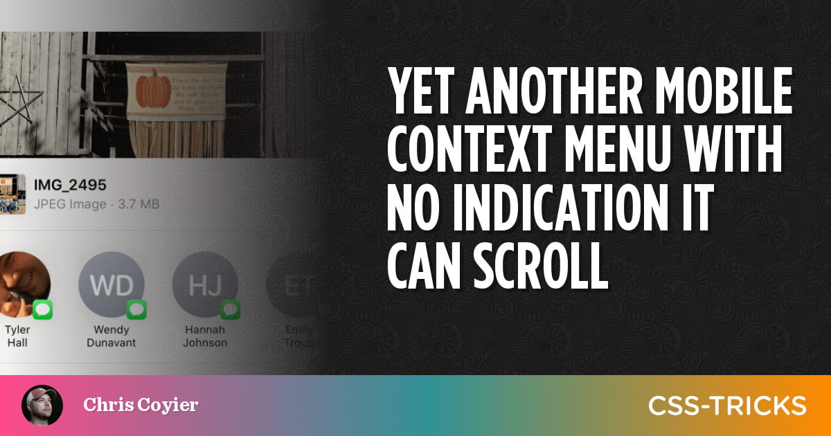
Remember Tyler Hall’s personal story of a UX moment where the popup sharing context menu on iOS had no visible indication that the content inside was scrollable? The thing his mom wanted to do seemed impossible iOS isn’t alone here — Terence Eden documents essentially the same problem on Android:
I tried sharing a website using Google Chrome for Android. I hit the share button, and a panel popped-up from the bottom of the screen.
Hmmm. It didn’t have the share destination that I wanted. It was early in the morning – when I’m not at my cognitive best – and I was stumped. There is nothing on this screen – other than the icons – to tell me how I can interact with it. There’s no scrollbar, no handle, no “more” icon, nothing.
I would think even just fairly subtle “scroll shadows” would go a long way in both cases, but some serious user testing should be in order here.


