Whether you are just starting out on the front end, or you’ve been doing it for a long time, building a tool that can generate some cool front-end magic can help you learn something new, develop your skills and maybe even get you a little notoriety.
You might have run across some of these popular online generators:
I’ve had fun building a few of these myself over the years. Basically, any time you run across some cool front-end thing, there might be an opportunity to make an interactive generator for that thing.
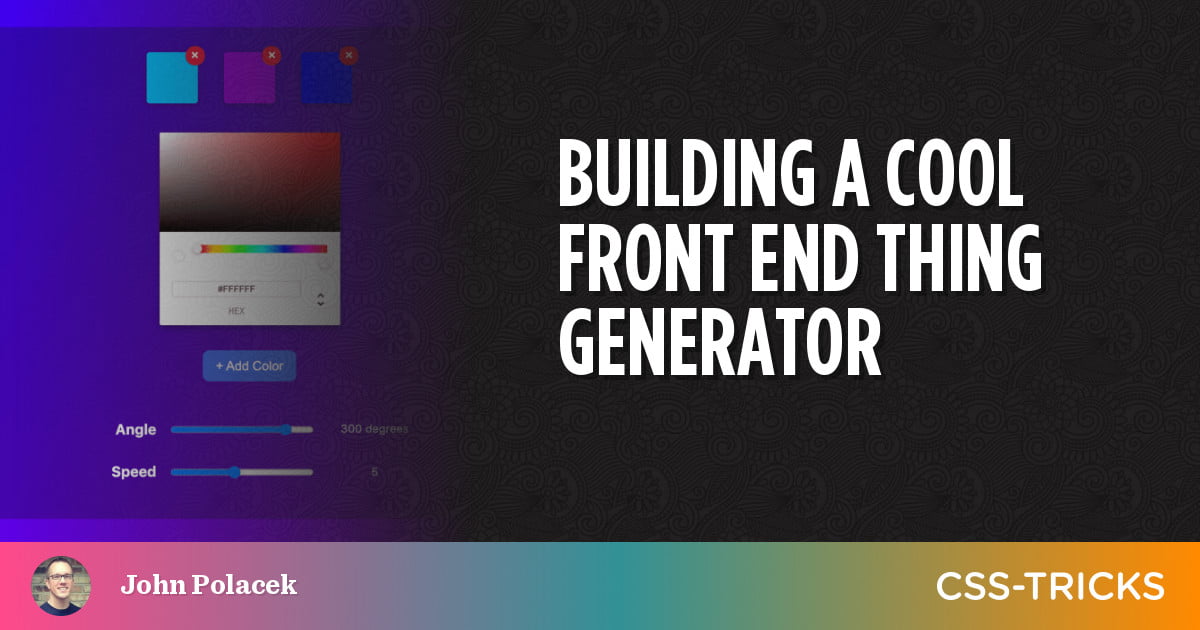
In this case, we are going to make an Animated Background Gradient Generator.
Scaffolding the project in Next
Table of Contents
A nice thing about these projects is that they’re all yours. Choose whatever stack you want and get going. I’m a big fan of Next.js, so for this project, I’m going to start as a basic Create Next App project.
npx create-next-app animated-gradient-background-generator
This generates all the files we need to get started. We can edit pages/index.js to be the shell for our project.
import Head from "next/head"
import Image from "next/image"
export default function Home() { return ( <> <Head> <title>Animated CSS Gradient Background Generator</title> <meta name="description" content="A tool for creating animated background gradients in pure CSS." /> <link rel="icon" href="/favicon.ico" /> </Head> <main> <h1> Animated CSS Gradient Background Generator </h1> </main> </> )
}
Animated gradients?
At the time I’m writing this article, if you do a search for animated CSS gradient background, the first result is this Pen by Manuel Pinto.
Let’s take a look at the CSS:
body { background: linear-gradient(-45deg, #ee7752, #e73c7e, #23a6d5, #23d5ab); background-size: 400% 400%; animation: gradient 15s ease infinite;
} @keyframes gradient { 0% { background-position: 0% 50%; } 50% { background-position: 100% 50%; } 100% { background-position: 0% 50%; }
}
This is a great example that we can use as the foundation for the generated animation.
A React component to describe an animated gradient
We can break out a few possible configurable options for the generator:
- An array of gradient colors
- The angle of the gradient
- The speed of the animation
To put in context, we want to provide these settings as data throughout our little app using a higher-order component, context/SettingsContext.js, along with some defaults.
import React, { useState, createContext } from "react" const SettingsContext = createContext({ colorSelection: [] }) const SettingsProvider = ({ children }) => { const [colorSelection, setColorSelection] = useState([ "deepskyblue", "darkviolet", "blue", ]) const [angle, setAngle] = useState(300) const [speed, setSpeed] = useState(5) return ( <SettingsContext.Provider value={{ colorSelection, setColorSelection, angle, setAngle, speed, setSpeed, }} > {children} </SettingsContext.Provider> )
} export { SettingsContext, SettingsProvider }
For our generator’s components, we want to create:
- a control components to adjust these settings,
- a visual display component for generated animated gradient, and
- a component for the CSS code output.
Let’s start with a Controls component that contains the various inputs we used to adjust the settings.
import Colors from "./Colors" const Controls = (props) => ( <> <Colors /> </>
) export default Controls
We can add our SettingsProvider and Controls components to pages/index.js:
import Head from "next/head"
import Image from "next/image"
import { SettingsProvider } from "../context/SettingsContext"
import Controls from "../components/Controls"
import Output from "../components/Output" export default function Home() { return ( <> <Head> ... </Head> <SettingsProvider> <main style={{ textAlign: "center", padding: "64px" }}> <h1>Animated CSS Gradient Background Generator</h1> <Controls /> <Output /> </main> </SettingsProvider> </> )
}
Our SettingsProvider begins with the three colors from our CodePen example as defaults. We can verify that we are getting the color settings via our SettingsContext in a new Colors component.
import React, { useContext } from "react"
import { SettingsContext } from "../context/SettingsContext" const Colors = () => { const { colorSelection } = useContext(SettingsContext) return ( <> {colorSelection.map((color) => ( <div>{color}</div> ))} </> )
} export default Colors
Let’s use the Colors component to display individual color swatches with a small button to delete via our SettingsContext.
import React, { useContext } from "react"
import { SettingsContext } from "../context/SettingsContext" const Colors = () => { const { colorSelection, setColorSelection } = useContext(SettingsContext) const onDelete = (deleteColor) => { setColorSelection(colorSelection.filter((color) => color !== deleteColor)) } return ( <div> {colorSelection.map((color) => ( <div key={color} style={{ background: color, display: "inline-block", padding: "32px", margin: "16px", position: "relative", borderRadius: "4px", }} > <button onClick={() => onDelete(color)} style={{ background: "crimson", color: "white", display: "inline-block", borderRadius: "50%", position: "absolute", top: "-8px", right: "-8px", border: "none", fontSize: "18px", lineHeight: 1, width: "24px", height: "24px", cursor: "pointer", boxShadow: "0 0 1px #000", }} > × </button> </div> ))} </div> )
} export default Colors
You may notice that we have been using inline styles for CSS at this point. Who cares! We’re having fun here, so we can do whatever floats our boats.
Handling colors
Next, we create an AddColor component with a button that opens a color picker used to add more colors to the gradient.
For the color picker, we will install react-color and use the ChromePicker option.
npm install react-colorOnce again, we will utilize SettingsContext to update the gradient color selection.
import React, { useState, useContext } from "react"
import { ChromePicker } from "react-color"
import { SettingsContext } from "../context/SettingsContext" const AddColor = () => { const [color, setColor] = useState("white") const { colorSelection, setColorSelection } = useContext(SettingsContext) return ( <> <div style={{ display: "inline-block", paddingBottom: "32px" }}> <ChromePicker header="Pick Colors" color={color} onChange={(newColor) => { setColor(newColor.hex) }} /> </div> <div> <button onClick={() => { setColorSelection([...colorSelection, color]) }} style={{ background: "royalblue", color: "white", padding: "12px 16px", borderRadius: "8px", border: "none", fontSize: "16px", cursor: "pointer", lineHeight: 1, }} > + Add Color </button> </div> </> )
} export default AddColor
Handling angle and speed
Now that our color controls are finished, let’s add some components with range inputs for setting the angle and animation speed.
Here’s the code for AngleRange, with SpeedRange being very similar.
import React, { useContext } from "react"
import { SettingsContext } from "../context/SettingsContext" const AngleRange = () => { const { angle, setAngle } = useContext(SettingsContext) return ( <div style={{ padding: "32px 0", fontSize: "18px" }}> <label style={{ display: "inline-block", fontWeight: "bold", width: "100px", textAlign: "right", }} htmlFor="angle" > Angle </label> <input type="range" id="angle" name="angle" min="-180" max="180" value={angle} onChange={(e) => { setAngle(e.target.value) }} style={{ margin: "0 16px", width: "180px", position: "relative", top: "2px", }} /> <span style={{ fontSize: "14px", padding: "0 8px", position: "relative", top: "-2px", width: "120px", display: "inline-block", }} > {angle} degrees </span> </div> )
} export default AngleRange
Now for the fun part: rendering the animated background. Let’s apply this to the entire background of the page with an AnimatedBackground wrapper component.
import React, { useContext } from "react"
import { SettingsContext } from "../context/SettingsContext"
const AnimatedBackground = ({ children }) => { const { colorSelection, speed, angle } = useContext(SettingsContext)
const background = "linear-gradient(" + angle + "deg, " + colorSelection.toString() + ")"
const backgroundSize = colorSelection.length * 60 + "%" + " " + colorSelection.length * 60 + "%"
const animation = "gradient-animation " + colorSelection.length * Math.abs(speed - 11) + "s ease infinite"
return ( <div style={{ background, "background-size": backgroundSize, animation, color: "white" }}> {children} </div> )
}
export default AnimatedBackground
We’re calling the CSS animation for the gradient gradient-animation. We need to add that to styles/globals.css to trigger the animation:
@keyframes gradient-animation { 0% { background-position: 0% 50%; } 50% { background-position: 100% 50%; } 100% { background-position: 0% 50%; }
}
Making it useful to users
Next, let’s add some code output so people can copy and paste the generated CSS and use in their own projects.
import React, { useContext, useState } from "react"
import { SettingsContext } from "../context/SettingsContext"
const Output = () => { const [copied, setCopied] = useState(false)
const { colorSelection, speed, angle } = useContext(SettingsContext)
const background = "linear-gradient(" + angle + "deg," + colorSelection.toString() + ")"
const backgroundSize = colorSelection.length * 60 + "%" + " " + colorSelection.length * 60 + "%"
const animation = "gradient-animation " + colorSelection.length * Math.abs(speed - 11) + "s ease infinite"
const code = `.gradient-background { background: ${background}; background-size: ${backgroundSize}; animation: ${animation};
}
@keyframes gradient-animation { 0% { background-position: 0% 50%; } 50% { background-position: 100% 50%; } 100% { background-position: 0% 50%; }
}`
return ( <div style={{ position: "relative", maxWidth: "640px", margin: "64px auto" }} > <pre style={{ background: "#fff", color: "#222", padding: "32px", width: "100%", borderRadius: "4px", textAlign: "left", whiteSpace: "pre", boxShadow: "0 2px 8px rgba(0,0,0,.33)", overflowX: "scroll", }} > <code>{code}</code> <button style={{ position: "absolute", top: "8px", right: "8px", background: "royalblue", color: "white", padding: "8px 12px", borderRadius: "8px", border: "none", fontSize: "16px", cursor: "pointer", lineHeight: 1, }} onClick={() => { setCopied(true) navigator.clipboard.writeText(code) }} > {copied ? "copied" : "copy"} </button> </pre> </div> )
}
export default Output
Making it fun
It is sometimes fun (and useful) to add a button that sets random values on a generator like this. That gives people a way to quickly experiment and see what kinds of results they can get out of the tool. It is also an opportunity to look up cool stuff like how to generate random hex colors.
import React, { useContext } from "react"
import { SettingsContext } from "../context/SettingsContext" const Random = () => { const { setColorSelection, setAngle, setSpeed } = useContext(SettingsContext) const goRandom = () => { const numColors = 3 + Math.round(Math.random() * 3) const colors = [...Array(numColors)].map(() => { return "#" + Math.floor(Math.random() * 16777215).toString(16) }) setColorSelection(colors) setAngle(Math.floor(Math.random() * 361)) setSpeed(Math.floor(Math.random() * 10) + 1) } return ( <div style={{ padding: "48px 0 16px" }}> <button onClick={goRandom} style={{ fontSize: "24px", fontWeight: 200, background: "rgba(255,255,255,.9)", color: "blue", padding: "24px 48px", borderRadius: "8px", cursor: "pointer", boxShadow: "0 0 4px #000", border: "none", }} > RANDOM </button> </div> )
} export default Random
Wrapping up
There will be a few final things you’ll want to do to wrap up your project for initial release:
- Update
package.jsonwith your project information. - Add some links to your personal site, the project’s repository and give credit where its due.
- Update the
README.mdfile that was generated with default content by Create Next App.
That’s it! We’re ready to release our new cool front end thing generator and reap the rewards of fame and fortune that await us!
You can see the code for this project on GitHub and the demo is hosted on Netlify.

