Dumb trick alert!
Not all browsers support all features. Say you want to write a fallback for browsers that doesn’t support CSS Grid. Not very common these days, but it’s just to illustrate a point.
You could write the supporting CSS in an @supports blocks:
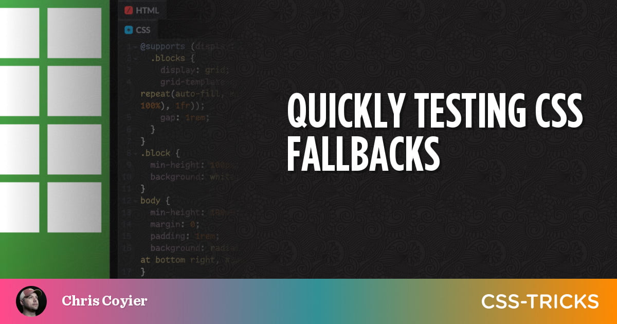
@supports (display: grid) { .blocks { display: grid; grid-template-columns: repeat(auto-fill, minmax(min(100px, 100%), 1fr)); gap: 1rem; }
}
Then to test the fallback, you quickly change @supports (display: grid) to something nonsense, like adding an “x” so it’s @supports (display: gridx). That’s a quick toggle:
The example above doesn’t have very good fallbacks does it?! Maybe I’d attempt to write something similar in flexbox, as hey, maybe there is some small group of browsers still out there that support flexbox and not grid. More likely, I’d just write a fallback that makes things look pretty OK as a column.
If I’m fairly confident the browser supports @supports queries (oh, the irony), I could write it like:
@supports (display: grid) { /* grid stuff */
} @supports not (display: grid) { /* at least space them out a bit */ .block { margin: 10px }
}
That’s an assumption that will get safer and safer to make, and honestly, we’re probably already there (if you’ve dropped IE support).
This makes me want that @when syntax even more though, because then we could write:
@when supports(display: grid) { } @else { }…which feels so fresh and so clean.


