Websites survive and disappear due to conversion rates. A high conversion rate means more sales and revenue, but a low conversion rate simply means that it’s hard to keep your business up and running.
Maintaining a healthy conversion rate is critical to the success of your online business, so it’s important to explore and master the user experience of your website, one of the most important factors influencing conversions. UX is associated with every page or element of a page that a prospect, visitor, or customer experiences when browsing and interacting with a website. It has to do with how easy it is to find what they are looking for on your site.
Let’s jump 4 quick ways on how effective UX affects conversion rates:
1. Who said Moving Pictures?
Table of Contents
Every time you navigate the landing page, you usually have a lot of text to record. This is because the landing page is actually a sales page that you want to persuade to click the CTA button. Some landing pages can be very long if you have a very detailed value proposition to portray to your visitors.
When it comes to UX, to be honest, it can be absolutely annoying to people.
Who has the time or wants to read all the text?
This situation is tuned for the video. Studies have shown that using a video on landing pages can significantly improve conversion rates. Conversions occur because the page communicates its value proposition well and encourages the user or customer to complete the purpose of the page.


/*div{padding-right:0!important;padding-bottom:10px}.ml-form-formContent.horozintalForm .ml-button-horizontal{width:100%!important}.ml-form-formContent.horozintalForm .ml-button-horizontal.labelsOn{padding-top:0!important}}
/*]]>*/
/**/
![]()
![]()
Picture 1. Example from EyeView
2. Mind Your CTA
The customer’s UX has a big impact on where your CTA’s are placed. If it’s difficult to view, read, or click on the CTA it will leave a negative impact on overall UX and conversions. The purpose of most online pages is to sell something, whether it’s a product or a subscription. Call to action buttons are an integral part of conversions.
Obviously, the larger the screen size (desktops and tablets and mobile devices), the more space for content there is in the top half of the page. According to NN Group’s UN experts, 84% is the average difference in how users process content at the top and bottom of the page. In other words, the content at the top of the page is focused on 84% more than the content at the bottom.
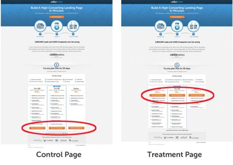

Picture 2. CTA Button Placement via Unbounce
3. Make it Lightning Fast
If you’re looking to acquire user information for later prospecting, using one of the trending lead magnet ideas with a lightning fast website will ultimately snatch the visitor’s info in a blitz. Additionally, website speed is one of the most important factors in determining whether your user experience is consistent. Websites that are significantly slower are eliminated compared to fast websites.
But how do you know if the speed is fast enough?
A classic 2009 survey by Akamai and Forrester, a content delivery network provider, found that 40 percent of consumers refuse to view the page for more than three seconds before leaving the site. If your website takes three and a half or four seconds to load, this is the case.
Your leads will fade with your conversions. A new study by DoubleClick conducted by Google in 2016 confirmed these earlier results. For mobile phones, 53% of mobile website visits are abandoned if the page takes longer than three seconds to load.
So your answer is three seconds or less. If you don’t want potential customers to believe that your site is having a bad experience because of the slowness of your site, your site pages should come up this fast!
Here are some helpful website speed tools that you can use to speed up your website:
- PageSpeed Insights from Google
- Pingdom website speed test
- Website speed and performance optimization for GTmetrix
However, most websites and all landing pages have only one purpose: to attract their visitors. One of the biggest problems that can negatively affect conversion rates is that the landing page has a lot of irregularities in the form of navigation links that keep visitors away from the page. These links act as disruptive factors that undermine the overall purpose of the page.
Solution? Remove the navigation bar, of course!
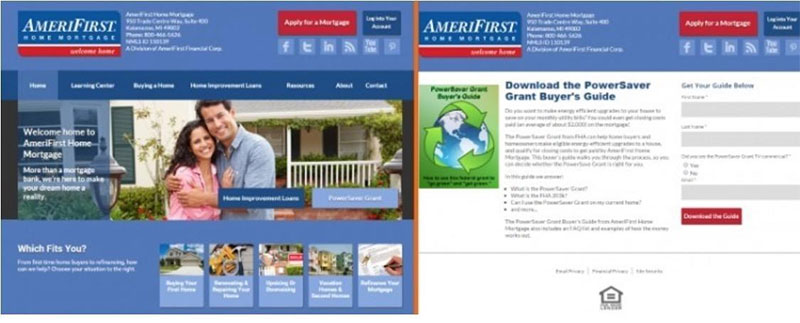

Picture 3. Decluttered Landing Page via Relevance
The removal of the landing page navigation policy resulted in a dramatic 30-40% increase in conversion rates at AmeriFirst.
Ready to Give Your Website a Boost?
If your website’s user experience is great, your website will be rewarded with more conversions. In other words, make sure the user experience is great and your visitors are more likely to convert.
So, when you ensure that the user experience on a website is great thanks to the clarity and goals set for the page, you can be sure that it will result in higher conversions.

