
This article presents an easy-to-follow guide for building an interactive linear gauge chart in JavaScript.
We’ll show to quickly create a cool and interactive linear gauge chart that highlights Covid-19 vaccination data around the world. Our chart will allow us to visualize the status of Covid-19 vaccination at the time of writing, and will display two types of data — showing how far away we are from the halfway target of both partially and fully vaccinating the global population.

What Is a Linear Gauge Chart?
Table of Contents
Data visualization is an invaluable tool, given the vast amount of data being created and numerous possibilities for gleaning information from data. Data visualization is particularly useful for identifying trends, interpreting patterns, and communicating complex ideas to the target audience.
A linear gauge chart represents a vertical or horizontal linear scale that shows the required values, with a color scale along with single or multiple pointers. The minimum and maximum values of the data range can be set over the axes according to the data being represented. The pointer position indicates the current value of the metric.
A gauge chart can display a single value or multiple values using an individual pointer or a combination of markers. The pointer can be a needle or a line with a marker of any shape like a circle, square, rectangle or triangle.
The linear gauge chart type is an effective visual representation for displaying how close or far the values are from the desired data point.
Types of linear gauges
The several types of linear gauges are thermometer chart, bullet chart, tank chart and LED chart. The mercury thermometer — consisting of minor ticks that displays the temperature with the pointer value — is a classic example of a linear gauge chart.
The linear gauge visualization we’ll be building
Here’s a sneak peek at the final linear gauge chart. Follow this tutorial to learn how we build this interesting and informative linear gauge chart with JavaScript.
The Four Steps to Building a JavaScript Linear Gauge
It’s always useful to have some skills with technologies like HTML and JavaScript. But in this tutorial, we’re using a JS charting library that makes it easier to create compelling charts like the linear gauge even with minimal technical knowledge.
There are several JavaScript charting libraries for visualizing data with ease, and here we’re creating the linear gauge chart with AnyChart. This library is flexible, with extensive documentation, and it consists some great examples. Moreover, it has a playground for experimenting with code and is free for non-commercial use. If you want to buy a licensed version, you can check out the available options, and if you’re an educational or not-for-profit organization, you can get in touch for a free license here.
The Steps for Making a JavaScript Linear Gauge
These are the basic steps for creating a linear gauge chart:
- Create a basic HTML page.
- Include the necessary JavaScript files.
- Add the data.
- Write the JavaScript code for the chart.
Let’s look through each of these steps in detail below.
1. Create a basic HTML page
The first thing we need to do is make an HTML page that will hold our visualization. We add a <div> block element and give it an ID so we can reference it later:
<html lang="en"> <head> <title>JavaScript Linear Gauge</title> <style type="text/css"> html, body, #container { width: 100%; height: 100%; margin: 0; padding: 0; } </style> </head> <body> <div id="container"></div> </body> </html> The width and height attributes of the <div> are set to 100% so that the chart is rendered across the entire screen. These attributes can be modified according to requirements.
2. Include the necessary JavaScript files
The next step is to reference the JS links in the HTML page. We’ll use the AnyChart library for this tutorial, so let’s include the corresponding files from their CDN.
To create a linear gauge chart, we’ll need to add three scripts: the core module, the linear gauge module, and the table module:
<html lang="en"> <head> <title>JavaScript Linear Gauge</title> <style type="text/css"> html, body, #container { width: 100%; height: 100%; margin: 0; padding: 0; } </style> </head> <body> <div id="container"></div> <script> // All the code for the JS linear gauge will come here </script> <script src="https://cdn.anychart.com/releases/8.10.0/js/anychart-core.min.js"></script> <script src="https://cdn.anychart.com/releases/8.10.0/js/anychart-linear-gauge.min.js"></script> <script src="https://cdn.anychart.com/releases/8.10.0/js/anychart-table.min.js"></script> </body> </html> 3. Add the data values
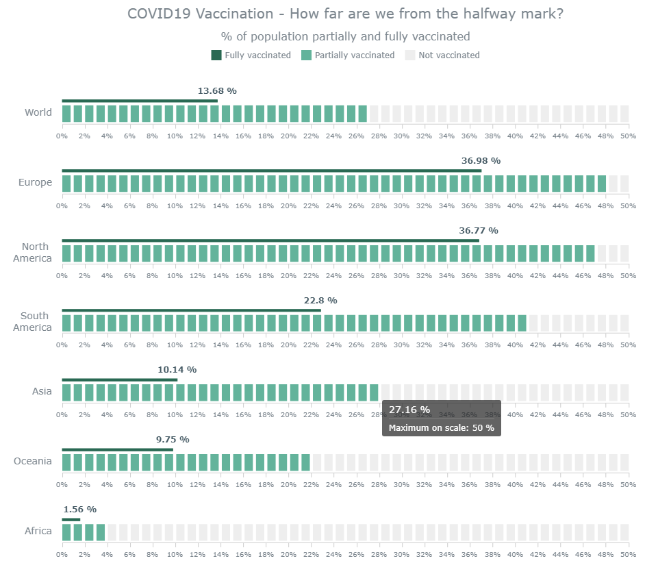
The data for the linear gauge chart is collected from Our World in Data and included in the code. On that site, we can see the percentage of the people having received one and two Covid vaccine doses for each continent in the whole world.
Because (at the time of writing) none of the numbers is greater than 50%, we’ve kept the maximum limit of the axis of all the linear gauges as 50%, and we compare how far away from that mark each continent is, as well as the global figure. We indicate at least partially vaccinated figures with LED representation, and the fully vaccinated numbers with a bar pointer. We’ll see how the data is added in the last step.
So then, our initial steps are all done, and now let’s add the code to make a linear gauge chart with JavaScript!
4. Write the JavaScript code for the chart
Before adding any code, we enclose everything in a function that makes sure that the entire code inside it executes only once the page is loaded.
Creating a linear gauge chart involves a couple of steps and is a bit more complex than the other basic chart types. But that doesn’t mean it’s very difficult, and we’ll go through each step to understand how the chart is made.
Defining the Linear Scale and Axis for the Gauge Chart
We have multiple pointers in our chart. So, let’s start with making a function that accepts two values: one for the bar pointer, and one for the LED gauge. We’ll then create a gauge, set the data, and specify the layout as horizontal. Next, we’ll set the range of the scales and the axes. We’ll make a linear scale with the minimum and maximum ranges. For the axis, we’ll define the attributes and set the orientation:
function drawGauge(value, settings) { // Create gauge with settings const gauge = anychart.gauges.linear(); gauge.data([value, settings.value]); gauge.layout('horizontal'); // Set scale for gauge const scale = anychart.scales.linear(); scale.minimum(0).maximum(settings.maximum).ticks({ interval: 2 }); // Set axis for gauge const axis = gauge.axis(0); axis.width('1%').offset('43%').scale(scale).orientation('bottom'); } Continue reading How to Create a Linear Gauge Chart in JavaScript on SitePoint.