A well-designed landing page can be the key to conversions. Whether you’re looking to grow your email database, sell something, or promote an event, the right landing page can make it happen.
Advertising costs time and money, and directing visitors to an irrelevant or messy landing page can be counterproductive. It’s worth taking the time to analyze your audience and their behaviors.
If you’re ready to create a landing page, it’s time to get inspired. To help you smash your 2022 marketing goals, we’ve put together a list of our favorite landing pages that incorporate SEO friendly web design.
The question is, which design would best suit your target audience?
What is a Landing Page?
Table of Contents
- 1 What is a Landing Page?
- 2 The Top Landing Pages and What Makes Them Great
- 2.1 1. Use Persuasive Text
- 2.2 2. Keep Them on Your Website
- 2.3 3. Prove You Know What You’re Talking About
- 2.4 4. Understand Your Audience
- 2.5 5. Give Them Something
- 2.6 6. Say it Above the Fold
- 2.7 7. Be Relevant and Mix it Up
- 2.8 8. Challenge Your Audience
- 2.9 9. Fill a Need
- 2.10 10. Be Innovative and Use Technology
- 3 10 Landing Page Ideas for 2022
You may be wondering what a landing page is. Before we start, here’s a quick explanation.
Unlike your homepage, a landing page is usually tied to your marketing campaigns.
When you create an online advertisement, you need to include a link. For example, you may use Google Adwords and Facebook Ads to encourage people to register their interest in your product.
Instead of directing users to a generic page on your website, you can send them to a highly targeted landing page. The content on your landing page will vary depending on your desired outcome.
But, it may include a sign-up form, information, a shop now button, or frequently asked questions. Most landing pages have a clear call to action.
The Top Landing Pages and What Makes Them Great
When it comes to landing pages, one size doesn’t fit all. We’ve put together our top ten designs to inspire you for 2022.
Whether you run an eCommerce store, B2B business, support group, or blog, there’s a landing page to suit your audience.
Get set to upgrade your marketing campaigns for the new year:
1. Use Persuasive Text
You only have limited space on your landing page, so you should choose your words carefully. Think about how you will convince the user to fill out their details or click your button.
For 2022, consider using persuasive text to catch the reader’s attention. Use a direct headline and copy they can’t resist.
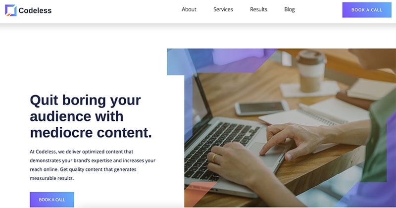
For example, take a look at this landing page for a content marketing agency. The headline is direct, and the persuasive text fits its entrepreneurial audience.

(Image Source)
Words like “quit,” “boring,” and “mediocre” may seem intimidating. But when your audience is savvy and looking for results, direct language can have a big impact.
In the above example from Codeless, the brand catches the reader’s attention straight away. In just over 30 words, the right audience will be curious to learn more.
The graphics and call to action are simple and fit with the brand’s theme. If you have a B2B (business to business) model, consider keeping the hero text on your landing page short and sweet. If you have something more to say, put it below the fold.
2. Keep Them on Your Website
Is your goal to increase page views and the time spent on your website? If you’ve noticed that visitors are fleeing the page as soon as they arrive, you may have a high bounce rate.
You can check your bounce rate in Google Analytics.
You should use the same strategies for your landing page as the rest of your website.
Here are a few simple rules to follow to improve your bounce rate:
- Make sure your page loads quickly. Optimize your images and minimize plugins
- Use HTTPS to improve security and prevent red flags from antivirus software
- Make sure your landing page looks professional
- Keep your background clean and avoid hard-to-read fonts and colors
- Avoid auto-play videos, annoying ads, and redirects
If you’ve engaged your audience and they decide to stick around, you’ll need to offer them something more. Consider adding “related posts” or “you may also like” at the end of your landing page.
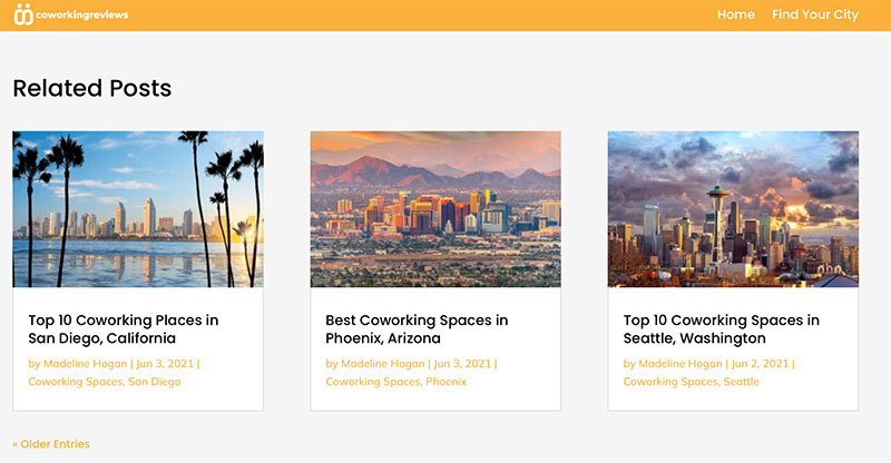
Here is how a page about Miami coworking reviews encourages its readers to continue browsing the website.

(Image Source)
The approach is subtle. They use the same theme, appealing images, and simple text.
3. Prove You Know What You’re Talking About
Want to add credibility to your brand? Give your users accurate information and shareable statistics.
A researched, engaging page can help you increase page views and grow your following. If you do it right, your page may even go viral.
Remember, informative doesn’t have to mean boring. It’s not about writing a thesis for a university lecturer. It’s about quick facts and figures that anyone can understand.
You can also use custom images and infographics to break up bodies of text.
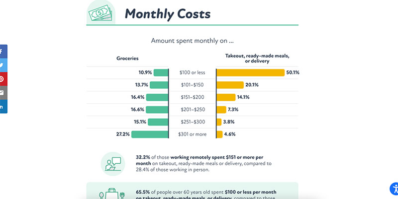
Here’s an example. Due to the COVID-19 pandemic, there has been an increase in demand for online meal deliveries.
Discount website Coupon Follow noticed this. It used data from this trend to create an informative page.

(Image Source)
It features different information, including statistics, spending, and meal delivery types. The coupon website encourages readers to share the statistics and links back to the article at the end of the page.
Meanwhile, Sleep Advisor takes credibility to a whole new level.
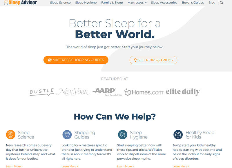

Sleep experts who run this company attempt to answer all your questions about sleep hygiene, the best mattresses for sleep, and even have a dedicated section for helping kids get healthy sleep.
Packed with statistic and research-based articles and guides, you would consider Sleep Advisor as your #1 go-to source for anything related to sleep.
4. Understand Your Audience
When you design your landing page, you should think about your target audience. After all, it’s about creating a positive user experience.
In 2022, get more bang from your advertising buck by getting to know your shoppers. You can use analytics, questionnaires, and shopping data to answer these questions:
- Who are they?
- What are they looking for?
- How old are they?
- Where do they live?
- When do they shop?
- What is their budget?
- What do they expect from you?
- What makes them unique?
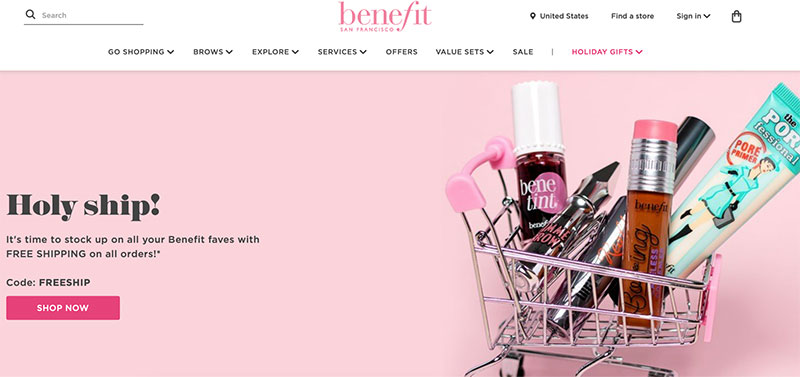
Use this information to develop buyer personas, then you can create a niche landing page that resonates with them. One brand that understands its audience is Benefit Cosmetics.

(Image Source)
They’re known for their feminine, retro graphics. When you purchase a beauty product from Benefit Cosmetics, you’re buying an experience.
From the product descriptions to the packaging, it’s pink, iconic, and sweet.
What does this mean for their landing pages? The example above is simple, but it works. There’s a pale pink background and a few of the bestsellers sitting in a teeny, tiny trolley.
The headline and text sound like a conversation between best friends. And, the brand offers the bonus of free shipping to encourage users to click “shop now.”
5. Give Them Something
If you want an immediate result from your landing page, you need to sweeten the deal.
As a general rule, popups are annoying and off-putting to internet users and not the best choice for a landing page. But, there is an exception.
You may have seen popup sign-up forms when you visit eCommerce stores. These forms usually offer a shopping discount or an entry into a competition. Most users tolerate these pop-ups because they give them something they want.
In return, the business owner can collect email addresses and grow its marketing list.
If you’re going to use a popup sign-up form, make sure it’s easy to close with a visible X in the top right corner.
Alternatively, you can include a special offer somewhere on your page. The offer will depend on your business type. For example, if you sell clothing, you could offer 10% off when they create an account. And for those selling SaaS products, the special deal could be one extra month added to their annual subscription.
Or if you run a marketing blog, you could offer a free eBook or online course when they subscribe to your email newsletter.
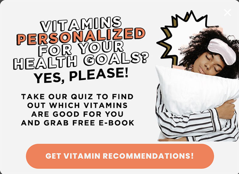
Here’s an example from FutureKind offering to take a quiz to get vitamin recommendations and a free ebook.

(Image Source)
6. Say it Above the Fold
The most valuable real estate on your landing page is above the fold. If you don’t capture people’s attention before they need to scroll, you can say goodbye to those new sign-ups.
If you have multiple landing pages, they may be viewed by the same people. Consistent branding above the fold will help boost brand recognition and trust.
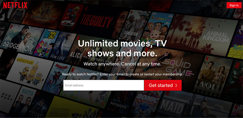
You’re probably familiar with this landing page from Netflix. In the background, you can see a selection of popular titles. While it’s subtle, there’s something for everyone.

(Image Source)
The background content is updated regularly to match what’s trending. Shows like You, Maid, Squid Game, and Bridgerton are all current Netflix hits.
The text is minimal, but the signature red directs eyes to the logo, “sign in”, and “get started” buttons. There’s no need to scroll because it’s all right here, above the fold.
7. Be Relevant and Mix it Up
If you’ve created a landing page, it doesn’t have to be a lifelong commitment. You can mix up your landing pages throughout the year.
Have some fun with your marketing and celebrate holidays and events. For example, you can have seasonal sales and Christmas discounts. Your landing pages will be relevant and time-sensitive, which creates a sense of urgency.
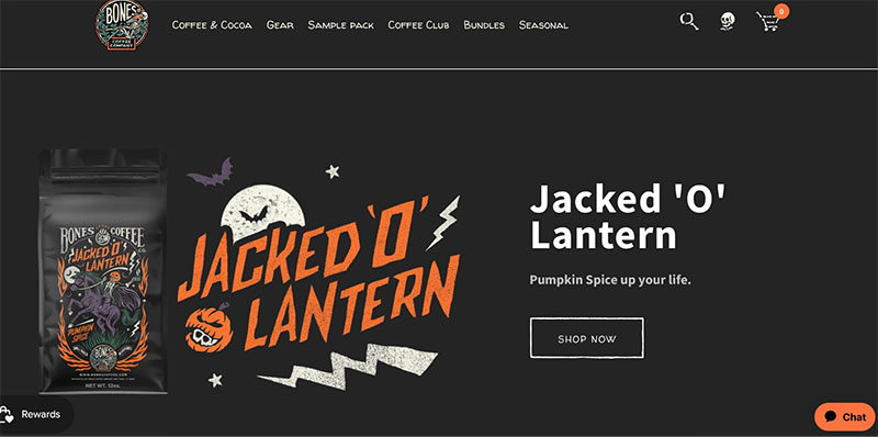
Here’s some inspiration for your own marketing campaigns. Bones Coffee creates holiday-specific coffee collections. To prove its dedication, it has included a seasonal tab in the menu bar.

(Image Source)
One of the brand’s themed landing pages is for the Halloween Jacked ‘O’ Lantern. It’s a pumpkin spice coffee with spooky packaging.
The landing page features the product with the name enlarged. The background is black, and there’s no need for extensive text. Fans of coffee and all things creepy will likely be tempted to hit “shop now.”
Whether it’s Thanksgiving, Valentine’s Day, World Nutella Day, or a business milestone, there’s always an event around the corner.
8. Challenge Your Audience
Depending on your business type, a dash of cheekiness may seal the deal. You may even want to challenge your audience to have some fun. A challenge could be a dare, riddle, or quiz.
This approach works particularly well for brands that already have a loyal following.
A challenge should always be inclusive, lighthearted, and relevant to your brand. It should never be discriminatory or offensive.
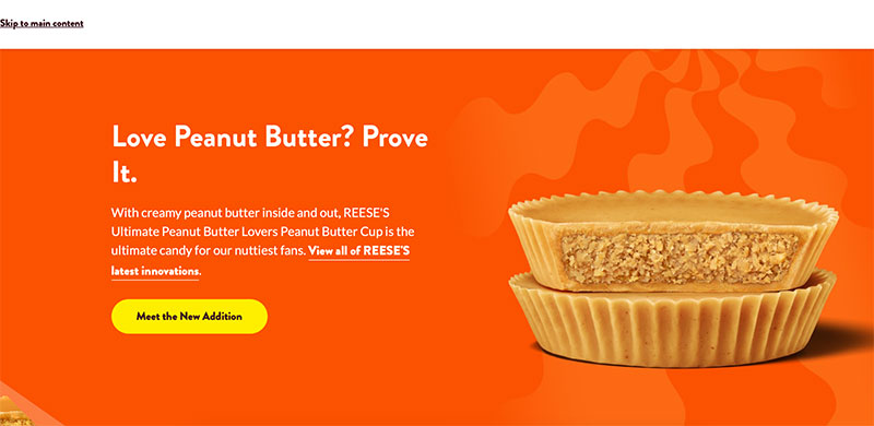
Let’s look at an example that features REESE’S Ultimate Peanut Butter Lovers Peanut Butter Cup. Who is this landing page aimed at? Anyone who can’t get enough of peanut butter.

(Image Source)
The challenge is in the headline. The brand asks the audience to prove their love of peanut butter by trying their newest nutty delight. The strategy is simple, but the words “prove it” give the readers a reason to seek it out.
If they see these Peanut Butter Cups on the shelves, this landing page could be the push they need to hand over their money. If they love the cups, they will continue to purchase them.
The orange background, yellow button, and product shot give the impression it’s a creamy, peanut butter-filled candy treat.
9. Fill a Need
Are you offering a service that fills a specific need? For example, your landing page may be promoting an online community group, course, or club.
If the answer is yes, you should consider the emotional response. Is your target audience looking for friendship and support? Are they searching for expert advice, tips, or a new hobby?
Choose your words and graphics carefully. Soft backgrounds, kind words, and welcoming graphics will offer reassurance.

(Image Source)
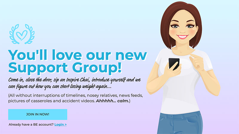
For example, here’s a landing page for a weight loss support group. It’s marketed as a calm, caring space, and the landing page design reflects this.
When you want people to feel comfortable, every word matters. Did you notice that the sign-up button says “join in now” instead of “join now”?
If you want new members to join a group, you will need to provide substance on your landing page. Think about including real member reviews, frequently asked questions, and a rundown on what’s included in the membership.
Unless they know someone who is already a member, you’ll need to (gently) sell everything you have to offer.
10. Be Innovative and Use Technology
Don’t be afraid to experiment with technology. You may not have the marketing budget of Adidas, but you can learn from it.
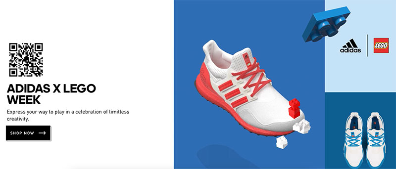
When the iconic sportswear label recently collaborated with Lego, the result was a landing page with plenty of talking points.

(Image Source)
The Adidas X Lego Week page features a QR code. These days, most people are familiar with QR codes. And, users will likely scan this to find out what’s behind it.
When you scan it, you’re taken to the app store with the option to download the brand’s app.
There are also images of the block happy shoes. Adidas has also used animation with bouncing Lego blocks.
These two brands are household names, but Adidas is leaving nothing to chance. It’s using all of the tools in its innovation tool kit to make this landing page as memorable and interactive as possible.
10 Landing Page Ideas for 2022
Are you ready to mix up your landing page designs in 2022? The first step is to know your audience and create an ad that suits your niche.
We’ve given you ten examples to inspire you in the near year. We spoke about persuasive text, increasing page views, and giving readers relevant information.
We also told you how to target your audience and why giving them an offer could help you secure a sale.
Consider mixing it up with seasonal promotions. You may even want to give them a fun challenge. Don’t forget to fill their needs and be innovative with technology.
Phil Singleton, SEO Expert and #1 Rated Kansas City SEO and Web Designer, believes that an investment in design will never go waste.
We hope you enjoyed our list of inspirational landing page designs for 2022. If you’d like to read more articles like this, check out our design inspiration archive.


