Make things easier
Table of Contents
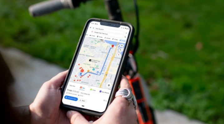
Make it easier for people to see your website when they are on their mobile phones in the bright sun. How can we do this? One way is to make sure our sites have enough color contrast, something we can do with the many online color contrast checkers at our disposal. Make it easier for people to access the information they need when their bandwidth is low, by shipping less JavaScript. Make it easier for the person who forgot their headphones to watch your video in a public place by providing captions. Put the contact information in a consistent, easy-to-find spot so the user who is stressed out can get ahold of someone without adding more stress to their situation. Make it easier for the person with a puppy in one hand and a mobile phone in the other to successfully interact with links and buttons by increasing the sizes of the interactive areas across the site.
If you’re a UX or visual designer, maybe this will inspire you to come up with some fresh perspectives for your existing user personas. Plus, it’s easier to get people on board if your persona examples include puppies. It’s not my rule; it’s just how it works. I’d personally lean toward kittens… maybe puppies and kittens? But I digress.
If you’re a developer, you might not think that any of these things are within your power to influence or control. As a developer myself, I don’t particularly agree with this mindset; but for the purpose of successfully writing this article, let’s pretend for a minute that I do. Let’s look at three things that developers can do to help increase the reach of the websites they work on.
Get all of your page content into landmark regions
From a practical perspective, this most commonly means header, main, aside and footer, but there are a few others as well—read up on them in the ARIA spec for the full list. What is the reason you want to do this? Well, one of the handy ways that screen reader users navigate around the page is by—you guessed it—landmark regions. The W3C’s WAI-ARIA website has a great example of the different kinds of screen readers using this feature, so be sure to check it out and see just how helpful it really is! If you’re working with page templates it can be easier than ever to make sure the primary template is set up correctly, too. This is definitely one place where developers can help make it easier for some users to successfully and easily use the sites they help build.
Add automated checks
We’re still pretty early in for the number of accessibility issues we can check for in an automated fashion, and you can still have a website that completely passes existing automated checks but is still inaccessible. That being said, it’s still worth getting it into your automated build process now. The bonus is that you can improve your codebase as new automated checks come out, which gives you time to get used to the existing checks. Use a template linter for static checks. Some IDE extensions can give you real-time feedback while you write your code! Automated tests can be used for dynamic code checks.
Add accessibility to your mental checklist
Heck, add it to a physical checklist until it’s ingrained in your mental checklist. Either way, get it in there. Here are some ideas to get you started:
- Ask about accessibility if you don’t see any annotations on the designs or feature specs you receive.
- Check the keyboard focus order when you’ve got the site up and running locally or in a container; TAB around and make sure you can get to all of the interactive elements.
- Review PRs with accessibility in mind. If someone has used a link where they should have used a button—or worse, they’ve used a div with no keyboard support—then give that feedback. This might mean you have to go remind yourself (or learn if you were never taught) what native browser support already exists for interactive elements.