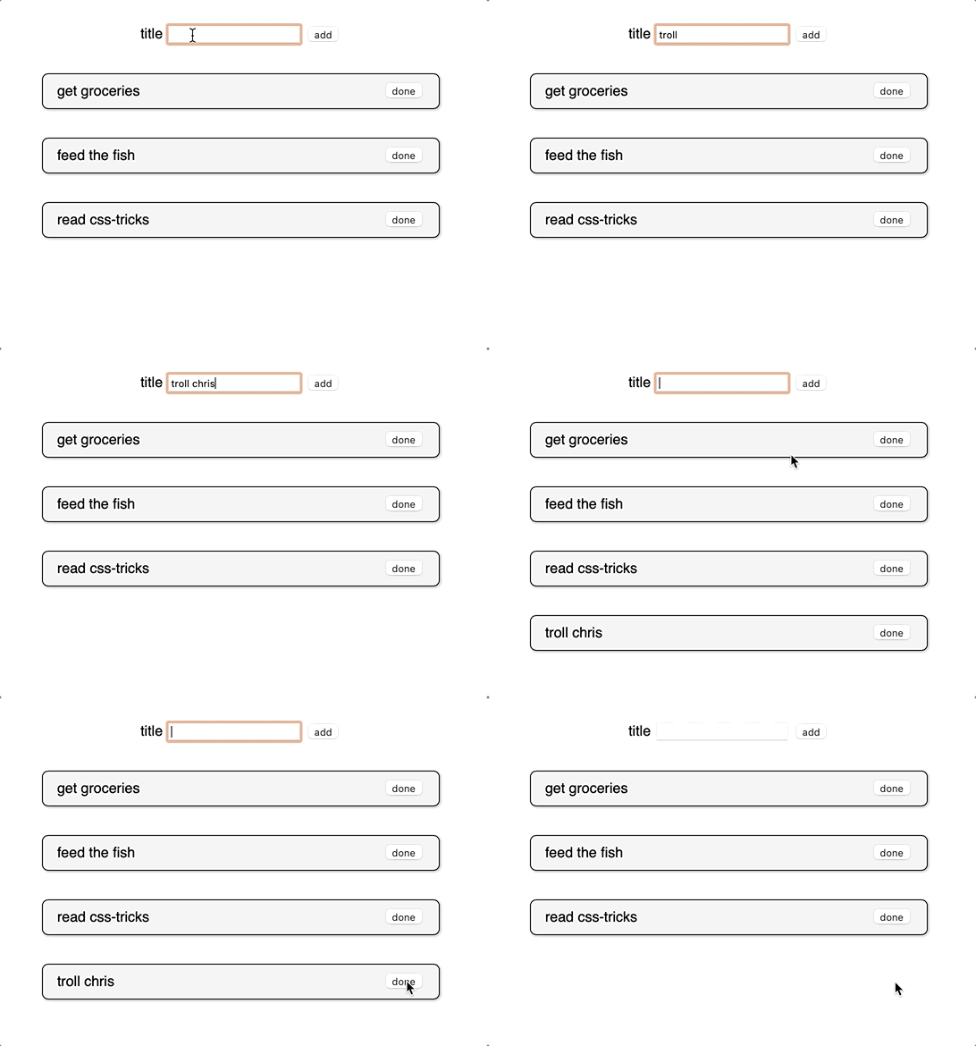
The Svelte transition API provides a first-class way to animate your components when they enter or leave the document, including custom Svelte transitions. By default, the transition directive uses CSS animations, which generally offer better performance and allow the browser’s main thread to remain unblocked. The API is as simple as this: <element transition:transitionFunction />. You can also specify in or out directives which are uni-directional transitions, only running when the element is mounted or unmounted.

Svelte offers a runtime svelte/transition package that ships with seven prepackaged Svelte transition functions, all of which can be dropped in and tweaked to your heart’s desire. Pairing this with the svelte/easing package, allows for a wide swath of interactions, without writing any of the transition code yourself. Play around with different transitions and easing functions to get a feel for what is possible.
Looking for instructions on how to get started with Svelte? We have a solid overview for you to check out.
The Svelte Custom Transition API
Table of Contents
If you need even more control than what the Svelte Transition API offers out of the box, Svelte permits you to specify your own custom transition function, as long as you adhere to a few conventions. From the docs, here’s what the custom transition API looks like:
transition = (node: HTMLElement, params: any) => { delay?: number, duration?: number, easing?: (t: number) => number, css?: (t: number, u: number) => string, tick?: (t: number, u: number) => void
}
Let’s break it down. A transition function takes a reference to the DOM node where the transition directive is used and returns an object with some parameters that control the animation and, most importantly, a css or tick function.
The css function’s job is to return a string of CSS that describes the animation, typically including some kind of transform or opacity change. Alternatively, you can opt to return a tick function, which lets you control every aspect of the animation with the power JavaScript, but pays a performance penalty since this type of transition does not use CSS animations.
Both the css and tick functions take two parameters called (t, u) by convention. t is a decimal number that travels from 0.00 to 1.00 while the element is entering the DOM and from 1.00 back to 0.00 when the element is leaving. The u parameter is the inverse of t or 1 - t at any given moment. For example, if you return a string of transform: scale(${t}), your element would smoothly animate from 0 to 1 on enter, and vice versa on exit.
These concepts may seem a bit abstract, so let’s solidify them by building our own custom Svelte transition!
Building your first custom Svelte transition
First, let’s set up some boilerplate that allows us to toggle an element’s existence in the DOM using a Svelte #if block. Remember, Svelte transitions only run when an element is actually leaving or entering the DOM.
<script> let showing = true
</script> <label for="showing"> Showing
</label>
<input id="showing" type="checkbox" bind:checked={showing} /> {#if showing} <h1>Hello custom transition!</h1>
{/if}
You should be able to toggle the checkbox and see our element starkly appear and disappear in place.
Next, let’s set up our custom Svelte transition function and get it wired up to our element.
<script> let showing = true // Custom transition function function whoosh(node) { console.log(node) }
</script> <label for="showing"> Showing
</label>
<input id="showing" type="checkbox" bind:checked={showing} /> {#if showing} <h1 transition:whoosh>Hello custom transition!</h1>
{/if}
Now, if you toggle the checkbox, you will see the <h1> element logged to the console. This proves we have the custom transition connected properly! We won’t actually use the DOM node in our example, but it’s often useful to have access to the element to reference its current styles or dimensions.
For our element to do any animation at all, we need to return an object that contains a css (or tick) function. Let’s have our css function return a single line of CSS that scales our element. We’ll also return a duration property that controls how long the animation takes.
<script> function swoop() { return { duration: 1000, css: () => `transform: scale(.5)` } } let showing = true
</script> <!-- markup -->
We’ve got something moving! You will notice our element jumps straight to .5 scale when toggling the checkbox. This is something, but it would feel much better if it smoothly transitioned. That’s where the (t, u) parameters come in.
<script> function swoop() { return { duration: 1000, css: (t) => `transform: scale(${t})` } } let showing = true
</script> <!-- markup -->
Now we are talking! Remember, t rolls smoothly from 0.00 to 1.00 when an element enters, and vice versa when it leaves. This allows us to achieve the smooth effect we want. In fact, what we just wrote is essentially the built-in scale transition from the svelte/transition package.
Let’s get a little bit fancier. To live up to our custom Svelte transition’s namesake, swoop, let’s add a translateX to our transform, so that our element zooms in and out from the side.
I want to challenge you to attempt the implementation first before we continue. Trust me, it will be fun! Assume that we want to translate to 100% when the element is leaving and back to 0% when it enters.
[waiting…]
How did it go? Want to compare answers?
Here’s what I got:
css: (t, u) => `transform: scale(${t}) translateX(${u * 100}%);`It’s okay if you have something different! Let me break down what I did.
The key thing here is the usage of the second parameter in the css function. If we think about our animation while the element is entering the screen, we want to end up at scale(1) translateX(0%), so we can’t use unaltered t for both the scale and the transform. This is the convenience behind the u parameter — it is the inverse of t at any given moment, so we know it will be 0 when t is 1! I then multiplied u by 100 to get the percentage value and tacked on the % sign at the end.
Learning the interplay between t and u is an important piece of the custom transition puzzle in Svelte. These two parameters enable a world of dynamism for your animations; they can be divided, multiplied, twisted, or contorted into whatever needs you have.
Let’s slap my favorite svelte/easing function on our transition and call it a day:
<script> import { elasticOut } from 'svelte/easing' function swoop() { return { duration: 1000, easing: elasticOut, css: (t, u) => `transform: scale(${t}) translateX(${u * 100}%)` } } let showing = true
</script> <label for="showing"> Showing
</label>
<input id="showing" type="checkbox" bind:checked={showing} /> {#if showing} <h1 transition:swoop>Hello custom transition!</h1>
{/if}
Wrapping up
Congratulations! You can now build a custom Svelte transition function. We have only scratched the surface of what is possible but I hope you feel equipped with the tools to explore even further. I would highly recommend reading the docs and going through the official tutorial to gain even more familiarity.


