You want what every small business owner wants. A high-converting website that drives traffic to itself while you sleep.
The problem? You launched your new website a year ago, and it’s still not performing the way you’d like it to. You’ve received a few complaints about load speed and a lack of clarity around what you offer — but you chalked that up to just a few bad reviews.
You’re about to roll out your latest line of smartphone cases, and you’re worried the launch will be a total fail. How can your audience get excited about your latest offer if they’re having trouble navigating your website?
You’ve had high-performing websites in the past, so what’s wrong with this one?
To gain some clarity around the problem, you enlist the help of a website design specialist.
After careful analysis, the specialist expresses that your new site has too many bells and whistles.
“You’ve been following all of the latest trends, and it looks like that backfired. Your site is having a hard time loading because it’s inundated with countless files and oversized images. I’ve also noticed there’s no clear indication of what you do or what you offer. I can recommend some ways to work that in. I also recommend toning down your font styles and reducing your color palette.”
Yikes, you didn’t know it was that bad.
But all is not lost. You’ve just stumbled upon this article, which means help is on the way.
In today’s article, we’re showing you how to drive traffic to your website in eight easy ways.
1. Audit your current website for user experience (UX)
Table of Contents
- 1 1. Audit your current website for user experience (UX)
- 2 2. Divide and conquer to create a better UX
- 3 3. Audit and improve your website aesthetics
- 4 4. Audit and improve your website’s readability
- 5 5. Revamp outdated blog posts
- 6 6. Create a lead magnet strategy
- 7 7. Captivate your audience with a unique value-add
- 8 8. Make sure your site is Google-friendly
- 9 Wrap up
- 10 About The Author
Your first order of business? Put yourself in the viewer’s seat.
Imagine you’re the customer. What do you see? What doesn’t feel intuitive? What’s hard to navigate? What does your entire customer experience look and feel like?
Next, run website marketing analytics and look for any details that could benefit your redesign. Be sure to compare your bounce rate and conversion rate to industry standards.
Here are some UX questions to ask yourself during the audit:
- Is my website as optimized for mobile as it could be?
- Is my knowledge base still accurate?
- What’s my current website speed?
- How do my bounce rate and conversion rate compare to industry standards?
- Do I have any outdated blog posts?
- Do I have any broken links?
- Do I have a strong website structure?
- Are my tabs fully functional?
- Is there any customer feedback analysis to do regarding the UX of my website?
- Does my website structure make sense?
To take this a step further, consider asking a focus group to audit your site and provide feedback. You can also run polls, surveys, and A/B tests for even more clarity.
2. Divide and conquer to create a better UX
You discovered a thing or two about your website and asked yourself some hard questions. Now that you have clarity around your site’s UX, we recommend creating a dedicated website redesign/UX team. This would be a team you can count on to address and improve every grievance on your list.
To make this process as efficient as possible, we recommend two things.
Our first tip is to create a website auditing checklist that you and your team can easily reference.
Here’s an example of a website auditing checklist:
Website Audit Checklist:
- Update site speed
- Fix broken links
- Flag outdated blogs
- Make a game plan with the team to revamp outdated blogs
- Fix broken tabs
- Fix improper spacing and structure
- Optimize for mobile
- Flag outdated knowledge base articles
- Make a plan with the team to revamp outdated knowledge base articles
Our second tip is to use a task manager to quickly and easily assign tasks to your website redesign/UX team members.
Not only do task management tools help keep your team productive, but they also make it easier to track:
- What website updates have been added
- Who’s working on a particular task and how to reach them
- Task assignments and status updates
- Task deadlines
- Team collaboration tasks
- Notes, roadblocks, and solutions
With a checklist and a task manager, you’re one step closer to driving more traffic to your site.
3. Audit and improve your website aesthetics
We’re all drawn to beauty. So naturally, your customers care about the look and feel of your site.
The key to having beautiful website aesthetics? Don’t take it overboard — but don’t bore your customer either.
It’s tempting to jump on every website design trend, but what’s in style isn’t always the best course of action. When it comes to website design, simple is best.
But, how do you find the balance between overkill and boring? Conducting A/B testing and hosting focus groups can help shed light on striking the right balance. Keeping aesthetics clean and in alignment with your buyer personas is also effective. And sometimes, observing the latest web design trends can also give you a great inspiration to come up with newer ideas for yourself.
When it comes to your fonts and colors, we recommend staying true to your brand. Be sure to use the same colors, fonts, and logos on every page to keep your website uniform. To take your color game up a notch, look into the psychology of colors to pinpoint shades in line with your goals.
For instance, shades of blue and green tend to have a calming effect on people. If you own a spa or offer wellness packages, then blues and greens would be a perfect fit for your brand.
As far as fonts go, stick to sans serif fonts. They’re the cleanest and easiest to read.
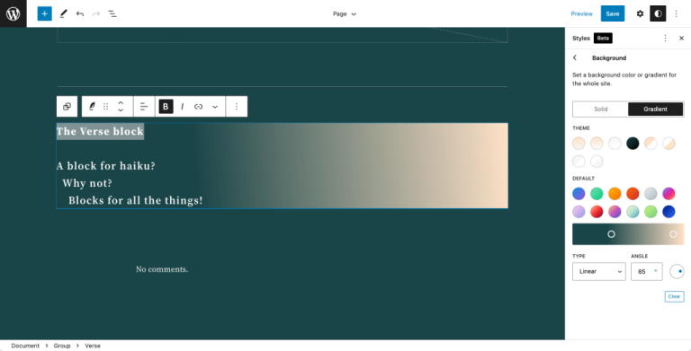
Here’s what sans serif fonts look like:


(Image Source)
Here’s an example of a custom t-shirt templates website using a sans serif font we absolutely love:
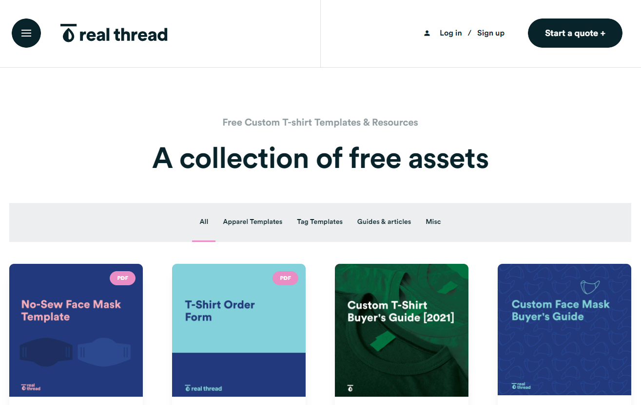

(Image Source)
We love this font because it’s the epitome of clean, and it’s fun. It doesn’t feel cold or dull like some other sans serif fonts do. If you’re interested in testing out this particular sans serif font, it’s called Majorant Medium by Emtype.
4. Audit and improve your website’s readability
One of the biggest threats to intuitive web design is poor readability.
If your audience can’t clearly read and understand your website, how do you expect them to sign up for your offers or connect with your brand?
To make sure your audience understands who you are and how you can help, it’s crucial to audit and improve your website’s readability.
When scanning your website for readability, consider your audience. What reading level do they have? Is English their first language?
If you have trouble tracking your audience’s reading level, aim for a 6th to 8th-grade level. Since most audiences tend to be in that range, it’s a good benchmark to start with.
To check your website copy for readability, use a grammar checker like Grammarly or a readability tool like Hemingway App.
It’s also crucial to be clear about what you offer. Your audience should understand exactly who you are and how you can help them within seconds of being on your website. To encourage this, make sure anything important is easy to see, read, and understand.
Your services, products, discounts, methods, and brand history should be clear as day.
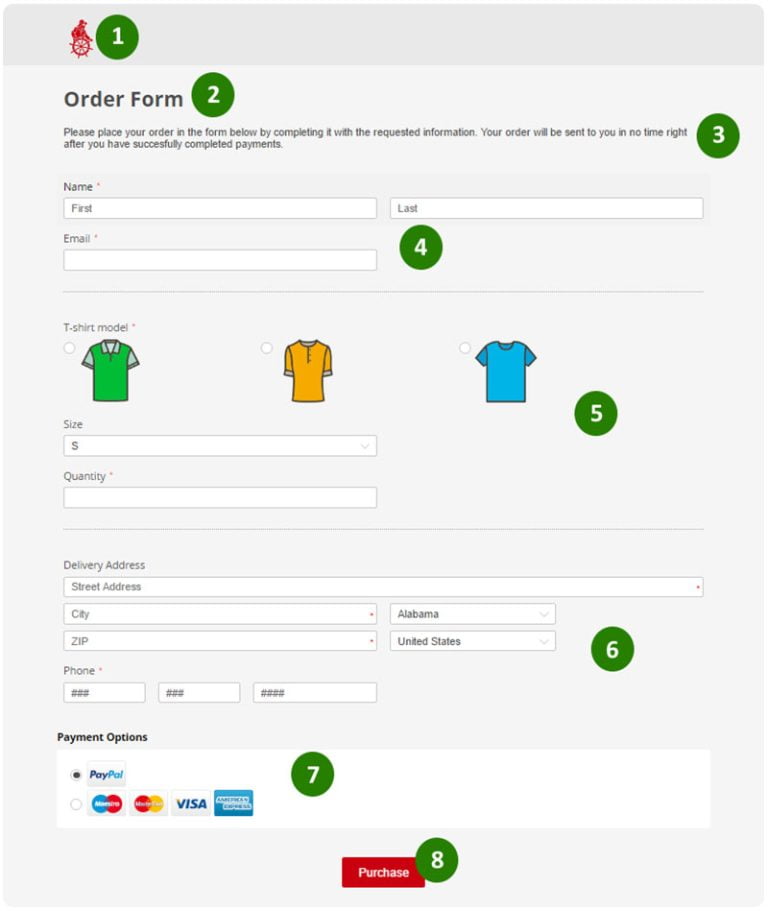
Here’s a perfect example of what we mean:


(Image Source)
In the example, this meal planning website chose a simple three-part image explaining how its service works in three easy steps.
With the images and clearly written steps, there’s no doubt about this brand and how it helps its customers.
Here are some other readability tips we recommend implementing on your website:
- Make sure your site has plenty of white space
- Make sure your font size is large enough to read clearly
- Make sure your contact information is easy to read and find
- Aim for proper spacing between sections
- Don’t name your tabs anything swanky — stick to the basics like “about,” “services,” and “contact us” so your audience knows exactly what each tab means
5. Revamp outdated blog posts
Bringing your outdated blog posts to life is an effective way to boost your organic reach.
Here are five ways you can revive outdated blog articles:
Update all details for accuracy
When scanning older articles, be sure to check and update any outdated:
- Statistics
- Graphs
- Information
- Case studies
- Interviews
- Numbers
- Current trends
- Dates
- Practices
Create a clickable table of contents
To boost readability, clickability, and SEO reach, consider embedding a clickable table of contents in every article.
Not only are articles easier to skim this way, but your reader can get right to the info they’re looking for.
If you’ve never seen a clickable table of contents before, here’s one from a Pre-Cana info article we came across:
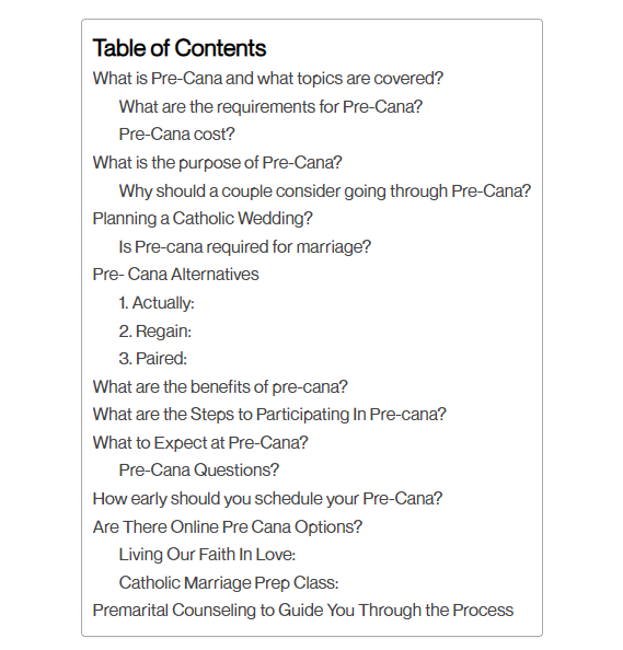

(Image Source)
With a table of contents like this one, readers can click on a link to a corresponding header and jump directly to the content they need.
Double-check the content score and increase SEO efforts if needed
Use an SEO tool like MarketMuse, Clearscope, or SurferSEO to scan your articles and make sure the content scores are competitive.
If you notice competing articles have higher scores, re-optimize your pieces to bump them up. Aim for a score at least five points higher than the competition without sacrificing article quality.
Refresh your images
Replace blurry images and stock photos with updated screenshots, graphs, educational photos, videos, infographics, self-edited photos, and custom images.
Lengthen your posts/create ultimate guides
Boost your authority score with Google and position yourself as an industry expert by extending your posts and writing ultimate guides.
6. Create a lead magnet strategy
Encourage higher conversions by creating a two-way lead magnet strategy.
While optimization efforts and ads play a key role in website traffic, having a lead magnet strategy is pivotal to magnetizing your brand. No pun intended.
Here’s what we mean by a two-way lead magnet strategy.
Embed a set of lead magnets on your website and another set elsewhere that leads to your site. To make this idea clearer, take a look at the examples below.
Here are some examples of lead magnets you could embed on your website:
- “Click here to sign up for our email newsletter”
- “Sign up for deals and discounts here”
- “Sign up for our rewards program here”
- “Save your seat”
- “Attend our upcoming webinar”


(Image Source)
Here are some examples of lead magnets you could have pointing to your website for lead generation
- “Read our latest blog post for the full scoop”
- “Get 50% off the entire site with this promo code”
- “Download our free ultimate guide”
- “Claim your free gift today”
7. Captivate your audience with a unique value-add
What kind of secret magic sauce can you sprinkle on your website to add value to your audience? We don’t mean anything flashy or hip. We mean in regard to adding value.
What can you offer your audience that no one else can? How can you change your prospects’ lives for the better?
To captivate your audience with a unique value-add, include a value proposition on your site’s homepage in a spot that’s easy to read. For instance, center it at the top right of your homepage.
If you’ve never heard the term “value proposition,” it means sharing how your unique gifts can change your customers’ lives for the better.
Here’s an example:
“We help tired and overworked project managers shave ten hours off their workweek with our free project management tool.”
We also recommend captivating your audience in other ways, too.
For instance, consider featuring a product quiz on your homepage that guides customers through the buying process. This tip is especially helpful if you sell many variations of the same product — for instance, skincare sets or makeup foundation.
Or consider creating video guides to demonstrate how to use your products. Or courses to help your target audience learn something they’ve been struggling to understand.
Whichever ways you choose to captivate your audience, be sure to conduct ample research in advance so that you know what your target market values most. Content marketing tools can help you do the necessary research and come up with captivating content ideas.
8. Make sure your site is Google-friendly
Make sure Google can find your site easily by following these tips:
- Hire an SEO strategist to audit your SEO efforts and come up with an SEO game plan. You can hire someone on a contract basis for doing SEO work if you have a small budget.
- Make sure your sitemap is structured correctly
- Make sure you have relevant, natural keywords throughout
- Implement a strategic internal linking practice
- Learn how to build quality backlinks to your website and blog
- Follow Google’s best practices guidelines to raise your website’s authority score
Wrap up
You want what every small business owner wants. A high-converting website that drives traffic to itself while you sleep.
But designing a website with your audience in mind isn’t always easy. It takes careful consideration, planning, and execution to launch a website that customers can’t get enough of.
To drive more traffic to your website, we recommend following the eight tips we shared today.
For good measure, here’s a quick recap of the tips we shared:
- 1. Audit your current website for user experience (UX)
- 2. Divide and conquer to create a better UX
- 3. Audit and improve your website aesthetics
- 4. Audit and improve your website readability
- 5. Revamp outdated blog posts
- 6. Create a lead magnet strategy
- 7. Captivate your audience with a unique value-add
- 8. Make sure your site is Google-friendly
Craving more website design tips? Check out our blog for more actionable tips.
About The Author


Guillaume is a digital marketer focused on handling the outreach strategy at uSERP and content management at Wordable. Outside of work, he enjoys his expat life in sunny Mexico, reading books, wandering around, and catching the latest shows on TV.

