I’m a big fan of movies by J.J. Abrams. I enjoy their tight plots, quippy dialog, and of course: anamorphic lens flares. Filmmakers like Abrams use lens flare to add a dash of ‘homemade’ realism to their movies, a technique we can easily recreate in tools like Photoshop, then add to our sites as raster images.
But what if we wanted to apply the same lens flare look without the use of photo editing tools? We can create a CSS lens flare to add a cinematic touch to our gallery images, background photos, or user profiles.
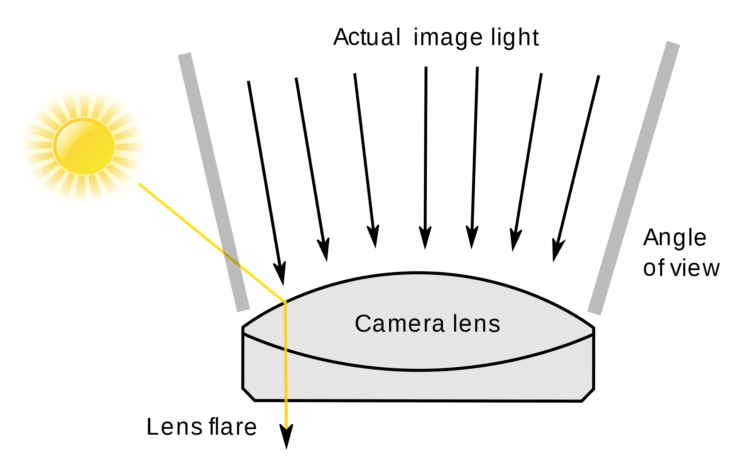
There are different types of flares in photography. The one we’re working with is known as artifacts, as they leave behind little blotches of light that take the shape of a camera’s aperture where the light enters and reflects off the surface of the lens.

Here’s a good example of the sort of lens flare we’re going to make, pulled straight from a J.J. Abrams movie still, naturally:

There are a few parts to the lens flare above. Let’s list them out so we know what we’re aiming for:
- The center light source appears as a glowing ball of light.
- There are some horizontal elliptical light streaks — rays of light that are distorted and blurred, resulting in elongated ellipses.
- Random rays of light shoot off from the center light source at various angles.
We start with the HTML elements below that map to our flare components. There is a central light source and two off-diagonal circular flares, three horizontal lens flares, and three conical ray-like flares.
<div class="lens-center"></div> <div class="circle-1"></div> <div class="circle-2"></div> <div class="left-flare horizontal-flare"></div> <div class="right-flare horizontal-flare"></div> <div class="full-flare horizontal-flare"></div> <div class="conic-1"></div> <div class="conic-2"></div> <div class="conic-3"></div>
</div>
Lastly, in order for our lens flare to be believably superimposed on an image, its center light source has to be adjustable. This way, we can place it over a believable existing light source on a picture and not overlap with any faces.
The background and light source of a CSS lens flare
Table of Contents
Let’s start with a black background and central light source for our CSS lens flare. Most gradients on the web are linear gradients with solid-color transitions, but we can apply alpha channels to them which is actually a nice way to produce a glowing effect. A circular-shaped radial gradient with multiple layers of semi-transparent colors gives us a good camera center effect.
background: radial-gradient( closest-side circle at center, hsl(4 5% 100% / 100%) 0%, hsl(4 5% 100% / 100%) 15%, hsl(4 10% 70% / 70%) 30%, hsl(4 0% 50% / 30%) 55%, hsl(4 0% 10% / 5%) 75%, transparent 99
);
filter: blur(4px);
Curious about that HSL syntax? It’s new and appears to be the future direction of defining alpha transparency in all CSS color functions.
Notice we’re using a CSS blur filter in there to make the gradients look a bit closer to layers of diffused light.
Now that we know how to add circular flares, we will also add a larger, diffused flare behind the light source, as well as three additional flares at a 45deg angle from the center, to give the effect a more realistic look.
Setting up horizontal light streaks
Let’s start with horizontal flares. There are a few options we can take, a very elongated ellipse gradient would be the simplest approach. However, I’ve noticed that horizontal lens flares are usually less symmetrical than the ones in my reference photos, so I wanted to make mine a little less symmetrical as well.
Luckily, radial gradients have an optional location argument in CSS. We can create two slightly differently-sized left and right portions of the same horizontal flare, and with slightly different colors. We can also add an opacity filter to make the area where the horizontal flares join the center to make the flare less jarring.
background: radial-gradient( closest-side circle at center, transparent 50%, hsl(4 10% 70% / 40%) 90%, transparent 100%
);
filter: blur(5px);
While we are at it, let’s also add a single full elongated elliptical bottom flare three-quarters of the way down the viewport for another touch of “realism.”
Creating the diffused rays of light
With both the radial and horizontal flares in place, all we have left are the angled rays of light shooting off from the light source. We could add additional elliptical radial gradients then skew and translate the container to get a close approximation. But we also have a CSS gradient that’s already made for the job, the conic gradient. Below is an example that gives us a 7deg conic gradient at a 5deg offset from its container’s bottom-right corner.
background: conic-gradient( from 5deg at 0% 100%, transparent 0deg, hsl(4 10% 70% / 30%) 7deg, transparent 15deg
);
transform-origin: bottom left;
transform: rotate(-45deg);
We’ll add a few conic gradients centered at our flare center, with various gradient angles of semi-transparent colors. Because conic gradients can show the corner of its container div, we will rotationally transform them using our light source as its origin, resulting in an offset diffused ray filter effect.
Using CSS custom properties for a more flexible lens flare
So far, we’ve created a responsive, but statically-positioned, lens flare effect at a fixed location. It would be difficult to adjust the center of the lens flare without also breaking the horizontal and conic flares around it.
To make the CSS lens flare both adjustable and less brittle, we’ll expose the light source flare’s position, size, and hue via a set of custom properties.
:root { --hue: 4; --lens-center-size: 40%; --lens-spread-size: 80%; --lens-left: 55%; --lens-top: 15%;
}
While we are at it, we are also going to adjust the flare hue and the size of the horizontal flare height. For horizontal flare width, we use CSS variable overloading to make them adjustable on their own; otherwise, we fall back to the light source flare center or the image center.
.left-flare { width: var(--left-flare-width, var(--lens-left, 50%));
}
This is what the completed CSS lens flare effect looks like with a photo background and the lens flare moved up so the light source location looks believable. Go ahead, add your own photo to see how it works in different contexts!
Other CSS and non-CSS lens flare examples
This is just one way to create a CSS lens flare, of course. I like this approach because it’s flexible in terms of the color, size, and positioning of the flare and its parts. That makes it more of a reusable component that can be used in many contexts.
Here’s one by Keith Grant that uses a linear gradient as well as CSS custom properties. Then it sprinkles some JavaScript in there to randomize the HSLA values.
Nicholas Guest has another CSS lens flare that applies a box shadow on the ::before and ::after pseudo-elements of a .flare element to get the effect, plus a smidge of jQuery that makes the flare follow the mouse on hover.
This one is made with Canvas and is neat in how the light source follows the mouse on hover while showing how the lens flare artifacts change position as the light source position changes.
The same sort of idea here:
And a fun one that uses GSAP, Canvas, and a library called JS.LensFlare:
How would you approach a CSS lens flare effect? Share in the comments!


