It’s a little over ten years since ‘flat design’ became the default and dominant design style – and with good reason. After all the glossy surfaces and shadows of ‘web 2.0’, we all needed design elements that remained crisp and legible in our newly responsive layouts.
However there is a danger that all this flat color design can start to look a bit ‘samey’. But rather than adding a new color or font, sometimes mixing in some extra texture can give your UI design the lift it needs. Let’s look at some killer examples.
Adding Paper Grain
Table of Contents
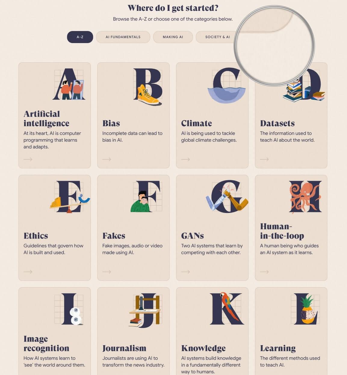
In 2019, Google released a cool side project called “The A-Z of AI”, which was designed to explain the basic concepts of Artificial Intelligence. The styling is modern and friendly, using broad panels of color, simple children’s book illustrations, and big, expressive serif typography.
But look closely at the flat color areas and you’ll notice a papery graininess. I magnified a small area in the image below, but you may need to examine the real thing to fully appreciate this texture. It’s so subtle I suspect most users don’t consciously notice it, but I think it supports the uncomplicated children’s book styling perfectly.
So, how did they get this effect?
I have to admit, I spent some time combing through the background-image CSS properties of all the large flat panel areas looking for a tiling graphic – but found nothing. It was puzzling.
It was only the next day that I had a little revelation. What if, rather than adding grain to each and every panel, they created a barely visible “grainy lens layer” that overlaid the entire site? Think of it like a Snapchat filter for graininess.
Bingo! I’d been looking in the wrong place.

If you inspect the HTML, you’ll find an :after pseudo element with the attached CSS:
._3rV4LQ0BePEq9V1dxEjhEF::after { background: url(/static/noise.jpg); content: ""; height: 100%; left: 0; opacity: .05; pointer-events: none; position: absolute; top: 0; width: 100%; z-index: 201;
}

This layer uses the grain image (noise.jpg) as a tiling background, and they’ve positioned it to cover the entire screen (width:100%, height: 100%, top:0, left:0, and z-index:201).
As we suspected, the opacity is set to almost transparent (opacity: .05), so that all that remains is a hint of uneven grain. The only potential gotcha with covering the screen with this “lens layer” (even if it’s transparent) is that it will block cursor access to all the links, inputs, and other user interactions below it.
Happily, this is easily solved by adding pointer-events: none, which makes this lens layer invisible to the user’s cursor.
I think this is a really useful technique. It delivers site-wide visual impact using no more than one tiny graphic and a dozen lines of CSS. That’s great bang for buck.
Paints, Pencils and Other Traditional Media
Computers are built to be precise and clean, and unlike most traditional media, digital colors don’t accidentally run or smudge or bleed or smear. This is great for keeping your desk clean, but it also means real, loose, organic, natural media like paint and pencils really stand out when you can find the right setting for them.
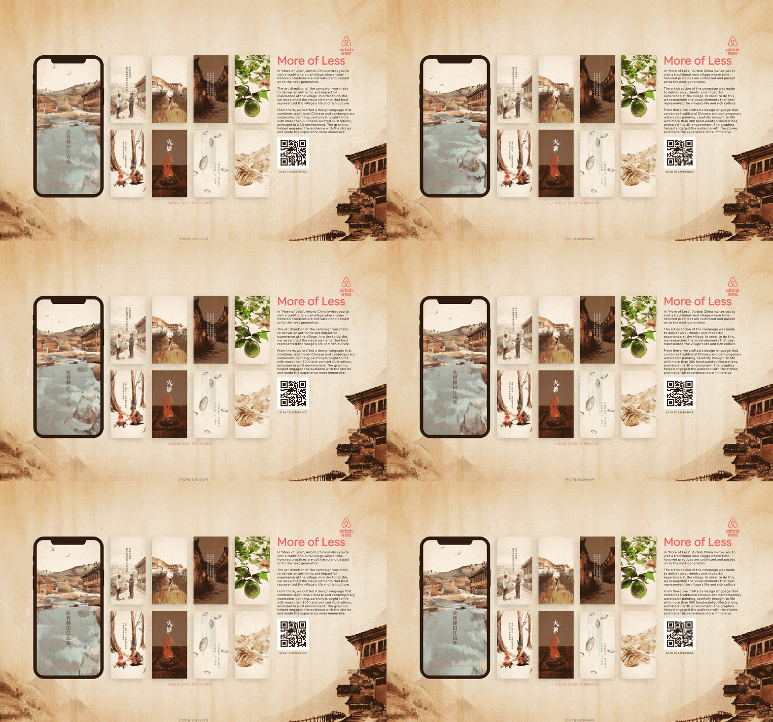
Although the application shown above has since expired, New Zealand agency Resn gave us a perfect recent example, authentically reproducing a traditional Chinese water-color style to promote AirBNB experiences in rural China.
This water-color styling soaked every pixel of the application, from dollying animation sequences to full-screen backgrounds, making it a huge undertaking.
Faded Memories
When Obys Agency paid digital tribute to Formula One ace Niki Lauda, their design approach leaned heavily into the mountains of fantastic archive photos and footage from Niki’s career.
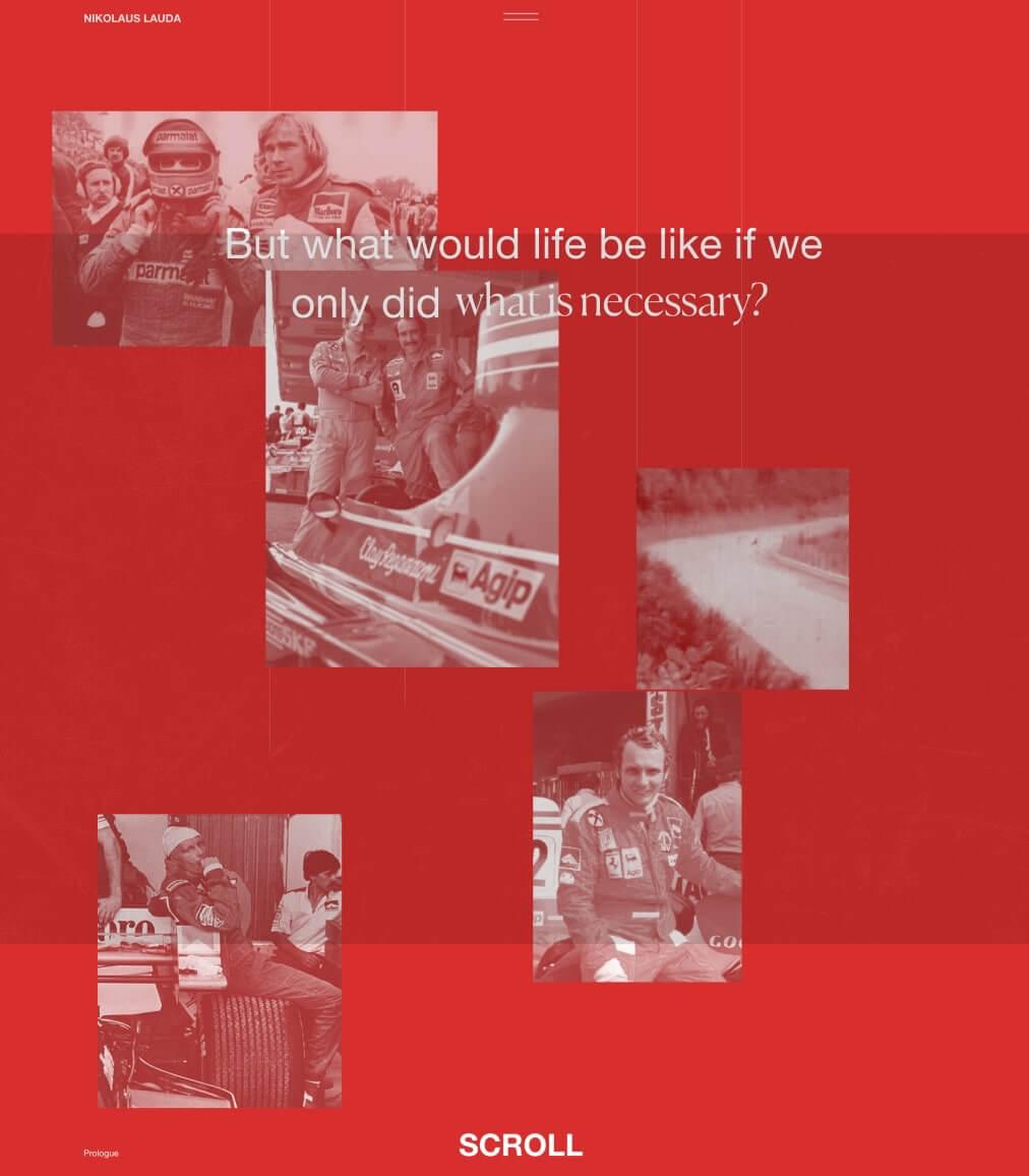
The gravelly red-sepia photos give the site a warm, slightly wistful feel. It can be tempting to follow the retro theme too far and perhaps mimic an old book or newspaper. Happily, Obys avoided this cliche by being able to showcase archive imagery within the kind of a dynamic web layout that’s simply not possible in a traditional book.
The Digital Retro Look

Of course, “retro” is never a specific moment in time, as much as a perspective, as Hypebeast demonstrates with their super-80s take on the retro theme. Their spinning vortex, two-color linework and glowing scanlines conjured up visions of Tron light cycles, WarGames command centers, and Blade Runner.
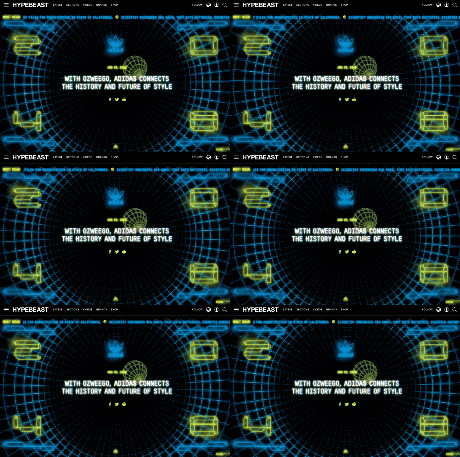
Although Hypebeast have used HTML5 canvas to render their animations, this “glowy TV scanline effect” would be perfectly suited to the lens layer technique we dissected earlier in the chapter.
Halftone and Ben Day Dots
If you’ve ever squinted closely at an old comic book, newspaper or magazine, you’ve probably noticed the pattern of dots creating the tone in images.
Technically, there are two types of dot patterns in print. Halftone screens use a plastic grid of tiny lenses that burn black dots onto the photographic film beneath them. More light creates bigger dots.
The first panel of the figure below shows a halftone sample from a 1964 Andy Warhol mural.

Ben Day dots are slightly different. Comic books — like the Superman example shown above — typically take black linework art and drop in areas of flat, evenly-sized Ben Day dots to simulate extra ink colors. A grid of small red dots on a white paper base is a cheap way to get pink.
Although the grungy, stippled look of these techniques began as an unavoidable byproduct of the print process, eventually it became an artistic statement in its own right — and continues to be used that way today.
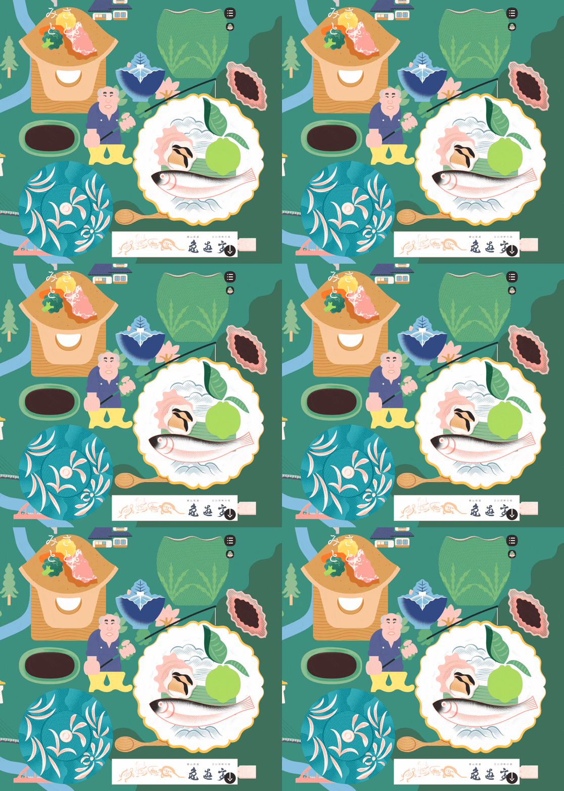
The small Japanese village of Misato, Shimane gives us my favorite recent example of this technique. Their site presents as an illustrated map that lets you take a virtual tour of the village. The illustrations are fun and mostly flat color but with some wonderful halftone flourishes, adding depth and texture.
DIY Halftones
There are dozens of Photoshop filters that will mimic the halftone process on your images. They’re… fine, but if we’re going to flush image detail out of a photo by converting it to a halftone, it makes sense to convert it into a vector graphic – ideally an SVG. For this, I can happily recommend HalftonePro.
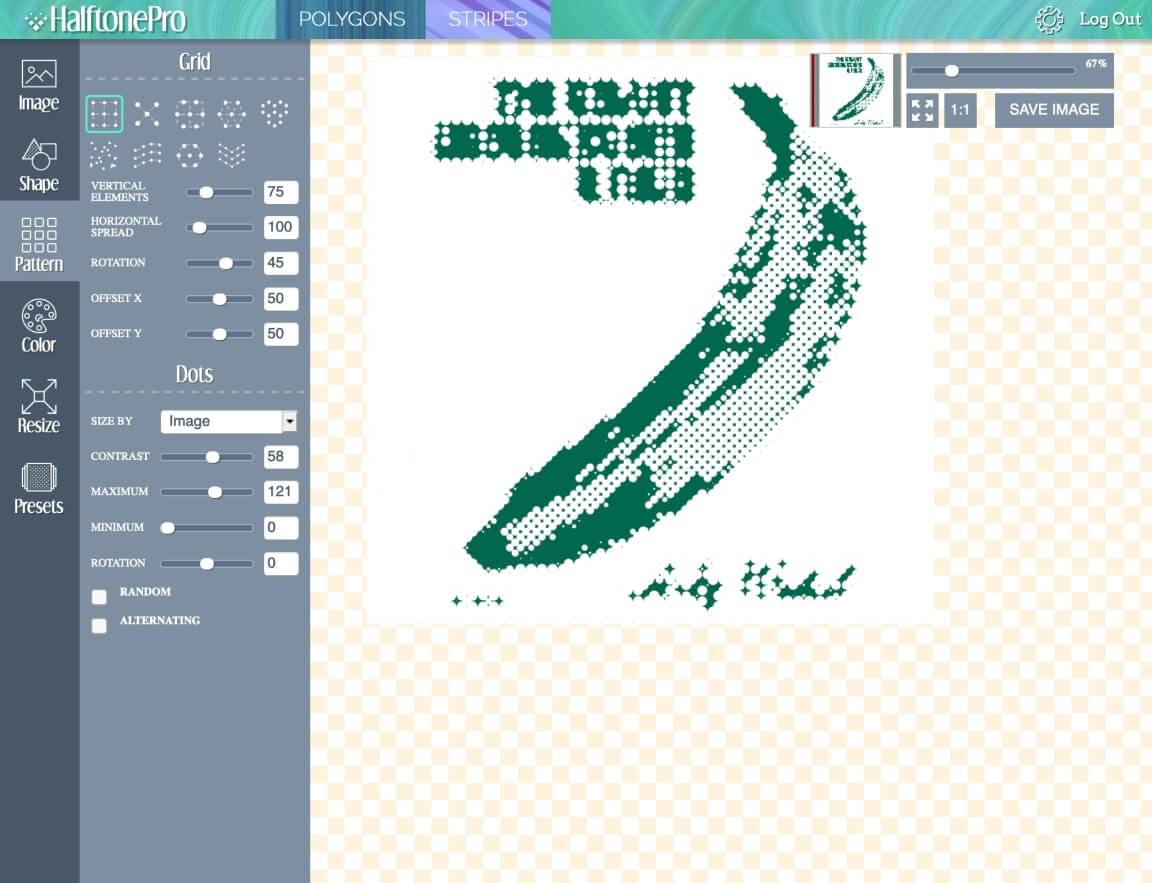
HalftonePro lets you upload any bitmap and apply a raft of halftone settings, including:
- grid scale
- grid pattern (circle, square, triangle, etc.)
- dot shape (circle, square, triangle, etc.)
- contrast
- color output
My quick tips for producing good SVG halftones are:
- Not all images are suited to this style. Bold, high-contrast images are generally more successful.
- File sizes can get big and unruly if you select a very fine grid. Embrace the grunginess.
- Use the presets to begin with to help you get a feel for what works.
- Use something like Jake Archibald’s SVG Optimizer to squeeze your file down.

Bear in mind that HalftonePro isn’t free. It’s currently a $15 outlay, but note that this is a one-time payment for lifetime membership — in a world full of monthly or yearly subscription plans. I paid for it and still think it’s good value.
Hidden Grain
Perhaps the sneakiest use of texture I’ve seen recently is displayed on the Harvard Film Archive. Open the site and you may think, “What texture? This site is as flat color as they come.”
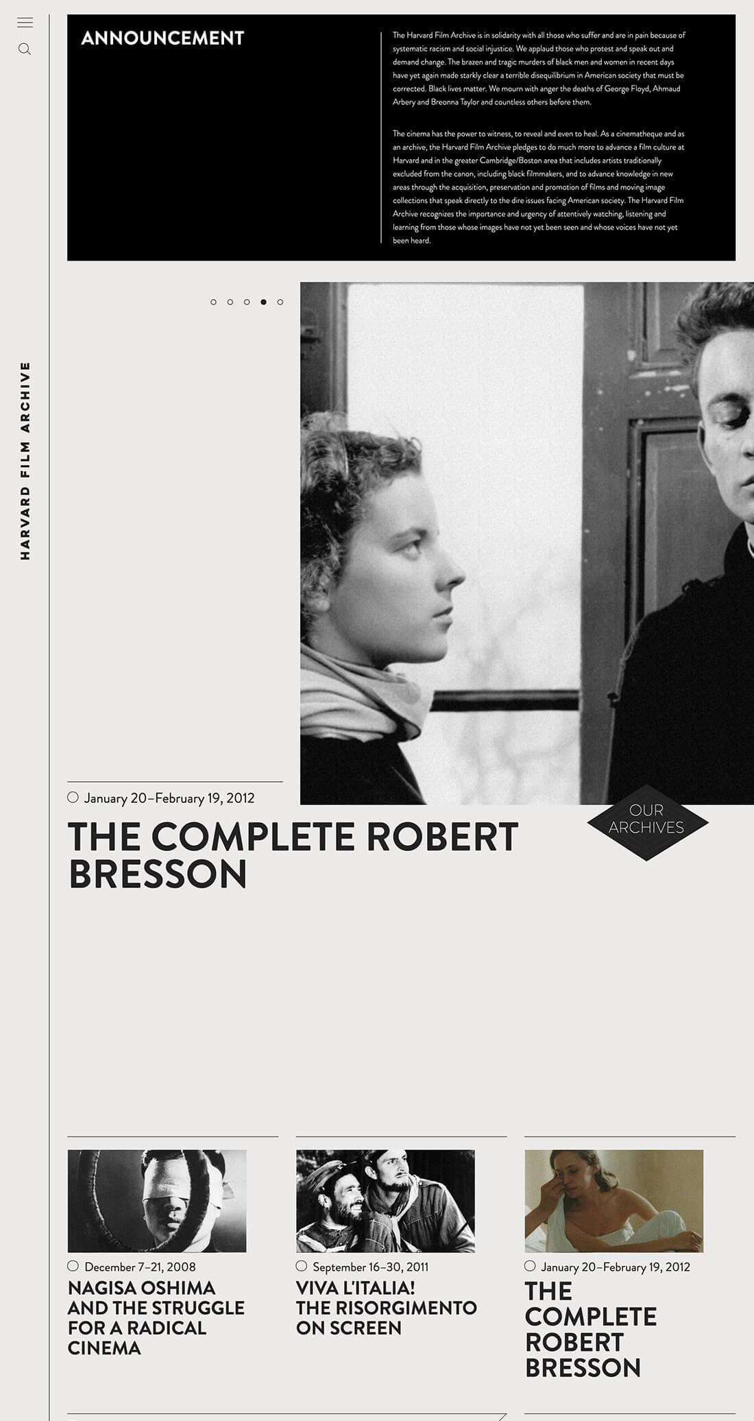
However, pay close attention to the images and you’ll begin to notice a humming energy there – something not unlike the flickering of celluloid. The front-end designers have added a subtle, animated film grain across the surface of all images. (Note, however, that the effect is absent from the mobile view on my phone.) I suspect very few users consciously notice it, but I’d argue that it definitely makes these still photographs feel like film stills.
How do they do it?
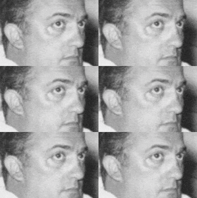
For those interested in the technical detail, the developers use JavaScript to create an HTML5 canvas layer on top of each image. Each canvas plays an almost transparent random noise animation. As ingenious as it is, the complexity of this idea only makes me admire the simplicity of the earlier Google AI paper texture more.
Starting Your Own Textural Trends
As we’ve seen above, texture can have a big impact on how people perceive your design. Staying on top of current web design trends is essential for creating effective contemporary designs, but having a knowledge of past modes that occurred outside the ethereal history of the Internet will help you to establish your own style and original designs.
Ultimately, the image that your clients are trying to establish, and the communication goals they’ve set, should be the determining factors in how much and what types of texture you apply.
Extract from ‘The Principles of Beautiful Web Design, 4th Ed‘.

