Calendars, shopping carts, galleries, file explorers, and online libraries are some situations where selectable items are shown in grids (i.e. square lattices). You know, even those security checks that ask you to select all images with crosswalks or whatever.

I found a neat way to display selectable options in a grid. No, not recreating that reCAPTCHA, but simply being able to select multiple items. And when two or more adjoining items are selected, we can use clever :nth-of-type combinators, pseudo elements, and the :checked pseudo-class to style them in a way where they look grouped together.
The whole idea of combinators and pseudos to get the rounded checkboxes came from a previous article I wrote. It was a simple single-column design:
This time, however, the rounding effect is applied to elements along both the vertical and horizontal axes on a grid. You don’t have to have read my last article on checkbox styling for this since I’m going to cover everything you need to know here. But if you’re interested in a slimmed down take on what we’re doing in this article, then that one is worth checking out.
Before we start…
Table of Contents
It’ll be useful for you to take note of a few things. For example, I’m using static HTML and CSS in my demo for the sake of simplicity. Depending on your application you might have to generate the grid and the items in it dynamically. I’m leaving out practical checks for accessibility in order to focus on the effect, but you would definitely want to consider that sort of thing in a production environment.
Also, I’m using CSS Grid for the layout. I’d recommend the same but, of course, it’s only a personal preference and your mileage may vary. For me, using grid allows me to easily use sibling-selectors to target an item’s ::before and ::after pseudos.
Hence, whatever layout standard you might want to use in your application, make sure the pseudos can still be targeted in CSS and ensure the layout stays in tact across different browsers and screens.
Let’s get started now
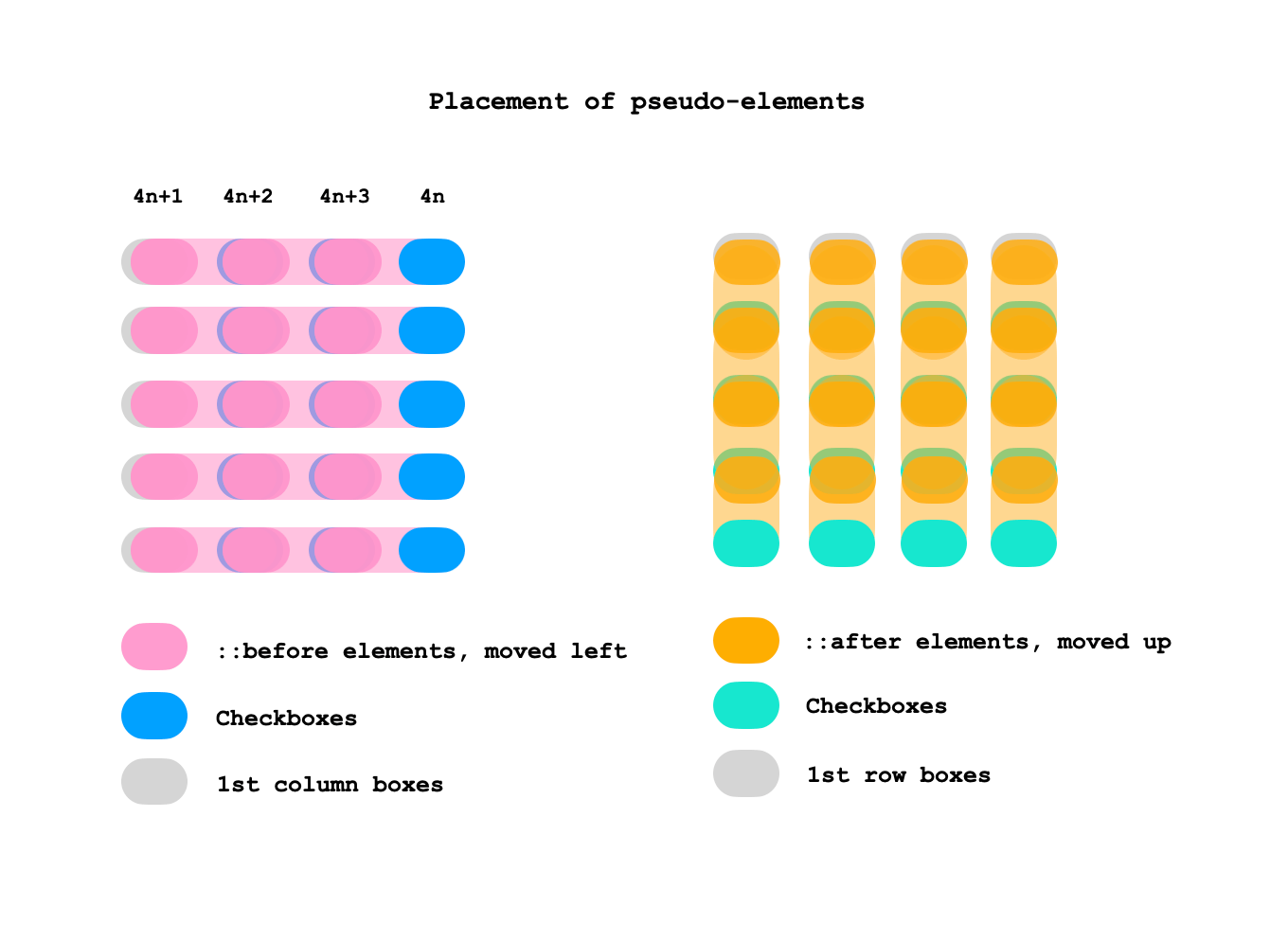
As you may have noticed in the earlier demo, checking and unchecking a checkbox element modifies the design of the boxes, depending on the selection state of the other checkboxes around it. This is possible because I styled each box using the pseudo-elements of its adjacent elements instead of its own element.
The following figure shows how the ::before pseudo-elements of boxes in each column (except the first column) overlap the boxes to their left, and how the ::after pseudo-elements of boxes in each row (except the first row) overlap the boxes above.

Here’s the base code
The markup is pretty straightforward:
<main> <input type=checkbox> <input type=checkbox> <input type=checkbox> <!-- more boxes -->
</main>
There’s a little more going on in the initial CSS. But, first, the grid itself:
/* The grid */
main { display: grid; grid: repeat(5, 60px) / repeat(4, 85px); align-items: center; justify-items: center; margin: 0;
}
That’s a grid of five rows and four columns that contain checkboxes. I decided to wipe out the default appearance of the checkboxes, then give them my own light gray background and super rounded borders:
/* all checkboxes */
input { -webkit-appearance: none; appearance: none; background: #ddd; border-radius: 20px; cursor: pointer; display: grid; height: 40px; width: 60px; margin: 0;
}
Notice, too, that the checkboxes themselves are grids. That’s key for placing their ::before and ::after pseudo-elements. Speaking of which, let’s do that now:
/* pseudo-elements except for the first column and first row */
input:not(:nth-of-type(4n+1))::before,
input:nth-of-type(n+5)::after { content: ''; border-radius: 20px; grid-area: 1 / 1; pointer-events: none;
}
We’re only selecting the pseudo-elements of checkboxes that are not in the first column or the first row of the grid. input:not(:nth-of-type(4n+1)) starts at the first checkbox, then selects the ::before of every fourth item from there. But notice we’re saying :not(), so really what we’re doing is skipping the ::before pseudo-element of every fourth checkbox, starting at the first. Then we’re applying styles to the ::after pseudo of every checkbox from the fifth one.
Now we can style both the ::before and ::after pseudos for each checkbox that is not in the first column or row of the grid, so that they are moved left or up, respectively, hiding them by default.
/* pseudo-elements other than the first column */
input:not(:nth-of-type(4n+1))::before { transform: translatex(-85px);
} /* pseudo-elements other than the first row */
input:nth-of-type(n+5)::after { transform: translatey(-60px); }
Styling the :checked state
Now comes styling the checkboxes when they are in a :checked state. First, let’s give them a color, say a limegreen background:
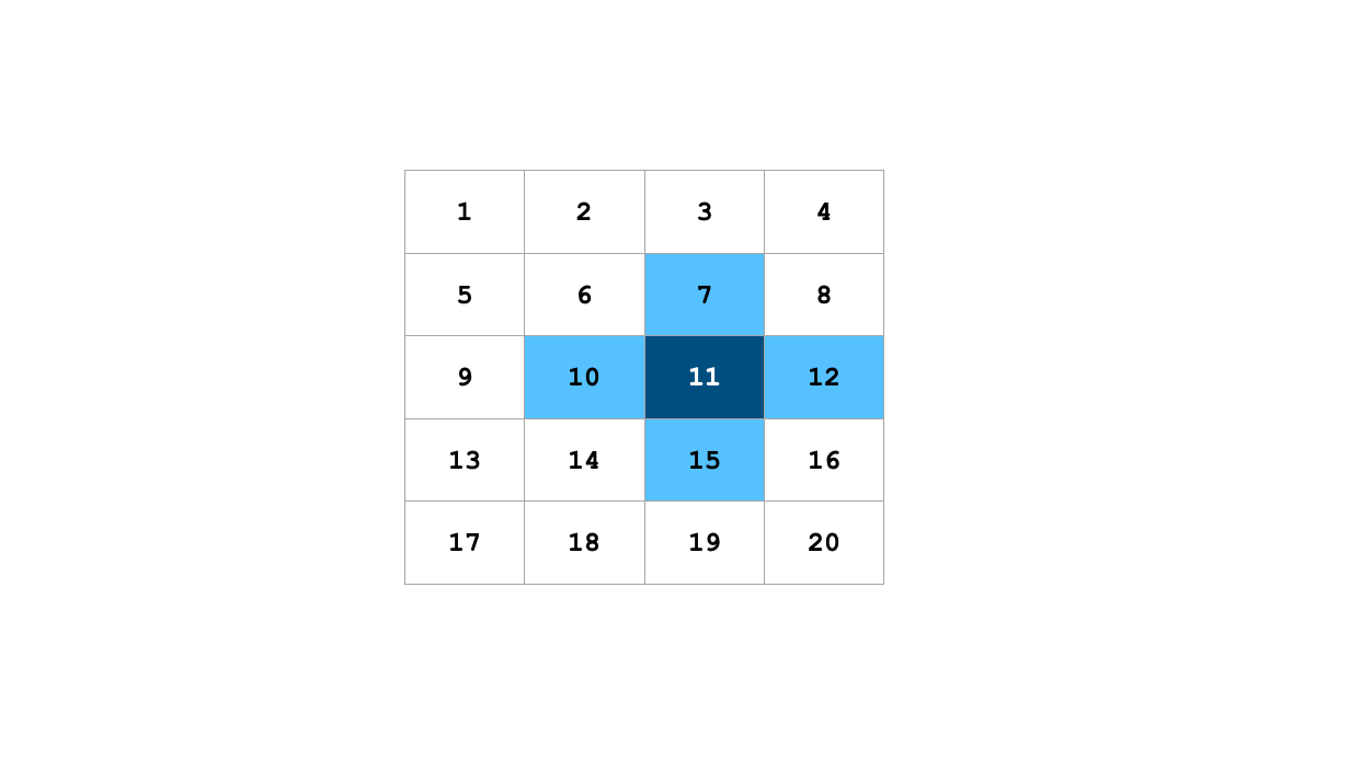
input:checked { background: limegreen; }A checked box should be able to re-style all of its adjacent checked boxes. In other words, if we select the eleventh checkbox in the grid, we should also be able to style the boxes surrounding it at the top, bottom, left, and right.

This is done by targeting the correct pseudo-elements. How do we do that? Well, it depends on the actual number of columns in the grid. Here’s the CSS if two adjacent boxes are checked in a 5⨉4 grid:
/* a checked box's right borders (if the element to its right is checked) */
input:not(:nth-of-type(4n)):checked + input:checked::before { border-top-right-radius: 0; border-bottom-right-radius: 0; background: limegreen;
}
/* a checked box's bottom borders (if the element below is checked) */
input:nth-last-of-type(n+5):checked + * + * + * + input:checked::after { border-bottom-right-radius: 0; border-bottom-left-radius: 0; background: limegreen;
}
/* a checked box's adjacent (right side) checked box's left borders */
input:not(:nth-of-type(4n)):checked + input:checked + input::before { border-top-left-radius: 0; border-bottom-left-radius: 0; background: limegreen;
}
/* a checked box's adjacent (below) checked box's top borders */
input:not(:nth-of-type(4n)):checked + * + * + * + input:checked + input::before { border-top-left-radius: 0; border-top-right-radius: 0; background: limegreen;
}
If you prefer you can generate the above code dynamically. However, a typical grid, say an image gallery, the number of columns will be small and likely a fixed number of items, whereas the rows might keep increasing. Especially if designed for mobile screens. That’s why this approach is still an efficient way to go. If for some reason your application happens to have limited rows and expanding columns, then consider rotating the grid sideways because, with a stream of items, CSS Grid arranges them left-to-right and top-to-bottom (i.e. row by row).
We also need to add styling for the last checkboxes in the grid — they’re not all covered by pseudo-elements as they are the last items in each axis.
/* a checked box's (in last column) left borders */
input:nth-of-type(4n-1):checked + input:checked { border-top-left-radius: 0; border-bottom-left-radius: 0;
}
/* a checked box's (in last column) adjacent (below) checked box's top borders */
input:nth-of-type(4n):checked + * + * + * + input:checked { border-top-left-radius: 0; border-top-right-radius: 0;
}
Those are some tricky selectors! The first one…
input:nth-of-type(4n-1):checked + input:checked…is basically saying this:
A checked
<input>element next to a checked<input>in the second last column.
And the nth-of-type is calculated like this:
4(0) - 1 = no match
4(1) - 1 = 3rd item
4(2) - 1 = 7th item
4(3) - 1 = 11th item
etc.
So, we’re starting at the third checkbox and selecting every fourth one from there. And if a checkbox in that sequence is checked, then we style the checkboxes adjacent, too, if they are also checked.
And this line:
input:nth-of-type(4n):checked + * + * + * + input:checkedIs saying this:
An
<input>element provided that is checked, is directly adjacent to an element, which is directly adjacent to another element, which is also directly adjacent to another element, which, in turn, is directly adjacent to an<input>element that is in a checked state.
What that means is we’re selecting every fourth checkbox that is checked. And if a checkbox in that sequence is checked, then we style the next fourth checkbox from that checkbox if it, too, is checked.
Putting it to use
What we just looked at is the general principle and logic behind the design. Again, how useful it is in your application will depend on the grid design.
I used rounded borders, but you can try other shapes or even experiment with background effects (Temani has you covered for ideas). Now that you know how the formula works, the rest is totally up to your imagination.
Here’s an instance of how it might look in a simple calendar:
Again, this is merely a rough prototype using static markup. And, there would be lots and lots of accessibility considerations to consider in a calendar feature.
That’s a wrap! Pretty neat, right? I mean, there’s nothing exactly “new” about what’s happening. But it’s a good example of selecting things in CSS. If we have a handle on more advanced selecting techniques that use combinators and pseudos, then our styling powers can reach far beyond the styling one item — as we saw, we can conditionally style items based on the state of another element.


