
We’ve looked at spinners. We’ve looked at dots. Now we’re going to tackle another common pattern for loaders: bars. And we’re going to do the same thing in this third article of the series as we have the others by making it with only one element and with flexible CSS that makes it easy to create variations.
Let’s start with not one, not two, but 20 examples of bar loaders.
What?! Are you going to detail each one of them? That’s too much for an article!
It might seem like that at first glance! But all of them rely on the same code structure and we only update a few values to create variations. That’s all the power of CSS. We don’t learn how to create one loader, but we learn different techniques that allow us to create as much loader as we want using merely the same code structure.
Let’s make some bars!
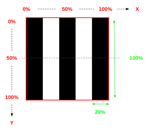
We start by defining the dimensions for them using width (or height) with aspect-ratio to maintain proportion:
.bars { width: 45px; aspect-ratio: 1;
}
We sort of “fake” three bars with a linear gradient on the background — very similar to how we created dot loaders in Part 2 of this series.
.bars { width: 45px; aspect-ratio: 1; --c: no-repeat linear-gradient(#000 0 0); /* we define the color here */ background: var(--c) 0% 50%, var(--c) 50% 50%, var(--c) 100% 50%; background-size: 20% 100%; /* 20% * (3 bars + 2 spaces) = 100% */
}
The above code will give us the following result:
Like the other articles in this series, we are going to deal with a lot of background trickery. So, if you ever feel like we’re jumping around too fast or feel you need a little more detail, please do check those out. You can also read my Stack Overflow answer where I give a detailed explanation on how all this works.
Animating the bars
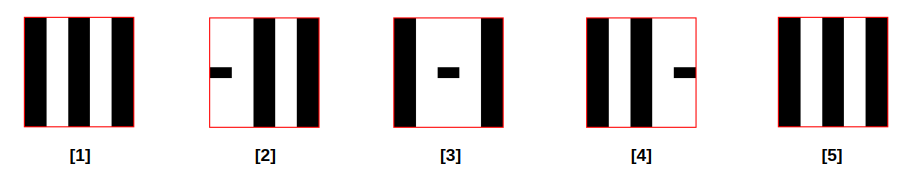
We either animate the element’s size or position to create the bar loader. Let’s animate the size by defining the following animation keyframes:
@keyframes load { 0% { background-size: 20% 100%, 20% 100%, 20% 100%; } /* 1 */ 33% { background-size: 20% 10% , 20% 100%, 20% 100%; } /* 2 */ 50% { background-size: 20% 100%, 20% 10% , 20% 100%; } /* 3 */ 66% { background-size: 20% 100%, 20% 100%, 20% 10%; } /* 4 */ 100% { background-size: 20% 100%, 20% 100%, 20% 100%; } /* 5 */
}
See what’s happening there? Between 0% and 100%, the animation changes the background-size of the element’s background gradient. Each keyframe sets three background sizes (one for each gradient).
And here’s what we get:
Can you start to imagine all the possible variations we can get by playing with different animation configurations for the sizes or the positions?
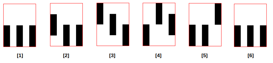
Let’s fix the size to 20% 50% and update the positions this time:
.loader { width: 45px; aspect-ratio: .75; --c: no-repeat linear-gradient(#000 0 0); background: var(--c), var(--c), var(--c); background-size: 20% 50%; animation: load 1s infinite linear;
}
@keyframes load { 0% { background-position: 0% 100%, 50% 100%, 100% 100%; } /* 1 */ 20% { background-position: 0% 50% , 50% 100%, 100% 100%; } /* 2 */ 40% { background-position: 0% 0% , 50% 50% , 100% 100%; } /* 3 */ 60% { background-position: 0% 100%, 50% 0% , 100% 50%; } /* 4 */ 80% { background-position: 0% 100%, 50% 100%, 100% 0%; } /* 5 */ 100% { background-position: 0% 100%, 50% 100%, 100% 100%; } /* 6 */
}
…which gets us another loader!
You’ve probably got the trick by now. All you need is to define a timeline that you translate into a keyframe. By animating the size, the position — or both! — there’s an infinite number of loader possibilities at our fingertips.
And once we get comfortable with such a technique we can go further and use a more complex gradient to create even more loaders.
Expect for the last two examples in that demo, all of the bar loaders use the same underlying markup and styles and different combinations of animations. Open the code and try to visualize each frame independently; you’ll see how relatively trivial it is to make dozens — if not hundreds — of variations.
Getting fancy
Did you remember the mask trick we did with the dot loaders in the second article of this series? We can do the same here!
If we apply all the above logic inside the mask property we can use any background configuration to add a fancy coloration to our loaders.
Let’s take one demo and update it:
All I did is updating all the background-* with mask-* and I added a gradient coloration. As simple as that and yet we get another cool loader.
So there is no difference between the dots and the bars?
No difference! I wrote two different articles to cover as many examples as possible but in both, I am relying on the same techniques:
- Gradients to create the shapes (dots or bars or maybe something else)
- Animating
background-sizeand/orbackground-positionto create the loader animation - Adding mask to add a touch of colors
Rounding the bars
Let’s try something different this time where we can round the edges of our bars.
Using one element and its ::before and ::after pseudos, we define three identical bars:
.loader { --s: 100px; /* control the size */ display: grid; place-items: center; place-content: center; margin: 0 calc(var(--s) / 2); /* 50px */
}
.loader::before,
.loader::after { content: ""; grid-area: 1/1;
}
.loader,
.loader::before,
.loader::after { height: var(--s); width: calc(var(--s) / 5); /* 20px */ border-radius: var(--s); transform: translate(calc(var(--_i, 0) * 200%));
}
.loader::before { --_i: -1; }
.loader::after { --_i: 1; }
That gives us three bars, this time without relying on a linear gradient:
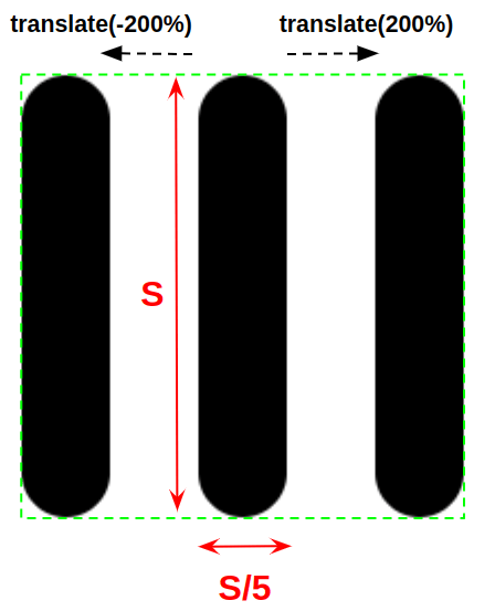
Now the trick is to fill in those bars with a lovely gradient. To simulate a continuous gradient, we need to play with background properties. In the above figure, the green area defines the area covered by the loader. That area should be the size of the gradient and, if we do the math, it’s equal to multiplying both sides labeled S in the diagram, or background-size: var(--s) var(--s).
Since our elements are individually placed, we need to update the position of the gradient inside each one to make sure all of them overlap. This way, we’re simulating one continuous gradient even though it’s really three of them.
For the main element (placed at the center), the background needs to be at the center. We use the following:
.loader { /* etc. */ background: linear-gradient() 50% / var(--s) var(--s);
}
For the pseudo-element on the left, we need the background on the left
.loader::before { /* etc. */ background: linear-gradient() 0% / var(--s) var(--s);
}
And for the pseudo on the right, the background needs to be positioned to the right:
.loader::after { background: linear-gradient() 100% / var(--s) var(--s);
}
Using the same CSS variable, --_i, that we used for the translate, we can write the code like this:
.loader { --s: 100px; /* control the size */ --c: linear-gradient(/* etc. */); /* control the coloration */ display: grid; place-items: center; place-content: center;
}
.loader::before,
.loader::after{ content: ""; grid-area: 1/1;
}
.loader,
.loader::before,
.loader::after{ height: var(--s); width: calc(var(--s) / 5); border-radius: var(--s); background: var(--c) calc(50% + var(--_i, 0) * 50%) / var(--s) var(--s); transform: translate(calc(var(--_i, 0) * 200%));
}
.loader::before { --_i: -1; }
.loader::after { --_i: 1; }
Now, all we have to do is to animate the height and add some delays! Here are three examples where all that’s different are the colors and sizes:
Wrapping up
I hope so far you are feeling super encouraged by all the powers you have to make complex-looking loading animations. All we need is one element, either gradients or pseudos to draw the bars, then some keyframes to move things around. That’s the entire recipe for getting an endless number of possibilities, so go out and starting cooking up some neat stuff!
Until the next article, I will leave you with a funny collection of loaders where I am combining the dots and the bars!


