For this fourth and final article of our little series on single-element loaders, we are going to explore 3D patterns. When creating a 3D element, it’s hard to imagine that just one HTML element is enough to simulate something like all six faces of a cube. But maybe we can get away with something more cube-like instead by showing only the front three sides of the shape — it’s totally possible and that’s what we’re going to do together.
The split cube loader
Here is a 3D loader where a cube is split into two parts, but is only made with only a single element:
Each half of the cube is made using a pseudo-element:

Cool, right?! We can use a conic gradient with CSS clip-path on the element’s ::before and ::after pseudos to simulate the three visible faces of a 3D cube. Negative margin is what pulls the two pseudos together to overlap and simulate a full cube. The rest of our work is mostly animating those two halves to get neat-looking loaders!
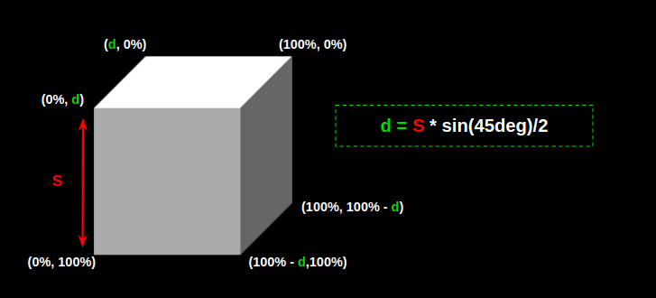
Let’s check out a visual that explains the math behind the clip-path points used to create this cube-like element:

We have our variables and an equation, so let’s put those to work. First, we’ll establish our variables and set the sizing for the main .loader element:
.loader { --s: 150px; /* control the size */ --_d: calc(0.353 * var(--s)); /* 0.353 = sin(45deg)/2 */ width: calc(var(--s) + var(--_d)); aspect-ratio: 1; display: flex;
}
Nothing too crazy so far. We have a 150px square that’s set up as a flexible container. Now we establish our pseudos:
.loader::before,
.loader::after { content: ""; flex: 1;
}
Those are two halves in the .loader container. We need to paint them in, so that’s where our conic gradient kicks in:
.loader::before,
.loader::after { content: ""; flex: 1; background: conic-gradient(from -90deg at calc(100% - var(--_d)) var(--_d), #fff 135deg, #666 0 270deg, #aaa 0);
}
The gradient is there, but it looks weird. We need to clip it to the element:
.loader::before,
.loader::after { content: ""; flex: 1; background: conic-gradient(from -90deg at calc(100% - var(--_d)) var(--_d), #fff 135deg, #666 0 270deg, #aaa 0); clip-path: polygon(var(--_d) 0, 100% 0, 100% calc(100% - var(--_d)), calc(100% - var(--_d)) 100%, 0 100%, 0 var(--_d));
}
Let’s make sure the two halves overlap with a negative margin:
.loader::before { margin-right: calc(var(--_d) / -2);
} .loader::after { margin-left: calc(var(--_d) / -2);
}
Now let’s make ‘em move!
.loader::before,
.loader::after { /* same as before */ animation: load 1.5s infinite cubic-bezier(0, .5, .5, 1.8) alternate;
} .loader::after { /* same as before */ animation-delay: -.75s
} @keyframes load{ 0%, 40% { transform: translateY(calc(var(--s) / -4)) } 60%, 100% { transform: translateY(calc(var(--s) / 4)) }
}
Here’s the final demo once again:
The progress cube loader
Let’s use the same technique to create a 3D progress loader. Yes, still only one element!
We’re not changing a thing as far as simulating the cube the same way we did before, other than changing the loader’s height and aspect ratio. The animation we’re making relies on a surprisingly easy technique where we update the width of the left side while the right side fills the remaining space, thanks to flex-grow: 1.
The first step is to add some transparency to the right side using opacity:
This simulates the effect that one side of the cube is filled in while the other is empty. Then we update the color of the left side. To do that, we either update the three colors inside the conic gradient or we do it by adding a background color with a background-blend-mode:
.loader::before { background-color: #CC333F; /* control the color here */ background-blend-mode: multiply;
}
This trick only allows us to update the color only once. The right side of the loader blends in with the three shades of white from the conic gradient to create three new shades of our color, even though we’re only using one color value. Color trickery!
Let’s animate the width of the loader’s left side:
Oops, the animation is a bit strange at the beginning! Notice how it sort of starts outside of the cube? This is because we’re starting the animation at the 0% width. But due to the clip-path and negative margin we’re using, what we need to do instead is start from our --_d variable, which we used to define the clip-path points and the negative margin:
@keyframes load { 0%, 5% {width: var(--_d); } 95%, 100% {width: 100%; }
}
That’s a little better:
But we can make this animation even smoother. Did you notice we’re missing a little something? Let me show you a screenshot to compare what the final demo should look like with that last demo:

It’s the bottom face of the cube! Since the second element is transparent, we need to see the bottom face of that rectangle as you can see in the left example. It’s subtle, but should be there!
We can add a gradient to the main element and clip it like we did with the pseudos:
background: linear-gradient(#fff1 0 0) bottom / 100% var(--_d) no-repeat;Here’s the full code once everything is pulled together:
.loader { --s: 100px; /* control the size */ --_d: calc(0.353*var(--s)); /* 0.353 = sin(45deg) / 2 */ height: var(--s); aspect-ratio: 3; display: flex; background: linear-gradient(#fff1 0 0) bottom / 100% var(--_d) no-repeat; clip-path: polygon(var(--_d) 0, 100% 0, 100% calc(100% - var(--_d)), calc(100% - var(--_d)) 100%, 0 100%, 0 var(--_d));
}
.loader::before,
.loader::after { content: ""; clip-path: inherit; background: conic-gradient(from -90deg at calc(100% - var(--_d)) var(--_d), #fff 135deg, #666 0 270deg, #aaa 0);
}
.loader::before { background-color: #CC333F; /* control the color here */ background-blend-mode: multiply; margin-right: calc(var(--_d) / -2); animation: load 2.5s infinite linear;
}
.loader:after { flex: 1; margin-left: calc(var(--_d) / -2); opacity: 0.4;
} @keyframes load { 0%, 5% { width: var(--_d); } 95%, 100% { width: 100%; }
}
That’s it! We just used a clever technique that uses pseudo-elements, conic gradients, clipping, background blending, and negative margins to get, not one, but two sweet-looking 3D loaders with nothing more than a single element in the markup.
More 3D
We can still go further and simulate an infinite number of 3D cubes using one element — yes, it’s possible! Here’s a grid of cubes:
This demo and the following demos are unsupported in Safari at the time of writing.
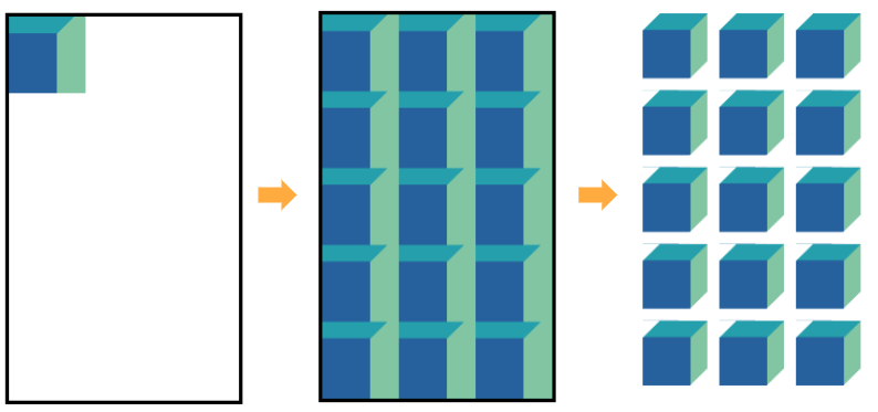
Crazy, right? Now we’re creating a repeated pattern of cubes made using a single element… and no pseudos either! I won’t go into fine detail about the math we are using (there are very specific numbers in there) but here is a figure to visualize how we got here:

We first use a conic-gradient to create the repeating cube pattern. The repetition of the pattern is controlled by three variables:
--size: True to its name, this controls the size of each cube.--m: This represents the number of columns.--n: This is the number of rows.--gap: this the gap or distance between the cubes
.cube { --size: 40px; --m: 4; --n: 5; --gap :10px; aspect-ratio: var(--m) / var(--n); width: calc(var(--m) * (1.353 * var(--size) + var(--gap))); background: conic-gradient(from -90deg at var(--size) calc(0.353 * var(--size)), #249FAB 135deg, #81C5A3 0 270deg, #26609D 0) /* update the colors here */ 0 0 / calc(100% / var(--m)) calc(100% / var(--n));
}
Then we apply a mask layer using another pattern having the same size. This is the trickiest part of this idea. Using a combination of a linear-gradient and a conic-gradient we will cut a few parts of our element to keep only the cube shapes visible.
.cube { /* etc. */ mask: linear-gradient(to bottom right, #0000 calc(0.25 * var(--size)), #000 0 calc(100% - calc(0.25 * var(--size)) - 1.414 * var(--gap)), #0000 0), conic-gradient(from -90deg at right var(--gap) bottom var(--gap), #000 90deg, #0000 0); mask-size: calc(100% / var(--m)) calc(100% / var(--n)); mask-composite: intersect;
}
The code may look a bit complex but thanks to CSS variables all we need to do is to update a few values to control our matrix of cubes. Need a 10⨉10 grid? Update the --m and --n variables to 10. Need a wider gap between cubes? Update the --gap value. The color values are only used once, so update those for a new color palette!
Now that we have another 3D technique, let’s use it to build variations of the loader by playing around with different animations. For example, how about a repeating pattern of cubes sliding infinitely from left to right?
This loader defines four cubes in a single row. That means our --n value is 4 and --m is equal to 1 . In other words, we no longer need these!
Instead, we can work with the --size and --gap variables in a grid container:
.loader { --size: 70px; --gap: 15px; width: calc(3 * (1.353 * var(--size) + var(--gap))); display: grid; aspect-ratio: 3;
}
This is our container. We have four cubes, but only want to show three in the container at a time so that we always have one sliding in as one is sliding out. That’s why we are factoring the width by 3 and have the aspect ratio set to 3 as well.
Let’s make sure that our cube pattern is set up for the width of four cubes. We’re going to do this on the container’s ::before pseudo-element:
.loader::before { content: ""; width: calc(4 * 100% / 3); /* Code to create four cubes */
}
Now that we have four cubes in a three-cube container, we can justify the cube pattern to the end of the grid container to overflow it, showing the last three cubes:
.loader { /* same as before */ justify-content: end;
}
Here’s what we have so far, with a red outline to show the bounds of the grid container:
Now all we have to do is to move the pseudo-element to the right by adding our animation:
@keyframes load { to { transform: translate(calc(100% / 4)); }
}
Did you get the trick of the animation? Let’s finish this off by hiding the overflowing cube pattern and by adding a touch of masking to create that fading effect that the start and the end:
.loader { --size: 70px; --gap: 15px; width: calc(3*(1.353*var(--s) + var(--g))); display: grid; justify-items: end; aspect-ratio: 3; overflow: hidden; mask: linear-gradient(90deg, #0000, #000 30px calc(100% - 30px), #0000);
}
We can make this a lot more flexible by introducing a variable, --n, to set how many cubes are displayed in the container at once. And since the total number of cubes in the pattern should be one more than --n, we can express that as calc(var(--n) + 1).
Here’s the full thing:
OK, one more 3D loader that’s similar but has the cubes changing color in succession instead of sliding:
We’re going to rely on an animated background with background-blend-mode for this one:
.loader { /* ... */ background: linear-gradient(#ff1818 0 0) 0% / calc(100% / 3) 100% no-repeat, /* ... */; background-blend-mode: multiply; /* ... */ animation: load steps(3) 1.5s infinite;
}
@keyframes load { to { background-position: 150%; }
}
I’ve removed the superfluous code used to create the same layout as the last example, but with three cubes instead of four. What I am adding here is a gradient defined with a specific color that blends with the conic gradient, just as we did earlier for the progress bar 3D loader.
From there, it’s animating the background gradient’s background-position as a three-step animation to make the cubes blink colors one at a time.
If you are not familiar with the values I am using for background-position and the background syntax, I highly recommend one of my previous articles and one of my Stack Overflow answers. You will find a very detailed explanation there.
Can we update the number of cubes to make it variables?
Yes, I do have a solution for that, but I’d like you to take a crack at it rather than embedding it here. Take what we have learned from the previous example and try to do the same with this one — then share your work in the comments!
Variations galore!
Like the other three articles in this series, I’d like to leave you with some inspiration to go forth and create your own loaders. Here is a collection that includes the 3D loaders we made together, plus a few others to get your imagination going:
That’s a wrap
I sure do hope you enjoyed spending time making single element loaders with me these past few weeks. It’s crazy that we started with seemingly simple spinner and then gradually added new pieces to work ourselves all the way up to 3D techniques that still only use a single element in the markup. This is exactly what CSS looks like when we harness its powers: scalable, flexible, and reusable.
Thanks again for reading this little series! I’ll sign off by reminding you that I have a collection of more than 500 loaders if you’re looking for more ideas and inspiration.


