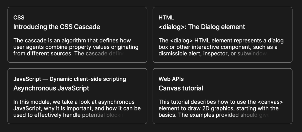
It’s no secret that MDN rolled out a new design back in March. It’s gorgeous! And there are some sweet CSS-y gems in it that are fun to look at. One of those gems is how card components handle truncated text.

Pretty cool, yeah? I wanna tear that apart in just a bit, but a couple of things really draw me into this approach:
- It’s an example of intentionally cutting off content. We’ve referred to that as CSS data loss in other places. And while data loss is generally a bad thing, I like how it’s being used here since excerpts are meant to be a teaser for the full content.
- This is different than truncating text with
text-overflow: ellipsis, a topic that came up rather recently when Eric Eggert shared his concerns with it. The main argument against it is that there is no way to recover the text that gets cut off in the truncation — assistive tech will announce it, but sighted users have no way to recover it. MDNs approach provides a bit more control in that department since the truncation is merely visual.
So, how did MDN do it? Nothing too fancy here as far the HTML goes, just a container with a paragraph.
<div class="card"> <p>Lorem ipsum dolor sit amet consectetur adipisicing elit. Inventore consectetur temporibus quae aliquam nobis nam accusantium, minima quam iste magnam autem neque laborum nulla esse cupiditate modi impedit sapiente vero?</p>
</div>
We can drop in a few baseline styles to shore things up.
Again, nothing too fancy. Our goal is cut the content off after, say, the third line. We can set a max-height on the paragraph and hide the overflow for that:
.card p { max-height: calc(4rem * var(--base)); /* Set a cut-off point for the content */ overflow: hidden; /* Cut off the content */
}
Whoa whoa, what’s up with that calc() stuff? Notice that I set up a --base variable up front that can be used as a common multiplier. I’m using it to compute the font-size, line-height, padding for the card, and now the max-height of the paragraph. I find it easier to work with a constant values especially when the sizing I need is really based on scale like this. I noticed MDN uses a similar --base-line-height variable, probably for the same purpose.
Getting that third line of text to fade out? It’s a classic linear-gradient() on the pargraph’s :after pseudo-element, which is pinned to the bottom-right corner of the card. So, we can set that up:
.card p:after { content: ""; /* Needed to render the pseudo */ background-image: linear-gradient(to right, transparent, var(--background) 80%); position: absolute; inset-inline-end: 0; /* Logical property equivalent to `right: 0` */
}
Notice I’m calling a --background variable that’s set to the same background color value that’s used on the .card itself. That way, the text appears to fade into the background. And I found that I needed to tweak the second color stop in the gradient because the text isn’t completely hidden when the gradient blends all the way to 100%. I found 80% to be a sweet spot for my eyes.
And, yes, :after needs a height and width. The height is where that --base variables comes back into play because we want that scaled to the paragraph’s line-height in order to cover the text with the height of :after.
.card p:after { /* same as before */ height: calc(1rem * var(--base) + 1px); width: 100%; /* relative to the .card container */
}
Adding one extra pixel of height seemed to do the trick, but MDN was able to pull it off without it when I peeked at DevTools. Then again, I’m not using top (or inset-block-start) to offset the gradient in that direction either. ????♂️
Now that p:after is absolutely positioned, we need to explicitly declare relative positioning on the paragraph to keep :after in its flow. Otherwise, :after would be completely yanked from the document flow and wind up outside of the card. This becomes the full CSS for the .card paragraph:
.card p { max-height: calc(4rem * var(--base)); /* Set a cut-off point for the content */ overflow: hidden; /* Cut off the content */ position: relative; /* needed for :after */
}
We’re done, right? Nope! The dang gradient just doesn’t seem to be in the right position.
I’ll admit I brain-farted on this one and fired up DevTools on MDN to see what the heck I was missing. Oh yeah, :after needs to be displayed as a block element. It’s clear as day when adding a red border to it.????♂️
.card p:after { content: ""; background: linear-gradient(to right, transparent, var(--background) 80%); display: block; height: calc(1rem * var(--base) + 1px); inset-block-end: 0; position: absolute; width: 100%;
}
All together now!
And, yep, looks sounds like VoiceOver respects the full text. I haven’t tested any other screen readers though.

I also noticed that MDN’s implementation removes pointer-events from p:after. Probably a good defensive tactic to prevent odd behaviors when selecting text. I added it in and selecting text does feel a little smoother, at least in Safari, Firefox, and Chrome.


