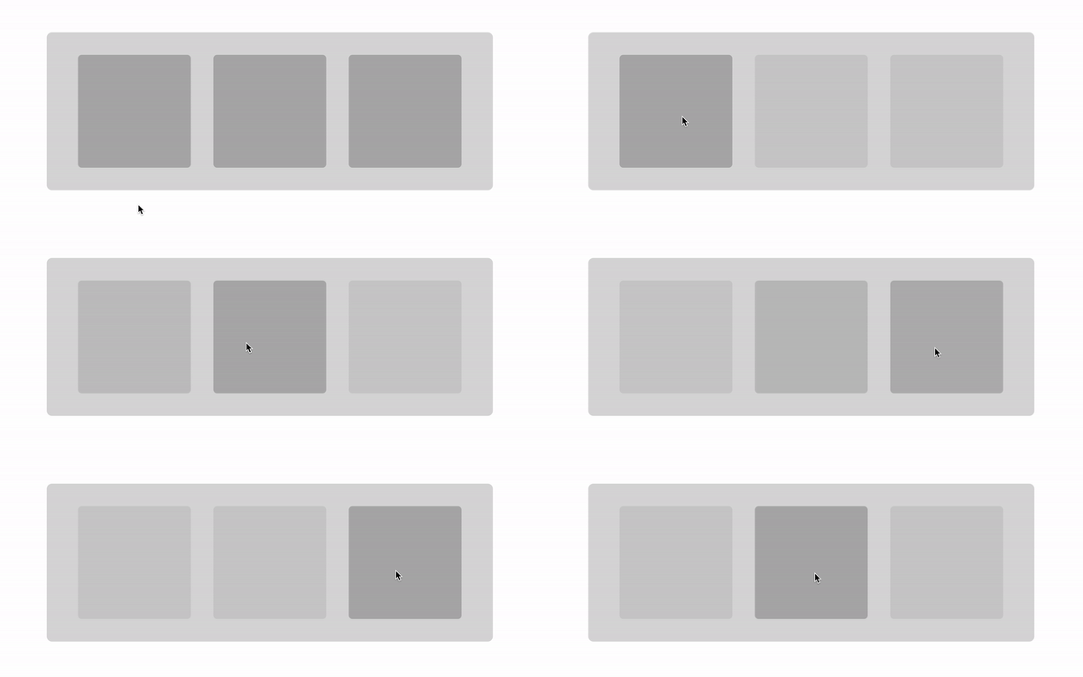
When working with CSS Grid, the first thing to do is to set display: grid on the element that we want to be become a grid container. Then we explicitly define the grid using a combination of grid-template-columns, grid-template-rows, and grid-template-areas. And from there, the next step is to place items inside the grid.
This is the classic approach that should be used and I also recommend it. However, there is another approach for creating grids without any explicit definition. We call this the implicit grid.
Table of Contents
“Explicit, implicit? What the heck is going on here?”
Strange terms, right? Manuel Matuzovic already has a good explanation of what we may by “implicit” and “explicit” in CSS Grid, but let’s dig straight into what the specification says:
The grid-template-rows, grid-template-columns, and grid-template-areas properties define a fixed number of tracks that form the explicit grid. When grid items are positioned outside of these bounds, the grid container generates implicit grid tracks by adding implicit grid lines to the grid. These lines together with the explicit grid form the implicit grid.
So, in plain English, the browser auto-generates extra rows and columns in case any elements happen to be placed outside the defined grid.
What about auto-placement?
Similar to the concept of implicit grid, auto-placement is the ability of the browser to automatically place the items inside the grid. We don’t always need to give the position of each item.
Through different use cases, we are going to see how such features can help us create complex and dynamic grid with a few lines of code.
Here, we have three different layouts but we only have one grid configuration that works for all of them.
main { display: grid; grid-template-columns: 1fr;
}
Only one column is taking up all the free space. This is our “explicit” grid. It’s set up to fit one grid item in the main grid container. That’s all. One column and one row:
But what if we decided to drop another element in there, say an aside (our dynamic sidebar). As it’s currently (and explicitly) defined, our grid will have to adjust automatically to find a place for that element. And if we do nothing else with our CSS, here’s what DevTools tells us is happening.

20px gap to help separate things visually.We can move the <aside> to a column beside the <section>:
aside { grid-column-start: 2;
}
And here’s what DevTools tells us now:

We place our element in the second column but… we don’t have a second column. Weird, right? We never declared a second column on the <main> grid container, but the browser created one for us! This is the key part from the specification we looked at:
When grid items are positioned outside of these bounds, the grid container generates implicit grid tracks by adding implicit grid lines to the grid.
This powerful feature allows us to have dynamic layouts. If we only have the <section> element, all we get is one column. But if we add an <aside> element to the mix, an extra column is created to contain it.
We could place the <aside> before the <section> instead like this:
aside { grid-column-end: -2;
}
This creates the implicit column at the start of the grid, unlike the previous code that places the implicit column at the end.
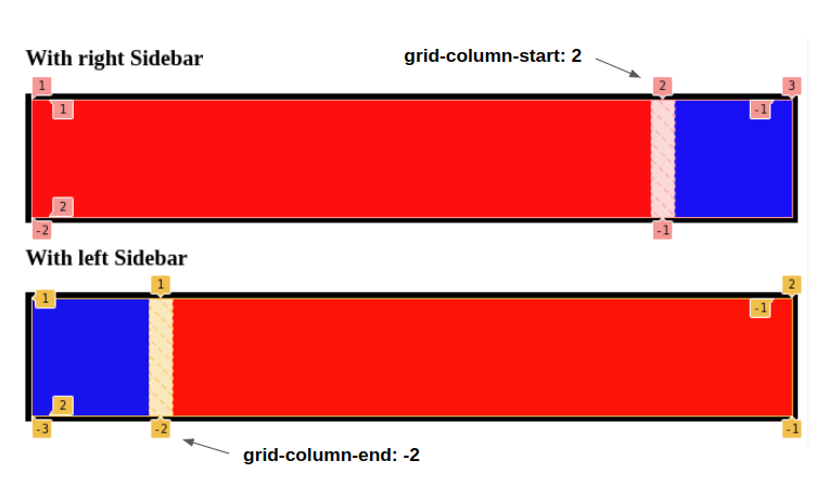
We can do the same thing more easily using the grid-auto-flow property to set any and all implicit tracks to flow in a column direction:
Now there’s no need to specify grid-column-start to place the <aside> element to the right of the <section>! In fact, any other grid item we decide to throw in there at any time will now flow in a column direction, each one placed in its own implicit grid tracks. Perfect for situations where the number of items in the grid isn’t known in advance!
That said, we do still need grid-column-end if we want to place it in a column to the left of it because, otherwise, the <aside> will occupy the explicit column which, in turn, pushes the <section> outside the explicit grid and forces it to take the implicit column.
I know, I know. That’s a little convoluted. Here is another example we can use to better understand this little quirk:
In the first example, we didn’t specify any placement. In this case, the browser will first place the <aside> element in the explicit column since it comes first in the DOM. The <section>, meanwhile, is automatically placed in the grid column the browser automatically (or implicitly) creates for us.
In the second example, we set the <aside> element outside of the explicit grid:
aside { grid-column-end: -2;
}
Now it doesn’t matter that <aside> comes first in the HTML. By reassigning <aside> somewhere else, we’ve made the <section> element available to take the explicit column.
Image grid
Let’s try something different with a grid of images where we have a big image and a few thumbnails beside it (or under it).
We have two grid configurations. But guess what? I am not defining any grid at all! All I am doing is this:
.grid img:first-child { grid-area: span 3 / span 3;
}
It’s surprising we only need one line of code to pull off something like this, so let’s dissect what’s going on and you will see that it’s easier than you may think. First of all, grid-area is a shorthand property that combines the following properties into a single declaration:
grid-row-startgrid-row-endgrid-column-startgrid-column-end
Wait! Isn’t
grid-areathe property we use to define named areas instead of where elements start and end on the grid?
Yes, but it also does more. We could write a whole lot more about grid-area, but in this particular case:
.grid img:first-child { grid-area: span 3 / span 3;
} /* ...is equivalent to: */
.grid img:first-child { grid-row-start: span 3; grid-column-start: span 3; grid-row-end: auto; grid-column-end: auto;
}
We can see the same thing when cracking open DevTools to expand the shorthand version:
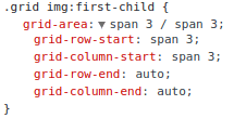
This means that the first image element in the grid needs to span three columns and three rows. But since we didn’t define any columns or rows, the browser does it for us.
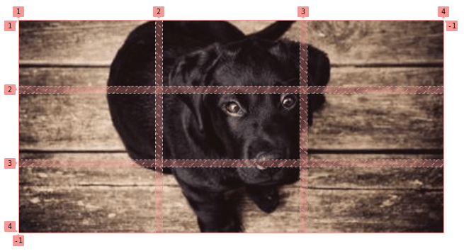
We’ve essentially placed the first image in the HTML to take up a 3⨉3 grid. That means that any other images will be placed automatically in those same three columns without the need to specify anything new.
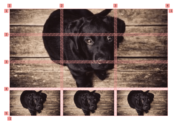
To summarize, we told the browser that the first image needs take up the space of three columns and three rows that we never explicitly defined when setting up the grid container. The browser set those columns and rows up for us. As a result, the remaining images in the HTML flow right into place using the same three columns and rows. And since the first image takes up all three columns in the first row, the remaining images flow into additional rows that each contain three columns, where each image takes up a single column.
All this from one line of CSS! That’s the power of “implicit” grid” and auto-placement.
For the second grid configuration in that demo, all I’ve done is change the automatic flow direction using grid-auto-flow: column the same way we did earlier when placing an <aside> element next to a <section>. This forces the browser to create a fourth column it can use to place the remaining images. And since we have three rows, the remaining images get placed inside the same vertical column.
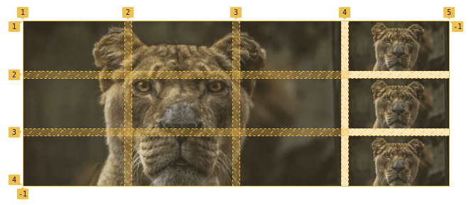
We need to add a few properties to the images to make sure they fit nicely inside the grid without any overflow:
.grid { display: grid; grid-gap: 10px;
} /* for the second grid configuration */
.horizontal { grid-auto-flow: column;
} /* The large 3⨉3 image */
.grid img:first-child { grid-area: span 3 / span 3;
} /* Help prevent stretched or distorted images */
img { width: 100%; height: 100%; object-fit: cover;
}
And of course, we can easily update the grid to consider more images by adjusting one value. That would be the 3 in the styles for the large image. We have this:
.grid img:first-child { grid-area: span 3 / span 3;
}
But we could add a fourth column simply by changing it to 4 instead:
.grid img:first-child { grid-area: span 4 / span 4;
}
Even better: let’s set that up as a custom property to make things even easier to update.
Dynamic layouts
The first use case with the sidebar was our first dynamic layout. Now we will tackle more complex layouts where the number of elements will dictate the grid configuration.
In this example, we can have anywhere from one to four elements where the grid adjusts in way that nicely fits the number of elements without leaving any awkward gaps or missing spaces.
When we have one element, we do nothing. The element will stretch to fill the only row and column automatically created by the grid.
Bit when we add the second element, we create another (implicit) column using grid-column-start: 2.
When we add a third element, it should take up the width of two columns — that’s why we used grid-column-start: span 2, but only if it’s the :last-child because if (and when) we add a fourth element, that one should only take up a single column.
Adding that up, we have four grid configurations with only two declarations and the magic of implicit grid:
.grid { display: grid;
}
.grid :nth-child(2) { grid-column-start: 2;
}
.grid :nth-child(3):last-child { grid-column-start: span 2;
}
Let’s try another one:
We’re doing nothing for the first and second cases where we have only one or two elements. When we add a third element, though, we tell the browser that — as long as it’s the :last-child — it should span two columns. When we add a fourth element, we tell the browser that element needs to be placed in the second column.
.grid { display: grid;
}
.grid :nth-child(3):last-child { grid-column-start: span 2;
}
.grid :nth-child(4) { grid-column-start: 2;
}
Are you starting to get the trick? We give the browser specific instructions based on the number of elements (using :nth-child) and, sometimes, one instruction can change the layout completely.
It should be noted that the sizing will not be the same when we work with different content:
Since we didn’t define any sizes for our items, the browser automatically sizes them for us based on their contents and we may end up with different sizing than what we just saw. To overcome this, we have to explicitly specify that all the columns and rows are equally sized:
grid-auto-rows: 1fr;
grid-auto-columns: 1fr;
Hey, we haven’t played with those properties yet! grid-auto-rows and grid-auto-columns set the size of implicit rows and columns, respectively, in a grid container. Or, as the spec explains it:
The grid-auto-columns and grid-auto-rows properties specify the size of tracks not assigned a size by
grid-template-rowsorgrid-template-columns.
Here is another example where we can go up to six elements. This time I will let you dissect the code. Don’t worry, the selectors may look complex but the logic is pretty straightforward.
Even with six elements, we only needed two declarations. Imagine all the complex and dynamic layouts we can achieve with a few lines of code!
What’s going on with that
grid-auto-rowsand why does it take three values? Are we defining three rows?
No, we are not defining three rows. But we are defining three values as a pattern for our implicit rows. The logic is as follows:
- If we have one row, it will get sized with the first value.
- If we have two rows, the first one gets the first value and the second one the second value.
- If we have three rows, the three values will get used.
- If we have four rows (and here comes the interesting part), we use the three values for the first three rows and we reuse the first value again for the fourth row. That’s why it’s a kind of pattern that we repeat to size all the implicit rows.
- If we have 100 rows, they will be sized three-by-three to have
2fr 2fr 1fr 2fr 2fr 1fr 2fr 2fr 1fr, etc.
Unlike grid-template-rows which defines the number of rows and their sizes, grid-auto-rows only sizes row that may get created along the way.
If we get back to our example, the logic is to have equal size when two rows are created (we will use the 2fr 2fr), but if a third row is created we make it a bit smaller.
Grid patterns
For this last one, we are going to talk about patterns. You have probably seen those two column layouts where one column is wider than the other, and each row alternates the placement of those columns.
This sort layout can be difficult too pull off without knowing exactly how much content we’re dealing with, but CSS Grid’s auto-placement powers makes it a relative cinch.
Take a peek at the code. It may look complex but let’s break it down because it winds up being pretty straightforward.
The first thing to do is to identify the pattern. Ask yourself: “After how many elements should the pattern repeat?” In this case it’s after every four elements. So, let’s look at using only four elements for now:
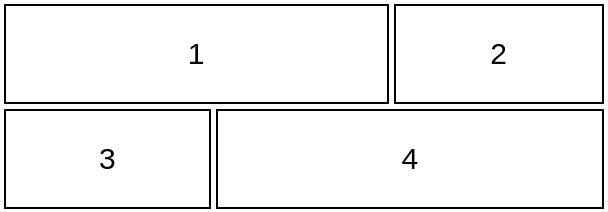
Now, let’s define the grid and set up the general pattern using the :nth-child selector for alternating between elements:
.grid { display: grid; grid-auto-columns: 1fr; /* all the columns are equal */ grid-auto-rows: 100px; /* all the rows equal to 100px */
}
.grid :nth-child(4n + 1) { /* ?? */ }
.grid :nth-child(4n + 2) { /* ?? */ }
.grid :nth-child(4n + 3) { /* ?? */ }
.grid :nth-child(4n + 4) { /* ?? */ }
We said that our pattern repeats every four elements, so we will logically use 4n + x where x ranges from 1 to 4. It’s a little easier to explain the pattern this way:
4(0) + 1 = 1 = 1st element /* we start with n = 0 */
4(0) + 2 = 2 = 2nd element
4(0) + 3 = 3 = 3rd element
4(0) + 4 = 4 = 4th element
4(1) + 1 = 5 = 5th element /* our pattern repeat here at n = 1 */
4(1) + 2 = 6 = 6th element
4(1) + 3 = 7 = 7th element
4(1) + 4 = 8 = 8th element
4(2) + 1 = 9 = 9th element /* our pattern repeat again here at n = 2 */
etc.
Perfect, right? We have four elements, and repeat the pattern on the fifth element, the ninth element and so on.
Those :nth-child selectors can be tricky! Chris has a super helpful explanation of how it all works, including recipes for creating different patterns.
Now we configure each element so that:
- The first element needs to take two columns and start at column one (
grid-column: 1/span 2). - The second element is placed in the third column (
grid-column-start: 3). - The third element is placed at the first column: (
grid-column-start: 1). - The fourth element takes two columns and starts at the second column: (
grid-column: 2/span 2).
Here that is in CSS:
.grid { display: grid; grid-auto-columns: 1fr; /* all the columns are equal */ grid-auto-rows: 100px; /* all the rows are equal to 100px */
}
.grid :nth-child(4n + 1) { grid-column: 1/span 2; }
.grid :nth-child(4n + 2) { grid-column-start: 3; }
.grid :nth-child(4n + 3) { grid-column-start: 1; }
.grid :nth-child(4n + 4) { grid-column: 2/span 2; }
We could stop here and be done… but we can do better! Specifically, we can remove some declarations and rely grid’s auto-placement powers to do the job for us. This is the trickiest part to grok and requires a lot of practice to be able to identify what can be removed.
The first thing we can do is update grid-column: 1 /span 2 and use only grid-column: span 2 since, by default, the browser will place the first item into the first column. We can also remove this:
.grid :nth-child(4n + 3) { grid-column-start: 1; }By placing the first, second, and fourth items, the grid automatically places the third item in the correct place. That means we’re left with this:
.grid { display: grid; grid-auto-rows: 100px; /* all the rows are equal to 100px */ grid-auto-columns: 1fr; /* all the columns are equal */
}
.grid :nth-child(4n + 1) { grid-column: span 2; }
.grid :nth-child(4n + 2) { grid-column-start: 3; }
.grid :nth-child(4n + 4) { grid-column: 2/span 2; }
But c’mon we can stroll do better! We can also remove this:
.grid :nth-child(4n + 2) { grid-column-start: 2; }Why? If we place the fourth element in the second column while allowing it to take up two full columns, we’re forcing the grid to create a third implicit column, giving us a total of three columns without explicitly telling it to. The fourth element cannot go into the first row since the first item is also taking two columns, so it flows to the next row. This configuration leave us with an empty column in the first row and an empty one in the second row.
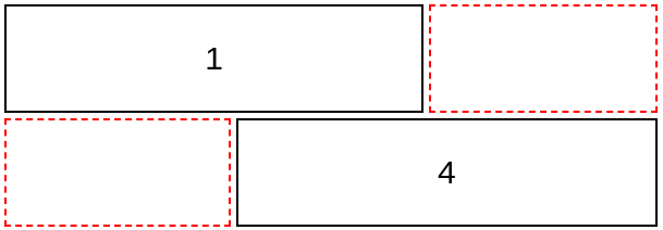
I think you know the end of the story. The browser will automatically place the second and third items in those empty spots. So our code becomes even simpler:
.grid { display: grid; grid-auto-columns: 1fr; /* all the columns are equal */ grid-auto-rows: 100px; /* all the rows are equal to 100px */
}
.grid :nth-child(4n + 1) { grid-column: span 2; }
.grid :nth-child(4n + 4) { grid-column: 2/span 2; }
All it takes is five declarations to create a very cool and very flexible pattern. The optimization part may be tricky, but you get used to it and gain some tricks with practice.
Why not use
grid-template-columnsto define explicit columns since we know the number of columns?
We can do that! Here’s the code for it:
.grid { display: grid; grid-template-columns: repeat(3, 1fr); /* all the columns are equal */ grid-auto-rows: 100px; /* all the rows are equal to 100px */
}
.grid :nth-child(4n + 1),
.grid :nth-child(4n + 4) { grid-column: span 2;
}
As you can see, the code is definitely more intuitive. We define three explicit grid columns and we tell the browser that the first and fourth elements need to take two columns. I highly recommend this approach! But the goal of this article is to explore new ideas and tricks that we get from CSS Grid’s implicit and auto-placement powers.
The explicit approach is more straightforward, while an implicit grid requires you to — pardon the pun — fill in the gaps where CSS is doing additional work behind the scenes. In the end, I believe that having a solid understanding of implicit grids will help you better understand the CSS Grid algorithm. After all, we are not here to study what’s obvious — we are here to explore wild territories!
Let’s try another pattern, a bit quicker this time:
Our pattern repeats every six elements. The third and fourth elements each need to occupy two full rows. If we place the third and the fourth elements, it seems that we don’t need to touch the others, so let’s try the following:
.grid { display: grid; grid-auto-columns: 1fr; grid-auto-rows: 100px;
}
.grid :nth-child(6n + 3) { grid-area: span 2/2; /* grid-row-start: span 2 && grid-column-start: 2 */
}
.grid :nth-child(6n + 4) { grid-area: span 2/1; /* grid-row-start: span 2 && grid-column-start: 1 */
}
Hmm, no good. We need to place the second element in the first column. Otherwise, the grid will automatically place it in the second column.
.grid :nth-child(6n + 2) { grid-column: 1; /* grid-column-start: 1 */
}
Better, but there’s still more work, We need to shift the third element to the top. It’s tempting to try placing it in the first row this way:
.grid :nth-child(6n + 3) { grid-area: 1/2/span 2; /* Equivalent to: grid-row-start: 1; grid-row-end: span 2; grid-column-start: 2 */
}
But this doesn’t work because it forces all the 6n + 3 elements to get placed in the same area which makes a jumbled layout. The real solution is to keep the initial definition of the third element and add grid-auto-flow: dense to fill the gaps. From MDN:
[The] “dense” packing algorithm attempts to fill in holes earlier in the grid, if smaller items come up later. This may cause items to appear out-of-order, when doing so would fill in holes left by larger items. If it is omitted, a “sparse” algorithm is used, where the placement algorithm only ever moves “forward” in the grid when placing items, never backtracking to fill holes. This ensures that all of the auto-placed items appear “in order”, even if this leaves holes that could have been filled by later items.
I know this property is not very intuitive but never forget it when you face a placement issue. Before trying different configurations in vain, add it because it may fix your layout with no additional effort.
Why not always add this property by default?
I don’t recommend it because, in some cases, we don’t want that behavior. Note how the MDN’s explanation there mentions it causes items to flow “out-of-order” to fill holes left by larger items. Visual order is usually just as important as the source order, particularly when it comes to accessible interfaces, and grid-auto-flow: dense can sometimes cause a mismatch between the visual and source order.
Our final code is then:
.grid { display: grid; grid-auto-columns: 1fr; grid-auto-flow: dense; grid-auto-rows: 100px;
}
.grid :nth-child(6n + 2) { grid-column: 1; }
.grid :nth-child(6n + 3) { grid-area: span 2/2; }
.grid :nth-child(6n + 4) { grid-row: span 2; }
Another one? Let’s go!
For this one, I will not talk too much and instead show you an illustration of the code I have used. Try to see if you get how I reached that code:
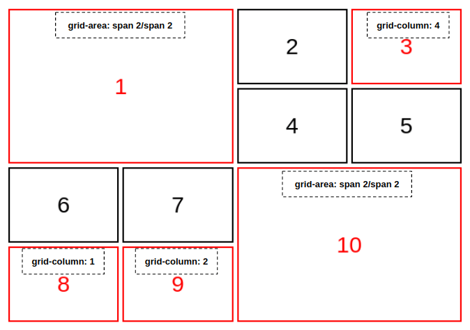
The items in black are implicitly placed in the grid. It should be noted that we can get the same layout more ways than how I got there. Can you figure those out, too? What about using grid-template-columns? Share your works in the comment section.
I am gonna leave you with a last pattern:
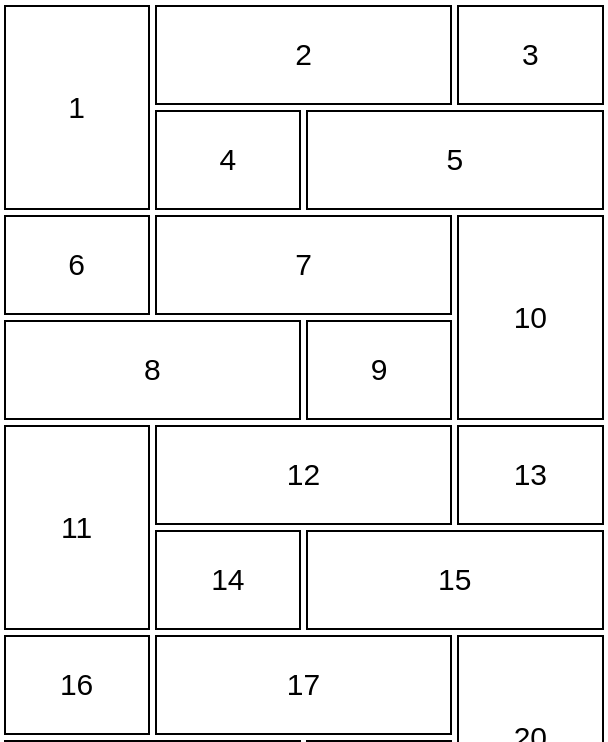
I do have a solution for this one but it’s your turn to practice. Take all that we have learned and try to code this by yourself and then compare it with my solution. Don’t worry if you end with something verbose — the most important thing is finding a working solution.
Want more?
Before we end I want to share a few Stack Overflow questions related to CSS Grid where I jumped in with answers that use many of the techniques we covered here together. It’s a good list that shows just how many real use cases and real-world situations come up where these things come in handy:
Wrapping up
CSS Grid has been around for years, but there are still a lot of little-known and used tricks that aren’t widely discussed. The implicit grid and auto-placement features are two of them!
And yes, this can get challenging! It has taken me a lot of time to grok the logic behind implicit grids and I still struggle with auto-placement. If you want to spend more time wrapping your head around explicit and implicit grids, here are a couple of additional explanations and examples worth checking out:
Similarly, you might want to read about grid-auto-columns in the CSS-Tricks Almanac because Mojtaba Seyedi goes into great detail and includes incredibly helpful visuals to help explain the behavior.
Like I said when we started, the methods we covered here are not meant to replace the common ways you already know for building grids. I am simply exploring different ways that can be helpful in some cases.


