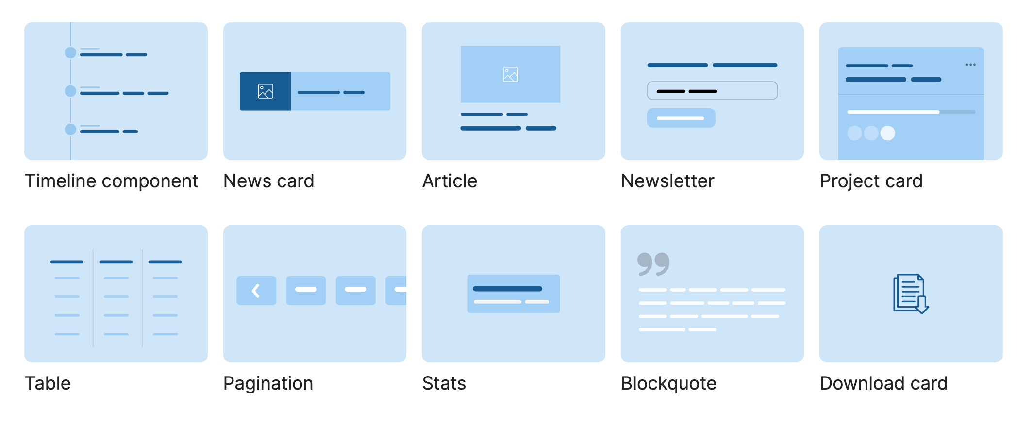
Ahmad Shadeed got an early jump on container queries and has a growing collection of examples based on everyday patterns.

And, if you missed it, his latest post on container queries does a wonderful job covering how they work since landing in Chrome 105 this month (we’ll see them in Safari 16 soon). Some choice highlights and takeaways:
- Containers are defined with the
container-typeproperty. Previous demos and proposals had been usingcontaininstead. - Container queries are very much like the media queries we’ve been writing all along to target the viewport size. So, rather than something like
@media (min-width: 600px) {}, we have@container (min-width: 600px) {}. That should make converting many of those media queries to container queries fairly straightfoward, minus the work of figuring out the new breakpoint values. - We can name containers to help distinguish them in our code (e.g.
container-name: blockquote).
Great job, Ahmad! And thanks for sharing!
Direct Link →


