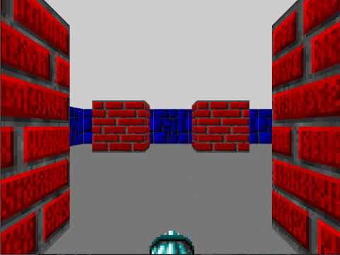
CSS-only Wolfenstein is a little project that I made a few weeks ago. It was an experiment with CSS 3D transformations and animations.
Inspired by the FPS demo and another Wolfenstein CodePen, I decided to build my own version. It is loosely based on Episode 1 – Floor 9 of the original Wolfenstein 3D game.
Editor: This game intentionally requires some quick reaction to avoid a Game Over screen.
Here is a playthrough video:
[embedded content]
In a nutshell, my project is nothing but a carefully scripted long CSS animation. Plus a few instances of the checkbox hack.
:checked ~ div { animation-name: spin; }The environment consists of 3D grid faces and the animations are mostly plain 3D translations and rotations. Nothing really fancy.
However, two problems were particularly tricky to solve:
- Play the “weapon firing” animation whenever the player clicks on an enemy.
- When the fast-moving boss got the last hit, enter a dramatic slow motion.
At a technical-level, this meant:
- Replay an animation when the next checkbox is checked.
- Slow down an animation, when a checkbox is checked.
In fact, neither was properly solved in my project! I either ended up using workarounds or just gave up.
On the other hand, after some digging, eventually I found the key to both problems: altering the properties of running CSS animations. In this article, we will explore further on this topic:
- Lots of interactive examples.
- Dissections: how does each example work (or not work)?
- Behind-the-scene: how do browsers handle animation states?
Let me “toss my bricks”.
Problem 1: Replaying Animation
Table of Contents
The first example: “just another checkbox”
My first intuition was “just add another checkbox”, which does not work:
Each checkbox works individually, but not both together. If one checkbox is already checked, the other no longer works.
Here’s how it works (or “does not work”):
- The
animation-nameof<div>isnoneby default. - The user clicks on one checkbox,
animation-namebecomesspin, and the animation starts from the beginning. - After a while, the user clicks on the other checkbox. A new CSS rule takes effect, but
animation-nameis stillspin, which means no animation is added nor removed. The animation simply continues playing as if nothing happened.
The second example: “cloning the animation”
One working approach is to clone the animation:
#spin1:checked ~ div { animation-name: spin1; }
#spin2:checked ~ div { animation-name: spin2; }
Here’s how it works:
animation-nameisnoneinitially.- The user clicks on “Spin!”,
animation-namebecomesspin1. The animationspin1is started from the beginning because it was just added. - The user clicks on “Spin again!”,
animation-namebecomesspin2. The animationspin2is started from the beginning because it was just added.
Note that in Step #3, spin1 is removed because of the order of the CSS rules. It won’t work if “Spin again!” is checked first.
The third example: “appending the same animation”
Another working approach is to “append the same animation”:
#spin1:checked ~ div { animation-name: spin; }
#spin2:checked ~ div { animation-name: spin, spin; }
This is similar to the previous example. You can actually understand the behavior this way:
#spin1:checked ~ div { animation-name: spin1; }
#spin2:checked ~ div { animation-name: spin2, spin1; }
Note that when “Spin again!” is checked, the old running animation becomes the second animation in the new list, which could be unintuitive. A direct consequence is: the trick won’t work if animation-fill-mode is forwards. Here’s a demo:
If you wonder why this is the case, here are some clues:
animation-fill-modeisnoneby default, which means “The animation has no effect at all if not playing”.animation-fill-mode: forwards;means “After the animation finishes playing, it must stay at the last keyframe forever”.spin1’s decision always overridespin2’s becausespin1appears later in the list.- Suppose the user clicks on “Spin!”, waits for a full spin, then clicks on “Spin again!”. At this moment.
spin1is already finished, andspin2just starts.
Discussion
Rule of thumb: you cannot “restart” an existing CSS animation. Instead, you want to add and play a new animation. This may be confirmed by the W3C spec:
Once an animation has started it continues until it ends or the animation-name is removed.
Now comparing the last two examples, I think in practice, “cloning animations” should often work better, especially when CSS preprocessor is available.
Problem 2: Slow Motion
One might think that slowing an animation is just a matter of setting a longer animation-duration:
div { animation-duration: 0.5s; }
#slowmo:checked ~ div { animation-duration: 1.5s; }
Indeed, this works:
… or does it?
With a few tweaks, it should be easier to see the issue.
Yes, the animation is slowed down. And no, it does not look good. The dog (almost) always “jumps” when you toggle the checkbox. Furthermore, the dog seems to jump to a random position rather than the initial one. How come?
It would be easier to understand it if we introduced two “shadow elements”:
Both shadow elements are running the same animations with different animation-duration. And they are not affected by the checkbox.
When you toggle the checkbox, the element just immediately switches between the states of two shadow elements.
Quoting the W3C spec:
Changes to the values of animation properties while the animation is running apply as if the animation had those values from when it began.
This follows the stateless design, which allows browsers to easily determine the animated value. The actual calculation is described here and here.
Another Attempt
One idea is to pause the current animation, then add a slower animation that takes over from there:
div { animation-name: spin1; animation-duration: 2s;
} #slowmo:checked ~ div { animation-name: spin1, spin2; animation-duration: 2s, 5s; animation-play-state: paused, running;
}
So it works:
… or does it?
It does slow down when you click on “Slowmo!”. But if you wait for a full circle, you will see a “jump”. Actually, it always jumps to the position when “Slowmo!” is clicked on.
The reason is we don’t have a from keyframe defined – and we shouldn’t. When the user clicks on “Slowmo!”, spin1 is paused at some position, and spin2 starts at exactly the same position. We simply cannot predict that position beforehand … or can we?
A Working Solution
We can! By using a custom property, we can capture the angle in the first animation, then pass it to the second animation:
div { transform: rotate(var(--angle1)); animation-name: spin1; animation-duration: 2s;
} #slowmo:checked ~ div { transform: rotate(var(--angle2)); animation-name: spin1, spin2; animation-duration: 2s, 5s; animation-play-state: paused, running;
} @keyframes spin1 { to { --angle1: 360deg; }
} @keyframes spin2 { from { --angle2: var(--angle1); } to { --angle2: calc(var(--angle1) + 360deg); }
}
Note: @property is used in this example, which is not supported by all browsers.
The “Perfect” Solution
There is a caveat to the previous solution: “exiting slowmo” does not work well.
Here is a better solution:
In this version, slow motion can be entered or exited seamlessly. No experimental feature is used either. So is it the perfect solution? Yes and no.
This solution works like “shifting” “gears”:
- Gears: there are two
<div>s. One is the parent of the other. Both have thespinanimation but with differentanimation-duration. The final state of the element is the accumulation of both animations. - Shifting: At the beginning, only one
<div>has its animation running. The other is paused. When the checkbox is toggled, both animations swap their states.
While I really like the result, there is one problem: it is a nice exploit of the spin animation, which does not work for other types of animations in general.
A Practical Solution (with JS)
For general animations, it is possible to achieve the slow motion function with a bit of JavaScript:
A quick explanation:
- A custom property is used to track the animation progress.
- The animation is “restarted” when the checkbox is toggled.
- The JS code computes the correct
animation-delayto ensure a seamless transition. I recommend this article if you are not familiar with negative values ofanimation-delay.
You can view this solution as a hybrid of “restarting animation” and the “gear-shifting” approach.
Here it is important to track the animation progress correctly. Workarounds are possible if @property is not available. As an example, this version uses z-index to track the progress:
Side-note: originally, I also tried to create a CSS-only version but did not succeed. While not 100% sure, I think it is because animation-delay is not animatable.
Here is a version with minimal JavaScript. Only “entering slowmo” works.
Please let me know if you manage to create a working CSS-only version!
Slow-mo Any Animation (with JS)
Lastly, I’d like to share a solution that works for (almost) any animation, even with multiple complicated @keyframes:
Basically, you need to add an animation progress tracker, then carefully compute animation-delay for the new animation. However, sometimes it could be tricky (but possible) to get the correct values.
For example:
animation-timing-functionis notlinear.animation-directionis notnormal.- multiple values in
animation-namewith differentanimation-duration’s andanimation-delay’s.
This method is also described here for the Web Animations API.
Acknowledgments
I started down this path after encountering CSS-only projects. Some were delicate artwork, and some were complex contraptions. My favorites are those involving 3D objects, for example, this bouncing ball and this packing cube.
In the beginning, I had no clue how these were made. Later I read and learned a lot from this nice tutorial by Ana Tudor.
As it turned out, building and animating 3D objects with CSS is not much different from doing it with Blender, just with a bit different flavor.
Conclusion
In this article we examined the behavior of CSS animations when an animate-* property is altered. Especially we worked out solutions for “replaying an animation” and “animation slow-mo”.
I hope you find this article interesting. Please let me know your thoughts!


