A lot of chatter around the ol’ <details> and <summary> elements lately! I saw Lea Verou recently tweet an observation about the element’s display behavior and that sorta splintered into more observations and usage notes from folks, including a revived discussion on whether <summary> should be allowed to contain interactive elements or not.
There are a lot of dots to connect and I’ll do my best here to do exactly that.
Can we change the display of elements nested in the <details> element?
Table of Contents
Super weird! If we crack open DevTools, the user agent stylesheet tells us <details> is a displayed as a block element.
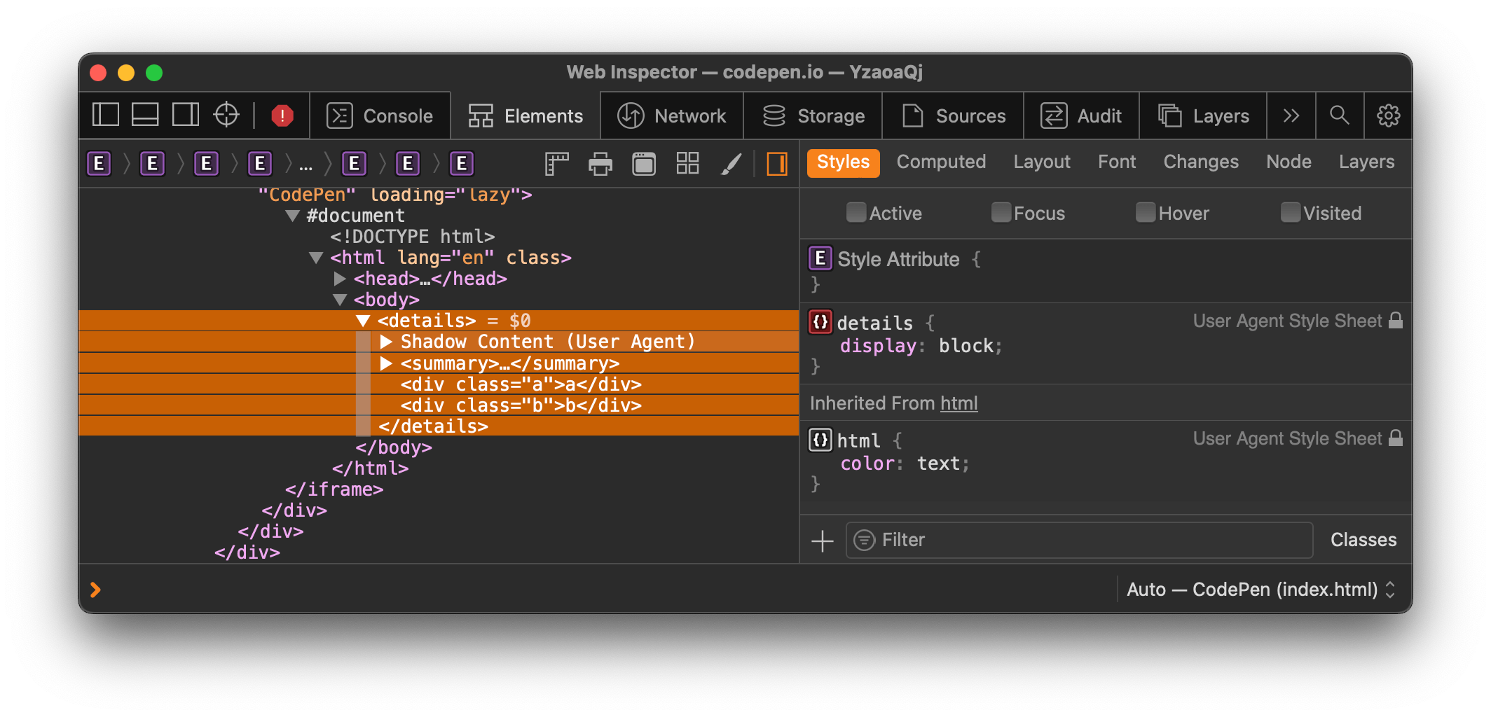
Notice the required <summary> element and the two additional <div>s in there. We can override the display, right?
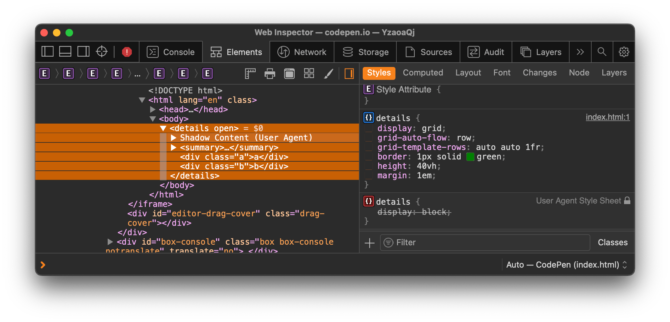
What we might expect is that <details> now has an explicit height of 40vh and three rows where the third row takes up the remaining space leftover from the first two. Like this:

Ugh, but the third row doesn’t… do… that.

Apparently what we’re dealing with is a grid container that is unable to apply grid behavior to its grid items. But the HTML spec tells us:
The
detailselement is expected to render as a block box. The element is also expected to have an internal shadow tree with two slots.(Emphasis mine)
And a little later:
The
detailselement’s second slot is expected to have itsstyleattribute set to “display: block; content-visibility: hidden;” when thedetailselement does not have anopenattribute. When it does have theopenattribute, thestyleattribute is expected to be removed from the second slot.(Emphasis mine, again)
So, the spec says the second slot — the two additional <div>s from the example — are only coerced into being block elements when <details> is closed. When it’s open — <details open> — they should conform to the grid display that overrides the user agent styling… right?
That’s the debate. I get that slots are set to display: contents by default, but jamming nested elements into slots and removing the ability to style them seems off. Is it a spec issue that the contents are slots, or a browser issue that we cannot override their display even though they are in the box tree? Smarter people can enlighten me but it seems like an incorrect implementation.
Is <details> a container or an interactive element?
Lots of folks are using <details> to toggle menus open and closed. It’s a practice popularized by GitHub.
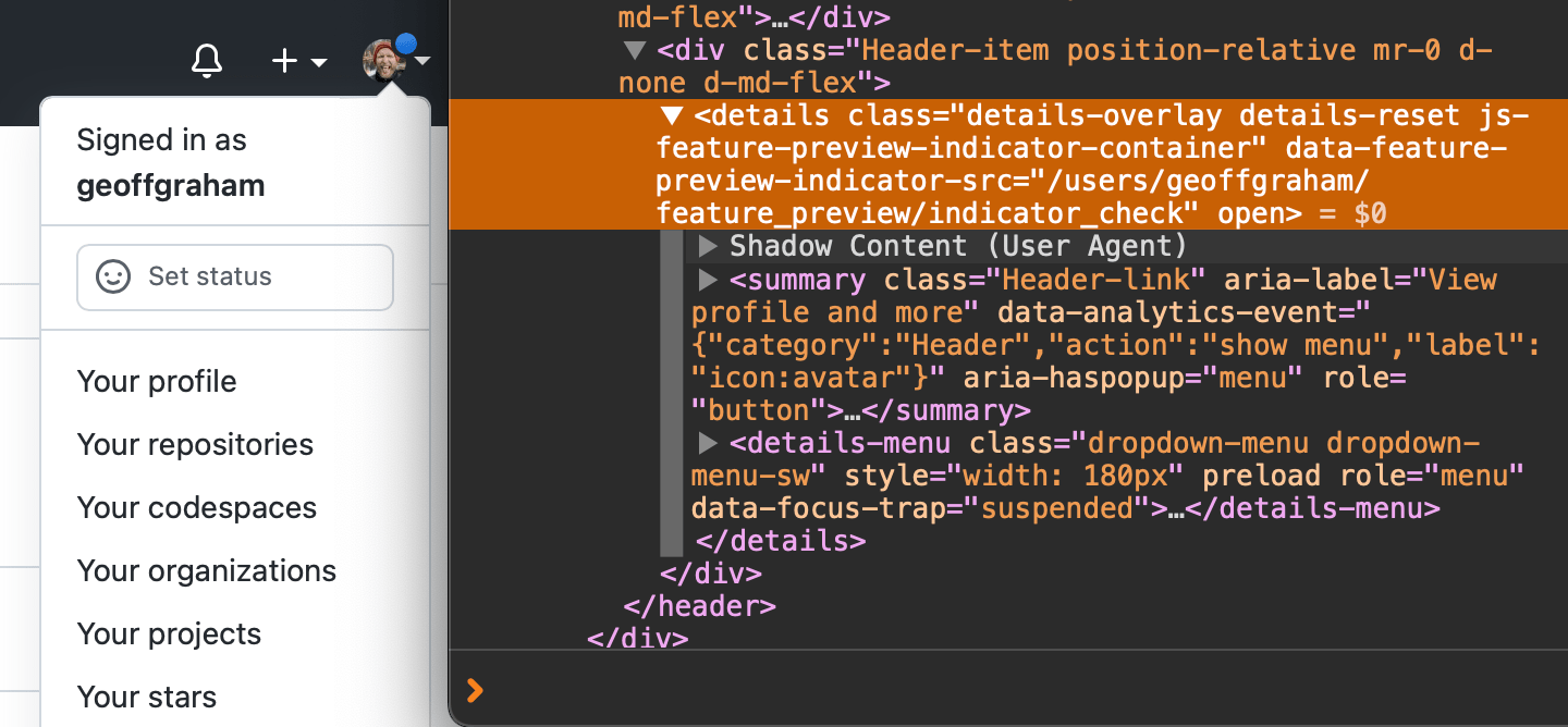
Seems reasonable. The spec sure allows it:
The
detailselement represents a disclosure widget from which the user can obtain additional information or controls.(Emphasis mine)
Alright, so we might expect that <details> is the container (it has an implicit role=group) and <summary> is an interactive element that sets the container’s open state. Makes sense since <summary> has an implcit button role in some contexts (but no corresponding WAI-ARIA role).
But Melanie Sumner did some digging that not only seems to contradict that, but leads to the conclusion that using <details> as a menu probably ain’t the best thing. See what happens when <details> is rendered without the <summary> element:
It does exactly what the spec suggests when it’s missing a <summary> — it makes its own:
The first
summaryelement child of the element, if any, represents the summary or legend of the details. If there is no childsummaryelement, the user agent should provide its own legend (e.g. “Details”).(Emphasis mine)
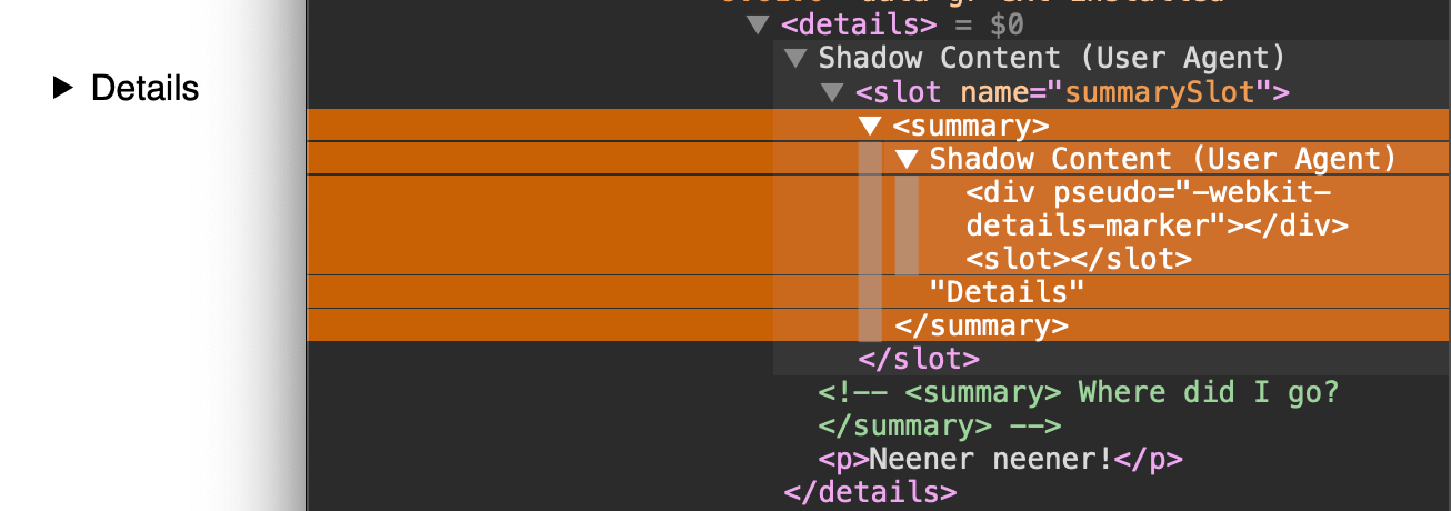
Melanie ran that through an HTML validator and — surprise! — it’s invalid:

So, <details> requires the <summary>. And when <summary> is missing, <details> creates it’s own, though it’s relayed as invalid markup. It’s all hunky-dory and valid when <summary> is there:
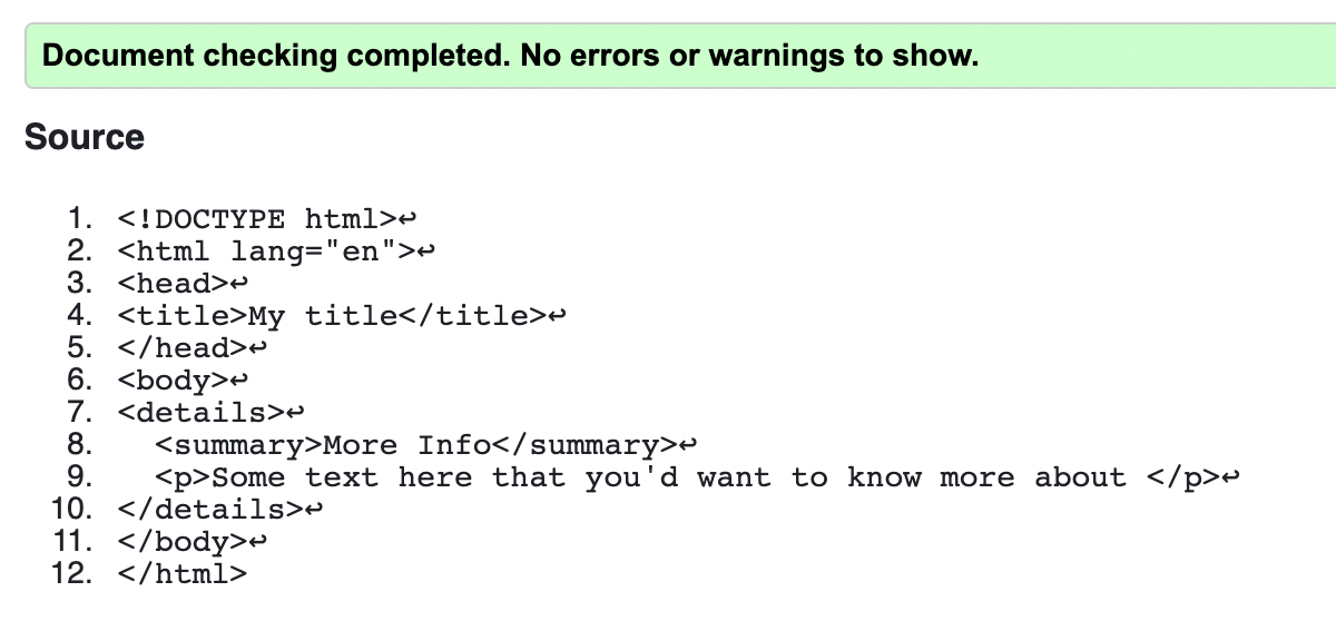
All of which leads to a new question: why is <summary> given an implcit button role when <details> is what appears to be the interactive element? Perhaps this is another case where the browser implementation is incorrect? Then again, the spec does categorize both as interactive elements. You can see how utterly confusing all of this becomes.
Either way, Melanie’s ultimate conclusion that we ought to avoid using <details> for menus is based on how assistive tech reads and announces <details> that contain interactive elements. The element is announced, but there is no mention of interactive controls beyond that until you, er, interact with <details>. Only then will something like a list of links be announced.
Besides, content inside a collapsed <details> is excluded from in-page searching (except in Chromium browsers, which can access the collapsed content at the time of writing), making things even more difficult to find.
Should <summary> allow interactive elements?
That’s the question posed in this open thread. The idea is that something like this would be invalid:
<details> <summary><a href="...">Link element</a></summary>
</details> <!-- or --> <details> <summary><input></summary>
</details>
Scott O’Hara sums up nicely why this is an issue:
The link is not discoverable at all to JAWS when navigating with its virtual cursor. If navigating to the summary element via the Tab key, JAWS announces “example text, button” as the name and role of the element. If hitting Tab key again, JAWS again announces “example text, button” even though keyboard focus is on the link.
[…]
There is more I could go on about with the various problems different AT have with the content model for summary… but that would just extend this comment out beyond what is necessary. tldr; the summary content model produces very inconsistent and sometimes just flat out broken experiences for people using AT.
Scott opened tickets to correct this behavior in Chromium and WebKit. Thanks, Scott!
Yet, it’s valid HTML:
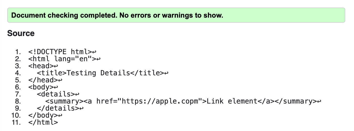
Scott goes further in a separate blog post. For example, he explains how slapping role=button on <summary> might seem like a reasonable fix to ensure it is consistently announced by assistive tech. That would also settle the debate over whether <summary> should allow interactive elements because buttons cannot contain interactive elements. The only problem then is that Safari then treats <summary> as a standard button, which loses it’s expanded and collapsed states. So, the correct role is announced, but now it’s state is not. ????
Where do we go now?
Are you scared to use <details>/<summary> with all of these issues and inconsistencies? I sure am, but only insofar as to make sure that what’s in it provides the right sort of experience and expectations for users.
I’m just glad these conversations are happening and that they’re taking place in the open. Because of that, you can comment on Scott’s three proposed solutions for how the content model for <summary> is defined, upvote his tickets, and report your own issues and use cases while you’re at it. Hopefully, the better we understand how the elements are used and what we expect them to do, the better they are implemented.


