This is a post about Shoelace, a component library by Cory LaViska, but with a twist. It defines all your standard UX components: tabs, modals, accordions, auto-completes, and much, much more. They look beautiful out of the box, are accessible, and fully customizable. But rather than creating these components in React, or Solid, or Svelte, etc., it creates them with Web Components; this means you can use them with any framework.
Some preliminary things
Table of Contents
Web Components are great, but there’s currently a few small hitches to be aware of.
React
I said they work in any JavaScript framework, but as I’ve written before, React’s support for Web Components is currently poor. To address this, Shoelace actually created wrappers just for React.
Another option, which I personally like, is to create a thin React component that accepts the tag name of a Web Component and all of its attributes and properties, then does the dirty work of handling React’s shortcomings. I talked about this option in a previous post. I like this solution because it’s designed to be deleted. The Web Component interoperability problem is currently fixed in React’s experimental branch, so once that’s shipped, any thin Web Component-interoperable component you’re using could be searched, and removed, leaving you with direct Web Component usages, without any React wrappers.
Server-Side Rendering (SSR)
Support for SSR is also poor at the time of this writing. In theory, there’s something called Declarative Shadow DOM (DSD) which would enable SSR. But browser support is minimal, and in any event, DSD actually requires server support to work right, which means Next, Remix, or whatever you happen to use on the server will need to become capable of some special handling.
That said, there are other ways to get Web Components to just work
with a web app that’s SSR’d with something like Next. The short version is that the scripts registering your Web Components need to run in a blocking script before your markup is parsed. But that’s a topic for another post.
Of course, if you’re building any kind of client-rendered SPA, this is a non-issue. This is what we’ll work with in this post.
Let’s start
Since I want this post to focus on Shoelace and on its Web Component nature, I’ll be using Svelte for everything. I’ll also be using this Stackblitz project for demonstration. We’ll build this demo together, step-by-step, but feel free to open that REPL up anytime to see the end result.
I’ll show you how to use Shoelace, and more importantly, how to customize it. We’ll talk about Shadow DOMs and which styles they block from the outside world (as well as which ones they don’t). We’ll also talk about the ::part CSS selector — which may be entirely new to you — and we’ll even see how Shoelace allows us to override and customize its various animations.
If you find you like Shoelace after reading this post and want to try it in a React project, my advice is to use a wrapper like I mentioned in the introduction. This will allow you to use any of Shoelace’s components, and it can be removed altogether once React ships the Web Component fixes they already have (look for that in version 19).
Introducing Shoelace
Shoelace has fairly detailed installation instructions. At its most simple, you can dump <script> and <style> tags into your HTML doc, and that’s that. For any production app, though, you’ll probably want to selectively import only what you want, and there are instructions for that, too.
With Shoelace installed, let’s create a Svelte component to render some content, and then go through the steps to fully customize it. To pick something fairly non-trivial, I went with the tabs and a dialog (commonly referred to as a modal) components. Here’s some markup taken largely from the docs:
<sl-tab-group> <sl-tab slot="nav" panel="general">General</sl-tab> <sl-tab slot="nav" panel="custom">Custom</sl-tab> <sl-tab slot="nav" panel="advanced">Advanced</sl-tab> <sl-tab slot="nav" panel="disabled" disabled>Disabled</sl-tab> <sl-tab-panel name="general">This is the general tab panel.</sl-tab-panel> <sl-tab-panel name="custom">This is the custom tab panel.</sl-tab-panel> <sl-tab-panel name="advanced">This is the advanced tab panel.</sl-tab-panel> <sl-tab-panel name="disabled">This is a disabled tab panel.</sl-tab-panel>
</sl-tab-group> <sl-dialog no-header label="Dialog"> Hello World! <button slot="footer" variant="primary">Close</button>
</sl-dialog> <br />
<button>Open Dialog</button>
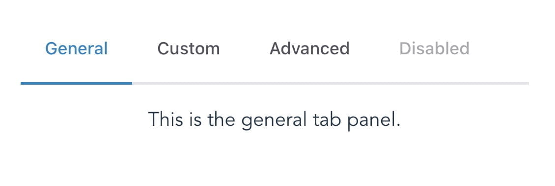
This renders some nice, styled tabs. The underline on the active tab even animates nicely, and slides from one active tab to the next.

I won’t waste your time running through every inch of the APIs that are already well-documented on the Shoelace website. Instead, let’s look into how best to interact with, and fully customize these Web Components.
Interacting with the API: methods and events
Calling methods and subscribing to events on a Web Component might be slightly different than what you’re used to with your normal framework of choice, but it’s not too complicated. Let’s see how.
Tabs
The tabs component (<sl-tab-group>) has a show method, which manually shows a particular tab. In order to call this, we need to get access to the underlying DOM element of our tabs. In Svelte, that means using bind:this. In React, it’d be a ref. And so on. Since we’re using Svelte, let’s declare a variable for our tabs instance:
<script> let tabs;
</script>
…and bind it:
<sl-tab-group bind:this="{tabs}"></sl-tab-group>Now we can add a button to call it:
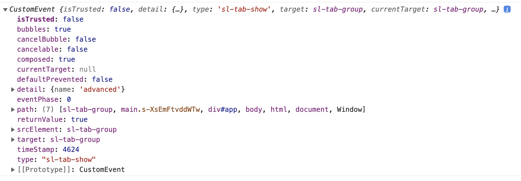
<button on:click={() => tabs.show("custom")}>Show custom</button>It’s the same idea for events. There’s a sl-tab-show event that fires when a new tab is shown. We could use addEventListener on our tabs variable, or we can use Svelte’s on:event-name shortcut.
<sl-tab-group bind:this={tabs} on:sl-tab-show={e => console.log(e)}>That works and logs the event objects as you show different tabs.

Typically we render tabs and let the user click between them, so this work isn’t usually even necessary, but it’s there if you need it. Now let’s get the dialog component interactive.
Dialog
The dialog component (<sl-dialog>) takes an open prop which controls whether the dialog is… open. Let’s declare it in our Svelte component:
<script> let tabs; let open = false;
</script>
It also has an sl-hide event for when the dialog is hidden. Let’s pass our open prop and bind to the hide event so we can reset it when the user clicks outside of the dialog content to close it. And let’s add a click handler to that close button to set our open prop to false, which would also close the dialog.
<sl-dialog no-header {open} label="Dialog" on:sl-hide={() => open = false}> Hello World! <button slot="footer" variant="primary" on:click={() => open = false}>Close</button>
</sl-dialog>
Lastly, let’s wire up our open dialog button:
<button on:click={() => (open = true)}>Open Dialog</button>And that’s that. Interacting with a component library’s API is more or less straightforward. If that’s all this post did, it would be pretty boring.
But Shoelace — being built with Web Components — means that some things, particularly styles, will work a bit differently than we might be used to.
Customize all the styles!
As of this writing, Shoelace is still in beta and the creator is considering changing some default styles, possibly even removing some defaults altogether so they’ll no longer override your host application’s styles. The concepts we’ll cover are relevant either way, but don’t be surprised if some of the Shoelace specifics I mention are different when you go to use it.
As nice as Shoelace’s default styles are, we might have our own designs in our web app, and we’ll want our UX components to match. Let’s see how we’d go about that in a Web Components world.
We won’t try to actually improve anything. The Shoelace creator is a far better designer than I’ll ever be. Instead, we’ll just look at how to change things, so you can adapt to your own web apps.
A quick tour of Shadow DOMs
Take a peek at one of those tab headers in your DevTools; it should look something like this:

Our tab element has created a div container with a .tab and .tab--active class, and a tabindex, while also displaying the text we entered for that tab. But notice that it’s sitting inside of a shadow root. This allows Web Component authors to add their own markup to the Web Component while also providing a place for the content we provide. Notice the <slot> element? That basically means “put whatever content the user rendered between the Web Component tags here.”
So the <sl-tab> component creates a shadow root, adds some content to it to render the nicely-styled tab header along with a placeholder (<slot>) that renders our content inside.
Encapsulated styles
One of the classic, more frustrating problems in web development has always been styles cascading to places where we don’t want them. You might worry that any style rules in our application which specify something like div.tab would interfere with these tabs. It turns out this isn’t a problem; shadow roots encapsulate styles. Styles from outside the shadow root do not affect what’s inside the shadow root (with some exceptions which we’ll talk about), and vice versa.
The exceptions to this are inheritable styles. You, of course, don’t need to apply a font-family style for every element in your web app. Instead, you can specify your font-family once, on :root or html and have it inherit everywhere beneath it. This inheritance will, in fact, pierce the shadow root as well.
CSS custom properties (often called “css variables”) are a related exception. A shadow root can absolutely read a CSS property that is defined outside the shadow root; this will become relevant in a moment.
The ::part selector
What about styles that don’t inherit. What if we want to customize something like cursor, which doesn’t inherit, on something inside of the shadow root. Are we out of luck? It turns out we’re not. Take another look at the tab element image above and its shadow root. Notice the part attribute on the div? That allows you to target and style that element from outside the shadow root using the ::part selector. We’ll walk through an example is a bit.
Overriding Shoelace styles
Let’s see each of these approaches in action. As of now, a lot of Shoelace styles, including fonts, receive default values from CSS custom properties. To align those fonts with your application’s styles, override the custom props in question. See the docs for info on which CSS variables Shoelace is using, or you can simply inspect the styles in any given element in DevTools.
Inheriting styles through the shadow root
Open the app.css file in the src directory of the StackBlitz project. In the :root section at the bottom, you should see a letter-spacing: normal; declaration. Since the letter-spacing property is inheritable, try setting a new value, like 2px. On save, all content, including the tab headers defined in the shadow root, will adjust accordingly.

Overwriting Shoelace CSS variables
The <sl-tab-group> component reads an --indicator-color CSS custom property for the active tab’s underline. We can override this with some basic CSS:
sl-tab-group { --indicator-color: green;
}
And just like that, we now have a green indicator!

Querying parts
In the version of Shoelace I’m using right now (2.0.0-beta.83), any non-disabled tab has a pointer cursor. Let’s change that to a default cursor for the active (selected) tab. We already saw that the <sl-tab> element adds a part="base" attribute on the container for the tab header. Also, the currently selected tab receives an active attribute. Let’s use these facts to target the active tab, and change the cursor:
sl-tab[active]::part(base) { cursor: default;
}
And that’s that!
Customizing animations
For some icing on the metaphorical cake, let’s see how Shoelace allows us to customize animations. Shoelace uses the Web Animations API, and exposes a setDefaultAnimation API to control how different elements animate their various interactions. See the docs for specifics, but as an example, here’s how you might change Shoelace’s default dialog animation from expanding outward, and shrinking inward, to instead animate in from the top, and drop down while hiding.
import { setDefaultAnimation } from "@shoelace-style/shoelace/dist/utilities/animation-registry"; setDefaultAnimation("dialog.show", { keyframes: [ { opacity: 0, transform: "translate3d(0px, -20px, 0px)" }, { opacity: 1, transform: "translate3d(0px, 0px, 0px)" }, ], options: { duration: 250, easing: "cubic-bezier(0.785, 0.135, 0.150, 0.860)" },
});
setDefaultAnimation("dialog.hide", { keyframes: [ { opacity: 1, transform: "translate3d(0px, 0px, 0px)" }, { opacity: 0, transform: "translate3d(0px, 20px, 0px)" }, ], options: { duration: 200, easing: "cubic-bezier(0.785, 0.135, 0.150, 0.860)" },
});
That code is in the App.svelte file. Comment it out to see the original, default animation.
Wrapping up
Shoelace is an incredibly ambitious component library that’s built with Web Components. Since Web Components are framework-independent, they can be used in any project, with any framework. With new frameworks starting to come out with both amazing performance characteristics, and also ease of use, the ability to use quality user experience widgets which aren’t tied to any one framework has never been more compelling.


