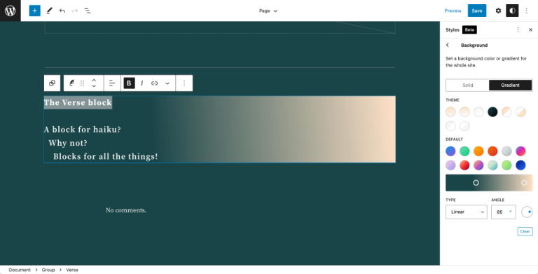
Fluid typography is a fancy way of “describing font properties, such as size or line height, that scale fluidly according to the size of the viewport”. It’s also known by other names, like responsive typography, flexible type, fluid type, viewport sized typography, fluid typography, and even responsive display text.
Here is an example of fluid typography that you can play live (courtesy of MDN documentation). CSS-Tricks has covered fluid typography extensively as well. But the point here is not to introduce you to fluid typography, but how to use it. More specifically, I want to show you how to implement fluid typography in WordPress 6.1 which recently introduced a fluid type feature directly in the WordPress Block Editor.
Open up your style.css file, slap in a style rule with fancy clamp()-ing on the font-size property, and good to go, right? Sure, that’ll give you fluid text, but to get Block Editor controls that make it possible to apply fluid type anywhere on your WordPress site? That requires a different approach in these block-ified days.
Fluid typography support in Gutenberg
Table of Contents
Some WordPress theme developers have been using the clamp() function to define a fluid font-size, in their WordPress themes, even in newer “block” themes such as Twenty Twenty-Two, Twenty Twenty-Three, and others.
But the Gutenberg plugin — the one that contains experimental development for WordPress Block and Site Editor features — introduced support for fluid typography starting in version 13.8. That opened the door for implementing at a theme level so that fluid type can be applied to specific elements and blocks directly in the Block Editor. CSS-Tricks was even given a shout-out in the Pull Request that merged the feature.
That work became part of WordPress Core in WordPress 6.1. Rich Tabor, one of the earlier advocates of fluid typography in the Block Editor says:
[Fluid typography] is also a part of making WordPress more powerful, while not more complicated (which we all know is quite the challenge). […] Fluid typography just works. Actually, I think it works great.
This Make WordPress post highlights the approach taken to support the feature at the block level so that a fluid font size is applied to blocks dynamically by default. There are some benefits to this, of course:
- It provides a way for theme authors to activate fluid typography without worrying about implementing it in code.
- It applies fluid typography to specific typographical entities, such as elements or blocks in a maintainable and reusable way.
- It allows flexibility in terms of font size units (e.g.
px,rem,em, and%).
Now that this new feature is available in the WordPress Block Editor by default, theme authors can apply uniform fluid typography without writing additional code.
Blocks that support typography and spacing settings
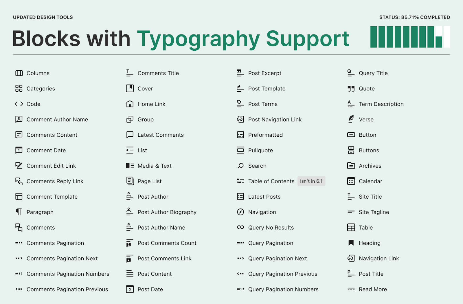
Gutenberg 14.1 released on September 16, 2022, and introduced typographic settings on a bunch of blocks. That means the text settings for those blocks were set in CSS before and had to be changed in CSS as well. But those blocks now provide font and spacing controls in the Block Editor interface.
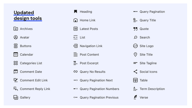
That work is currently slated to be added to WordPress 6.1, as detailed in this Make WordPress blog post. And with it is an expanded number of blocks that with typography support.
Declaring fluid type in a WordPress block theme
So, how do we put this new fluid typography to use in WordPress? The answer is in theme.json, a new-ish file specific to block themes that contains a bunch of theme configurations in key:value pairs.
Let’s look at a rule for a large font in theme.json where contentSize: 768px and we’re working with a widesize: 1600px layout. This is how we can specify a CSS font-size using the clamp() function:
"settings": { "appearanceTools": true, "layout": { "contentSize": "768px", "wideSize": "1600px" }, "typography": { "fontSizes": [ { "name": "Large", "size": "clamp(2.25rem, 6vw, 3rem)", "slug": "large" } ] }
}
As of WordPress 6.1, only rem, em and px units are supported.
That’s great and works, but with the new fluid type feature we would actually use a different approach. First, we opt into fluid typography on settings.typography, which has a new fluid property:
"settings": { "typography": { "fluid": true }
}
Then we specify our settings.fontSizes like before, but with a new fluidSize property where we can set the min and max size values for our fluid type range.
"settings": { "appearanceTools": true, "layout": { "contentSize": "768px", "wideSize": "1600px" }, "typography": { "fontSizes": [ { "size": "2.25rem", "fluidSize": { "min": "2.25rem", "max": "3rem" }, "slug": "large", "name": "Large" } ] }
}
That’s really it. We just added fluid type to a font size called “Large” with a range that starts at 2.25rem and scales up to 3rem. Now, we can apply the “Large” font to any block with font settings.
How does this works under the hood? Rich Tabor offers a nice explanation, as does this Pull Request in GitHub. In short, WordPress converts the theme.json properties into the following CSS rule:
.has-large-font-size { font-size: clamp(36px, calc(2.25rem + ((1vw - 7.68px) * 1.4423)), 48px);
}
…which is applied to the element, say a Paragraph Block:
<p class="has-large-font-size">...</p>Initially, I found it hard to understand and wrap around in my mind the concept of the CSS clamp() function without also learning about the min(), max(), and calc() functions. This calculator tool helped me quite a bit, especially for determining which values to use in my own theme projects.
For demonstration purposes, let’s use the calculator to define our font-size range so that the size is 36px at a 768px viewport width and 48px at a 1600px viewport width.
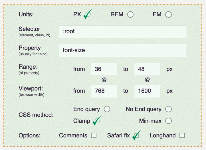
The calculator automatically generates the following CSS:
/* 36px @ 768px increasing to 48px @ 1600px */
font-size: clamp(36px, calc(2.25rem + ((1vw - 7.68px) * 1.4423)), 48px);
The calculator provide options to select input units as px, rem, and em. If we select rem unit, the calculator generates the following clamp() value:
/* 2.25rem @ 48rem increasing to 3rem @ 100rem */
font-size: clamp(2.25rem, calc(2.25rem + ((1vw - 0.48rem) * 1.4423)), 3rem);
So, those minimum and maximum values correspond to the the fluidSize.min and fluidSize.max values in theme.json. The min value is applied at viewports that are 768px wide and below. Then the font-size scales up as the viewport width grows. If the viewport is wider than 1600px, the max is applied and the font-size is capped there.
Examples
There are detailed testing instructions in the merged Pull Request that introduced the feature. There are even more testing instructions from Justin Tadlock’s pre-prelease post on Make WordPress.
Example 1: Setting a new fluid font setting
Let’s start with Justin’s set of instructions. I used in a modified version of the default Twenty Twenty-Three theme that is currently under development.
First, let’s make sure we’re running the Gutenberg plugin (13.8 and up) or WordPress 6.1, then opt into fluid type on the settings.typography.fluid property in the theme.json file:
{ "version": 2, "settings": { "appearanceTools": true, "layout": { "contentSize": "768px", "wideSize": "1600px" }, "typography": { "fluid": true } }
}
Now, let’s drop the settings.typography.fontSizes examples in there:
{ "version": 2, "settings": { "appearanceTools": true, "layout": { "contentSize": "768px", "wideSize": "1600px" }, "typography": { "fluid": true "fontSizes": [ { "name": "Normal", "size": "1.125rem", "fluid": { "min": "1rem", "max": "1.5rem" }, "slug": "normal" } ] } }
}
If everything is working correctly, we can now head into the WordPress Block Editor and apply the “Normal” font setting to our block:
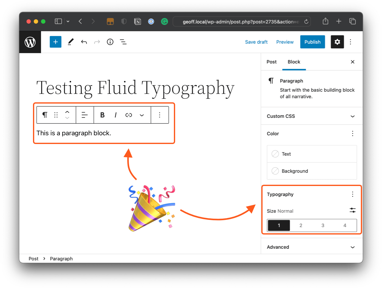
Nice! And if we save and inspect that element on the front end, this is the markup:

Very good. Now let’s make sure the CSS is actually there:

Good, good. Let’s expose that CSS custom property to see if it’s really clampin’ things:

Looks like everything is working just as we want it! Let’s look at another example…
Example 2: Excluding a font setting from fluid type
This time, let’s follow the instructions from the merged Pull Request with a nod to this example by Carolina Nymark that shows how we can disable fluid type on a specific font setting.
I used the empty theme as advised in the instructions and opened up the theme.json file for testing. First, we opt into fluid type exactly as we did before:
{ "version": 2, "settings": { "appearanceTools": true, "layout": { "contentSize": "768px", "wideSize": "1000px" }, "typography": { "fluid": true } }
}
This time, we’re working with smaller wideSize value of 1000px instead of 1600px. This should allow us to see fluid type working in an exact range.
OK, on to defining some custom font sizes under settings.typography.fontSizes:
{ "version": 2, "settings": { "typography": { "fluid": true, "fontSizes": [ { "size": ".875rem", "fluid": { "min": "0.875rem", "max": "1rem" }, "slug": "small", "name": "Small" }, { "size": "1rem", "fluid": { "min": "1rem", "max": "1.5rem" }, "slug": "normal", "name": "Normal" }, { "size": "1.5rem", "fluid": { "min": "1.5rem", "max": "2rem" }, "slug": "large", "name": "Large" }, { "size": "2.25rem", "fluid": false, "slug": "x-large", "name": "Extra large" } ] } }
}
Notice that we’ve applied the fluid type feature only on the “Normal”, “Medium”, and “Large” font settings. “Extra Large” is the odd one out where the fluid object is set to false.
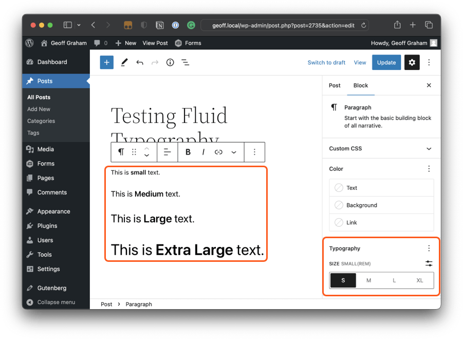
What WordPress does from here — via the Gutenberg style engine — is apply the properties we set into CSS clamp() functions for each font size setting that has opted into fluid type and a single size value for the Extra Large setting:
--wp--preset--font-size--small: clamp(0.875rem, 0.875rem + ((1vw - 0.48rem) * 0.24), 1rem);
--wp--preset--font-size--medium: clamp(1rem, 1rem + ((1vw - 0.48rem) * 0.962), 1.5rem);
--wp--preset--font-size--large: clamp(1.5rem, 1.5rem + ((1vw - 0.48rem) * 0.962), 2rem);
--wp--preset--font-size--x-large: 2.25rem;
Let’s check the markup on the front end:

Good start! Let’s confirm that the .has-x-large-font-size class is excluded from fluid type:

If we expose the --wp--preset--font-size--x-large variable, we’ll see it’s set to 2.25rem.

That’s exactly what we want!
Block themes that support fluid typography
Many WordPress themes already make use of the clamp() function for fluid type in both block and classic themes. A good example of fluid typography use is the recently released Twenty Twenty-Three default theme.
I’ve reviewed all the block themes from WordPress Block Theme directory, examining theme.json file of each theme and to see just how many block themes currently support fluid typography — not the new feature since it’s still in the Gutenberg plugin as of this writing — using the CSS clamp() function. Of the 146 themes I reviewed, the majority of them used a clamp() function to define spacing. A little more than half of them used clamp() to define font sizes. The Alara theme is the only one to use clamp() for defining the layout container sizes.
Understandably, only a few recently released themes contain the new fluid typography feature. But here are the ones I found that define it in theme.json:
And if you read my previous post here on CSS-Tricks, the TT2 Gopher Blocks theme I used for the demo has also been updated to support the fluid typography feature.
Selected reactions to the WordPress fluid typography features
Having fluid typography in WordPress at the settings level is super exciting! I thought I’d share some thoughts from folks in the WordPress developer community who have commented on it.
Matias Ventura, the lead architect of the Gutenberg project:
Rich Tabor:
As one of the bigger efforts towards making publishing beautifully rich pages in WordPress, fluid typography is a pretty big experience win for both the folks building with WordPress — and those consuming the content.
Automattic developer Ramon Dodd commented in the Pull Request:
Contrast that idea with font sizes that respond to specific viewport sizes, such as those defined by media queries, but do nothing in between those sizes.
theme.jsonalready allows authors to insert their own fluid font size values. This won’t change, but this PR offers it to folks who don’t want to worry about the implementation details.
Nick Croft, author of GenesisWP:
Brian Garner, designer and principal developer advocate at WPEngine:
A few developers think some features should be an opt-in. Jason Crist of Automattic says:
I love the power of fluid typography, however I also don’t believe that it should just be enabled by default. It’s usage (and the details of it) are important design decisions that should be made carefully.
You can also find a bunch more comments in the official testing instructions for the feature.
Wrapping up
The fluid typography feature in WordPress is still in active development at the time of this writing. So, right now, theme authors should proceed to use it, but with caution and expect some possible changes before it is officially released. Justin cautions theme authors using this feature and suggests to keep eye on the following two GitHub issues:
There is also still lots of ongoing work on typography and other design-related WordPress tools. If you’re interested, watch this typography tracking GitHub ticket and design tools related GitHub issues.
Resources
I used the following articles when researching fluid type and how WordPress is implementing it as a feature.


