Oftentimes in the past, I needed to figure out how to add styles to all elements inside the container but not the hovered one.
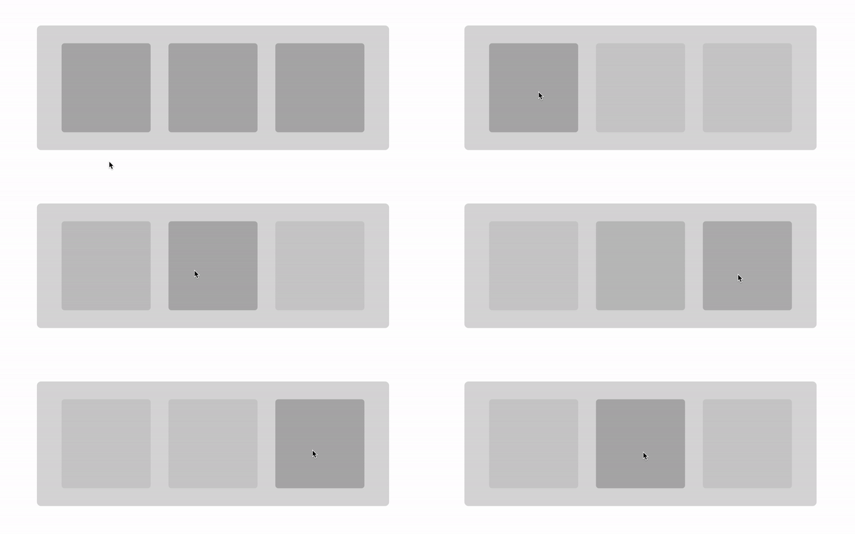
This effect requires selecting the siblings of a hovered element. I used to apply JavaScript for this, adding or removing the class that defined the proper CSS rules on mouseenter and mouseleave events, similar to this:
Although the code does the trick, my gut feeling always told me that there must be some pure-CSS way to achieve the same result. A few years ago, while working on a certain slider for my company, I came up with a solution similar to how Chris Geelhoed recreated the famous Netflix homepage animation and I understood that I didn’t need JavaScript for this anymore.
A couple of months ago I was trying to implement the same approach to a grid-based feed on my company website and — boom — it didn’t work because of the gap between the elements!
Luckily for me, it appeared that it doesn’t have to stay like this, and once again I didn’t need JavaScript for it.
Markup and base CSS
Table of Contents
Let’s start coding by preparing the proper markup:
.gridis a grid-based<ul>list;- and
.grid__childelements are<li>children that we want to interact with.
The markup looks like this:
<ul class="grid"> <li class="grid__child"></li> <li class="grid__child"></li> <li class="grid__child"></li>
</ul>
The style should look like this:
.grid { display: grid; grid-template-columns: repeat(auto-fit, 15rem); grid-gap: 1rem;
} .grid__child { background: rgba(0, 0, 0, .1); border-radius: .5rem; aspect-ratio: 1/1;
}
This example code will create three list items occupying three columns in a grid.
The power of CSS selectors
Now, let’s add some interactivity. The approach that I initially applied was based on two steps:
- hovering on the container should change the styles of all elements inside…
- …except the one that cursor is hovering at the moment.
Let’s start with grabbing every child while the cursor is hovering over the container:
.grid:hover .grid__child { /* ... */
}
Secondly, let’s exclude the currently hovered item and reduce the opacity of any other child:
.grid:hover .grid__child:not(:hover) { opacity: 0.3;
}
And this would be perfectly enough for containers without gaps between the child elements:
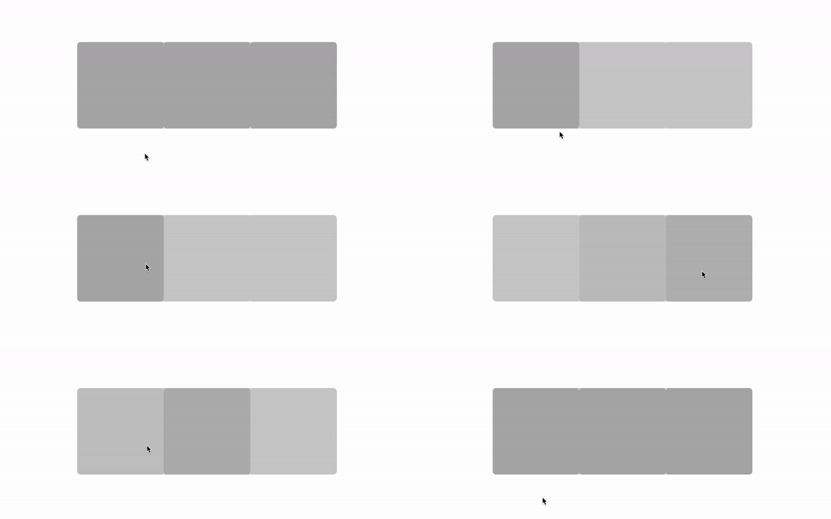
However, in my case, I couldn’t remove these gaps:
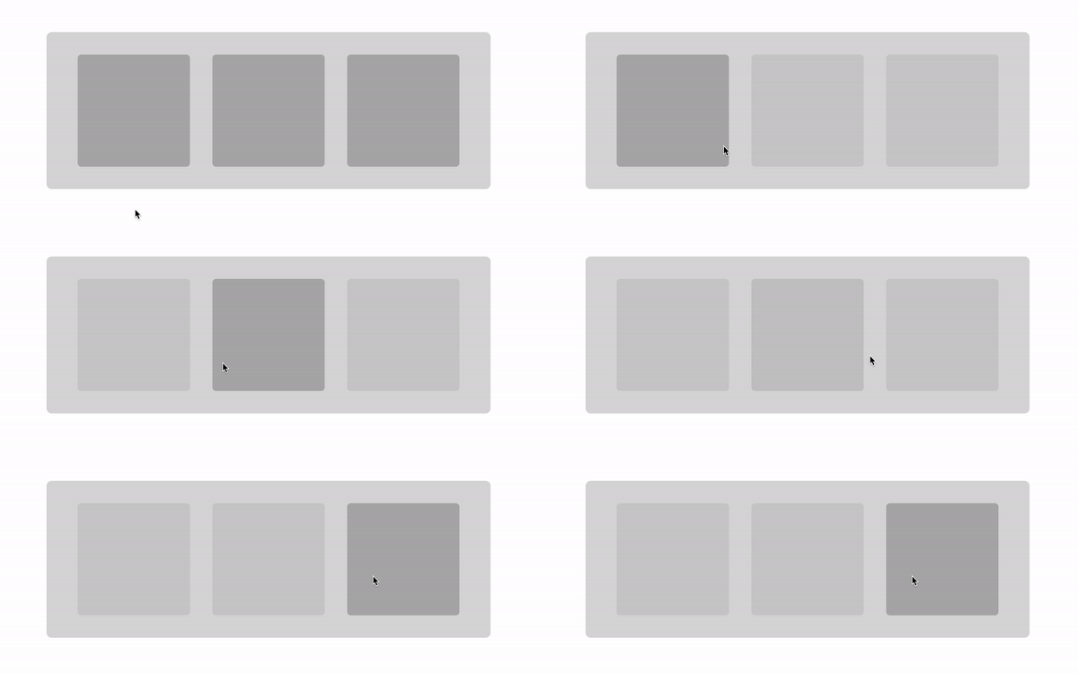
When I was moving the mouse between the tiles all of the children elements were fading out.
Ignoring the gaps
We can assume that gaps are parts of the container that are not overlayed by its children. We don’t want to run the effect every time the cursor enters the container, but rather when it hovers over one of the elements inside. Can we ignore the cursor moving above the gaps then?
Yes, we can, using pointer-events: none on the .grid container and bringing them back with pointer-events: auto on its children:
.grid { /* ... */ pointer-events: none;
} /* ... */ .grid__child { /* ... */ pointer-events: auto;
}
Let’s just add some cool transition on opacity and we have a ready component:
It’s probably even cooler when we add more tiles and create a 2-dimensional layout:
The final CSS looks like this:
.grid { display: grid; grid-template-columns: repeat(auto-fit, 15rem); grid-gap: 3rem; pointer-events: none;
} .grid:hover .grid__child:not(:hover) { opacity: 0.3;
} .grid__child { background: rgba(0, 0, 0, .1); border-radius: .5rem; aspect-ratio: 1/1; pointer-events: auto; transition: opacity 300ms;
}
With only 2 additional lines of code we overcame the gap problem!
Possible issues
Although it’s a compact solution, there are some situations where it might require some workarounds.
Unfortunately, this trick won’t work when you want the container to be scrollable, e.g., like in some kind of horizontal slider. The pointer-events: none style would ignore not only the hover event but all the others, too. In such situations, you can wrap the .grid in another container, like this:
<div class="container"> <ul class="grid"> <li class="grid__child"></li> <li class="grid__child"></li> <li class="grid__child"></li> <li class="grid__child"></li> <li class="grid__child"></li> <li class="grid__child"></li> <li class="grid__child"></li> </ul>
</div>
Summary
I strongly encourage you to experiment and try to find a simpler and more native approach for tasks that are usually expected to have some level of complexity. Web technologies, like CSS, are getting more and more powerful and by using out-of-the-box native solutions you can achieve great results without the need of maintaining your code and cede it to browser vendors.
I hope that you liked this short tutorial and found it useful. Thanks!
The author selected the Tech Education Fund to receive a donation as part of the Write for DOnations program.


