In the last article, we made a pretty cool little slider (or “carousel” if that’s what you prefer) that rotates in a circular direction. This time we are going to make one that flips through a stack of Polaroid images.
Cool right? Don’t look at the code quite yet because there’s a lot to unravel. Join me, will ya?
The basic setup
Most of the HTML and CSS for this slider is similar to the circular one we made last time. In fact, we’re using the exact same markup:
<div class="gallery"> <img src="" alt=""> <img src="" alt=""> <img src="" alt=""> <img src="" alt="">
</div>
And this is the basic CSS that sets our parent .gallery container as a grid where all the images are stacked one on top of one another:
.gallery { display: grid; width: 220px; /* controls the size */
}
.gallery > img { grid-area: 1 / 1; width: 100%; aspect-ratio: 1; object-fit: cover; border: 10px solid #f2f2f2; box-shadow: 0 0 4px #0007;
}
Nothing complex so far. Even for the Polaroid-like style for the images, all I’m using is some border and box-shadow. You might be able to do it better, so feel free to play around with those decorative styles! We’re going to put most of our focus on the animation, which is the trickiest part.
What’s the trick?
The logic of this slider relies on the stacking order of the images — so yes, we are going to play with z-index. All of the images start with the same z-index value (2) which will logically make the last image on the top of the stack.
We take that last image and slide it to the right until it reveals the next image in the stack. Then we decrease the image’s z-index value then we slide it back into the deck. And since its z-index value is lower than the rest of the images, it becomes the last image in the stack.
Here is a stripped back demo that shows the trick. Hover the image to activate the animation:
Now, imagine the same trick applied to all the images. Here’s the pattern if we’re using the :nth-child() pseudo-selector to differentiate the images:
- We slide the last image (
N). The next image is visible (N - 1). - We slide the next image (
N - 1). The next image is visible (N - 2) - We slide the next image (
N - 2). The next image is visible (N - 3) - (We continue the same process until we reach the first image)
- We slide the first image (
1). The last image (N) is visible again.
That’s our infinite slider!
Dissecting the animation
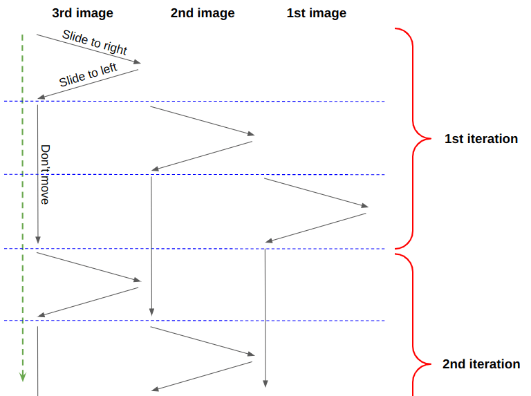
If you remember the previous article, I defined only one animation and played with delays to control each image. We will be doing the same thing here. Let’s first try to visualize the timeline of our animation. We will start with three images, then generalize it later for any number (N) of images.

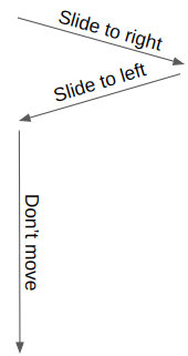
Our animation is divided into three parts: “slide to right”, “slide to left” and “don’t move”. We can easily identify the delay between each image. If we consider that the first image starts at 0s, and the duration is equal to 6s, then the second one will start at -2s and the third one at -4s.
.gallery > img:nth-child(2) { animation-delay: -2s; } /* -1 * 6s / 3 */
.gallery > img:nth-child(3) { animation-delay: -4s; } /* -2 * 6s / 3 */
We can also see that the “don’t move” part takes two-thirds of the whole animation (2*100%/3) while the “slide to right” and “slide to left” parts take one-third of it together — so, each one is equal to 100%/6 of the total animation.
We can write our animation keyframes like this:
@keyframes slide { 0% { transform: translateX(0%); } 16.67% { transform: translateX(120%); } 33.34% { transform: translateX(0%); } 100% { transform: translateX(0%); } }That 120% is an arbitrary value. I needed something bigger than 100%. The images need to slide to the right away from the rest of the images. To do that, it needs to move by at least 100% of its size. That’s why I went 120% — to gain some extra space.
Now we need to consider the z-index. Don’t forget that we need to update the image’s z-index value after it slides to the right of the pile, and before we slide it back to the bottom of the pile.
@keyframes slide { 0% { transform: translateX(0%); z-index: 2; } 16.66% { transform: translateX(120%); z-index: 2; } 16.67% { transform: translateX(120%); z-index: 1; } /* we update the z-order here */ 33.34% { transform: translateX(0%); z-index: 1; } 100% { transform: translateX(0% ); z-index: 1; } }Instead of defining one state at the 16.67% (100%/6) point in the timeline, we are defining two states at nearly identical points (16.66% and 16.67%) where the z-index value decreases before we slide back the image back to the deck.
Here’s what happens when we pull of all that together:
Hmmm, the sliding part seems to work fine, but the stacking order is all scrambled! The animation starts nicely since the top image is moving to the back… but the subsequent images don’t follow suit. If you notice, the second image in the sequence returns to the top of the stack before the next image blinks on top of it.
We need to closely follow the z-index changes. Initially, all the images have are z-index: 2. That means the stacking order should go…
Our eyes ???? --> 3rd (2) | 2nd (2) | 1st (2)We slide the third image and update its z-index to get this order:
Our eyes ???? --> 2nd (2) | 1st (2) | 3rd (1)We do the same with the second one:
Our eyes ???? --> 1st (2) | 3rd (1) | 2nd (1)…and the first one:
Our eyes ???? --> 3rd (1) | 2nd (1) | 1st (1)We do that and everything seems to be fine. But in reality, it’s not! When the first image is moved to the back, the third image will start another iteration, meaning it returns to z-index: 2:
Our eyes ???? --> 3rd (2) | 2nd (1) | 1st (1)So, in reality we never had all the images at z-index: 2 at all! When the images aren’t moving (i.e., the “don’t move” part of the animation) the z-index is 1. If we slide the third image and update its z-index value from 2 to 1, it will remain on the top! When all the images have the same z-index, the last one in the source order — our third image in this case — is on top of the stack. Sliding the third image results in the following:
Our eyes ???? --> 3rd (1) | 2nd (1) | 1st (1)The third image is still on the top and, right after it, we move the second image to the top when its animation restarts at z-index: 2:
Our eyes ???? --> 2nd (2) | 3rd (1) | 1st (1)Once we slide it, we get:
Our eyes ???? --> 3rd (1) | 2nd (1) | 1st (1)Then the first image will jump on the top:
Our eyes ???? --> 1st(2) | 3rd (1) | 2nd (1)OK, I am lost. All the logic is wrong then?
I know, it’s confusing. But our logic is not completely wrong. We only have to rectify the animation a little to make everything work the way we want. The trick is to correctly reset the z-index.
Let’s take the situation where the third image is on the top:
Our eyes ???? --> 3rd (2) | 2nd (1) | 1st (1)We saw that sliding the third image and changing its z-index keeps it on top. What we need to do is update the z-index of the second image. So, before we slide the third image away from the deck, we update the z-index of the second image to 2.
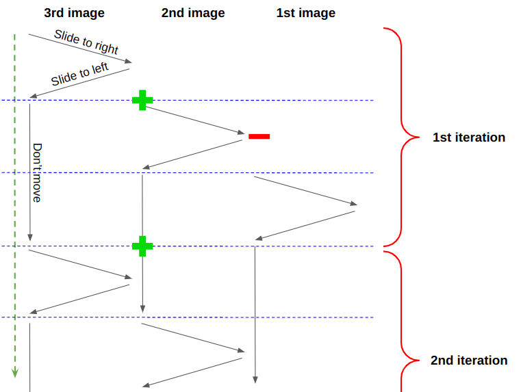
In other words, we reset the z-index of the second image before the animation ends.

The green plus symbol represents increasing z-index to 2, and the red minus symbol correlates to z-index: 1. The second image starts with z-index: 2, then we update it to 1 when it slides away from the deck. But before the first image slides away from the deck, we change the z-index of the second image back to 2. This will make sure both images have the same z-index, but still, the third one will remain on the top because it appears later in the DOM. But after the third image slides and its z-index is updated, it moves to the bottom.
This two-thirds through the animation, so let’s update our keyframes accordingly:
@keyframes slide { 0% { transform: translateX(0%); z-index: 2; } 16.66% { transform: translateX(120%); z-index: 2; } 16.67% { transform: translateX(120%); z-index: 1; } /* we update the z-order here */ 33.34% { transform: translateX(0%); z-index: 1; } 66.33% { transform: translateX(0%); z-index: 1; } 66.34% { transform: translateX(0%); z-index: 2; } /* and also here */ 100% { transform: translateX(0%); z-index: 2; } }A little better, but still not quite there. There’s another issue…
Oh no, this will never end!
Don’t worry, we are not going to change the keyframes again because this issue only happens when the last image is involved. We can make a “special” keyframe animation specifically for the last image to fix things up.
When the first image is on the top, we have the following situation:
Our eyes ???? --> 1st (2) | 3rd (1) | 2nd (1)Considering the previous adjustment we made, the third image will jump on the top before the first image slides. It only happens in this situation because the next image that moves after the first image is the last image which has a higher order in the DOM. The rest of the images are fine because we have N, then N - 1, then we go from 3 to 2, and 2 to 1… but then we go from 1 to N.
To avoid that, we will use the following keyframes for the last image:
@keyframes slide-last { 0% { transform: translateX(0%); z-index: 2;} 16.66% { transform: translateX(120%); z-index: 2; } 16.67% { transform: translateX(120%); z-index: 1; } /* we update the z-order here */ 33.34% { transform: translateX(0%); z-index: 1; } 83.33% { transform: translateX(0%); z-index: 1; } 83.34% { transform: translateX(0%); z-index: 2; } /* and also here */ 100% { transform: translateX(0%); z-index: 2; }
}
We reset the z-index value 5/6 through the animation (instead of two-thirds) which is when the first image is out of the pile. So we don’t see any jumping!
TADA! Our infinite slider is now perfect! Here’s our final code in all its glory:
.gallery > img { animation: slide 6s infinite;
}
.gallery > img:last-child { animation-name: slide-last;
}
.gallery > img:nth-child(2) { animation-delay: -2s; } .gallery > img:nth-child(3) { animation-delay: -4s; } @keyframes slide { 0% { transform: translateX(0%); z-index: 2; } 16.66% { transform: translateX(120%); z-index: 2; } 16.67% { transform: translateX(120%); z-index: 1; } 33.34% { transform: translateX(0%); z-index: 1; } 66.33% { transform: translateX(0%); z-index: 1; } 66.34% { transform: translateX(0%); z-index: 2; } 100% { transform: translateX(0%); z-index: 2; }
}
@keyframes slide-last { 0% { transform: translateX(0%); z-index: 2; } 16.66% { transform: translateX(120%); z-index: 2; } 16.67% { transform: translateX(120%); z-index: 1; } 33.34% { transform: translateX(0%); z-index: 1; } 83.33% { transform: translateX(0%); z-index: 1; } 83.34% { transform: translateX(0%); z-index: 2; } 100% { transform: translateX(0%); z-index: 2; }
}
Supporting any number of images
Now that our animation works for three images, let’s make it work for any number (N) of images. But first, we can optimize our work a little by splitting the animation up to avoid redundancy:
.gallery > img { z-index: 2; animation: slide 6s infinite, z-order 6s infinite steps(1);
}
.gallery > img:last-child { animation-name: slide, z-order-last;
}
.gallery > img:nth-child(2) { animation-delay: -2s; } .gallery > img:nth-child(3) { animation-delay: -4s; } @keyframes slide { 16.67% { transform: translateX(120%); } 33.33% { transform: translateX(0%); }
}
@keyframes z-order { 16.67%, 33.33% { z-index: 1; } 66.33% { z-index: 2; }
}
@keyframes z-order-last { 16.67%, 33.33% { z-index: 1; } 83.33% { z-index: 2; }
}
Way less code now! We make one animation for the sliding part and another one for the z-index updates. Note that we use steps(1) on the z-index animation. That’s because I want to abruptly change the z-index value, unlike the sliding animation where we want smooth movement.
Now that the code is easier to read and maintain, we have a better view for figuring out how to support any number of images. What we need to do is update the animation delays and the percentages of the keyframes. The delay are easy because we can use the exact same loop we made in the last article to support multiple images in the circular slider:
@for $i from 2 to ($n + 1) { .gallery > img:nth-child(#{$i}) { animation-delay: calc(#{(1 - $i)/$n}*6s); }
}
That means we’re moving from vanilla CSS to Sass. Next, we need to imagine how the timeline scale with N images. Let’s not forget that the animation happens in three phases:

After “slide to right” and “slide to left”, the image should stay put until the rest of the images go through the sequence. So the “don’t move” part needs to take the same amount of time as (N - 1) as “slide to right” and “slide to left”. And within one iteration, N images will slide. So, “slide to right” and “slide to left” both take 100%/N of the total animation timeline. The image slides away from the pile at (100%/N)/2 and slides back at 100%/N .
We can change this:
@keyframes slide { 16.67% { transform: translateX(120%); } 33.33% { transform: translateX(0%); }
}
…to this:
@keyframes slide { #{50/$n}% { transform: translateX(120%); } #{100/$n}% { transform: translateX(0%); }
}
If we replace N with 3, we get 16.67% and 33.33% when there are 3 images in the stack. It’s the same logic with the stacking order where we will have this:
@keyframes z-order { #{50/$n}%, #{100/$n}% { z-index: 1; } 66.33% { z-index: 2; }
}
We still need to update the 66.33% point. That’s supposed to be where the image resets its z-index before the end of the animation. At that same time, the next image starts to slide. Since the sliding part takes 100%/N, the reset should happen at 100% - 100%/N:
@keyframes z-order { #{50/$n}%, #{100/$n}% { z-index: 1; } #{100 - 100/$n}% { z-index: 2; }
}
But for our z-order-last animation to work, it should happen a bit later in the sequence. Remember the fix we did for the last image? Resetting the z-index value needs to happen when the first image is out of the pile and not when it starts sliding. We can use the same reasoning here in our keyframes:
@keyframes z-order-last { #{50/$n}%, #{100/$n}% { z-index: 1; } #{100 - 50/$n}% { z-index: 2; }
}
We are done! Here’s what we get when using five images:
We can add a touch of rotation to make things a bit fancier:
All I did is append rotate(var(--r)) to the transform property. Inside the loop, --r is defined with a random angle:
@for $i from 1 to ($n + 1) { .gallery > img:nth-child(#{$i}) { --r: #{(-20 + random(40))*1deg}; /* a random angle between -20deg and 20deg */ }
}
The rotation creates small glitches as we can sometimes see some of the images jumping to the back of the stack, but it’s not a big deal.
Wrapping up
All that z-index work was a big balancing act, right? If you were unsure how stacking order work before this exercise, then you probably have a much better idea now! If you found some of the explanations hard to follow, I highly recommend you to take another read of the article and map things out with pencil and paper. Try to illustrate each step of the animation using a different number of images to better understand the trick.
Last time, we used a few geometry tricks to create a circular slider that rotates back to the first image after a full sequence. This time, we accomplished a similar trick using z-index. In both cases, we didn’t duplicate any of the images to simulate a continuous animation, nor did we reach for JavaScript to help with the calculations.
Next time, we will make 3D sliders. Stay tuned!


