If you’ve ever worked on sites with lots of long-form text — especially CMS sites where people can enter screeds of text in a WYSIWYG editor — you’ve likely had to write CSS to manage the vertical spacing between different typographic elements, like headings, paragraphs, lists and so on.
It’s surprisingly tricky to get this right. And it’s one reason why things like the Tailwind Typography plugin and Stack Overflow’s Prose exist — although these handle much more than just vertical spacing.
Firefox supports :has() behind the layout.css.has-selector.enabled flag in about:config at the time of writing.
What makes typographic vertical spacing complicated?
Table of Contents
Surely it should just be as simple as saying that each element — p, h2, ul, etc. — has some amount of top and/or bottom margin… right? Sadly, this isn’t the case. Consider this desired behavior:
- The first and last elements in a block of long-form text shouldn’t have any extra space above or below (respectively). This is so that other, non-typographic elements are still placed predictably around the long-form content.
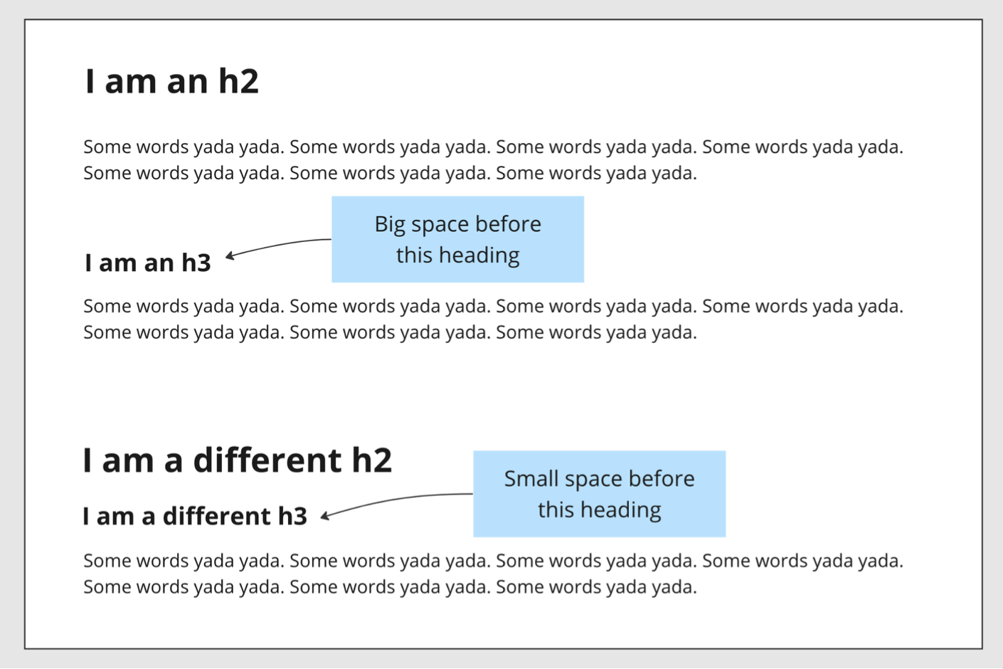
- Sections within the long-form content should have a nice big space between them. A “section” being a heading and all the following content that belongs to that heading. In practice, this means having a nice big space before a heading… but not if that heading is immediately preceded by another heading!

You need to look no further than right here at CSS-Tricks to see where this could come in handy. Here are a couple of screenshots of spacing I pulled from another article.


The traditional solution
The typical solution I’ve seen involves putting any long-form content in a wrapping div (or a semantic tag, if appropriate). My go-to class name has been .rich-text, which I think I use as a hangover from older versions of the Wagtail CMS, which would add this class automatically when rendering WYSIWYG content. Tailwind Typography uses a .prose class (plus some modifier classes).
Then we add CSS to select all typographic elements in that wrapper and add vertical margins. Noting, of course, the special behavior mentioned above to do with stacked headings and the first/last element.
The traditional solution sounds reasonable… what’s the problem?
Rigid structure
Having to add a wrapper class like .rich-text in all the right places means baking in a specific structure to your HTML code. That’s sometimes necessary, but it feels like it shouldn’t have to be in this particular case. It can also be easy to forget to do this everywhere you need to, especially if you need to use it for a mix of CMS and hard-coded content.
The HTML structure gets even more rigid when you want to be able to trim the top and bottom margin off the first and last elements, respectively, because they need to be immediate children of the wrapper element, e.g., .rich-text > *:first-child. That > is important — after all, we don’t want to accidentally select the first list item in each ul or ol with this selector.
Mixing margin properties
In the pre-:has() world, we haven’t had a way to select an element based on what follows it. Therefore, the traditional approach to spacing typographic elements involves using a mix of both margin-top and margin-bottom:
- We start by setting our default spacing to elements with
margin-bottom. - Next, we space out our “sections” using
margin-top— i.e. very big space above each heading - Then we override those big
margin-tops when a heading is followed immediately by another heading using the adjacent sibling selector (e.g.h2 + h3).
Now, I don’t know about you, but I’ve always felt it’s better to use a single margin direction when spacing things out, generally favoring margin-bottom (that’s assuming the CSS gap property isn’t feasible, which it is not in this case). Whether this is a big deal, or even true, I’ll let you decide. But personally, I’d rather be setting margin-bottom for spacing long-form content.
Collapsing margins
Because of collapsing margins, this mix of top and bottom margins isn’t a big problem per se. Only the larger of two stacked margins will take effect, not the sum of both margins. But… well… I don’t really like collapsing margins.
Collapsing margins are yet one more thing to be aware of. It might be confusing for junior devs who aren’t up to speed with that CSS quirk. The spacing will totally change (i.e. stop collapsing) if you were to change the wrapper to a flex layout with flex-direction: column for instance, which is something that wouldn’t happen if you set your vertical margins in a single direction.
I more-or-less know how collapsing margins work, and I know that they’re there by design. I also know they’ve made my life easier on occasion. But they’ve also made it harder other times. I just think they’re kinda weird, and I’d generally rather avoid relying on them.
The :has() solution
And here is my attempt at solving these issues with :has().
To recap the improvements this aims to make:
- No wrapper class is required.
- We’re working with a consistent margin direction.
- Collapsing margins are avoided (which may or may not be an improvement, depending on your stance).
- There’s no setting styles and then immediately overriding them.
Notes and caveats on the :has() solution
- Always check browser support. At time of writing, Firefox only supports :has() behind an experimental flag.
- My solution doesn’t include all possible typographic elements. For instance, there’s no
<blockquote>in my demo. The selector list is easy enough to extend though. - My solution also doesn’t handle non-typographic elements that may be present in your particular long-form text blocks, e.g.
<img>. That’s because for the sites I work on, we tend to lock down the WYSIWYG as much as possible to core text nodes, like headings, paragraphs, and lists. Anything else — e.g. quotes, images, tables, etc. — is a separate CMS component block, and those blocks themselves are spaced apart from each other when rendered on a page. But again, the selector list can be extended. - I’ve only included
h1for the sake of completeness. I usually wouldn’t allow a CMS user to add anh1via WYSIWYG, as the page title would be baked into the page template somewhere rather than entered in the CMS page editor. - I’m not catering for a heading followed immediately by the same level heading (
h2 + h2). This would mean that the first heading wouldn’t “own” any content, which seems like a misuse of headings (and, correct me if I’m wrong, but it might violate WCAG 1.3.1 Info and Relationships). I’m also not catering for skipped heading levels, which are invalid. - I am in no way knocking the existing approaches I mentioned. If and when I build another Tailwind site I’ll use the excellent Typography plugin, no question!
- I’m not a designer. I came up with these spacing values by eyeballing it. You probably could (and should) use better values.
Specificity and project structure
I was going to write a whole big thing here about how the traditional method and the new :has() way of doing it might fit into the ITCSS methodology… But now that we have :where() (the zero-specificity selector) you can pretty much choose your preferred level of specificity for any selector now.
That said, the fact that we’re no longer dealing with a wrapper — .prose, .rich-text, etc. — to me makes it feel like this should live in the “elements” layer, i.e. before you start dealing with class-level specificity. I’ve used :where() in my examples to keep specificity consistent. All the selectors in both of my examples have a specificity score of 0,0,1 (except for the bare-bones reset).
Wrapping up
So there you have it, a bleeding-edge solution to a very boring problem! This newer approach is still not what I’d call “simple” CSS — as I said at the beginning, it’s a more complex topic than it might seem at first. But aside from having a few slightly complex selectors, I think the new approach makes more sense overall, and the less rigid HTML structure seems very appealing.
If you end up using this, or something like it, I’d love to know how it works out for you. And if you can think of ways to improve it, I’d love to hear those too!


