Every restaurant today has its own website. Having a website is a great way for these restaurants to establish their digital presence. It’s also an opportunity for them to market themselves, their service, and the items they serve in their restaurants.
If you, too, are in the restaurant business, here are a few super helpful tips on how you can design a visually appealing website for it.
#1 Start with the Website’s Skeleton
Table of Contents
- 1 #1 Start with the Website’s Skeleton
- 2 #2 Visualize the Hero Section
- 3 #3 Incorporate Images of the Food and Beverages You Plan to Serve
- 4 #4 Keep a Separate Section on Your Website That Showcases Your Restaurant’s Menu
- 5 #5 Pick a Color Scheme Suited to Your Restaurant’s Theme or the Type of Food It Serves
Before you dive into the visuals of your restaurant’s website, you must first decide on the website’s skeleton. That means you have to plan what’s going to go on your website, the various sections and pages, the navigation or menu bar, how you’ll arrange the various sections of your website, and so on.
Start from the top. Think of how you’ll set the menu bar. Then, think of how the hero section will look. We’ll dive into the visual design of the hero section in the next point.
Afterward, draw the basic outline of the various sections on the landing page as well as the structures for your other pages. These pages can include your menu page, about us page, contact page, etc.
When designing the skeleton, keep user-friendliness in mind. This should always be your first priority here, as without a user-friendly skeleton and design, the website will not appeal to most people.
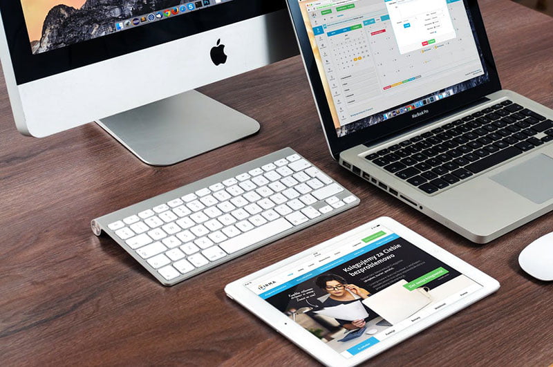
#2 Visualize the Hero Section
The hero section is the first section people will see when they visit your website. In most cases, it’s the section right below your website’s navigation or menu bar. Since it’s the section that will be most visible upon visiting the site, you must make it look as visually appealing as you can.
Your hero section should highlight your brand or restaurant’s identity. That means it’s the section that should summarize the experience people are to expect when they visit your restaurant in person.
This section should be colorful or even mild and minimalistic at times. It depends on your restaurant’s theme or style. You can highlight your restaurant’s ambiance here, along with some of the most popular dishes that you serve.
The hero section can change from time to time. For instance, you can highlight any new offers or discounts that are available during various times of the year. You can also use the section to introduce people to a new item on your menu.
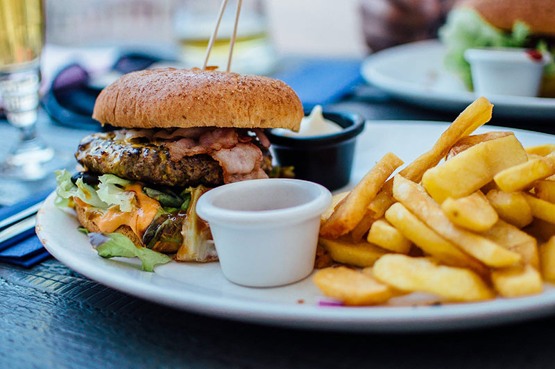
#3 Incorporate Images of the Food and Beverages You Plan to Serve
You should have pictures of all your food and beverages on your site. This should be ensured in the restaurant’s menu section on the site.
However, you need to highlight the more popular items. For that, these items should be more prominent on your site.
Your web designer will have a good idea regarding this if they, too, are local to the area your restaurant is based in. For instance, let’s say your restaurant is in Denver, Colorado. Lamb and Colorado-style pizzas are very popular there. Any top Denver web design agency will be aware of this too. They can then make these items’ pictures more prominent on the site if your restaurant serves them. The agency will also share its ideas about how you can make the most of this idea that will benefit your site’s visuals.
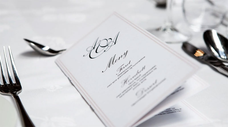
#4 Keep a Separate Section on Your Website That Showcases Your Restaurant’s Menu
Most people will be visiting your website to check your restaurant’s menu. Therefore, it’s only logical to have a separate page on the site dedicated to the menu.
The menu should be just as it is in print. The different types of foods and beverages should be segmented based on their types. Each item needs to have its picture displayed along with the respective prices. You can also include the quantity or number of servings you’re getting for that price.
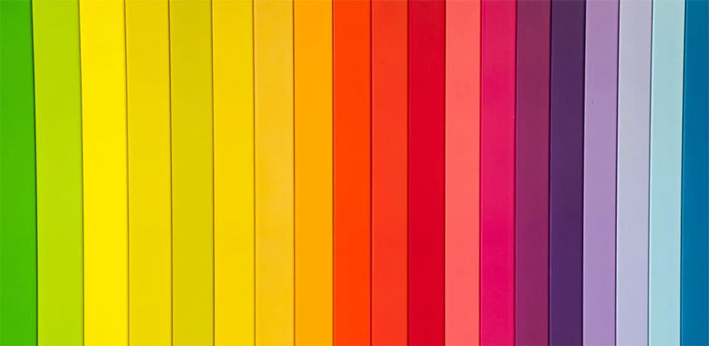
#5 Pick a Color Scheme Suited to Your Restaurant’s Theme or the Type of Food It Serves
The overall color scheme of the site should match your restaurant’s theme or style. If it’s a fine-dining restaurant or if you want to portray a classy vibe, you should opt for mild or single-tone colors. For a more outgoing style, the restaurant can have bright and flashy colors.
If you’re not sure how to pick the color scheme, ask your web designers to do it for you.
Designing your restaurant’s website doesn’t need to be that big of a hassle. As long as you know what you want to incorporate into it and have the right people working behind it, your restaurant’s website will turn out to be an amazing one.

