I was reading “Creative List Styling” on Google’s web.dev blog and noticed something odd in one of the code examples in the ::marker section of the article. The built-in list markers are bullets, ordinal numbers, and letters. The ::marker pseudo-element allows us to style these markers or replace them with a custom character or image.
::marker { content: url('/marker.svg') ' ';
}
The example that caught my attention uses an SVG icon as a custom marker for the list items. But there’s also a single space character (" ") in the CSS value next to the url() function. The purpose of this space seems to be to insert a gap after the custom marker.
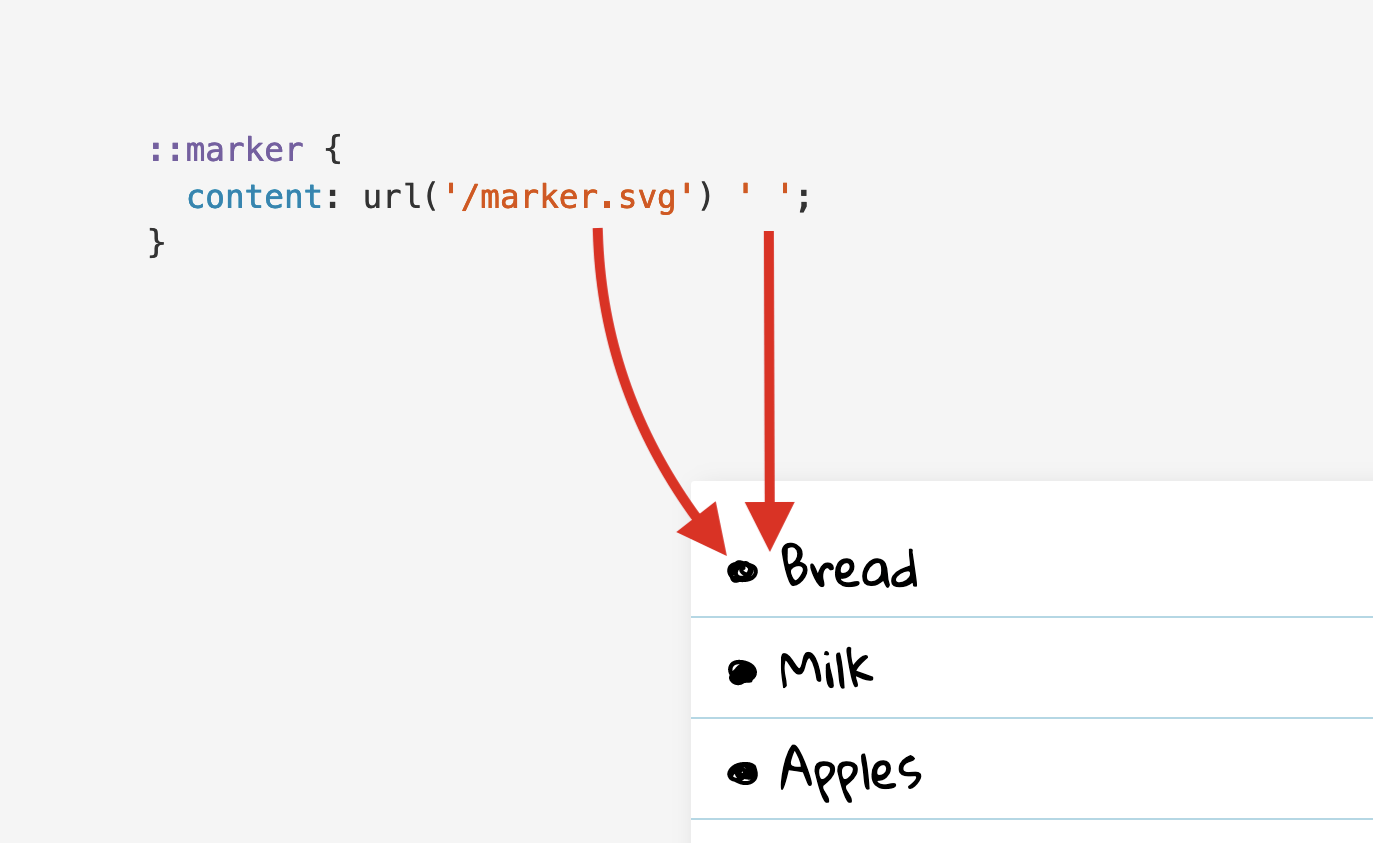
When I saw this code, I immediately wondered if there was a better way to create the gap. Appending a space to content feels more like a workaround than the optimal solution. CSS provides margin and padding and other standard ways to space out elements on the page. Could none of these properties be used in this situation?
First, I tried to substitute the space character with a proper margin:
::marker { content: url('/marker.svg'); margin-right: 1ch;
}
This didn’t work. As it turns out, ::marker only supports a small set of mostly text-related CSS properties. For example, you can change the font-size and color of the marker, and define a custom marker by setting content to a string or URL, as shown above. But the margin and padding properties are not supported, so setting them has no effect. What a disappointment.
Could it really be that a space character is the only way to insert a gap after a custom marker? I needed to find out. As I researched this topic, I made a few interesting discoveries that I’d like to share in this article.
Adding padding and margins
Table of Contents
First, let’s confirm what margin and padding do on the <ul> and <li> elements. I’ve created a test page for this purpose. Drag the relevant sliders and observe the effect on the spacing on each side of the list marker. Tip: Use the Reset button liberally to reset all controls to their initial values.
Note: Browsers apply a default padding-inline-left of 40px to <ol> and <ul> elements. The logical padding-inline-left property is equivalent to the physical padding-left property in writing systems with a left-to-right inline direction. In this article, I’m going to use physical properties for the sake of simplicity.
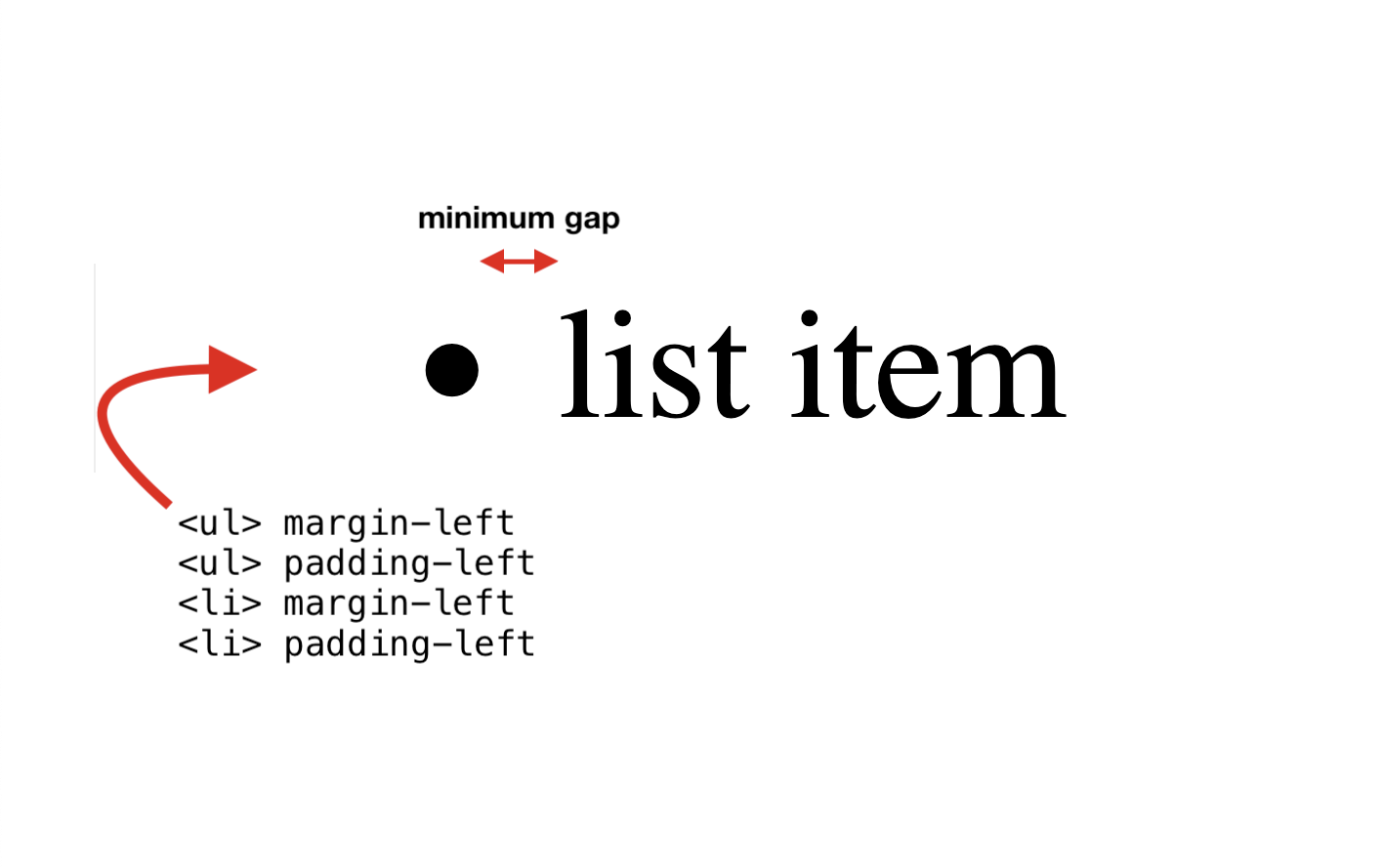
As you can see, padding-left on <li> increases the gap after the list marker. The other three properties control the spacing to the left of the marker, in other words, the indentation of the list item.
Notice that even when the list item’s padding-left is 0px, there is still a minimum gap after the marker. This gap cannot be decreased with margin or padding. The exact length of the minimum gap depends on the browser.
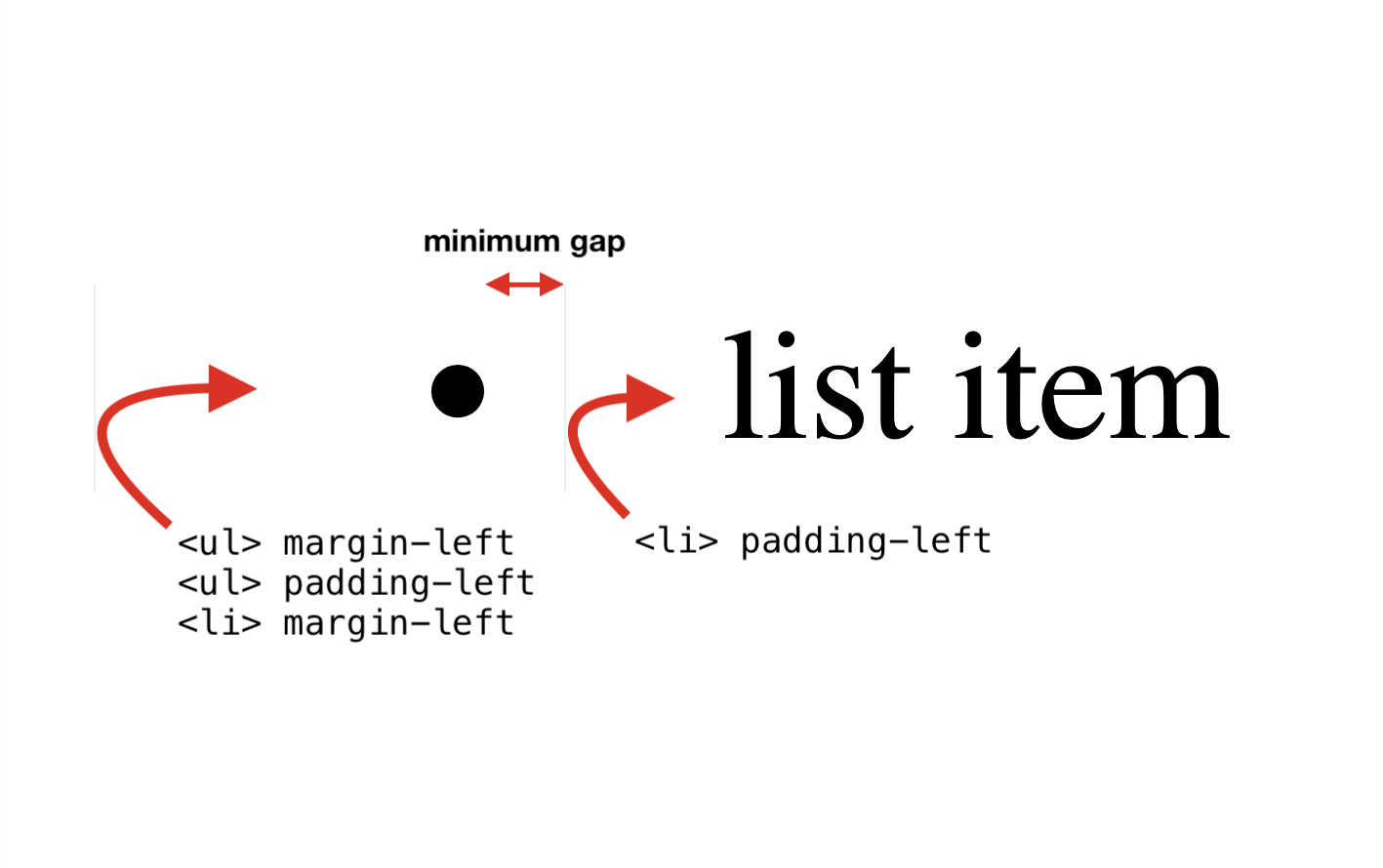
To sum up, the list item’s content is positioned at a browser-specific minimum distance from the marker, and this gap can be further increased by adding a padding-left to <li>.
Next, let’s see what happens when we position the marker inside the list item.
Moving the marker inside the list item
The list-style-position property accepts two keywords: outside, which is the default, and inside, which moves the marker inside the list item. The latter is useful for creating designs with full-width list items.
If the marker is now inside the list item, does this mean that padding-left on <li> no longer increases the gap after the marker? Let’s find out. On my test page, turn on list-style-position: inside via the checkbox. How are the four padding and margin properties affected by this change?
As you can see, padding-left on <li> now increases the spacing to the left of the marker. This means that we’ve lost the ability to increase the gap after the marker. In this situation, it would be useful to be able to add margin-right to the ::marker itself, but that doesn’t work, as we’ve established above.
Additionally, there’s a bug in Chromium that causes the gap after the marker to triple after switching to inside positioning. By default, the length of the gap is about one-third of the text size. So at a default font-size of 16px, the gap is about 5.5px. After switching to inside, the gap grows to the full 16px in Chrome. This bug affects the disc, circle, and square markers, but not ordinal number markers.
The following image shows the default rendering of outside and inside-positioned list markers across three major browsers on macOS. For your convenience, I’ve horizontally aligned all list items on their markers to make it easier to compare the differences in gap sizes.
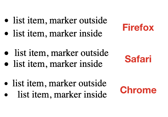
To sum up, switching to list-style-position: inside introduces two problems. We can no longer increase the gap via padding-left on <li>, and the gap size is inconsistent between browsers.
Finally, let’s see what happens when we replace the default list marker with a custom marker.
Switching to a custom marker
There are two ways to define a custom marker:
list-style-typeandlist-style-imagepropertiescontentproperty on the::markerpseudo-element
The content property is more powerful. For example, it allows us to use the counter() function to access the list item’s ordinal number (the implicit list-item counter) and decorate it with custom strings.
Unfortunately, Safari doesn’t support the content property on ::marker yet (WebKit bug). For this reason, I’m going to use the list-style-type property to define the custom marker. You can still use the ::marker selector to style the custom marker declared via list-style-type. That aspect of ::marker is supported in Safari.
Any Unicode character can potentially serve as a custom list marker, but only a small set of characters actually have “Bullet” in their official name, so I thought I’d compile them here for reference.
| Character | Name | Code point | CSS keyword |
|---|---|---|---|
| • | Bullet | U+2022 |
disc |
| ‣ | Triangular Bullet | U+2023 |
|
| ⁃ | Hyphen Bullet | U+2043 |
|
| ⁌ | Black Leftwards Bullet | U+204C |
|
| ⁍ | Black Rightwards Bullet | U+204D |
|
| ◘ | Inverse Bullet | U+25D8 |
|
| ◦ | White Bullet | U+25E6 |
circle |
| ☙ | Reversed Rotated Floral Heart Bullet | U+2619 |
|
| ❥ | Rotated Heavy Black Heart Bullet | U+2765 |
|
| ❧ | Rotated Floral Heart Bullet | U+2767 |
|
| ⦾ | Circled White Bullet | U+29BE |
|
| ⦿ | Circled Bullet | U+29BF |
Note: The CSS square keyword does not have a corresponding “Bullet” character in Unicode. The character that comes closest is the Black Small Square (▪️) emoji (U+25AA).
Now let’s see what happens when we replace the default list marker with list-style-type: "•" (U+2022 Bullet). This is the same character as the default bullet, so there shouldn’t be any major rendering differences. On my test page, turn on the list-style-type option and observe any changes to the marker.
As you can see, there are two significant changes:
- There is no longer a minimum gap after the marker.
- The bullet has become smaller, as if it were rendered at a smaller
font-size.
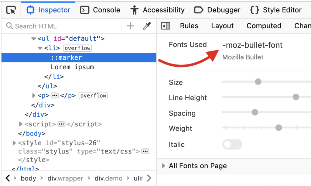
According to CSS Counter Styles Level 3, the default list marker (disc) should be “similar to • U+2022 BULLET”. It seems that browsers increase the size of the default bullet to make it more legible. Firefox even uses a special font, -moz-bullet-font, for the marker.
Can the small size problem be fixed with CSS? On my test page, turn on marker styling and observe what happens when you change the font-size, line-height, and font-family of the marker.
As you can see, increasing the font-size causes the custom marker to become vertically misaligned, and this cannot be corrected by decreasing the line-height. The vertical-align property, which could easily fix this problem, is not supported on ::marker.
But did you notice that changing the font-family can cause the marker to become bigger? Try setting it to Tahoma. This could potentially be a good-enough workaround for the small-size problem, although I haven’t tested which font works best across the major browsers and operating systems.
You may also have noticed that the Chromium bug doesn’t occur anymore when you position the marker inside the list item. This means that a custom marker can serve as a workaround for this bug. And this leads me to the main problem, and the reason why I started researching this topic. If you define a custom marker and position it inside the list item, there is no gap after the marker and no way to insert a gap by standard means.
- There is no minimum gap after custom markers.
::markerdoesn’t supportpaddingormargin.padding-lefton<li>doesn’t increase the gap, since the marker is positionedinside.
Summary
Here’s a summary of all the key facts that I’ve mentioned in the article:
- Browsers apply a default
padding-inline-startof40pxto<ul>and<ol>elements. - There is a minimum gap after built-in list markers (
disc,decimal, etc.). There is no minimum gap after custom markers (string or URL). - The length of the gap can be increased by adding a
padding-leftto<ul>, but only if the marker is positioned outside the list item (the default mode). - Custom string markers have a smaller default size than built-in markers. Changing the
font-familyon::markercan increase their size.
Conclusion
Looking back at the code example from the beginning of the article, I think I understand now why there’s a space character in the content value. There is just no better way to insert a gap after the SVG marker. It’s a workaround that is needed because no amount of margin and padding can create a gap after a custom marker that is positioned inside the list item. A margin-right on ::marker could easily do it, but that is not supported.
Until ::marker adds support for more properties, web developers will often have no choice but to hide the marker and emulate it with a ::before pseudo-element. I had to do that myself recently because I couldn’t change the marker’s background-color. Hopefully, we won’t have to wait too long for a more powerful ::marker pseudo-element.


