In this article, we’ll give a quick overview of the CSS overflow property, what its purpose is, and how we can use it to ensure our layouts work well on all devices and screen sizes.
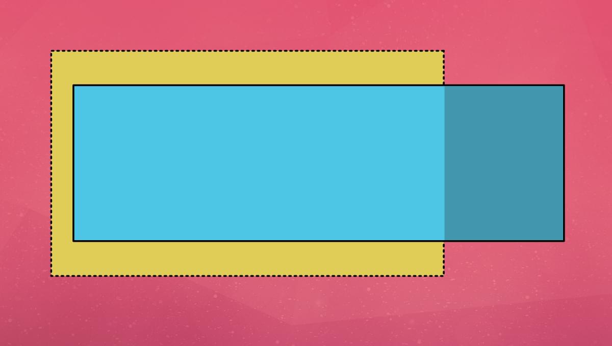
The CSS overflow property is used to control the visibility of content that overflows the boundaries of an HTML element. Overflow can occur when an element has a fixed width, height or content size, and the content inside the element is too large to fit within these constraints. When this happens, the extra content will flow outside the boundaries of the containing element, causing horizontal or vertical scrolling or overlapping content.
The following Pen shows an example of content that’s too wide for its container. No overflow properties have yet been set.
See the Pen CSS Overflow 1: no overflow property set by SitePoint (@SitePoint)
on CodePen.
CSS overflow allows us to control the visibility and behavior of the overflow content by providing four different values: visible, hidden, scroll, and auto.
How to use the CSS overflow property to control the visibility of overflowing content
Table of Contents
By default, the overflow property is set to visible, which means that any overflow content will be visible, even if it flows outside the boundaries of the containing element. This can cause overlapping, scrolling, and other issues.
To control the visibility of overflow content, you can set the overflow property to one of four possible values, which we’ll cover next.
1. Overflow visible
The visible value is the default value of the overflow property. When set to visible, any content that overflows the boundaries of the containing element will be visible, even if it flows outside the boundaries of the element. Additionally, no scrollbars will appear despite the content overflowing.
Here’s an example of using the visible value for the overflow property:
div { overflow: visible;
}
The following Pen demonstrates the effect of setting overflow: visible on the containing element. Nothing has changed from the original example.
See the Pen CSS Overflow 2: overflow visible by SitePoint (@SitePoint)
on CodePen.
The hidden value will hide any overflow content that flows outside the boundaries of the containing element. No scrollbars will appear or be necessary to access the hidden content. This can be useful when an element has specific size constraints, and any content that expands beyond those limits should not be visible.
Here’s an example of using the hidden value for the overflow property:
div { overflow: hidden;
}
The following Pen shows the effect of applying overflow: hidden to the container. The overflowing content is now not visible and can’t be accessed by the end user. So use this option with caution!
See the Pen CSS Overflow 3: overflow hidden by SitePoint (@SitePoint)
on CodePen.
3. Overflow scroll
The scroll value will add a scrollbar to the containing element if overflow content is present. This can be useful when you want to give users the ability to scroll through the overflowing content within a defined space.
Here’s an example of using the scroll value for the overflow property:
div { overflow: scroll;
}
The following Pen demonstrates what happens when we apply overflow: scroll to the containing element. Users can now scroll to the right to view the content that overflows the container.
See the Pen CSS Overflow 4: overflow scroll by SitePoint (@SitePoint)
on CodePen.
In the example above, notice also the use of overflow-y: hidden;, which is an extra option that hides the empty scroll bar to the right of the container. (Try removing it in the Pen to see the difference.)
We can set overflow to apply just in one direction by using the overflow-x or overflow-y properties instead of simply overflow, which applies overflow rules in both directions. In the examples shown in this article, content is only overflowing along the Y axis, so we could just use the overflow-y property in place of overflow.
4. Auto
The auto value will add a scrollbar to the containing element only if overflow content is present. The scrollbars will appear when the content is too large to fit within a defined space. When the content fits within the defined space, the scrollbars will be hidden, and the content will be visible.
Here’s an example of using the auto value for the overflow property:
div { overflow: auto;
}
The following Pen shows the effect of using overflow: auto on the containing element. In this simple example, the visual effect is the same as using overflow: scroll. But no scrollbar appears on the y-axis, as there’s no overflow in that direction.
See the Pen CSS Overflow 5: overflow auto by SitePoint (@SitePoint)
on CodePen.
Why is the CSS overflow property important for web development?
The CSS overflow property is an essential tool for web developers, allowing us to control the visibility and behavior of overflow content within an HTML element. This property ensures that the content flows properly within a defined space, avoiding issues such as overlapping, scrolling, or content that can’t be seen.
The overflow property also contributes to making responsive designs on different screen sizes. By controlling the visibility and behavior of overflow content, you can ensure that content appears as intended on devices with different screen sizes or resolutions.
Overall, the CSS overflow property is essential to ensuring that web content appears as intended on a wide range of devices, web browsers, and screen sizes.
Can CSS overflow be used to create responsive designs on different screen sizes?
Yes, the CSS overflow property can be used to create responsive designs on different screen sizes. By using the hidden or scroll values, we can ensure that content remains within defined boundaries, avoiding overlapping, scrolling, or content that can’t be seen.
We can also use the auto value to ensure that content appears as intended on devices with different screen sizes or resolutions. When the overflow property is set to auto, the scrollbars will appear when the content is too large to fit within the defined space, ensuring that users can access all content in the element.
When troubleshooting issues related to CSS overflow property, we should consider the following factors:
-
Ensure that the
overflowis set correctly for the element. -
Check to ensure that the element has the correct width, height or content size.
-
Examine the CSS code to ensure that there are no conflicting styles that could affect the
overflowsettings or the element’s size. -
Consider using browser developer tools to inspect the element and its properties. This can help us identify issues such as overlapping or incorrect size definitions.
By following these steps and testing the element on different devices, you can identify and resolve issues related to CSS overflow.
Conclusion
In conclusion, the CSS overflow property is an essential tool that allows us to control the visibility and behavior of content that has the potential to overflow the bounds of its container. This ensures that the content fits correctly into a defined space without issues such as overlapping or scrolling.
By harnessing the overflow property, web developers can create responsive designs on different screen sizes and resolutions, guaranteeing that their content looks great on any device or screen. Finally, troubleshooting issues related to CSS overflow can be done efficiently and effectively by considering the element’s size, the CSS code, and using browser developer tools.

