Advertisement
The Rocket League font is the perfect combo of style and adrenaline, and I’m stoked to explore it with you.
Take a look at this:
- Rocket League? High-octane fun, right?
- Typography: The heart and soul of our designs!
Alright, let’s lay out the game plan for this action-packed article:
- The origins of the Rocket League font
- The standout features that make it a design MVP
- Examples of the font scoring big time
- How to level up your designs with the Rocket League font
So, are you ready to jump into the turbo-charged world of typography inspired by one of the most exciting gaming experiences out there?
About Rocket League
Table of Contents
- 1 About Rocket League
- 2 Rocket League Logo: Meaning and History
- 3 Rocket League Logo Font
- 4 Use of the Rocket League Font
- 5 License Info
- 6 FAQs about the Rocket League font
- 6.1 What is the Rocket League font?
- 6.2 Where can I download the Rocket League font?
- 6.3 Is the Rocket League font free to use?
- 6.4 Can I use the Rocket League font for commercial projects?
- 6.5 What are the characteristics of the Rocket League font?
- 6.6 How can I install the Rocket League font on my computer?
- 6.7 What file types are available for the Rocket League font?
- 6.8 Does the Rocket League font support multilingual characters?
- 6.9 Are there any similar fonts to the Rocket League font?
- 6.10 Can the Rocket League font be used for merchandise or branding purposes?
- 7 Ending thoughts on the Rocket League font
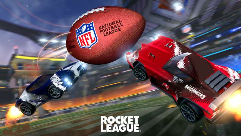
In a nutshell, Rocket League is a multiplayer computer game that borrows elements from both racing and soccer/football while creating a unique formula. On the one hand, there is the game’s “Racing” mode, which lets you drive a car around the track while performing jaw-dropping jumps thanks to your unique talents.
In addition, there are the traditional football/soccer rules, which require you to direct the ball to the “net,” score some goals and finish the game with a better result than the other team. Not to mention, if you’re a brand-new gamer, you can find the Rocket League logo on practically every gaming platform out there.
/*div{padding-right:0!important;padding-bottom:10px}.ml-form-formContent.horozintalForm .ml-button-horizontal{width:100%!important}.ml-form-formContent.horozintalForm .ml-button-horizontal.labelsOn{padding-top:0!important}}
/*]]>*/
/**/
![]()
Rocket League Logo: Meaning and History
The Rocket League’s visual identity has through two iterations of its logo, and it opted for minimalism. In contrast to the most recent revamp, which had a radically minimalistic design, the original emblem was the most intricate and colorful.
2014 – 2015
The cross-platform video game’s original logo was a complex geometric design with a top and bottom that resembled two rectangles placed on top of each other. A chrome frame encircled the full outside of the design. It was broad and substantial (in 3D). The icon’s primary area was tinted blue, and the icon and the text were placed on top of this background. Naturally, the racing car in the emblem was the main visual. It had big wheels and was white with beautiful details. The video game’s name appeared in large fonts in the text portion. In the upper register, it had a chic sans-serif at first.
2015 – 2020

The 2015 makeover included a new badge concept, which is still visible today albeit in a different form. It had a black logotype on a three-dimensional blue emblem with a white automobile image on it. Both phrases were capitalized and arranged one under the other in a bold, contemporary sans-serif typeface. A gradient gray sphere adorned the crest’s upper left corner. Along with the original form, there were also two flat monochrome variations with a white crest and a black artwork on it, or its opposite version.
2020 – Today
The logo was modified following Psyonix’s acquisition of Epic Games. This move to free-to-play was also impacted by the transition. The Octane shield is absent from the current version of the emblem. All graphic elements were eliminated as a result of the redesign so that the game’s name could take center stage. There isn’t even the slightest alteration made to the phrase “Rocket League.” As before, it is written in capital letters, painted in black, and made up of big, broad characters.
Rocket League Logo Font

The name is written in a Futura ExtraBold-like geometric chopped typeface. The letter “G” is the lone alternative. The other indicators are all the same. This font was developed by designer Paul Renner in 1927. The icon’s color scheme is fairly diverse and consists of a gray ball and a blue shield with white accents.
Futura ExtraBold consists with:
- Futura ExtraBold Compressed
- Futura ExtraBold Italic
- Futura ExtraBold Oblique
- Futura ExtraBold Outline
- Futura ExtraBold Shaded
The ideal typeface for all of your whimsical ideas is Futura ExtraBold. The Extra Bold font subfamily is used. The Futura ExtraBold can be used to make intriguing covers, shop and store names, and logos. In addition, the Futura ExtraBold typeface is ideal for branding tasks, home furnishings designs, product packaging, or just for chic text overlays on any background image.
The following logos, movie posters, album covers, etc., in addition to Rocket League, also feature the Futura typeface: Calvin Klein, Wedding Crashers, Cluedo Logo, Cosmopolis, Forza Horizon, Father of the Bride, Licence to Kill, Gravity, Dope Logo, Life of Pi, Native, Rage Valley, Ninja Assassin, The Wolf Among Us, PEGI Logo.
Advertisement
For the Rocket League wordmark, which consists of large geometric characters, designers created their own collection of glyphs. Other fonts that are similar but not identical Twentieth Century Ultra Bold, Gotham Bold/Heavy, and Akagi Pro Fat.
Gotham Bold Font
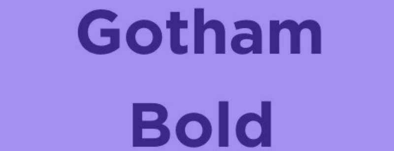
Only the foundation of a large family of fonts, the iconic Gotham typeface was inspired by the strong architectural capitals. Gotham is a strong and essential design that comes in four distinct widths and a variety of weights, as well as comprehensive character sets, extended language compatibility, and variations for various media. The same eight weights, from Thin to Ultra, are offered in both roman and italic for each of the Gotham family’s four widths. To ensure that each style has a heavier equivalent that gives the same level of emphasis, Gotham maintains visually consistent gaps between its weights.
Twentieth Century Ultra Bold

Between 1936 and 1947, Sol Hess created and drew Twentieth Century at the Lanston Monotype drawing department. The Monotype typeface library received its first weight in 1959. The geometric forms that served as the foundation for Twentieth Century began in Germany in the early 1920s and were fundamental to the Bauhaus movement at the time. The emphasis shifted from needless ornamentation to form and function.
It was most acceptable to use this simple sans-serif with geometric shapes. Text can be set using the softer weights of the Twentieth Century font family, while headlines and advertisements can be displayed using bold and condensed styles. It is frequently spelled 20th century.
Akagi Pro Font

The well-known Akagi typeface has been entirely rebuilt and expanded in Akagi Pro. The expansion continues to be described as modern, tidy, straightforward, and friendly. It adds more than 250 additional characters per weight, numerous new ligature options, expanded stylistic alternates, four sets of figures, new symbols, case-sensitive punctuation, superscripts, subscripts, ordinals, expanded language support, and two new styles that give the lighter weights of the family even more flexibility.
Use of the Rocket League Font
Creating movie posters, banners, posters, sports logos, titles, game graphics, game development, distinctive emblems, printing on fabrics, card printing, technical documentation, and much more is simple thanks to their striking appearance.
License Info
Please be advised that the Futura ExtraBold typeface is only available for personal use. For commercial use or any kind of support, you must, nevertheless, get in touch with the author.
FAQs about the Rocket League font
What is the Rocket League font?
The Rocket League font was designed specifically for use in the game’s logo and user interface. The modernity and boldness of the font’s design represent the game’s focus on fast-paced competition and cutting-edge technology.
Where can I download the Rocket League font?
Rocket League’s font is a proprietary design by the game’s maker, Psyonix, and as such, it is not distributed publicly. However, there are a number of similar typefaces that can be used as substitutes and are either freely accessible or can be purchased.
Is the Rocket League font free to use?
Since the Rocket League font is a Psyonix-owned proprietary font, the answer is no. The usage of this font calls for a license and approval from the manufacturer.
Can I use the Rocket League font for commercial projects?
Obtaining a license from Psyonix is necessary for any commercial use of the Rocket League font. Before putting any font to commercial use, be sure you understand the license requirements.
What are the characteristics of the Rocket League font?
The Rocket League font has the features of a contemporary, bold style from the future. It’s a versatile font that captures the spirit of the game’s fast-paced competition and cutting-edge technology.
How can I install the Rocket League font on my computer?
Rocket League uses a proprietary font designed and owned by Psyonix, making it impossible to download and install the font on your computer.
What file types are available for the Rocket League font?
Since Psyonix owns the rights to the Rocket League font, it cannot be downloaded in any other format. The company’s preferred format is the only one accepted.
Does the Rocket League font support multilingual characters?
Since it is intended primarily for English text, the Rocket League font does not contain any multilingual characters.
Are there any similar fonts to the Rocket League font?
You can also use the Eurostile typeface, which has a similarly bold and modern appearance to the Rocket League font, as an alternative.
Can the Rocket League font be used for merchandise or branding purposes?
Merchandise and other branding projects involving the Rocket League font must get a license from Psyonix. Before putting any font to commercial use, be sure you understand the license requirements.
Ending thoughts on the Rocket League font
There is nothing like Rocket League, despite the fact that many video games on the market rely (nearly) exclusively on multiplayer gameplay elements. The ability to play soccer or football without using your foot or even your hand is one of the game’s key elements. Instead, you can drive a car around an enclosed arena where you can drift and pick up speed to correctly hit the ball.
Rocket League has received favorable reviews and various honors. The game has a casual and competitive environment and has gained popularity on the streaming service Twitch.
Depending on the letters selected, the font style may change. The ideal typeface for all of your whimsical ideas is Futura ExtraBold. An excellent option for emphasizing your design components.
If you enjoyed reading this article about the Rocket League font, you should read these as well:
