Halloween is celebrated in different cultures around the globe and provides a big sales opportunity. If you are ready to embrace the dark side and use the holiday to your advantage, we are here to help. Today we are going to share with you the best practices and examples for Halloween emails.
While some people will put faces on pumpkins, adorn their halls with spooky decorations, and try on scary costumes, email marketers send email newsletters with scarily remarkable features, spooktacular deals, and devilishly pleasant atmospheres. It is that time of the year when you can have fun with your Halloween email newsletter and end up with a commercially lucrative venture.
Download free Halloween email templates.
So, discover best practices and examples for Halloween emails. Embrace the holiday season and enhance your email marketing campaigns with our expert tips and recommendations.
Halloween Email Tips and Examples
Table of Contents
Halloween Email Subject Line
First things first; you may have the best costume ever, but if you are unable to get neighbors to open their doors to see it, then it is worthless. In the email marketing universe, this means to create a subject line that will force contacts to click to see what is inside. It is a tie-breaker that decides whether you get a chance to impress or fail and come home with nothing.
Although general tips for creating high converting subject lines work, no one says that you should avoid spooky Halloween-themed keywords that may catch the eye of a subscriber in the email inbox. It is one of those holidays when people are more open to jokes and tricks. Therefore, use their relaxed and amiable mood and our best practices for Halloween subject lines.
No-Code Email Template Builder
With Postcards you can create and edit email templates online without any coding skills! Includes more than 100 components to help you create custom emails templates faster than ever before.
Try FreeOther Products
Keep It Short, Straightforward and Halloweeny
Remember, 30 to 50 characters is an optimal amount length for the subject line. Note that the first 38 characters are displayed regardless of the monitor size. On top of that, keep the message simple and straight to the point.
Finally, remember your goal. One might immediately associate your subject line with the spooky holiday. Therefore, add some creepy vibes inside by using Halloween-related email words. Need some good pitches? Then try out these fantastic short, straightforward, and Halloweeny headlines:
- No Tricks, Just Treats
- Screaming Deals
- Don’t Miss These Spooktacular Offers!
- KILLER Deals
- Find scary good offers
- Spooky Savings
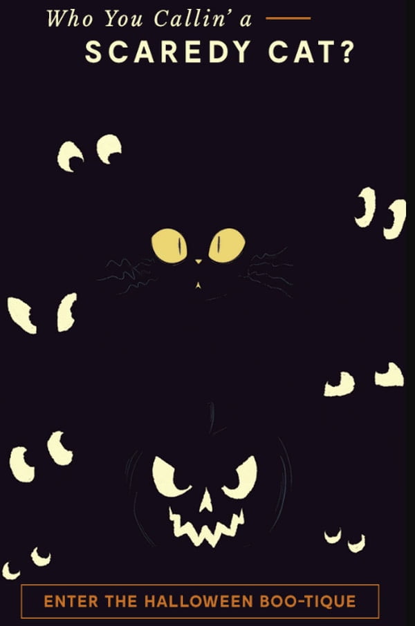
Modcloth
Use seasonal Halloween emojis

???? Ready to get spooky?
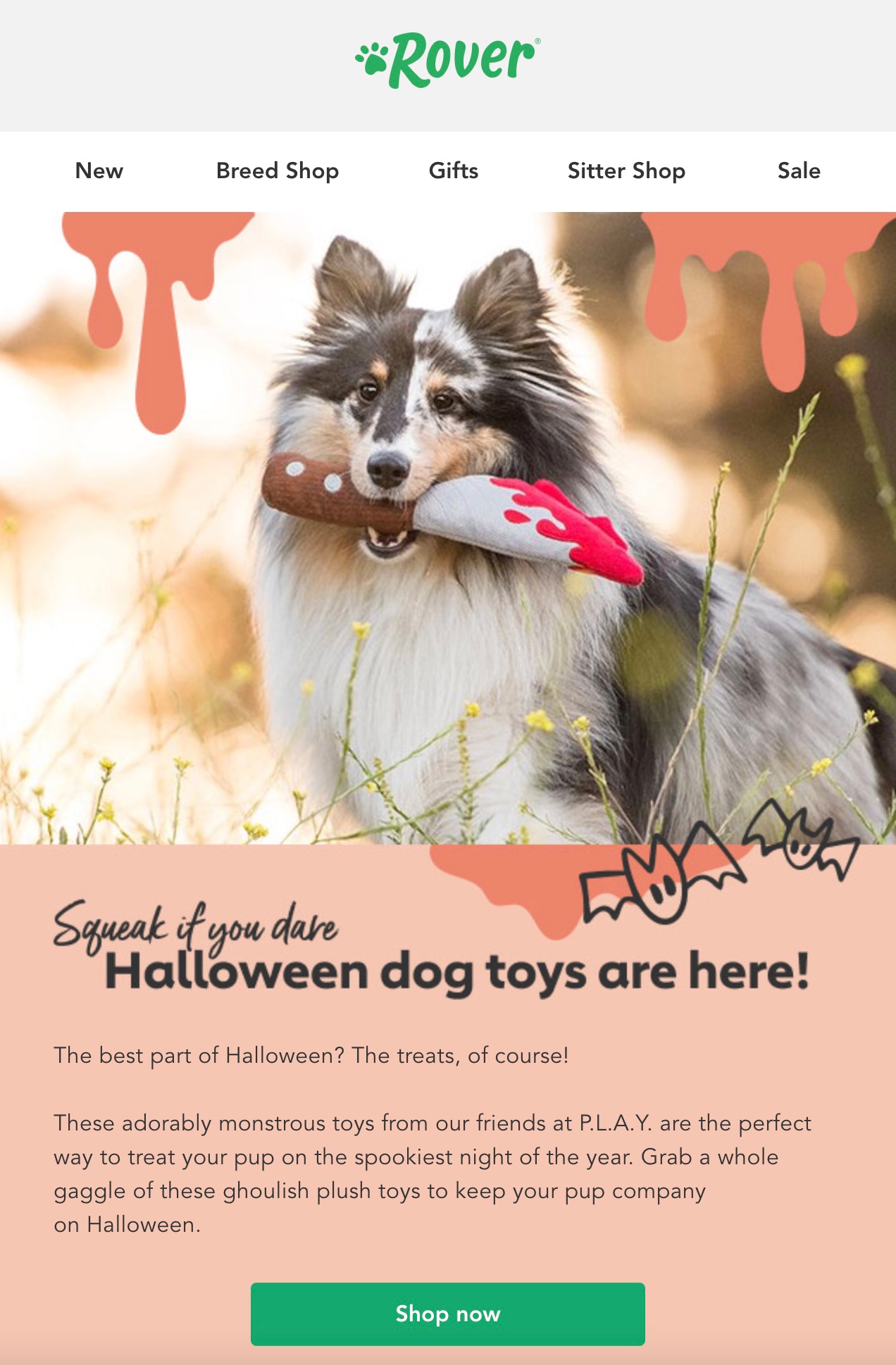
???? Halloween toys your dog will love ????
What better time to bring out your funny side than on Halloween? Practice your cleverness and wittiness with emojis. It is a universal language that delivers a message in an intuitive way and incorporates emotions. There are plenty of creepy small icons that exude the vibe of this holiday such as
- Jack-o-Lantern
- Skull
- Smiling Devil
- Superhero
- Magician
- And even candy and lollipop can do good for your short introduction
Besides, they will tie in perfectly to the spooky copy as well. Place them as small accents throughout the content or use them as a bullet list. However, do not overdo it. Your tone should be fun or smart or witty, but not juvenile.
Play with sender name
Halloween is a good time for jokes and of course, silly names. Show people that not only an email newsletter has the spirit of the All Saints’ Eve, but you are also in a holiday mood. It will undoubtedly bring subscribers to your side.
Stick to the relaxed tone of voice and change your name by adding some eerie but funny adjectives. For instance, you can add “–cula” or “-kenstein” to your name to sound more creepy yet still hilarious. You can also use puns by adapting parts of your name. For example, if you are Jennifer you can go for JenniFear.
Email design
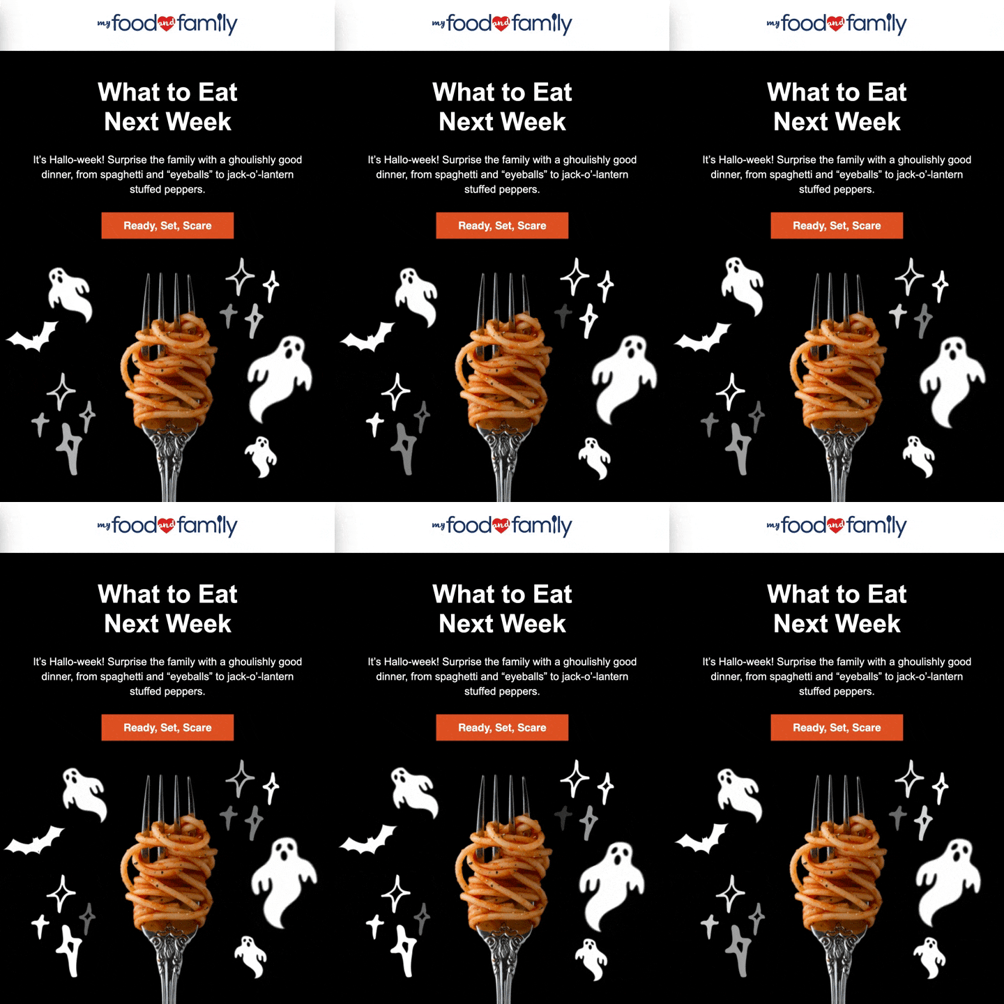
Even if you run a serious campaign and all your email newsletters stick to a formal tone, Halloween is a time when you can go a little bit crazy by getting off the beaten track and dressing your eblasts into spooky costumes. You can change one or two things to meet the mood of the trick-or-treating, or you can force every inch of your email design to scream Halloween.
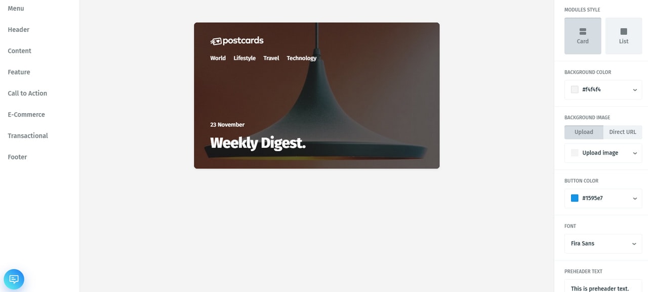
If you do not have time to build the design from scratch and you are looking for a quick yet viable solution to bring your idea into life, then you should address this issue to Postcards. The free HTML email template builder has an intuitive drag-and-drop interface and hundred of hand-crafted modules, and it can sort everything out in just a few magical clicks.
Colors
The first thing to do with your email newsletter is to choose the right color. Several options will help achieve the desired level of spookiness in your design. Let us consider the front-runners.
Black
Well, you can never go wrong with black color. It is so universal that it fits various occasions without hassle. And, this time it is the best of the best for doing this job. It goes perfectly with all those Halloween themes that are centered around witches, darkness, spooky shadows, cauldrons, and ghoulishness.
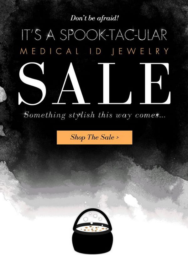
Udimi
Orange
Orange is our runner-up. It is one of the favorite colors of Halloween.
You can’t go wrong with it since orange color brings positive emotions wherever it can. What’s more, since chances are you will use one or two gourds for your decorations, these two perfectly go together and help get your Halloween email newsletter into the spirit.
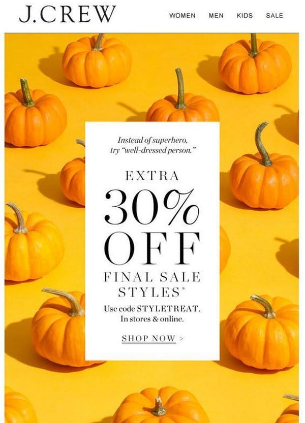
J.Crew
White
Another ideal partner in crime is white. While it may seem neutral on majority occasions, but when it comes to Halloween it associates with ghosts, ghouls, and spider webs.
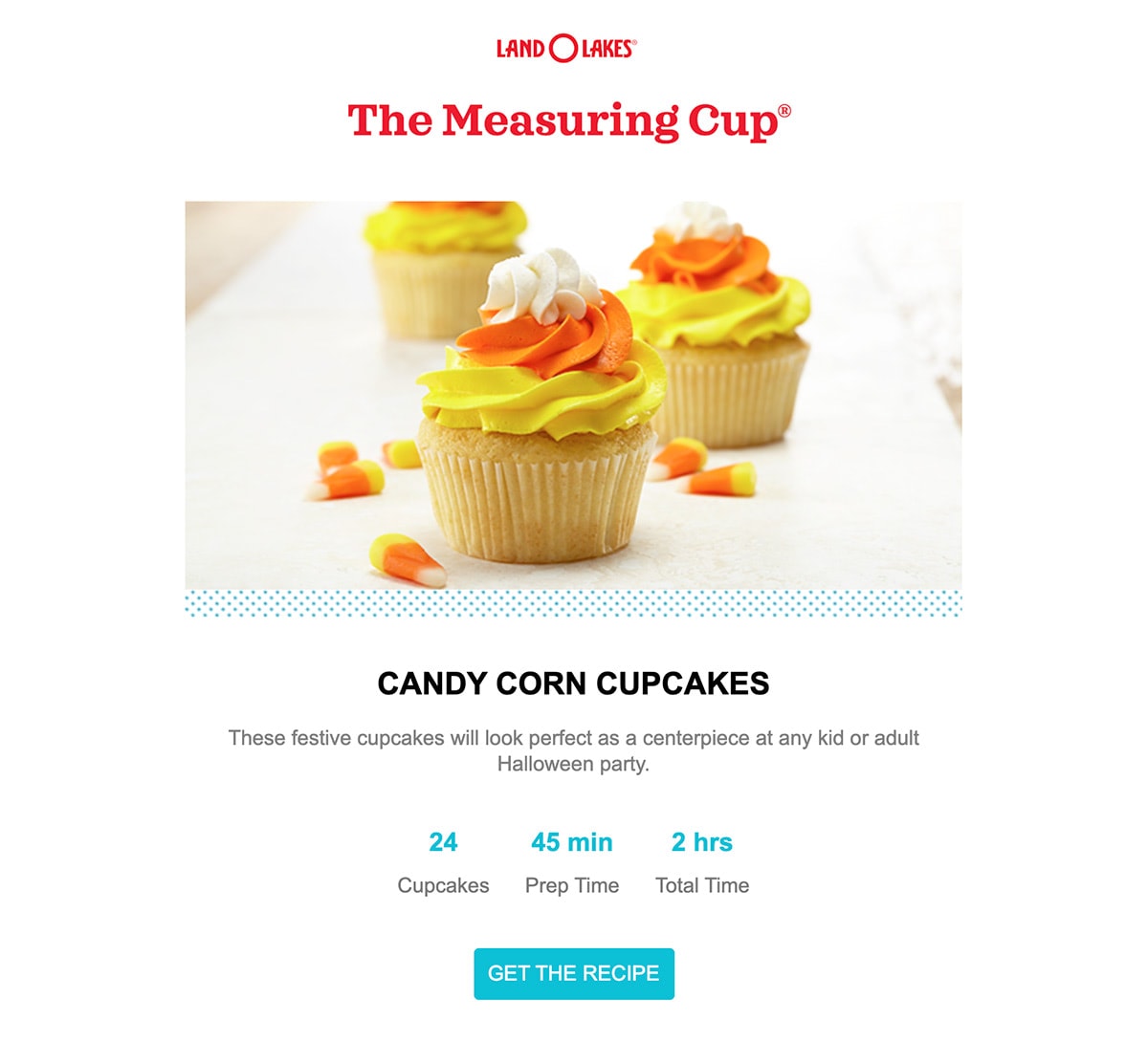
Land O’Lakes
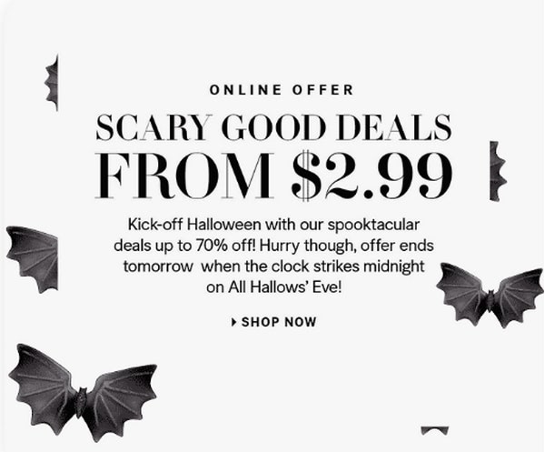
Ungapped
While all those color options are great for Halloweeny designs, however what if you want to stick to your corporate identity and use brand color schemes. It is not a problem since you can always adapt illustrations, images or even small decorative details to your needs, to say nothing about finding and working into newsletter animated gifs.
Images
If a color-coordinated design is not enough for achieving the desired result, you can always use spooky photos to establish a creepy but still light-hearted atmosphere. People scan then read; a well-thought-out picture delivers the message instantly.
Use pictures that feature Halloween-specific elements such as:
- Gourds/pumpkins
- People in costumes
- Black cats
- graveyards
- Decorated halls, etc.
Don’t overdo it. People do not like pools of blood in their inboxes. Stay positive and use humor. Also, remember to properly segment your audience to not stumble upon image-off users that won’t be able to appreciate your diligence.
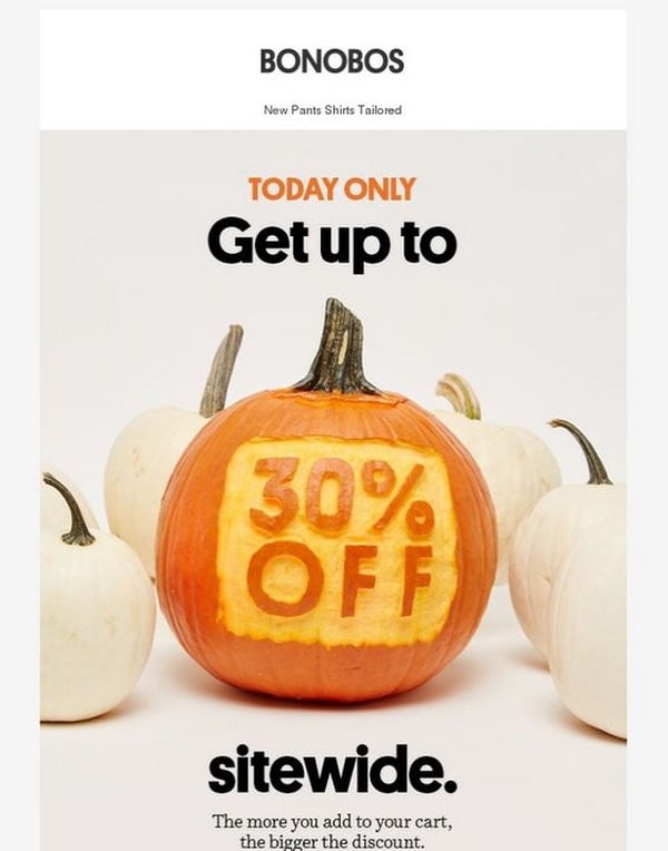
Bonobos
Illustrations
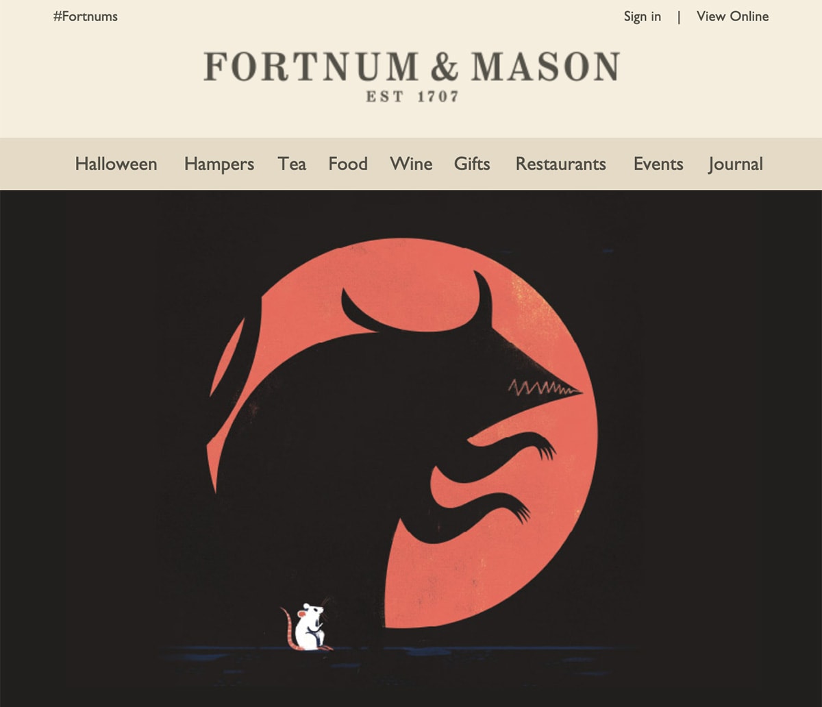
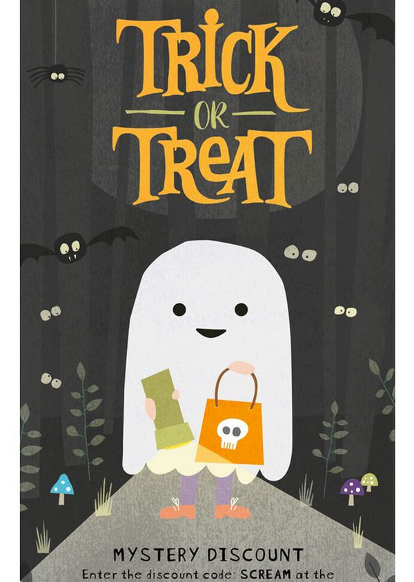
What always raises our pulse is images turned off, and art turned on. The more so, there is a whole variety of illustrations that fit the bill. It doesn’t have to be all about blood, devils, or zombies. Not only ghosts and vampires are associated with the holiday. How about children who are dressed up as superheroes, or a trick-or-treat bag that is filled with yummy chocolate bars and candies? Nothing says Halloween like this stuff:
- Pumpkins
- Black cats
- Candy
- Leaves
- Ghosts
- Costumes
- Gravestones
- Trick-or-treat bag
- Creepy forest trees
Use them as backgrounds to lay a foundation for the deal or as a tool for declaring an offer. You can go for various kinds of illustrations from raw sketches that work perfectly with cut-out pictures to gorgeous watercolor compositions that easily command attention.
Shop Halloween Treats
Whistlefish
Halloween Gifs
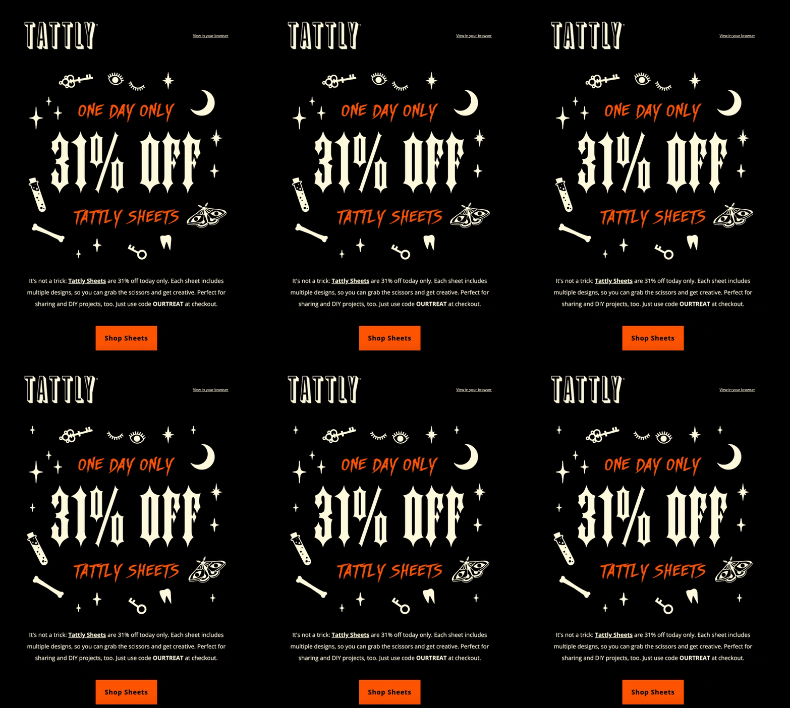
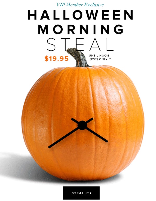
Taunt readers with dynamic content is a proven way to get the conversion juices flowing. Gifs are one of the most influential elements in email newsletter design that give your holiday metrics some oomph. They do have some limitations, but in a majority of cases, they work like a Swiss watch.
For instance, you can add:
- An animation of product to put an extra focus on the deal
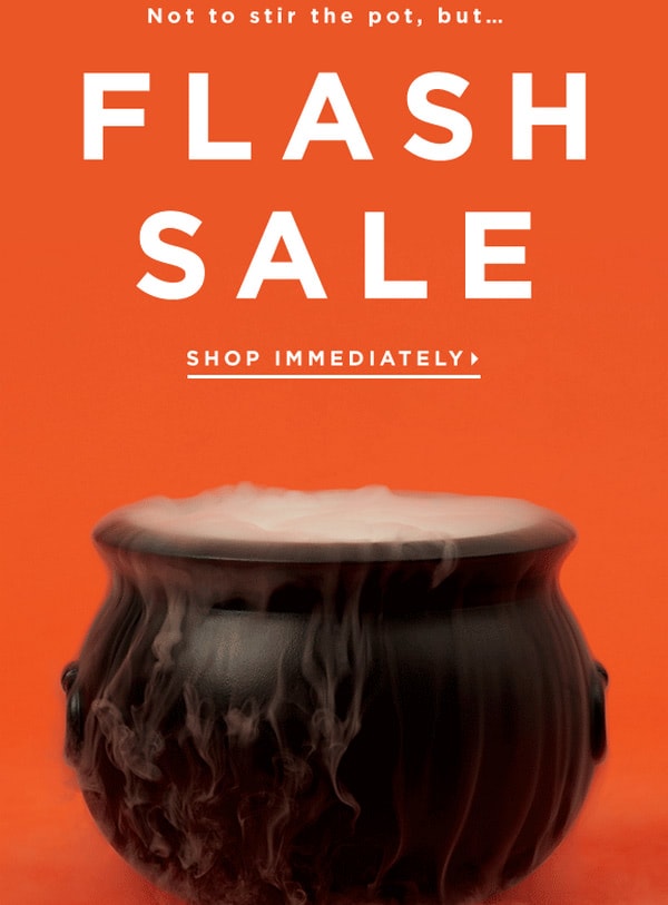
- An alive decoration like a floating ghost, flying bats or steaming cauldron
- Working clocks to stress out urgency, and much more
Taylor McKenzie
Loft
The Strategy
Halloween emails serve as a crucial part of seasonal marketing campaigns, allowing businesses to tap into the festive spirit and consumer willingness to spend during this period. These emails, often adorned with thematic graphics and spooky elements, aim at enticing customers with special offers, discounts, or exclusive Halloween-related products. They not only bolster engagement but also encourage a significant boost in sales, driving traffic both in-store and online.
Creating a sense of urgency through limited-time offers or exclusive Halloween deals can further fuel customer action. However, the effectiveness of Halloween emails heavily relies on their timing, relevancy, and the value they offer to the recipients. Moreover, integrating a personalized approach, like addressing the recipient by name or referencing past interactions, can significantly enhance the impact of these emails.
Expert opinion suggests that a well-strategized and creatively designed Halloween email campaign, that aligns with a brand’s identity and caters to the interests of its target audience, can considerably elevate customer engagement and result in a notable increase in sales during this season.
Well, let’s get down to business and drive some traffic using vigilantly-scheduled and well-thought-out campaigns.
The best way to turn the holiday to your advantage is to play heavy on traditions. It will help to engage subscribers, generate excitement, and lighten the mood. You can benefit from time-proven techniques. The path to success begins with the Halloween sneak peeks followed by a trick or treat campaign and finishing with an extended sale.
Halloween Email Example from Loft
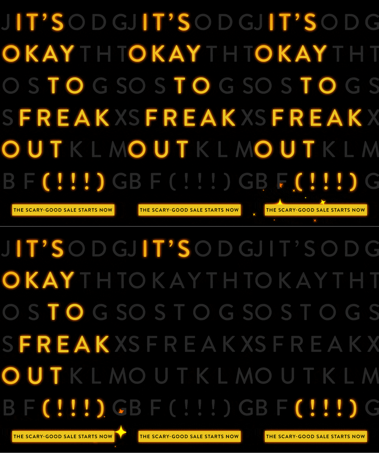
Loft sent out one of the simplest yet highly memorable Halloween email examples last year. How did they do this? Simple, they used the most significant trend in email marketing design, animated gif.
Though, that’s not all. They have also skillfully brought together in one place a minimalistic approach, entertaining part, and marketing trick, tying everything with a well-established Halloween atmosphere. The latter is realized with the help of a magical theme. Using gorgeous golden coloring and star-shaped graphical assets, the team melts the subscribers’ hearts rather than scare their pants off.
Note the language, message, and button. The language is friendly. “The scary-good sales” screams Halloween. The central phrase, “It is okay to freak out,” strengthens the holiday spirit. The call-to-action button, with its flawless design and witty saying, reinforces a sense of urgency and finishes off the entire composition, luring subscribers in. Brilliant.
Promotional Halloween Newsletter Example
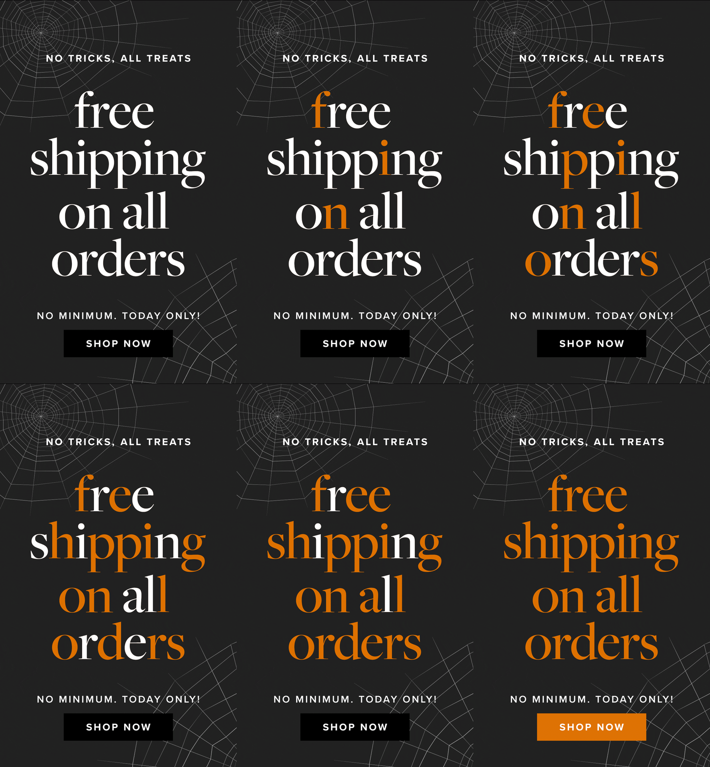
If you like the previous approach, you will undoubtedly appreciate this great Halloween newsletter example. It is based on the same idea. However, this time it is more down-to-earth because the team has decided to play with a creepy theme instead of a lovely magical one.
Spider web displayed on the background does its job perfectly: it gives the design a bit of scary feel but not that kind of frightening. The thing is the team did not overdo it. They just use a small Halloween detail that hints about the holiday. It is enough to get subscribers into the proper mood.
Again, this Halloween emails is made as an animated gif that plays a letter sequence. There is also a combo of the Halloweeny message, enjoyable entertaining element, and skillfully ingrained marketing trick.
Compact, simple, but effective.
Halloween Email Example from Pretty Dresses
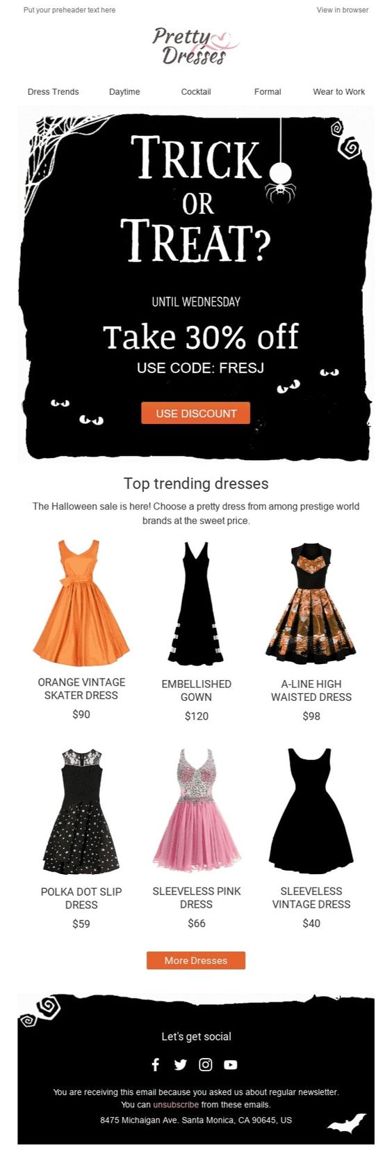
The team behind Pretty Dresses presents us with one of the popular solutions adopted in Halloween newsletter examples these days. Here you can see a holiday theme only partially. The team has added a festive banner to the hero area and related graphics to the footer leaving the central part for the product display. This way, the standard promotional email turns into a fantastic piece with a Halloween spirit.
Though, that’s not all. All the vital information, such as a discount, time frame, and code are revealed right there. This smart move helps the email set the right tone for the newsletter and ignite the subscriber’s interest right from the get-go.
This solution is increasingly popular among the companies that sell goods outside of the Halloween sector but want to grasp this retail opportunity. Here you can see how different dresses are skillfully aligned with the feast. They are not costumes, but it feels like they perfectly fit the occasion. Smart.
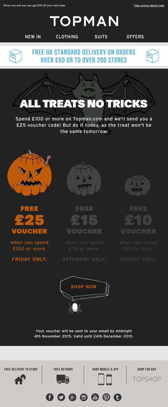
Halloween Newsletter Example from Topman
The Halloween newsletter example from Topman is planned to the smallest detail. Every inch of this design screams Halloween. Indeed, the well-thought-out illustrated approach can do magic. It always grabs the attention and brings people to your side because it is difficult to resist the power and charisma of creativity and the human touch inherent to this solution. Besides, it gives the e-blast a friendly vibe.
Note how the team has presented types of vouchers which you can get and call-to-action button. Scary pumpkins, coffin, spider: they are simply brilliant.
As for marketing tricks, they are also ably introduced. For example, the upper part of the email (that is the most viewed part) features the announcement of free delivery, whereas the sense of urgency sharpened right in the heart of the composition. Clever.
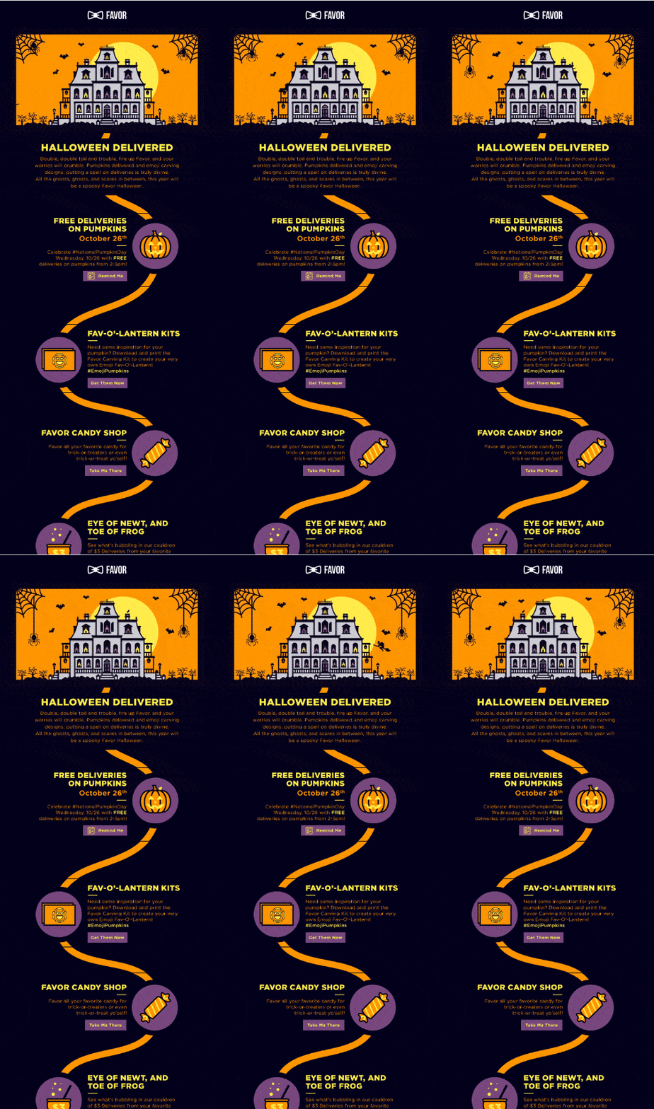
Halloween Email Example from Favor
Many brands adore the illustrated approach. Favor is one of them. Its team has replenished the collection of artistic Halloween email examples with an inspiring piece. They have delighted their subscribers with a storytelling experience that is nothing but delight.
This Halloween newsletter example brings value and a real pleasure to every subscriber. The team has included shopping incentive (free delivery) and useful content such as a link to Fav-o-lantern kits. This way, they drive traffic to the website and, at the same time, contribute to the relationships with the users.
Also, note the design. It is just incredible. The fancy scene with the haunted house is set in motion to produce a powerful effect. Icons, graphics, and typography are just what the doctor ordered.
Everything is just Spook-tacular.
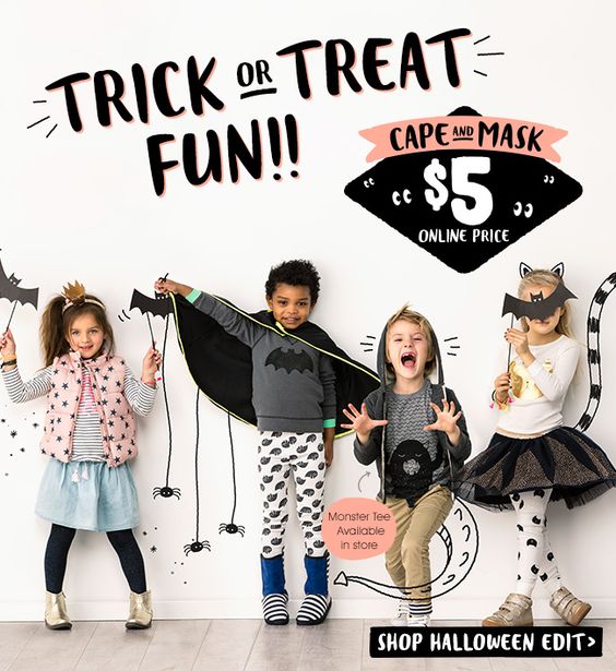
Halloween Newsletter Example from CottononKids
Let’s step away from the lavishly illustrated approach and move towards a clean and neat semi-realistic environment that is another popular option. Brands use it to align goods with the feast. Although it does not have such an artistic charisma, it easily beats anyone in the competition thanks to professional realization and creative ideas.
The Halloween newsletter example from Cottononkids shows this in practice. It has all the features of a high-converting holiday email that capitalizes on this solution:
- The message is strong and loud.
- The offer is attention-grabbing.
- The goods are in focus, looking pretty much desirable.
- The festive atmosphere penetrates every aspect of the design and brings the crowd closer to the brand.
This Halloween email example does not feel promotional. It looks like a cover of the voguish magazine that gives you advice on what to wear to look outstanding this October thereby unobtrusively foisting goods. Clever.

Holiday Scare – October Newsletter Example
Much like the previous Halloween newsletter example, this one also makes the most out of a realistic scene. However, unlike Cottononkids, the team has only used coloring to set the festive mood. Black does all the heavy lifting here. It has a mystery flair that separates the newsletter from the others. Also, it lets the company ensure a powerful businesslike vibe.
Note the goods that were picked. They also have a black color, even the key chain. While it may seem too much, but surprisingly it works here. The design does not feel gloomy or dull. On the contrary, it looks harmonious and simply fantastic.
As for the marketing side, each piece is accompanied by an old and new price that makes it a desirable deal. Also, right on the top, you can see two tricks. The first one is a sense of urgency established with the phrase “One Day Only.” The second one is a sense of exclusivity that is obtained with the words “Exclusive Savings.” Last but not least, call-to-action. It sits next to these two to invite warmed up subscribers to the website. Right in time. Smart.
Pre-Halloween Emails
According to statistics, strategies that butter up subscribers beforehand see more traffic than ones that are conducted one time. Therefore, an engagement program never hurts anybody. Generating excitement in advance helps to incentivize engagement among followers, keep subscribers hooked, and build brand loyalty.
Start sending Halloween sneak peeks right at the beginning of October and treat your contacts with multiple emails throughout the month.
Trick or Treat Campaigns
Who does not like trick-or-treating? When it comes to creating successful Halloween email marketing campaigns, there should not be any tricks. (All treats is preferred.)
This is the perfect opportunity to use reciprocity in your email newsletter. Give away something special — an exclusive offer, small gift, or free shipping. Treating is all about being generous.
What’s more, the general practice dictates to choose mystery sales over regular ones since they instantly drum up interest and fit the Halloween mood.
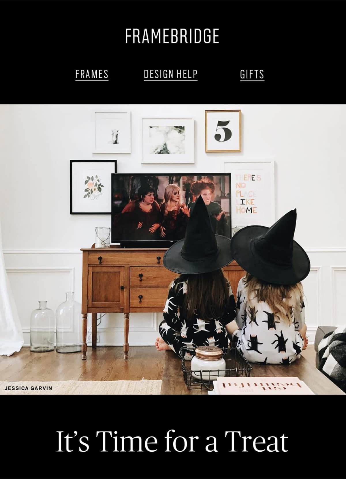
Framebridge
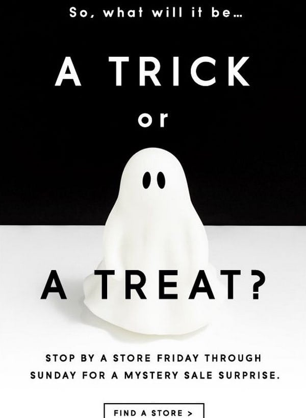
J.Crew Email Design
Extend Offers
Since Halloween can take place in the middle of the week, it is a good practice to extend sales by several days and grab the attention of users who were busy during workdays. Also, it may come as a pleasant surprise that will drive extra traffic to your website.
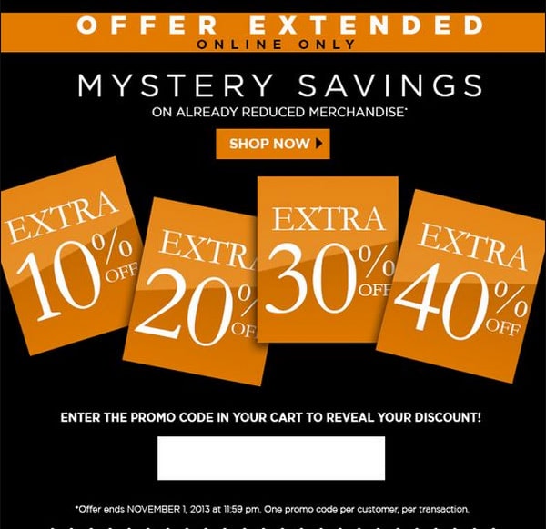
Brown shoes
Last, but not least
Although Halloween is a place to have fun, all the best practices of creating email marketing campaigns work here as well. Therefore, the fundamental things that you need to do to ensure success include:
- Clean your subscription list
- Segment audience
- Personalize subject line and copy
- Set the best timing
- Use psychological tricks
- Ensure your template works well across various devices and email readers
- Help new customers to finalize a purchase by using transactional emails
- Do A/B tests for subject lines and copy
- Review the performance of the last year’s campaign
Conclusion
Whatever sector you are in, do not miss a chance to keep contacts hooked and generate extra revenue. All you need is a good strategy and a relevant Halloween email that caters to subscribers’ needs.
What’s more, even if you do not plan to hold a sale this Halloween, it does not mean that you should not stop by and say “Hi!” Use a Halloween-themed email newsletter to extend the lifespan of consumer relationships, unobtrusively remind about your brand, and show your devotion to beloved subscribers.


