Web design has always drawn inspiration from print. Whether it’s content layouts, typography, or image placement, print is always a worthy point of reference given its longevity. Websites today continue to be inspired by print design, with many shifting to text content-heavy designs as opposed to the more visual approaches we have become so accustomed to. There’s also a rise in websites using a palette of simple blacks for typography and off-white for backgrounds.
In this article, we are going to showcase a selection of the finest recent examples of print-inspired website designs.
Your Web Designer Toolbox
Unlimited Downloads: 500,000+ Web Templates, Icon Sets, Themes & Design Assets
DOWNLOAD NOW
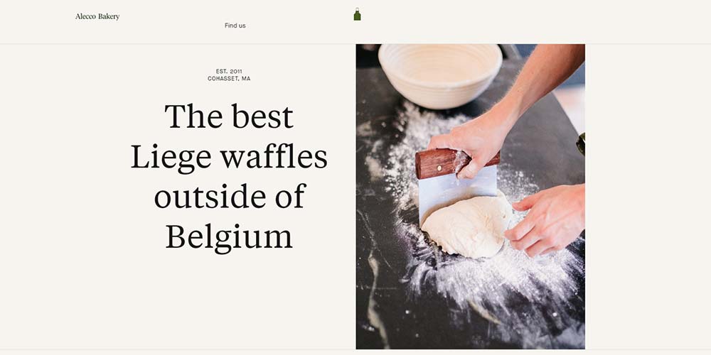
Using beautiful serif typography and muted background colors, Alecco Bakery has produced a simple design with great emphasis on the content and imagery.
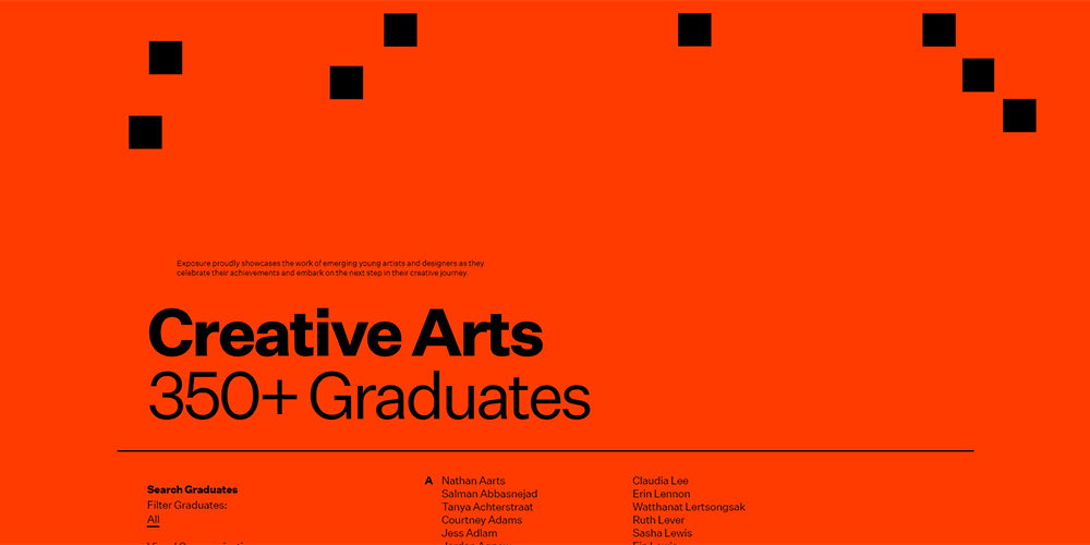
The website for Exposure Exhibition uses print-style divider lines, large headline typography, and a neat and structured column layout for content.
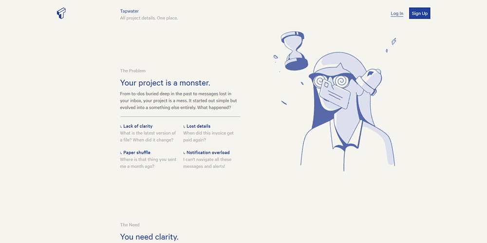
Another site that utilizes a muted, off-white background color, Tapwater also implements print-style divider lines and a structured column layout. The illustrations are simple and reminiscent of styles found in quality print publications and newspapers.
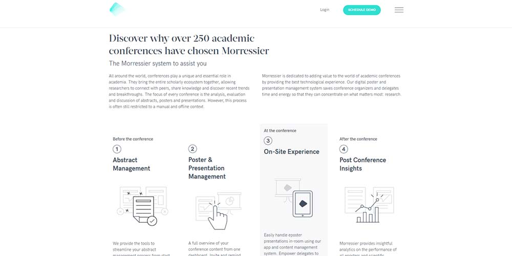
Morressier’s illustrations are simple, using just monochrome tones. It also uses a well-defined grid structure, akin to that of a newspaper publication.
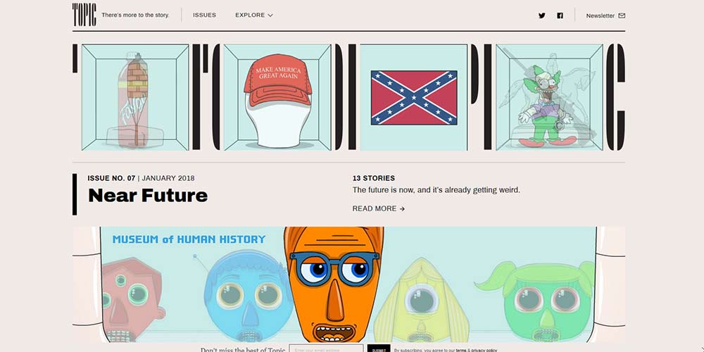
Topic’s light beige background color is contrasted with heavily-stylized imagery and emphatic vertical left borders to draw attention to content sections.
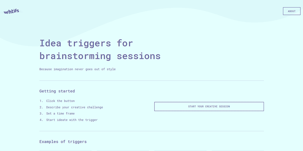
Whtifs uses a beautiful combination of mono typography with simplistic button styles and clearly ordered content with divider lines. It’s free of any imagery or illustration, providing a print-like document.
Smith Made Studio
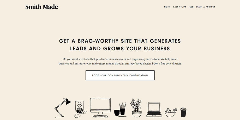
Using only black and white upon a beige backdrop, Smith Made keeps things both traditional and simple. It’s a website that could easily be mistaken for a print document at first glance, in part due to the serif typography, lack of color and hand-drawn illustration style.
This post may contain affiliate links. See our disclosure about affiliate links here.