With tens of thousands of websites launching online every day, the need to stand out has never been more important.
From a visual standpoint, web designers have most recently been enhancing their website designs through the use of bright colors and graphics.
It is important that this is done carefully and with precision, since the use of bright colors can pose some potential issues, namely with contrast and garish colors which can be unpleasurable to look at.
Below, I have rounded up some of the very best bright and colorful website designs on the web today.
Your Web Designer Toolbox
Unlimited Downloads: 500,000+ Web Templates, Icon Sets, Themes & Design Assets
Table of Contents

DOWNLOAD NOW![]()
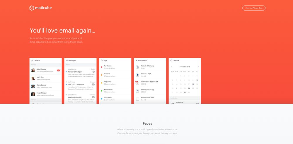
Mailcube
Mailcube integrates a vibrant header background with beautiful, minimal typography and product screenshots.
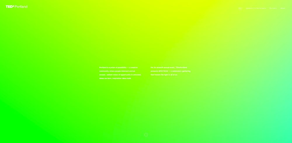
TedXPortland
TedXPortland truly pushes the boundaries of bright color usage in web design. The visually impressive gradients contain only a small chunk of text to compensate for any potential readability issues.
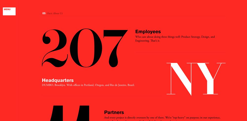
Work&Co
Work&Co uses a bold red with a highly effective combination of black and white serif text. The large type adds emphasis and contributes heavily to the fantastic web design.
Baianat
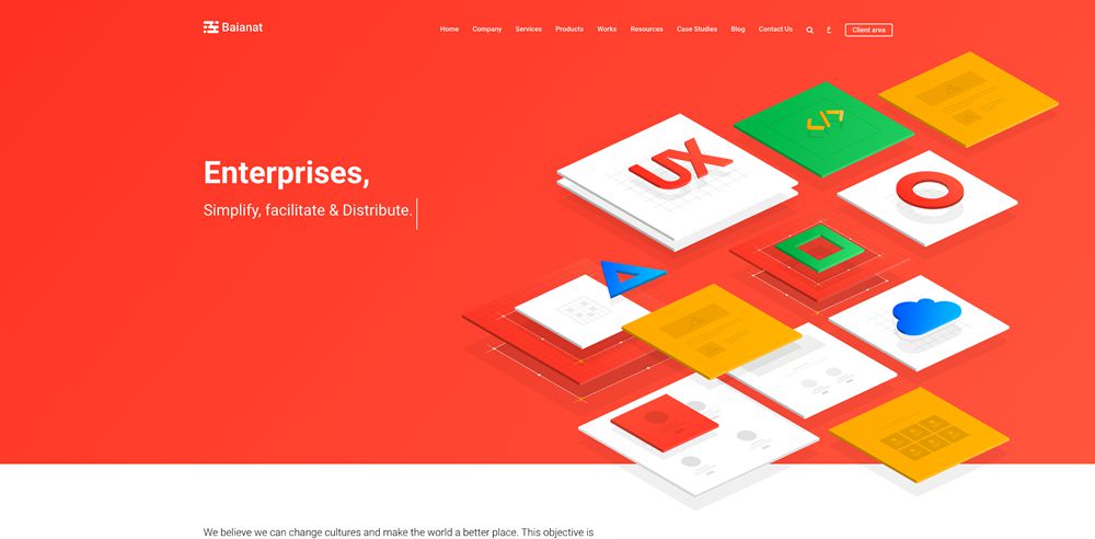
Baianat combines a bold header background with some unique and colorful perspective icon designs. The result is bold, but not overly in-your-face. The white provides some relief from the bright hero section.
aparto
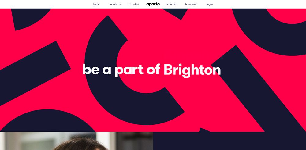
Aparto uses some incredibly bold graphics and harsh colors in contrast against similarly bold typography. The graphics are eye-catching and stand out. The result is on-brand, exciting, and calls for the user’s attention.
Stripe Connect
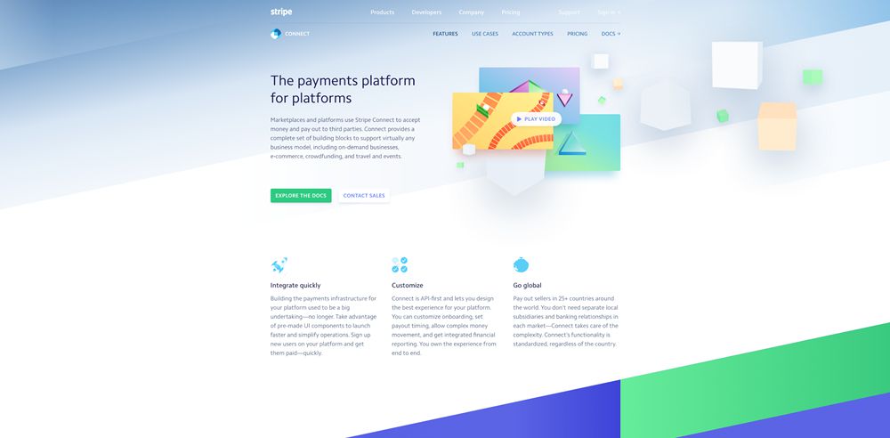
A more muted and considered example, Stripe uses less vibrant color schemes but nonetheless effectively incorporates an abundance of bright color via angled backgrounds and graphics, to iconography and typography.
MADEO
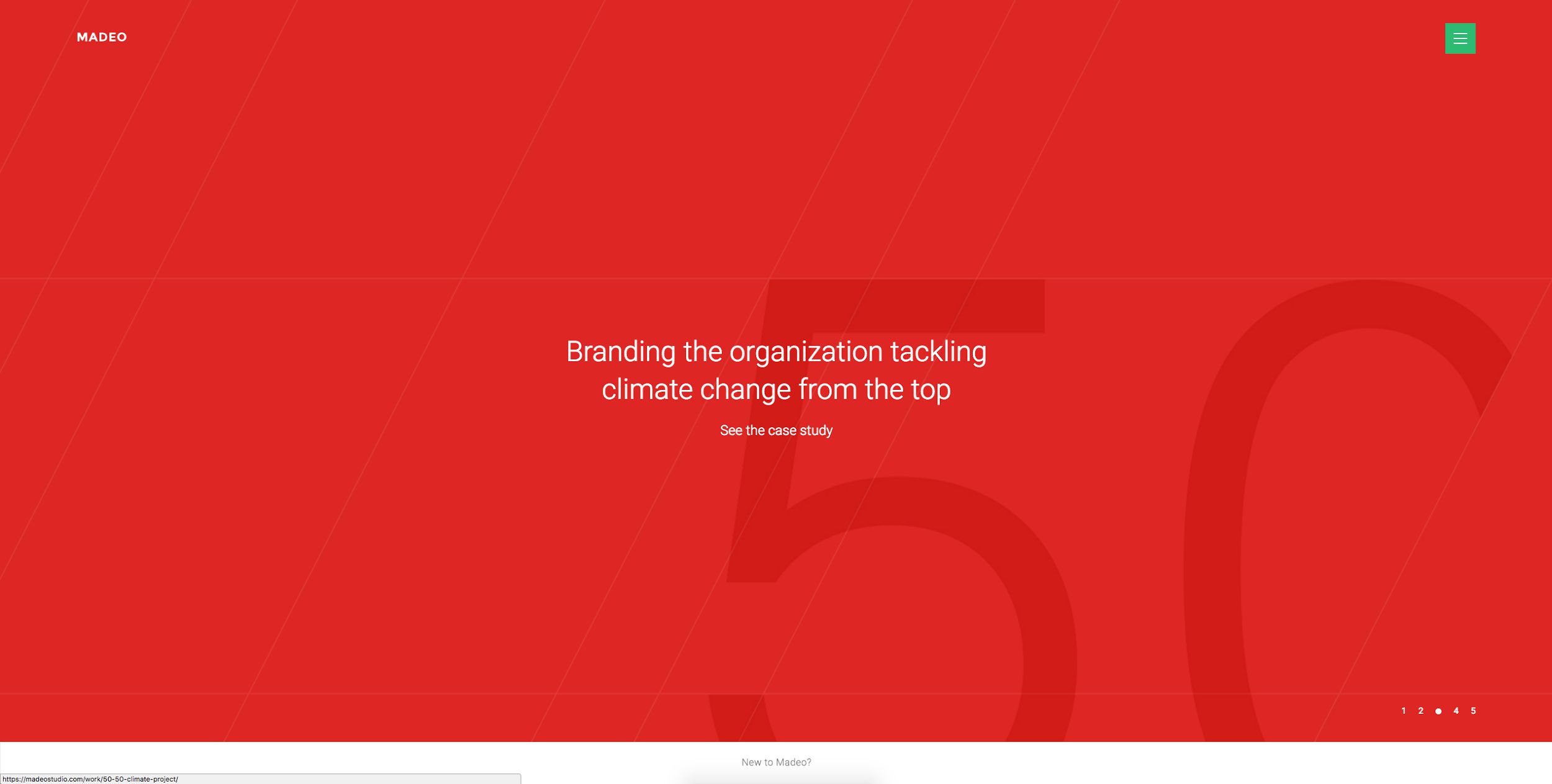
MADEO is extremely minimal in its use of bright color, opting for a primary red with hints of vibrant green. The abundance of spacing and minimal typographic elements in the design, make it ever more effective and visually appealing.
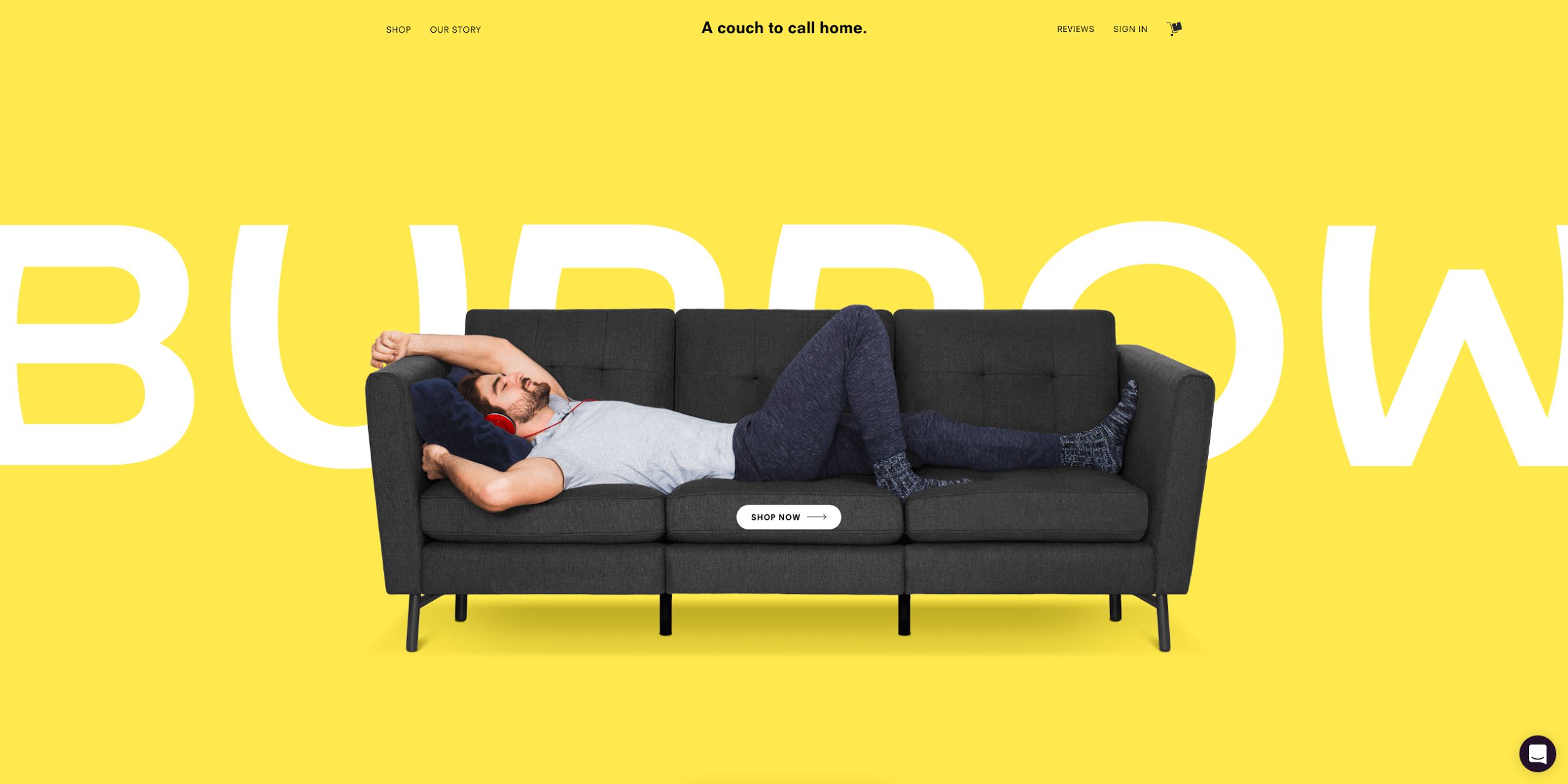
Burrow
Lastly, Burrow is a prime example of how to effectively incorporate product imagery alongside a bright color. It draws a great deal of attention to the brand and product, and sparks positive emotions and sunny imagery through their choice of yellow as the primary color.
What do you think about bright colors in web design? Share your opinions below!
This post may contain affiliate links. See our disclosure about affiliate links here.
