When a web designer creates pages, sometimes they want to set an element where they need to bend or wrap texts inside a circle (e.g. for the site’s logo or title). Photoshop and some image editing software is often the go-to software for creating these images.
On the other hand, bending and setting text on a circle without using Photoshop gives flexibility to the design and value to the SEO since search engines can’t read texts in images.
This can be an easy task using Adobe Photoshop and Illustrator but setting text on web type using HTML and CSS might be a challenge. Thanks to the power of CSS3 and jQuery, this can be done.
Your Designer Toolbox
Unlimited Downloads: 500,000+ Web Templates, Icon Sets, Themes & Design Assets
Table of Contents

DOWNLOAD NOW![]()
Resources You Will Need to Complete This Tutorial:
Using CSS3 (The Harder Way)
To give you ideas how we will implement this using only CSS3, take a look at the figure below.

As you can see, for us to be able to do this using CSS3 only, we need to break the text apart to individual letters. We can do this by using the span tag on each single text. First, we need to wrap all texts in a container ID named simple_arc, then, put each letter on a span tag. We will also need to put a unique class to each spanned text to optimize their position later on using CSS. Take a look at the HTML code below.
<div id="simple_arc"> <span class='w0'>S</span> <span class='w1'>I</span> <span class='w2'>M</span> <span class='w3'>P</span> <span class='w4'>L</span> <span class='w5'>E</span> <span class='w6'> </span> <span class='w7'>A</span> <span class='w8'>R</span> <span class='w9'>C</span> </div>
Now, to properly position the text, we need add width and height to our container ID simple_arc . Check out the code below.
#simple_arc { display: block; width:306px; height:305px; }
Next, to simplify the process for each class that we put on each span text, we need to use the child selector (>) to select all child elements of span class w, the class that we placed, followed by its number (according to its order). Then we place nth-of-type(n + 0) selector to match every element that is the nth child of span class.
Click here to learn more about nth-of type(n). Afterwards, we set the position of each element to absolute and then use the transform-origin property to change the position on transformed elements.
#simple_arc>span[class^=w]:nth-of-type(n+0){ display:block; position:absolute; -moz-transform-origin:50% 100%; -webkit-transform-origin:50% 100%; -o-transform-origin:50% 100%; -ms-transform-origin:50% 100%; transform-origin:50% 100%; }
Now, go ahead and add some basic styles such as font size and font face to the span element. So you’ll have this.
#simple_arc span{ font-family:'Viga'; font-size:38px; font-weight:regular; font-style:normal; line-height:0.65; white-space:pre; overflow:visible; padding:0px; }
Next let’s add styles to each span class that we’ve added.
First, we will use the transform property and give it a property value of rotate. The value of rotate will have the numeric value of the radius (which will be represented by rad). This will rotate the text position to a specific radius value.
Next, we’ll also give it width and height and manage the position using left and top properties.
#simple_arc .w0 { -moz-transform: rotate(-1.14rad); -webkit-transform: rotate(-1.14rad); -o-transform: rotate(-1.14rad); -ms-transform: rotate(-1.14rad); transform: rotate(-1.14rad); width: 21px; height: 24px; left: 42.7px; top: 93.95px; }
I won’t be covering each span class that was set for each text since each class has the same concept in setting up their position on the screen but you can download the files to check them.
We have 3 examples (simple arc, reverse arc and auto-radius) on the demo you can check to know how you can apply these codes. This part gives you the basic understanding on how to manipulate the text position and place them to look like a set on a circular shape.
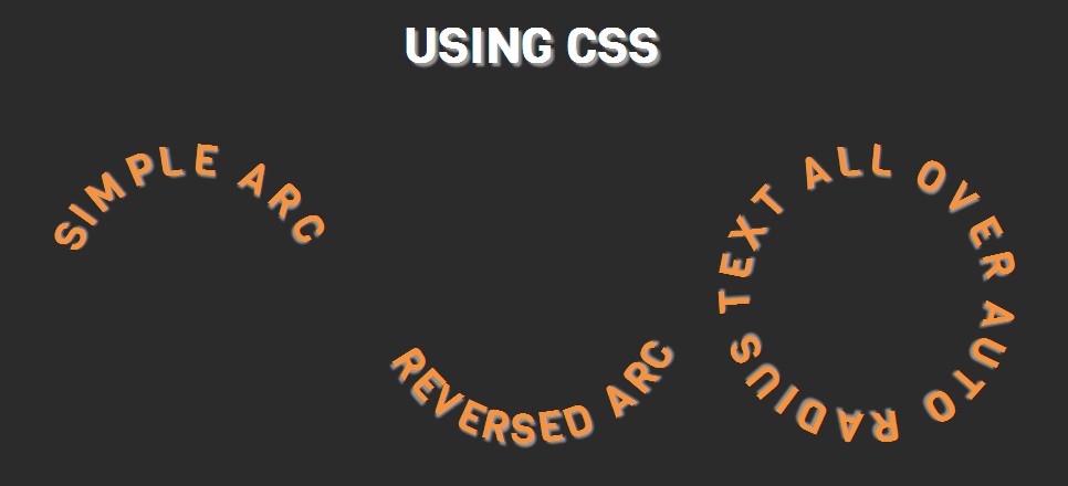
Tip: If you want to use a web tool that generates codes for bending or setting text on a circle using CSS only, you might want to check out CSS Warp, a CSS to path generator.
Using jQuery (The Easiest Way)
To bend text set text on a circle using jQuery, we will use a plugin called circletype.js, a tiny jQuery plugin that lets you set type on a circle. OK, let’s put this plugin to work.
Simple Arc
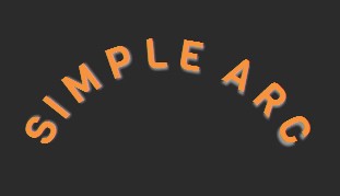
For this part, let’s create a simple arc which gives you a sweet text bend.
Here’s the HTML code.
SIMPLE ARC
Notice that we gave it an ID of Simple Arc. Next, load the jQuery library and and then call this code below before the closing body tag. This will set the radius to 135, which will bend the text upward.
$('#simple_arc').circleType({radius:135});
Reversed Arc
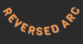
Now that we have a simple arc, let’s go ahead and reverse the bend position of the text.
Here’s the HTML code.
REVERSED ARC
Next, call this code below before the closing body tag. This will set the radius to 160 and then by setting dir to -1, the text will flow counter-clockwise.
$('#reversed_arc').circleType({radius: 160, dir:-1});
Auto-Radius
Now that we have tried the simple and reversed arc, let’s put some text around a circle. So to do this, set the HTML code below:
AUTO RADIUS TEXT ALL OVER
Then call this code below before the closing body tag. By leaving the radius empty, CircleType.js will execute a perfect radius and will set the text on a circle.
$('#auto_radius').circleType();

Curving, bending or setting text on a circle on web type is much easier to be done with jQuery. On the other hand, using CSS only gives you full control on the text positions. Hope you’ve learned on this tutorial and see you next time!
This post may contain affiliate links. See our disclosure about affiliate links here.


