The outline property in CSS draws a line around the outside of an element. This is quite similar to the border property, the main exception being that outline isn’t a part of the box model. It is often used for highlighting elements, for example, the :focus style.
In this article, let’s put a point on it, leaning into what outline is good at:
- They can be collapsed with each other (trickery!) because they technically “take up no space.”
- Showing and hiding outlines, or changing
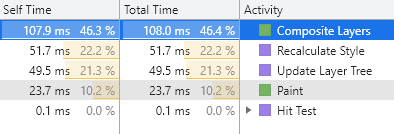
outline-width, doesn’t trigger layouts (which is good for performant animations and transitions).
Easier faux-table cell borders
Table of Contents
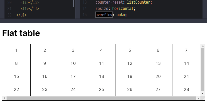
Below is an example of a list that is laid out as a grid, making it look a bit like a table layout. Every cell has a minimum width, and will grow/shrink as the container becomes wider/narrower.
We could use border to pull this off, like this:
But in order to make an even border around each cell — never doubling up or missing — it’s a cumbersome process. Above, I used a border on all sides of each “cell” then negative margins to overlap them and prevent doubling. That meant clipping off the border on two sides, so the borders had to be re-applied there on the parent. Too much fiddly work, if you ask me.
Even having to hide the overflow is a big ask, which you have to do because, otherwise, you’ll trigger scrollbars unless you resort to even thicker trickery, like using absolutely-positioned pseudo elements.

Check out the same result, visually, only using outline instead:
The code here is much cleaner. There is no real trickery at play. Each “cell” just has an outline around it, and that’s it.
Border in animation
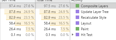
Changing border-width will always trigger layout, no matter if it is actually needed.

In addition, due to Chrome’s special handling of sub-pixels for border widths, animating the border-width property makes the entire border shake (which I think is strange). Firefox doesn’t have this issue.

There are pros and cons when it comes to animating borders. Check out Stephen Shaw’s post from a while back for an example of the performance implications.
There are some gotchas
Of course there are. Like most other CSS properties, there are a few “gotchas” or things to know when working with the outline property:
- Rounded outlines are only supported in Firefox at the time of writing. I imagine other browsers will eventually support them as well.
- An outline always goes around all the sides. That is to say it’s not a shorthand property like, say,
border; so nooutline-bottom, and so on.
But we can work around these limitations! For example, we can use add a box-shadow with no blur radius as an alternative. But remember: box-shadow has a higher performance cost than using either outline and border.
That’s it!
Will you always be working on something that calls for faking a table with an unordered list? Unlikely. But the fact that we can use outline and its lack of participation in the box model makes it interesting, particularly as a border alternative in some cases.
Maybe something like this tic-tac-toe board Chris put together several years ago could benefit from outline, instead of resorting to individually-crafted cell borders. Challenge accepted, Mr. Coyier? ????