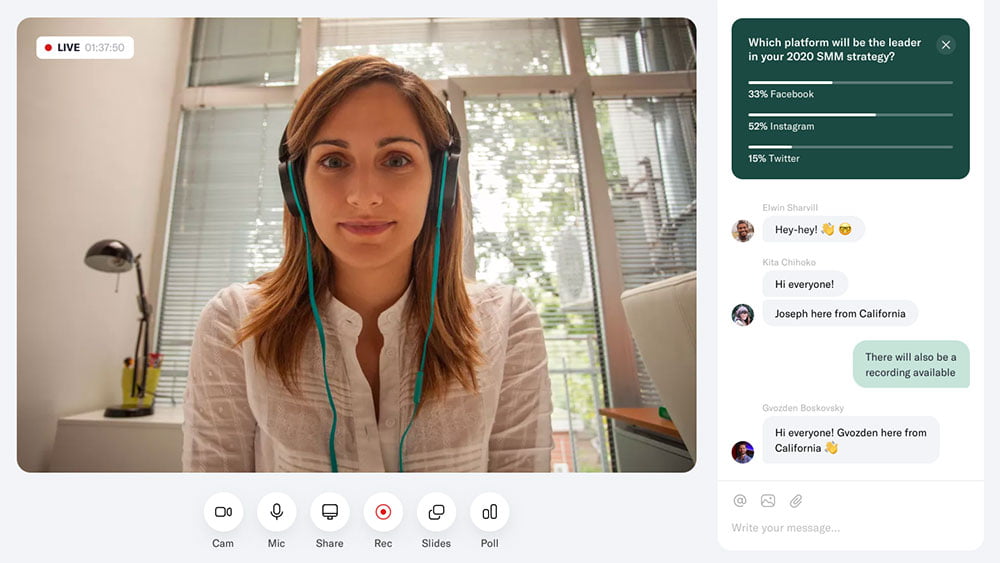
Webinars are a great way to reach out to your target audience and generate leads.
But how do you design a webinar landing page that will help you get more people on the call? What should you include in your webinar landing page, so it performs better than other similar pages?
In this article, we’ll take a look at how one can design the perfect webinar landing page for their event for more sign-ups!
#1 – Focus on What Your Audience Wants
Table of Contents
- 1 #1 – Focus on What Your Audience Wants
- 2 #2 – Optimize for Search Engines
- 3 #3 – Add a Teaser Video
- 4 #4 – Create Urgency
- 5 #5 – Feature Social Proof
- 6 #6 – Make Registration Form Easy to Fill Out
- 7 #7 – Place All Important Information Above the Fold
- 8 #8 – Remove Distractions from Your Landing Pages
- 9 #9 – Add Chat Widgets
- 10 Conclusion
Your webinar won’t be a success if it doesn’t cater to the needs and demands of your target audience. In fact, the most vital part of your content strategy is to plan your business goals to help a clearer vision of what you want to achieve with your webinar.
Therefore, determine the subject matter of your webinar and how it will help them.
The best approach to this is finding the most pressing problem that your audience is dealing with and how your webinar provides the solution. It would even be better if the answer is industry-specific and that only you as a service provider can offer.
This immediately allows your webinar to stand out from the pack due to its unique selling proposition and get more people to check out your landing page.
Pro tip: Determine where you plan on promoting your webinar. For instance, if most of your audience is on Instagram, it only makes sense to market your webinar on the platform to drive webinar signups.
#2 – Optimize for Search Engines
To get more people to view your webinar page, you need to help web crawlers like Google find it. Once they do, they will index your page to appear on search results for its target keyword.
Doing this allows your landing page to appear on the first page of Google search for a keyword that users search for thousands of times monthly. If that’s the case, expect to generate even more highly targeted page visitors who are ready to sign up for your webinar!
To do this, you need to search for a phrase or term related to your webinar topic. Using a keyword research tool that will help you brainstorm for keyword ideas goes a long way.
Most of these tools also show you not only the search volume but also the keyword difficulty. Thus, you must find keywords with lots of searches and have low difficulty scores. From there, decide which among the filtered keywords fit your landing page.
To optimize your page for organic search, you must mention the chosen keyword on the most critical elements of your landing page.
The simplest way to optimize your webinar landing pages for their respective target keywords is by mentioning the keyword in the following elements of the page:
- H1 Title
- SEO Title
- URL
Almost all webinar software, even the free ones, has SEO features to enter the keyword on these page elements.
From here, you’ve completed much of your on-page SEO. Next, it’s a matter of making your landing page copy read well and formatting its content to make it easier to read, such as using bullet points and others.
Some of your audience respond better when they see what your webinar will be about.
While there’s no doubt they can read the text on your webinar landing page, video content like a teaser video is much better in putting two and two together.
What this means is the video will explain the webinar to them much clearer and more succinctly. But, at the same time, they won’t misunderstand what you’re trying to say in the copy, which is what most people get wrong (more on this later).
When creating a video teaser for your webinar, you want to have a clear and concise message about what your webinar is all about. However, don’t ramble on for too long, as it doesn’t make viewers interested in how the video will eventually end. Instead, you can use high-quality images of people when they’re listening or talking during an event.
#4 – Create Urgency
While you want to get the most attendees to your webinar, there is no way that you can accommodate all interested parties to your event.
At the same time, you can’t wait before you fill out all the seats for your webinar. It may take more than months before that happens, assuming that you’re new to the webinar game.
That’s why you must limit the seats and run the webinar sign-up for a few days only. Although you’d think that doing both for the webinar is counter-intuitive, think of it from the other side of the coin.
For example, you can create a sense of urgency in your audience by featuring a countdown timer on the page. It will show how much time visitors have before your webinar closes the door on new sign-ups.
Knowing that the webinar is time-sensitive, they’ll also be more compelled to sign up and join your webinar instead of waiting. Especially if your topic resonates with them, they’ll sign up in a heartbeat!
#5 – Feature Social Proof
Your target audience must trust you first before you can get more webinar signups. If they don’t know who you are or aren’t familiar with your work, they won’t become potential attendees of your event, plain and simple!
To help bridge the gap between you and your audience, you need to show them that you are a reliable source of information and that it’s worth their time and effort to attend your event.
To do this, you need social proof from previous attendees of your webinars. Ask them their thoughts about the webinar and feature the best reviews on the page to help you boost conversions.
This reason is why running surveys after every webinar for feedback is essential. You can use them as testimonials for other landing pages you’ll create.
Even better, feature a testimonial from an influencer that people trust in your industry. Even a sentence or two of glowing remarks about you and the value you bring will help you give you more credibility and help you maximize conversions.
If this is your first time running a webinar, you can use other forms of social proof, such as blog comments from satisfied readers or positive tweets from your followers.
Most webinar platforms have these elements you can feature in your landing page, so showing off your social proof shouldn’t be a problem.
#6 – Make Registration Form Easy to Fill Out
As a webinar host, you want to know your attendees even before the event. That’s why some would think that asking them these questions on the landing page is only appropriate.
After all, if they like the webinar, signing up for a long-form won’t matter, right?
Wrong!
Having lots of form fields to fill in makes it difficult for people to sign up and join you in the webinar simply. So instead, they’ll not sign up and just leave your page even though they want to join it.
By simply asking for their email address (and their first name if possible), you make joining your webinar as frictionless as possible. As a result, you can get more signups this way!
Aside from your webinar platform, you can create this on your current website builder and customize the form that visitors will have to fill out.
#7 – Place All Important Information Above the Fold
The first thing people see from your webinar landing page is “above the fold,” or the section of the page that loads first. Because a quarter of visitors leave the page five seconds after the page hasn’t finished loading, you need to put all the stops on the above-the-fold section of your webinar landing page.
Thus, building landing pages with eye-catching but simple designs is a must.
The goal is to grab your potential webinar attendees’ attention at a glance, so it should be professional and clean.
Next, promote critical features of your webinar in an engaging manner, such as how many topics you will cover or how long the session will be, so attendees can have these expectations coming into the webinar.
Finally, show your CTA on this part of the page. Aside from a form, you can also use a CTA button that they can click on, bringing them to any section of the page for more information.
Therefore, by prioritizing the information sequence starting with your above-the-fold, you grab your audience by the throat with all the details they need to know about your webinar. But, at the same time, you must present the information in a way that’s appealing to them.
#8 – Remove Distractions from Your Landing Pages
Your webinar registration landing page is to get visitors to sign up for your event. Therefore, as a basic web design practice, any element that prevents you from achieving this goal should be removed from the page.
For example, the navigation and footer menus should be removed from the page. These contain links to other pages of your site, social media profiles, and others. These run the risk of distracting visitors from clicking on other pages of your site as well instead of signing up, so it’s best to get rid of them.
#9 – Add Chat Widgets
Aside from linking to your site’s contact page, embed your live chat or chatbot widget on the page. The idea is to keep them within the page so they eventually sign up for your webinar.
The great thing about these widgets is people remain on the webinar landing page while talking to you or browsing your knowledge base content. This way, once they’re done talking to you, they can just continue browsing the page until they decide to sign up.
Conclusion
If you want to grow your online audience and get more eyeballs on the product or service you’re promoting, design your webinar registration page carefully.
First, its layout can determine whether someone will attend an event or not. Thus, it’s essential to include the elements mentioned above (and remove the unimportant ones) to ensure a high-converting webinar landing page.
More importantly, you must promote the page and optimize it so more people get to see it. This way, you get to convert visitors and drive conversions on your page.
By keeping in mind both principles and the tips in this post, you can ensure the success of your webinar!


