I got together with Tim Kadlec from over at WebPageTest the other day to use do a bit of performance testing on CSS-Tricks. Essentially use the tool, poke around, and identify performance pain points to work on. You can watch the video right here on the site, or over on their Twitch channel, which is worth a subscribe for more performance investigations like these.
Web performance work is twofold:
Step 1) Measure Things & Explore Problems
Step 2) Fix it
Tim and I, through the amazing tool that is WebPageTest, did a lot of Step 1. I took notes as we poked around. We found a number of problem areas, some fairly big! Of course, after all that, I couldn’t get them out of my head, so I had to spring into action and do the Step 2 stuff as soon as I could, and I’m happy to report I’ve done most of it and seen improvement. Let’s dig in!
Identified Problem #1) Poor LCP
Table of Contents
Largest Contentful Paint (LCP) is one of the Core Web Vitals (CWV), which everyone is carefully watching right now with Google telling us it’s an SEO factor. My LCP was clocking in at 3.993s which isn’t great.
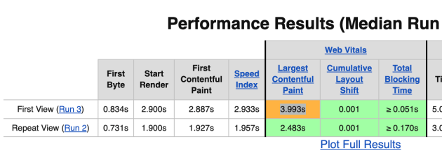
I learned from Tim that it’s ideal if the First Contentful Paint (FCP) contains the LCP. We could see that wasn’t happening through WebPageTest.
Things to fix:
- Make sure the LCP area, which was ultimately a big image, is properly optimized, has a responsive
srcset, and is CDN hosted. All those things were failing on that particular image despire working elsewhere. - The LCP image had
loading="lazy"on it, which we just learned isn’t a good place for that.
Fixing technique and learnings:
- All the proper image handling stuff was in place, but for whatever reason, none of it works for
.giffiles, which is what that image was the day of the testing. We probably just shouldn’t use.giffiles for that area anyway. - Turn off lazy loading of LCP image. This is a WordPress featured image, so I essentially had to do
<?php the_post_thumbnail('', array('loading' => 'eager')); ?>. If it was an inline image, I’d do<img data-no-lazy="1" ... />which tells WordPress what it needs to know.
Identified Problem #2) First Byte to Start Render gap
Tim saw this right away as a fairly obvious problem.
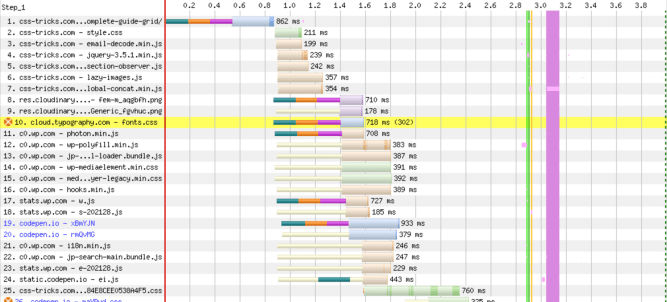
In the waterfall above (here’s a super detailed article on reading waterfalls from Matt Hobbs), you can see the HTML arrives in about 0.5 seconds, but the start of rendering (what people see, big green line), doesn’t start until about 2.9 seconds. That’s too dang long.
The chart also identifies the problem in a yellow line. I was linking out to a third-party CSS file, which then redirects to my own CSS files that contain custom fonts. That redirect costs time, and as we dug into, not just first-page-load time, but every single page load, even cached page loads.
Things to fix:
- Eliminate the CSS file redirect.
- Self-host fonts.
Fixing technique and learnings:
- I’ve been eying up some new fonts anyway. I noted not long ago that I really love Mass-Driver’s licensing innovation (priced by # of employees), but I equally love MD Primer, so I bought that. For body type, I stuck with a comfortable serif with Blanco, which mercifully came with very nicely optimized RIBBI1 versions. Next time I swear I’m gonna find a variable font, but hey, you gotta follow your heart sometimes. I purchased these, and am now self-hosting the font-files.
- Use
@font-faceright in my own CSS, with no redirects. Also usingfont-display: swap;, but gotta work a bit more on that loading technique. Can’t wait forsize-adjust.
After re-testing with the change in place, you can see on a big article page the start render is a full 2 seconds faster on a 4G connection:

Identified Problem #3) CLS on the Grid Guide is Bad
Tim had a neat trick up his sleeve for measuring Cumulative Layout Shift (CLS) on pages. You can instruct WebPageTest to scroll down the page for you. This is important for something like CLS, because layout shifting might happen on account of scrolling.
See this article about CLS and WebPageTest.
The trick is using an advanced setting to inject custom JavaScript into the page during the test:
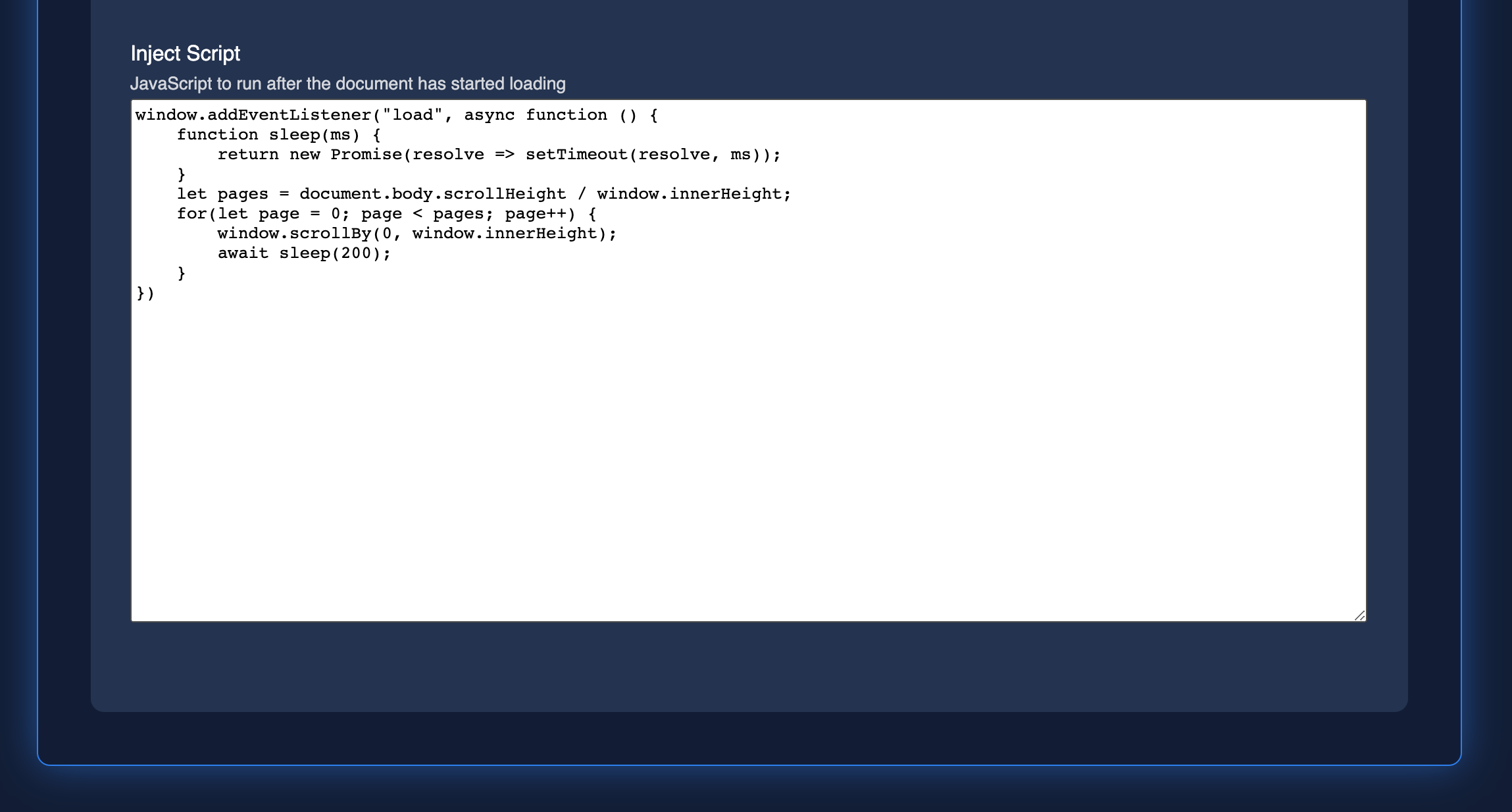
At this point, we were testing not the homepage, but purposefully a very important page: our Complete Guide to Grid. With this in place, you can see the CWV are in much worse shape:

I don’t know what to think exactly about the LCP. That’s being triggered by what happens to be the largest image pretty far down the page.
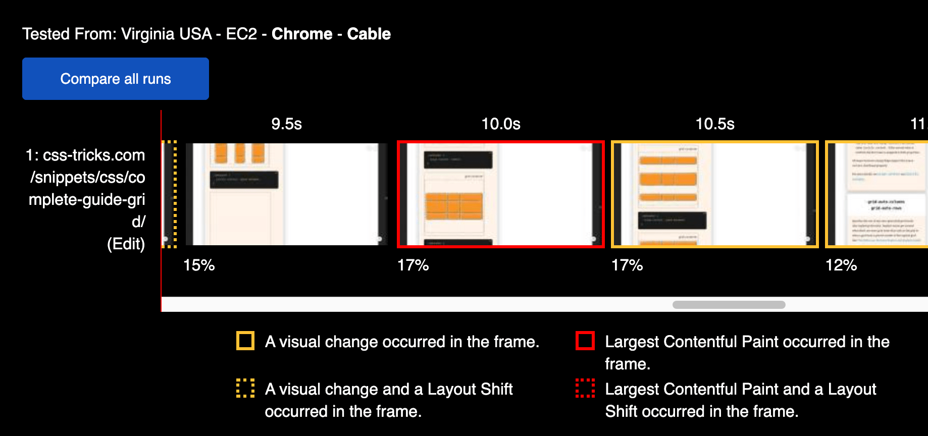
The CLS is more concerning, to me, because any shifting layout is always obnoxious to users. See all these dotted orange lines? That is CLS happening:
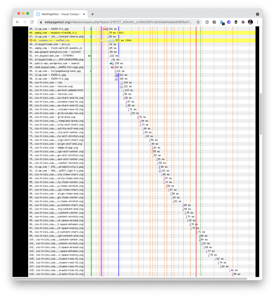
Things to fix:
- CLS is bad because of lazy loaded images coming in and shifting the layout.
Fixing technique and learnings:
- I don’t know! All those images are inline
<img loading="lazy" ...>elements. I get that lazy loading could cause CLS, but these images have properwidthandheightattributes, which is supposed to reserve the exact space necessary for the image (even when fluid, thanks to aspect ratio) even before it loads. So… what gives? Is it because they are SVG?
If anyone does know, feel free to hit me up. Such is the nature of performance work, I find. It’s a mixture of easy wins from silly mistakes, little battles you can fight and win, bigger battles that sometimes involves outside influences that are harder to win, and mysterious unknowns that it takes time to heal. Fortunately we have tools like WebPageTest to tell us the real stories happening on our site and give us the insight we need to fight these performance battles.


