26.7.2021 – By Nathan Hardy
My First CSS
CSS can be hard to grasp when you’re starting out. It can seem like magic wizardry and you can very easily find yourself playing whack-a-mole adjusting one property only to have something else break. It is frustrating, and that was my experience for quite a long time before things suddenly seemed to “click”.
Reflecting back on this time, I think there are a few key concepts that were vital to things finally all making sense and fitting together. These were:
- The Box Model (e.g. box-sizing, height, width, margin, padding)
- Layout (e.g. display)
- Document Flow and Positioning (e.g. position, top, left, etc.)
There are also some useful concepts to keep in mind when building reusable and composable components.
Everything is a Rectangle
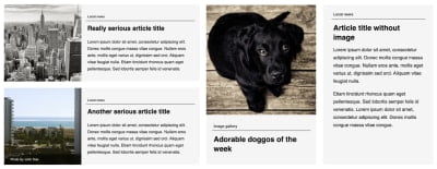
A key way I think about building visual UI components is that basically everything can be broken down into a bunch of rectangles on a page. It can be overwhelming to consider all aspects of a page at once, so break things down mentally into a series of rectangular components and ignore everything that doesn’t matter for the piece that you’re working on at that point.
The Box Model
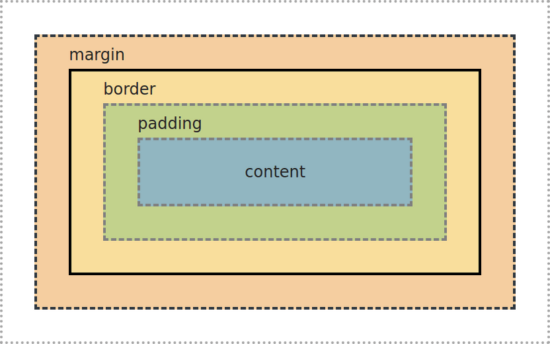
content
padding
border
margin
When you consider the size of an element (i.e. its height and width), there are two different models by which to measure this and you can adjust this with the box-sizing property.
- box-sizing: content-box (browser default)
The size of an element only includes its content, and not its padding or border.
- box-sizing: border-box
The size of an element is inclusive of its padding and border. When you set width: 100% with content-box, the content will be 100% of the width of the parent element, but any borders and padding will make the element even wider.
border-box makes a lot more sense, and I find it much easier to reason about. To apply border-box to all elements on the page, make sure you have something like this snippet in your stylesheet (a lot of CSS resets will include this anyway):
1
*, ::before, ::after {
2
box-sizing: border-box;
Going forward, I’m only going to be considering border-box, as it’s our preferred box model at Kablamo.
- margin values sometimes collapse with an adjacent element’s margin, taking the maximum of the margins between them rather than the combination of both. The rules around this can be somewhat complex, and Mastering margin collapsing
- margin and explicit width/height don’t work on inline content
- margin is not applicable to table cells
Layout
Elements are usually laid out in the document in the order that they appear in the markup. The display property controls how an element and/or its children are laid out. You can read about display in more detail at MDN.
- display: inline allows content to flow kind of like text and to fit with other inline content, sort of like tetris pieces
- display: block means the element effectively behaves like a rectangle containing all of its children that grows in height to fit content (width is 100% of the parent content box by default). Effectively, line breaks are inserted before and after the element.
- display: inline-block is like a mixture of both inline and block. Its contents will be contained within a rectangle, but that rectangle can be laid out as part of inline content.
- display: flex and display: grid are more advanced layout algorithms for arranging children according to certain rules. These are the bread and butter of building flexible, responsive layouts and are well-worth learning about in more depth. Learning these has been gamified in Flexbox Froggy and Grid Garden.
Document Flow and Positioning
The position property affects how elements are positioned with respect to the flow of the document in combination with positioning properties (top, left, right, bottom, inset).
- Elements are position: static by default, which means that positioning properties have no effect on the position of the element and the element is laid out normally. Statically positioned elements also do not have their own stacking context, which means that setting z-index will also have no effect.
- position: relative is like position static, except that top, left, and other positioning properties act like an offset of where the element should be visually laid out (although sibling and ancestor elements will behave as though it is still in the original position).
- position: absolute takes the element out of the flow of the document and ancestors/siblings will be laid out as if the element were not present. Positioning properties specify offsets of where the element should be visually laid out relative to the nearest non-static parent. You can add position: relative to an ancestor to use it as the anchor point for an element with position: absolute.
- position: fixed along with positioning properties means that the element is removed from the normal flow of the document and instead laid out relative to the viewport. If positioning properties are specified, they will ensure the element is laid out always with that offset to the viewport (i.e. they appear fixed in place and don’t move, even when scrolling).
- position: sticky is a bit more complex, but you can think about it as a hybrid of position: relative and position: fixed. You can read more about the exact mechanism at MDN.
Reusable and Composable Components
The visual aspect of reusable and composable components should ideally be self-contained. Outer margins are generally a bad idea. Margin collapse on outer borders means component layout is more complicated to reason about and the effective boundary is not the same as the visual boundary (such as a border). This can mean that components behave less predictably and you can no longer think of them as just a rectangle.
Essentially, you want to make your components easy to just include in an application without worrying if they break outside of their simple rectangle.
Summation
Overall, I think these are most of the guiding principles that I wish I understood a lot sooner than I actually did. I spent a lot of time fumbling around, tweaking CSS back and forth, and not really understanding why things weren’t behaving as expected.
Eventually it did “click” for me and I felt like I suddenly understood things.


