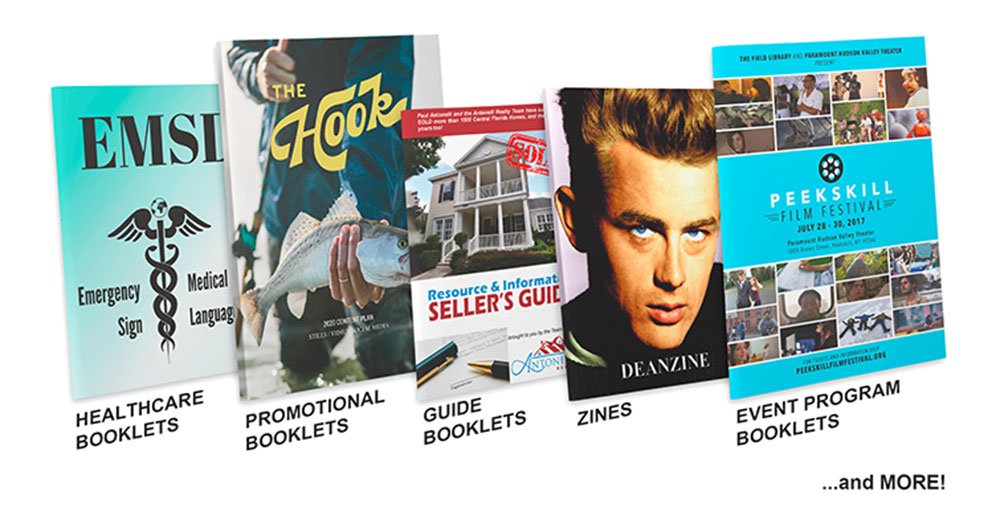
Even in a digital age, effective marketing booklets can have a profoundly positive impact on your company’s ability to reach, engage, and convert prospects into customers and clients. But in order to be effective, marketing booklets must be strategically designed and optimized to satisfy your underlying objectives.
Try These Design Tips and Tricks
Marketing booklets, sales brochures – whatever you want to call them, they work! But in order to generate maximum impact, you need to be purposeful with how you design them. Here are a few of our favorite tips:
- Choose High Quality Paper
Paper quality is something that most people don’t consider when designing a marketing booklet. They either skip right over it or they assume it’s all the same. But we’re here to tell you there can be major variances from one type of paper to the next. Consider this:
- Gloss paper is shiny and features a lustrous, smooth-coated finish that looks and feels glossy. It’s ideal in scenarios where you want rich color to pop off the page.
- Matte paper has a duller coat with a low gloss finish. This minimizes glare and delivers a clean, professional look. This type of paper is ideal when you have lots of text.
- Uncoated paper is much like traditional printing paper (though slightly higher in quality). It can be written on and is frequently used in color books and workbooks.
On top of paper types, you also have to consider how you want your booklet bound. There’s saddle stitch, perfect binding, spiral binding, wire-o binding, etc. All of these seemingly small details come together to create a cohesive look and feel. Ignore any of these factors and you’ll be left with a disheveled mess.
- Get the Cover Right
The primary purpose of a marketing booklet cover is to get people to open it up and read the first page. If your cover doesn’t do this, you’ve failed.
The mistake many businesses make is designing their covers so they’re all about the company. But here’s the cold, hard truth: Nobody cares about your company. They care about themselves. So design the cover so that it interests them.
- Be Intentional With Layout
“Confusing page layouts, type that’s too big or too small, too many different fonts or too many different colors of type on a page can all make a brochure – and your business – look unprofessional,” entrepreneur Janet Attard writes. “If you’re designing your own brochures you can give your brochures and fliers a professional look by using free design templates.”
Choose templates that prioritize simplicity and guide the reader’s eyes along. Eliminate anything that distracts and try to keep it as visual as possible. (You can certainly use text, but pare back and avoid chunky paragraphs. This is where people get lost and become disengaged.)
- Simplify the Color Scheme
Colors should not be an afterthought. You want to think about your color palette from the very start. As a general rule of thumb, stick with a maximum of three colors (with one being the primary color and the other two serving to complement it).
Avoid using low value colors (which are lighter colors) as your primary color and instead go with a high value color (darker). Having said that, you don’t want two dark colors. Low value colors are ideally used in a complementary fashion.
- Keep the Messaging Clear
When designing a brochure, it’s common to set aside some space for copy and then quickly whip some up to fit whatever leftover space there is. But this is a risky approach to take.
In reality, you should begin with clear messaging and then design around it. As previously mentioned, you’ll want to keep your copy as concise as possible. But this means you have to carefully weigh every single word!
Give Your Sales Booklets a Fighting Chance
Your marketing booklet or sales brochure is in direct combat with your reader’s attention span. If they lose focus, even for a millisecond, you risk striking out. The objective is to hold their attention so that you can deliver a clear and enticing offer that moves them to action. Design is just one element in this equation, but it sure is an important one!

