URL Shorteners are tools we use to make links shorter than they actually are. With a URL Shortener, you can transform a long link (maybe for a registration form or article) into a shorter version.
Behind the scenes, the long and short versions of a given link have been stored in some database. Then when a user visits the short link in a browser, the URL Shortener will redirect the user to the long version of the link (where the actual content is found).
Shortened links from URL shorteners are commonly used when the long version of those links would be too long to use. Sharing links on social media or when designing flyers and adverts is a popular use of URL shorteners.
For one of my projects, I created a personal URL shortener. My intention was to use it for links to articles I write or videos I make. I used Firebase to build the backend of the URL shortener. Specifically, I used the Firestore database to store short and long versions of any given link.
To create links, I had to use the Firebase console. This wasn’t a problem but it was cumbersome for the high frequency of editing links. The user experience (UX) was not ideal. Now I was faced with a problem. How do I create, edit, and delete links? I needed to build a frontend for the URL shortener. I needed a website for this.
In this article, we’ll review the available tools used for building this frontend, decision choices, and factors that influenced why they were made.
Problem statement
Table of Contents
The project requirements were:
- Platform/Architecture. The engineering and structure of the coding process.
- UI Toolkit. Components to use for the various parts of the UI.
- Convenience. Building the backend was not tough, so this frontend should not be either. I wanted clean code and fast development.
The First Decision Choice: Angular
Many ideas come to mind when starting out to build a frontend. In a broad sense, we could categorize frontend building options into 3 platforms:
- Website Builders – like WordPress, Wix, Squarespace, etc.
- Vanilla Building – using plain HTML, CSS, and JavaScript.
- JavaScript Framework – like React, Vue, Angular, etc.
In my experience, website builders provide a very restricted collection of widgets, components, and templates. Most website builders don’t provide an easy way to integrate an entire custom backend like Firebase. While it is possible to build impressive sites by connecting these pieces together, the degree of complexity of my project was likely beyond what these services typically provide.
Using the no-framework style or vanilla would have been a possibility. However, the deciding factor that made me not choose the pure vanilla route was that the latest non-CDN version of the Firebase JavaScript SDK (Version 9) is designed with installation via npm or yarn and module bundling in mind.
JavaScript frameworks handle frontend core parts (like routing, backend-linking, etc.) to reduce developer efforts. There are many of them and choosing which to use seemed to be a harder choice to make.
There are many JavaScript frameworks for frontend development. Examples include Angular, React, Vue, etc.
Of the available frameworks, I have the most familiarity with Angular. This is because I have used it on previous projects like:
- Choir Carol Quiz: Portal where Quiz participants competed in two online rounds of timed multiple choice questions on select Bible chapters.
- Genesys AE-FUNAI Community: Custom Form where members of Genesys Campus Club AE-FUNAI (my community) report their progress and share their achievements.
- Tutorial Management System: Simple session management dashboard between students and tutors.
This familiarity allows me to build quickly with Angular. Being able to build quickly should not be underestimated.
I chose Angular because of its Object-Oriented Programming (OOP) ability. OOP is a programming paradigm that focuses more on classes, data, or state being managed, rather than on the logic controlling the data, as is the case with functional programming. Separation of concerns is one advantage of using OOP. In other words, OOP permits encapsulation. It permits you to scope aspects of the program to peculiar domains or classes.
In Angular, components (and their lifecycle methods) are scoped to TypeScript classes. This makes you think the OOP way. The OOP advantage reflects in how Angular components serve as reusable UI units in the Angular framework. That way you see an Angular component as some self-sufficient entity that is yet part of a whole. This makes frontend development easy as various parts of the frontend app can be scoped to components and hence can be used where needed.
I also chose Angular because it uses TypeScript. TypeScript is JavaScript with features of a typed programming language. Typing in this context means a variable can’t change the kind of value it holds all through its life. For example, a variable holding a string will not all of a sudden hold a number while it is used in that program. Typing increases code quality and reduces bugs.
As a result of its type system, TypeScript reduces the time spent debugging Angular apps. It gives developer experience as the developer will have more time to build the frontend app. Debugging also becomes easy for the developer.
Note: Here is more on Object-Oriented Programming with TypeScript
Still, on Angular’s advantages, Angular apps come as a complete setup. They handle important features like bundling CSS preprocessors or Angular services by themselves. That said, when using Angular, you don’t need to configure each library independently, Angular takes care of this.
An Angular service is what Angular uses to configure dependency injection. In simple terms, dependency injection is providing an application with what it needs to function (dependencies) without the application having to take care of how the dependencies were gotten. I also chose Angular because of its out-of-the-box handling of services. So Firebase, for example, will be auto-provided to all Angular components that need without any extra configuration.
The benefits of Object-Oriented Programming, TypeScript, and dependency injection make Angular a go-to for frontend development. Coupled with the fact I was already familiar with Angular, Angular was more convenient for this URL shortener project.
Angular articles on CSS-Tricks are also part of the story. They gave me more confidence with using Angular.
The Second Decision Choice: Material Design
After choosing Angular, my next task was to consider how I would handle the user interface (UI).
I could ignore and do vanilla CSS instead but why reinvent the wheel? After all, this would defeat the reason for using a JavaScript framework – convenience.
With choosing a UI toolkit, there seems to be an ocean of options. To name a few, one can use Bootstrap, Bulma, Semantic UI, Tailwind, etc. Each toolkit has its own specifications and motivations.
For the use case of my project, Material Design led the pack.
One of the most important factors was the support for Angular and Material Design. There is an entire Angular-only specification for Material on material.angular.io (that is as a subdomain to the Angular docs itself).
I settled for Material Design because it focuses on components. Unlike other CSS frameworks, it doesn’t have CSS utility classes. This was okay because I only wanted some component kit (buttons, icons, inputs, sidebars, snack bars, etc.) Material also adds animations, ripple, and shadow effects by itself; making it more convenient than other libraries.
Furthermore, Angular Material has out-of-the-box theming support, when initializing Angular Material, you have the option of choosing a pre-defined theme for the entire Angular app or creating a custom one.
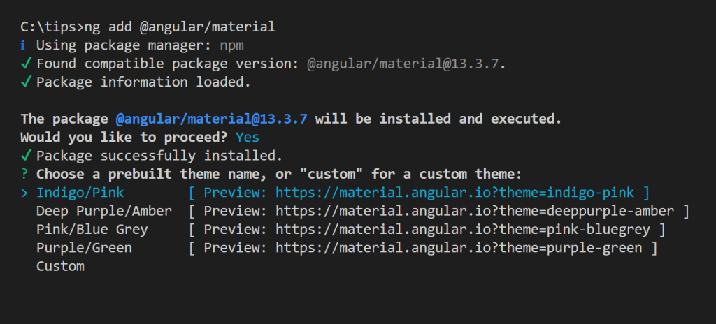
For the sake of convenience, I chose a dark theme while setting up Angular Material.
The Third Decision Choice: Reactive Forms
With a framework and toolkit decided, I turned my attention to one of the most important features of the URL shortener. The core of the URL shortener’s frontend is the form for creating and updating links.
Let’s call this form the links editor. The links editor form has only two inputs, one for the short version of a link and the other for the full URL the short version will redirect to.
For managing forms, Angular comes with two mechanisms. So instead of creating a form and handling its validation and submission as is done in vanilla HTML and JavaScript, you have to use either of the two ways Angular provides. The two methods are:
- Template-driven forms
- Reactive forms
Template-driven forms as the name imply, involve the HTML (template) code controlling the greater part of the Angular form. This approach is preferable when your form does not do much or is for one-time usage.
Reactive forms, on the other hand, provide a model-driven approach to handling form inputs whose values change over time. I needed reactive forms because it is the same form that I will use to edit different links at any point in time.
Note: Here is more material on using Reactive Forms.
At this point, the benefits of previous choices began playing out. Angular Material has form-field components. The form-field wraps the input as a component and provides animations, ripple effects, and error messages if necessary.
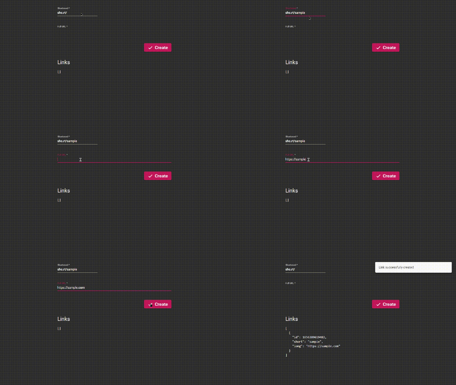
So I used it for the two inputs of the editor form.
The Fourth Decision Choice: Angular Material Bottom Sheet and Drawer
The final decision involved how to improve the user experience. The URL shortener would need other features like viewing all created links and their analytics. These features would require space on the screen that required me to rethink if there were better solutions to display the links editor form to the user.
If the user has no current need for the links editor form, it makes sense for the links editor form to not always be in view. This would free up space on the UI for other elements.
However, splitting this user experience into two separate pages felt disruptive. Instead, to open the links editor when needed, I added a floating action button on the page for creating links. When clicked, the button will cause the editor form to be opened in any fitting UI component.
A bottom sheet, as the name implies, is a UI component that opens from the bottom of the screen. It has interactive content the user can work it. It overlays the current view of a mobile screen (but doesn’t fully block it).

Bottom sheets are usually used in place of pop-ups if the user will spend a long time interacting with their content. So, bottom sheets are a good fit to open the editor on mobile screens. However, interacting with a bottom sheet is hard when the screen is wide. I needed a different UI component for the links editor form on wide screens.
Drawers open by the side. Using a drawer to open the links editor form on a wide screen was the go-to option. Drawers won’t be good for the editor on mobile screens. The screen’s width would be relatively small and the drawer might completely block the screen (which is not a desirable UX).
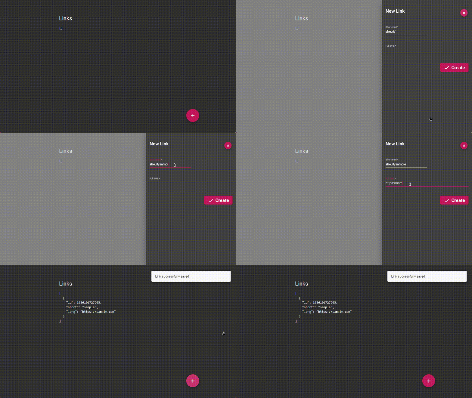
I selected these two UI components from Material Design for the form to have some responsive effect. So whether on my phone or laptop creating links would be done in a fitting UI component.
In the code, Angular checks if the device is of small screen width. If so, it opens a bottom sheet containing the links editor form. On the other hand, if the screen is wide, Angular opens a drawer containing the same form.
Using these two components brought about a minor complication. If my phone is rotated or my laptop’s browser window’s width is reduced, the form opens on the contrary UI component. That is instead of opening in a drawer in a laptop, it will open in a bottom sheet (because the browser’s width was reduced).
Maintenance, Future-proofing, Future Releases
When I thought of opportunities to iterate on this project, I ran into limitations with the current use case designed to support a single administrator. But with authentication and user accounts, it can support additional users managing links and accessing analytics.
In that case, the above choices of components will still be appropriate. The links editor is responsive so on any device, users will have a good user experience.
If I had to do it all over again, I think I would have tried out the vanilla method. Building entirely without any helpers like Angular, Material, or UI components. I would try building from scratch in HTML, CSS, and JavaScript and see if I didn’t lose out on convenience as I thought I would.
Conclusion
You can access the final Angular code here on GitHub.
This was a review of some of the main choices I made when developing my project. Of course, there is more to building the frontend of a URL shortener. But for a start, these UI components made the building process convenient. They made the links editor form responsive and could be of similar use to you in your projects (not necessarily a URL shortener).
There are many other UI components from various libraries you can use for any such project. But as with my case, if convenience is a deciding factor, you would make the right decision choice that would be fitting for the UI.
Ultimately, what shaped my decisions was understanding what my project required, knowledge of tools I had used from previous projects, and expectations with time constraints. My past experience – successes and mistakes – helped guide me too.
Cheers!


