Well, color me this! I was griping to myself last night about just how gosh dang hard it is to read text messages in Apple Messages. You know, not the blue bubbles that you get when messaging other iPhone users. Those are iMessages.
What I’m talking about are the green bubbles you get when messaging non-iPhone users. Those are standard text messages.
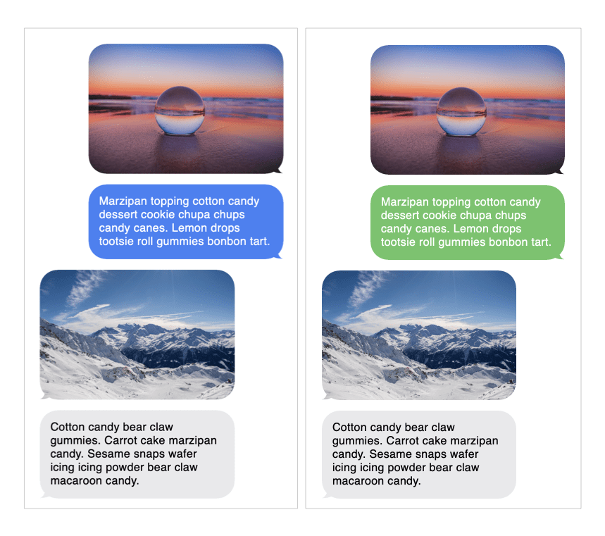
Let’s run the green through a contrast checker to see what’s up.
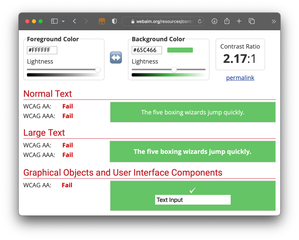
Oomph. Now I know why I always reach for my reading glasses when a text message pops up. That 2.17:1 ratio is below the WCAG 2.0 AA requirement of 4.5:1 and wayyyyy below the AAA level of 7:1.
Turns out I’m not the only one griping. A quick search turned up a little trove of news and blog posts — some as recent as last week — about the readability of those green text message bubbles.
I’m no conspiracy theorist and like to give benefit to doubt. Buuuuut…
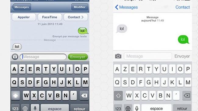
Credit: Phoceis
- iOS 6: Dark text on a green gradient background
- iOS 7: White text on a
#5AB539background (or something close to it) - iOS 16.1: White text on a
#6ACC46background
That second one is based on old screenshots and might not be the most accurate color value. But still, the transition from iOS 6 with dark text to what we have today in iOS 16.1 shows a clear regression. I’d like think the design team checked the updated values against WCAG guidelines, sure, but at least against their own Human Interface Guidelines.
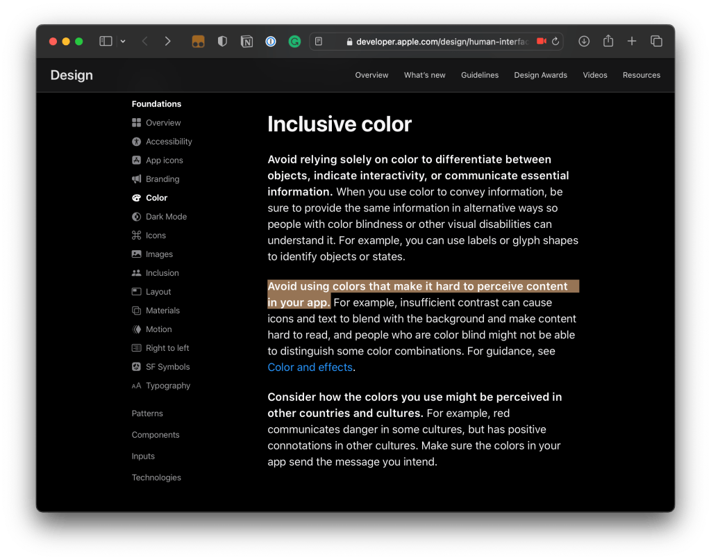
The current green background (#65C466) appears to be different than what is listed as the green “system color” (#30D158, converted from a RGB of 48, 209, 88) in the iOS palette listed in the guidelines. But it’s not like that gets us any closer to a passing WCAG AA or AAA rating.

????♂️

