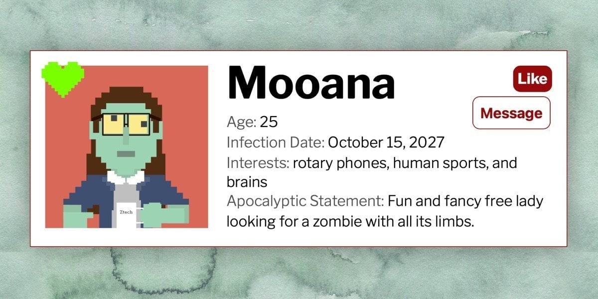
In my last article, we saw that web components aren’t as scary as they seem. We looked at a super simple setup and made a zombie dating service profile, complete with a custom <zombie-profile> element. We reused the element for each profile and populated each one with unique info using the <slot> element.
Here’s how it all came together.
That was cool and a lot of fun (well, I had fun anyway…), but what if we take this idea one step further by making it interactive. Our zombie profiles are great, but for this to be a useful, post-apocalyptic dating experience you’d want to, you know, “Like” a zombie or even message them. That’s what we’re going to do in this article. We’ll leave swiping for another article. (Would swiping left be the appropriate thing for zombies?)
This article assumes a base level of knowledge about web components. If you’re new to the concept, that’s totally fine — the previous article should give you everything you need. Go ahead. Read it. I’ll wait. *Twiddles thumbs* Ready? Okay.
First, an update to the original version
Table of Contents
Let’s pause for one second (okay, maybe longer) and look at the ::slotted() pseudo element. It was brought to my attention after the last article went out (thanks, Rose!) and it solves some (though not all) of the encapsulation issues I encountered. If you recall, we had some CSS styles outside of the component’s <template> and some inside a <style> element within the <template>. The styles inside the <template> were encapsulated but the ones outside were not.
But that’s where ::slotted comes into play. We declare an element in the selector like so:
::slotted(img) { width: 100%; max-width: 300px; height: auto; margin: 0 1em 0 0;
}
Now, any <img> element placed in any slot will be selected. This helps a lot!
But this doesn’t solve all of our encapsulation woes. While we can select anything directly in a slot, we cannot select any descendant of the element in the slot. So, if we have a slot with children — like the interests section of the zombie profiles — we’re unable to select them from the <style> element. Also, while ::slotted has great browser support, some things (like selecting a pseudo element, e.g., ::slotted(span)::after) will work in some browsers (hello, Chrome), but won’t work in others (hello, Safari).
So, while it’s not perfect, ::slotted does indeed provide more encapsulation than what we had before. Here’s the dating service updated to reflect that:
Back to interactive web components!
First thing I’d like to do is add a little animation to spice things up. Let’s have our zombie profile pics fade in and translate up on load.
When I first attempted this, I used img and ::slotted(img) selectors to directly animate the image. But all I got was Safari support. Chrome and Firefox would not run the animation on the slotted image, but the default image animated just fine. To get it working, I wrapped the slot in a div with a .pic class and applied the animation to the div instead.
.pic { animation: picfadein 1s 1s ease-in forwards; transform: translateY(20px); opacity: 0;
} @keyframes picfadein { from { opacity: 0; transform: translateY(20px); } to { opacity: 1; transform: translateY(0); }
}
“Liking” zombies
Wouldn’t it be something to “Like” that cute zombie? I mean from the user’s perspective, of course. That seems like something an online dating service ought to have at the very least.
We’ll add a checkbox “button” that initiates a heart animation on click. Let’s add this HTML at the top of the .info div:
<input type="checkbox" id="trigger"><label class="likebtn" for="trigger">Like</label>Here’s a heart SVG I pulled together. We know that Zombies love things to be terrible, so their heart will be an eye searing shade of chartreuse:
<svg viewBox="0 0 160 135" class="heart" xmlns="http://www.w3.org/2000/svg" fill-rule="evenodd" clip-rule="evenodd" stroke-linejoin="round" stroke-miterlimit="2"><path d="M61 12V0H25v12H12v13H0v36h12v13h13v12h12v12h12v12h12v13h13v12h12v-12h13v-13h11V98h13V86h-1 13V74h12V61h12V25h-12V12h-12V0H98v12H85v13H74V12H61z" fill="#7aff00"/></svg>Here’s the important bits of the CSS that are added to the template’s <style> element:
#trigger:checked + .likebtn { /* Checked state of the .likebtn. Flips the foreground/background color of the unchecked state. */ background-color: #960B0B; color: #fff;
} #trigger { /* With the label attached to the input with the for attribute, clicking the label checks/unchecks the box, so we can remove the checkbox. */ display: none;
} .heart { /* Start the heart off so small it's nigh invisible */ transform: scale(0.0001);
} @keyframes heartanim { /* Heart animation */ 0% { transform: scale(0.0001); } 50% { transform: scale(1); } 85%, 100% { transform: scale(0.4); }
} #trigger:checked ~ .heart { /* Checking the checkbox initiates the animation */ animation: 1s heartanim ease-in-out forwards;
}
Pretty much standard HTML and CSS there. Nothing fancy or firmly web-component-ish. But, hey, it works! And since it’s technically a checkbox, it’s just as easy to “unlike” a zombie as it is to “Like” one.
Messaging zombies
If you’re a post-apocalyptic single who’s ready to mingle, and see a zombie whose personality and interests match yours, you might want to message them. (And, remember, zombies aren’t concerned about looks — they’re only interested in your braaains.)
Let’s reveal a message button after a zombie is “Liked.” The fact that the Like button is a checkbox comes in handy once again, because we can use its checked state to conditionally reveal the message option with CSS. Here’s the HTML added just below the heart SVG. It can pretty much go anywhere as long as it’s a sibling of and comes after the #trigger element.
<button type="button" class="messagebtn">Message</button>Once the #trigger checkbox is checked, we can bring the messaging button into view:
#trigger:checked ~ .messagebtn { display: block;
}
We’ve done a good job avoiding complexity so far, but we’re going to need to reach for a little JavaScript in here. If we click the message button, we’d expect to be able to message that zombie, right? While we could add that HTML to our <template>, for demonstration purposes, lets use some JavaScript to build it on the fly.
My first (naive) assumption was that we could just add a <script> element to the template, create an encapsulated script, and be on our merry way. Yeah, that doesn’t work. Any variables instantiated in the template get instantiated multiple times and well, JavaScript’s cranky about variables that are indistinguishable from each other. *Shakes fist at cranky JavaScript*
You probably would have done something smarter and said, “Hey, we’re already making a JavaScript constructor for this element, so why wouldn’t you put the JavaScript in there?” Well, I was right about you being smarter than me.
Let’s do just that and add JavaScript to the constructor. We’ll add a listener that, once clicked, creates and displays a form to send a message. Here’s what the constructor looks like now, smarty pants:
customElements.define('zombie-profile',
class extends HTMLElement { constructor() { super(); let profile = document.getElementById('zprofiletemplate'); let myprofile = profile.content; const shadowRoot = this.attachShadow({ mode: 'open' }).appendChild(myprofile.cloneNode(true)); // The "new" code // Grabbing the message button and the div wrapping the profile for later use let msgbtn = this.shadowRoot.querySelector('.messagebtn'), profileEl = this.shadowRoot.querySelector('.profile-wrapper'); // Adding the event listener msgbtn.addEventListener('click', function (e) { // Creating all the elements we'll need to build our form let formEl = document.createElement('form'), subjectEl = document.createElement('input'), subjectlabel = document.createElement('label'), contentEl = document.createElement('textarea'), contentlabel = document.createElement('label'), submitEl = document.createElement('input'), closebtn = document.createElement('button'); // Setting up the form element. The action just goes to a page I built that spits what you submitted back at you formEl.setAttribute('method', 'post'); formEl.setAttribute('action', 'https://johnrhea.com/undead-form-practice.php'); formEl.classList.add('hello'); // Setting up a close button so we can close the message if we get shy closebtn.innerHTML = "x"; closebtn.addEventListener('click', function () { formEl.remove(); }); // Setting up form fields and labels subjectEl.setAttribute('type', 'text'); subjectEl.setAttribute('name', 'subj'); subjectlabel.setAttribute('for', 'subj'); subjectlabel.innerHTML = "Subject:"; contentEl.setAttribute('name', 'cntnt'); contentlabel.setAttribute('for', 'cntnt'); contentlabel.innerHTML = "Message:"; submitEl.setAttribute('type', 'submit'); submitEl.setAttribute('value', 'Send Message'); // Putting all the elments in the Form formEl.appendChild(closebtn); formEl.appendChild(subjectlabel); formEl.appendChild(subjectEl); formEl.appendChild(contentlabel); formEl.appendChild(contentEl); formEl.appendChild(submitEl); // Putting the form on the page profileEl.appendChild(formEl); }); }
});
So far, so good!
Before we call it a day, there’s one last thing we need to address. There’s nothing worse than that first awkward introduction, so lets grease those post-apocalyptic dating wheels by adding the zombie’s name to the default message text. That’s a nice little convenience for the user.
Since we know that the first span in the <zombie-profile> element is always the zombie’s name, we can grab it and stick its content in a variable. (If your implementation is different and the elements’s order jumps around, you may want to use a class to ensure you always get the right one.)
let zname = this.getElementsByTagName("span")[0].innerHTML;And then add this inside the event listener:
contentEl.innerHTML = "Hi " + zname + ",nI like your braaains...";That wasn’t so bad, was it? Now we know that interactive web components are just as un-scary as the zombie dating scene… well you know what I mean. Once you get over the initial hurdle of understanding the structure of a web component, it starts to make a lot more sense. Now that you’re armed with interactive web component skills, let’s see what you can come up with! What other sorts of components or interactions would make our zombie dating service even better? Make it and share it in the comments.


