Advertisement
The best thing about artsy websites is that you can design them any way you want them. In the best-case scenario, they will be modern, resourceful, and easy to use. Artists with an amazing art website are perceived better by the public, and they improve their credibility.
Better yet, artsy websites let you showcase your fine art at a fraction of the price. You don’t need expensive galleries or art shows. Instead, you have an online portfolio where people can contact you, see what you do, and even buy your fine art.
But how do you create a great art website? Keep reading and learn from the best! These artsy websites look beautiful and professional, and you will for sure find one that inspires you.
Best artsy websites with minimalist designs
Table of Contents
- 1 Best artsy websites with minimalist designs
- 1.1 Micheal Bulk Studio
- 1.2 Raku Inoue
- 1.3 Banksy
- 1.4 Jason Arkles
- 1.5 Levon Biss
- 1.6 Benjamin Hardman
- 1.7 Artbox
- 1.8 Milkovi
- 1.9 Maegan Guerette
- 1.10 Artic
- 1.11 Leslie David Studio
- 1.12 James Turrell
- 1.13 Art and History Museum
- 1.14 Jon Burgerman
- 1.15 Mike Perry Studio
- 1.16 Pedro Campos
- 1.17 Street Art
- 1.18 Almost Real
- 1.19 Kate Vass
- 1.20 Raul & David
- 1.21 Edzera Gallery
- 1.22 Jam Factory
- 1.23 Andrea Lawl Manning
- 1.24 Hattie Stewart
- 1.25 Art for Global Goals
- 1.26 Philippa Rice
- 1.27 Mel Volkman
- 2 FAQ on designing an artsy website
- 2.1 What are some key elements to include on an artsy website?
- 2.2 How can I create a visually appealing design for an artsy website?
- 2.3 What kind of content should be included on artsy websites?
- 2.4 How can I optimize an artsy website for search engines?
- 2.5 How can I ensure that an artsy website is user-friendly and easy to navigate?
- 2.6 What are some effective ways to showcase artwork on an artsy website?
- 2.7 How can I use social media integration to promote an artsy website?
- 2.8 What are some important considerations for mobile responsiveness and accessibility on an artsy website?
- 2.9 How can I use storytelling and narrative to enhance the design of an artsy website?
- 2.10 What are some legal considerations for an artsy website, such as copyright and intellectual property?
- 3 Ending thoughts on these artsy websites
Micheal Bulk Studio
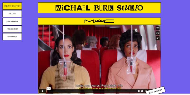
Michael Bulk’s fine art website is very eye-catchy and fresh. On the home page, you can see a background video that displays the art collection. As you move from page to page, the colors change.
Raku Inoue
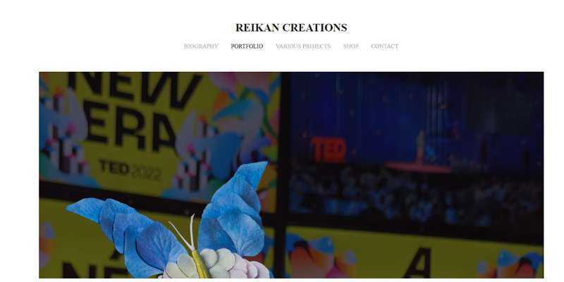
Raku Inoue is a popular multidisciplinary artist whose contemporary art is internationally recognized. He organized several art exhibitions to present breathtaking works of organic materials, such as leaves, stems, and flowers.
/*div{padding-right:0!important;padding-bottom:10px}.ml-form-formContent.horozintalForm .ml-button-horizontal{width:100%!important}.ml-form-formContent.horozintalForm .ml-button-horizontal.labelsOn{padding-top:0!important}}
/*]]>*/
/**/
![]()
His art website is as rich as his portfolio. You can check his art collection, buy a piece at the e-store, or read more in his portfolio. Contact information is well-arranged and easy to access. Lastly, he uses a non-distracting, discreet theme.
Banksy
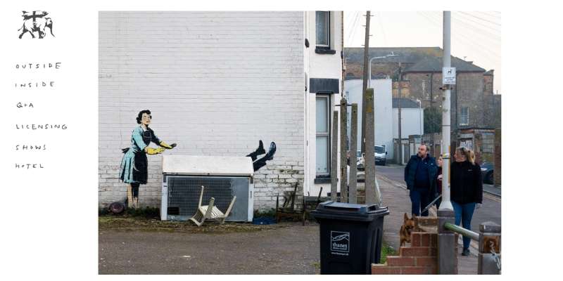
Another one of these artsy websites comes from Banksy. Banksy is a well-known elusive street art professional who specializes in graffiti. His art website is as spartan as the artist himself. Bold in form and function, and relatively sparse in information, this website will intrigue anyone. What we appreciate the most about this website is the blog with fresh and relevant posts.
Jason Arkles
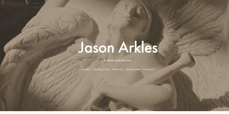
You may know Jason Arkles for his amazing 19th-century sculptures. When it comes to his website and his online store, he likes to keep things simple and clean. Thus, there are only two things you can find online: the artwork and the contact information.
Levon Biss
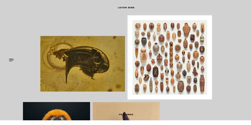
Levon Biss, on the other hand, is a light- and photography master. His art websites are minimal and clutter-free, as the whole idea is for the viewer to expand the screen and view the artwork in detail.
The navigation menu is quite packed with pages, but foldable at the same time. Art lovers will only get to see the things they want to see.
Benjamin Hardman
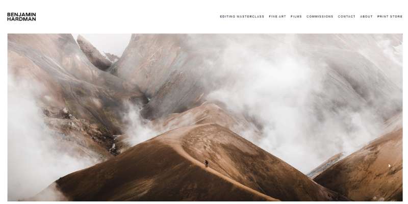
Benjamin is another photographer that likes to throw some spotlight on his work online. He photographs harsh environments to raise awareness, and his website is just as bold as his original art.
Emerging artists have a lot to learn from this website. The homepage, for instance, contains no other element than a slideshow with impact photographs. Navigation to other pages (including an online store) is enabled with a sleek, almost invisible navigation bar.
The magic of art websites like this one is that they combine minimalism with optimal usability. There may not be as many icons as we are used to having, but the visual hierarchy takes us where we need to be anyway.
Artbox
Advertisement
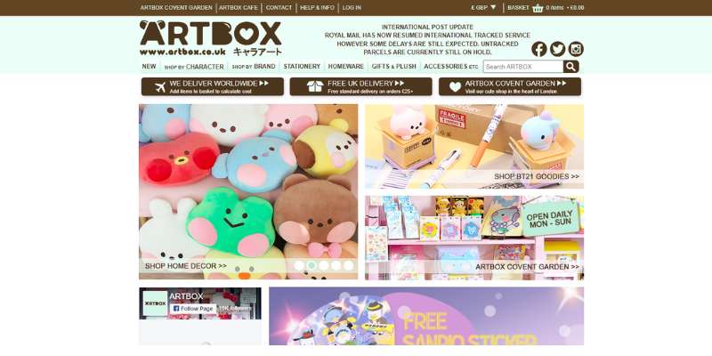
This custom art website is very sleek and depicts interest in every visitor. Art lovers are welcomed with a full-screen video and cool animations upon hover.
Artbox’s independent artists stand for diversity, and this is something you could tell from the website. Each art print is represented differently and features unusual shapes and styles. The ample use of white space is another feature that deserves an honorable mention. Thanks to it, the art galleries on this website look truly professional.
Milkovi
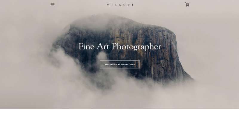
Here comes another modern art website with a minimalist feature. The design is clean, and navigation is made very easy. There is one hero image in the header and only a few relevant links on the side.
We also recommend a similar color scheme – the timeless combination of white and black, paired with blue and green accents.
Maegan Guerette

For those of you who don’t know her, Maegan Guerette is an upcoming freelance photographer. She specializes in event photography, and her great website displays all the superb projects she has accomplished so far.
Check the art galleries, and you will be impressed by the simplicity of the web design. Wherever you click, a piece of art pops up. She also has social media buttons embedded on all pages, which is a feature to consider.
Artic
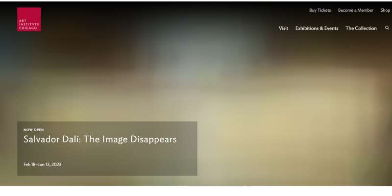
This superb art website belongs to the Art Institute of Chicago. It is the favorite hub of art collectors who get to enjoy timeless pieces of the highest quality. The works are shown worldwide, and a lot of attention is paid to engaging and retaining visitors.
The homepage features a delightful background video. It displays some of the best-limited edition works and high-quality reproductions. The pieces are also displayed individually on a masonry layout on the homepage.
Leslie David Studio
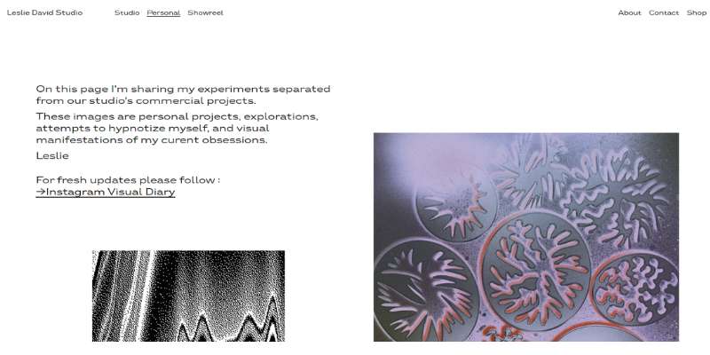
This website belongs to Art director Leslie David. It is the official web hub of his creative design agency where he showcases his works and communicates with his clients.
On this website, you can find both: Leslie’s personal and studio portfolio. You can decide which one you want on the home page, so you will hardly ever be confused. The online platform pays attention to user-friendliness, and that is the main reason to add it to this list.
James Turrell
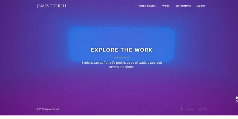
If you are looking to deliver an informative website, James Turell has the right example for you. He has years of experience, and attempts (quite successfully!) to tell this story to online audiences.
His art gallery is a real treat to the eye. It is the perfect example of how beautifully art print transitions to the screen. This is also one of the few artist’s websites that let you search through online art by date and location. To do this, you need site features such as search buttons and cartographic timelines.
Art and History Museum
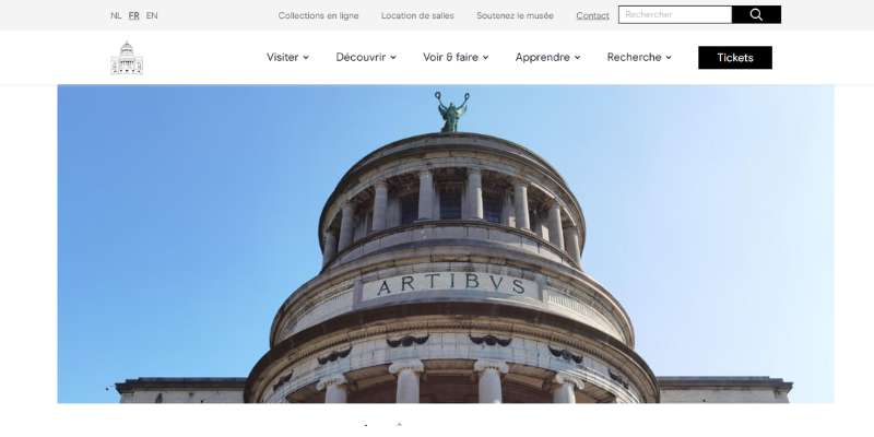
The website of the Art and History Museum has only one purpose. It introduces art lovers around the world to the history of races and their beautiful creations. The layout is clean and attractive, and visitors can subscribe for a virtual museum tour.
A sticky header is also introduced to make navigation easier for every user. The museum even has an Instagram page and integrated feed where you can share and track your favorite artwork.
Jon Burgerman
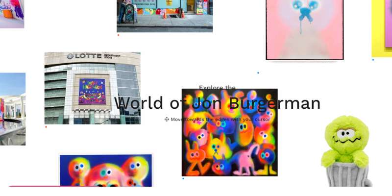
Jon Burgerman is extremely talented and praised for his in-hyper realistic drawings. The unique set of works also includes murals, characters, and doodles.
As expected, he owns a website that fully supports the quality of his work. He uses a full-screen image slider to display works as ‘stories’, and even lets you share these stories on social media. He makes use of many professional effects, such as gifs, parallax scrolling, and bold colors.
Mike Perry Studio
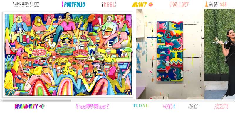
The beautiful online art gallery is displayed horizontally, and you can find your favorite art piece already on the homepage.
The website aims to entertain you, which is why every navigation option is accompanied by a fun gif.
Pedro Campos
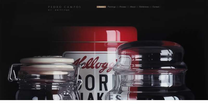
Pedro Campos is another contemporary art professional who attempts to recreate photos on canvas. His best paintings are available as full-screen images, and the design layout is very simple. What we like the most are the fade-in/out effects you see as you switch between pages.
Street Art
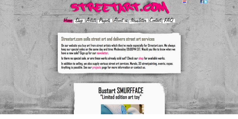
Street Art is another modern and innovative art website that deserves attention. The vibrant artwork is the star of the show, and there is a story for each piece of art displayed on the homepage.
Better yet, the website uses a grid layout to introduce as many art pieces as possible. The site is integrated with Google Maps to display the origins of this artwork, which is also something you should consider.
Almost Real
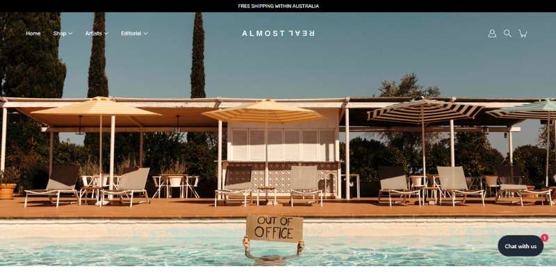
AlmostReal is, in fact, an art market for photography fans. You can find galleries from many famous authors, or even participate in art fairs. The website is simple and easy to navigate and makes smart use of white spaces.
Kate Vass
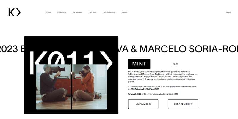
Kate Vass gallery is another online marketplace where you can buy the works of multiple artists. Most of all, they display photography and specialize in upcoming technologies.
What we like the most about this one-stop shop is the social moment. Visitors are invited to participate in all sorts of events like exhibitions and unique collection displays.
Raul & David
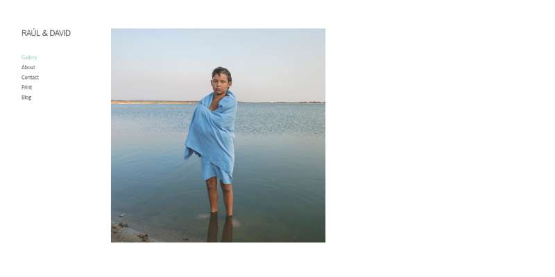
Raul & David are modern photographers. Their website, alike their work, tells a story with only a few basic elements. You can find their art prints everywhere on the site, including the hero scene on the home page. The photographers also run an online art blog with interesting industry news
Edzera Gallery
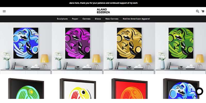
Edzerza Gallery (Canada) displays the foremost Inuit art. Their website offers multiple limited-edition prints. You can find an item from traditional carvings to modern art oil paintings. This website also has a blog where you can read more about Inuit culture and history.
Another thing that sets the Edzera website apart is the availability of educational resources. You can even download a glossary with Inuit terms and a historical brief on selected items.
Jam Factory
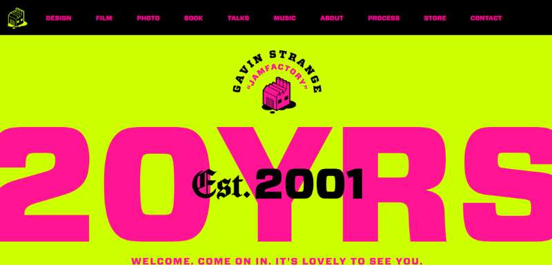
This website is the personal art portfolio of designer Gavin Strange. He specializes in new art and offers trendy graphic designs in various forms. For instance, you can purchase his fun gifs, oversized fonts, or even parallax scrolling. This is the one-stop shop for all effects you need.
Andrea Lawl Manning
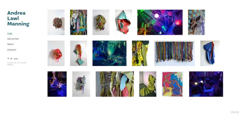
Andrea’s online art goes beyond simple painting. He is the master of unique, modern sculptures, and his website makes this obvious.
Visitors around the world find this website very user-friendly, and they are right to do so. The website features intuitive navigation, clear CTAs, and clickable pictures.
Hattie Stewart
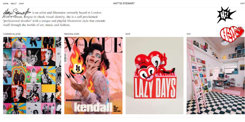
Hattie Stewart also has a very interactive, user-oriented art website. The designer ensured each click is followed by an illustrative emoji or a fun gif. Once you select a project, you access a beautiful contemporary art gallery with multiple images. If you want your website to be more playful, this is the place to get inspired!
Art for Global Goals
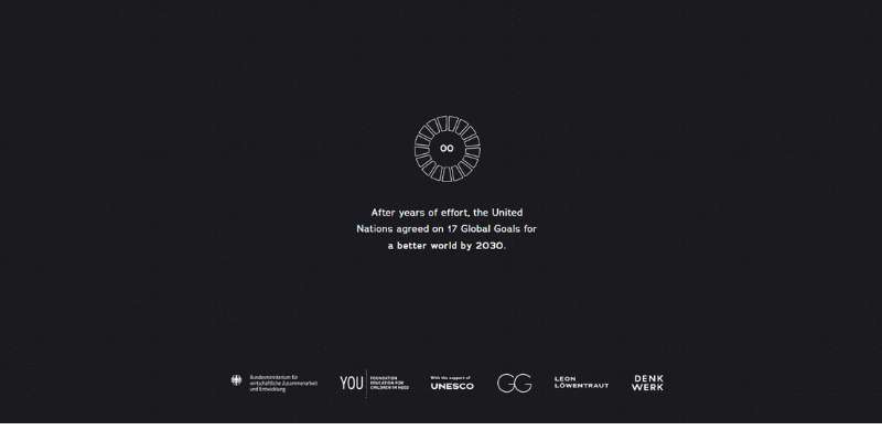
This website specializes only in the works of exceptional German German Artist Leon Lowentraut. You can see all 17 of his paintings presented with a clear headline, classic menu, and vibrant color palette. What we love about this website is its attention to detail. You can see all paintings full-screen and even zoom in. A sticky header on the side will provide you with all the information you need.
Philippa Rice
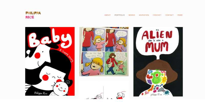
Phillipa Rice’s area of work is modern art. We’ve all seen some of her inspirational illustrations, comics, and illustrations. She also has an amazing online portfolio where works are displayed on an asymmetric grid and with the use of trendy effects.
The color scheme is also adorable and reminds us of the unique comic book style paired with new art. Therefore, this website is attractive to everyone. Children are just getting acquainted with this world, and adults associate it with their nostalgic fondness for the theme.
Mel Volkman
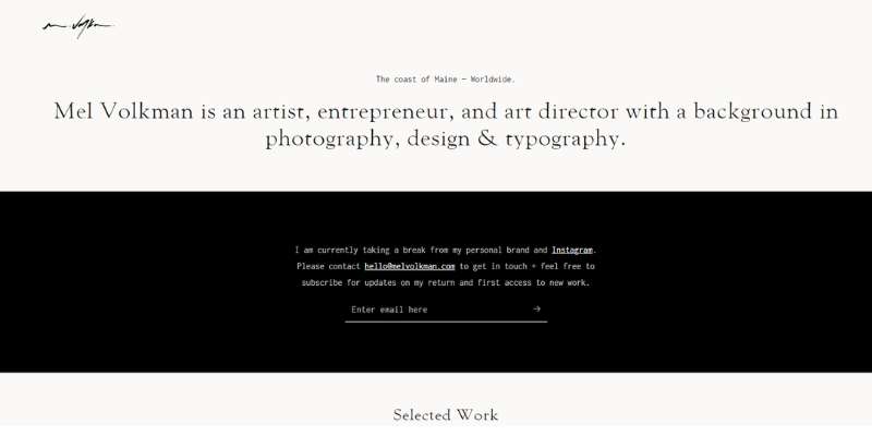
Last but not least, we present you the fine art website of Maine-based artist Mel Volkman. You should consider this website for selling art in an online shop.
The website features a trendy e-store based on the Instagram three-column template. Works, on the other hand, are displayed on a Journal template and stacked one below the other.
FAQ on designing an artsy website
What are some key elements to include on an artsy website?
Artsy websites should include important features such as an about page, artwork portfolio, contact information, and links to social media profiles.
To provide further context and insight into the artist’s work, including artist bios, descriptions of the creative process, and a blog or news section.
How can I create a visually appealing design for an artsy website?
Use a clean and simple style with an emphasis on high-quality artwork photos to build a visually appealing artsy website.
Employ an easy-to-read typeface that complements the artist’s style, as well as a color scheme that represents the mood and tone of the artwork. To achieve a sense of balance and harmony, use whitespace and negative space.
What kind of content should be included on artsy websites?
A portfolio of artwork, artist bios, contact information, and connections to social media profiles should all be included on an artsy website.
It may also be beneficial to include information about upcoming exhibitions or events, artist news, and educational resources such as blog entries or instructional videos.
How can I optimize an artsy website for search engines?
Use relevant keywords in page titles, meta descriptions, and content to optimize an artsy website for search engines.
Employ headings and subheadings to establish a logical structure that search engines can understand. Use descriptive filenames and alt tags to optimize photos and other media for SEO.
An artsy website should feature an easy-to-use navigation system, as well as links to vital content such as the portfolio, artist bios, and contact information.
To generate a sense of organization and clarity, use whitespace and negative space. To ensure that your website appears fantastic on all devices, use a responsive design.
What are some effective ways to showcase artwork on an artsy website?
Use high-quality photographs or videos that show off the artwork in the best possible light when displaying it on artsy websites.
Provide context and information about each piece with descriptive descriptions or titles, such as medium, size, and price. Make it simple for users to find certain pieces or types of artwork by using categories or filters.
Social networking can be an effective way to promote an artsy website and attract a larger audience.
Employ social media buttons to make it simple for people to share website content on their own social media sites. Utilize social media posts to promote new artwork, upcoming exhibits or exhibitions, and other artist news or updates.
What are some important considerations for mobile responsiveness and accessibility on an artsy website?
To ensure that all people can view an artsy website, it should be optimized for mobile devices.
Employ a responsive design that adjusts to multiple screen sizes, and make sure all content is readable and easy to navigate on mobile devices. To ensure that people with impairments can access the material, utilize alt tags for photos and other media.
How can I use storytelling and narrative to enhance the design of an artsy website?
The narrative may be a powerful technique for improving the design of an artsy website and connecting with the audience on a deeper level.
Provide context and significance to the artwork by including artist biographies, descriptions of the creative process, and behind-the-scenes insights. Make an emotional connection with the audience by using narrative to help them grasp the artist’s vision and perspective.
What are some legal considerations for an artsy website, such as copyright and intellectual property?
Copyright and intellectual property regulations may be important considerations for an artsy website.
Make sure that any artwork is appropriately attributed and that the artist has secured all required permits or licenses.
To protect artwork from unlawful use or theft, employ watermarks or other security measures. Outline any policies or processes pertaining to the sale or distribution of artwork in clear and straightforward language.
It may also be beneficial to speak with a legal practitioner to ensure that the website complies with all applicable rules and regulations.
Ending thoughts on these artsy websites
Every artist, painter, or photographer out there needs a strong online presence. Website and social media are key tools to display artwork to wide audiences in the world, and to do so in a more creative way. Artsy websites with a hero scene drive more customers your way and reaffirm your success. Better yet, art collectors get to buy art online, which gives you an additional source of profit.
Quite the deal, isn’t it?
If you enjoyed reading this article about artsy websites, you should check out this one with the best startup sites.
We also created similar articles like these with animated website designs, spa website designs, dog grooming sites, and coffee shop websites.
And there are several more that you can check out like these relaxing sites, trippy sites, political websites, and weird sites.


