Although, it’s been some time since it was officially released. If you didn’t read the article on HTML5 yet, I strongly advise you do so, as CSS3 works better with the latest markup language from the World Wide Web Consortium.
CSS2 appeared back in 1998, and since then a lot has happened on the internet. Its only revision was made in 2011, CSS2.1, but experts in the industry say it was only a matter of time until CSS3 should have been released, as the features it comes with are entirely necessary and were missed during the past years.
Your Designer Toolbox
Unlimited Downloads: 500,000+ Web Templates, Icon Sets, Themes & Design Assets
Table of Contents

DOWNLOAD NOW![]()
What many people, didn’t know about CSS3 was that its development started only one year after the submission of its previous version. So the W3C has been working on this improved version since 1999, for more than 12 years until the first CSS3 stable version was released.
Although it sounds like there is a big difference between CSS2 and CSS3 (which is quite true), all modern browsers were quite quick to adopt the new addition to the W3C family. All major browsers support most CSS3 features that are currently available.
You might also like: An Introduction to HTML5.
As with HTML5, the Consortium still considers CSS3 to be under continuous development and it is very unlikely for it to get a final version, for the same reasons HTML5 will probably not. With the web requirements and the industry in general, changing so fast, coding needs to move forward at the same pace.
CSS3 in a Nutshell and Main Differences to CSS2
Maybe the biggest difference between CSS2 and CSS3 is the separation of modules. While in the previous version everything was a large single specification defining different features, CSS3 is divided into several documents which are called modules.
Every single module has new capabilities, without hurting the compatibility of the previous stable release. When we talk about modules, we can name more than fifty of them. However, four of these have been published as formal recommendations. The big four is comprised of the following:
- Media Queries (published in 2012)
- Namespaces (published in 2011)
- Selectors Level 3 (published in 2011)
- Color (published in 2011)
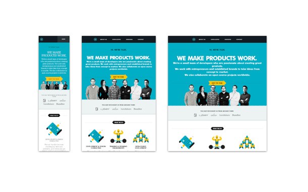
The media queries might well be the most important addition to CSS. What it does is simple: it allows certain conditions to be applied to different stylesheets, making websites fluid and fit all kinds of screen sizes. Media queries allow developers to tailor to different resolutions without having to change or remove content.

Example of a responsive grid built with media queries
Media queries work very easily and once you have used them once you are pretty much set. Let’s look below at some lines of code.
@media screen and (max-width: 600px) { background: #FFF;
}
By starting to style in the media query above, you will only style for screens with a maximum width of 600 pixels. In the example above, all screens with a maximum width of 600 pixels will show you a white background.
However, the max-width is not the only condition you can apply to a stylesheet. You can use max-device-width too (which is the screen resolution, unlike max-width which is the viewing area), you can use min instead of max, but you can also combine two conditions, such as in the example below, which will only apply for screens with a viewing area between 600 and 900 pixels.
@media screen and (min-width: 600px) and (max-width: 900px) { background: #FFF;
}
CSS3 has some pre-defined stylesheets for portable devices, such as iPhone or iPad, which you can see below:
<link href="iphone4.css" rel="stylesheet" media="only screen and (-webkit-min-device-pixel-ratio: 2)" type="text/css" />
and
<link href="portrait.css" rel="stylesheet" media="all and (orientation:portrait)" />
<link href="landscape.css" rel="stylesheet" media="all and (orientation:landscape)" />
As you can see above, the media queries can come in quite handy when developers need to make fluid grids work on different devices with different screen sizes.
Some other important design considerations of CSS3 are, for example, the borders, which now can be made rounded without hacks. CSS3 has actually introduced rounder borders, which is a huge help for designers and developers.
However, many of these features do not work in older versions of Internet Explorer, but this is not something new for us, we’ve heard it before. The only code you need to add in the stylesheet (in the specific class) is something similar to:
-moz-border-radius: 5px;
-webkit-border-radius: 5px;
border: 2px solid #897048;
As you can see, it is much easier than before.
Gradients are also available in CSS3, another cool addition that we have wanted to see for some time, as well as box/text shadows and border images.
In order to add text shadow to content without any hacks, CSS3 simply requires something similar to the following line of code:
text-shadow: 2px 2px 2px #ddccb5;
Creating columns for content has never been easier than with CSS3, as now you have four lines of code you can use at any time. These are:
- column-count
- column-width
- column-gap
- column-rule
Another great time saver is the option of inserting multiple backgrounds directly from CSS, instead of using all kinds of hacks as we used to do before. The code is simple to write and to remember, and I am sure you will use it at some point in time.
.multiplebackgrounds {
height: 100px;
width: 200px;
padding: 20px;
background: url(top.gif) top right no-repeat,
url(bottom.gif) top left repeat-y,
url(middle.gif) bottom repeat-z;
}
Vendor prefixes
Back when CSS3 was newly released, vendor prefixes were used all the time, as they helped browsers interpret the code. Sometimes you still need to use them today, in case the browser you are testing in doesn’t read the code. So below is a short list of all the vendor prefixes for major browsers:
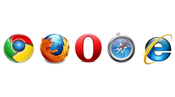
-moz-: Firefox-webkit-: Webkit browsers such as Safari and Chrome-o-: Opera-ms-: Internet Explorer
Note that, according to an official press release from a few weeks ago, Opera will soon build their new desktop and mobile browser on WebKit too, instead of their current Presto rendering engine. This means that the -o- vendor prefix will disappear at some point in time, leaving us with only three major ones.

Vendor prefixes are used in order to make CSS3 compatible with all major browsers
New pseudo-classes
The arrival of CSS3 brings us a bunch of new pseudo-classes, including structural ones, that target elements based on their position in the document and relation to different other elements.
- :only-child – in case you have an element in the document tree that is the only child of its parent, it can be targeted by this pseudo-class.
- :empty – targets elements that don’t have any children or any text, for example an empty element such as <p></p>.
- :nth-child(n) – it takes advantage of numeric (n) values and targets child elements in relation to their position within the parent. To give you a precise example, a list of blog comments would probably look more appealing with alternating background colors – this can be done using this pseudo-class.
- :first-of-type – this targets the first of a specific type of element within a parent, and is the opposite of :last-of-type.
- :first-child – targets the first child element in a parent, regardless of its type. It is the opposite of :last-child.
- :not(s) – this one targets elements that are not matched by the specified selector (s).
- :root – this one targets the root element of a document.
There are more pseudo-classes added to the new CSS3, but as this is basically an article for beginners, it is not really worth mentioning them.
Examples
There are not many examples of CSS3 that I can show you, as it usually is used in collaboration with HTML5 or jQuery. CSS is for styling and enhancement, not for creating applications. Therefore there are only two interesting links I want to share with you.
- Rotating Multiple Images
- Robot Animation
Where to learn?
As I advised you in the HTML5 article (and even much more now), CSS3 is impossible to master unless you have prior CSS knowledge. I assume since you’ve read this article, that you have prior CSS experience, so you just have to build on that.
Otherwise, you need to take it from the top. To ease you into the CSS3 learning process, I will recommend several sources:
Conclusion
HTML5 and CSS3 are here to stay, and in combination, these two tools are very powerful and can create beautiful, high-quality solutions.
Therefore you need to learn them and start using them today, otherwise, you will fall behind your competitors.
As promised before, I will start working on putting together several HTML5/CSS3 tutorials so that you will be able to learn even more from 1WD. However, until that comes, please make sure you have at least some basic knowledge of HTML5 and CSS3, so that we are all on the same page when we start. See you next time!
This post may contain affiliate links. See our disclosure about affiliate links here.


