This year has ended with a great blast and I’m pretty sure that everyone has done their countdowns and throwback blog posts, tweets and even status updates.
It’s a pretty cool thing to do because you get to remember all the awesome things this year has given you. You look back at how bad you were design-wise last year and how well you’ve improved.
Your Designer Toolbox
Unlimited Downloads: 500,000+ Web Templates, Icon Sets, Themes & Design Assets
Table of Contents
- 1 Your Designer ToolboxUnlimited Downloads: 500,000+ Web Templates, Icon Sets, Themes & Design Assets
- 2 The Best Graphic Design Tutorials
- 3 The Best Web Design Tutorials
- 4 Build Flat Responsive WordPress Website From Scratch (High Quality Course)
- 5 The Best jQuery Tutorials
- 6 Wrap up!
- 7 Why It Is Good Idea To Learn JavaScript And jQuery?
- 8 Introduction
- 9 Origins of jQuery
- 10 The Advantages
- 11 The Disadvantages
- 12 jQuery Mobile — Oh, The Goodies!
- 13 Conclusion
- 14 jQuery Mobile – What You Need to Know
- 15 jQuery Mobile’s Main Concept
- 16 Then, the hero arrives
- 17 Awesomeness proven, let’s code!
- 18 Basic structure
- 19 Basic UI components
- 20 Navigation, Lists, Form & Dialog Components
- 21 Custom font embedding
- 22 Compress images
- 23 Remove components
- 24 Now it’s your turn?
- 25 Introduction to Responsive Web Design
- 26 Grid system and background images
- 27 Scale everything down
- 28 Consider the media queries
- 29 What to do now?
- 30 Examples of responsive design
- 31 Further reading
- 32 Web Design Symmetry and Asymmetry
- 33 What is Symmetry?
- 34 Asymmetry
- 35 Symmetrical vs Asymmetrical Web Design
- 36 More Examples of Impressive Web Design
- 37 Why Creating Minimalist Design Makes You a Better Designer
- 38 Working on typography
- 39 Attention on the main element
- 40 Closing in on perfection
- 41 Use negative space
- 42 Getting everything right
- 43 Know your work’s value
- 44 Bottom line
- 45 Create a Jigsaw Puzzle Using jQuery and PHP
- 46 Splitting an Image into Smaller Parts
- 47 Creating the Puzzle Using Jquery
- 48 Loading Images for the Drag and Drop Puzzle
- 49 Making the Puzzle Sortable
- 50 Identify the Winning Moment
- 51 Bonus Tip
- 52 Whats Next?
- 53 Conclusion

DOWNLOAD NOW![]()
With this, you get to assess yourself how much more you could exert and, in turn, how much more money you could earn.
Retrospection also tells you what more could you learn. Seeing what you’re weak at will also allow you to see where you could trained. That is why self-correction and openness to new things is a great habit for a designer.
Speaking of learning, were you able to catch some of the best web design tutorials this year? This year has given a lot of trends and knowledge that made tutorials prevalent as stars in the night sky.
Well, for one thing, these tutorials will teach give you new knowledge and improve on what you already know. You’ll never know; maybe one day, the web design noob becomes the ninja.
Now, let’s look back at the top 70 tutorials that rocked the web design world. Some of these, you might have seen before. Others, you might have missed. But one thing is for sure, these tutorials don’t kid when they say they will teach you new cool things. So, for those who lived under the rock last year, let’s roll! Be sure to look at the table of contents, as we have included some of great material on some design subjects that are going greatly help with your learning.
Table of Contents:
- The Best Graphic Design Tutorials
- The Best Web Design Tutorials
- The Best jQuery Tutorials
- Why It Is Good Idea To Learn JavaScript And jQuery?
- JQuery Mobile – What You Need to Know
- Introduction to Responsive Web Design
- Web Design Symmetry and Asymmetry
- Why Creating Minimalist Design Makes You a Better Designer
- Create a Jigsaw Puzzle Using jQuery and PHP
The Best Graphic Design Tutorials
The following tutorials highlights graphic designs. It includes typography and basic web mock up designs. These tutorials are aimed at making your website look better using graphic design elements such as fonts, shapes and a lot more!
Working with Types: Typography Design Tutorial for Beginners
This one discusses the basics of typography and how to create your very first design! For beginners, this one’s recommended.
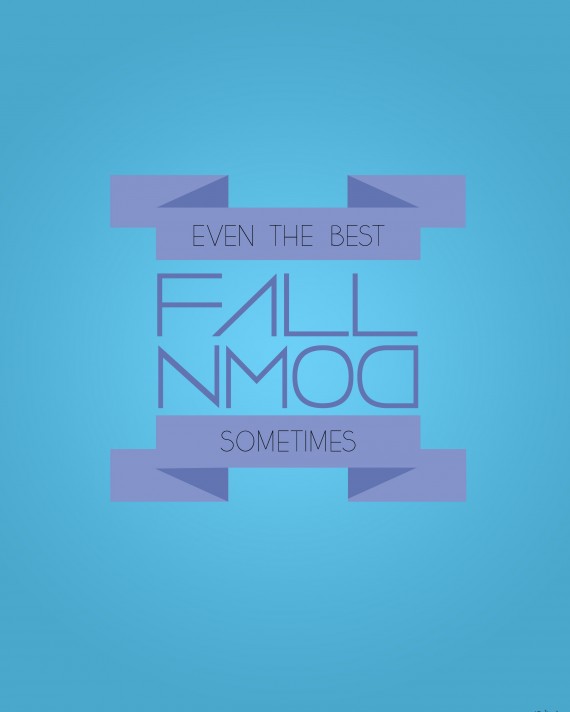
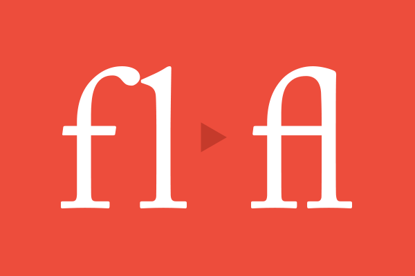
Your Logo as a Web Font Ligature
Create beautiful logos using types and not worry about CSS3 cross browser considerations (which is very, very tricky, messy and takes a lot of effort). This one shall render with better quality with the smallest effort and time.
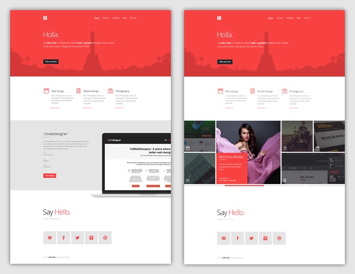
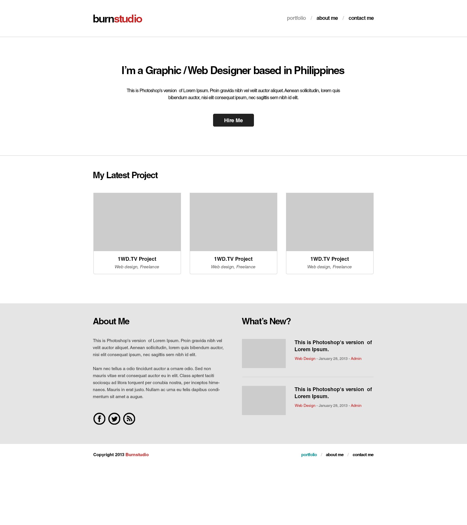
Flat Web Design Tutorial – Portfolio Landing Page [FREE Download]
This tutorial will teach you to create a very beautiful flat design portfolio landing page. Very easy to follow and tinker with!
The Best Web Design Tutorials
Three of the best used platforms in web design are used in this section. This is a list of PSD to HTML/CSS tutorials and HTML and CSS tricks. Make your site look better using these easy-to-follow tutorials.
Build Flat Responsive WordPress Website From Scratch (High Quality Course)
If you are looking to take your web design career to whole new level in 2015 – we created The Ultimate 2015 Web Design Learning Course, where in 9 hours we will teach you how to Build Your Own WordPress Site – 100% Responsive & Flat –
You will learn how to build website from scratch in Photoshop, then convert PSD to HTML and CSS. Finally using Bootstrap magic, we will convert website to fully responsive and functional WordPress website.
Yes, you will learn how to make website responsive, but this time you will be building high quality website design you can be really proud of!
We throw in some business lessons, interviews and many bonuses to amplify your learning and help you get some clients as well! Watch the video to see exactly what’s inside.
What you are waiting for? Take your skills to the next level right now.
[tip]P.S. Looking for more responsive web tutorials? See it pays to read until the end!
Basic Web Design Video Course – Wireframing, Photoshop Tools & Panels, and Designing [Part 1]
Talking about details, this one goes off the charts. Broken into parts, this comprehensive tutorial discusses the major facets of web design that you should know. Great for both beginners and experts.
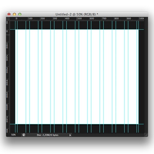
How to Create Your Own Custom Grid System in Photoshop
Grid systems are of great help in putting different elements in a page without becoming lost in pixels. This tutorial teaches you how to use a very simple tool (a Photoshop plugin called Guide Guide) to design using grids.
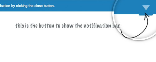
Hide / Show Notification Bar With CSS3
Do you want to create a sliding notification bar? This tutorial is for you. Written in the simplest and most understandable way possible, you will be amazed at how easy it is to add a notification bar in your website design.
Web Design: How to Convert CSS to SASS & SCSS
SASS and SCSS are pretty new to some designers. With CSS still known as a very plausible and useful language, learning how to convert CSS to SASS and SCCS is not bad for some knowledge that you might use in the future. When you read this tutorial, you will see how these languages are both alike and different in many ways.
How To Style Google Maps
Putting maps on your website is great, especially for corporate clients. But styling them? That’s better. Now learn how to do this through this tutorial, and you’ll be able to look at maps in a whole new way.

Getting Creative with the Google Maps API
We’ve seen earlier how could we style maps. This one is another tutorial about this. The only difference is that it pushed further as it incorporated a lot of new elements that we thought we could never place in maps before. Amaze your clients at how you could design a map just for them.
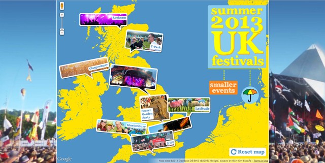
Web Design: Equal Column Height With CSS
What bugs most designers is unequal column heights. An OC designer will have a hard time tinkering with pixels and doing trial and error computations. This becomes a major headache for beginners as they still don’t know the tricks of the trade yet. So, this tutorial becomes a must if they need to add more to their skills. Look at this tutorial to see which of your methods is easier to execute and which produces more accurate results!
How To Create a Web-Based Video Player
It’s always fun to customize all the elements you post in your website. It gives a personal touch to it. More so, you achieve uniformity in design. This tutorial is a proof of this perk. Learn how to create a web-based video player that you can really call ‘yours’.

How To Use CSS3 Multiple Backgrounds
When I first read this tutorial, I never knew that having multiple backgrounds in one div or class is possible. Well, we all have our moments of learning, don’t we? This one is a great yet simple example of this.
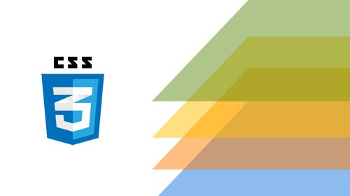
Creating Content Tabs with Pure CSS
In the early popularity of CSS3, this tutorial has done wonders for me. Being able to create tabbed contents easily with CSS? It’s a pretty amazing thing to know.
Fun CSS Loading Animations
I’ve talked about loading animations before and how cool they are. They make your website more fun and makes your audience do (or see) something while they’re waiting. Interested? Learn from this tutorial.

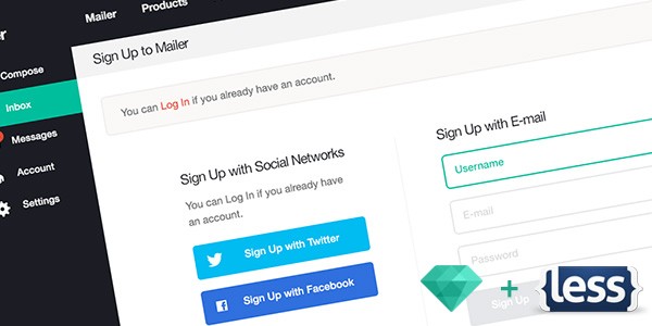
Flat UI Pro Tutorial: How To Use LESS to Create a Sign-In Form
David East gives a very simple and detailed explanation on how he created a custom sign-up form using LESS and HTML. It’s very simple and easy to follow. You just need basic coding knowledge. That’s all.
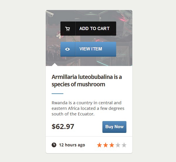
Create an e-Commerce Web Element with CSS3
Have you ever had any e-commerce customers? Or you wanted to put up one? Well, this tutorial is a good kick-start. Learn how to put e-commerce elements in any site using only CSS3!
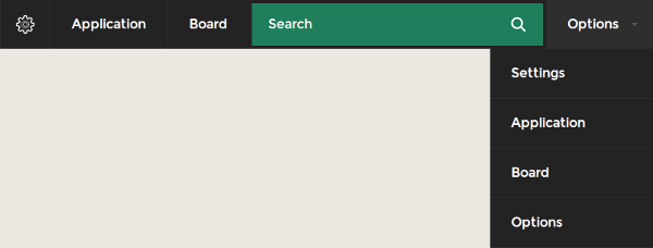
Create a Drop Down Menu with Search Box in CSS3 and HTML
Do you want to create a very simple and elegant drop-down menu and search box? This one’s for you. With its very trendy design and easy to follow steps, a drop down menu could never be created this easier.
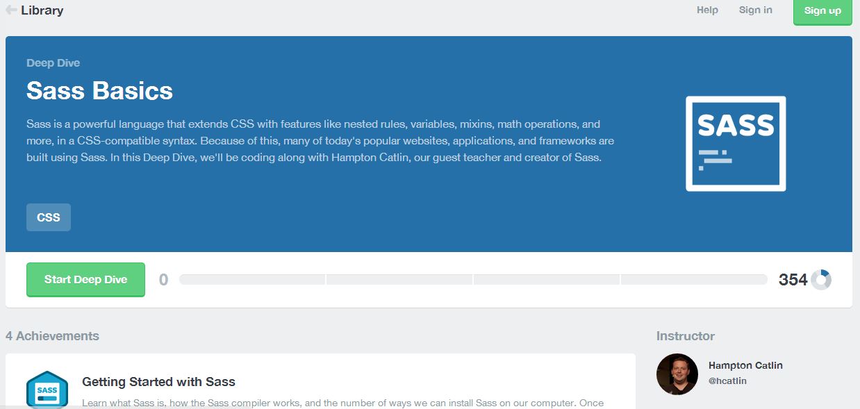
Learn SASS on Treehouse
“SASS is the most mature, stable, and powerful professional grade CSS extension language in the world.” So does the SASS website says. So where to learn this Syntactically Awesome Style Sheets? Nowhere else but on this tutorial!
Creating Non-Rectangular Layouts with CSS Shapes
Sometimes it’s good to deviate from designing norms. A good example of this is non-rectangular layouts. It gives a refreshing look to the over-all design of the page. Give your clients and yourself a new view by trying this tutorial out.
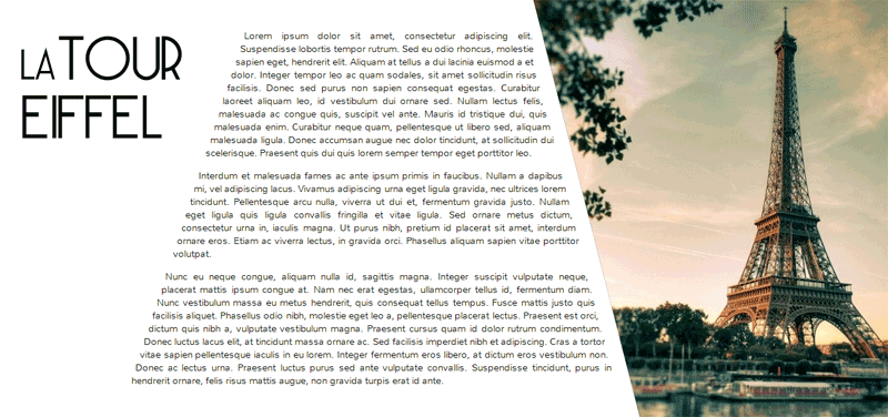
How To Create Flat Style Breadcrumb Links with CSS
Breadcrumbs are great tools for navigation. It lets you know where are you exactly on the website and prevents you from getting lost in the deep, dark woods. Learn how to save your viewers with breadcrumbs and learn how to do it creatively using CSS!
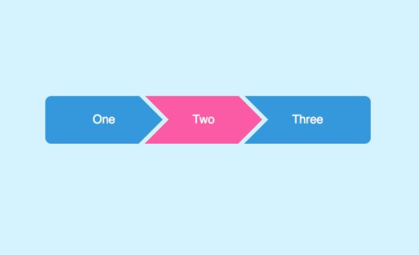
Bring Your Forms U- to-Date With CSS3 and HTML5 Validation
Great for contact forms, this tutorial will help you create a simple but very useful contact form. I was amazed at how it matched with any design because of its awesome simplicity.
Quick Tip: Don’t Forget the Viewport Meta Tag
Is responsive designing complicated? Or are you just complicating things out? It turns out that, most of the time, you’re the one complicating things out. Good thing you have this tutorial to clarify.

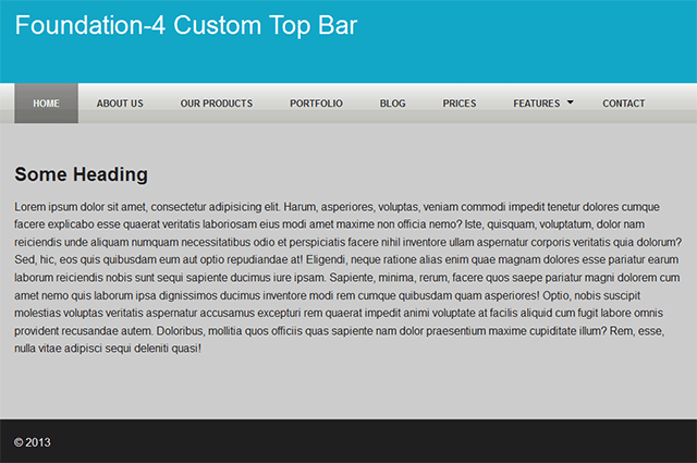
How to Customize the Foundation 4 Top Bar
Another navigation menu tutorial proves to be brilliant as it crosses over browsers and devices with simplicity, style and sense. Great tutorial.
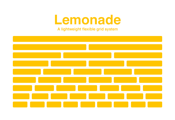
Build a Freshly Squeezed Responsive Grid System
Using one of the many grid systems, this tutorial is aimed towards teaching designers to use grids for easy styling. This method is a very great tool, especially when doing responsive designs.
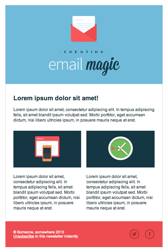
Build an HTML Email Template From Scratch
Email templates could attract more traffic to your website. Once you send your subscriber cool emails, they will be awed at how good you are and might even hire you because of this. So learn how.
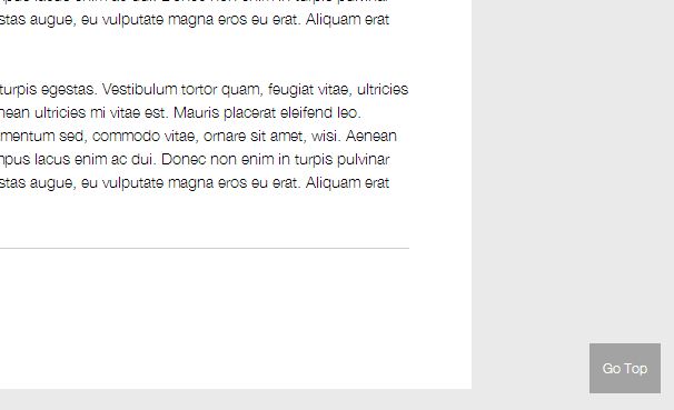
Quick Tip: Implement a Sticky “Back to Top” Button
One of the greatest advancements in web design is that “back-to-the-top” button which allows you to scroll into the top of the page in a single click. This tutorial lets you create that. Put it on your website now!
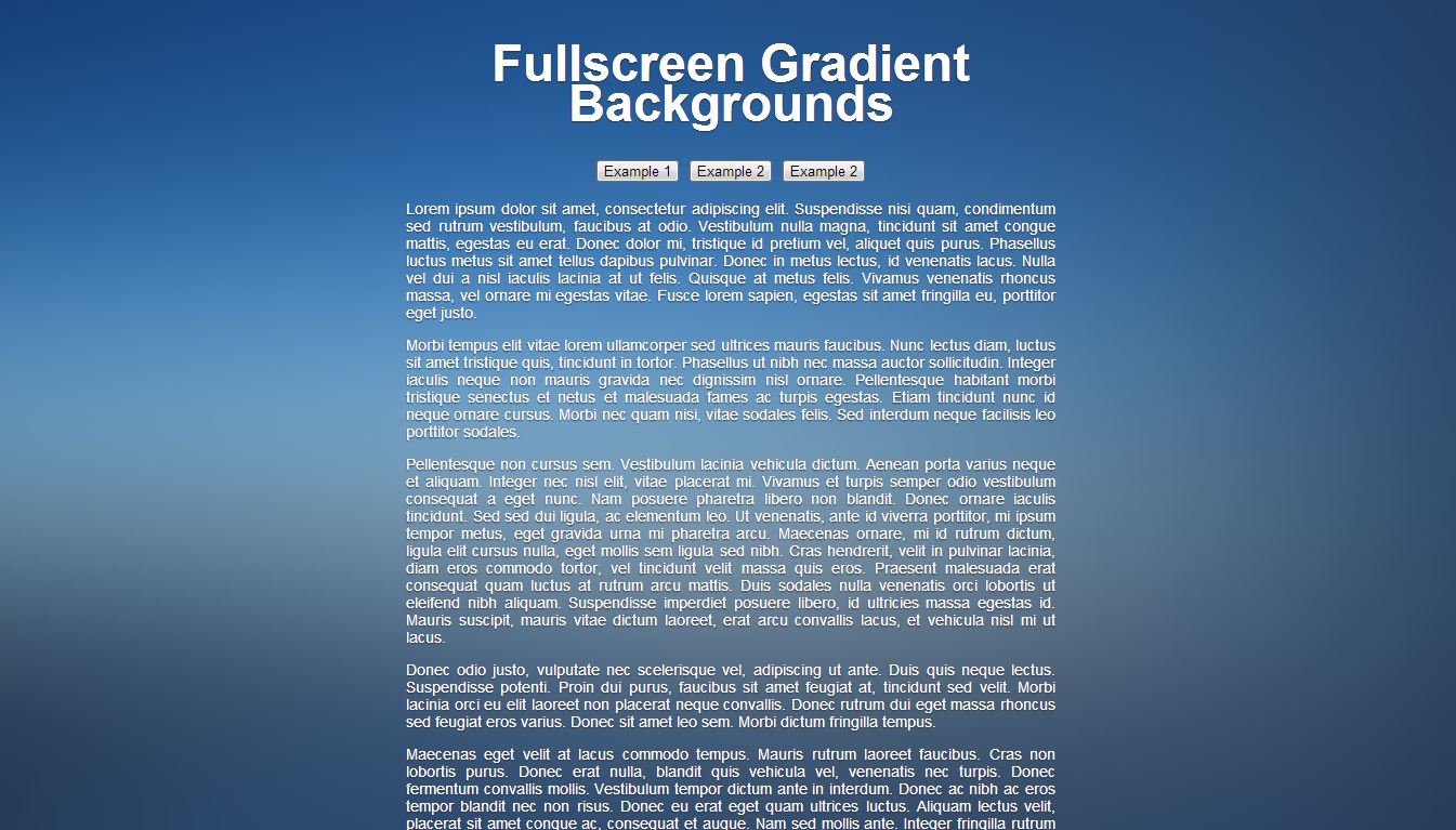
Quick Tip: Using Images as Fullscreen Faux-Gradient Backgrounds
I personally love full screen backgrounds. They give professional and neat-looking feel to your website. Try this on your designs and your client will surely love them!
Circle Navigation Effect with Css3
This easy-to-navigate and use navigation effect gives a very clever method of presenting data in your website. Another quality tutorial for your convenience.

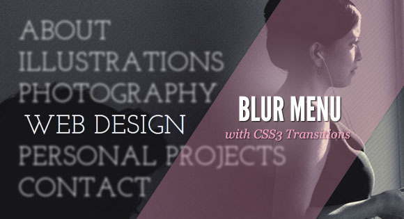
Blur Menu with CSS3 Transitions
Another amazing navigation effects, this tutorial lets you create a very cool navigation that blurs unselected links. I recommend this for designers who want to design portfolios.
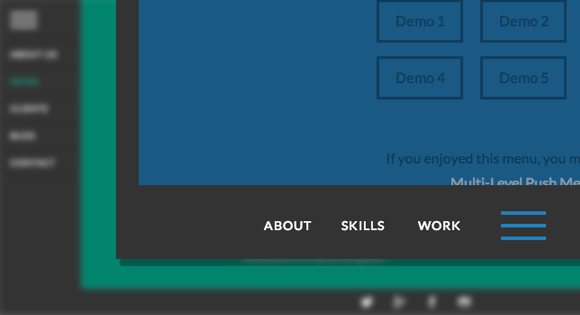
Animated Border Menus
Who would have thought that you could do something as clever as this? I love this tutorial because it lets me understand the greatness and coolness of using borders with animations.
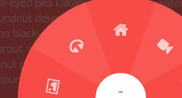
Building a Circular Navigation with CSS Transforms
The world surely is both flat and round as this tutorial proves that something amazing can be achieved by fusing two opposing ideas in the literal aspect. With different effects to tinker on and with this conveniently written article, you’ll soon adapt this in your creative outputs.
The Best jQuery Tutorials
Here’s for you guys who like to have a little bit of a challenge. Some advanced stuff! jQuery effects that will surely make your clients’ eyes pop! The list is easy to follow and comes with demos that you could download and tinker!
Beginner’s Guide to Working with jQuery Animation
This tutorial delves into jQuery animation basics and lets you understand these fundamentals while preparing you for more advanced stuff. For beginners, this is a yes-yes tutorial.

jQuery How-to: Creating and Inserting New Elements
Learn the basics of jQuery from this very comprehensive set of tutorials!

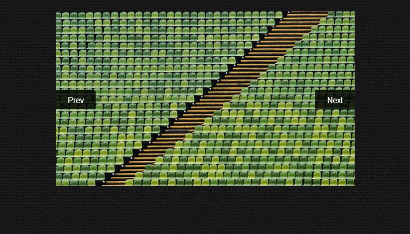
Creating Touch-Enabled Slider With SwipeJS And jQuery
With the advent of mobile touch devices, doing jQuery sliders became a little bit more complicated. As we all know, it is very easy for web designers to use jQuery slider navigations. But it becomes difficult when transforming these into mobile as the navigation icons become cluttered in the tight screen resolution. The answer to this? Make the slider touch-enabled.
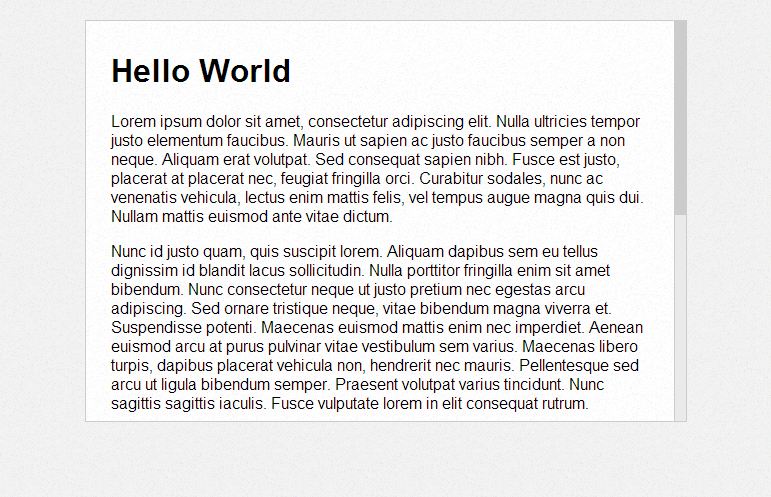
Customizing Browser Scroll Bar With CSS / JQuery
Does the default scroll bar bore you? Well, good news is, you could re-design them. Learn how from this tutorial.
Building a Mobile Panel With jQuery Mobile
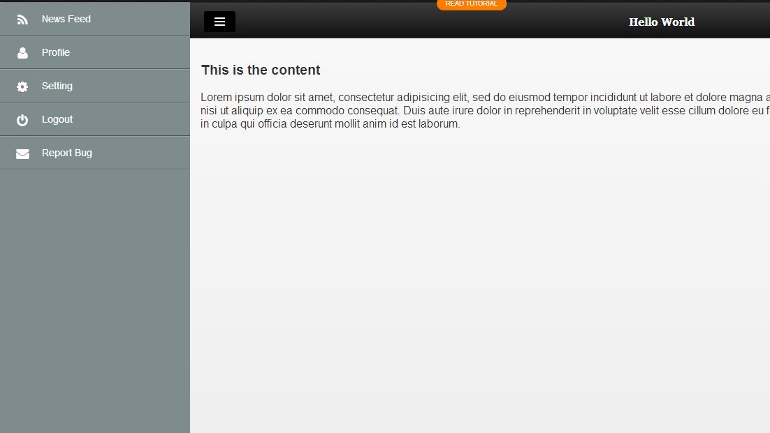
I first saw this mobile panel on the mobile version of Facebook. Well, for one thing, I knew that someday someone will do the re-creation of this panel. So, here it is!
How to Implement Infinite Page Scroll Effect in Static Webpages
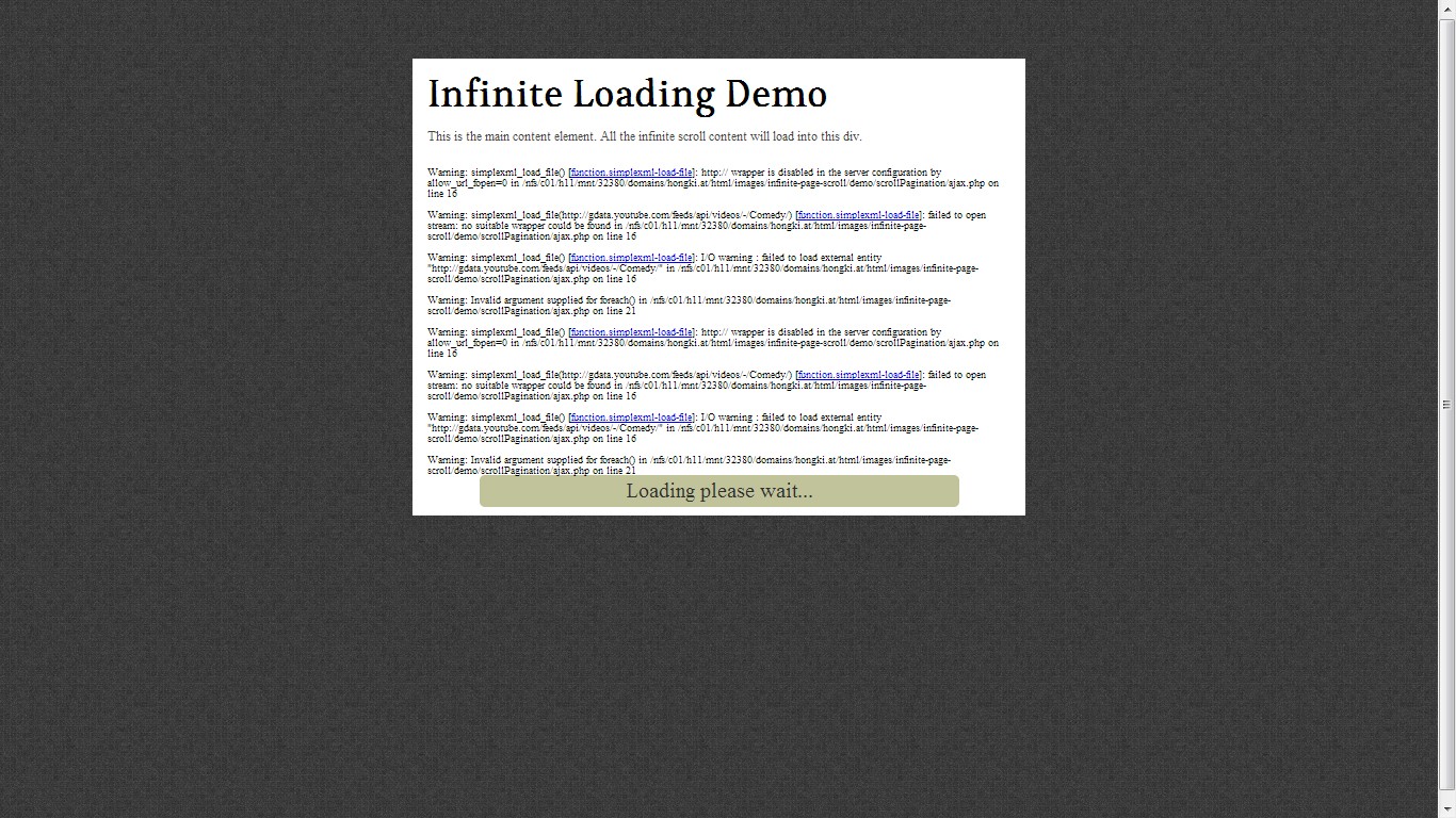
Are you into infinite scrolling? Or do you want your design to have one? You came to the right place because I will tell you where it is. It’s right in this particular tutorial. Learn how to seamlessly feed your future viewers with content.
Smart (Auto-Hiding) Website Header & Footer Using jQuery
This tutorial discusses and demonstrates how you can build a sticky header bar that will auto-hide after a few scrolls. This is very advantageous because it allows you to achieve the ease of access capability of a sticky nav bar, and the convenience as well as lack of distraction in a regular nav bar.

Sticky Position (Bar) with CSS or jQuery
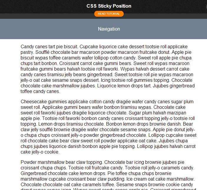
Make your sidebar and other elements on your website always visible. Avoid scrolling them together with the content through this tutorial.
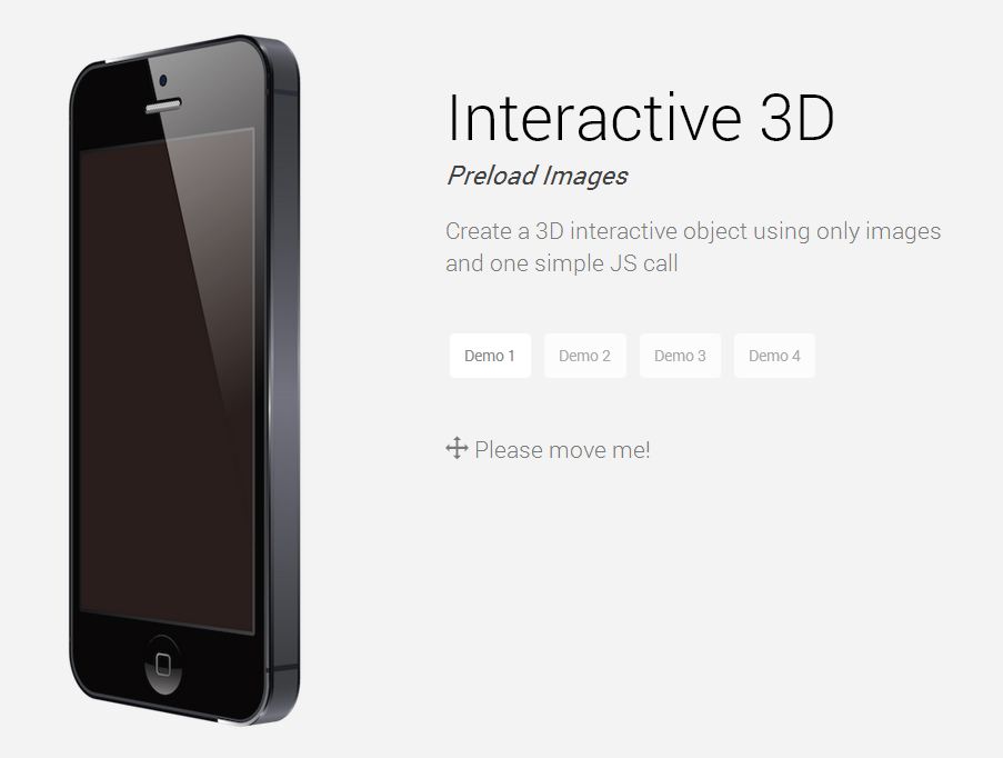
Create an Awesome 3D Interactive Object Using Only Images and jQuery
Do you have a client who wants to put up an online shopping website? Do you need a 3d presentation of a product you want to place in your website? This one is perfect for you.
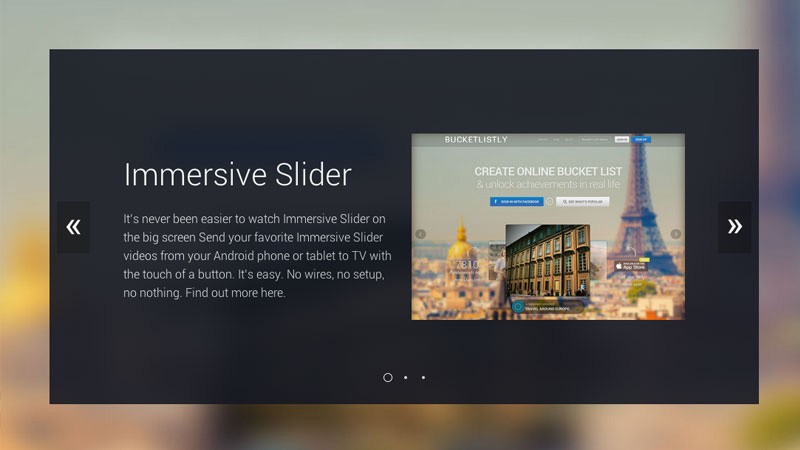
Creating an Immersive Slider Experience with jQuery Immersive Slider
Sliders are still a thing in the world of web design. Be creative and try this tutorial out. Your eyes will pop at the fusion of simplicity and beauty at its finest.
Creating a Parallax Scrolling Webpage Using Jarallax.js
Doing a videogame website design? Or a promotional website for a movie? Try this tutorial and let it help you using Parallax scrolling.

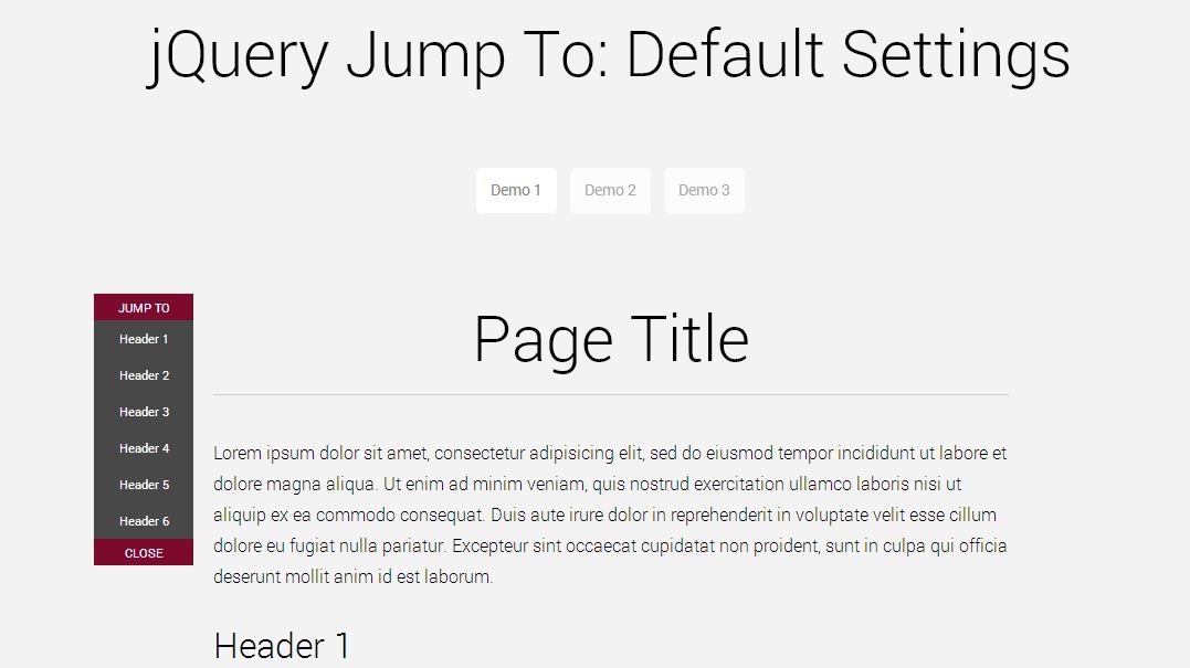
Create a Smooth Jump To Sub-Navigation Menu in One JS Call
Navigation is a key element to any website. If you have the easiest to navigate design, more likely, you’ll get the money. Allow your users to still navigate even within posts using this tutorial.
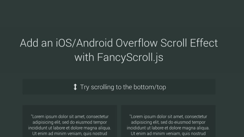
FancyScroll.js: Add an iOS/Android Overflow Scroll Effect
Are you a fan of Android or iOS scroll effects? Adapt them to your website and give it a feel of simplicity and professionalism.
OnePageScroll.js: Creating an Apple’s iPhone 5S Website
One page scrolling has been a think this year. With the major companies like Apple following the trend, it becomes a bandwagon design as it epitomizes the functionality of all content within one page.
Notify Better.js: Creating a Dynamic Favicon and Title
Dynamic favicons are cool. Period. It gives a flare on your designs and lets you own every bit of it. Create dynamic favicons by following this tutorial and I bet you’ll have a very good time tinkering with this.

LoadingBar.js: Adding a YouTube-like Loading Bar to Your Website
When YouTube first adapted that loading bar, everybody’s eyebrows went high and wondered if they could re-do it and adapt the design into their website. Well, we can. Here’s the tutorial.
Super Simple Text Rotator with Almost No Effort Required
Great for advertisements and short descriptions, this text-rotator will make your website more creative and adds flavor of movement and dynamism into it.
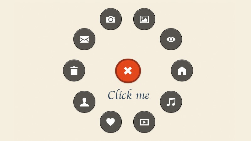
Create a Path-like Menu Button with WheelMenu.js
With the revamp of Path a few years back came a button like no other. It is very convenient and eye-pleasing. Learn how to create it through this tutorial.
Creating the New Google Play’s Multi-Level Navigation from Scratch
Reeking with googliness is the next tutorial that borrowed the design of Google play. Learn how to create this eye-candy tutorial now.
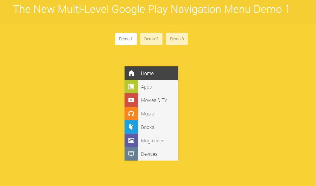
Add Depth to Flat UI with Flat Shadow.js
Use long shadows using code? Yes, you can. I didn’t believe that too. Well, not before I have finished reading this tutorial. Read and see for yourself.
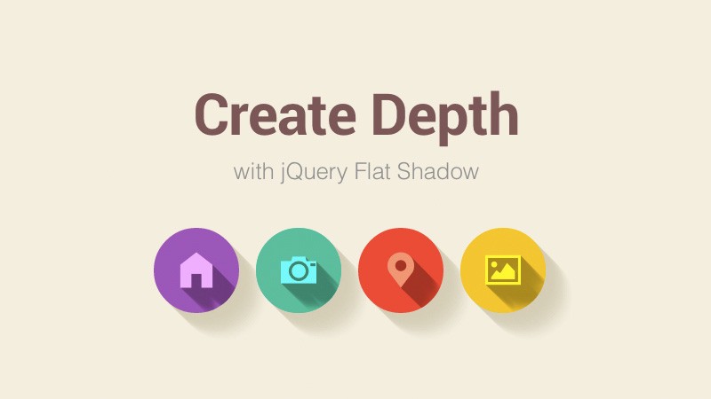
Creating a Swipeable Side Menu for the Web
Learn to recreate the behavior of side menus in smartphone applications in your website design. Both designs are suited for mobile and desktop versions. Learn how this tutorial works and become fun for both mobile and desktop users!
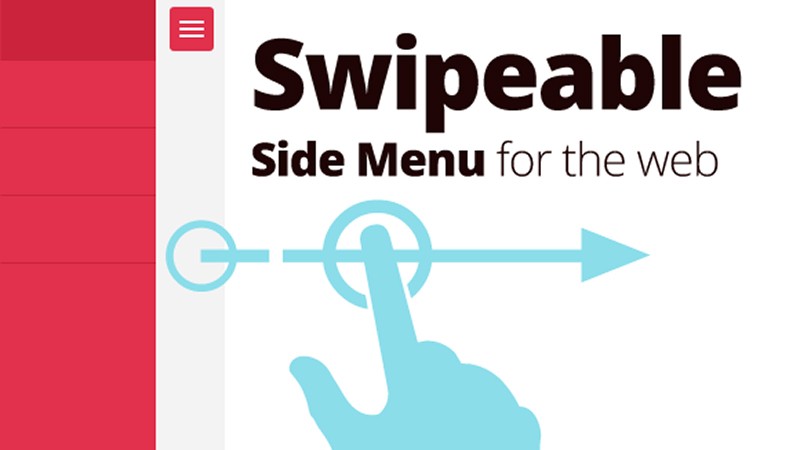
Creating a 3D Interactive Gallery with CSS and jQuery
Imaginations are pushed further as this gallery is put into the limelight. Be amazed at how simple and yet awesome the output is. This is great for portfolio designs!
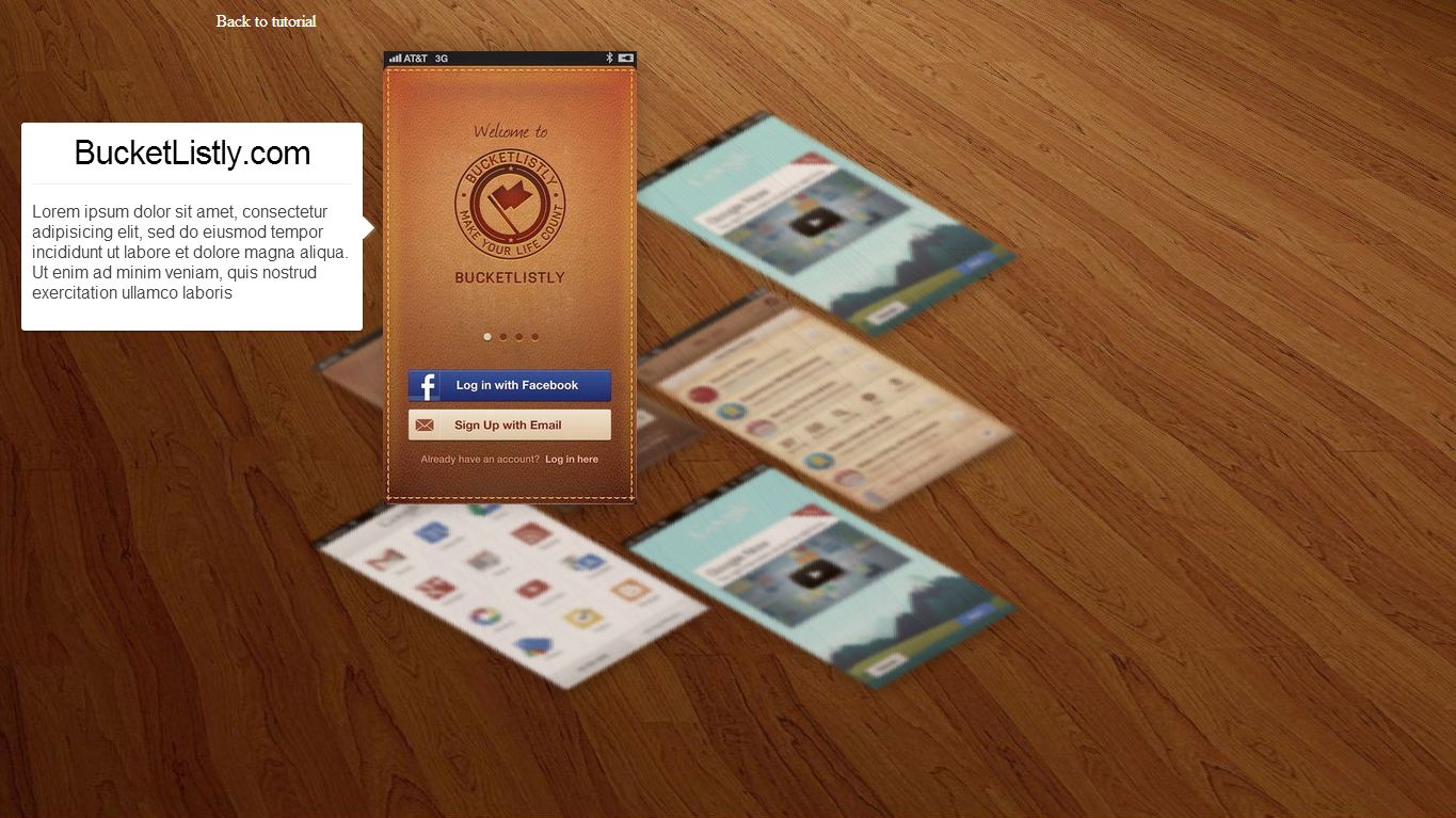
Making Draggable Webpage Elements Using jQuery
Draggable elements are very interactive. It lets your viewer see how your mind works by stretching your users’ imagination. Using this tutorial, you will learn how to put a little twist in your regular design.
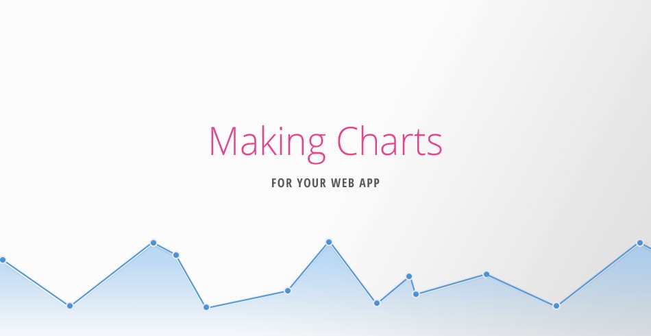
Make Pretty Charts For Your App with jQuery and xChart
Want to put something analytic in your website? How about trying charts using jQuery and xCharts? Be prepared for eyegasms as you will be pampered with good-looking data.
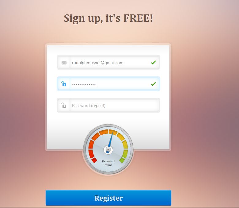
Create a Beautiful Password Strength Meter
If you are planning to put sign-up forms, better spice it up using this tutorial. Add a beautiful password strength meter to ensure the safety of your users while adding a different look in your forms.
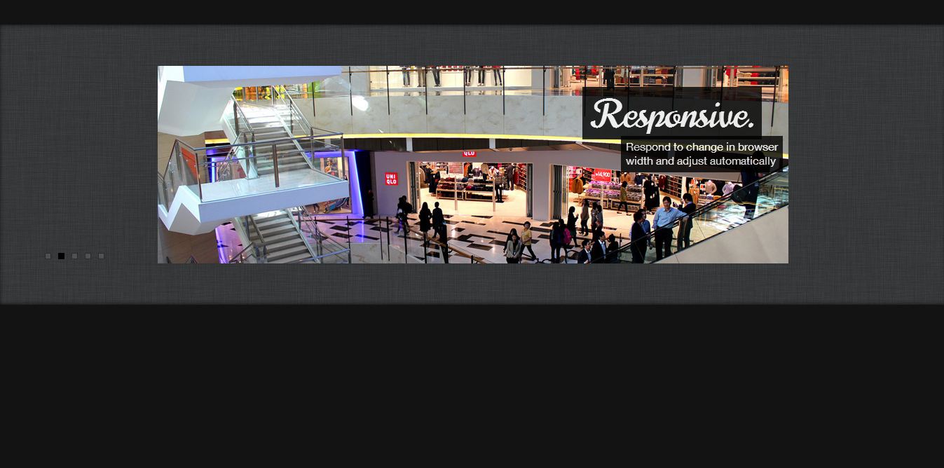
How to Build an iOS-Style Content Slider using jQuery
Create a cool slideshow using jQuery inspired by iOS. The good thing about this tutorial is that it allows you to drag the images to navigate them.
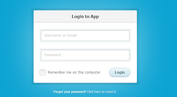
How to Create a CSS3 Login Form
Refurbish your log-in page through this very simple tutorial. Give your users a new look and make your website better.
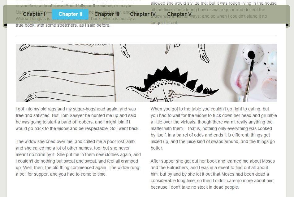
Create a Sticky Navigation Header Using jQuery Waypoints
This is another cool tutorial that involves the navbar. This time, it moves a few pixels down and becomes less opaque.
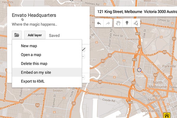
Quick Tip: Embedding New Google Maps
Maps are back on track as another tutorial is included in this list. Re-tweak your maps using this tutorial and revolutionize how people navigate in real life.
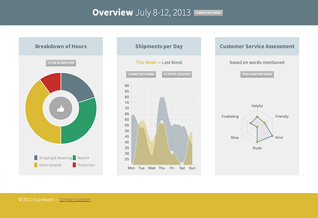
Build a Dynamic Dashboard With ChartJS
This chart tutorial adds effect to the previous one as it provides with more samples and templates to choose from. Present your data using pie, line and hexagonal charts.
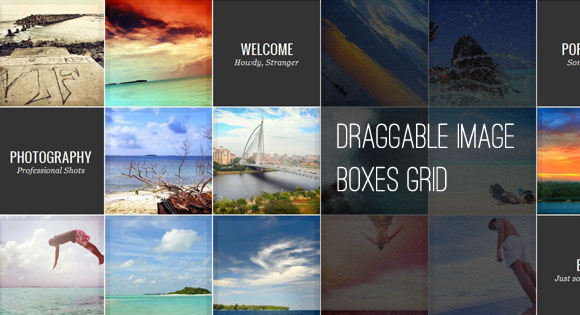
Draggable Image Boxes Grid
Do you have a client who wants a gallery type design? Well, this one might help you. Using grids and tiles as navigation tools, your client will surely love your work.
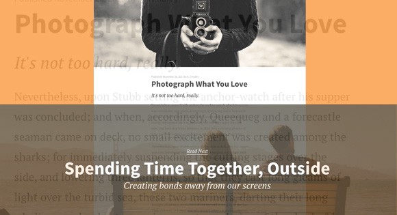
Medium-Style Page Transition
Showcase your posts in a totally new way using these transitions. With both simplicity and elegance, this tutorial will surely help you impress your clients, now and in the future.
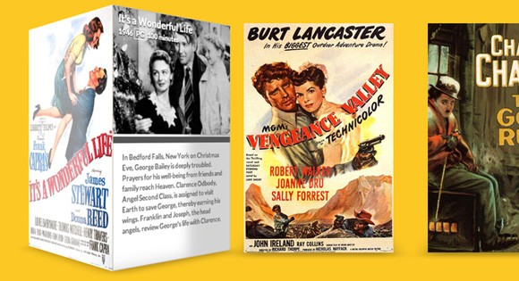
3D Shading with Box-Shadows
3D-looking boxes are not an abomination in the flat design trend. In fact, adding a 3D effect in your designs will accentuate the message you are trying to convey. Learn how it works on this tutorial.
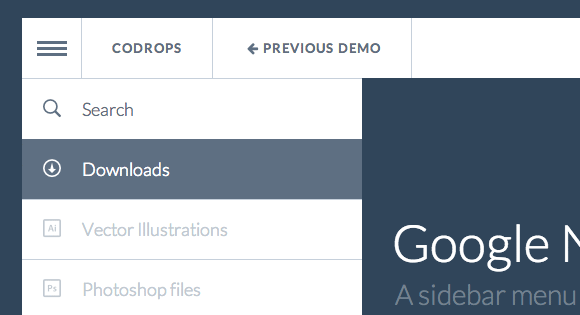
Google Nexus Website Menu
Want to tinker more on menus? This Nexus-looking menu is great for a start. It is totally refreshing to see and amazingly easy to navigate. Try it.
Caption Hover Effects
Hovers have never been this awesome. I admit that I was pretty impressed with this tutorial. Clever as it may seem to be, reading this will make you realize that it’s not that difficult to do after all.
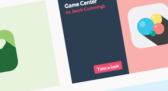
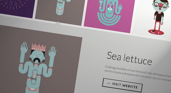
Thumbnail Grid With Expanding Preview
Another gallery tutorial that lets you enlarge the image for a better preview by clicking on the thumbnail.
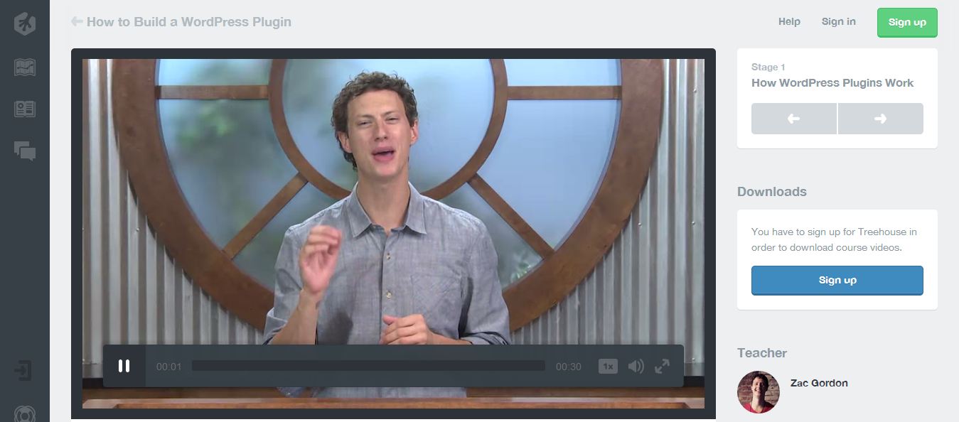
How WordPress Plugins Work
Perhaps one of the best WordPress plugin tutorials there is. This one introduces you to the magical world of plugins and teaches you step-by-step to become a plugin developer.
Killer Responsive Layouts With CSS Regions
Still in responsive layouts? Smashing Magazine gives an option using CSS Regions. Read this tutorial and become free from the limits posed by CSS elements.
Wrap up!
And there you have it, guys. Seventy tutorials that highlights previous year. As new year comes right into our doorsteps, read these tutorials to refresh and to learn new things for the next year will surely be a bang! More tutorials to come, more design trends to be inspired from, more clients to ask for your help and hopefully, more money to fall right into your pockets.
Okay, there you have it, all the tutorials you could wish for to take a further step in to web design and developing, but before you visit all the tutorials we have prepared some material ourselves. Let’s take a look.
Why It Is Good Idea To Learn JavaScript And jQuery?
If you have anything to do with web development, you probably have heard the term ‘jQuery’ over a million times already. Believe it or not, jQuery has risen to popularity in a short span of time and today it stands as one of the most well-loved and popular entities when it comes to developing for the internet. In this section, we shall be taking a look at jQuery in detail — its origins, advantages, disadvantages, and anything else that matters.
Introduction
jQuery is an open source, cross-browser, CSS3 compliant JavaScript library that has made client side scripting relatively easier. It can produce dynamic web pages as well as Flash-like animations. Like it or hate it, jQuery enjoys tremendous popularity among developers, and it surely deserves its popular spot! As stated by Wikipedia, jQuery today powers over 55% of the 10,000 most visited websites on the internet.

Image Credit
Origins of jQuery
jQuery was first released in January 2006 at BarCamp NYC by John Resig. Support for AJAX was added the very next month, and jQuery moved to the completely open source MIT license later in May that year. Following that, September 2006 witnessed the release of XML version of the API and the Visual jQuery Magazine.
Twelve months later, in September 2007, a new user interface library greeted jQuery. Things had already started to gain momentum, and exactly a year later, in September 2008 (Wow! September surely seems to be the preferred month for jQuery folks), Microsoft and Nokia announced their support for jQuery. Microsoft has tried to adopt jQuery for use within Visual Studio (so as to integrate it with its ASP.NET AJAX Framework), whereas Nokia has integrated jQuery in the web run-time widget development platform.

2009 was the year that saw jQuery gain wide acceptance and build an outreach platform. The first-ever jQuery podcast and an online summit were accomplished in November, whereas December greeted jQuery with the .net Magazine’s Award for Best Open Source Application. Later, in 2010, a mobile project was announced for jQuery. The next two years saw many new event APIs and re-writing of certain selector engines, and the rest is history!
The Advantages
The foremost advantage of jQuery is that it is not rocket science, in comparison to its alternatives. You can easily add plugins on top of the base library, and this in turn saves a lot of time and efforts (and head aches). In fact, one of the primary reasons why Resig and his team considered the creation of jQuery was to save time — when it comes to development for the web, time matters a lot, and jQuery caters to the shortage of time by being a flexible and nimble solution.
Furthermore, jQuery comes with the MIT License, which ensures that the project enjoys fast and steady growth as there are no legal or licensing hassles to worry about. This in turn has led to the growth of a loyal and broad community, thereby leading to jQuery’s popularity. Bug fixes, patches, updates, support — have no fear, you are in safe hands with the jQuery community!
It is common knowledge that jQuery interacts well with AJAX (else, why would Microsoft bother with it in the first place?). This gives jQuery a distinct advantage over the other complicated alternatives such as the likes of Flash and bare CSS.
In short, to sum it up:
- jQuery is flexible and speedy for development.
- It comes with MIT License and is open source.
- The project is supported by a wonderful community.
- IT HAS PLUGINS!
- Bugs are killed…..er…. fixed pretty quick.
- IT LOVES AJAX!
- In other words: jQuery makes programming a piece of cake (well, sort of).
The Disadvantages
Unarguably, the biggest drawback with jQuery is its multiple versioning. Even if you run the latest update (and fix the known bugs), you will have to choose either to host your library yourself (and continually update), or, alternatively, load the library from Google. The latter seems plausible, but it can risk incompatibility with your code as and when newer versions are released.
With Microsoft on its side, jQuery surely seems to be winning the battle, especially because the AJAX control toolkit is too bulky for most people. However, if you have chosen jQuery to save time and/or make up for your lesser level of programming knowledge, getting jQuery to play fair with AJAX will give you nightmares. For instance, even minor things such as the differences between GET and POST HTTP can make you need aspirin.
A super-active community provides steady development for jQuery. However, if you yourself are not active enough to match pace with the community, you will definitely miss out on some parts or the other of the rapid process of jQuery development.

Earlier in this article, we discussed how jQuery can be quick to learn. Yes, that is true. It can be quick to learn, but it is always difficult to master. Getting animations to work in jQuery at a pace that is comparable to those in bare CSS is always a tough job. Why? First, DOM manipulations are slow anyway and secondly, CSS uses browser-side transitions (and relies on good ol’ C++), which is faster than JavaScript on any given day.
jQuery’s biggest attribute is jQuery Spaghetti. Basically, jQuery is a library that aims to help you with DOM and CSS selectors (it does that pretty well, mind you). However, problem arises when people start treating jQuery as a framework for client-side interaction. The outcome? A mammoth .js file, full of callbacks, generic names and of course design changes.
Lastly, another trifle arises when it comes to JavaScript Object Notation, that is, if $.get is used in lieu of $.getJSON — ah, the chaos!
Again, to sum it up:
- You just have to get the version correct, and pray that you keep getting it correct.
- jQuery is easy to accomplish, but not always easy to implement as compared to, say, CSS.
- Even though it is swift, the end product may not always be fast-paced.
- If improperly used as a framework, things can get complicated beyond measure.
jQuery Mobile — Oh, The Goodies!
Before we wind up this article, let’s take a look at jQuery Mobile as well.
Basically, jQuery Mobile is a web framework which is optimized for touch devices. Naturally, such optimization means that it can work with a great deal of devices, ranging from smartphones to tablets. The latest stable build 1.1.1 was released in July this year.
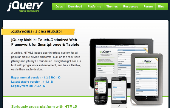
So, does it have any advantages of its own? Of course it does!
- jQuery Mobile is compatible with most major mobile platforms, such as iOS, BlackBerry, Windows Mobile, Symbian and Android.
- Since it is based on jQuery (obviously!), it does not have a difficult learning curve for new developers.
- It supports custom themes.
- It is extremely lightweight and quick (in development mode, the size goes somewhere around 70 KB).
- Let’s mention it again: it is touch-optimized.
- It loves responsive designs, HTML5 and AJAX.
Sounds like the Duke Nukem of mobile web frameworks, right? Indeed, jQuery Mobile has got its own share of awesomeness. However, it isn’t without some minor drawbacks either:
- First up, if you directly import the jQuery Mobile library (alongside its CSS file), it will generate new calls to the server (and possibly slow down the overall functioning of your app).
- The styling of jQuery Mobile has a good deal of rounded corners gradients — what if your design doesn’t have any?
Conclusion
Regarding future plans, by early 2013, jQuery intends to drop support for older versions of IE in order to reduce file size and accomplish performance improvement.
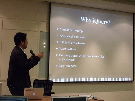
Where is it headed, then? Well, advantages and disadvantages apart, the future surely looks bright for jQuery. It does not have to face an army of haters like Flash, and despite having humble beginnings, today it commands the respect of all and sundry.
Like it or not, jQuery has indeed made our lives easier. It definitely is one of the best libraries out there when it comes to JavaScript. At the end of the day, jQuery, just like any other tool, is only as good as the programmer. As a programmer, one needs to be extra aware and pro-active when using jQuery, in order to match pace with the community and get the maximum advantages out of jQuery.
Do you use jQuery in your projects? How has your experience been? Feel free to share your thoughts with us in the comments below!
Now let’s take look at jQuery mobile.
jQuery Mobile – What You Need to Know
I’m sure you’ve heard about jQuery. So, its mobile version is pretty close to what you already are used to, but with a lot of enhancements for mobile screen events (like touching instead of click, and there is no hover) and browsers (this one is tricky since there are plenty of browsers and devices out there) and capabilities (pluggable components).
The crazy thing is how simple it is to initiate and build a fully working mobile site. Actually, we’ll be talking about concepts, tips, codes, and in the meantime you can build your own app, in no more than one hour. Yeah, noob to ninja in one hour, this is what you’ll get here 🙂
So, let’s rock!
jQuery Mobile’s Main Concept
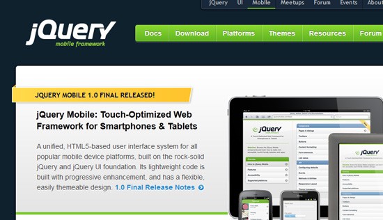
Cross browsing, a nightmare that was coming back
Those who used to code anything between 2001 and 2008 (while < IE6 was pretty huge, and Firefox / Chrome were just the new kids on the browser block) faced the nightmare of cross-browser issues. I mean, if you think that putting a vendor prefix before CSS code is cross-browser, try to get things working well on IE5.5, IE6, Opera and Firefox without CSS / JS hacks.
That, dear Padawan, was crazy.
Back to 2010, mobile was getting bigger and bigger. So were the types of browsers out there. Each smart phone and tablet has its own capabilities and its own particularities. Try mixing that with touch oriented screens and a huge range of screen sizes. Sound familiar?
Then, the hero arrives

Credits: bizior (photo) & Rochester Oliveira (edit)
jQuery Mobile comes with a huge compatibility table, with lots of devices and platforms well covered. All you’ve got to do is include their libraries, and try to stop your jaw from hitting the floor when you see the amazing features.
Oh, and it’s not just about cross browsing. It also covers a lot of UI elements that are already standards out there. And if you want a little more customized look you can easily change that, without messing up functionality.
Awesomeness proven, let’s code!
Ok, now you know why this project is so great, let’s take a look at some of the overall effects, components, good practices and code that you may want to use.
Basic structure
Just to get started, let’s grab our files from jQuery’s CDN. We’ll need just 3 files:
- jQuery Mobile stylesheet
- jQuery JS
- jQuery Mobile JS
So your code will look like:
&lt;!DOCTYPE html&gt; &lt;html&gt; &lt;head&gt; &lt;title&gt;Starter page&lt;/title&gt; &lt;meta charset="utf-8" /&gt; &lt;meta name="viewport" content="width=device-width, initial-scale=1" /&gt; &lt;meta http-equiv="X-UA-Compatible" content="IE=edge,chrome=1" /&gt; &lt;link rel="stylesheet" href="http://code.jquery.com/mobile/1.0/jquery.mobile-1.0.min.css" /&gt; &lt;script src="https://code.jquery.com/jquery-1.6.4.min.js"&gt;&lt;/script&gt; &lt;script src="https://code.jquery.com/mobile/1.0/jquery.mobile-1.0.min.js"&gt;&lt;/script&gt; &lt;/head&gt; &lt;body&gt; &lt;div data-role="page" id="home"&gt; &lt;div data-role="header"&gt; &lt;h1&gt;Header&lt;/h1&gt; &lt;/div&gt; &lt;div data-role="content"&gt; &lt;p&gt;Lorem ipsum&lt;/p&gt; &lt;/div&gt; &lt;div data-role="footer"&gt; &lt;h4&gt;Footer&lt;/h4&gt; &lt;/div&gt; &lt;/div&gt; &lt;/body&gt; &lt;/html&gt;
As you may notice it uses HTML5 markup and data-* attributes to get things working. This snippet will output this (all tests done with iOS 5.0.1 @ iPod):
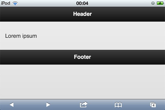
Important note, any “traditional” jQuery call should be placed before the call for mobile framework.
Basic UI components
jQuery Mobile uses data-* attributes to define UI components. Actually you just saw 4 of them above. Let’s see a small list of them and their correspondent data attribute:
- data-role=”page” : you can set divs inside your HTML page to behave as pages. SO what we’ve done above is to create a page “home” inside our file
- data-role=”header”: used to mark divs as top toolbars. You can set up data-position=”fixed” as well so it’ll behave as fixed toolbar
- data-role=”content”: the main part of your website / app. Images, buttons, actions and all the magic happens here!
- data-role=”footer”: defines a toolbar at the bottom of current page. May use data-position=”fixed” too so it’ll force to stay at the bottom of the screen
- data-role=”button”: it’ll be useful together with elements. You may use also data-transition to define how it’ll load next page. Options: slide, slideup, slidedown, pop, fade, flip. Another cool thing is data-icon, which gives you a lot of default icons. You may also reduce its size using data-inline=”true”.
- data-theme=”a/b/c/d/e”: Define color scheme used for elements.
Let’s wrap up all those attributes in a simple 2-page linking. Output:
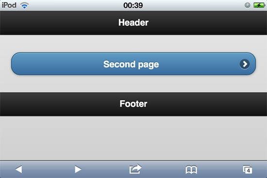
Second page:

Code:
&lt;!DOCTYPE html&gt; &lt;html&gt; &lt;head&gt; &lt;title&gt;Starter page&lt;/title&gt; &lt;meta charset="utf-8" /&gt; &lt;meta name="viewport" content="width=device-width, initial-scale=1" /&gt; &lt;meta http-equiv="X-UA-Compatible" content="IE=edge,chrome=1" /&gt; &lt;link rel="stylesheet" href="http://code.jquery.com/mobile/1.0/jquery.mobile-1.0.min.css" /&gt; &lt;script src="https://code.jquery.com/jquery-1.6.4.min.js"&gt;&lt;/script&gt; &lt;script src="https://code.jquery.com/mobile/1.0/jquery.mobile-1.0.min.js"&gt;&lt;/script&gt; &lt;/head&gt; &lt;body&gt; &lt;div data-role="page" id="home" data-theme="b"&gt; &lt;div data-role="header"&gt; &lt;h1&gt;Header&lt;/h1&gt; &lt;/div&gt; &lt;div data-role="content"&gt; &lt;p&gt;Lorem ipsum&lt;/p&gt; &lt;p&gt;&lt;a href="#second" data-role="button" data-transition="fade" data-icon="arrow-r" data-iconpos="right"&gt;Second page&lt;/a&gt;&lt;/p&gt; &lt;/div&gt; &lt;div data-role="footer"&gt; &lt;h4&gt;Footer&lt;/h4&gt; &lt;/div&gt; &lt;/div&gt; &lt;div data-role="page" id="second"&gt; &lt;div data-role="header"&gt; &lt;h1&gt;Header second page&lt;/h1&gt; &lt;/div&gt; &lt;div data-role="content"&gt; &lt;p&gt;I'm second page!&lt;/p&gt; &lt;/div&gt; &lt;div data-role="footer"&gt; &lt;h4&gt;Footer second page&lt;/h4&gt; &lt;/div&gt; &lt;/div&gt; &lt;/body&gt; &lt;/html&gt;
Then we have a bunch of other default components that are easily implemented with jQuery Mobile:
- data-role=”navbar”: Used to create menus. Then you should place a ul item with li’s and a’s (BTW, that’s the way you should create menus, always)
- data-role=”listview” + data-filter=”true” : Awesomely easy way to create searchable lists. Really useful!
- data-role=”fieldcontain”: This is a container for form elements
- select data-native-menu=”false”: creates a cool select element as “floating” element instead of default select which stole half of screen area
- select data-role=”slider”: Creates a “on / off” slider, useful for options pages
- input type=email, tel, number, url..: accepts any HTML5 data format, and adjust keyboard to better fit data type
- input type=range: same as before, but this one uses new HTML format and creates an actual slider, good for numbers range inputs
- data-rel=”dialog”: is an anchor attribute that makes target page opens as dialog box.
- data-add-back-btn=”true”: add this attribute to your page and you’ll have a “back” button. Cool, huh?
Now we’ll edit our demo file a little bit. It’ll be 4 pages now:
- Home screen will have a dialog box
- Form elements page will use all we have mentioned
- List page will have a searchable list so you can try it
- Alert page has target content when user clicks the alert link
Previews:
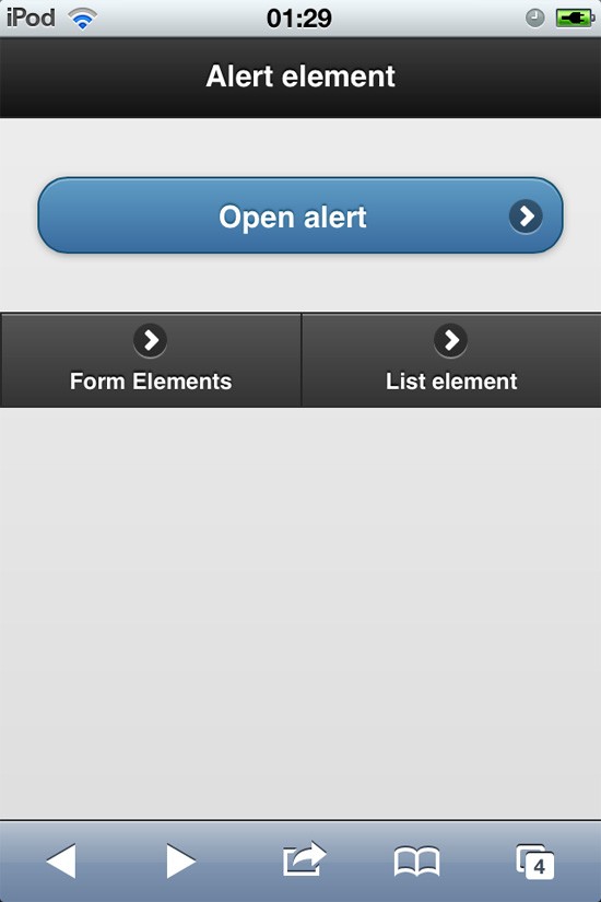
Alert page:
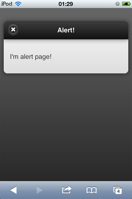
Form page:

Lists page:
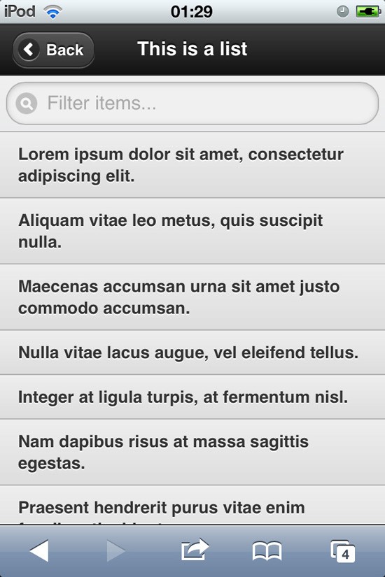
&lt;!DOCTYPE html&gt; &lt;html&gt; &lt;head&gt; &lt;title&gt;Starter page - 1stWebDesigner.com&lt;/title&gt; &lt;meta charset="utf-8" /&gt; &lt;meta name="viewport" content="width=device-width, initial-scale=1" /&gt; &lt;meta http-equiv="X-UA-Compatible" content="IE=edge,chrome=1" /&gt; &lt;link rel="stylesheet" href="http://code.jquery.com/mobile/1.0/jquery.mobile-1.0.min.css" /&gt; &lt;script src="https://code.jquery.com/jquery-1.6.4.min.js"&gt;&lt;/script&gt; &lt;script src="https://code.jquery.com/mobile/1.0/jquery.mobile-1.0.min.js"&gt;&lt;/script&gt; &lt;/head&gt; &lt;body&gt; &lt;div data-role="page" id="home" data-add-back-btn="true"&gt; &lt;div data-role="header"&gt; &lt;h1&gt;Alert element&lt;/h1&gt; &lt;/div&gt; &lt;div data-role="content"&gt; &lt;p&gt;&lt;a href="#alert" data-role="button" data-transition="fade" data-icon="arrow-r" data-iconpos="right" data-theme="b" data-rel="dialog"&gt;Open alert&lt;/a&gt;&lt;/p&gt; &lt;/div&gt; &lt;div data-role="footer"&gt; &lt;div data-role="navbar"&gt; &lt;ul&gt; &lt;li&gt;&lt;a href="#form" data-role="button" data-transition="fade" data-icon="arrow-r" data-iconpos="right" data-inline="true"&gt;Form Elements&lt;/a&gt;&lt;/li&gt; &lt;li&gt;&lt;a href="#list" data-role="button" data-transition="fade" data-icon="arrow-r" data-iconpos="right" data-inline="true"&gt;List element&lt;/a&gt;&lt;/li&gt; &lt;/ul&gt; &lt;/div&gt; &lt;/div&gt; &lt;/div&gt; &lt;div data-role="page" id="form" data-add-back-btn="true"&gt; &lt;div data-role="header"&gt; &lt;h1&gt;Form elements&lt;/h1&gt; &lt;/div&gt; &lt;div data-role="content"&gt; &lt;div data-role="fieldcontain"&gt; &lt;label for="name" class="select"&gt;Choose:&lt;/label&gt; &lt;select id="name" name="select" data-native-menu="false"&gt; &lt;option value="value1"&gt;option1&lt;/option&gt; &lt;option value="value2"&gt;option2&lt;/option&gt; &lt;option value="value3"&gt;option3&lt;/option&gt; &lt;/select&gt; &lt;label for="slider"&gt;Select slider:&lt;/label&gt; &lt;select name="slider" id="slider" data-role="slider"&gt; &lt;option value="off"&gt;Off&lt;/option&gt; &lt;option value="on"&gt;On&lt;/option&gt; &lt;/select&gt; &lt;label for="slider"&gt;Input slider:&lt;/label&gt; &lt;input type="range" name="slider" id="slider" value="0" min="0" max="100" /&gt; &lt;label for="email"&gt;Email Input:&lt;/label&gt; &lt;input type="email" id="email" name="email" value="" /&gt; &lt;label for="num"&gt;Number Input:&lt;/label&gt; &lt;input type="number" id="num" name="num" value="" /&gt; &lt;/div&gt; &lt;/div&gt; &lt;div data-role="footer"&gt; &lt;div data-role="navbar"&gt; &lt;ul&gt; &lt;li&gt;&lt;a href="#home" data-role="button" data-transition="fade" data-icon="arrow-r" data-iconpos="right" data-inline="true"&gt;Home&lt;/a&gt;&lt;/li&gt; &lt;li&gt;&lt;a href="#list" data-role="button" data-transition="fade" data-icon="arrow-r" data-iconpos="right" data-inline="true"&gt;List element&lt;/a&gt;&lt;/li&gt; &lt;/ul&gt; &lt;/div&gt; &lt;/div&gt; &lt;/div&gt; &lt;div data-role="page" id="list" data-add-back-btn="true"&gt; &lt;div data-role="header"&gt; &lt;h1&gt;This is a list&lt;/h1&gt; &lt;/div&gt; &lt;div data-role="content"&gt; &lt;ul data-role="listview" data-filter="true"&gt; &lt;li&gt;Lorem ipsum dolor sit amet, consectetur adipiscing elit.&lt;/li&gt; &lt;li&gt;Aliquam vitae leo metus, quis suscipit nulla.&lt;/li&gt; &lt;li&gt;Maecenas accumsan urna sit amet justo commodo accumsan.&lt;/li&gt; &lt;li&gt;Nulla vitae lacus augue, vel eleifend tellus.&lt;/li&gt; &lt;li&gt;Integer at ligula turpis, at fermentum nisl.&lt;/li&gt; &lt;li&gt;Nam dapibus risus at massa sagittis egestas.&lt;/li&gt; &lt;li&gt;Praesent hendrerit purus vitae enim faucibus tincidunt.&lt;/li&gt; &lt;li&gt;Curabitur sit amet lectus neque, id facilisis elit.&lt;/li&gt; &lt;/ul&gt; &lt;/div&gt; &lt;div data-role="footer"&gt; &lt;div data-role="navbar"&gt; &lt;ul&gt; &lt;li&gt;&lt;a href="#home" data-role="button" data-transition="fade" data-icon="arrow-r" data-iconpos="right" data-inline="true"&gt;Home&lt;/a&gt;&lt;/li&gt; &lt;li&gt;&lt;a href="#form" data-role="button" data-transition="fade" data-icon="arrow-r" data-iconpos="right" data-inline="true"&gt;Form element&lt;/a&gt;&lt;/li&gt; &lt;/ul&gt; &lt;/div&gt; &lt;/div&gt; &lt;/div&gt; &lt;div data-role="page" id="alert" data-add-back-btn="true"&gt; &lt;div data-role="header"&gt; &lt;h1&gt;Alert!&lt;/h1&gt; &lt;/div&gt; &lt;div data-role="content"&gt; &lt;p&gt;I'm alert page!&lt;/p&gt; &lt;/div&gt; &lt;/div&gt; &lt;/body&gt; &lt;/html&gt;
Custom font embedding
Probably no method will beat @font-face. So I suggest you go to Font Squirrel and generate your font files.
Compress images
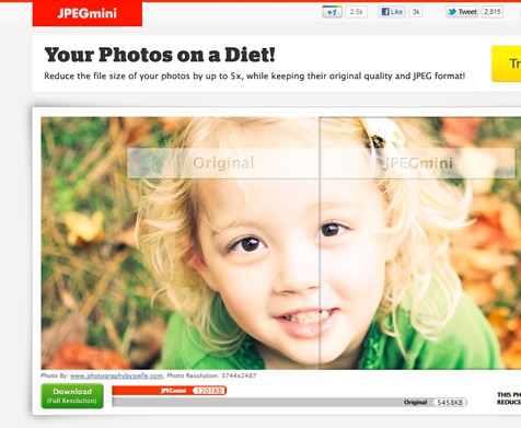
You should do this all the time, actually. But when you are designing for the mobile world, even a few kb’s makes big difference. So save your user’s bandwidth and compress not only your code, but all your images.
JPEG mini has the best compressing service I’ve ever seen, and it’s quite easy to use, you should give it a try!
Remove components
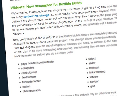
We talked about just a few of many jQuery Mobile’s components. So it’s more likely you won’t be using them all.
The good news is that you can easily remove them, by making your own build 🙂
Now it’s your turn?
So, how are you planning to use jQuery Mobile? Have another cool tip to share? Don’t be shy and comment!
No, we didn’t forget anyone who is just starting out, so here is the introduction to responsive design.
Introduction to Responsive Web Design
Responsive Web Design is another important concept which can be called “planning”, but it has a name of its own because it is widely used nowadays. A few years back we didn’t need to think about mobile phones, tablets and different screens, because there were not too many of them – or not at all. Well, the IT world has changed since then and now there are a bunch of screen sizes and platforms designers need to deliver for. Responsive Web Design is the concept of a website which should adapt to fit any device that chooses to display it. Not only mobile devices, but also stationery computers and tablets.
According to Ethan Marcotte, who wrote an interesting book, Responsive Web Design after starting this whole concept, there are three parts to this kind of approach: a flexible grid, flexible images and media queries.
This means old fixed-width layouts do not fit the new web anymore and the way we work needs to be changed. This is why, today, we will review the most important parts of the new approach and talk about each of them. As a designer, the faith of a project is always in your hands. You need to understand how the layout will work and what Responsive Web Design means in order to be able to take on this approach.
Grid system and background images
The grid system used in magazines, for example, needs to be used in Responsive Web Designs as well. It is impossible to design with this approach without having a grid system. Now, in order for the layout to be flexible, you need to give the measurements in percent, not pixels. This means that a 50% width will always be half of the screen the website is shown on, regardless of its size. This is where flexible and responsive web design starts from.
If you wish to use background images, it is OK, but you will have to properly select the right one. Photographs, illustrations or any other images that can’t be tiled are not proper for fluid grid systems. Therefore do not use horizontal gradients either, because they do not scale well horizontally. The texture borders will also suffer and look quite awful. If there is something you could use, then textures easy to tile are good, such as grunge, grain and so on.
Scale everything down
When you design with the responsive approach you have to scale everything down. This means the fixed-width approach you used until now has to disappear, exactly like the horizontal scroll. Instead, try to insert every information or web element in such a way that if you resize the browser width you will still be able to see every piece of information. With a flexible wrapper made in percent instead of pixels this is possible. Most of today’s webpages are not flexible and this damages their chances of being properly shown on a mobile device.
Working in percent is the same as in pixels, there is not much of a difference and you don’t need to learn other properties or CSS selectors. Working in percent is also simpler, because it is quite clear what width: 100% means. Regardless of the dimensions of the screen, the mentioned div will always be at a maximum width. If instead of percent you would have had pixels, then regardless of how the big the screen would be, the div will always be at 100 pixels. On an iPhone this is a lot. On my computer with a screen of 1600×900 resolution this is nothing. You see the difference? It is just more logic to work this way.
Consider the media queries
I am sure you all know what these media queries mean. But to explain the concept of modules better, you can take a look at the following image.
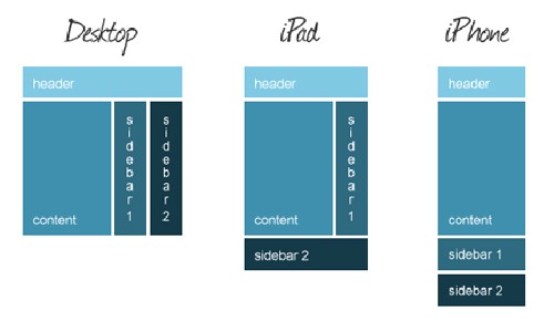
Media Queries for desktop, iPhone and iPad
This basically means that you have to consider the way your layout is going to be, by thinking of the platform you design for. The main problem on the internet today is that designers and developers do not think of more than the queries for desktop and, maybe, for iPad. Nobody thinks of the iPhone screen when designing a webpage for desktop use.
These modules need to be resized and moved when an iPhone browses through them, therefore the design has to be flexible. By using the media queries properly this is possible. In the end of the article you will see a list of further resources and by reading those you will find out more about the media queries and how to use them. The main idea behind this concept is that the modules change their place and size based on the screen size that the website is shown on.
You can learn more about Media Queries and everything you need to know about the topic to get you started by reading our E-Book “Responsive Website Design“.
It covers all the basics along with great examples and advice that you will need to make your website ready for any screen size and mobile device. Grab your copy now!
What to do now?
The reason behind the internet not having flexible designs is the designer’s lack of knowledge about this issue. Therefore I always believed a designer should also be able to code HTML & CSS, because by knowing all the potential problems, you can also design in such a way that you avoid them.
I hope that by reading this article the graphic designers will understand there is a big need of flexible layouts on the web nowadays, as this changes and will continue to change and grow for many years to come. With the addition of HTML5 and CSS3 coding flexible layouts just got a bit easier, although the new mark-up language is still in development and experts say it will always be, so we can’t count on it to be done too soon.
The amount of information given is also something to think about, because a desktop website should have way more information and elements than a website designed for portable devices. There are very many things to think about before going responsive on the web, but it is also therefore the internet grows and becomes more and more important. With such a big amount of decisions to take before even starting to design, it should be clear to everybody that designing responsive is a challenge for even the finest experts out there.
Examples of responsive design
1. CSS Tricks
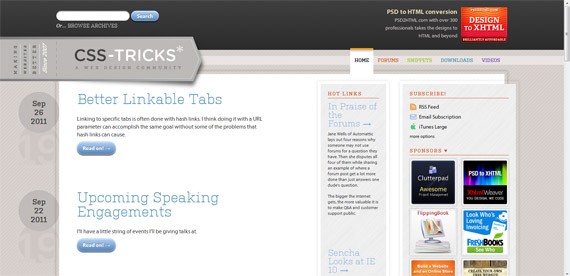
CSS Tricks full-sized
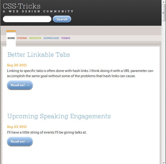
CSS Tricks resized
2. Simon Collision
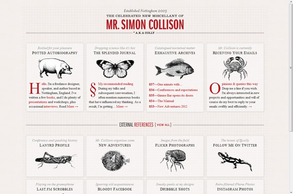
Simon Collision full-sized
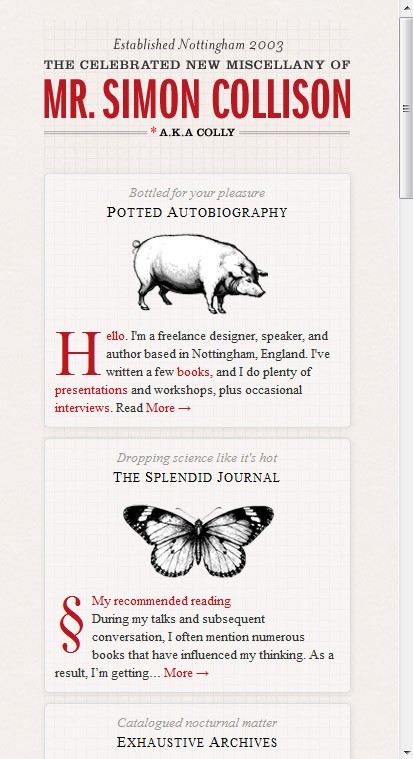
Simon Collision resized
3. Hardboiled Web Design
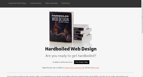
Hardboiled Web Design full-sized
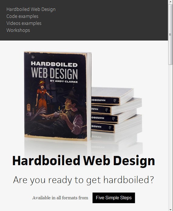
Hardboiled Web Design resized
Further reading
To find out more on this topic, simply follow these recommendations. You can also see more examples by accessing the last link.
Beginners Guide to Responsive Web Design on Think Vitamin
CSS Media Queries on CSS Tricks
Fluid Grids on A List Apart
Responsive Web Design on Smashing Magazine
Showcase of Outstanding Responsive Web Designs on Line25
Now let’s go deeper in web design.
Web Design Symmetry and Asymmetry
Balance is an important concept in web design. To create balance, one must know how to use symmetry and asymmetry to create beauty and contrast. These tools are integral in creating a unifying and aesthetically pleasing web design. It is important to understand this concept properly before you use it.
What is Symmetry?
We see beauty in things or people who are symmetrical. Symmetry is always a factor in aesthetics and beauty, but what does it really mean?
Symmetry is the sense of harmoniously pleasing balance and proportion. There is balance of similarity in an object, proven by geometry or physics. Gravity is an important factor in natural symmetry, that’s why most things in nature evolve towards symmetry. That’s why we see beauty in symmetry.
The most common type is reflection symmetry, also known as bilateral symmetry. Basically, this means having ‘two matching sides’. Which means that if you fold the object in half on its median axis, both sides have essentially identical halves.
Nature is filled with examples bearing bilateral symmetry. Butterflies, leaves, sea life, etc. exhibit this form of symmetry. Almost all plant and animal life exhibit reflection symmetry, only a few do not. Of course, bilateral symmetry in nature is only approximate, and do not perfectly match up when folded on the middle axis.

One perfect example is the human body. The left and right halves of the human body perfectly mirror each other. Internally, it is not the case, as body organs often do not mirror each other.
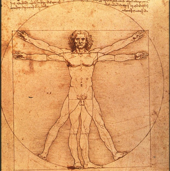
There are many types of reflection symmetry, such as horizontal (most common in nature), vertical, diagonal, etc.
Asymmetry
Asymmetry, on the other hand, is described as the absence of symmetry. Compositional balance can be achieved in asymmetry.
Asymmetry is also common in nature and biology. Most of us are either right-handed or left-handed. We are also either left brain or right brain dominant. Our internal organs do not perfectly match up. Asymmetry creates energy and tension, while symmetry is static and orderly.

Beauty in Asymmetry (Photo from Wiki)
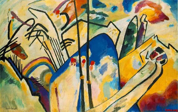
Asymmetry in Art by Wassily Kandinsky
There is a feeling of movement in asymmetry, that is why it seems more interesting in art and architecture. There is freedom in asymmetry, it is not contained or inhibited, unlike symmetry. On the downside, symmetry can be tiresome to the eye. If not done correctly, it can look messy or confusing.
Symmetrical vs Asymmetrical Web Design
Balance is integral in web design– thus the proper use of both terms, symmetry and asymmetry, is important. Symmetry in web design is often discouraged because it makes the layout look boring and static. There is a lack of dynamic energy in the design, which may not hold the viewer’s interest.
But symmetrical web design isn’t always that bad. It just depends on what your objectives are. Symmetrical web design does have its own advantages. Symmetry in web design gives order and balance. It looks clean, which is important especially if the website is professional and an information vehicle.
Asymmetrical web design is interesting and dynamic. Symmetry helps us remember, while asymmetry grabs interest.

Duuel
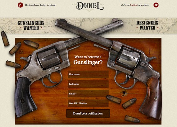
http://duuel.com/
A rather witty example to show symmetry in web design. Duuel is dedicated to finding the finest designers-slash-gunslingers, who can handle a duel with other fellow designers. It shows the best of talents dueling against each other, thus it is only right to use reflection symmetry, showing the equals of talent and intellect showcasing what they have to offer.
Another form of symmetry, which is rotational symmetry, can help create rhythm and flow. It directs the viewer’s eye on where to start and where to go next.
Translational is another type of symmetry, wherein an object is repeated across a plane, still retaining its same orientation, size or form. If you know about the Gestalt principle, you’ll already be familiar with the idea of our brain being fooled into leading us where it wants to go, and also for creating balance in our head.
Duplos
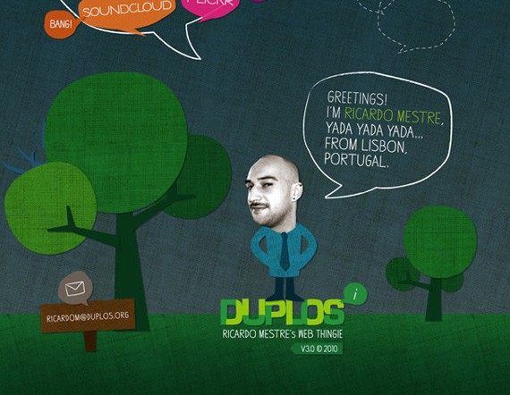
Duplos
Duplos is a great web site that makes use of asymmetry. Despite the fact that none of the elements mirror each other, it makes use of compositional balance. That’s why the web design still looks beautiful and interesting at the same time.
You can also combine both symmetry and asymmetry. You can create harmonious balance by integrating symmetry and asymmetry in your web design. Use symmetrical factors to make layout look professional and sleek, where information is placed to make it easy to remember. Use asymmetrical elements to grab attention, where viewer interest is important.
Google Website
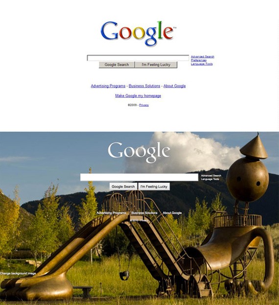
Image from Web Designer Depot
A perfect example is Google’s new website. We are all familiar with the old Google website. It is perfectly symmetrical, making use of white space, and with no use of any creative elements whatsoever. It’s a very useful website, but nonetheless quite boring and static.
Now the web site gives you an option to make design changes, where you can choose from a variety of themes and images, even your own Picasa pictures. The Google logo is now white instead of the familiar multi-colored logo. Everything else is just the same: the links, the Google logo and search bar in the center. The new site has married symmetry and asymmetry quite successfully.
Asymmetrical objects are more outstanding visually than symmetrical objects. For this, the general layout and background should be visually passive, thus symmetry is important for these elements. Asymmetry should be used for individual designs that are meant to draw attention and break the monotony.
More Examples of Impressive Web Design
Almost all web design layouts do not use symmetry or asymmetry exclusively, but instead uses elements of both. Here are some great web design examples that integrate symmetrical and asymmetrical elements:
Emily White Smith
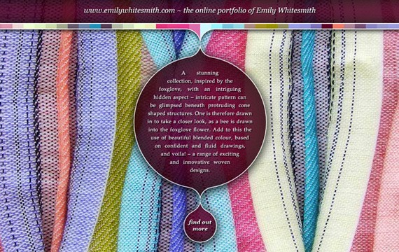
Great Bearded Reef

Ambermiro
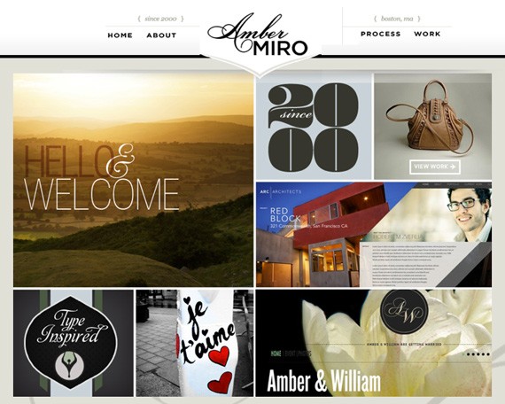
Fix Outlook

Creative People

Lotie

It Looks Good
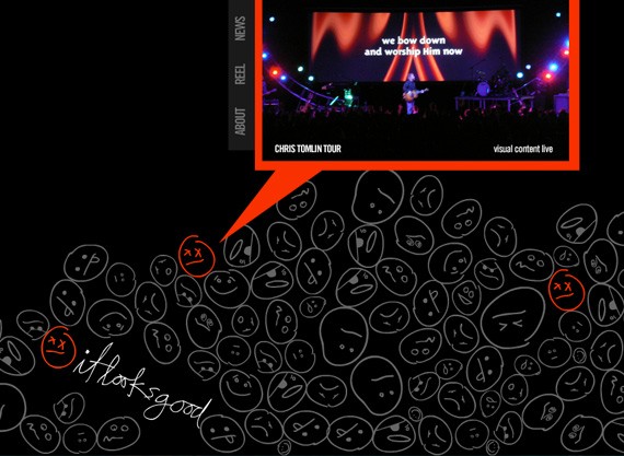
To sum up this article, here are a few tips on how you can use symmetry and asymmetry to your advantage:
- Symmetry is great for the basic layout structure.
Repeated elements create a calm and balanced space. Translation symmetry can create balance, at the same time maintain the space for the text and images.

- Asymmetry is great for grabbing the viewers’ attention.
Too much symmetry is dull, as what we have displayed countless times. To make your web design layout more interesting, add a few asymmetrical objects here and there, to grab attention and wake the sea of monotony. Asymmetry is heavier visually, so it directs the viewer’s eyes to the intended area.
- With asymmetry, compositional balance should be in mind at all times.
Yes, asymmetry is interesting, but it can also look unpolished and unfinished. Since the different elements have different weights, be careful how you arrange your elements so they look perfectly balanced on all sides. This will control your design flow, thus the end result will look beautiful, interesting and polished.
- Follow your instincts.
We have an eye for knowing what looks good or not. We have been trained, innately it seems, to see if there is visual balance or not. If the design looks too cluttered, too boring or too confusing, it probably is.
- Stick to basics.
Don’t over-analyze the web design as a whole. You are an artist, but remember that the majority of your viewers aren’t. Do not over style or over think your design. Just look at your design as a common person. Avoid confusing your layout so that the flow of the information and design goes smoothly.
Cause we want to help you get even better as web designers, the next section is about minimalist design and how can that make you better designer. Ready? Okay.
Why Creating Minimalist Design Makes You a Better Designer
Our target as designers most of the time is improving ourselves and our techniques. There are many ways of doing this. You can read books, find an internship or simply learn a lot by example from the internet. But there are some other ways as well. You might not believe it, but by only designing minimalist layouts you will become a better designer. You might ask yourself why, therefore I thought of putting together some ideas to try to convince you that this is also a good way of improving your skills.
Minimalist designs have been with us for quite some time now, emerging from nowhere a couple of years ago. It is easy to spot all over the place as everybody longs for such a design and everybody looks to have it. People pay lots of money for revamping their websites and minimalism seems to be everybody’s direction right now.
I do believe designing minimalist websites improve your skills because there is a reason why minimalism is popular. After more than 20 years of cluttered web pages, Flash animations, large Photoshop graphics and so on, it’s time for minimalism to shine. It is indeed time to only show the information which really needs to be shown. That is if you are a good designer, obviously. Not everybody can properly design in this style – but this is a total other discussion, so let’s get back to our topic.

Minimalist designs bring in a friendly environment without clutter and confusions. Web pages are now easy to look at and are quick to analyze even by an untrained eye. After so much time of the old web era, people kind of had enough with web pages that were nearly impossible to grasp. So there is indeed a reason why minimalism is so popular. But can it indeed improve your skills?
Working on typography
One of the elements which stand out in the new web era is typography. It is also probably one of the most important elements on a website. Text becomes an element on its own in today’s design and all of us have to work hard to achieve that perfect balance. It can be picking the right font, the perfect size or a good contrast – every one of these plus many others are crucially important in perfecting your website’s typography.
Unfortunately, although it is clearly important, typography is something that is often neglected by designers. Choosing the perfect font takes a lot of time and many designers simply do not have it (or do not want to spend time on it), therefore Arial and Helvetica seem to fit every website. Well this might have been true a few years back, it is not valid anymore. Learning to properly work on typography as an element of minimalist design will definitely help you achieve something not every other designer can.
Don’t just choose random fonts. Play with them, have a palette of 10-15 and switch them around until you will get the desired effect.
Attention on the main element
Another asset of the minimalist design is the main element which is always in focus. As mentioned earlier, there is no place for clutter or any other elements which are not necessary to the website’s target. This makes designers choose only one element and focus on it. Putting the whole focal point on one element is always a challenge, but by doing it many times you will find this is a very useful skill.
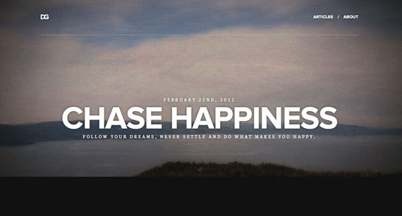
Being able to make something stand out, and at the same time make the other things visible as well, is not something every beginner designer can do. If you ask me what a good designer is, then I will tell you that a good designer is the one who can put elements in focus and forget about the rest. Just because you can fill the whole web page with things doesn’t mean you are a good designer.
Closing in on perfection
When designing minimalist sites you need to focus on everything, even if it is a small pixel. Because they are so simple, it is easy to notice flaws in it, therefore designers need to close in on perfection and make every single pixel look good. If there is one element that looks bad on your page, it will stand out. By designing in a minimalist way you will learn to be “pixel perfect”. There is no other way of creating a good minimalist design.
Many minimalist designs are built on a grid system, although it is not always easy to spot it. By designing like this you will also learn to use grid systems while designing and coding. Grid systems are something I am in awe of and I think you should be too. They make your website look so much better and organized that it is almost impossible not to like it.
Use negative space
There is no minimalist design without a lot of negative space (also called “white space”). New designers are afraid of using it because you kind of need a lot of visual experience in order to make it work well. Not every piece of your page needs to be filled in with something, but this is a concept not everybody fully understands. The faster you learn and acknowledge it, the better you will be at designing minimalist layouts – and the better your skills will be.

The reason behind us using negative space is that minimalist pages only contain few elements – so the rest of the space needs to be filled in with something. In this case, because we want to avoid clutter, we fill it with the background color. Why would knowing how to properly use negative space make you a better designer? Because this concept is rather new and being able to properly use it everywhere will give you an edge over the others in the business.
Getting everything right
It is not only about being pixel perfect. It is also about incorporating as few elements as possible while also conveying the wanted message to the visitors. This forces us to get every small element right. You do not want anything to stand out from a negative stand point and you want every element to express something. Every element has its purpose and doing a perfect job means you can’t remove any more element without affecting the site’s goal.
Know your work’s value
By this I mean you should know the work you have done is the best you could come up with. You might meet some clients now and then who, only because there are way too few elements on the layout, are not willing to pay. This is the moment when you will need to explain them why that specific layout is good for them.
Knowing the strong points of your work is a skill you need to learn and designing minimalist layouts will help you achieve it – with a bit of help from difficult clients though. It might not be a skill you will use too often, but it will come in handy in your freelance career for sure.

Bottom line
Only knowing what minimalist design means doesn’t make you a perfect designer, just like only knowing theory doesn’t necessarily mean you can also put everything into practice. In other words, there are some skills which you can get in two ways: the hard way (reading books, spending money on conferences, spending too much time on research) or the easy way (learning by doing).
I have tried this myself and the conclusion is incredible. Learning is way faster when you do it by actually working. By following the advice in this article you will find yourself in the middle of a win-win scenario. You will learn to design better minimalist layouts and will also gain helpful skills for your career.
Until next time! What do you think about the topic discussed here? Do you think it is easier to learn by doing, or in some other way?
Now let’s create really cool jigsaw puzzle.
Create a Jigsaw Puzzle Using jQuery and PHP
Almost everyone, at one point during childhood, has played jigsaw puzzles. Today I am going to show you how to create a jigsaw puzzle using jQuery and PHP. Lets start creating puzzles. I know that you must be waiting to see the puzzle in action. I am not going to keep you guessing. Here is the sample demo of the puzzle and download of tutorial files.
Now you got your wish. So lets move onto creating the puzzle.
Splitting an Image into Smaller Parts
First thing we have to do is choose an image for the puzzle. Only jpg images can be used in this example. I am going to use the 1stwebdesigner header image for the puzzle. Once you choose the image it has to be split into smaller images to create the puzzle components.
There are a lot of online tools available for splitting images. But I am going to use my own php code to split the image. The purpose of this tutorial is to make the puzzle. So I am not going to explain the whole PHP code for splitting images. I’ll just explain the necessary configurations.
<?php $image_file = 'puzzle.jpg'; $src = imagecreatefromjpeg($image_file); list($width, $height, $type, $attr) = getimagesize($image_file); $split_size = '150'; $cal_width = $width % $split_size; $cal_height = $height % $split_size; if ($cal_width > 0) { $new_width = intval($width / $split_size) * $split_size + 100; } else { $new_width = $width; } if ($cal_height > 0) { $new_height = intval($height / $split_size) * $split_size + 100; } else { $new_height = $height; } if ($width > 1200) { $width = 1200; $new_width = 1200; } $image_p = imagecreatetruecolor($new_width, $new_height); $image = imagecreatefromjpeg($image_file); imagecopyresampled($image_p, $image, 0, 0, 0, 0, $new_width, $new_height, $width, $height); imagejpeg($image_p, $image_file, 100); $x_comp = intval($new_width / $split_size); $y_comp = intval($new_height / $split_size); $winning_string = ''; $image_names = ''; $src = imagecreatefromjpeg($image_file); $dest = imagecreatetruecolor($split_size, $split_size); for ($y = 0; $y < $y_comp; $y++) { for ($i = 0; $i < $x_comp; $i++) { $characters = 'abcdefghijklmnopqrstuvwxyz'; $ran_string = ''; for ($p = 0; $p < 4; $p++) { $ran_string .= $characters[mt_rand(0, strlen($characters) - 1)]; } imagecopy($dest, $src, 0, 0, $i * $split_size, $y * $split_size, $split_size, $split_size); imagejpeg($dest, "images/$ran_string.jpg"); $winning_string .= $ran_string; $image_names .= $ran_string . ","; } } $image_names = substr($image_names, 0, -1); $images = explode(',', $image_names); shuffle($images);
?>
Code Explanation
- First you have to provide the name of your image in the $image_file variable. I have used puzzle.jpg as the name and it should be on the same path as the file which contains the above php code.
- In line 8 you see the variable $split_size. It is defined in pixels and you can change the value if you want. I have used 150. So the image will be split into parts of 150px * 150px images.
- Also make sure total width and height of your image is a multiple of 150. If it is not a multiple of 150 some parts of the original image will be removed when split.
- Then in line 54 you should specify a folder for the split images to be stored. I have used the folder name as images.
Now what you have to do is download the tutorial files first. Then copy it to your web server and give necessary permissions to folders. Then open the split.php file and make the changes mentioned above or keep the default values.
Once you execute it in the browser you will get a output like the following.

You should keep both Winning String and Load String as shown in the above screen. Now we are done with the image split. So lets move onto the next section.
Creating the Puzzle Using Jquery
I have already created images for our puzzle in the images folder. Now we have to create the puzzle by loading the puzzle images. Before that we need to enable Drag and Drop support using Jquery UI library. So I’ll show you the necessary files to be included.
I have downloaded and included the necessary files of jQuery UI Library in the tutorial files. You can use the following code to include the files related to our tutorial.
<html lang='en'>
<head> <title>Jquery Drag and Drop Puzzle</title> <script src="jquery-1.7.2.js" type="text/javascript"></script> <script src="ui/jquery.ui.core.js" type="text/javascript"></script> <script src="ui/jquery.ui.widget.js" type="text/javascript"></script> <script src="ui/jquery.ui.mouse.js" type="text/javascript"></script> <script src="ui/jquery.ui.sortable.js" type="text/javascript"></script> <link rel="stylesheet" href="demos.css">
</head>
<body> </body>
</html>
In the code you can see the file called jquery.ui.sortable.js. It is used to handle the drag and drop and then sort the items inside the given container. This is called Sortable in Jquery UI library. Once you make an element sortable, you will be able to both drag and drop items inside that element. You can make item sortable using the following code.
Jquery Code for Making Unordered List Sortable
$("#sortable").sortable();
Unordered List with Items
<ul id='sortable'> <li>Item 1</li> <li>Item 2</li>
</ul>
Above codes will enable sortable event on all the li items inside the ul container with the id sortable
Basic CSS Styles for Sortable Element
<style type='text/css'> #sortable { list-style-type: none; margin: 0; padding: 0; } #sortable li { float: left;} .msg_text{ text-align: center; padding: 20px; font-size: 30px; text-shadow: 1px 1px 1px rgb(21, 23, 28); }
</style>
Loading Images for the Drag and Drop Puzzle

Now I am going to display the image parts as puzzle. We can use the following PHP code with small configurations to load the images. This code is located in puzzle.php file on the project folder. You can run the puzzle.php file in your web server to directly execute the demo. Now get ready with the Winning String we created earlier.
<?php $image_names = "ilsc,scmz,lsea,derv,logi,eyen,vkxl,ihrx,mwgc,bwdk,rfwb,oezh"; $images = explode(',', $image_names); shuffle($images); $new_width = "900"; $new_height= "300"; $split_size= "150"; echo "<ul id='sortable' style='width:" . $new_width . "px;height:" . $new_height . "px;'>"; foreach ($images as $key => $image_name) { echo "<li class='ui-state-default' id='recordArr_$image_name' style='width:" . $split_size . "px;height:" . $split_size . "px;'> <img src='images/$image_name.jpg' /></li>"; } echo "</ul>"; ?>
Code Explanation
- First enter the Load String we generated earlier into the variable called $image_names. Keep it as it is if you are going to use the default demo.
- Each time you change the image of your puzzle and split it with the split.php file, you have to assign the Load String here.
- Then we have variables called $new_width and $new_height. These values should be defined according to the number of parts in your puzzle.
- We created 150px * 150px images and we have 6 images horizontally since original image I used was 900*300px. So $new_width should be 150*6 = 900. Also we have 2 images vertically. So $new_height should be 150*2 = 300. Configure those values according to size of your image. Also $split_size is set to 150 since we are using 150*150 images.
- Then we load all the images for the puzzle inside unordered list. You don’t have to do anything there.
- Now we have completed displaying the puzzle images.
You can see the puzzle on your screen and try to drag and drop images. You must be wondering why the puzzle is not working. That’s because we haven’t made the puzzle sortable yet. That’s where the magic happens. So lets make it sortable.
Making the Puzzle Sortable

Include the following code snippet on the head section of your document after the js and css files.
<script type="text/javascript"> $(function() { $("#sortable").sortable({ opacity: 0.6, cursor: 'move', update: function() { } }); }); </script>
Now you can drag and drop the images and you will be able to see that images are changing in the puzzle. But there is no way you can check whether puzzle is solved or not unless its a very simple one. So now I am going to tell you how to check whether puzzle is solved using a very simple method.
Identify the Winning Moment
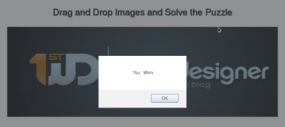
Here is the code that will notify you when the puzzle is solved. Include it inside the update function of the code we created in the previous section
<script type="text/javascript"> $(function() { $("#sortable").sortable({ opacity: 0.6, cursor: 'move', update: function() { var winningString = "oezh,rfwb,lsea,vkxl,ihrx,ilsc,eyen,mwgc,derv,logi,bwdk,scmz"; var currentString = ''; $('#sortable li').each(function(){ var imageId = $(this).attr("id"); currentString += imageId.replace("recordArr_", "")+","; }); currentString = currentString.substr(0,(currentString.length) -1); if(currentString == winningString){ alert("You Won"); } } }); }); </script>
Code Explanation
- Each time you move an item in the puzzle the update function will be executed.
- First insert the Winning String we got earlier when creating images, into winningString variable.
- Then the code will get the current positions of the images in the puzzle and creates a string with current item order.
- Next we check whether current string matches the winning string and displays the winning message.
We have completed our tutorial on creating puzzles and now you can enjoy creating and solving puzzles.
Bonus Tip
Have you tried fixing the puzzle yet ?
You might have done it pretty easily since only 12 parts are available in the demo. But when the number of parts increases it will be very difficult unless you find out the correct method.
If you are a designer or developer who has knowledge in working with HTML DOM, you will be able to find the correct method. Drag and drop images a few times and see how the images are positioning. Then try to match that with how the HTML DOM works when you add and remove elements dynamically. I am sure that you will be able to figure it out.
So you can learn about the DOM while having fun with fixing puzzles. Let me know if you figure it out using the comments section.
Whats Next?
Now we have completed creating a basic puzzle using jQuery drag and drop features. What we did was manually create image parts using some php code and including those parts of the puzzle. You can extend this by allowing users to upload images and create the image parts dynamically. Then allow the users to select the puzzle from a dropdown and fix it. So you will be able to create puzzles out of any image.
Sounds good right ? Here is some more functionality you can include in your puzzle.
1. Assign a time to fix the puzzle in a given time period using javascript setTimeout function.

2.Save image names in a database table with correct order and provide a score on how many parts have been completed inside the given time.
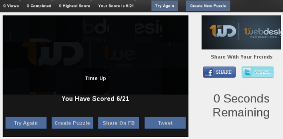
You can extend these features and create a puzzle site for users very easily. Let me know if you have any questions regarding using these puzzles or extending features. Use the instructions in the project files to execute the demo properly. Hope to hear from you.
Conclusion
We really hope that this article about tutorials will be your to go place for learning new thing, as we wanted to include the tips on how to become even better not just show you where you can learn them. Until next time, keep on learning and of course tell us you opinion.
This post may contain affiliate links. See our disclosure about affiliate links here.


