In this article you will see the Graphic design examples from all over the World. Graphic design is a lot like languages.
It’s an identity; beautiful and enigmatic. Graphic design varies from culture to culture, influenced by a country’s culture, history and way of life. Just like art and music, graphic design aesthetics differ from culture to culture.
There may be common elements found in a culture’s graphic design, not found in other cultures and vice versa.
Table of Contents:
- Graphic Design Examples From Worldwide: How Different Culture Reflects In The Artwork
- How Different Nationalities Design
- Graphic Design From Developing Countries
- Graffiti Art: From the Streets to High-End Galleries
- 50 EPIC Examples Of Street Art That Will Blow You Away
- 74 Absolutely Stunning pieces of Eye Candy for your Inspiration
- Get Inspired: 43 Amazingly Creative Papercut Artwork
Graphic Design Examples From Worldwide: How Different Culture Reflects In The Artwork
Table of Contents
- 1 Graphic Design Examples From Worldwide: How Different Culture Reflects In The Artwork
- 2 How Different Nationalities Design
- 3 Graphic Design From Developing Countries
- 4 Turkey
- 5 Egypt
- 6 The Philippines
- 7 Thailand
- 8 Cuba
- 9 Conclusion
- 10 Graffiti Art: From the Streets to High-End Galleries
- 11 Graffiti’s Origins and History
- 12 Art on the Streets
- 13 A Move to the High End Galleries
- 14 Graffiti in Art Exhibits Today
- 15 50 EPIC Examples Of Street Art That Will Blow You Away
- 15.1 1. Autumn 3D ish Pavement Art
- 15.2 2. Taupo
- 15.3 3. ZHE 155
- 15.4 4. Cuba Gallery
- 15.5 5. Street Art Off Degraves Street
- 15.6 6. 3D Street Painting Step By Step
- 15.7 7. Rotterdam
- 15.8 8. Panty Graffiti2
- 15.9 9. Contrast Layout
- 15.10 10. Doter
- 15.11 11. Dibs 2011
- 15.12 12. Japan
- 15.13 13.Chalk Art – Cause On Uproar
- 15.14 14. Wall In The Mall
- 15.15 15. Setik 01
- 15.16 16. Graffiti 1013
- 15.17 17. Stencil work
- 15.18 18. Retard
- 15.19 19. Pilipinas Street Plan
- 15.20
- 15.21 20. Graffiti 863
- 15.22 21. Mushism
- 15.23 22. Wood Morning Wall
- 15.24 23. CStyle
- 15.25 24. A Revolutionary Let Down
- 15.26 25. The Wild Ones
- 15.27 26. Shades
- 15.28 27. Homeless Not Smiless
- 15.29 28. This Is Bandung 2011
- 15.30 29. Bokito
- 15.31 30. Artist At Work
- 15.32 31. 1134 NYC Stencil
- 15.33 32. 3D Jupiter Postcard
- 15.34 33. Valparaiso, Chile
- 15.35 34. Tiger
- 15.36 35. Street Art In Colors
- 15.37 36. Street Art
- 15.38 37. Octopus
- 15.39 38. Swan
- 15.40 39. Excavation Of Dinosaur
- 15.41 40. Mucha Chalk Art
- 15.42 41. Street Art Amsterdam
- 15.43 42. Design Conditioner
- 15.44 43. Street Art Monster
- 15.45 44. Ruined Building Art
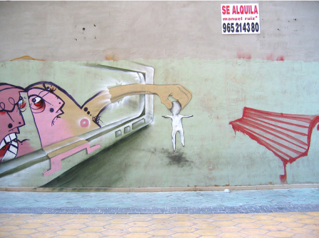
- 15.46 45. Street Art From Spain
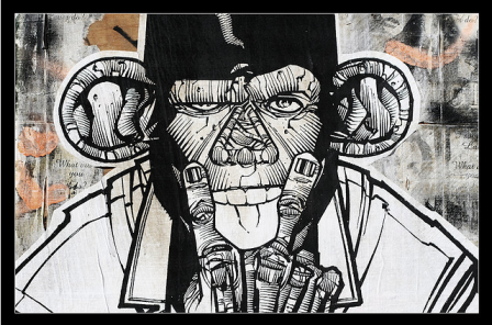
- 15.47 46. Street Art Of Monkey Man
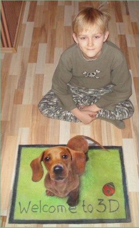
- 15.48 47. 3D Dog
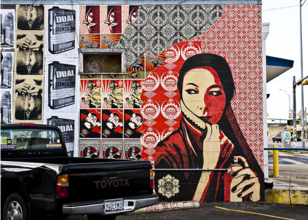
- 15.49 48. Street Art With Eastern Look
- 15.50 49. Melbourne Street Art
- 15.51 50. Sweet Art-PAC Milan
- 16 74 Absolutely Stunning pieces of Eye Candy for your Inspiration
- 16.1 1. My Dream of World Peace by ~killmatthew33
- 16.2 2. Water Witch Eye by ~asdfgfunky
- 16.3 3. Eye serie 30 by ~MelckyXY
- 16.4 4. Eye See you by ~MonkeySeed
- 16.5 5. Apophysis Eye by =peach
- 16.6 6. Eye from some Eyes by =Fatalsoul
- 16.7 7. Aquarius eye by =ftourini
- 16.8 8. Jade by `Lilyas
- 16.9 9. Apple of my Eye by ~mickeykumar
- 16.10 10. Eye eye by ~norking
- 16.11 11. Leafy Eye by ~reinedescoeurs
- 16.12 12. Looking at You by *DraculeaRiccy
- 16.13 13. Eye Color by ~Whistala
- 16.14 14. Disturbia by ~RudolphEurich
- 16.15 15. Flower eye series by ~Jenya88
- 16.16 16. Eye of Time -II- by ~YourSweetAgony
- 16.17 17. I Dream of Freedom by ~loopyluv
- 16.18 18. Eye scream by ~maliciaZintent
- 16.19 19. Apple eye by ~toxic92
- 16.20 20. Eye by ~deGimbalz
- 16.21 21. For the world to see … by ~keikei11
- 16.22 22. Steampunk Ring green eye by *CatherinetteRings
- 16.23 23. Darksiders – End of My World by *DomMcCann
- 16.24 24. Eye Candy by ~LiNoR
- 16.25 25. Cool eye 2 by ~fallen-angel-636
- 16.26 26. Eye Candy by ~RooCouture
- 16.27 27. Reflections XXII by ~neodecay
- 16.28 28. Apple by ~Khay88
- 16.29 29. Soft Leaking Eye by *VegasMike
- 16.30 30. Eye Candy by *SaraSchool
- 16.31 31. Macro eye vector by ~seldom-sleeping
- 16.32 32. What meets the eye by *Hera-of-Stockholm
- 16.33 33. Soul Searching by =MichaelO
- 16.34 34. Zombie eye by ~freakshow6661
- 16.35 35. Werewolf eye by ~Esroth
- 16.36 36. With this Eye by ~blue-mirage
- 16.37 37. Sea Eye by ~Dyyyy
- 16.38 38. In Your Eye by ~BrokenWings3D
- 16.39 39. Snowy Eye by ~darkchilightchi
- 16.40 40. Passion Of The Night by ~Dyyyy
- 16.41 41. Rose Love Eye by ~Dyyyy
- 16.42 42. Yellow Magic Eye by ~Dyyyy
- 16.43 43. Eye of a devine by ~PheoniX-VII
- 16.44 44. Eye of a predator by =ftourini
- 16.45 45. Eyes open wide by ~LiNoR
- 16.46 46. Natural Eye by ~LiNoR
- 16.47 47. Rainbow eye by ~ThErEaLDoLLyFrikka
- 16.48 48. Eye by ~sweety-girl2oo8
- 16.49 49. Eye Sketch by ~LyonsGate
- 16.50 50. Eye of the lemon by ~MLep
- 16.51 51. Eye Hate Spiders by ~Forgotten-Myth
- 16.52 52. Kiwi eye reloaded by =ftourini
- 16.53 53. In The Eye Of The Begotten IX by ~neodecay
- 16.54 54. T-eye-M by *123Stella
- 16.55 55. Eiko Eye-Con – Competition by =TheNeonGryphon
- 16.56 56. Eye of a nymph, by ~iheartsomersby
- 16.57 57. Fish eye by =ssecret
- 16.58 58. Eye grabber by ~lorrainemd
- 16.59 59. Chestnut Eye by ~oilcorner
- 16.60 60. Behind the eye by ~Ober88
- 16.61 61. Eye love d you by =ftourini
- 16.62 62. Eye candy by =ftourini
- 16.63 63. Eye – full HDR by ~ridethespiral1
- 16.64 64. Another eye??? by ~gyuszi02
- 16.65 65. Big eye goldfish by ~inmc
- 16.66 66. Eye On Fire by =Birthstone
- 16.67 67. Eye Candy by ~mprox
- 16.68 68. Avatar eye by ~MrJackXIII
- 16.69 69. The eye by ~Black-Ban
- 16.70 70. Into the Depth of an Eye by ~Snow-Owl
- 16.71 71. Fire Eye by =MEGAN-Yrrbby
- 16.72 72. The eye by ~morkovka55
- 16.73 73. Blue cup eye by ~bangrud
- 16.74 74. Broken Eye by ~SoloEvolution
- 17 Get Inspired: 43 Amazingly Creative Papercut Artwork
- 18 26. Papercut for “The Scene” by Himmapaan
- 19 Make Your Own Papercut
We’re all very familiar with graphic design from the west, particularly in the US and UK. I will discuss and showcase graphic design from around the world, from the most interesting cultures: Latin America, China, Japan, Middle East, India and the Netherlands. Graphic design from these areas is a bit different, but still very aesthetically appealing.
Latin America
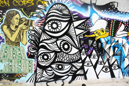
Latin America is occupied with 500 million people, consisting of 20 Spanish-speaking countries save for Portuguese Brazil. Latin America has produced the most unusual and energetic form of graphic expression history has seen. Art is alive and well in the streets of Argentina, Ecuador and Brazil. Building exteriors filled with graffiti & stencil art. Latin American design is a reflection of the rampant street art scene: colorful, tantalizing, soulful, and a bit naive.
Her art revolved around her surroundings and culture. It is diverse, given its hundreds of years of exploitative colonization from other countries. Latin America is one whole continent and stretches more than 21 million kilometers, but we see a common theme for all Latin American design: the latino’s love for life, dance and celebration.

by Jorge Alderete
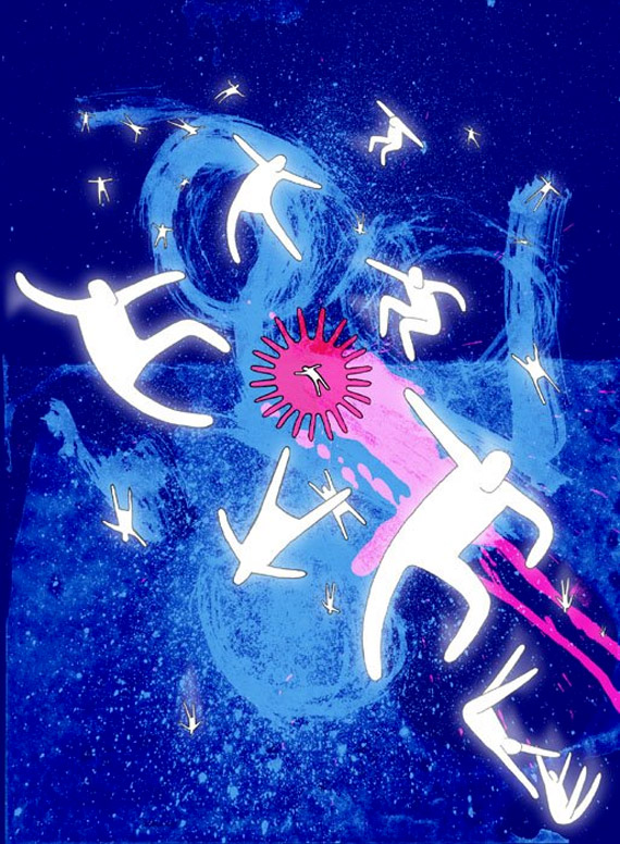
By Victor Candia
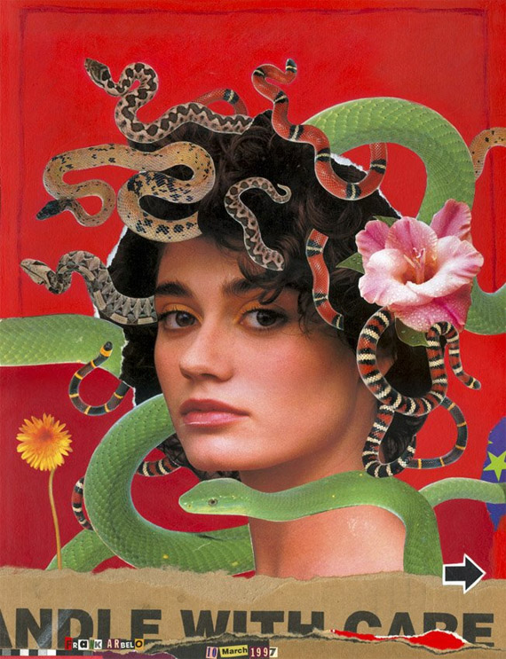
by Frank Arbelo
Most Latin American posters have evident pop art and art deco influences. It makes use of contrasting colors, wacky typography and energetic shapes.


By Daniel Aviles
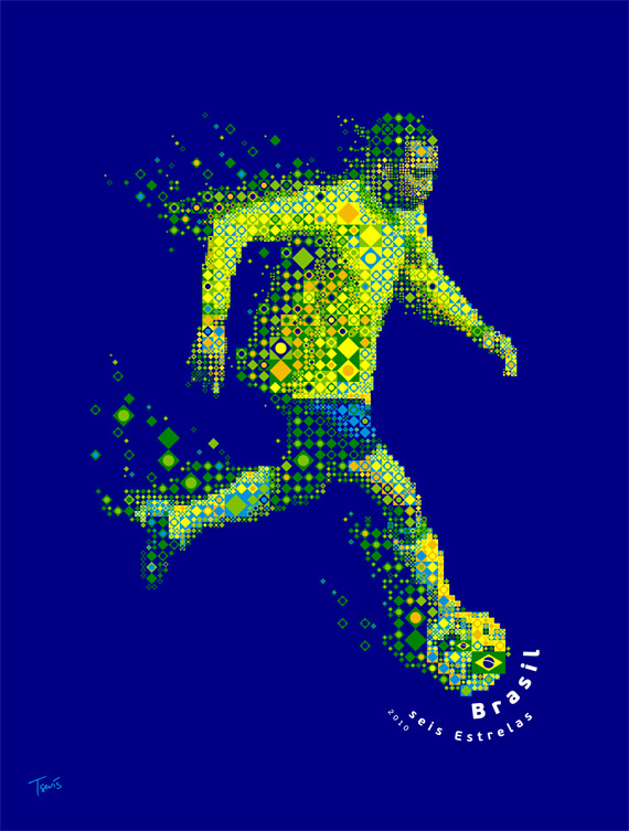
By Charis Tsevis
The latino’s piousness is evident with the use of religious themes and Roman Catholic symbols.
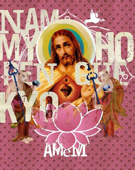
by Thiago Barros
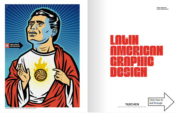
Propaganda, nationalism and revolution are also common themes in Latin American graphic design (especially in the Caribbean islands).
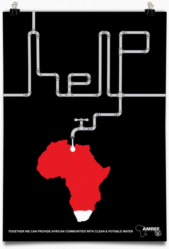
by Juan Camilo Rojas
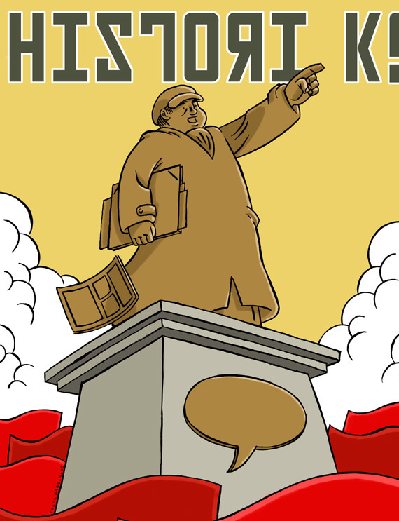
By Frank Arbelo
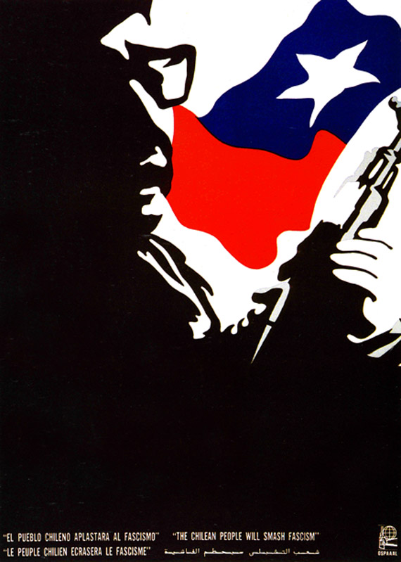
by Ernesto Garcia Peña
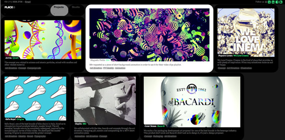
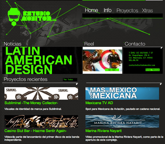
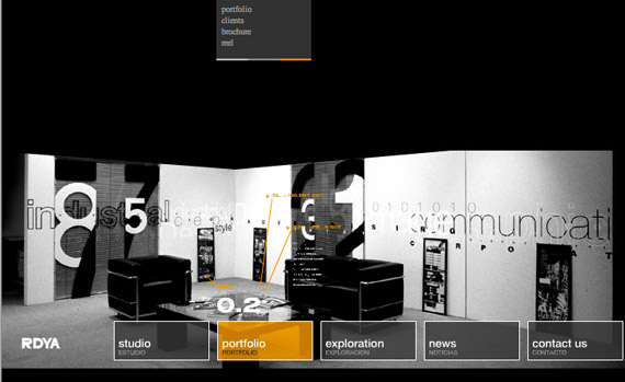
Impressive Latin American Web Design
Weareplace
Estudio Monitor
RDYA
Pablo Alferi
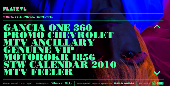
Latin American graphic design shows the latino’s love for partying and celebration. Latino graphic designers are liberal when it comes to using bold colors and contrasting elements. Minimalism is also used, but mostly for web design–and it’s not as ‘minimal’ as it is in other places. The world can learn a lot from the Latin Americans; such as to take life less seriously and enjoy. They teach us to look at design not just visually, but with your six senses.
China
China is one of the oldest civilization, spanning at least 4,000 years. During its heyday, China was one of the most advanced societies in the world, but through imperialism and civil wars it began to decline. Still, China has a flourishing history of art, literature and culture.
Chinese graphic design is fairly new as compared to the west. It wasn’t until recently, in 1979, that China reopened their doors to the world again, welcoming new ideas and the latest technologies. The country is making a slow but sure move to democratic ways, becoming more liberal with new ideas, especially in art and design. China is surging with creative energy with a strong sense of nationalism (if not a bit xenophobic), so it’s no surprise that modern graphic design still employs the same design elements found in traditional Chinese art.
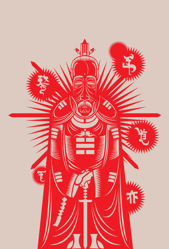
by Nod Young
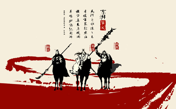
by Doopaa.cn

‘I Love Guangzhou’ by Wu Zhen
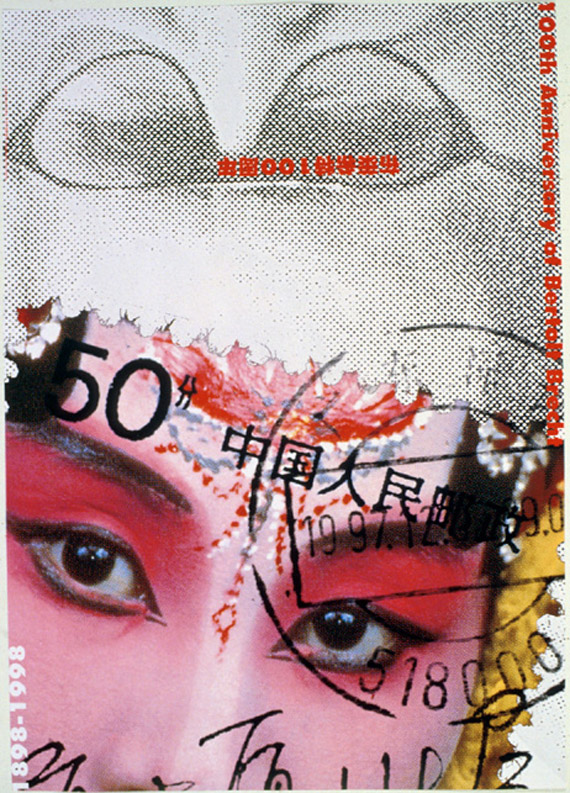
by Jiaying Yan, Photo Courtesy of Maryellen McFadden
Graphic design in China was used as an effective means of illegal political expression. It was a vehicle for self-identity and self-expression.
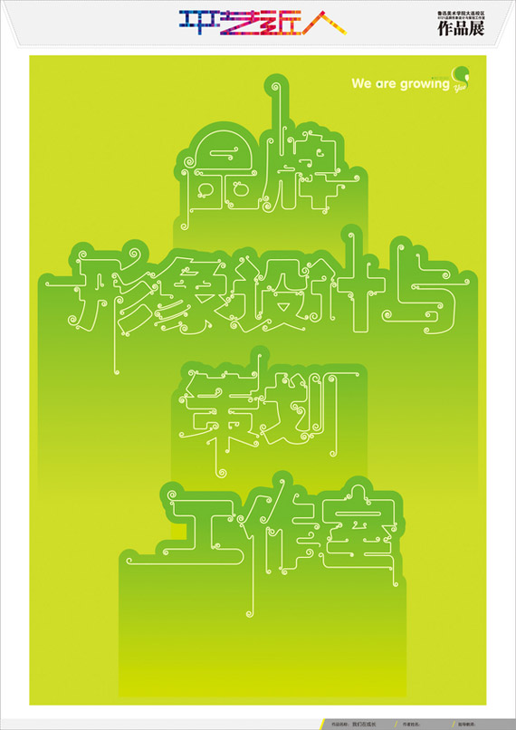
by Su Yue
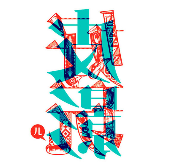
by Qian Qian, Photo Courtesy of Maryellen McFadden
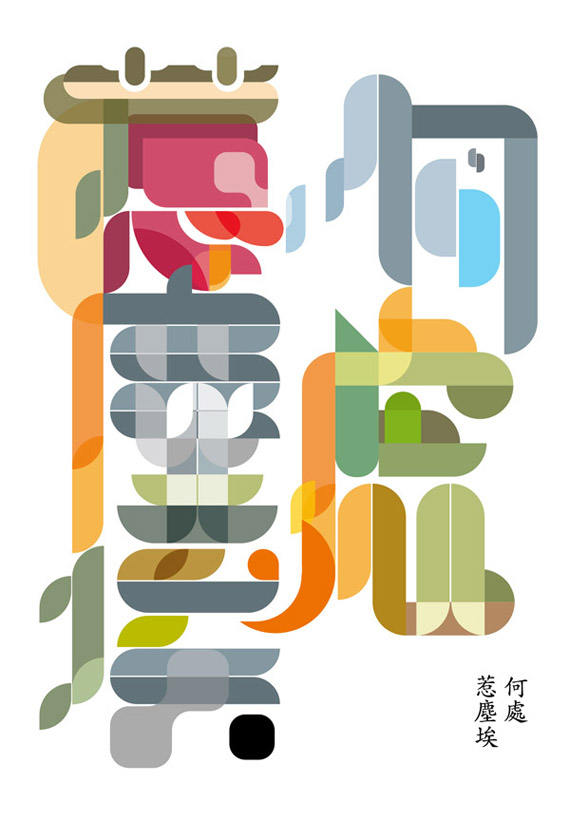
by Nod Young
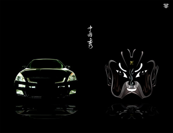
by Fizi Pao
Wonderful Chinese Web Design
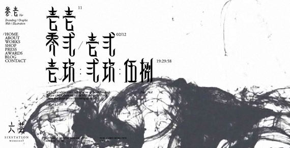
Six Station
Wotoon Design

Conceives

Shizixiu
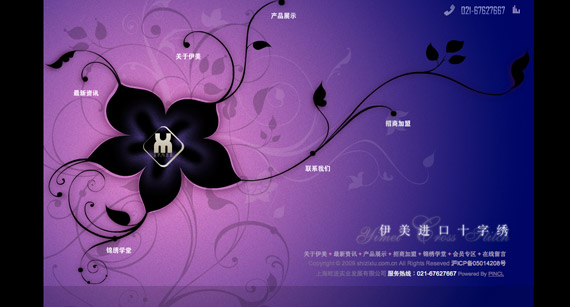
Chinese web design is addicted to using Flash. Web sites from China are highly interactive and playful. Some elements in graphic design are copied from other cultures. In the recent decade, Chinese graphic design is heavily influenced by the west, but still retains its own Chinese drive and soul. For example, design makes use of feng shui symbols, calligraphy, cultural festivities, etc.
Japan
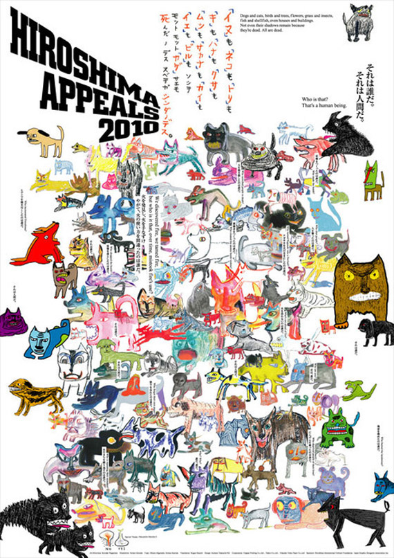
Japanese contemporary art takes many forms: architecture, advertising, video games, anime and graphic design. Japan’s influence in art is immense, contributing many ideas in graphic design and modern art in general. Japanese graphic design is urban and offbeat. They show an affinity for neon colors, simulating the lights we see in downtown Tokyo at night.
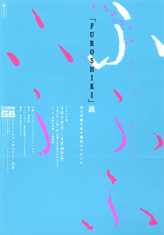
Furoshiki. Photo Courtesy by Gurafiku
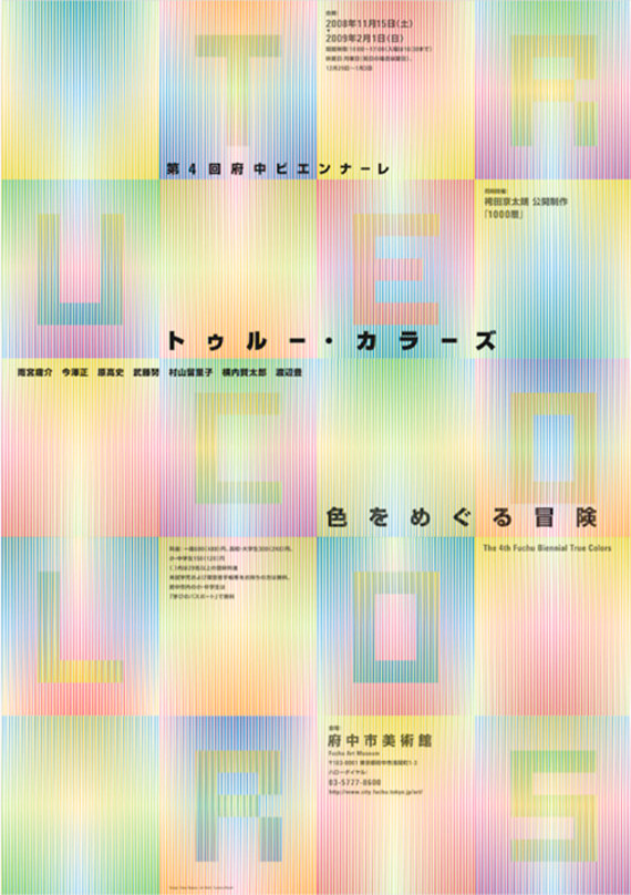
by Takeo Nakano
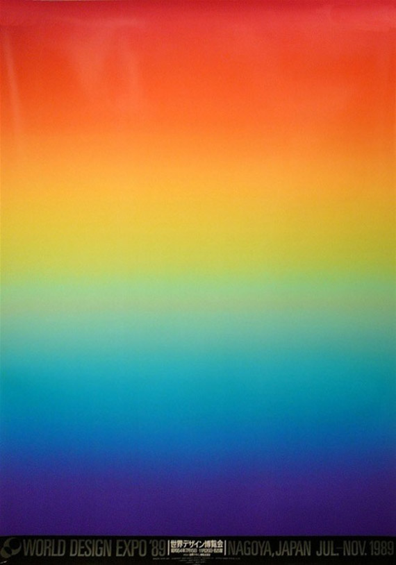
World Design Expo Poster by Koichi Sato
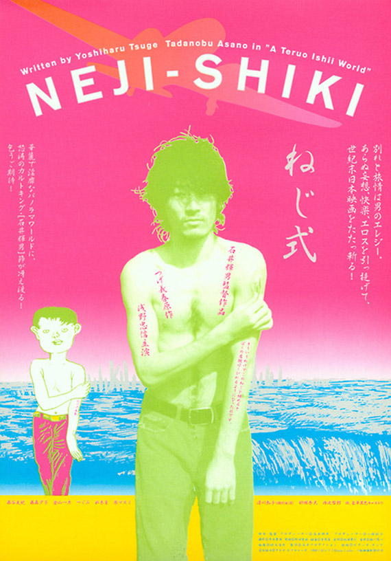
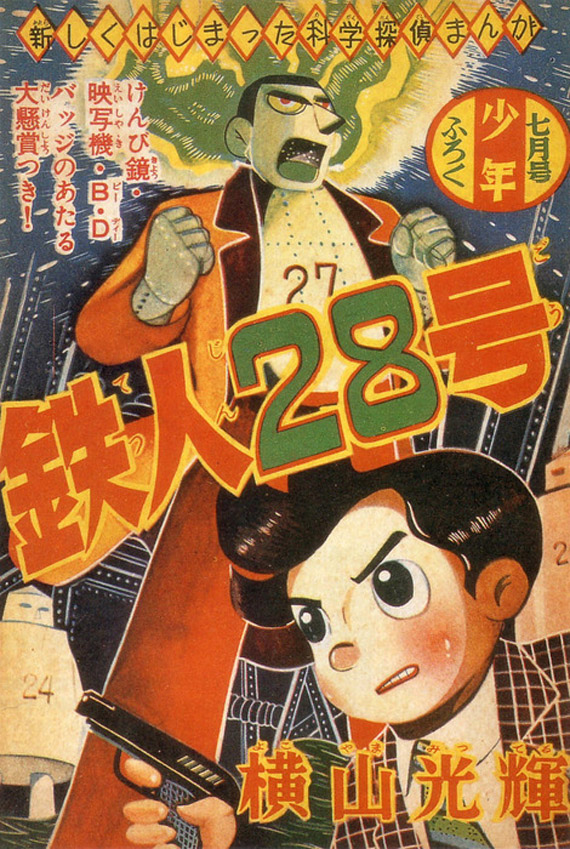
Japanese graphic design has heavy influences from Japanese traditional art and manga.
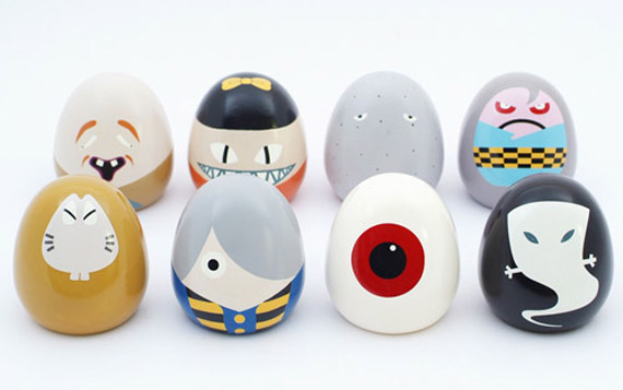
by Shigeru Mizuki
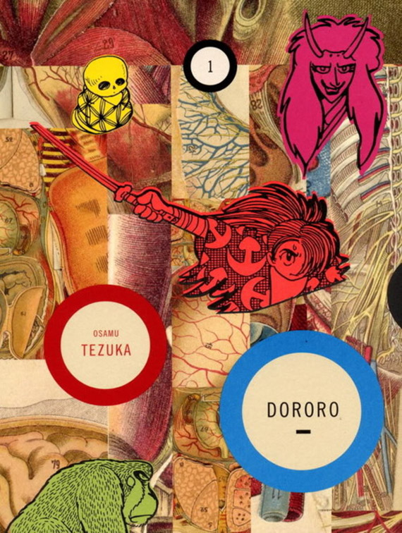
by Peter Mendelsund
Brilliant Japanese Web Design
Idemitsu

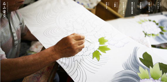
Ishiyama Senko
Ryuichi Sakamoto
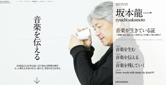
Go Jimbou
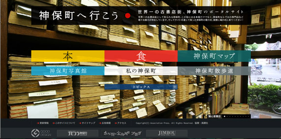
Japanese graphic design is interesting because it’s radically different from what we are used to in the west. It’s extremely varied, and an infusion between the old and the new. On one side of the spectrum, it’s sleek, futuristic and very minimal. But on another, it is super cute, childish and wacky.
Middle East
The Middle East is seen by the west as mysterious, alluring and mystifying: it’s the land of sands, flying carpets and magic lamps, the kind most of us will only visit in our dreams. The Middle East is a paradox–this culture is wealthy with some of the oldest and most extensive art in history, boasting thousands of years of art. However, graphic design in the Middle East is still pretty recent. It’s still a struggle for the Arab world: freelancing is not a good way to earn a living here, the government is not very cooperative and there are only a few graphic design schools around.
Middle East graphic design is just as alluring and mystifying. It is strongly influenced by old calligraphy and arabesque, or the repetition of forms and patterns.
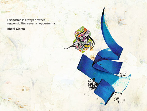
by Khawar Bilal
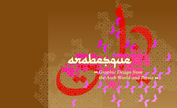
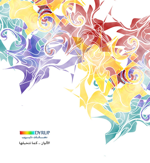
by Fayez Al Harti
The Middle East has slowly opened themselves to the western culture of consumerism. The Arabs love their gold–and this affinity can be evident in design.
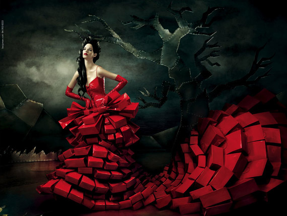
by Mohanad Shuraideh
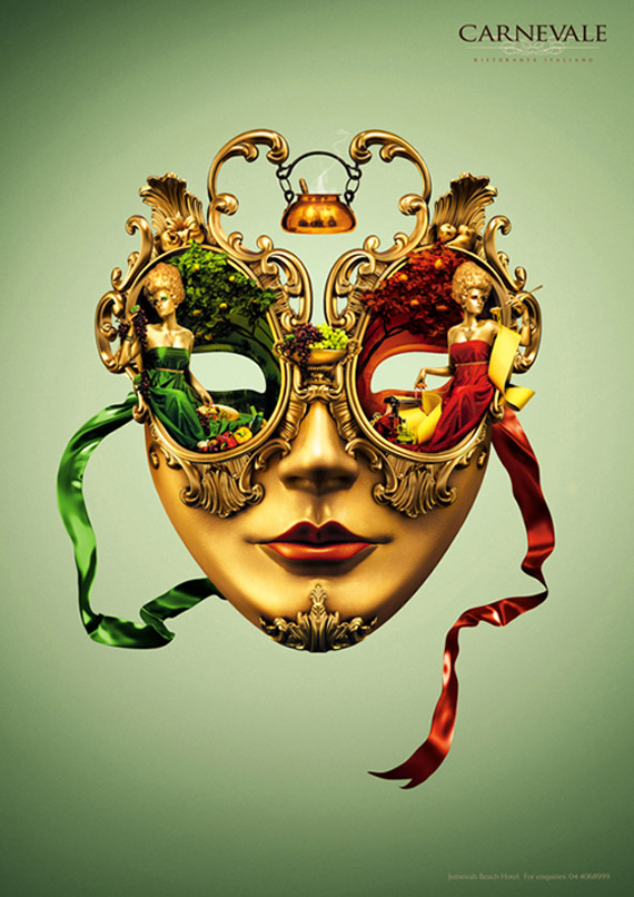
Just like the whole world, the Middle East world has also caught on the minimalist bug, but still maintains the Middle Eastern vibe we’re all familiar with.
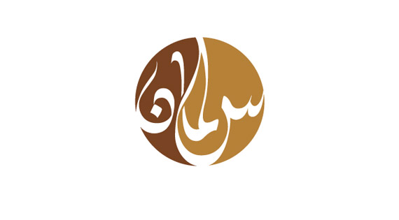
by Samhar Khuzam
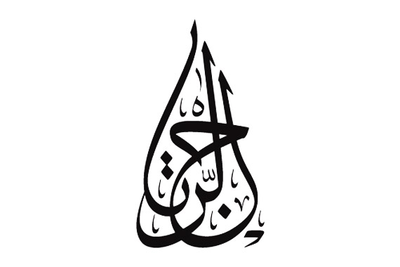
by Samhar Khuzam

Photo by Media Me
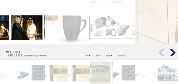
Superb Middle Eastern Web Design
DU.ae

Zukhruf
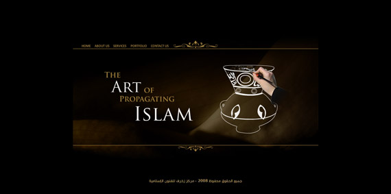
Alama
Cocolicious
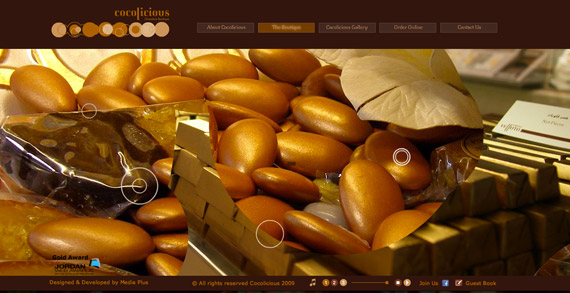
Middle Eastern design is rich in color and culture. Like other Asian countries, the Middle East prides herself in beautiful symbols and calligraphy.In some aspects, the region is still conservative in many matters. For example, they need to open themselves to the idea of freelancing, female graphic designers, etc. Nevertheless, the region is a hot-pot of new and intermixing ideas. They have adopted many Western ideas on design, but retain the identity that makes them distinct.
Netherlands
The Netherlands is a Dutch speaking country located in the Northwest of Europe, bordering Belgium to the south and Germany to the east. The Netherlands is a tiny country, but is home to the greatest artists in history: Rembrandt, van Gogh, van Eyck, Mondrian and van Doesburg.
Dutch graphic design tend to be individualistic, if not anarchic. They prefer clean, minimalist designs–this is where the De Stijl movement, precursor of the Minimalist movement, started after all. The Dutch are inclined towards conceptual art and contemporary themes. Simplicity is appreciated, and ‘undesign’ is a common design strategy here.
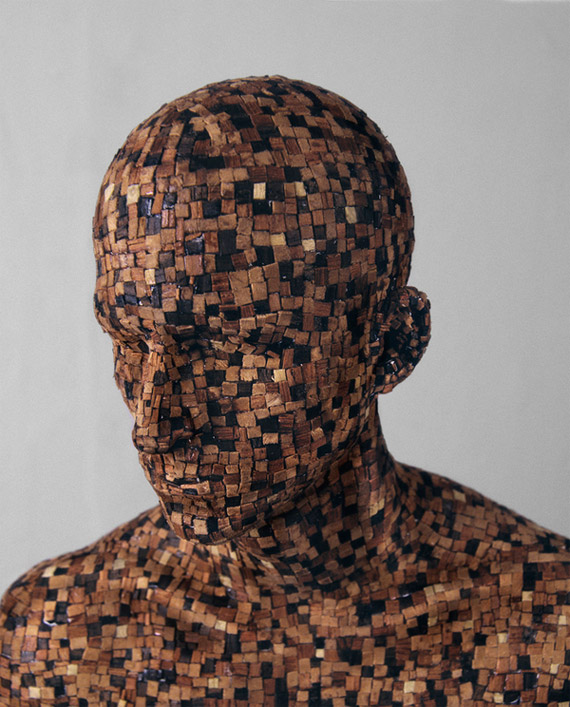
by Levi Van Veluw
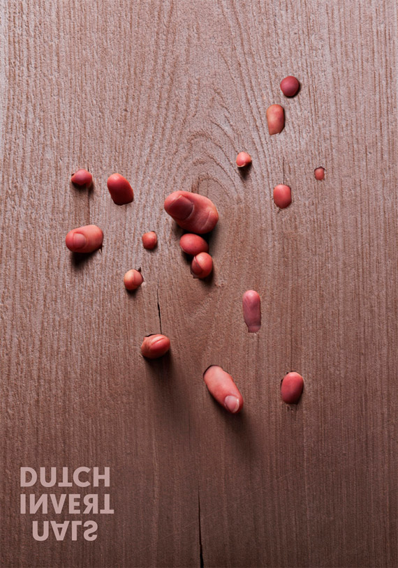
Photo by Design.nl
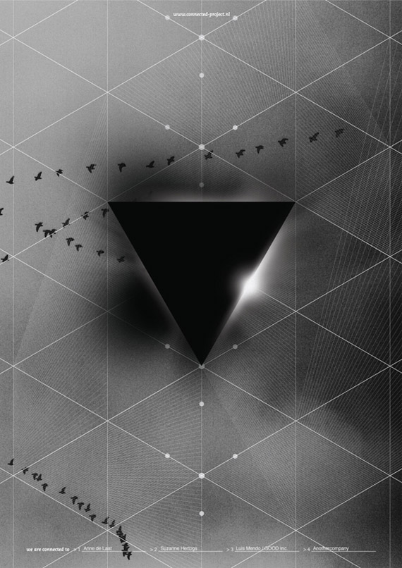
by Another Company
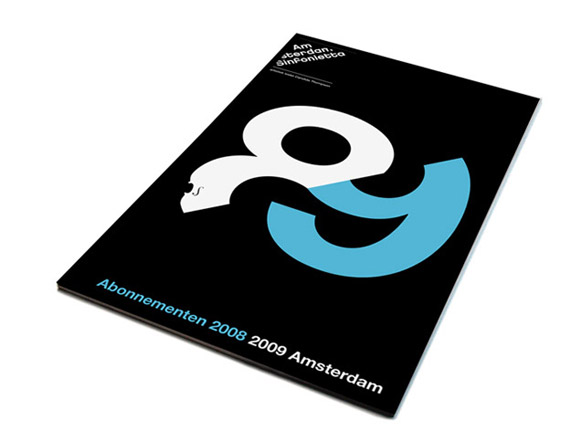
by Studio Dumbar
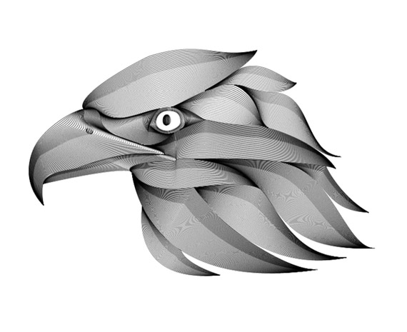
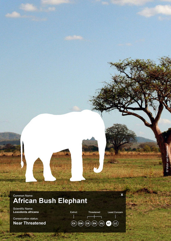
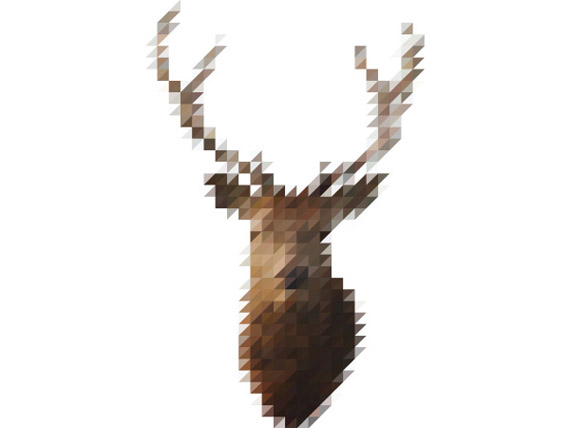
Dutch designers often design conceptually. One of my favorites is the young Dutch graphic designer Victor van Gaasbeek, whose designs are typically Dutch, modern but make use of nature and natural elements.
Great Dutch Web Design
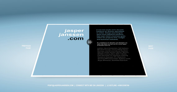
Jasper Janssen
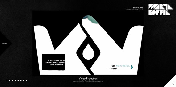
ZwarteKoffie
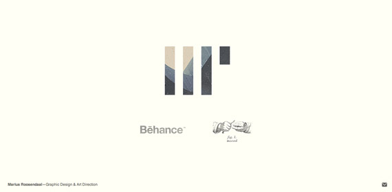
Marius Roosendaal
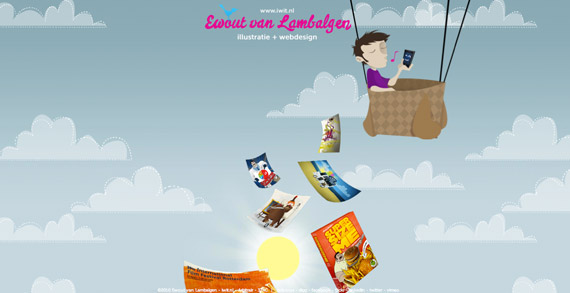
Ewout van Lambalgen
The Netherlands and her neighboring countries create the trend when it comes to graphic and web design. Their art is clean, conceptual and smart. It doesn’t mean that it’s all serious and minimalist though–Dutch design can also be playful.
Maybe because of the government’s huge financial support for the arts, or the country’s prosperous economy, or probably the local’s passion for the arts, Dutch graphic design is among the most advanced in the world.
Conclusion
Because different cultures have a different history and story, we have different experiences, beliefs and customs. We see the world from a slightly different angle. Graphic Designers from around the world have their own approaches to art. Despite that, one thing is certain: good design will always be good design. Even if we don’t understand the meaning, symbol and calligraphy being used, we can distinguish good from bad design. Appreciating art goes beyond cultural and geographical lines; and its more than a summation of our culture and beliefs. Appreciating design is an international and universal feeling, felt by all despite our color, skin or race.
We’ve got more, check the next section.
How Different Nationalities Design
You asked for more, so you got it. We’ve covered Latin American, Middle Eastern, Dutch, Chinese and Japanese graphic design. It was a beautiful introduction to art from our brothers who speak different tongues. Graphic Design can be dramatic, emotional, powerful, romantic, serene, political or even all of the above.
Scandinavia is located in northern Europe and includes Denmark, Sweden and Norway and sometimes Greenland, Finland and Iceland. Scandinavia is comprised of first world countries, which are, according to survey, among the happiest people on earth.
As one may expect, Scandinavia is relatively advanced in the field of graphic and web design. They are in fact the leaders of design in this generation. Minimalism is a common theme. From architecture, furniture, advertising, to graphic design, they certainly know how to wow.
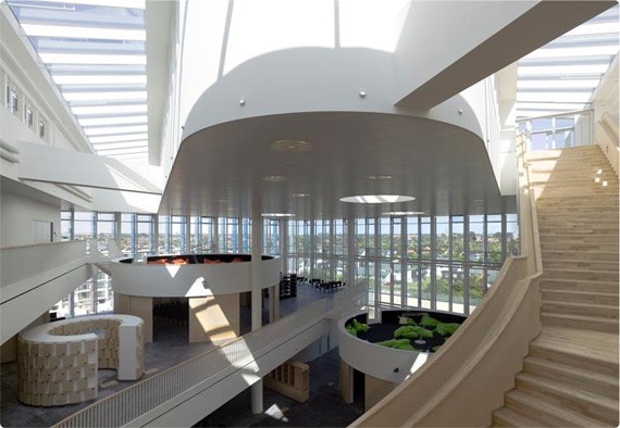
Orestad Gymnasium in Denmark. Photo by Beneighteleven
Yes, Scandinavian design is known for its minimalism and simplicity. They believe that it doesn’t take a lot of elements to create beauty. It’s all about creating awe for the spectators, but it does not need to be showy. Their design aesthetic is more functional and goal-oriented than decorative and fussy.
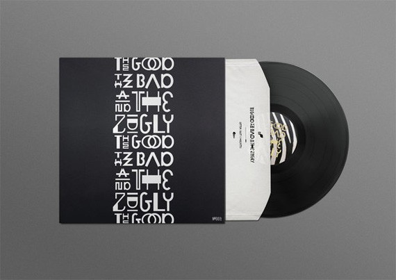
Packaging design by Norwegian Designer Ludvig Bruneau Rossow
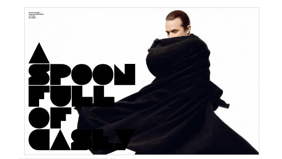
Homework by Jack Dahl
But this does not mean that Scandinavian designs look professional and minimalist, or it can get boring. They know how to have fun with color and elements too! Designs below are colorful and playful, but still very distinctly ‘Scandinavian’.
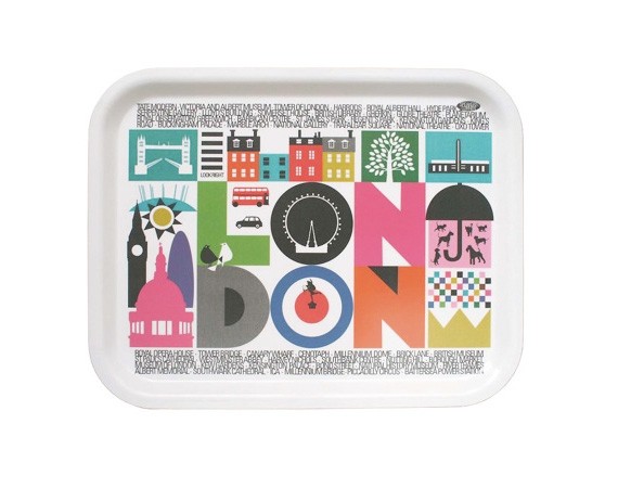
London Tray by Maria Dahlgren
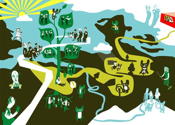
Web design reflects much of the Scandinavian design aesthetic. It is clean, no fuss and fluid. But unlike graphic design, it is more aware and open to the international scene. It borrows a lot of international ideas, particularly from the US and UK. Below is the web site of award-winning freelance designer Gummisig.
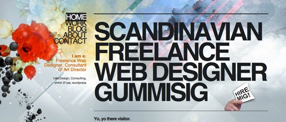
Gummisig
In a few words, Scandinavian graphic design is chic, bold and modern. They keep their heritage intact, and at the same time they do not ‘try too hard’ to keep up with other countries. This is what makes Scandinavian design beautiful: it is cool, but doesn’t try too hard. Despite being individualistic in nature, Scandinavian graphic design has been inspired from a few key design elements and concepts from her neighbors in Scandinavia, Austria and Germany.
Peter Ørntoft
Peter Orntoft of Copenhagen, Denmark describes himself as a visual communicator. His works are smart, innovative and modern. He knows his field very well; to have the ability to be playful and still get his message across.
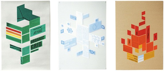
Organic Grid
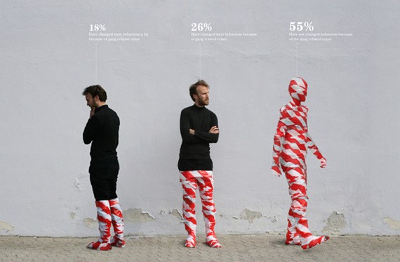
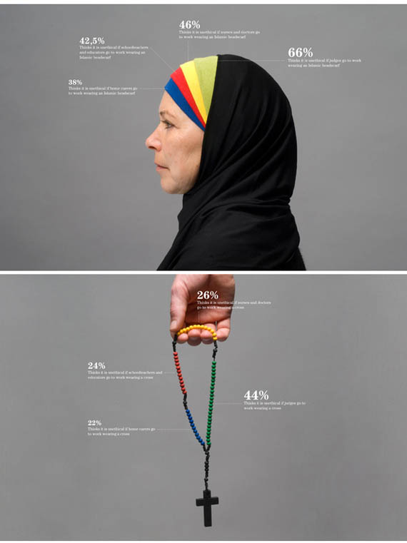
Information Graphics in Context
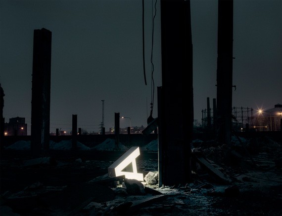
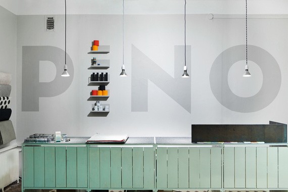
Aleksi Hautamäki
Aleksi Hautamäki is a designer based in Helsinki, Finland, specializing in branding environments. He has worked with various huge multinational companies like Apple, Adidas, O2, etc.
Måns Wikström
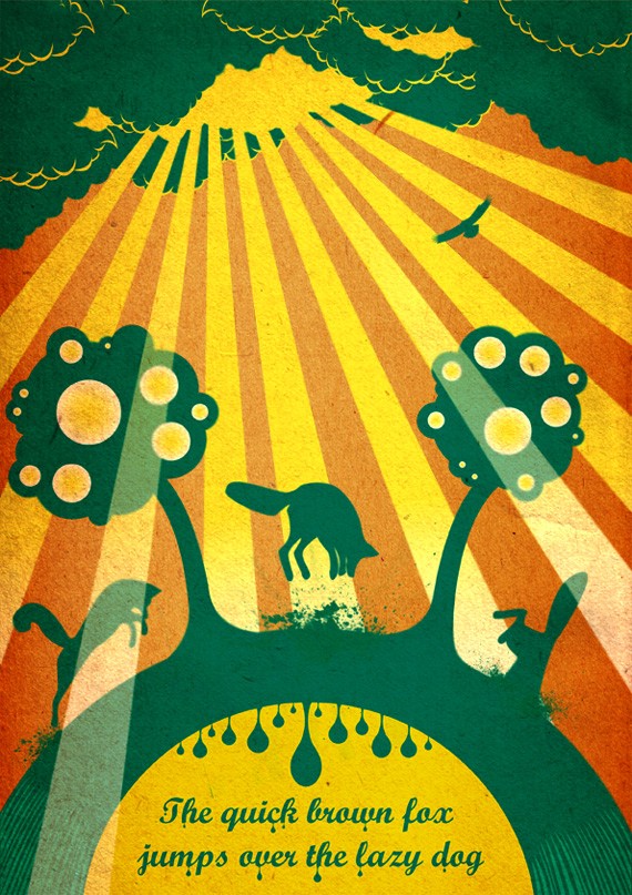
Måns Wikström is based out of Stockholm, Sweden. He loves using color without compromising Scandinavian aesthetic, and is liberal on using different techniques in design.

Zebra
Israel
Israel is a modern country with an old heart. In some places it is a busy metropolis, but in some it still looks like the ancient Canaan in the Bible. It’s a place where outsiders looking in cannot help but get fascinated.
Israel is rich in culture, so you expect to find rich art and graphic design. On the streets you hear different tongues being spoken–English, French, Turkish, Spanish, Arabic, and of course, Hebrew. Hebrew is a writing system that has been used for thousands of years. The 22-letter alphabet has evolved from the Phoenician language, also borrowed by the Ancient Greeks, Latins and eventually Arabic and Cyrillic. Israel is the only place now that still speaks and writes in Hebrew. As seen in the Dead Sea scrolls, so little has changed of the alphabet since ancient times.But with the changing times, new needs arose. It used to be used for purely religious purposes but has since catered to the needs of new communication and commercial needs. It has been used for advertisements, posters, billboards, packaging, magazines and more.
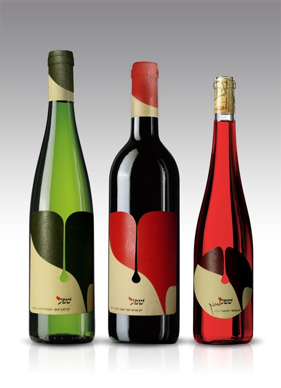
The ancient alphabet is given a new look fit for the modern times. Below is a photo of a poster for Festival Beshekel, a music festival for Israel.
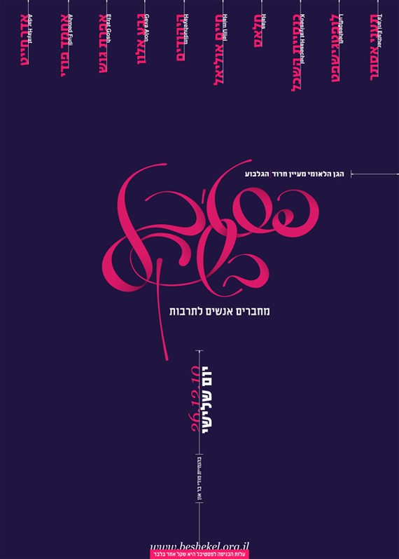
by Moshik Nadav
Israel is a young state despite its 3,000 years of existence; because of this, they are still yet to form their own identity. Israeli graphic design is heavily influenced by the Western motifs but still retains attributes of Israeli culture. Israel design makes use of imagery for cultural and political messages with traditional themes; often easily understood by the locals but leaving foreigners totally unaware.
In summation, I noticed three things with Israel web design:
1. There is strong use of Flash based designs. The Middle East Asian state loves Flash and animation, it’s quite popular there. CSS is not popular, in fact many local clients have no idea what it is.
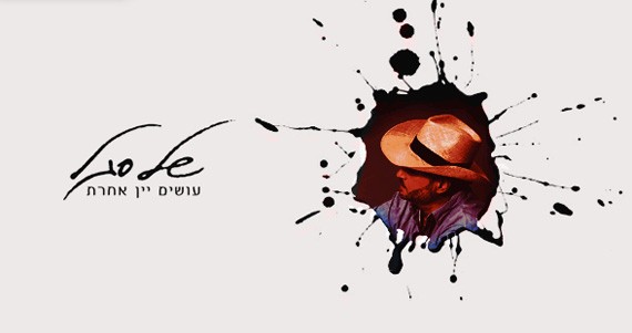
2. Israelis know branding like their own. In fact if they have a specialization, maybe it’s this. Their portfolio in branding is just impressive.
3. Again, typography is one of the most interesting aspects of Hebrew web design. The alphabet of course evokes a religious appearance; so the problem of most designers is how to use the alphabet for a more modern and commercial side.
Israeli Graphic Designers
David Tartakover
David Tartakover is an accomplished Israeli laureate, artist, author and lecturer. His works often have strong political, cultural and historical messages.
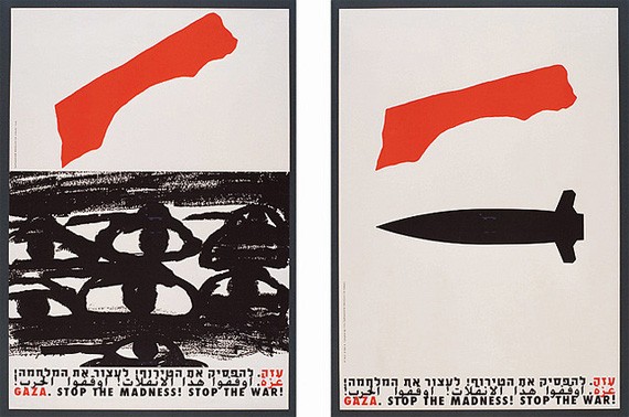
Stop the Madness, Stop the War
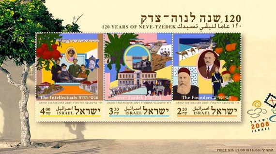
12o Years of Neve-Tzedek
Moshik Nadav
A graphic designer who specializes in typography, so it may be more proper to refer him as a typeface designer. He has worked with both the Hebrew and the standard English alphabet.
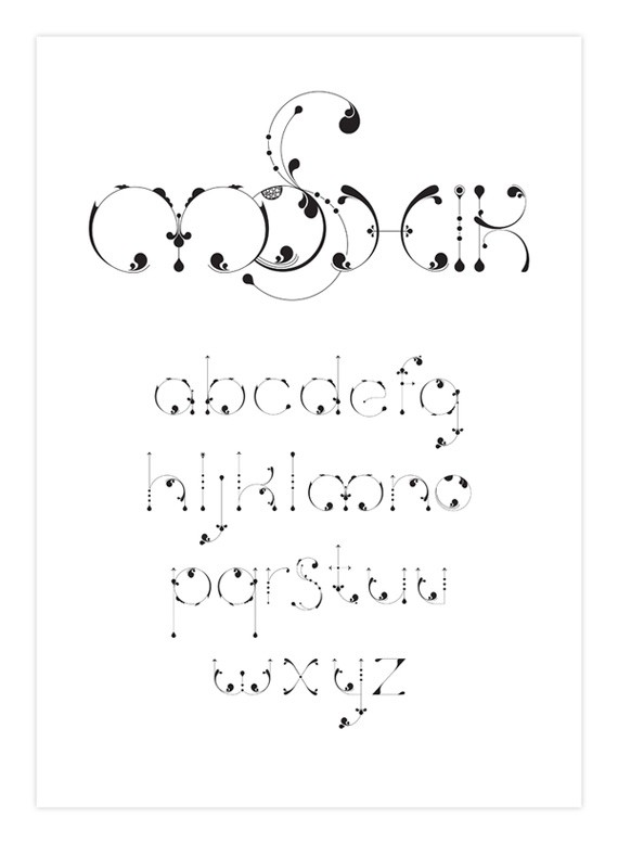
Moshik
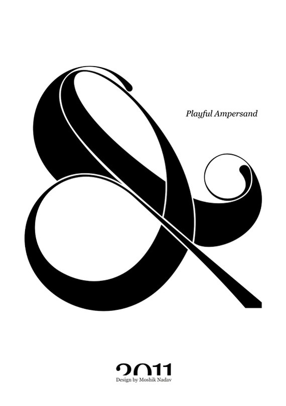
Playful Ampersand
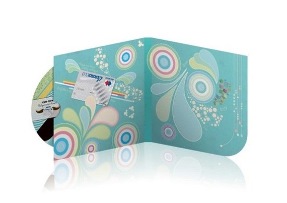
Roma Muskalyuk
Another talented graphic designer with an impressive portfolio. He takes on works of art in a fun and fresh way,dissecting common elements and making them his own. Roma Muskalyuk’s works are influenced by the Western modern art but still retain the traditional quality that is distinctly Hebrew.

AUM
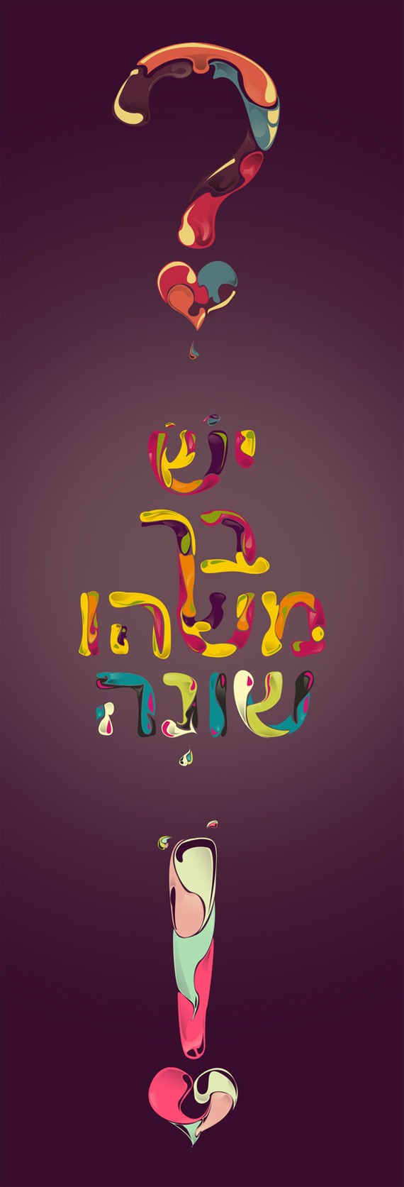
There’s Something Different About You
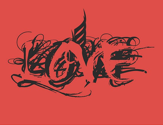
Love
Africa
South Africa is a little different than the rest of the places mentioned because there is no single culture here. It has been dubbed as the ‘Rainbow Nation’, referring to its rich cultural and ethnic diversity. South Africa is known as a rich melting pot of different cultures. There is religious tolerance as there are many different faiths including: Muslim, Christian, Sunni, Hindu or Buddhist. A lot of different languages are spoken in South Africa, such as Khoisan, Indian and English.
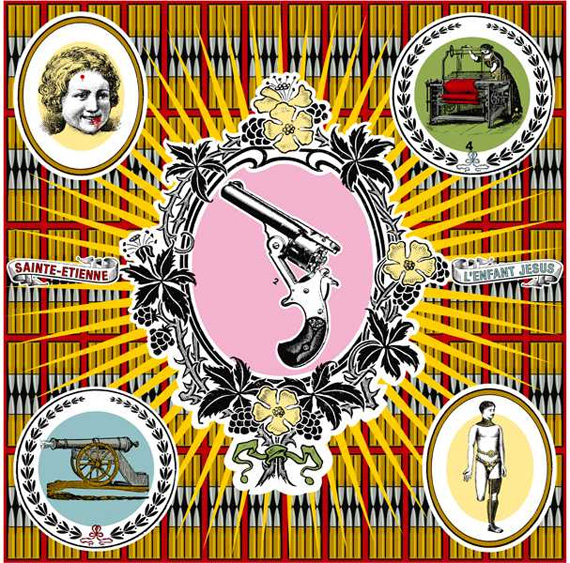
L’enfant Jesus by Garth Walker
South Africa was indeed the cradle of humanity–and many experts believe this is the place where the first human society existed. The oldest art in the world is found in this region. Art has been found dating at least 75,000 years ago, in the form of necklaces or cave paintings.
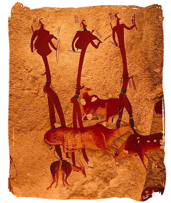
Primitive Ancient Art by the San People
As the region was subsequently colonized by different countries like the British and the Dutch, art also takes up a new form. Merging western influenced art with the folk art of Afrikaner, Trekboers created an eclectic mix which is still evident today.
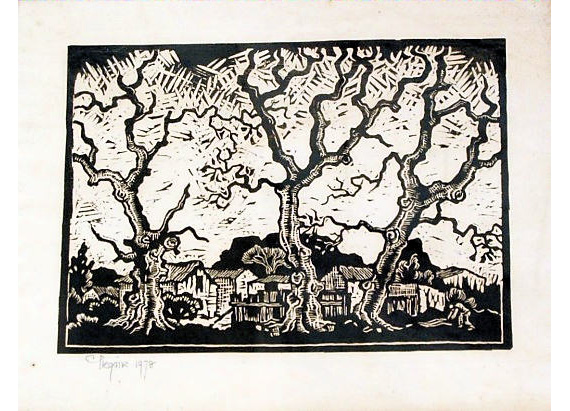
Lino print by Gregoire Boonzaaier
Today, South Africa boasts a bustling art scene that is diverse, modern, contemporary, but again primitive, soulful and close to nature.African graphic design is very new, but has an old soul. Because of its very young age she has yet to create an identity. She has borrowed a lot of elements from Western graphic design, but merges modernism with ancient Afrikan art.
South Africa is a lot like Latin America when it comes to their passion for music, festivities, sport and football. Throw in a bit of the African vibe to it and you’ll get a visual fusion that is fun, unique, soulful and otherworldly.

Photo by South African Design

Design for a Board Game, by Carel de Beer.
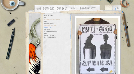
Website by Am I Collective, a design collective based in Africa.
African Graphic Designers
Garth Walker
Garth Walker is an internationally reputed graphic designer based in South Africa. In 1994 he opened Orange Juice Design which became one of the country’s best known design studios. It was later acquired by Ogilvy South Africa. In 2008, Walker opened his new and solo design studio, Mister Walker. He specializes in visual design and branding.
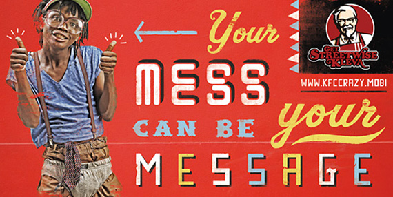

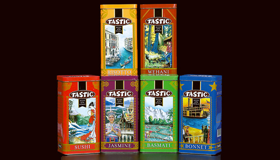
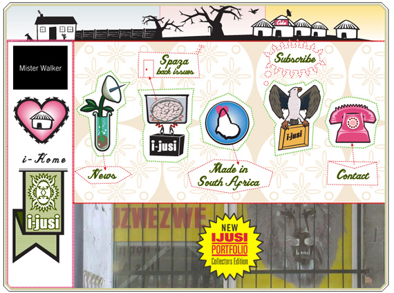
Web Design
Ian Jepson
Ian Jepson’s designs and illustrations are characteristically quirky and smart. He is currently working for Am I Collective and is based in Cape Town, South Africa.
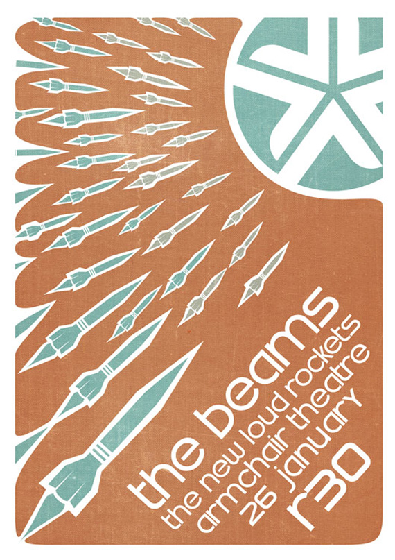
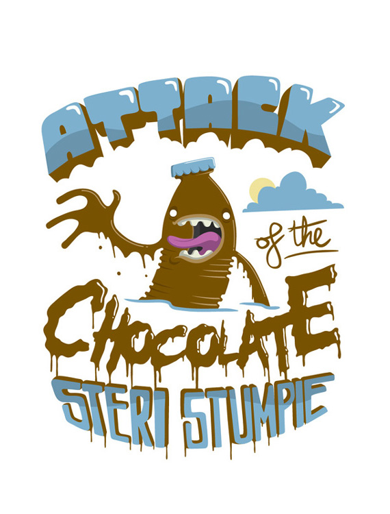
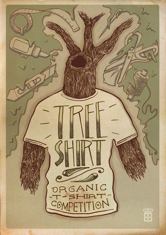
Jordan Metcalf
This South African artist/illustrator has strong and poignant works in his portfolio. His works are unique and have a soul to them; they are lively on their own despite the artist’s preference for limited use of colors.
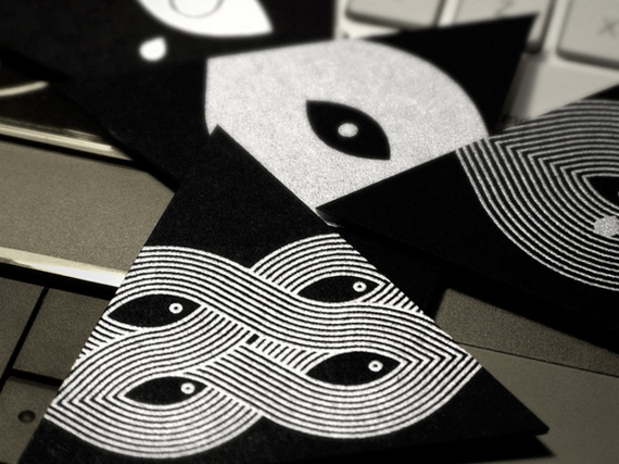
Business Cards by Metcalf

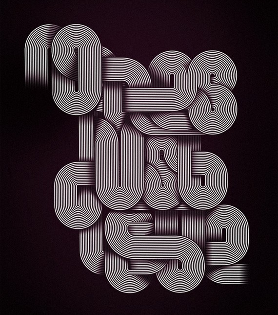
Russia
Russia has 1/6 of the world’s land mass. This enigmatic giant is mysterious and seductive; charming but elusive. Russia has made great contributions to art since her inception, such as classical music, fine art, literature and ballet.
Russian Constructivism has a huge impact on Russian graphic design today. The art movement is a form of abstract art; rejecting pictorial representation and instead evoking emotion through color and shapes against negative space.
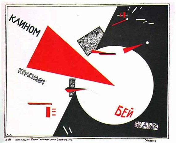
by El Lissitzky, one of the first pioneers of Russian Constructivism. Platypus 1789
The art movement was a strong driving force in the industry. It has widened its horizons since the 1920s, moving from the canvas to photography, typography, printmaking and graphic design. In the past, the former communist USSR closed off international ties, but now we see that they are opening more and more to the world. They are beginning to adopt international concepts and influences, which is very remarkable in art.
Below is a work by Alexey Frolov, a Russian designer, who is obviously inspired by Russian constructivism. Today the art movement is still used by many designers with equal zest and energy.

by Alexey Frolov
As for Russian web design, layout is always smooth and dynamic. It doesn’t use as much Flash as other cultures, preferring Javascript and xHTML.
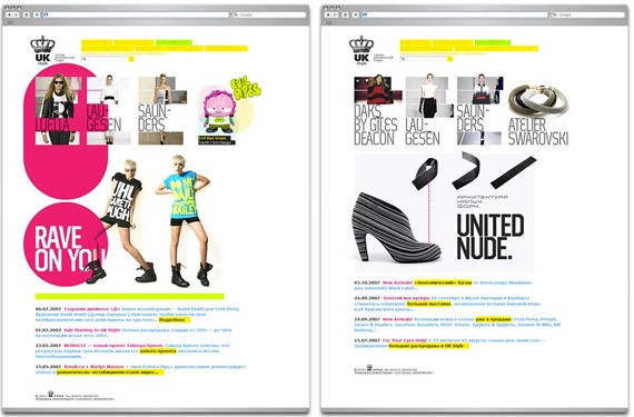
by Losinsky Vladimir
Some web designers joke about hating to work with the Russian Cyrillic alphabet. They find it old-fashioned and inflexible; but they find ways to get by through playing with the typography for a more modern look.
Russian Graphic Designers
Roma Lubimov
Lubimov’s works are filled with life and energy. Surreal, dream-like and almost out of this world–that’s how I would describe his design aesthetic.
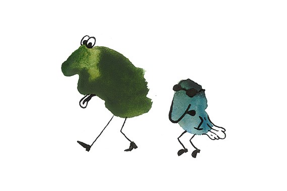
Shadows on my Wall

XL
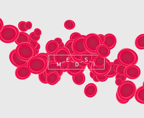
Medsi
Alexey Frolov
Alexey Frolov’s work has that characteristic powerful silence. Some of his works seem to be inspired by Russian constructivism. Frolov is based in St. Petersburg, Russia.
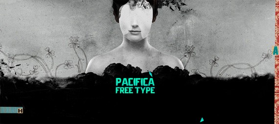
Pacifica Free Type
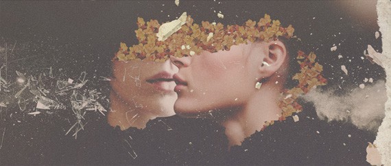
Sad-eyed Face
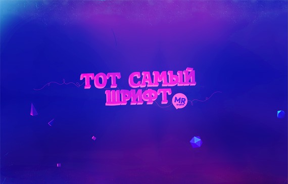
Tot Samyi Shrift
Graphic Design From Developing Countries
There is no single definition to what a developing country is, and the list may vary greatly. Some developing countries may have high standards of living, while others vice versa. These countries are not as well represented in many aspects because of their so-called status–may it be politically, socially or culturally. Even in designs, most of the famous graphic designers hail from first world, or developed countries. There is much debate and criticism on the term ‘developing country’, but let us not discuss it in this article.
The countries I will discuss here are from the list of the World Economic Outlook Report by the International Monetary Fund; and thus following the ‘Western model’ of economic development.
Turkey
Established in 1923, the new Turkish Empire wanted to separate itself from the old Ottoman Empire. Turkey is now borrowing political, cultural, fashion and technological ideas from the west. This meant that Turkish graphic design changed radically to meat the expectations from the west. The biggest change brought to this modernization is the change from Arabic script to the Latin alphabet. Among the most important names in Turkish graphic design is Ihap Hulusi Gorey until the 1950s. He was called the ‘king of graphic art’ because of his vast contributions in his field. Graphic design’s developments when the need for political posters, publications and leaflets rose. But by the end of the 70s the graphic designed practiced leaned to using it for the commercialization of the field. Now, the Turkish Society of Graphic Artists regularly awards designers in various fields such as posters, logos, book covers, branding, letterheads, web design, etc. Another positive success in Turkish graphic design is the gender equality; for Turkey is a country where many female designers have achieved great success.
Turkish Graphic Designers and their Works
Mehmet Gozetlik Mehmet Gozetik is an award-winning graphic designer hailing from Istanbul, Turkey. Most of his works are more inclined to inspirations from Western modern design, such as inspirations from technology and minimalism. His works are broad and varied: creative invitations, magazine ads, posters, packaging branding, corporate identity, typography, and so much more. 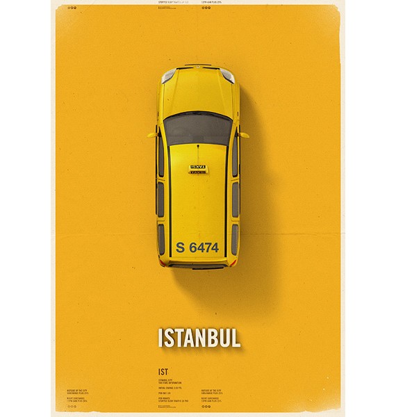
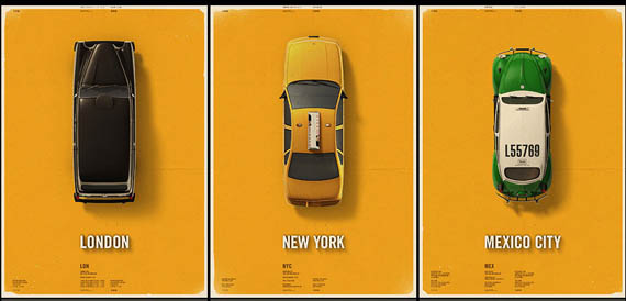
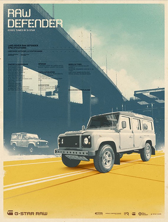
Tamer Koseli
From his works alone you can tell that Tamer Koseli is quite a character. His works look humorous, radiant, full of energy. Koseli is a Swiss born designer who is now based in Istanbul. He doesn’t shy away from using color to achieve the best results.
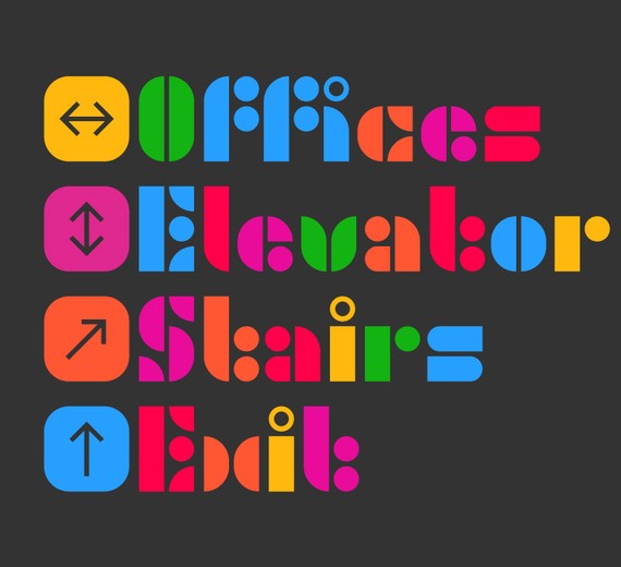

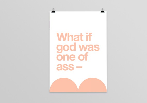
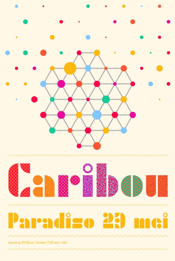
Ali Emre Dogramaci
Ali Emre Dogramaci’s works are in two words, minimalist and enigmatic. His designs are conceptual in nature, they invite the viewers to think and engage.
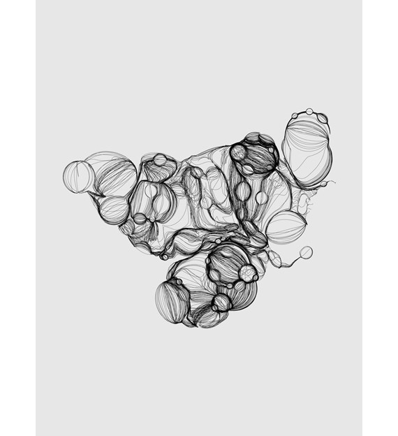
For Sleepyheads Only
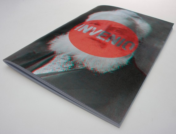
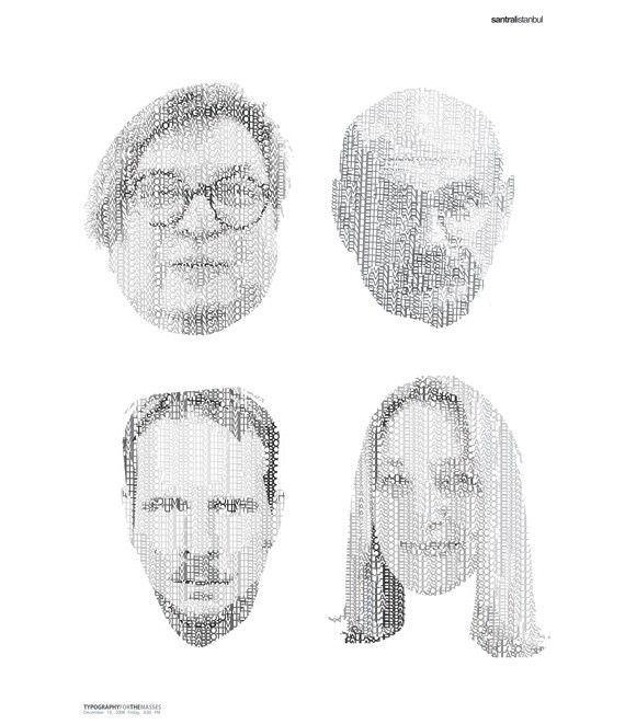
Typography for the Masses
Egypt
Egypt’s history of design goes back for thousands of years, being one of the world’s oldest civilizations. Egypt brought to us the mummies, the great pyramids, the Great Sphinx of Giza. It is this great civilization that brought strong influences in the history of art. The first evidences of visual communication was in the form of Egyptian hieroglyphs, which were carved by the temple priests.
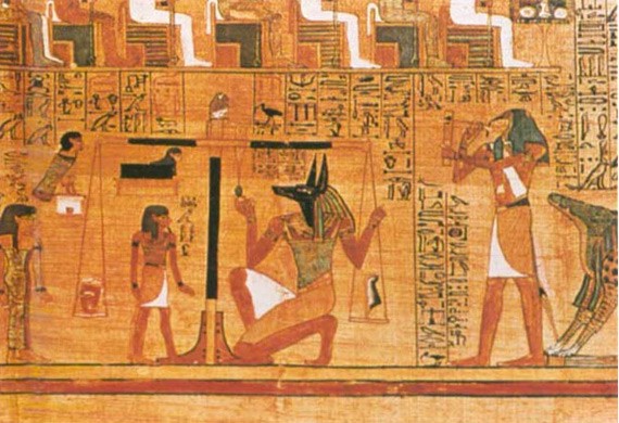
Book of the Dead, 1400 BC (Image from Parkland)
Hieroglyphs were the Egyptian’s only form of visual and written communication. The Egyptians are among the first to combine words and pictures into a whole. The whole picture looks polished, a unified whole. The Ancient Egyptian’s paintings are often graphic, with bold outlines and flat silhouettes. The paintings’ depictions are more symbolic than realistic. After the fall of the great empire, however, Egypt fell hard. For centuries, the country was under control under foreign occupation. By the 20th century, Egypt became a modern nation– and thus, they used modern design as their tool to visual expression for their own national identity as well as freedom from foreign oppression. New mediums are introduced, such as photography, printing, cinema, etc. Modern graphic design of Egypt showed a renewed national patrimony. They returned to the ancient Egyptian art that is most well-known to them, detaching themselves from any Arab, African, or other foreign influences. There is resistance to show their relations to their past foreign oppressors, but have since been open to new styles and technologies in the modern world.
The Best of Egyptian Graphic Design
Islam Zayed
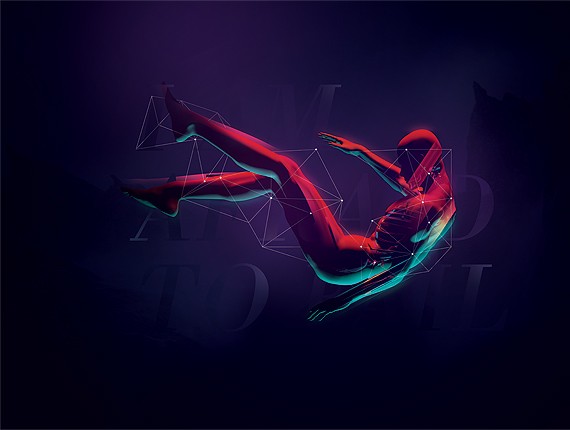
Modern Egyptian designers like Islam Zayed revives Egyptian classical art, but using modern techniques and influences. Zayed plays with typography well–no one knows asymmetry and aesthetics like Zayed does. He is based in Cairo, Egypt.
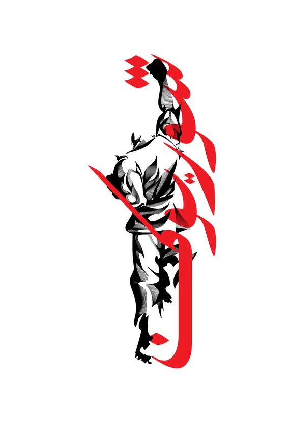
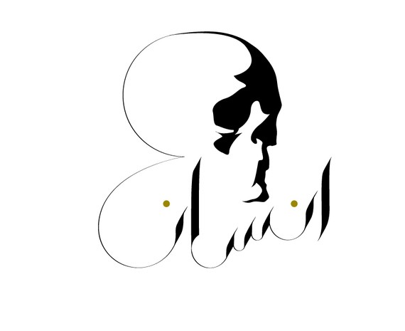
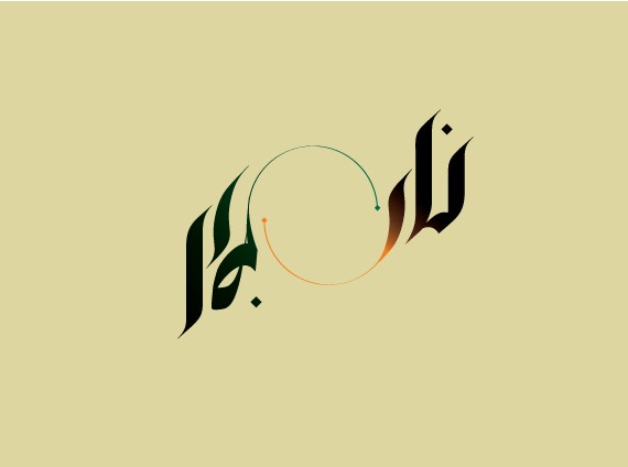
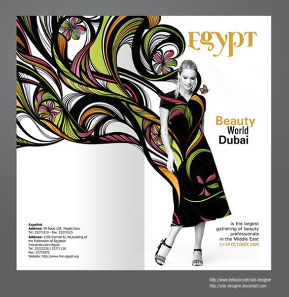
Soha El Nassag In the western world, seeing female designers and artists hailing from the Middle East is so rare. This rarity makes their works a little bit more special, a ‘breath of fresh air’, because we seldom see and hear voices in the male-dominated region. Soha El Nassag’s works are strong but graceful, with a strong impact without being forceful. She is a graphic designer and focuses on branding, corporate identity and logos. 
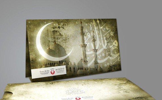
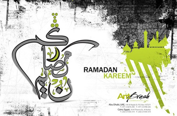
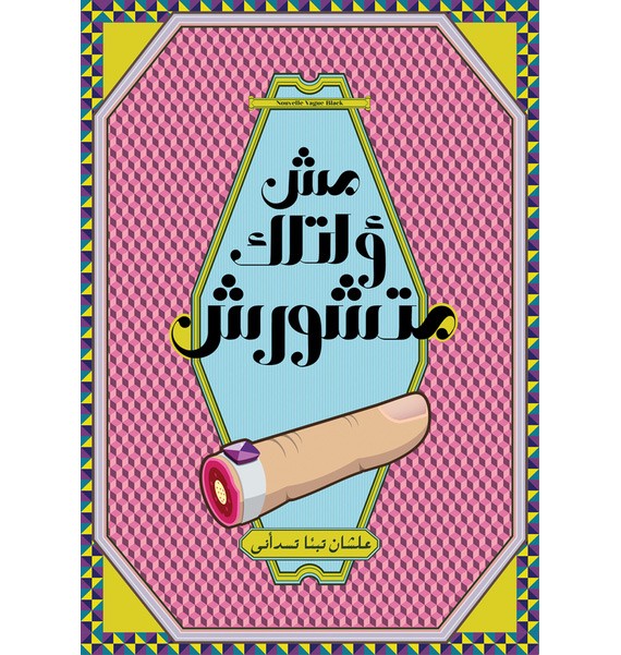
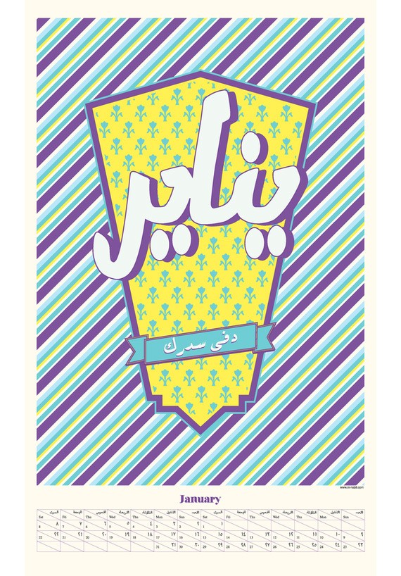
Mohamed Nabil Labib I am always moved by foreign characters like Chinese alphabets and Middle Eastern scripts, for they always look more poetic than the boring latin alphabet. Labib likes to romance his audience by their captivating typography. And while I cannot read a word of it, it’s something to admire about. 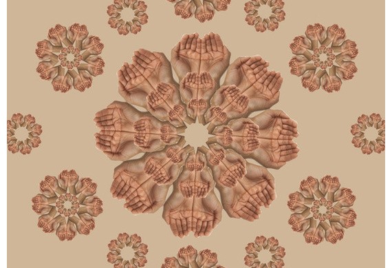
The Philippines
Philippine graphic design is characterized by rich colors, fine lines and festive elements. Philippines is indeed festive by heart, they know how to have a good time. Maybe a characteristic the country got from their forefathers after more than 300 years of Spanish occupation. A perfect example to describe the Philippines aesthetic is the Philippine jeepney. The Philippine jeepney has the heart of the Filipino, it is colorful, bright, funky but modest. It is a perfect example of Filipino ingenuity, that turned the American jeeps left after the World War II into a smart public transport invention.
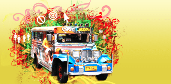
Filipinos are optimistic in nature, they have a great sense of humor and they take on life lightly. This is ironic for a third world country riddled with problems of poverty and corruption. Philippine culture and design is sunny and vibrant, just like the climate. Because of the Philippines’ connection because of the American occupation during the early 1900s, Filipinos patronize American brands, clothing and design until this day. Probably the Philippines is more ‘western’ than its other Asian counterparts, in terms of popular culture and language.
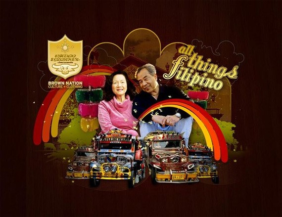
The Brown Nation by Drew Europeo
Philippines are also heavily influenced by comic and graphic design. During the WWII the Americans also brought comics to the islands. Since then it is widely read, and everyone grew up reading comics. The pop art aesthetic can be seen in Philippine graphic design up to this day.
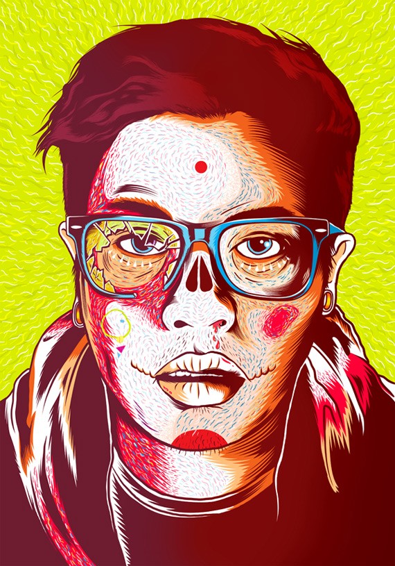
Portraits 2011 by Wham Bacabac
Philippine Graphic Designers & Works
Wham Bacabac Wham Bacabac is among my favorite Philippine graphic designers, because his works show much diversity. At the same time, his works are still characteristic of Philippine graphic design, such as his no shame use of colors and lines.
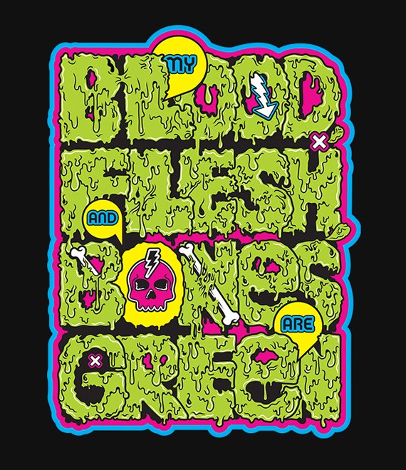
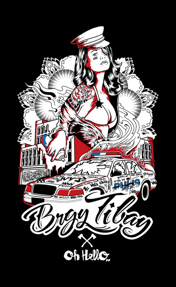
Brgy Tibay
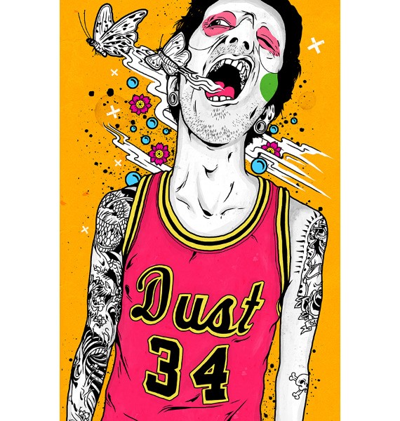
Skin and Needles
Drew Europeo Drew Europeo’s works have a magnetic appeal to them. He still loves his colors and funky typography just like any Filipino artist, but he has a somewhat unique fascination to geometric shapes and figures. 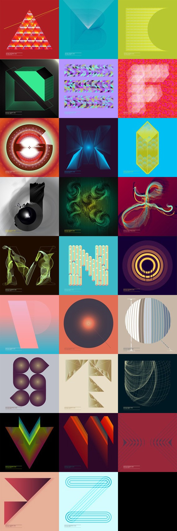
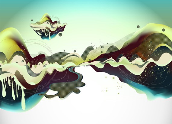
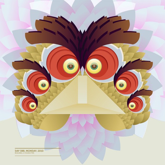
Building a Character
Vgrafiks Design + Branding Vgrafiks describe themselves as a social design enterprise that provides design services in marketing, branding, print, interactive, etc. As aforementioned, Philippine graphic design is rich in street art and graffiti influences; and these influences can be seen in some of Vgrafiks’ works.
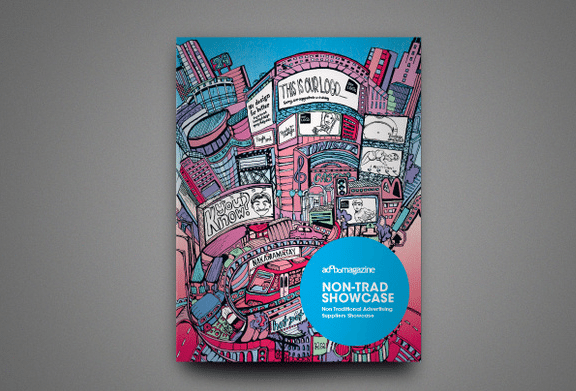
Adobo Magazine Showcase
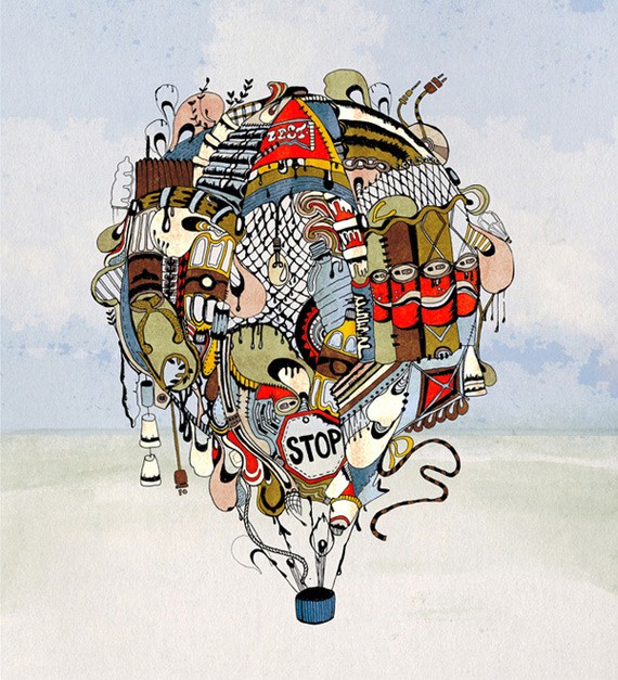
Make Something Beautiful
Vgrafiks is a genius when it comes to branding identity, such as their work for The FARM:
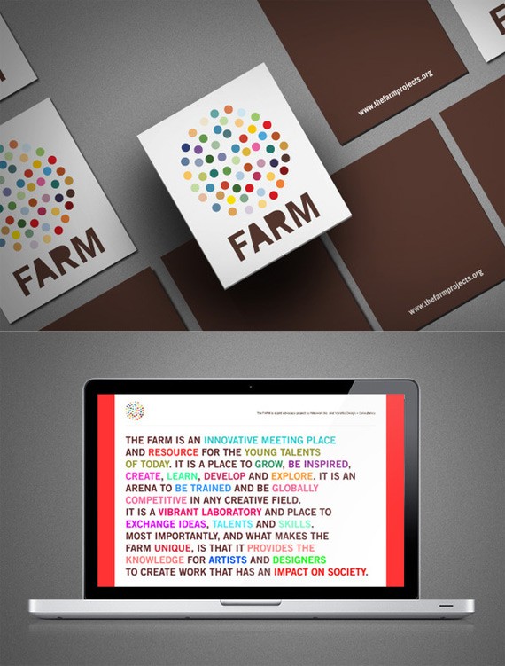
The FARM project
Thailand
Thailand is located in Southeast Asia, formerly known as the kingdom of Siam. Thailand is rich in culture, art and tradition. In recent years Thailand’s economy has greatly expounded, due to the influx of tourism. Plus, Thailand is positioned to move in a positive direction, since the country has a liberal outlook towards its people, and no censorship, which is not common in many of Thailand’s neighboring countries. Thai artists and designers are able to express themselves in a variety of media such as graphic design, web design, painting, photography, installation, interactive media, etc. The center of modern graphic design is in the country’s capital Bangkok. Just like the capital, graphic design talent is diverse and exotic. Thai graphic design combines traditional Thai elements with techniques.
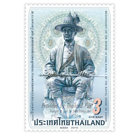
Image from Creative Roots
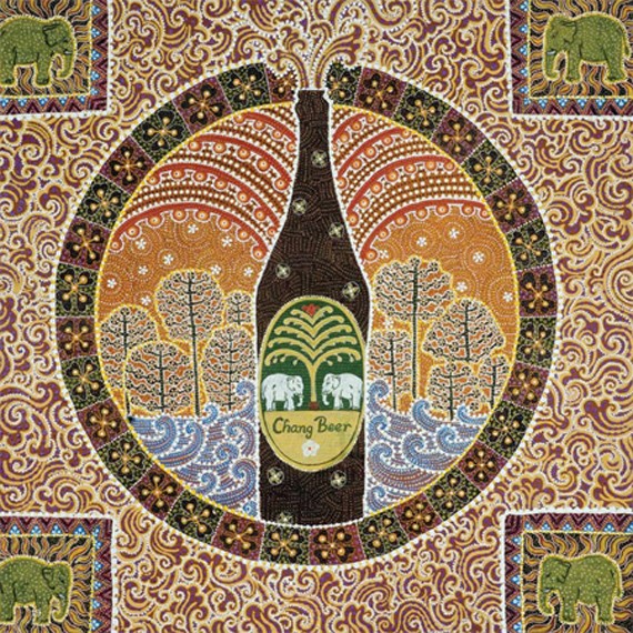
Chang Beer
Patterns are a common element in the works, as well as diversity in uses of color and texture. Despite that, Thai graphic design seems to shy away from using too much saturated colors as compared to its other Southeast Asian neighbor, the Philippines. The main religion is Buddhism, thus visual art in the country was then mainly Buddhist. Graphic design is full of diverse textures and structure, and these elements are obviously inspired by the architecture of the Thai structures and temples.
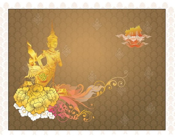
Amazing Thai Graphic Design
Siam Ruay As seen in most of his works, Siam Ruay is a fan of keeping things simple. He likes to use elements minimally, and white space is common in his graphic design works. 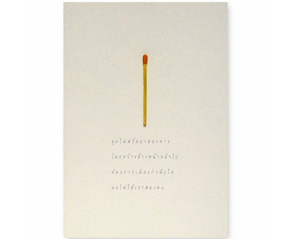
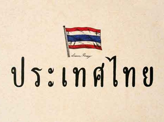
Tarin Yuangtrakul Tarin Yuangtrakul’s works are whimsical and pretty, with an oriental spirit of its own.
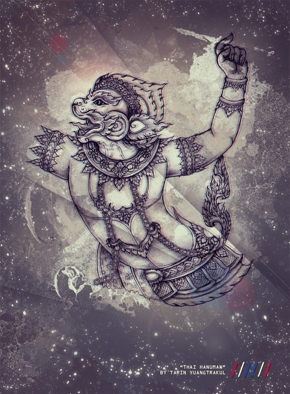
Thai Hanuman
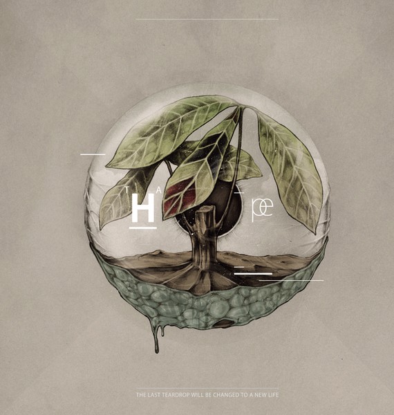
Hope For
I am a Thai Graphic Designer Project
The project showcases excellent design and typographic work from talented graphic designers around Thailand. It’s a showcase of work from various talents, from tenured professionals, to amateurs and students. Despite their differences, one thing is common: they’re Thai with a deep love in graphic design. Here are just few of the photos, but you can check more at http://imtgd.org.
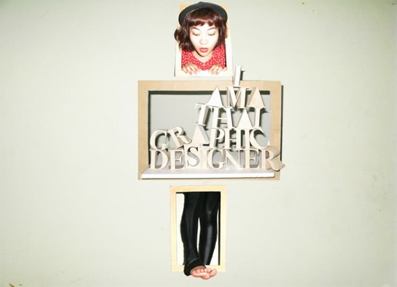

Thrissawan Phonglamjiak
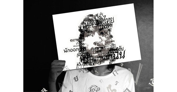
Anan Trakarnsrisunun
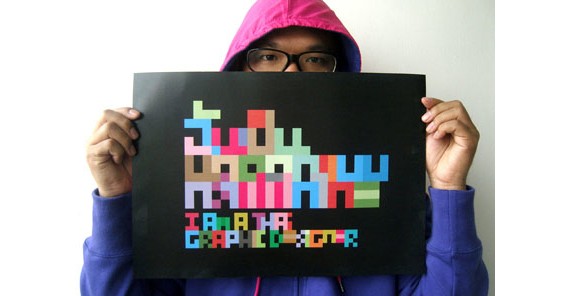
Zood
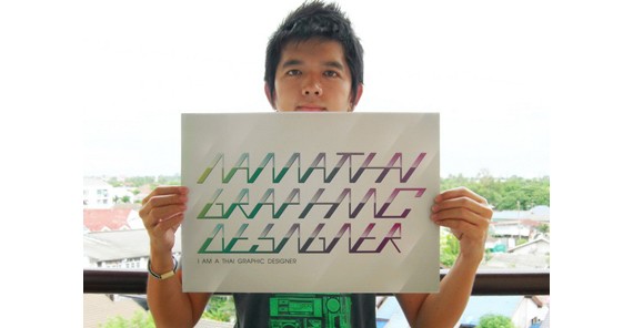
Ruangtam Sammasanti
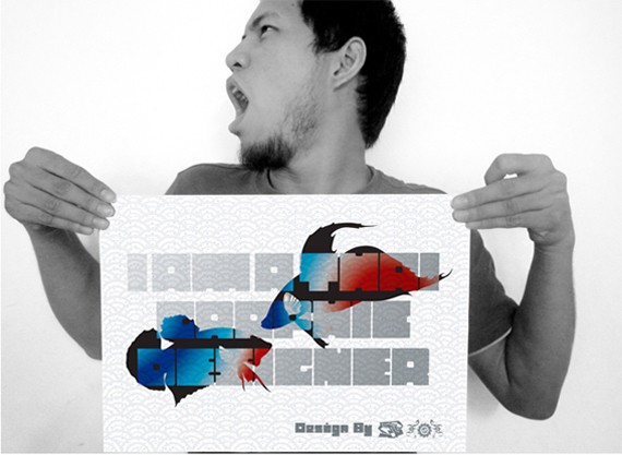
F.O.F.
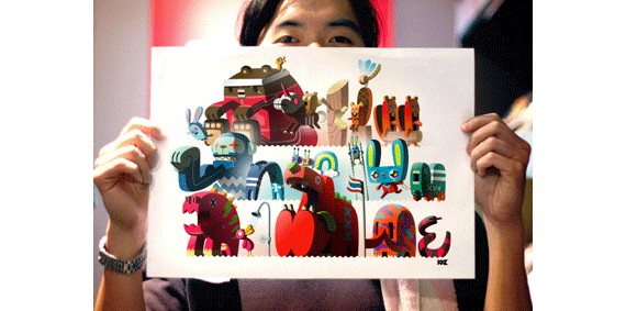
Kongkij
Cuba
When you think of Cuba, the images that come into your mind are plenty: Golden beaches. Palm Trees. Casinos. Exotic women. Fidel Castro. Cuba was once a tiny little island that serves as a luxury playground for the Americans and Europeans who came in search of romance, gambling, latin music and beaches. This physically laid back but politically tumultuous environment will eventually influence what Cuban graphic design will be. The golden age of Cuban graphic design started in the 1965 and ended 10 years after, 1975. These 10 years are considered the most fruitful stage in the history of Cuban graphic design. Cuban graphic artists combined elements of various art styles such as art deco, Bauhaus and art nouveau with its own Cuban distinct style. Silkscreen was a popular medium for designers during its golden age–because of the function of being able to reproduce posters and designs, a necessity back then.
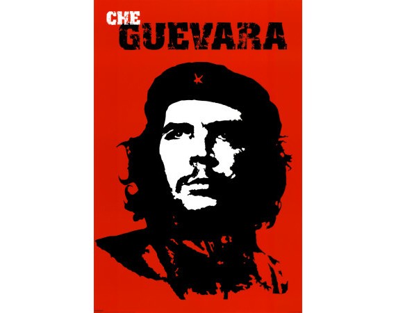
Che Guevara was a central figure in Cuban history, but this memorable poster of him is actually designed by Irish artist Jim Fitzpatrick.
Cuban graphic design is strong and powerful, still having its socialism influences from the past. The Cubans love the basic colors of red, yellow and black. The Revolution, after all, held a big impact in Cuban history and society. The revolution also influenced Cuban graphic design entirely. Propaganda is a popular theme among Cuban artists.
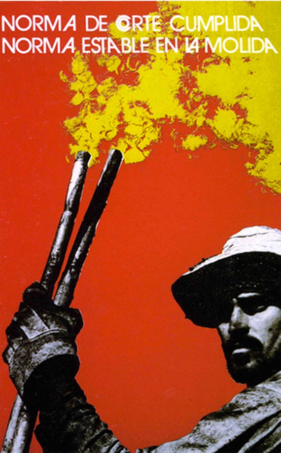
Cuban silk screen poster by Heriberto Echeveria (Photo from Lincoln Cushing)
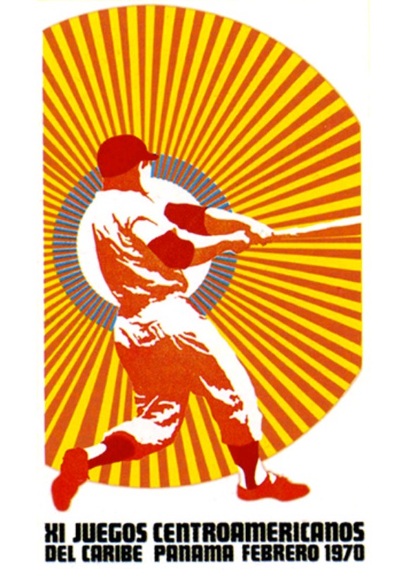
Cuban sports poster by Jesus Fornjans 1970 (Image from Lincoln Cushing)
Since the Golden Age, Cuban graphic design has been struggling to recovery. New graphic designers cannot match the quality of works of the old masters, as several critiques would note. This is due to several problems; such as the development from screen printing to digital and web design–which some designers found hard to cope. Other problems include economic instability, resistance to modern technology and inconsistency of the new generation designers.
Amazing Cuban designers and their works
Rene Mederos We can’t talk about Cuban graphic design without mentioning Rene Mederos. Mederos’ choice of medium is silkscreen. His style is often nature elements, contoured surfaces, solid colors; and his works always have a political message to it. Rene Mederos was a huge name in the world of Cuban graphic design, and he influenced a whole generation of artists not only in Cuba but around the world.
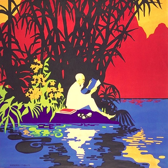
Viet Nam will Win (Photo from ZPub)
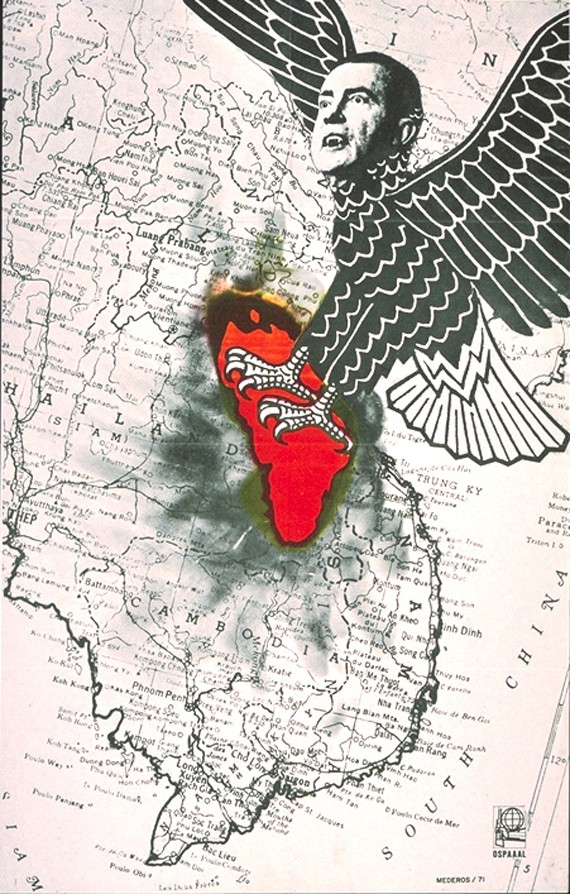
Nixon Tearing out the Heart of Indochina (Photo from ZPub)
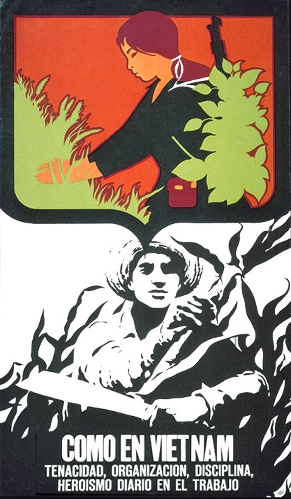
Photo from ZPub
Rene Azcuy Cardenas His specialty is designing movie posters. 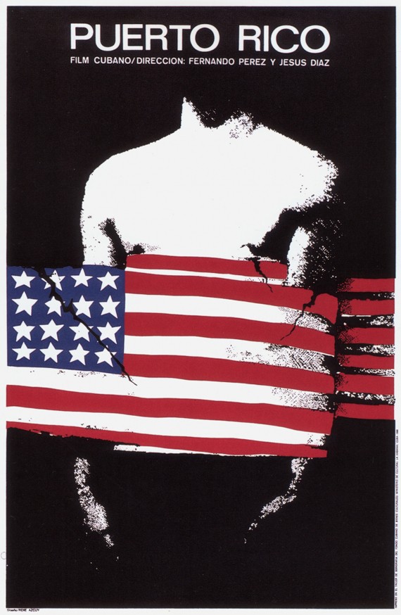
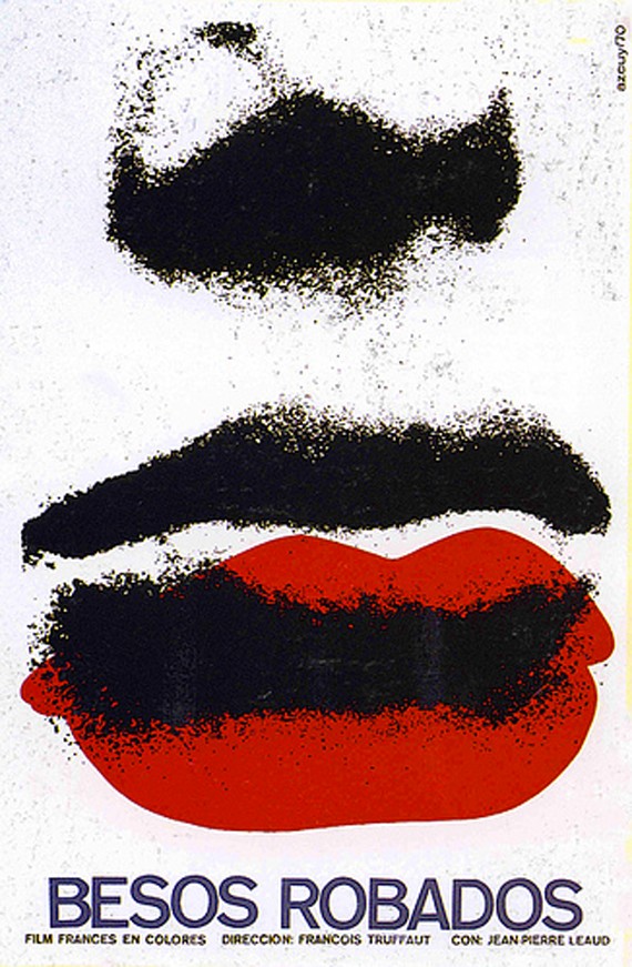
Besos Robados (Photo from Lincoln Cushing)
Eladio Rivadulla
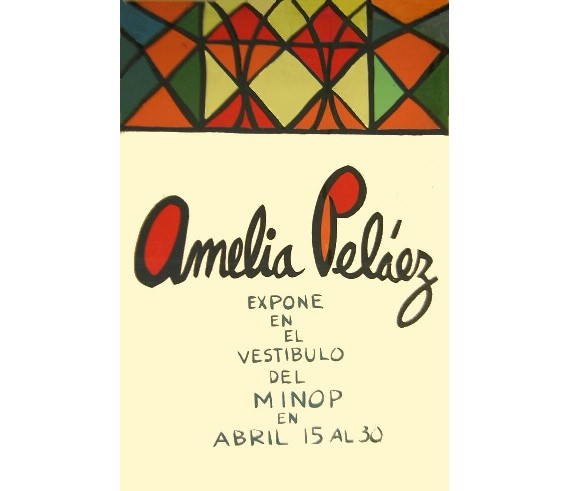
Image from Cubarte
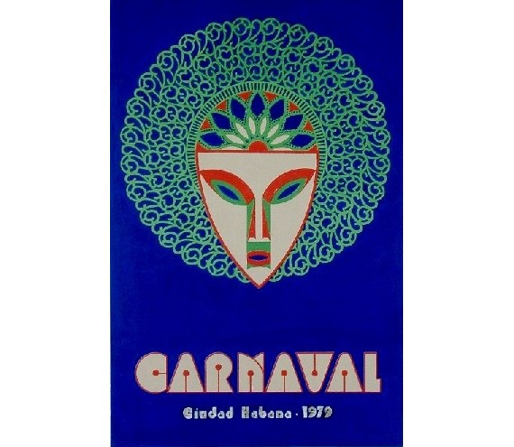
Image from Cubarte
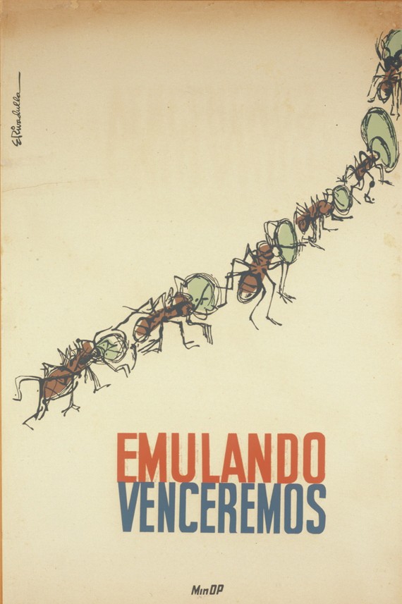
Photo from Molossus

Conclusion
It makes you wonder: why is the graphic design of developing countries is more lively, vibrant and optimistic, as opposed to the minimalist, lifeless(sometimes almost robotic) and aloof design of the 1st world countries? I do not say which is better of course, but the contrast is stark. There is no such thing as a country more ‘developed’ and ‘richer’ or ‘developing’ and ‘poorer’ when it comes to design. Graphic design is, in a word, ‘international’. There are no boundaries set on how a first, second or third world country’s graphic design should look, and vice versa. They are all beautiful in their own unique way.
Now let’s move on to more inspiring and maybe a little unconventional art designs.
Graffiti Art: From the Streets to High-End Galleries
Graffiti art, and underground street culture in general, has long been seen as provocative and uncompromising. It has close connections to gang culture; originally vandalizing objects and places to mark their territory. Today, graffiti art is now a respected and new art form, a rich medium with no restrictions and plenty of freedom to work with.
Graffiti is a subjective art form. Some regard it as a new and rising art form, and others regard it as plain vandalism. In most countries it is regarded illegal. Thus graffiti art is sometimes referred to as ‘underground art’. Artists are forced to create their works in the dark, hiding from the police, officials and the common city dwellers.
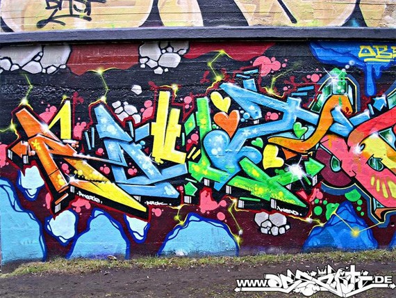
Graffiti artists prefer to keep their identities anonymous, preferring to stay ‘hidden’ and unattached from their works, whilst marveling at their graffiti art from afar. While they do ‘sign’ their names on their works, they hide it in plain view, including it in their spray paint masterpieces and thus protecting their identities in this outsider art form.
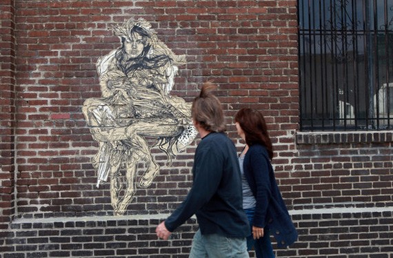
Image from the New York Times
Graffiti’s Origins and History
The word graffiti actually came from the Italian word ‘graffio’, which means ‘scratch’. It is interesting to know that graffiti has been around since the dawn of human civilization, when the prehistoric man learned how to make colored powder and created images. Ancient cavemen scrawled and painted images on the cave walls. Romans wrote on the walls of the buildings of their conquered cities. Ancient cities such as Pompeii has revealed graffiti, election slogans, and even obscene drawings. Graffiti was a popular propaganda medium during the World War II, both from the Nazis and anti-Nazi groups.
Graffiti art’s modern history came from low origins. World War II seems to be the starting point of graffiti art. “Kilroy was here” became a popular American expression, along with a drawing of Kilroy peeking over a wall.’What, No?….’ was another popular graffiti subject during the 40s, referring to the lack of commodities during the war.
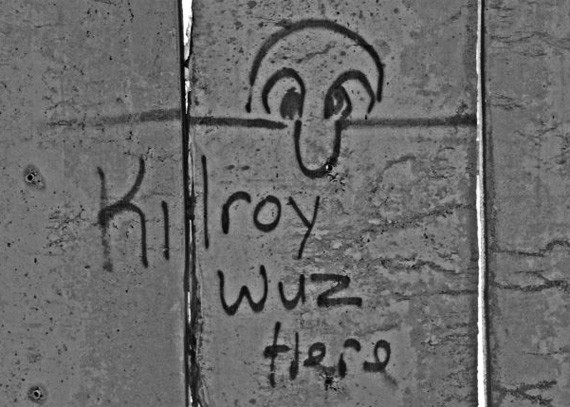
Back then, graffiti started as merely tagging or vandalism, writing names in public signs to mark territory. The century saw the great move from the rural areas to the big, urban cities, and thus gangs thrived. Gangs would mark public property with their gang names, tags and titles.
Art on the Streets
Not long after, the art form improved, and graffiti was no longer restricted to gangs. Graffiti has become almost beautiful (albeit still largely illegal). It was the medium for young artists to express themselves without restriction.
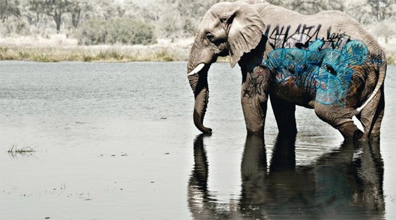
One early artist called himself ‘Cornbread’, who resided in Philadelphia. He is considered the ‘father of modern graffiti’, who started in 1967. He has written his name on an elephant at a Philadelphia zoo, and even on the side of the Jackson 5’s jet.
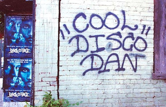
Another was Cool ‘Disco’ Dan, who resided in the Washington DC area. His trademark is a unique rendering of his name, seen around the Washington DC metropolis, especially along the route of Washington Metro Red Line.
And of course, we cannot write an article on graffiti art without mentioning Banksy. Banksy is a graffiti artist, painter and film director. His style is satirical with a bit of dark humor, with his trademark stenciling technique. His graffiti works often have social and political themes, usually on anti-war, anti-capitalism.
Little is known of Banksy. No one knows his real name, his friends, what he does for a living, etc. But almost everyone in the art world is familiar with his style. Aside from addressing political and social issues in his pieces, his work often has a certain wit to it, a keen sense of humor that will make you laugh or at least smirk. Even celebrities and renowned artists have praised his works.
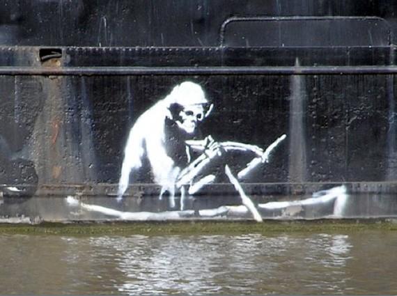
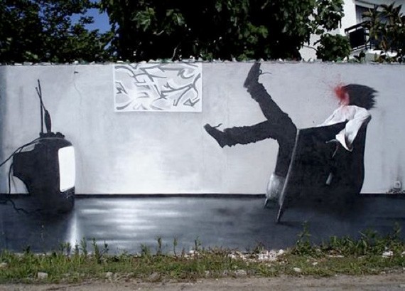
Banksy seems to be quite a traveler, for his works have been seen around the world: aside from his homeland England, he is busy creating graffiti pieces in Australia, USA, France, Spain, Greece and even Palestine.
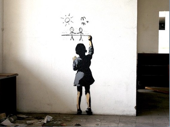
Banksy has gained a huge following around the world, but also garnered a few enemies and critics. Some reject his works, saying it is just, essentially, vandalism. Whether you’re a fan or a foe, there is no doubt that Banksy is among the most influential artists in the modern art world.
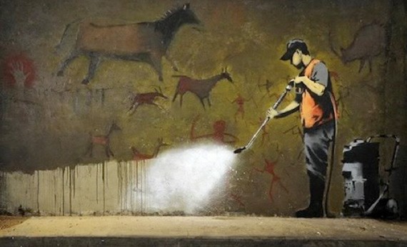
A Move to the High End Galleries
Jean-Michel Basquiat was among the few graffiti artists who made the jump from the streets to the galleries. Basquiat began his career as a graffiti artist in New York City, before jumping into fine art. He is considered to be one of the most influential artists in the 21st century. Coincidentally, he was also good friends with Andy Warhol, another influential artist of our time.
Basquiat’s graffiti works also had political poetical overtones. He used the pseudonym ‘SAMO’ as a graffiti artist, and often drew on random surfaces and objects.
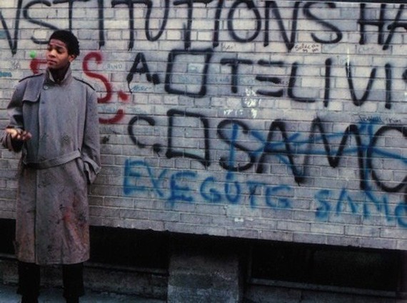
Basquiat’s style is neo-expressionism. He still used some styles he learned when he was merely a graffiti artists, like incorporating words, letters, pictograms, map symbols, logos, numbers, diagrams and codes into his paintings.
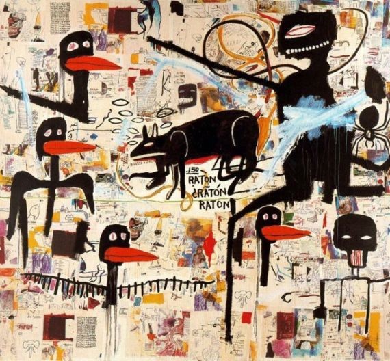
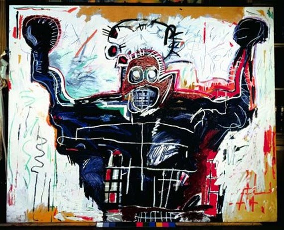
Basquiat and Warhol often collaborated, especially during the years 1984 to 1985. However this was not very well received in the art world. The two held a huge influence in each others works. But unlike Basquiat, Warhol never took drugs, and he was appalled and fascinated by Basquiat’s excessive uses. Their friendship continued until the death of the latter, in 1987. The death of his friend greatly affected Basquiat, and soon afterwards his depression and drug addiction began to spiral.
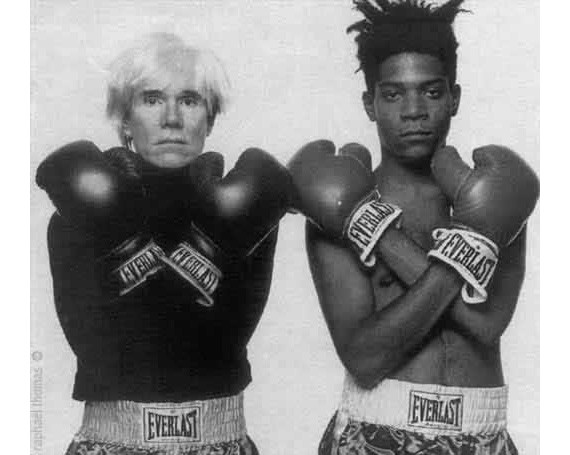
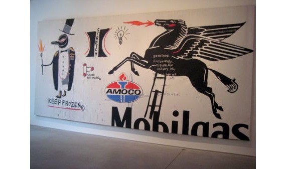
Sadly for Basquiat’s story, there was no happy ending. He spiraled down to depression and drug abuse, which later became the cause of his death.
Graffiti in Art Exhibits Today
Today, the art world and the general public is more open toward graffiti art. The public has become more tolerant and appreciative of this underground art. In Los Angeles, for example: The Museum of Contemporary Art (MOCA) organized an exhibit celebrating urban graffiti on walls, subways and buses; and it proved to be a hugely successful show.
The ‘Art in the Streets Exhibit’ featured prominent street artists like Taki 183, Banksy, Keith Haring, Henry Chalfant, etc. This is actually the first major US museum exhibit on graffiti and street art. The exhibition traces the development of graffiti art from the 70s to the international movement it’s become today. It featured installations, paintings, sculptures and mixed media that helped shape the evolution of graffiti art.
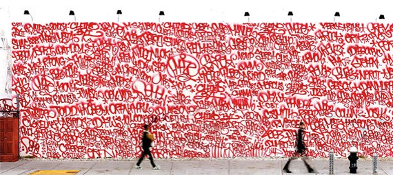
Barry McGee, Houston Street & the Bowery, New York (photo by Farzad Owran)
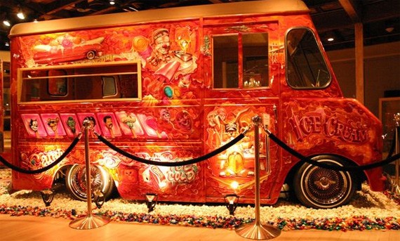
Graffiti Ice Cream Truck on Exhibition
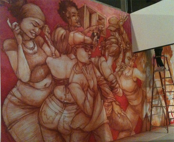
Graffiti art is widely recognized around the world. There have been exhibits and galleries worldwide dedicated to the celebration of graffiti art. Another prestigious exhibition is ‘Born in the Streets’, at the Fondation Center in Paris, France.
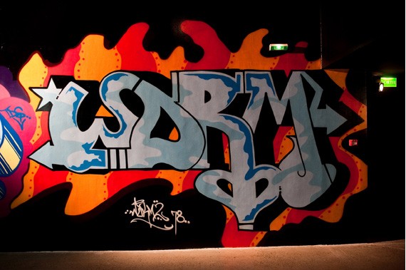
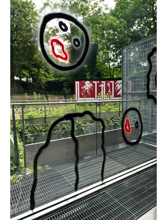
Image by Creative Review
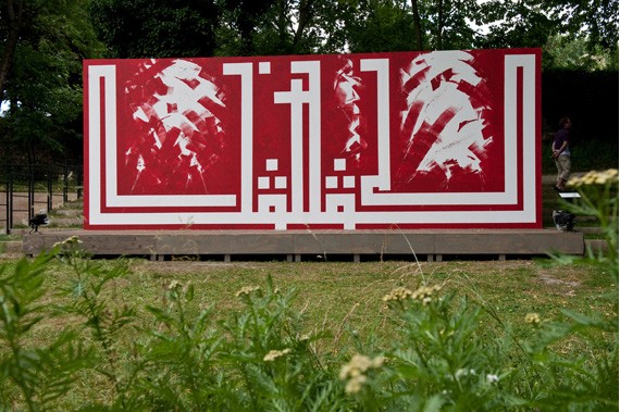
Image by Creative Review
But outside, graffiti is still illegal and could land you a ticket to jail. While admirers applauded graffiti, the police are calling it an increasing problem. The LA Police said that a wave of graffiti in the city has been encouraged by ‘Art in the Streets’. Up until this day, the four decade debate on whether graffiti art is legal or not is still a hot topic between artists and legal groups.
Whether you like graffiti art or not, we know that graffiti art is here to stay. Maybe in later years, the rise of this new art form will bring about new laws legalizing them. Some people may be for it, while some adamantly against it. Whatever will happen, we are sure that graffiti’s here to stay; for the boundaries of art are constantly changing. We can only wonder where graffiti’s place will be in the next ten years.
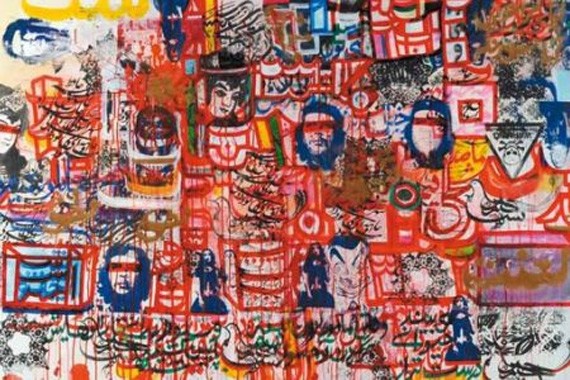
Graffiti by Mohammad Khodashenas, Iranian graffiti artist
Because we really want to inspire you, let’s look at some more street art designs.
50 EPIC Examples Of Street Art That Will Blow You Away
An artist needs no permission to display his art and his creativity has no boundaries. Street art is a perfect illustration of this aspect in artists. Although this art form is unsanctioned no one can stop it from expansion. Graffiti is different from corporate art which is painted for advertisement purposes. For some street artists there is no reason other than personal expression. Some street artists, however, use their art as a way to subvert the mainstream or raise political or social issues.
Apart from the reasons that gave birth to street art, the brilliance, endowment and ingenuity of graffiti artists is undeniable. There are as many examples of street “doodles” as there are boulevard virtuosos in the world. Many of them are so picturesque and breathtaking that you can not keep stop looking. Here are some that I can’t stop looking at, enjoy.
1. Autumn 3D ish Pavement Art
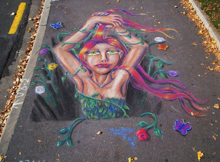
2. Taupo
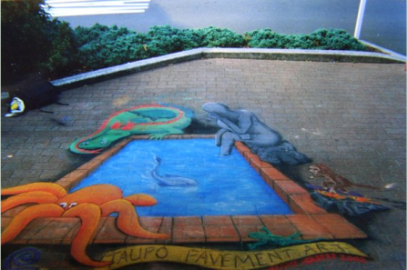
3. ZHE 155
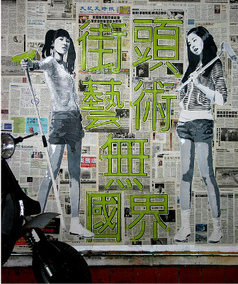
4. Cuba Gallery
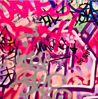
5. Street Art Off Degraves Street
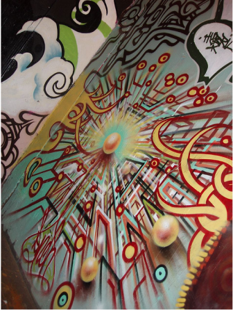
6. 3D Street Painting Step By Step

7. Rotterdam
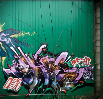
8. Panty Graffiti2
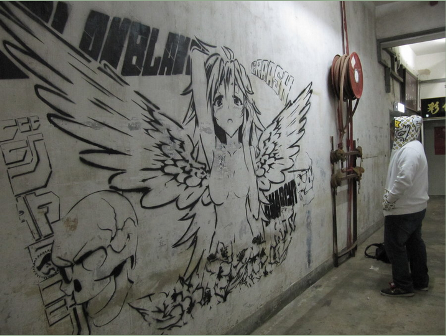
9. Contrast Layout
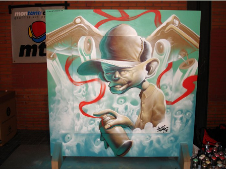
10. Doter
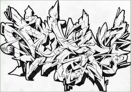
11. Dibs 2011
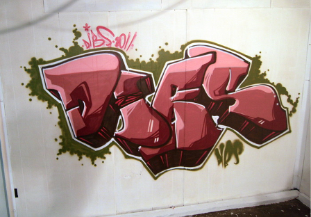
12. Japan
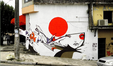
13.Chalk Art – Cause On Uproar
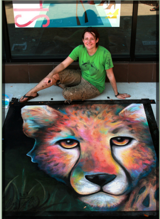
This chalk art was developed for a chalk walk art event at Hyde Park village. The theme of this work is National Geographic’s “cause and uproar”. The look of the lion has been captured tidily in this image.
14. Wall In The Mall

15. Setik 01
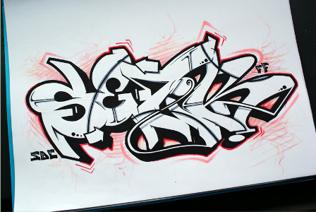
16. Graffiti 1013
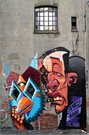
17. Stencil work
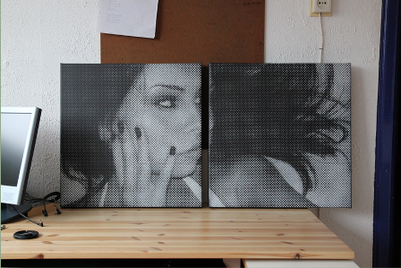
18. Retard
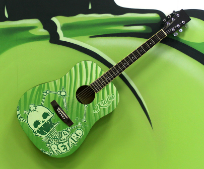
19. Pilipinas Street Plan
20. Graffiti 863
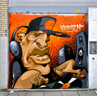
21. Mushism
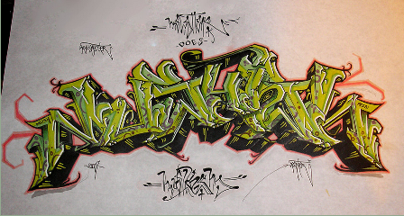
22. Wood Morning Wall
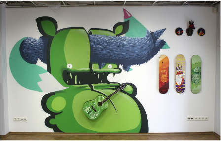
23. CStyle
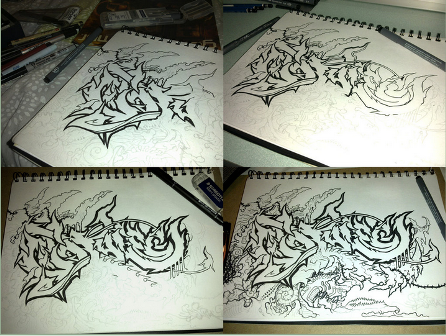
24. A Revolutionary Let Down
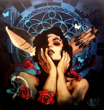
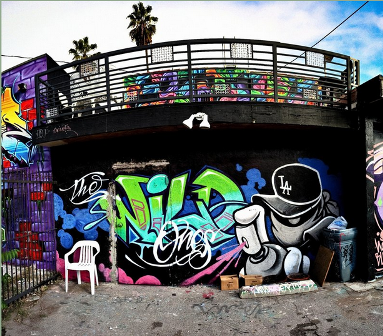
25. The Wild Ones
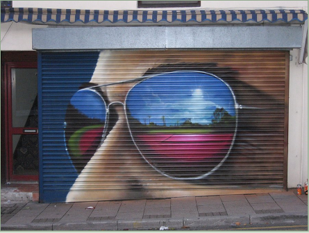
26. Shades
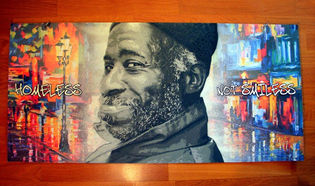
27. Homeless Not Smiless
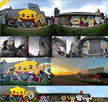
28. This Is Bandung 2011
29. Bokito
30. Artist At Work
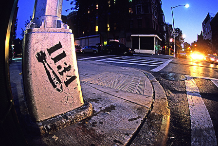
31. 1134 NYC Stencil
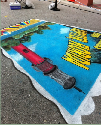
32. 3D Jupiter Postcard
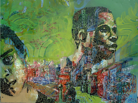
33. Valparaiso, Chile
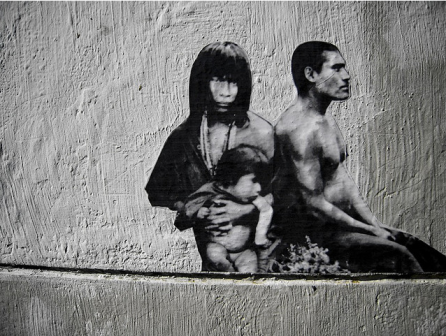
34. Tiger
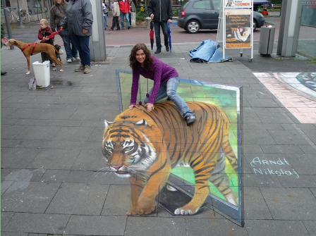
35. Street Art In Colors
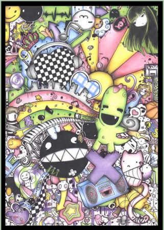
36. Street Art
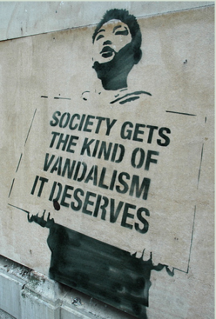
37. Octopus
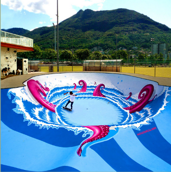
38. Swan
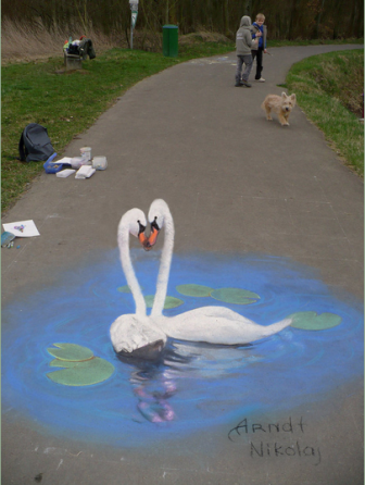
39. Excavation Of Dinosaur
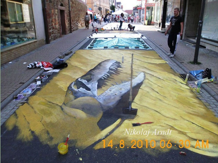
40. Mucha Chalk Art
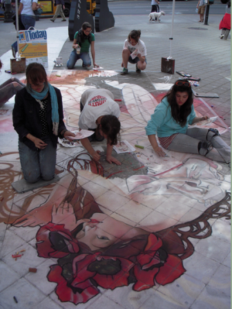
41. Street Art Amsterdam
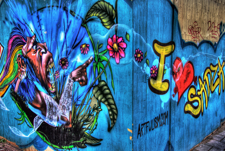
42. Design Conditioner
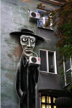
43. Street Art Monster
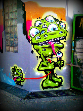
44. Ruined Building Art
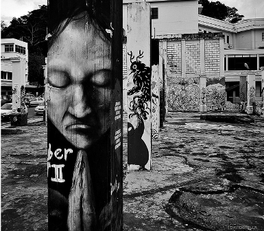
45. Street Art From Spain
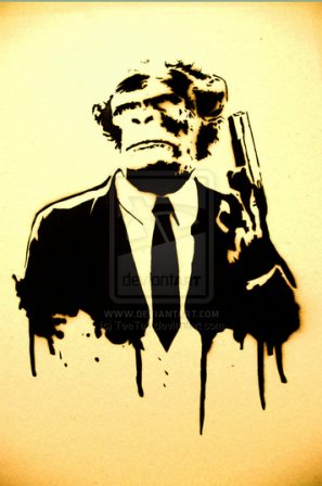
46. Street Art Of Monkey Man
47. 3D Dog
48. Street Art With Eastern Look
49. Melbourne Street Art
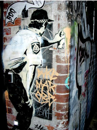
50. Sweet Art-PAC Milan
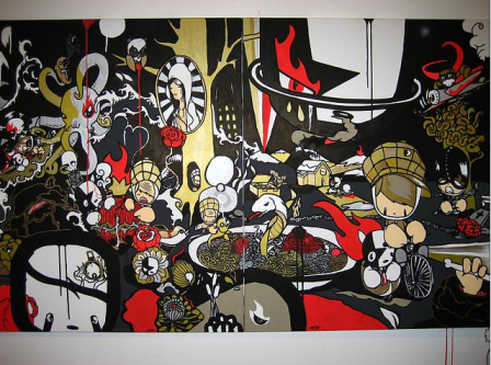
In the next section you’ll be able to see some great designs from Ukraine. Ready? Let’s roll!
Let’s finish this article with some amazing artistic eye designs.
74 Absolutely Stunning pieces of Eye Candy for your Inspiration
I’ve gathered 75 amazing, stunning artworks that are all having the eye as the center of attention. Here you will find photos, digital drawings, photo manipulations, traditional drawings and more. Don’t miss out on these, they will impress and inspire. Enjoy!
Clicking on the images will take you to the artists page with possibilities to watch the pictures in bigger formats. Some can also be downloaded or bought as prints.
1. My Dream of World Peace by ~killmatthew33
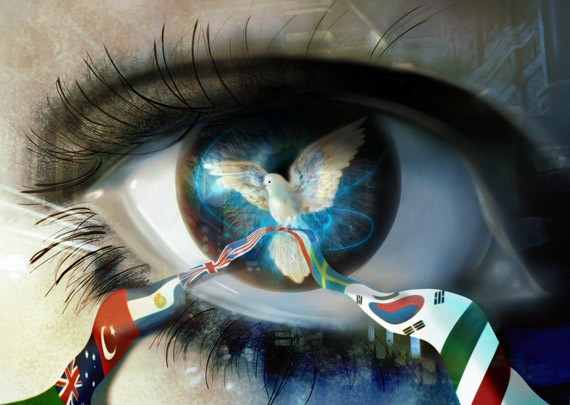
2. Water Witch Eye by ~asdfgfunky
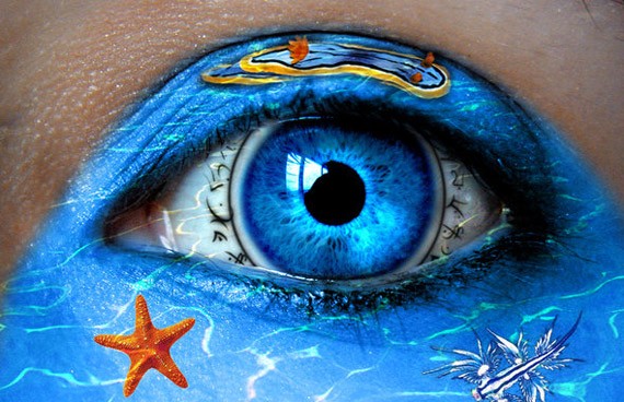
3. Eye serie 30 by ~MelckyXY
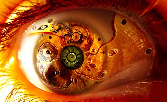
4. Eye See you by ~MonkeySeed
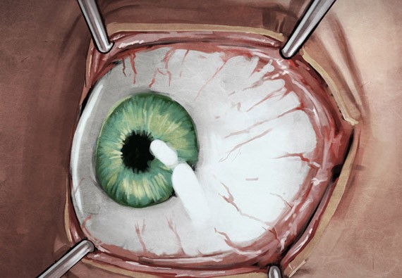
5. Apophysis Eye by =peach

6. Eye from some Eyes by =Fatalsoul
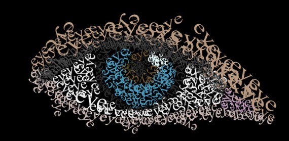
7. Aquarius eye by =ftourini
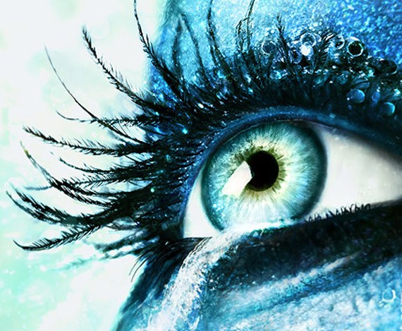
8. Jade by `Lilyas
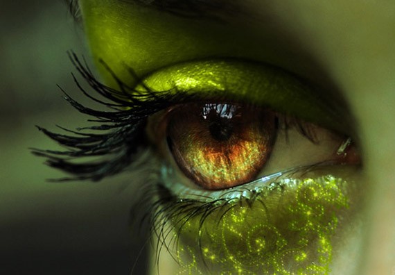
9. Apple of my Eye by ~mickeykumar
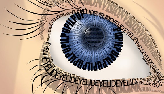
10. Eye eye by ~norking

11. Leafy Eye by ~reinedescoeurs
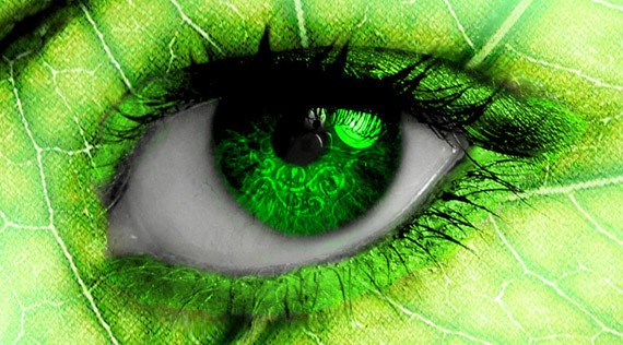
12. Looking at You by *DraculeaRiccy
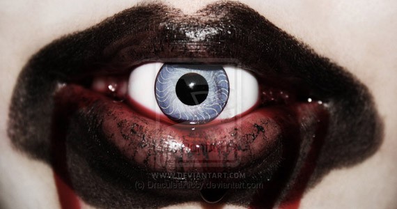
13. Eye Color by ~Whistala
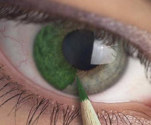
14. Disturbia by ~RudolphEurich
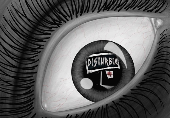
15. Flower eye series by ~Jenya88
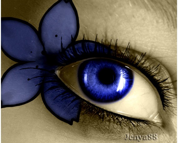
16. Eye of Time -II- by ~YourSweetAgony
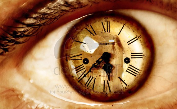
17. I Dream of Freedom by ~loopyluv

18. Eye scream by ~maliciaZintent

19. Apple eye by ~toxic92
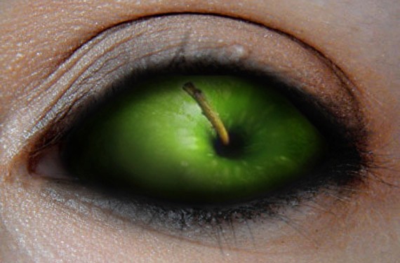
20. Eye by ~deGimbalz
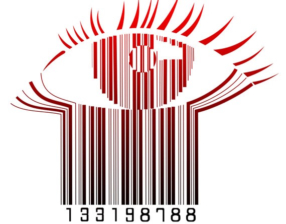
21. For the world to see … by ~keikei11
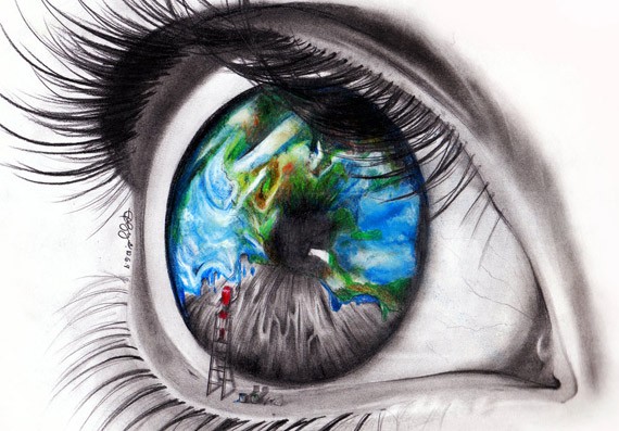
22. Steampunk Ring green eye by *CatherinetteRings
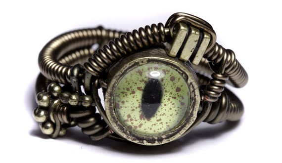
23. Darksiders – End of My World by *DomMcCann
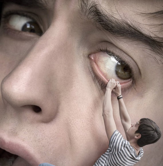
24. Eye Candy by ~LiNoR

25. Cool eye 2 by ~fallen-angel-636
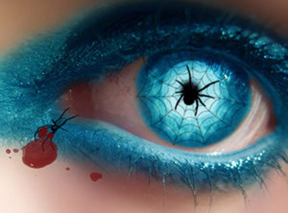
26. Eye Candy by ~RooCouture
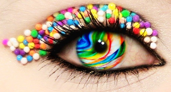
27. Reflections XXII by ~neodecay
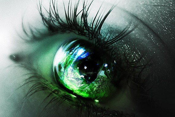
28. Apple by ~Khay88
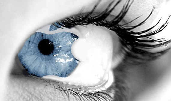
29. Soft Leaking Eye by *VegasMike
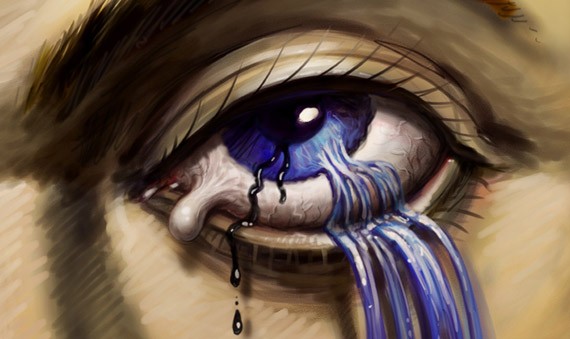
30. Eye Candy by *SaraSchool
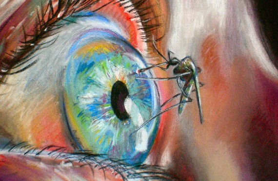
31. Macro eye vector by ~seldom-sleeping
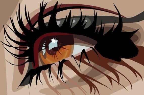
32. What meets the eye by *Hera-of-Stockholm
33. Soul Searching by =MichaelO
34. Zombie eye by ~freakshow6661
35. Werewolf eye by ~Esroth
36. With this Eye by ~blue-mirage
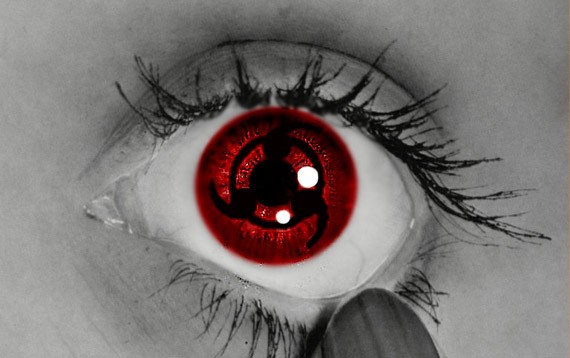
37. Sea Eye by ~Dyyyy
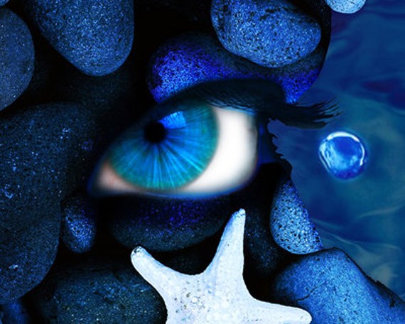
38. In Your Eye by ~BrokenWings3D
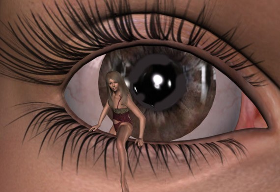
39. Snowy Eye by ~darkchilightchi
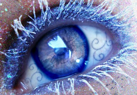
40. Passion Of The Night by ~Dyyyy
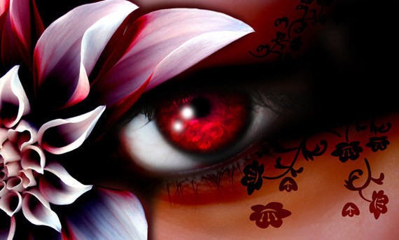
41. Rose Love Eye by ~Dyyyy
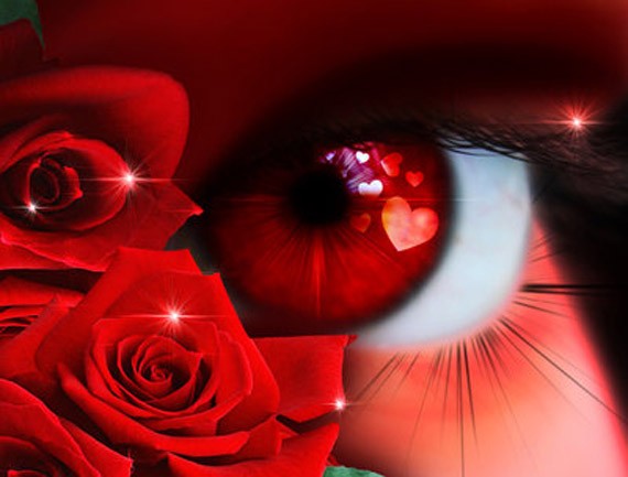
42. Yellow Magic Eye by ~Dyyyy
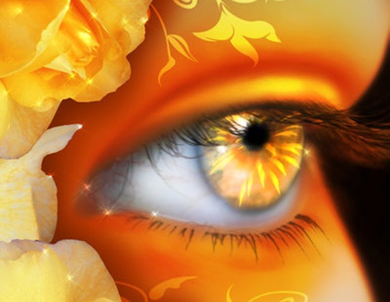
43. Eye of a devine by ~PheoniX-VII
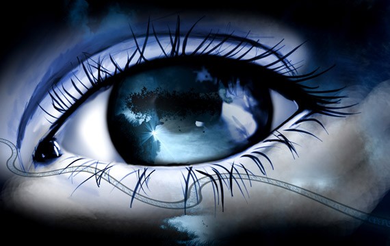
44. Eye of a predator by =ftourini
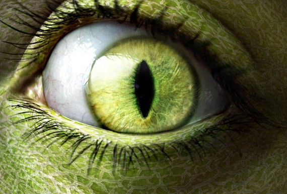
45. Eyes open wide by ~LiNoR
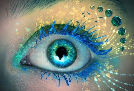
46. Natural Eye by ~LiNoR
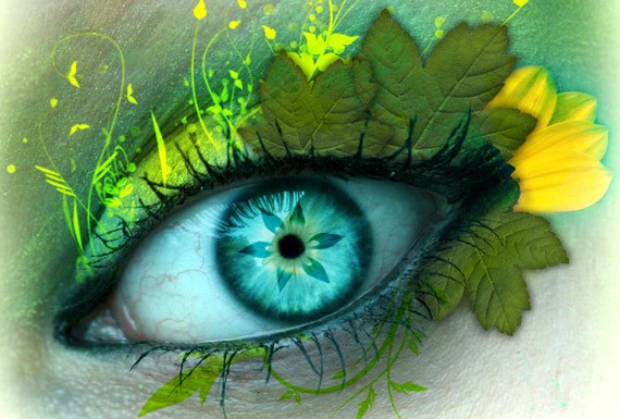
47. Rainbow eye by ~ThErEaLDoLLyFrikka
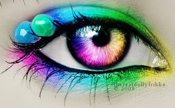
48. Eye by ~sweety-girl2oo8
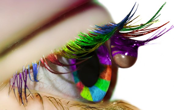
49. Eye Sketch by ~LyonsGate
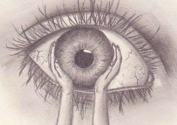
50. Eye of the lemon by ~MLep
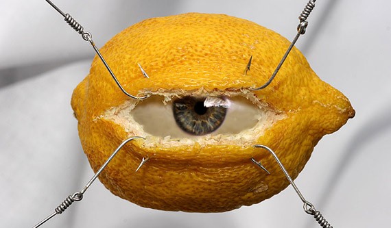
51. Eye Hate Spiders by ~Forgotten-Myth
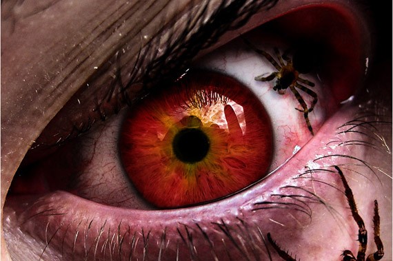
52. Kiwi eye reloaded by =ftourini
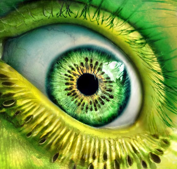
53. In The Eye Of The Begotten IX by ~neodecay
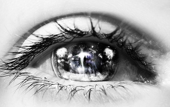
54. T-eye-M by *123Stella
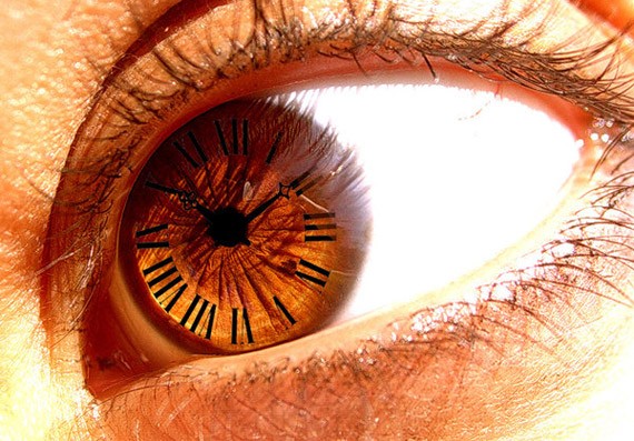
55. Eiko Eye-Con – Competition by =TheNeonGryphon
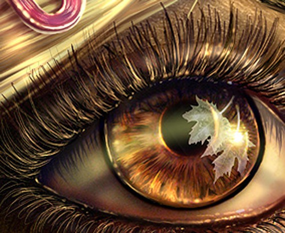
56. Eye of a nymph, by ~iheartsomersby
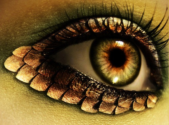
57. Fish eye by =ssecret
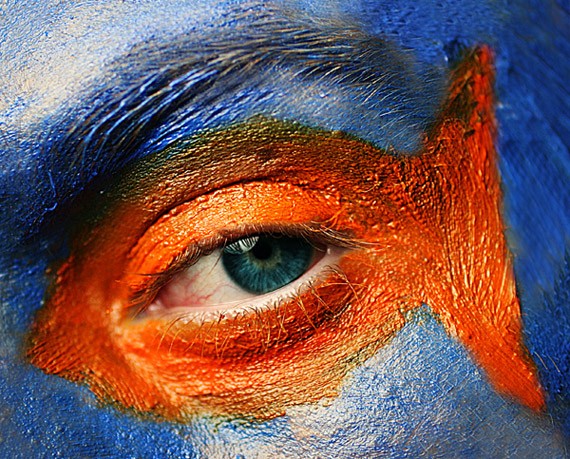
58. Eye grabber by ~lorrainemd
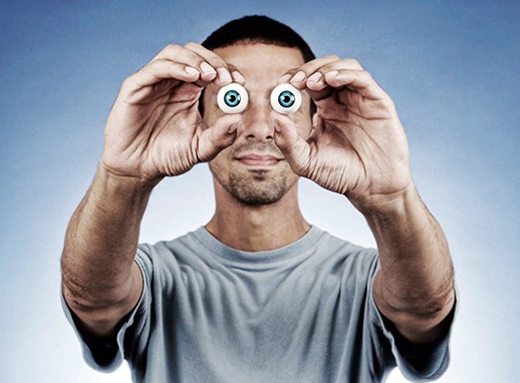
59. Chestnut Eye by ~oilcorner
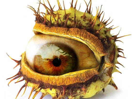
60. Behind the eye by ~Ober88

61. Eye love d you by =ftourini
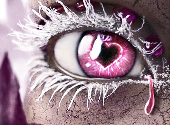
62. Eye candy by =ftourini
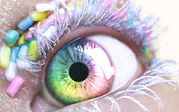
63. Eye – full HDR by ~ridethespiral1
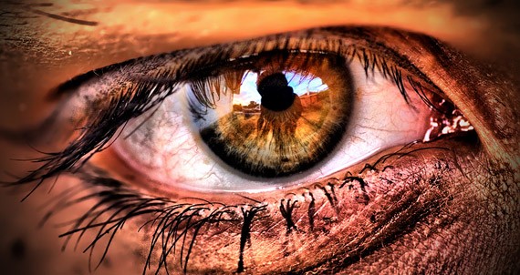
64. Another eye??? by ~gyuszi02
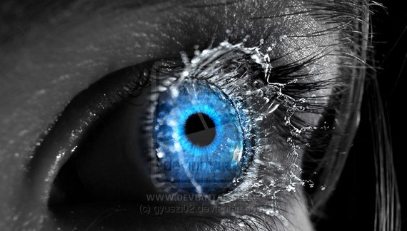
65. Big eye goldfish by ~inmc

66. Eye On Fire by =Birthstone
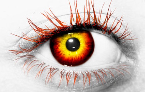
67. Eye Candy by ~mprox
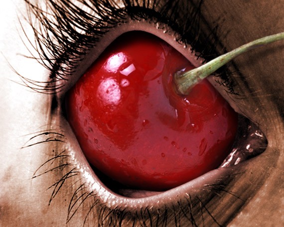
68. Avatar eye by ~MrJackXIII
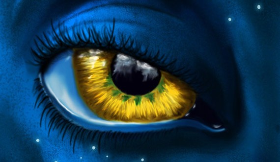
69. The eye by ~Black-Ban
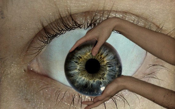
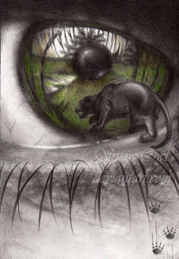
70. Into the Depth of an Eye by ~Snow-Owl
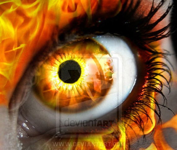
71. Fire Eye by =MEGAN-Yrrbby
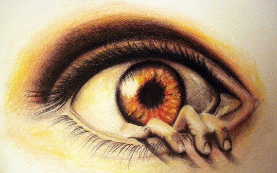
72. The eye by ~morkovka55
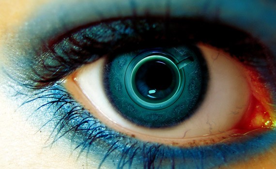
73. Blue cup eye by ~bangrud
74. Broken Eye by ~SoloEvolution
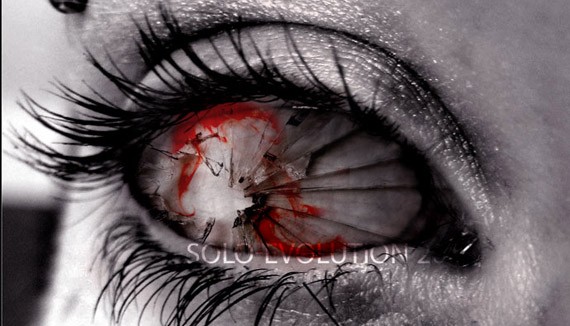
I hope you enjoyed this collection of “eye candy”. If you have any feedback, please leave a comment! 🙂
Really the final section and it’s all about papercut art.
Get Inspired: 43 Amazingly Creative Papercut Artwork
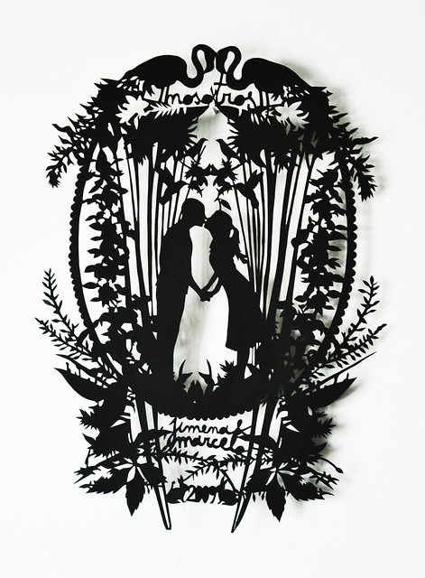
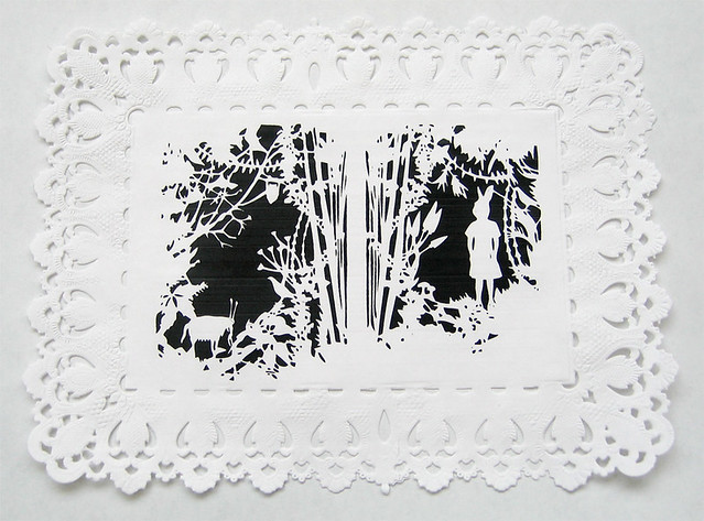
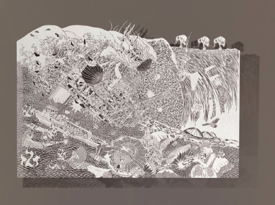
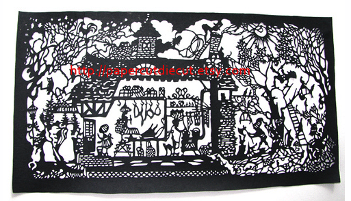
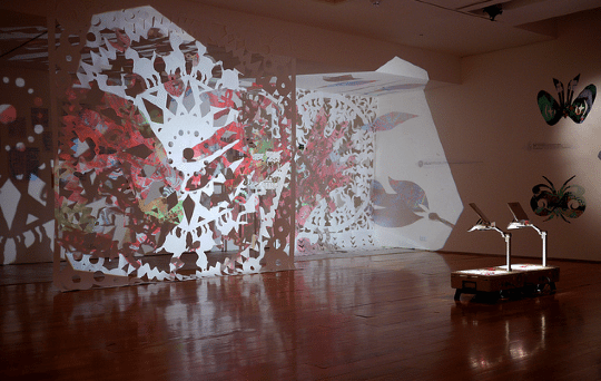
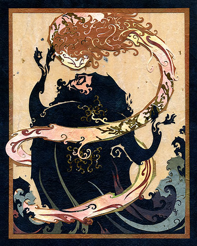
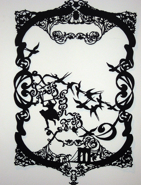
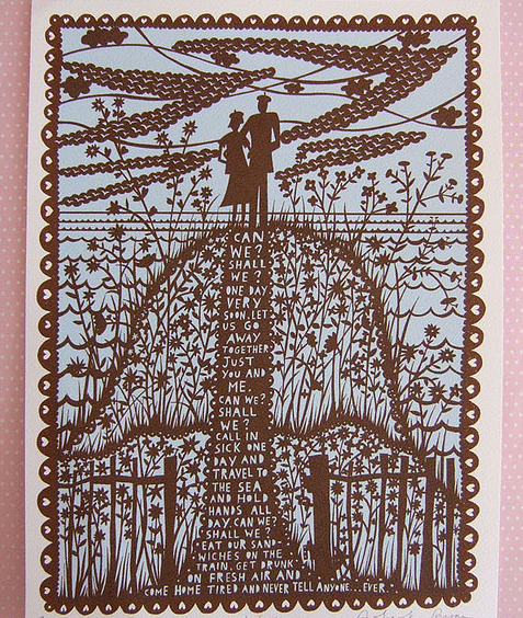
 Derives from the Greek term for the ancient Egyptian writing material, paper as we call it today is being used for many purposes. From writing a simple note to advertising media, the paper it self become very important in our life. Furthermore, paper can also be used as decorations.
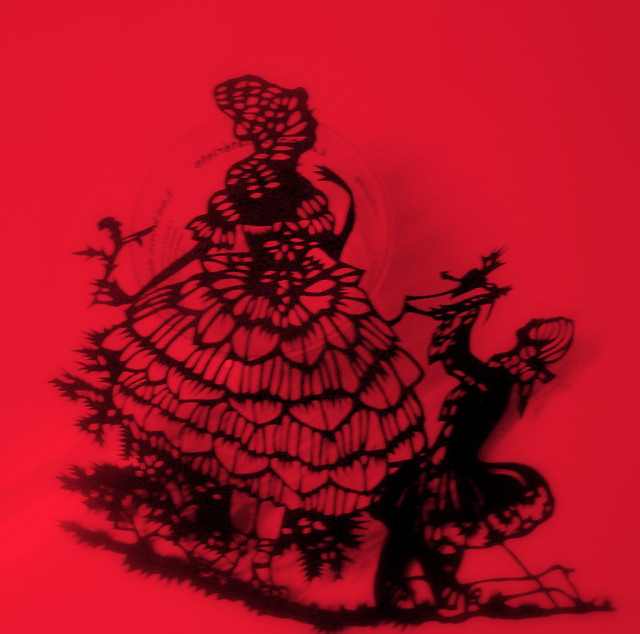
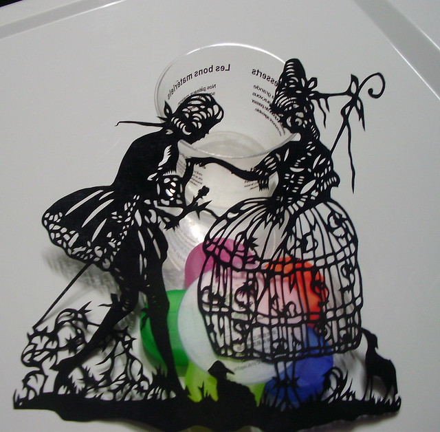
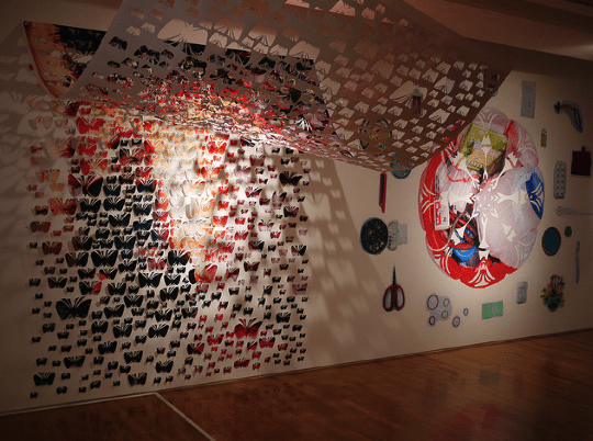
Papercut for example, is a simple paper decoration. Though, when it comes to creative ideas they will no longer look simple. Instead, these stunning papercut artwork will leave you with praise. In today’s post, we have selected 45+ amazingly creative papercut artwork for your inspiration. Make sure to check them all and be amazed on how amazing one paper could be.
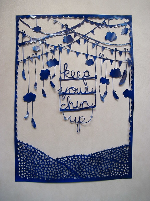
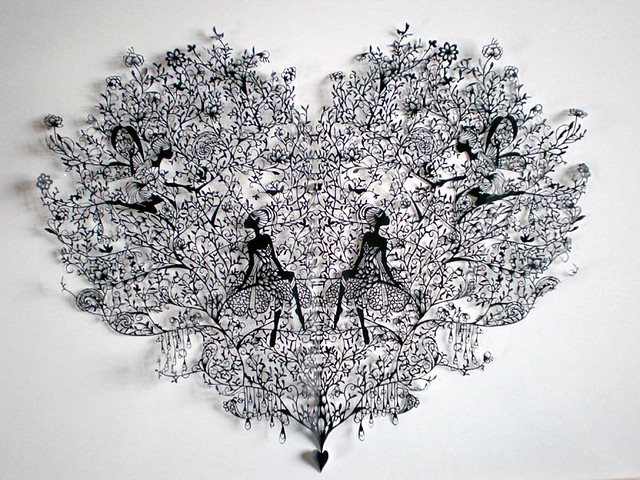
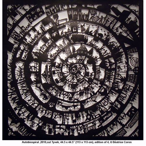
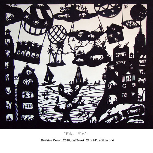
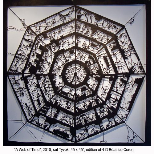
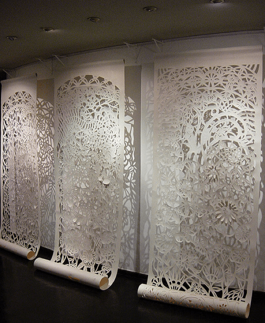
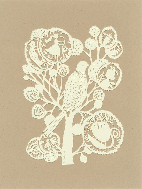
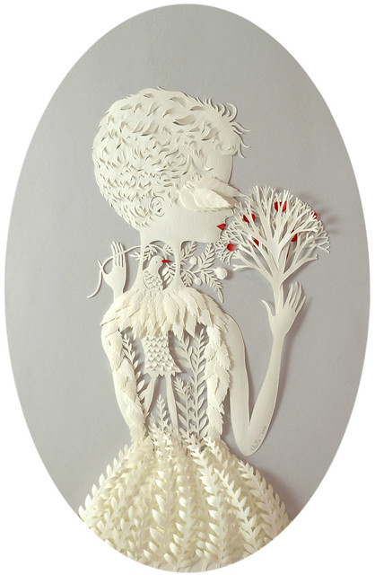
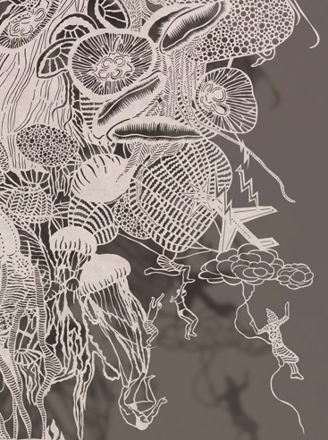
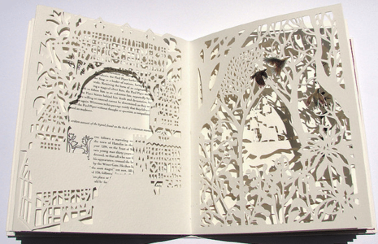
26. Papercut for “The Scene” by Himmapaan

Make Your Own Papercut
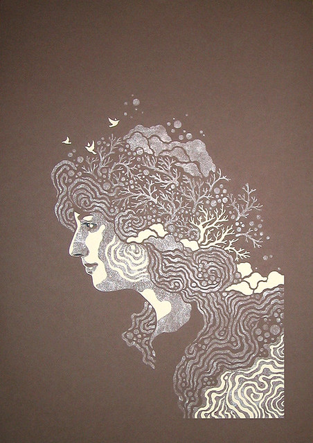
Aren’t they all amazing? It is actually not so difficult to create a papercut artwork, though you will need to be patient and practice on cutting the desired shapes. If you’re really interested on how to create one, check out this tutorial: How To: DIY Papercuts by Skinny Laminx. Don’t forget to tell us which is your favorite piece or if you’re a papercut artist, feel free to show your artwork to us.
This post may contain affiliate links. See our disclosure about affiliate links here.

