This article is all about creative websites and their unique navigations. Navigation plays a crucial role in the success or failure of any website. An easy to navigate website is more likely to be explored in more detail as compared to a website with more complex navigation. Regardless of the functionality of the website, the navigation is the first thing that must be taken care of.
Accomplishing matchless navigation that successfully performs its function is almost similar to mounting Mt. Everest. Getting an exceptional navigation with wonderful functionality makes the website easy to navigate and interesting for the visitors, therefore assuring a better user experience.
Your Web Designer Toolbox
Unlimited Downloads: 500,000+ Web Templates, Icon Sets, Themes & Design Assets
Table of Contents
- 1 Your Web Designer ToolboxUnlimited Downloads: 500,000+ Web Templates, Icon Sets, Themes & Design Assets
- 2 Creative Websites with Unique And Unusual Navigation!
- 2.1 1. Racket
- 2.2 2. Iamyuna
- 2.3 3. Samsung Mobile
- 2.4 4. Case Studies
- 2.5 5. Helmy Bern
- 2.6 6. Cathy Beck
- 2.7 7. TinyTeam
- 2.8 8. Alexbuga
- 2.9 9. Thibaud
- 2.10 10. Small Stone
- 2.11 11. Gleis3
- 2.12 12. Amore
- 2.13 13. Yodabaz
- 2.14 14. Sensi Soft
- 2.15 15. Nickad
- 2.16 16. 75b
- 2.17 17. Dave
- 2.18 18. Vernon Clarke
- 2.19 19. Revolution Driving Tuition
- 2.20 20. Jeremy Levine
- 2.21 21. Wards Exchange
- 2.22 22. Sideshow Press
- 2.23 23. Bountybev
- 2.24 24. Noonstyle
- 2.25 25. Vanity Claire
- 2.26 26. EwingCole
- 2.27 27. Custom Tshirts
- 2.28 28. Christian Sparrow
- 2.29 29. Salt Films
- 2.30 30. Blue Bug Digital
- 2.31 31. Section Seven
- 2.32 32. Sq Circle
- 2.33 33. EyeDraw
- 2.34 34. Light Motion design
- 2.35 35. Studio Stemmler
- 2.36 36. Eric johansson
- 2.37 37. Iipvapi
- 2.38 38. Narrow Design
- 2.39 39. Organic Grid
- 2.40 40. Smriyaz
- 2.41 41. Unfold
- 2.42 42. Yugop
- 2.43 43. Vanalen
- 3 Eye-Catching Websites With One-of-a-Kind Navigations For Inspiration
- 4 Components of Good Website Navigation:
- 5 Horizontal Navigation
- 6 2. Davroc Interiors
- 7 5. Sarah Hyland
- 8 7. Kinder Aktuell
- 9 14. Chris Guille Beau
- 10 15. Small Stone Recordings
- 11 17. Loodo
- 12 19. Duarte Pires
- 13 Vertical Navigation
- 14 1. Brian Handley Design
- 15 2. INNOVATIVE Imaging Professionals
- 16 3. Envira Media Inc.
- 17 7. Cambrian House
- 18 11. Wards Exchange
- 19 12. AJ Miles
- 20 14. Adventure Here
- 21 15. KKMedia
- 22 16. National Television
- 23 Other Examples of Navigations
- 24 5. WOW Brand Impact
- 25 6. Nathan Borror
- 26 7. Nora Rose Travis
- 27 Tips on Designing the Perfect Navigation System for Your Website
- 28 E-Commerce Websites
- 29 News Websites
- 30 Blogs
- 31 Corporate Websites
- 32 Review-based Websites
- 33 Conclusion
- 34 Highly Entertaining Website Headers for Your Inspiration
- 34.1 1. The Pixel
- 34.2 2. Pralinenschachtel
- 34.3 3. Juan Diego Velasco
- 34.4 4. Art 4 Web
- 34.5 5. Bern
- 34.6 6. Sob Controllers
- 34.7 7. Cult Foo
- 34.8 8. Bei Blog
- 34.9 9. UGS Mag
- 34.10 10. Mark Forrester
- 34.11 11. Marchand de Trucs
- 34.12 12. Barcamp Bordeaux
- 34.13 13. Broke Design
- 34.14 14. The Farmer and the Chef
- 34.15 15. Barleys Green ville
- 34.16 16. Bupla
- 34.17 17. Pixel Resort
- 34.18 18. Mike Dascola
- 34.19 19. Boompa
- 34.20 20. Living Design
- 34.21 21. Toasted Digital
- 34.22 22. Field Runners
- 34.23 23. Erics Empire
- 34.24 24. Just dot
- 34.25 25. Cochemer Stadtsoldaten
- 34.26 26. Florida Flourish
- 34.27 27. Giselejaquenod
- 34.28 28. Kulturbanause
- 34.29 29. Digimurai
- 34.30 30. Nomilk Today
- 34.31 31. Web Burza
- 34.32 32. Alexandregomes
- 34.33 33. Racket
- 35 Creative uses of Ribbons in Web Design
- 36 1. Wells Riley
- 37 2. Carnivale du vin
- 38 3. Wp1000 Themes
- 39 4. Urban off
- 40 5. Decorama design
- 41 6. Tech jobs under
- 42 7. Future of car sharing
- 43 8. Pistachio app
- 44 9. Small studio
- 45 10. Le tipi
- 46 11. Less Money
- 47 12. Table 37
- 48 13. Sleepstreet
- 49 14. Pixel Stadium
- 50 15. Simple as milk
- 51 16. Fe.Rocious
- 52 17. Quote Roller
- 53 18. Tapp3 Media
- 54 19. Jopp Design
- 55 20. Tanya merone
- 56 21. X graphica
- 57 22. St. Kilda High Hopes
- 58 23. Letter Learner
- 59 24. The Portfolio of Alex Pierce
- 60 25. Rockaholic
- 61 26. Paris Jones
- 62 27. Myselfdsk
- 63 28. Made by Chipmunk
- 64 29. ParkBud
- 65 30. Appmiral
- 66 31. Sunday Best Websites
- 67 32. Cake Sweet Cake
- 68 33. Moving
- 69 34. Webzguru
- 70 35. Ruby Bots hosting
- 71 36. Run do to-do
- 72 37. Ebridal
- 73 38. Pongathon
- 74 39. Legal Services of Southern Missouri
- 75 40. Consafan
- 76 41. Krichevtsova Alexandra
- 77 42. Elevated Imagery
- 78 43. CJs Favorites
- 79 Know Why Your Website’s Header Is Driving People Away
- 80 Old is no more the gold
- 81 Submerge!
- 82 Break The “Text Book” Definition of Dynamic Headers
- 83 Ditch the Rectangle
- 84 Ditch the Header Itself!
- 85 Keep Thinking Different. Don’t Give Up!
- 86 Conclusion

DOWNLOAD NOW![]()
Table of Contents:
- Creative Websites with Unique And Unusual Navigation!
- Eye-Catching Websites With One-of-a-Kind Navigations For Inspiration
- Tips on Designing the Perfect Navigation System for Your Website
- Highly Entertaining Website Headers for Your Inspiration
- Creative uses of Ribbons in Web Design
- Know Why Your Website’s Header Is Driving People Away
At this time, we have selected some unique websites with marvellous and distinctive navigational elements that will not only enthuse you, but will demonstrate how to merge novelty with realism. Enjoy!
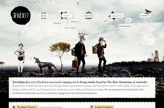
1. Racket
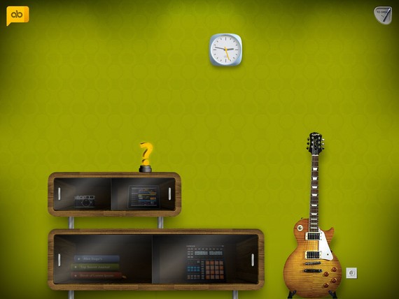
Here you will see the navigation menu hanging in the air. The navigation menu looks somewhat off the cuff but at the same time it looks so cool.
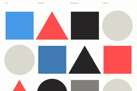
2. Iamyuna
Here the navigation may appear minimal and negligible but once you keep your mouse on the option it shows you the complete list of all available choices. The mouse over effect is simply amazing.
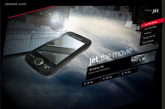
3. Samsung Mobile
Samsung Mobile features an extremely dynamic and animated website with a unique and appealing navigation style.
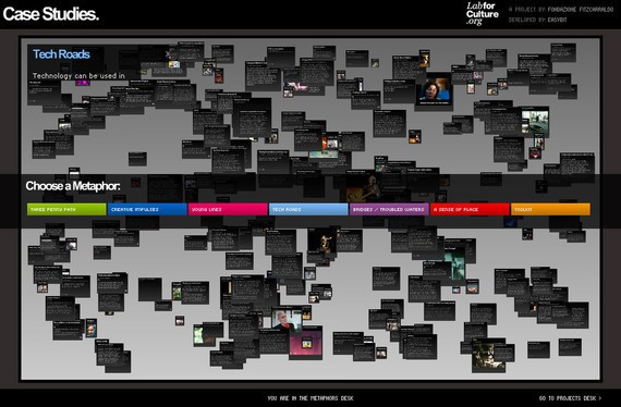
4. Case Studies
Centrally aligned navigation with some links at the top of the page is truly an extraordinary approach for a navigation menu. Clicking on any centrally aligned option will reveal the detail page.
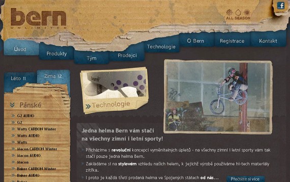
5. Helmy Bern
Helmy Bern features a somewhat disorganized top navigation but the side bar and the bottom navigation menu are simply amazing. The use of the right color to create the right impact can be seen here.
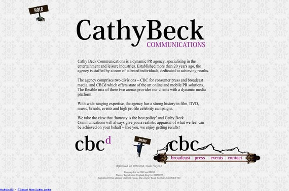
6. Cathy Beck
Cathy Beck makes use of a unique approach for her site navigation. Here the navigation is set at the bottom of the page rather than the top of the page, further the mouse over effect is out of the ordinary.
7. TinyTeam
TinyTeam offers a very systematic and pragmatic navigation menu that eliminates any confusion a new visitor may have in browsing the website and finding its desired information.
8. Alexbuga
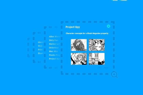
The sliding effect on mouse over is the key point of navigation plan of this website that makes this navigation extremely classy and elegant. The main navigation reveals when you place your mouse on the logo design at the top of the page.
9. Thibaud
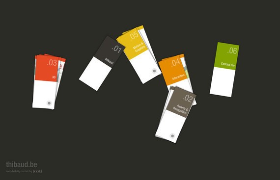
It’s truly fun to browse this website. You can actually arrange and rotate the cards present on the home page by simply dragging and dropping them to your desired location and can see the portfolio by clicking on it.
10. Small Stone
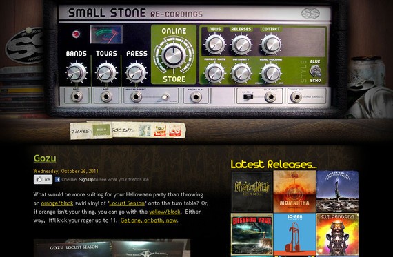
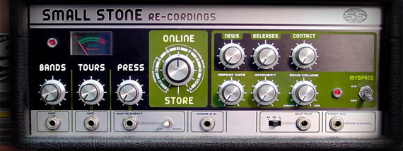
An unusual navigation that matches the website name. Here the designer has successfully imitated a recording device as a navigation menu.
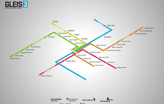
11. Gleis3
The navigation plan used in Gleis3 website looks somewhat like a road map that leads you to your desired location easily and effortlessly. Simply click on an option and you will get the relevant information.
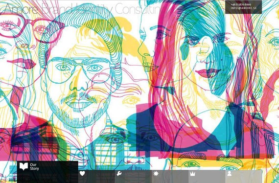
12. Amore
With a horizontal as well as vertical navigation plan, this website holds its own charm. The main navigation menu is placed at the bottom of the page with some cool and beautiful mouse over effects.
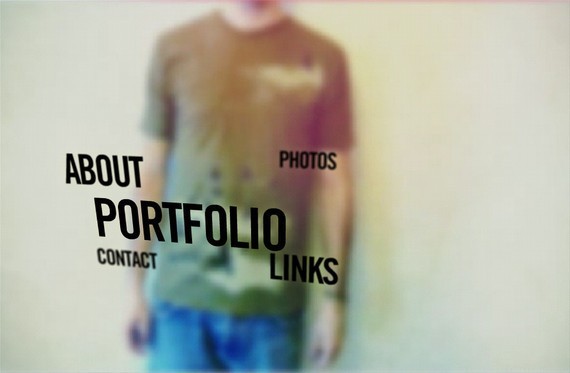
13. Yodabaz
Here the navigation is presented with an animated background image sufficient enough to create that attention grabbing first impression. Clicking on the portfolio reveals some of their excellent work.
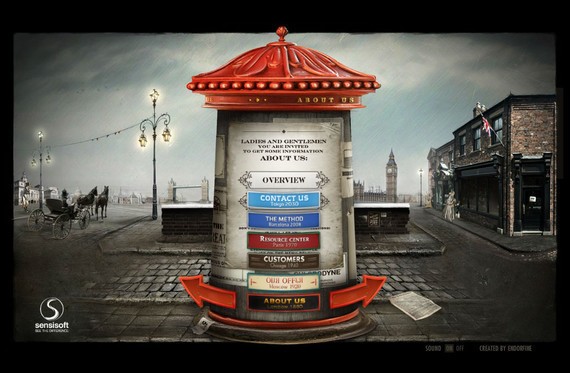
14. Sensi Soft
The whole navigation is set to be at the center that makes this website extremely well-organized and easy to navigate. The effects that this website uses are beyond the ordinary mouse over effects.
15. Nickad
Nickad brings flash into play to make its navigation menu and overall website design look stunning. This is something that you will never find in any other website navigation plan.
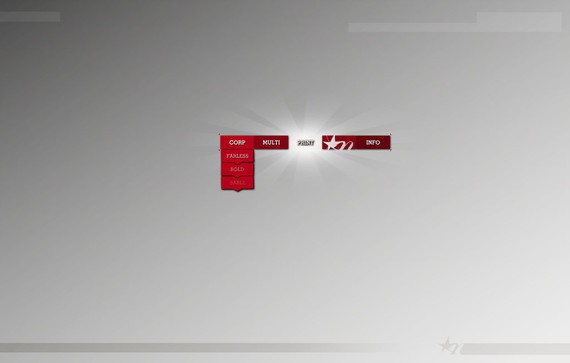
16. 75b
75b also has a horizontal and vertical navigation plan. The main options or menu is placed with the vertical navigation while the sub-menus are placed with the horizontal navigation.
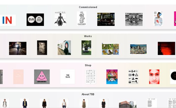
17. Dave
This website not only brings an exceptional use of navigation into play but also experiments with unique typography to set it apart from dozens of other similar websites.
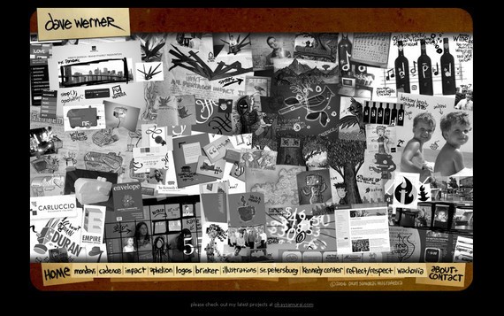
18. Vernon Clarke
Here the whole navigation has been summed up within an icon of a film tape with some small icons on it. Besides that the website also features some exceptional work on the main page.
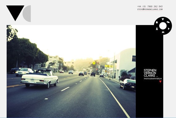
19. Revolution Driving Tuition
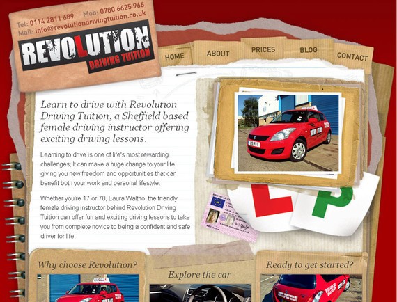
Simple and nice navigation with no more classy effects, even a novice can also understand how this website works.
20. Jeremy Levine
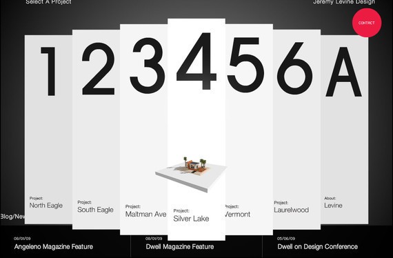
An imaginative demonstration of the navigation menu that makes this website fun to browse. Jeremy Levine takes advantage of its dazzling color combination to make its navigation even more eye-catching.
21. Wards Exchange
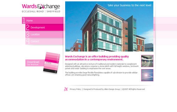
The whole navigation has been placed at the side of the website design that makes this website tremendously well-ordered and easy to navigate. The effects this website uses are beyond the ordinary mouse over effects.
22. Sideshow Press
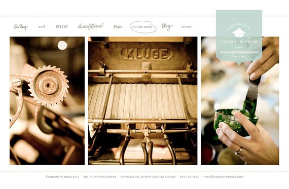
The navigation is presented with some cool and appealing effects giving this website a personal and human touch. Clicking on any option will take you horizontally to the relevant section.
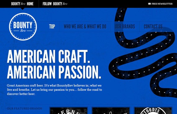
23. Bountybev
Bountybev make the most of its bright color combination to make its navigation even more attention-grabbing. The use of bold typography further makes this unique website design hard to forget.
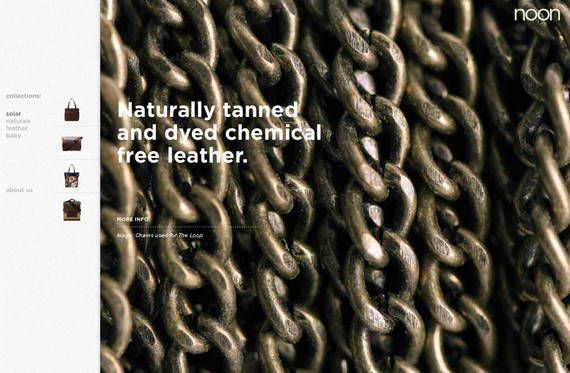
24. Noonstyle
Here again, the navigation has been set at the sidebar to make this website look well organized and efficient. When clicked, the website also shows the relevant options in the sidebar.
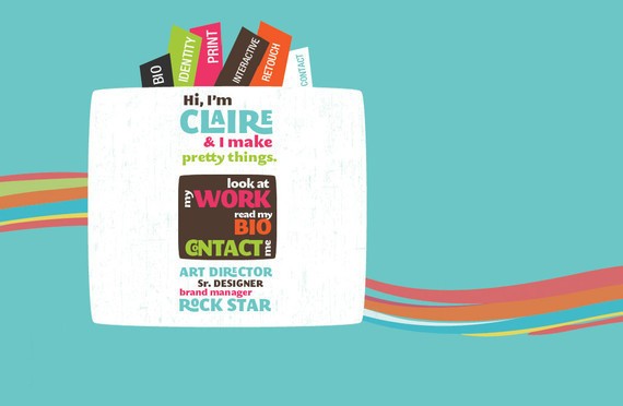
25. Vanity Claire
Easy and on the contrary an artistic approaches to design navigation for Vanity Claire that not only matches with the main concept of the website but also affords regularity.
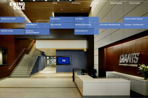
26. EwingCole
Here, the navigation options are divided into two parts. The top most navigation reveals the content in the customary style while the second navigation is presented in a somewhat trendy style.
27. Custom Tshirts
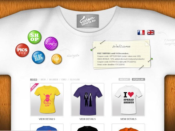
Here the main links are presented at the top while a portfolio or T-shirt photo are presented with a mouse over effect that enlarge the photo when you place your mouse on it.
28. Christian Sparrow
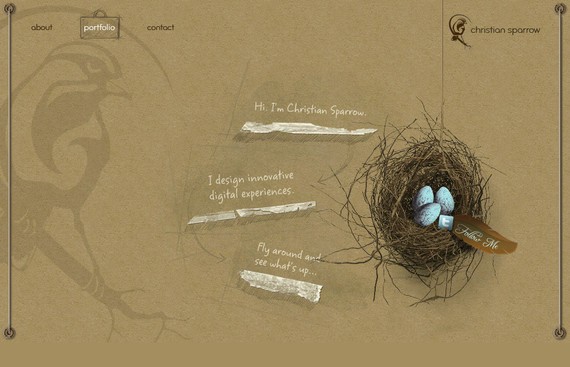
Christian Sparrow makes use of a simple but attractive navigation plan that not only grabs the attention of the visitors but also creates an everlasting first impression.
29. Salt Films
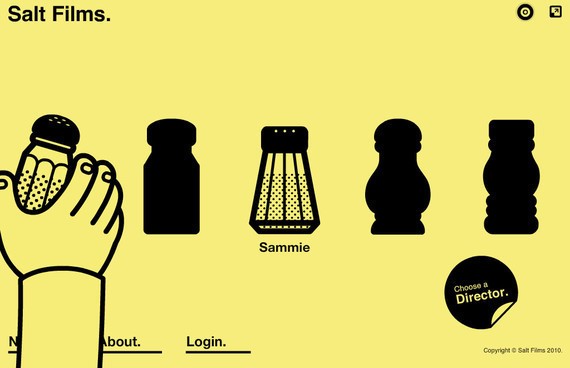
In this navigation menu the thing that stands out is the animated hand which gives the whole website a very unique and appealing look.
30. Blue Bug Digital
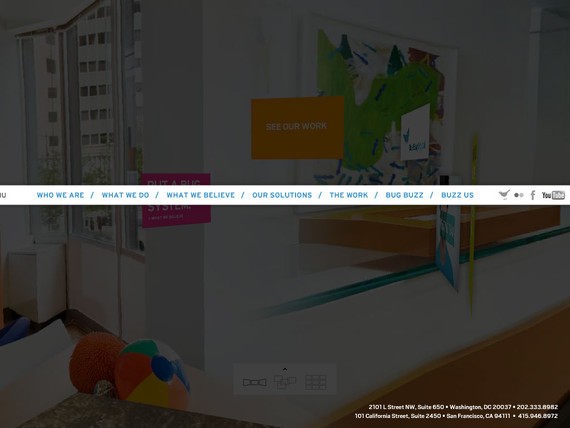
Blue Bug Digital makes use of an animated background that revolves 360 degree providing you a complete preview along with the navigation menu.
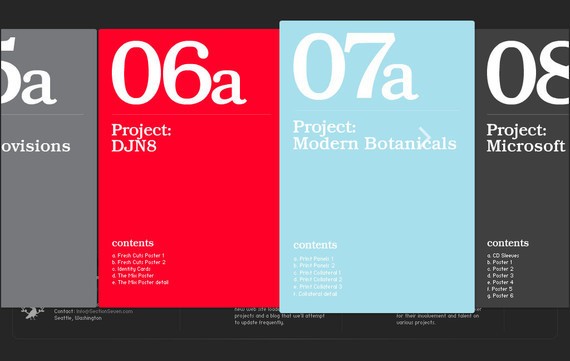
31. Section Seven
Section Seven also uses its navigation menu in an extremely creative and artistic way making the whole website look and design visually appealing and remarkable.
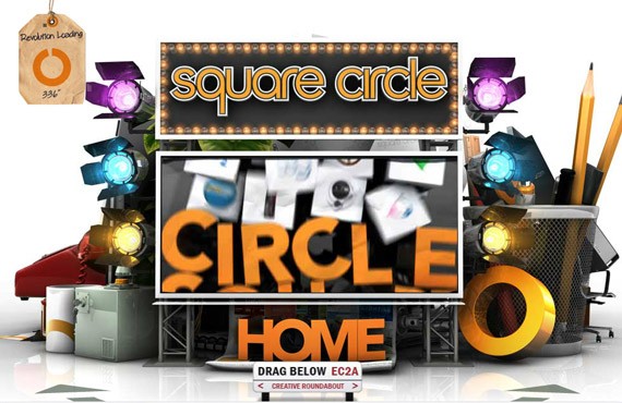
32. Sq Circle
While the website loads completely, the message says we are creative and pragmatic. That proves true when you explore the site in detail. The navigation truly is out of the box and extraordinary.
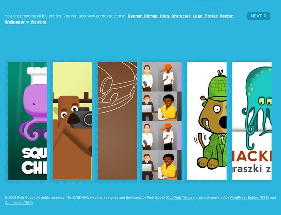
33. EyeDraw
EyeDraw presents a very non-fussy and clean website layout giving its visitors an easy to navigate and understand website. The main options slide to give you a complete preview when you place your mouse on it.
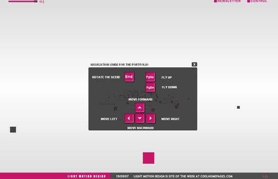
34. Light Motion design
Light Motion design also provides a navigation plan or guide for those who are not very internet savvy. On the whole, the navigation is exceptional and has been designed in a very systematic way.
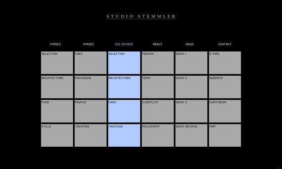
35. Studio Stemmler
Studio Stemmler combines effective navigation, excellent design and a beautiful color combination all in a one to get this visually appealing and attractive website to the surface.
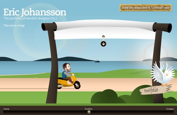
36. Eric johansson
A fun and irreverent site that also give you the option to view the site in a more traditional way.
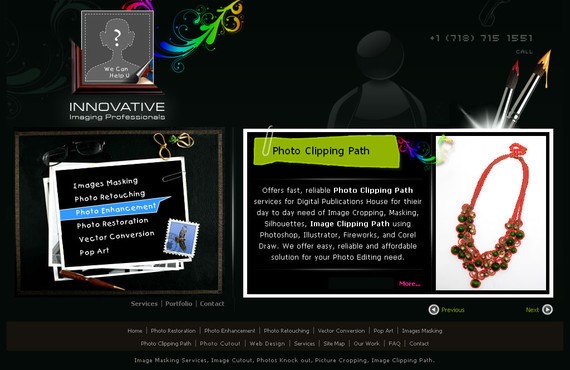
37. Iipvapi
Innovation at its very best is what that describe this navigation menu perfectly. Simple but effective navigation with some cool effects.
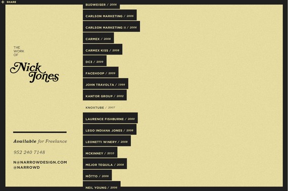
38. Narrow Design
A vertically sliding navigation menu that moves to the left when one item is clicked giving its details on the remaining part of the screen.
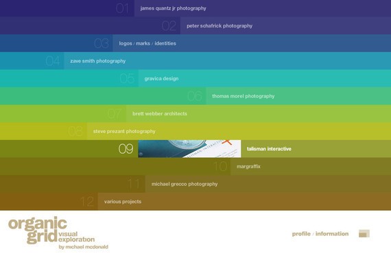
39. Organic Grid
Organic Grid holds a visually appealing website navigation that consists of more than 90% of the main page.
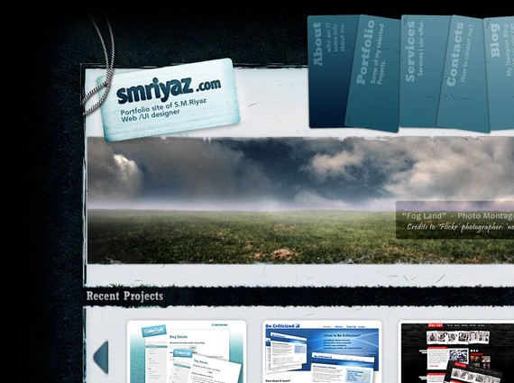
40. Smriyaz
An extremely beautiful website design with neat and efficient navigation menu that guides its visitors how to explore the site to make the most of it.
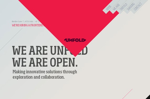
41. Unfold
Simple but a creative approach to design navigation for Unfold that not only matches with the main concept of the website but also provides symmetry. Simply click on the top navigation links to explore the site in detail.
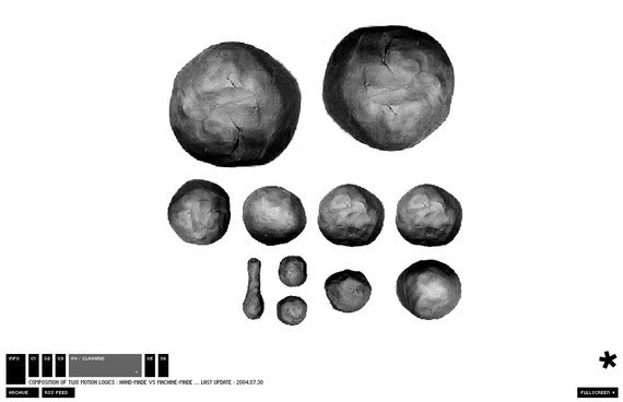
42. Yugop
The navigation is placed at the bottom of the page with some exceptionally animated effects.
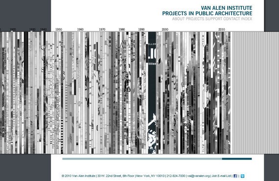
43. Vanalen
Vanalen also presents a very unusual and unique navigation menu that is totally different from the ordinary websites. The navigation plan used in this unusual website is rare and exceptionally creative.
Alright, ready for some more navigational inspiration and some great tips? Let’s go!
A website is like a magazine where people search for information. The table of contents of a magazine is like the navigation of a website. Table of contents provides an overview of your magazine, while a navigation also shows on what your viewers should expect to see on your website. Both serves as pathways for your viewers on how they can read your mag or explore your website.
Primary navigation are the main menus or categories of a website. These are considered as the most important links that can be seen the moment your website loads. Most of the primary navigation consists of Home, About Us, Contact Us and other links depending on what kind of website you are creating.

Keep in mind that primary navigation should not have more than seven or eight links. Choose the most important links and put them as the main menus and the rest will be placed on the sub-menus.
Secondary navigation are the secondary links or sub-menus of a website. Usually, these are to be found from a drop down menu or a fly-out menu.
A drop down menu is when a user mouse over and click on a menu button, then sub-menus will be shown.
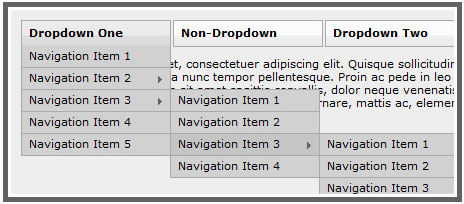
Sample Image of a Drop Down Menu
A flyout menu is when a user hovers onto a menu button, then sub-menus will appear. In this case, the user doesn’t have to click the button for the sub-menus to appear.
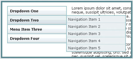
Sample Image of a Flyout Menu
3. Position of Menus
It is important that you position your menus on a place where your viewers can easily see them.
Usually, horizontal navigation is put on top and under the header of your website. While a vertical navigation, this is commonly put on the left side of the website.
To add up on to this, always put your menus from left to right since most viewers start reading from the left.

Even you put your links from right to left, your viewers will still read them starting from left. Take the image below as an example. Even the links are put into a right to left position, viewers will still read them starting from the Contact Us, Blog, About Us and then Home.

4. Size of Buttons and Menu Label
The size of your menus must be noticeable, but not too large that they would occupy too much space. Adjust them where they can be seen easily by your visitors while maintaining a professional look.
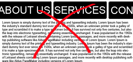
When putting menu labels, make sure they are readable in size. Also, choose a font color that is in contrast with the color of your button. If the color of your button is light, use dark color for your menu label and vice versa.
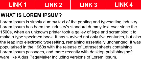
5. Color of Menu Buttons
Colors are one way to entice the visitors of your website. Use a color for your menus that is in contrast with the background color of your website. This way, you can capture the attention of your viewers and your buttons will stand out with the other elements of your website.

Take a look at this example. Even the buttons have the same color as the background, it still stands out for it has button-click effect and the text color is white.

6. Icons and Effects
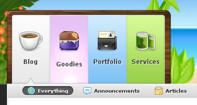
Icons are great way to differentiate your buttons and they also inform users on what viewers could expect on that link. Also, hover effects is a good way to attract viewers’ attention. This also informs the visitor that they can click the button which looks different from the others. You can also put a button-click effect to inform your viewers on what button they clicked.
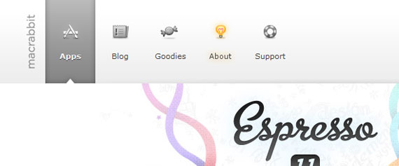
To give you more idea about this, I have here a good example of website navigation. The designer of PixelResort put icons on top of each menu label to represent the link. Also, it has a hover effect (glowing circle) and a button-click effect (arrow pointing on the link). In this case, the page is on the Blog link and the mouse pointer of the viewer is put on the Goodies link.
And my last tip for you…
7. The less click, the better.
Viewers tend to be impatient when searching for information, they want to seek what they are searching very quickly. Make sure that your navigation respond as quickly as possible to your viewers’ instincts.
In this article, I will highlight amazing horizontal and vertical navigations for your inspiration. First, let us take a look at horizontal navigation.
Horizontal navigation is the widely used navigation of web designers today. Usually, the navigation bar is placed right under the header.
Good Characteristics:
1. It occupies less space
Horizontal navigation is mostly used by web designers for it occupies less space, because it is placed at the top part of the website. Then, the rest of the spaces you can use for your content.
2. More noticeable
Our eyes first notice elements of the website that are placed on the center, that is why horizontal menus are more noticeable since they are placed on the top and center part of the website.
3. Easier to use
Viewers find horizontal navigation easier to use. Comparing it to vertical navigation, you still have to move your mouse pointer on the left part of the screen (or sometimes right) to click the menus. If the navigation is horizontally placed, you just have to move your pointer upward to click a menu button.
4. Viewers are already used to it
Since it is the mostly used navigation, viewers always expect that all websites have this type of navigation.
Bad Characteristics:
When using horizontal navigation, you are limited on the width space of your website and this still depends on the layout of your website.
Horizontal navigation can only be used if the number of your menus is already fixed, because the size and design depends on the number of menus to be placed.
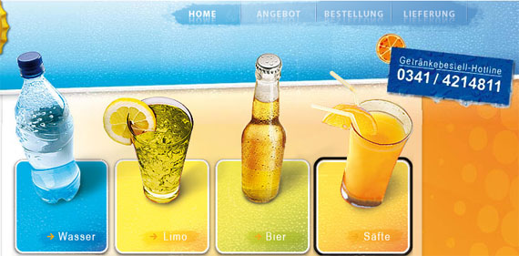
Here are some example of horizontal navigation for your inspiration:
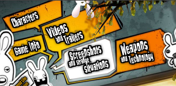
2. Davroc Interiors
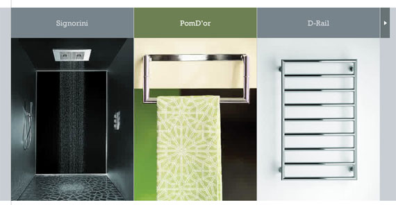


5. Sarah Hyland

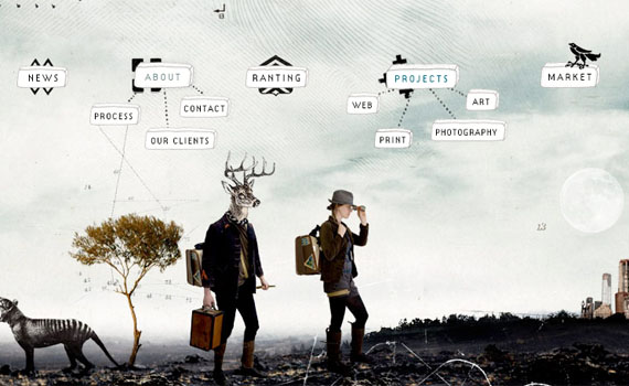
7. Kinder Aktuell

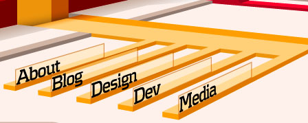
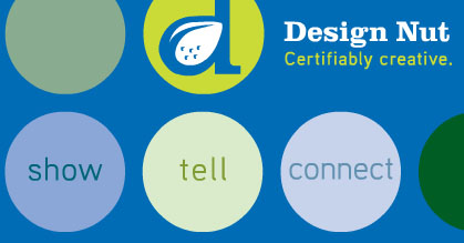


14. Chris Guille Beau

15. Small Stone Recordings
17. Loodo


19. Duarte Pires


Now let us go to vertical navigation.
Vertical navigation are usually placed on the left side of a website and the menus are placed from the top to bottom, like a ladder.
Good Characteristics:
Vertical navigation allows you to group your menus and place sub-menus under each main category. Unlike in horizontal navigation, you still need to create a drop down menu for the sub-menus.
If you are trying to put more or remove menus in the future, you can use vertical navigation. It will be easier for you to add or remove menus without resizing each buttons.
Bad Characteristics:
1. It occupies a lot of space
Usually, menus in vertical navigation are placed on the left side of the website and this occupies a lot of space on the whole website template. Unlike when using horizontal navigation, you are just using the top part of your website.
For your buttons not to occupy too much space, you are limited to few characters when putting labels for your menu. If you will be putting many characters, tendency is the font size of your menu label would be small or you will occupy too much space on your template.
If you have several menus for your website, the tendency is that your viewers need to scroll down their to see the other menus placed at the bottom part.
4. Viewers are not used to it
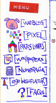
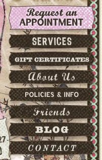
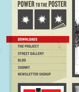
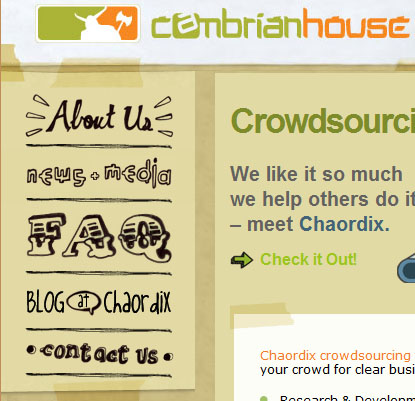
Viewers expect that a website should always have a horizontal navigation, since it is mostly used by web designers. But nowadays, there are already websites that are using vertical navigation and are designed creatively to make it easier and noticeable for visitors.
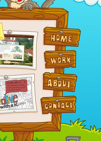
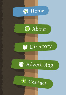
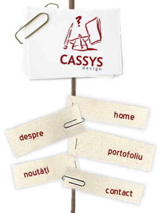
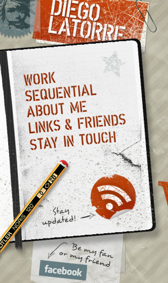
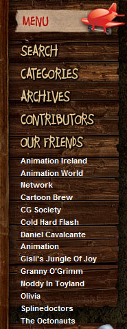
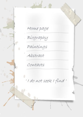
To give you more idea about vertical navigations, take a look at these websites.
1. Brian Handley Design
2. INNOVATIVE Imaging Professionals

3. Envira Media Inc.
7. Cambrian House
11. Wards Exchange

12. AJ Miles
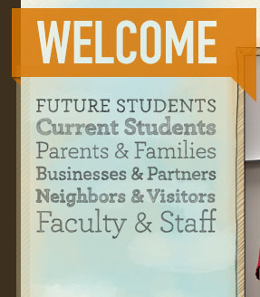
14. Adventure Here
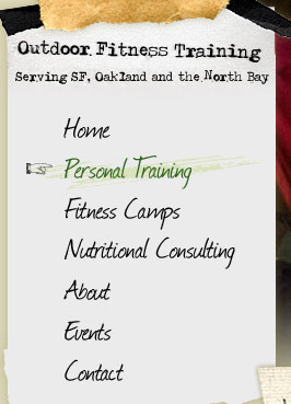
15. KKMedia
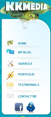
16. National Television

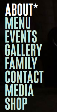

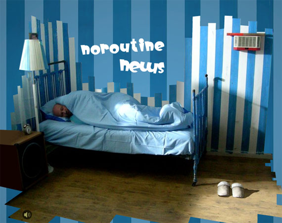
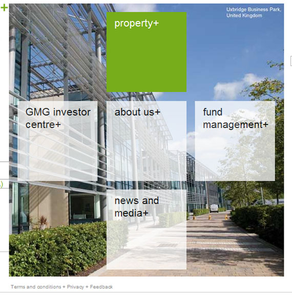
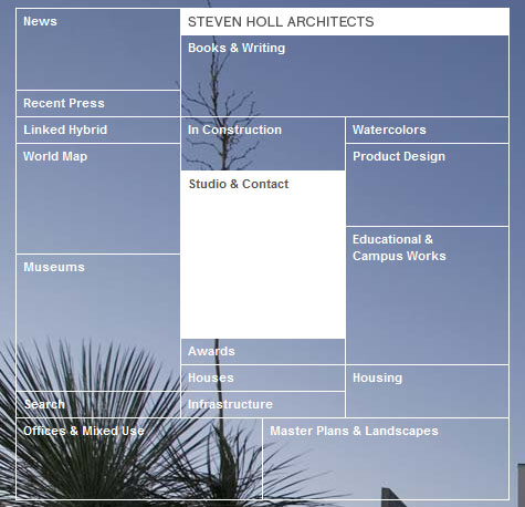
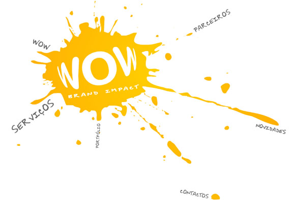
Here are some examples of websites with one-of-a-kind navigations.

5. WOW Brand Impact
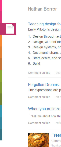
6. Nathan Borror
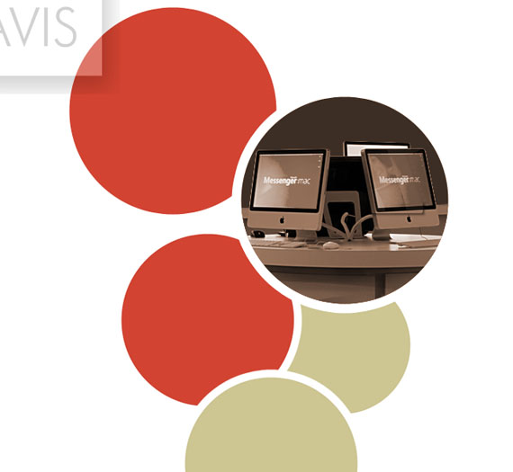
7. Nora Rose Travis
What are your favorites among the selection? Comment out and feel free to share.
So, you are still wondering how to create the perfect navigation for your website? We’ve got you covered. Read the next section.
Well, navigational menus can be a big turn off for your readers if they aren’t planned well. Although webmasters assume that a simple menu is enough, most of the time yet they forget that a navigational menu has its own requirements. Sometimes a simple to use navigation will do just fine for your website design while at times you will have to click a lot of links into your navigational menu so as to compliment the various branches of your website.
This discussion will pick up some of the obvious forms of websites and then shed some light on how the navigational menu changes for each of them. Hold tight and don’t leave!
E-Commerce Websites
The buzz of today for developed nations and the future for upcoming nations, e-commerce has evolved as one of the most current businesses on the Internet and almost all of them have been able to earn their share of fame during their lifetime.
One common point between all e-commerce websites is how complex they are. No matter how simple a e-commerce portal is, at the end of the day lot of navigational links have to be used so that readers can order multiple items or continue shopping from the cart. This is when it becomes important for webmasters to come up with the perfect blend of simplicity and complexity that keeps readers on that e-commerce portal.
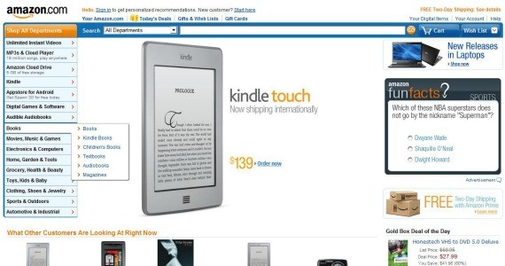
What better example then Amazon when it comes to an e-commerce portal. Amazon has been successful in coming up with a very simple to use navigational menu which leads to almost every category under which the company features products. Also, the search system of Amazon is next to perfect which almost always results into satisfactory queries.
One must understand that it is this two type of navigational system (menu+search) which helps Amazon to keep visitors engrossed.
News Websites
Ah, news websites! They are famous for their content heavy presentation. I am not sure if there is even one news website which I have read thoroughly. The amount of content generated by a news website is enough to confuse readers. And this is when a sorted navigational system becomes important.
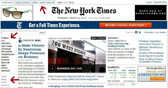
Imagine a news website like New York Times with just a top navigational menu that links to Home and few other important categories. Nobody would understand the depth of the website if they used such an incomplete navigational system. It is important to understand that the general perspective of a reader for a news based website is a lot of content with a complex navigational system. So, if you are including a very in-depth navigational system for a news based website then you’re doing things right.
Blogs
Well, which discussion on navigational menus would be complete without talking about blogs? In this section we will target blogs that are content rich. One can argue that niche specific blogs can run with a fewer number of categories so the navigational menu can be avoided in these cases. In this case, we must understand that it is advantageous for niche specific blogs to divide their content into various categories. Now, these categories need to be listed in the navigational menu so that visitors can dig into various forms of content on that blog.
This is where it becomes very important for content rich and niche blogs to have all its major categories listed on every page of the blog so that navigation is a cakewalk.
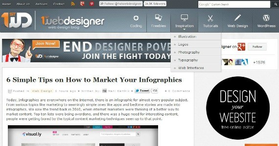
On the whole, a blog can have following navigational styles to check old content which is not available on the home page:
- Pagination – This is placed at the end of each page and gives direct links to other pages of the blog.
- Archive Page – Some A-List blogs use archive pages which can be used to display a complete archive of articles easily accessible from that a single page.
- Categories/Tags In Sidebar – This is a common feature used by most blogs. A list of categories or tags used by the blog can be shown on the sidebar so that they are easily accessible from every page.
- Header Menu – This happens to be an obvious form of navigation in blogs. It can be used for linking to the most readily used pages like the Contact and About Us pages. Some blogs use the header menu to link to major categories.
- Footer Navigation – In the last few years blogs have come up with a footer navigation where a huge footer is used to link back to literally everything on the blog. This footer can be used to connect categories, pages and tags together.
Please understand that it is the format of content and the amount of visitors that will decide what sort of navigation a blog should use. Usually it depends on the blog’s webmaster to do some form of A/B testing to understand what suits the blog the most.
Corporate Websites
Corporate websites can show extensive variations in their style. While some of the corporate websites are used as a platform to represent an already famous company. Such websites basically are the face of the company without any other meaning whatsoever. Such corporate websites keep the customers informed and that is it.
On the other hand there are corporate websites that will keep try to entice new customers. They play a different ballgame altogether but still, at the end of the day, they are corporate websites. The professionalism reflected from these websites is almost always similar.
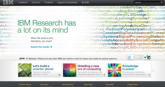
It is this professional factor that forces corporate websites to include the least amount of navigation links. Usually, a header menu with links to basic pages is all that is required to complete the navigational section of a corporate website. To add the Midas touch a webmaster can use footer based menu if the website has lot of content that can be admired by the visitor. The footer menu will never play down the professionalism factor of the corporate website.
Review-based Websites
Review-based websites cover a lot of area and various niches all in one platform. Usually such websites target consumer oriented products and provide a platform where users can leave comments or reviews regarding a respective service.
The problem with such a website is that due to a huge amount of content which is divided into various niches, it becomes almost impossible to cover all of it in one navigational style. This is when the menu style show in the image below can come in handy.
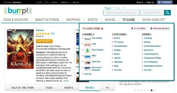
Review based websites will use huge drop down menus which are almost like a new pop up opening on every mouse over. This style of navigational menus gives the review based websites ample amount of space to showcase almost every category without making it look congested. White space matters!
Conclusion
Not yet done, folks! But I hope that you have an idea of how important navigational menus are and how they change without us noticing them. See, the point is that navigational menus must not be a point of concern for the website visitor. They must blend with the website and its content in a manner that they look perfectly appropriate with that respective website. Get the idea?
As we all know by now, the navigation system is very important to any website. However, also header of a website can play a big role when visitors decide to stay on your website and because the navigation and header are somehow related, we wanted to combine this two in the same article.
Highly Entertaining Website Headers for Your Inspiration
The header of a website is the most important and crucial element that needs to be visually appealing and engaging and at the same time very functional to assist the visitors in navigating the website. Since the header is the first thing your visitors notice, you have to be very careful in designing this crucial part of your web design. With an appealing and attention grabbing header design, you will surely increase chances of your website being explored more by your visitors.
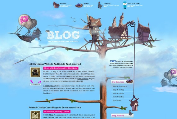
1. The Pixel
Beautifully designed header that not only fulfills the function of a header in a web design, but also improves the overall look of the website.
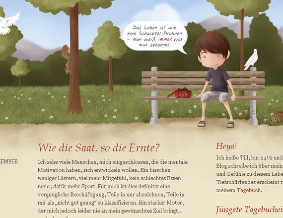
2. Pralinenschachtel
Simple and uncluttered design focusing on simplicity, yet keeping it very creative and visually engaging.
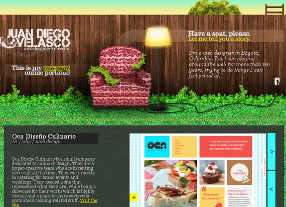
3. Juan Diego Velasco
Wow! Such an appealing and charming header I have ever seen. The credit goes to the designer who successfully delivered his creativity and imagination into a beautiful design.
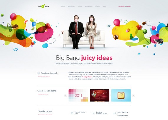
4. Art 4 Web
Artistic is the word that describes this header design. With loads of vibrant colors, this header truly is the highlight of the website design.
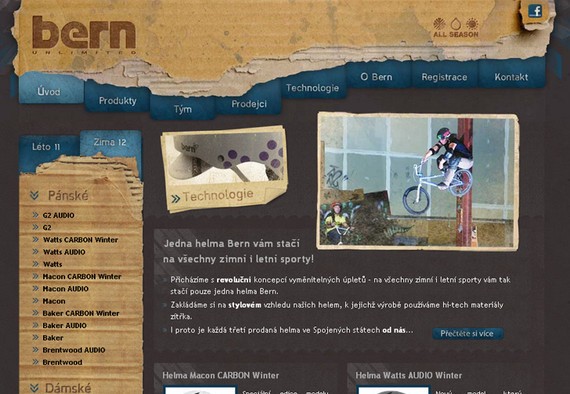
5. Bern
Although quite simple yet extremely effective design that uses beautiful color combination and appealing effects to grab the visitors’ attention.
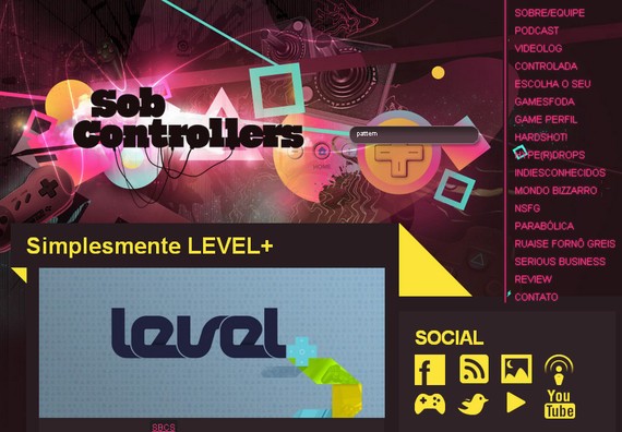
6. Sob Controllers
This brilliant header design has been created by keeping a close and detailed look at the visitors’ perspectives and this is the reason they have come up with such a stunning header design.
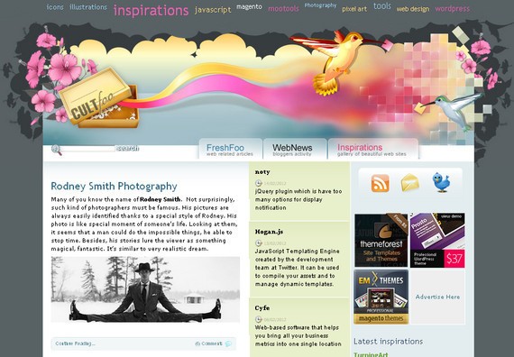
7. Cult Foo
Creativity and innovation have been taken to the next level in this header design. You will simply be mesmerized with the beauty and attractiveness of its design. Quite a unique approach.
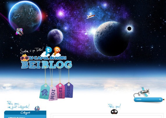
8. Bei Blog
This header makes you feel that you have entered the galaxy. The color theme is excellent and all the design elements complement each other.
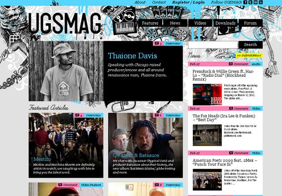
9. UGS Mag
Although unique and creative in its own way but quite clumsy and cluttered. May be the background image could have been little bit better.
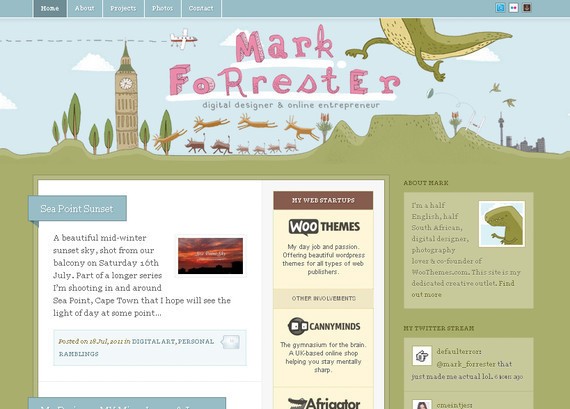
10. Mark Forrester
With such a soft color tone and nice graphics, this header design sets itself apart from the other headers in this collection. The creative approach of the designer must be praised.
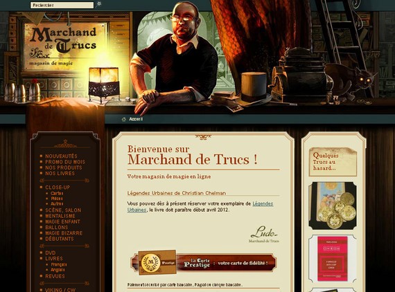
11. Marchand de Trucs
This uniquely designed header is different from the ordinary website headers. The navigation is placed at the side while the header area features only the most important links.
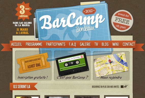
12. Barcamp Bordeaux
With bold typography and large images, this visually alluring header design attracts loads of visitors’ attention while providing an effective navigation plan.
13. Broke Design
A simply innovative approach for a website header. You will see an extraordinary use of creativity in this header design.

14. The Farmer and the Chef
This is another brilliantly designed header that speaks volumes. You can notice excellent creativity and originality of the theme being incorporated well in the design.

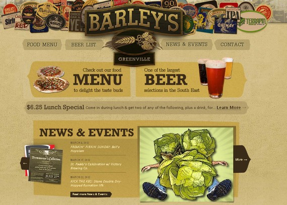
15. Barleys Green ville
This header design is a rather atypical design for a website header, however, this unusual design truly stands out mainly because of its subtle look and appeal.
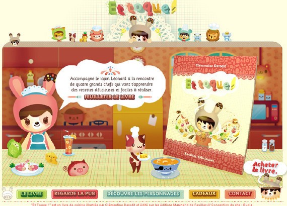
16. Bupla
This header design presents beautiful images to grab the attention of the onlookers as well as provide necessary information in its navigation plan to assist their visitors.
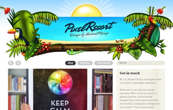
17. Pixel Resort
A colorful, lively and energetic header design is this. The use of color is excellent and will definitely bring a positive change in your mood.
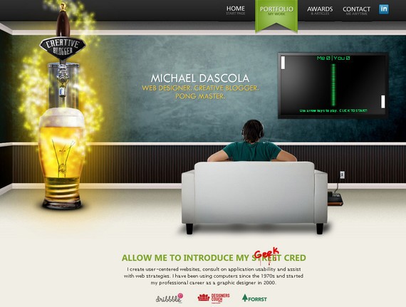
18. Mike Dascola
Mike Dascola’s header is the perfect combination of creativity and functionality. This headers features an unusual color combination that makes this header design memorable.
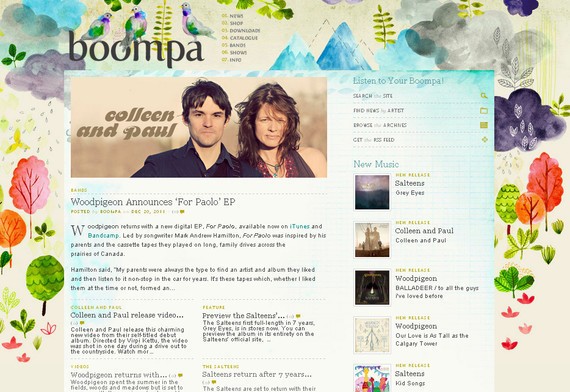
19. Boompa
Simple and uncluttered design that focuses on the simplicity and minimalism. The color theme is also very refreshing.
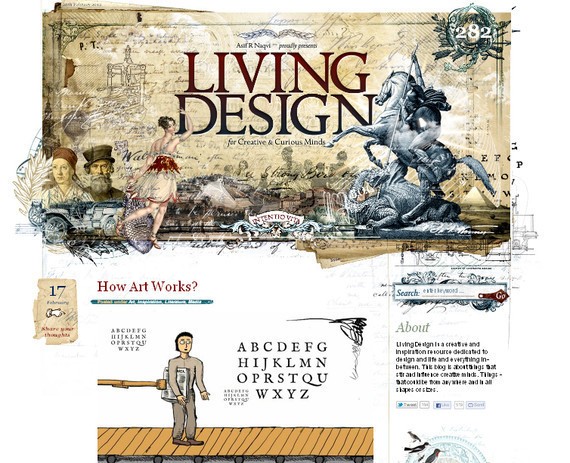
20. Living Design
In this header design, you will notice the creative use of images along with right kind of typography that can simply make a design outstanding.
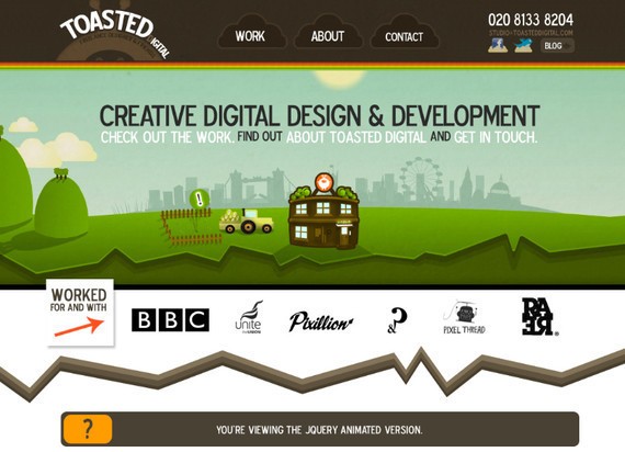
21. Toasted Digital
Here is another excellent example of a unique header design. Although this header design is somewhat similar to the standard headers but still it has some appeal.
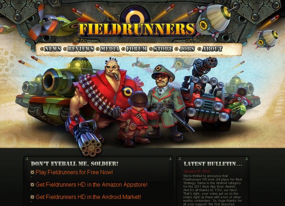
22. Field Runners
Bold and beautiful illustration along with sufficient information in the navigation menu makes this header design a memorable one.
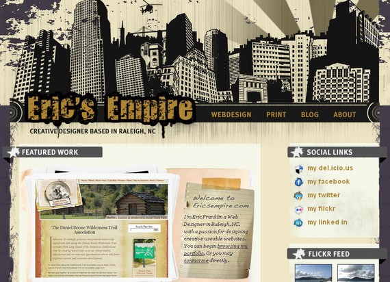
23. Erics Empire
In this header design, the designer has made use of some dark colors that successfully turns out well with the overall design.
24. Just dot
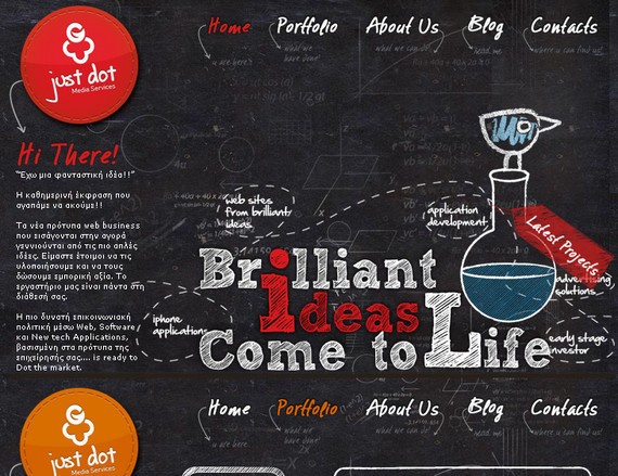
Just Dot makes use of a creative approach when designing their header as you can see the visually appealing mouse over effect and excellent typography have been incorporated well in the design.
25. Cochemer Stadtsoldaten
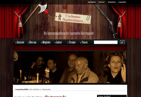
This header design is somewhat similar with loads of other header designs that you see on the net however the use of images and font selection are something that must be praised.
26. Florida Flourish
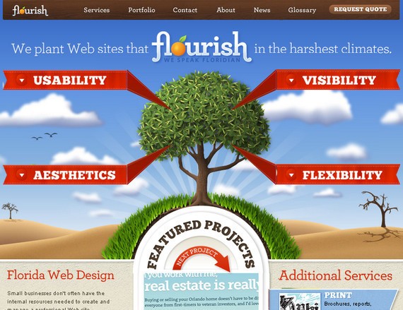
Florida Flourish’s header design can be described as being sophisticated and stylish while presenting all the basic functionality.
27. Giselejaquenod
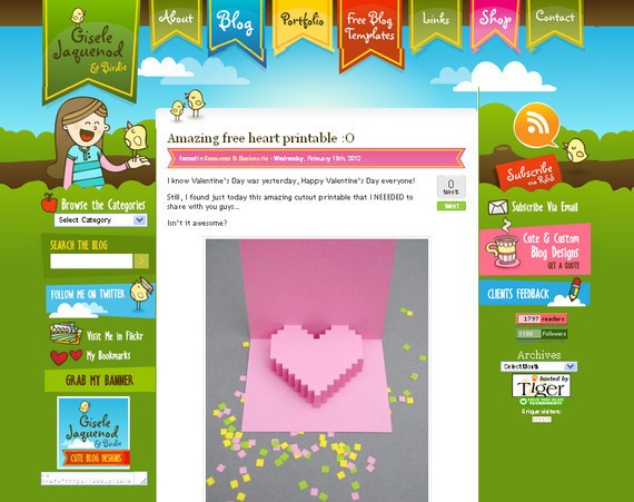
This is not an ordinary header, and this is the reason why it has been listed in the showcase of creative header design.
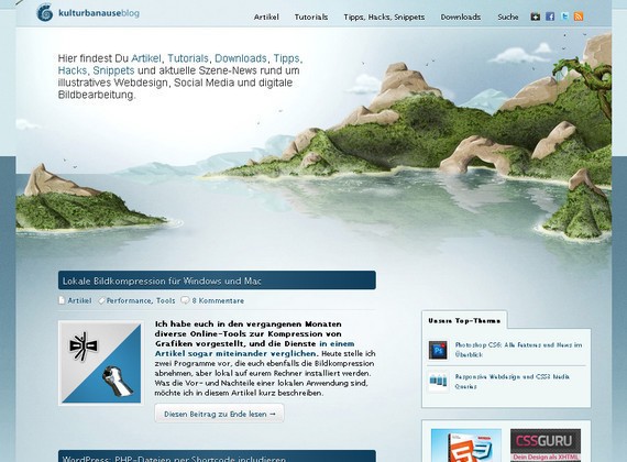
28. Kulturbanause
Nature is the best source of inspiration and this is apparent from this header design. See how inspiring the nature is.
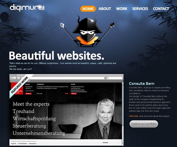
29. Digimurai
Simple but attractive header design that does not perplex its visitors with plenty of graphics and ambiguous navigation.
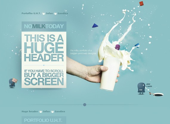
30. Nomilk Today
In this header design, you can notice the use of big typography along with subtle use of color that blends well with the other design elements.
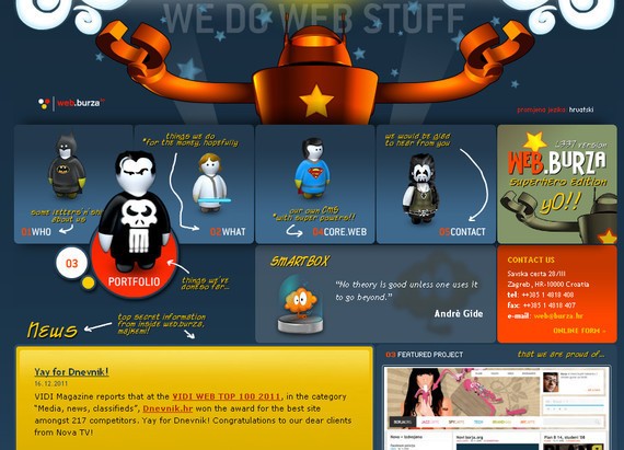
31. Web Burza
The color palette and high quality graphics are the highlights of this header design that are making it exceptionally alluring and fascinating.
32. Alexandregomes
With soothing colors and well placed design elements, this design makes its place in our showcase of creative headers.
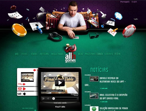
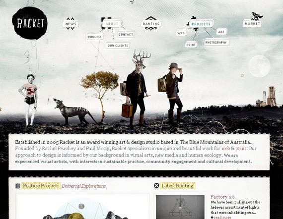
33. Racket
Last but not the least, the creativity being presented in this header design is also above the par; and this is the reason why this design appeal loads of visitors.
In the next section we will take a look at some creative usage of ribbons, as they are often used in headers and navigation menus.
Creative uses of Ribbons in Web Design
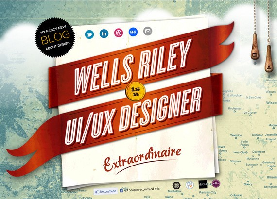
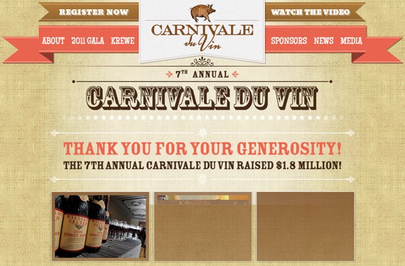
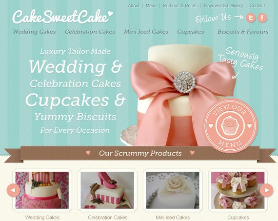
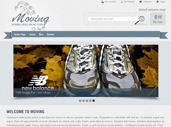
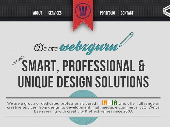
You must have noticed the increasing trend of using ribbons in web design. By using ribbons in web design you can make the noteworthy objects of your website more appealing and prominent. More often than not, a ribbon is used as background for navigation. Here is a beautiful and inspiring showcase of some visually appealing web designs that feature ribbons.
1. Wells Riley
2. Carnivale du vin
3. Wp1000 Themes
4. Urban off
5. Decorama design
6. Tech jobs under
7. Future of car sharing
8. Pistachio app
9. Small studio
10. Le tipi
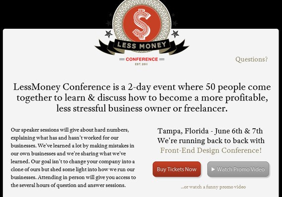
11. Less Money
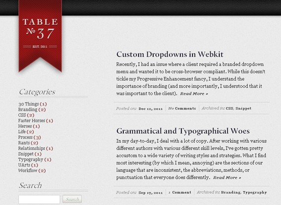
12. Table 37
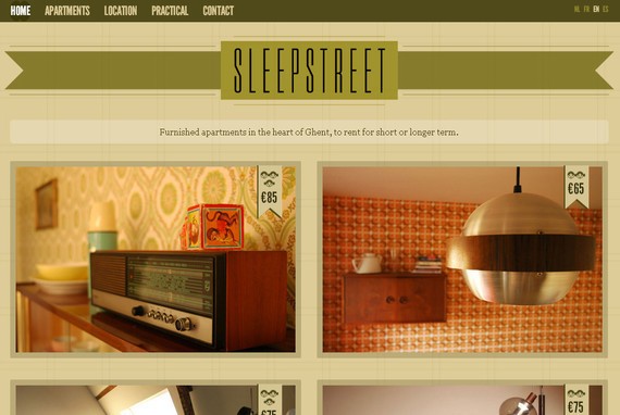
13. Sleepstreet
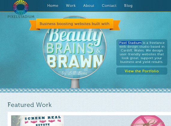
14. Pixel Stadium
15. Simple as milk
16. Fe.Rocious
17. Quote Roller
18. Tapp3 Media
19. Jopp Design
20. Tanya merone
21. X graphica
22. St. Kilda High Hopes
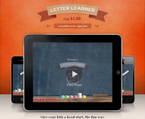
23. Letter Learner
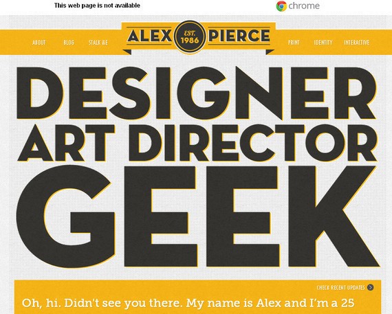
24. The Portfolio of Alex Pierce
25. Rockaholic

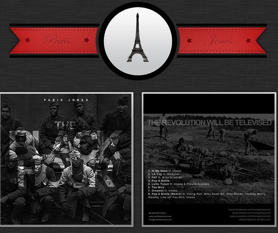
26. Paris Jones
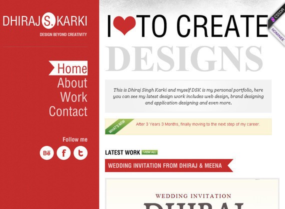
27. Myselfdsk
28. Made by Chipmunk
29. ParkBud
30. Appmiral
31. Sunday Best Websites
32. Cake Sweet Cake
33. Moving
34. Webzguru
35. Ruby Bots hosting
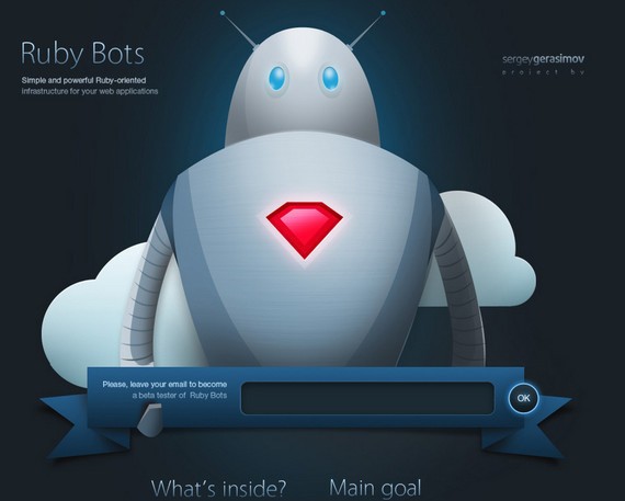
Here a dark blue color ribbon that lets you give your email address and become a beta tester of Ruby Bots. The graphic elements also liven up the ribbon look.
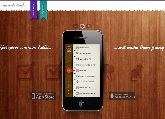
36. Run do to-do
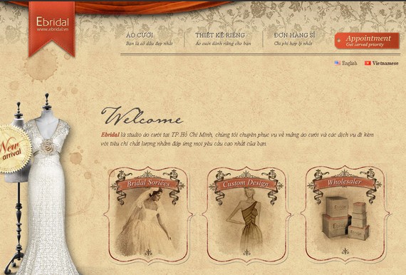
37. Ebridal
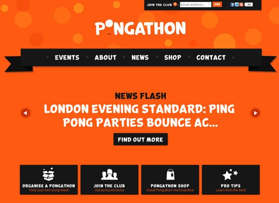
38. Pongathon
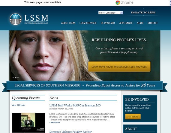
39. Legal Services of Southern Missouri
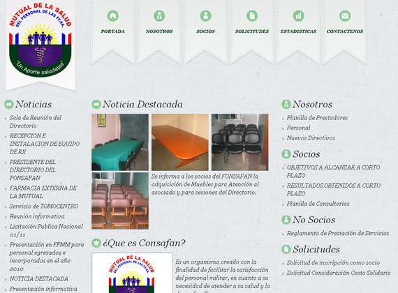
40. Consafan
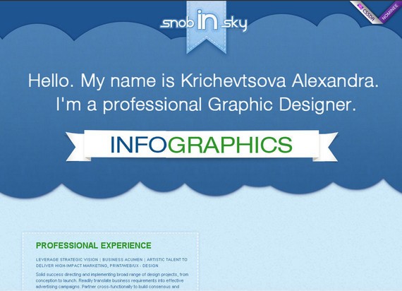
41. Krichevtsova Alexandra
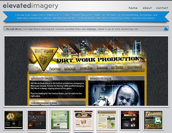
42. Elevated Imagery
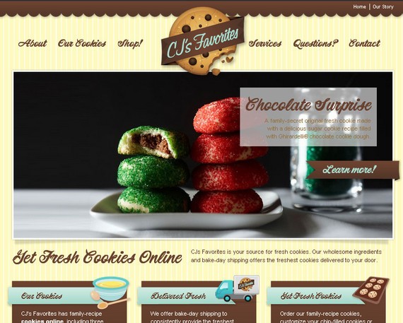
43. CJs Favorites
Now let’s see how your header can make or brake your website. Why can header drive people away from your website? Find the answer below.
Know Why Your Website’s Header Is Driving People Away
Whichever website you visit, the first thing that you will notice is the header image of that website. Later on, scrolling down the page or admiring the header image is something that depends on the purpose of your visit. The point is that the header image (or, to be more generic, the header section) is a very important part of any website design. Header images have been an integral part of websites for a long time, but lately original designers have given a whole new life and excitement to header images. It is the header image that initiates the mission of any website and a dull header image might just kill the experience.
Today, we will go through the basic semantics of header image design and how the very default looking header images are still sitting on most websites. We will try to figure out what web designers can do to create jaw dropping header images and use examples to understand how designers are actually implementing original ideas.
Old is no more the gold
Gone are the days when a regular rectangular header image design will be good enough for your upcoming website design. Notice that if your website is very old and has its own fan following then you might not have to experiment with header images, but if you are new in business then you have to do something different so as to attract visitors. I am sorry to say, but the wrapper of the chocolate is an important reason behind you buying that chocolate. Get it?
There are plenty of default designs and plugins available that make it super easy for website designers to come up with a basic header image but that just isn’t helping you out. If you want to be part of this business then get real. Think. Out. Of. The. Box!
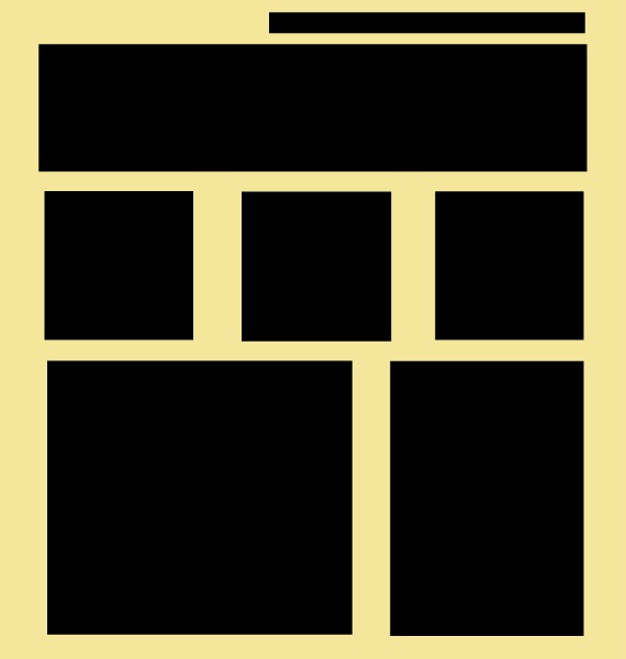
It will sound a bit weird if we tag something as default design in today’s website design industry, but unfortunately it is true. The structure that you see above has become, more or less, the default website design for those who want to go live real quick. Register a domain, pick up a template and you will be live within minutes. But, is that of any use? The ready-to-go designs help you go online but don’t help you get the attention of internet surfers. True?
So, how can we actually take our first step toward out-of-box looks? What can one really do with the default header shapes, sizes and designs? Aren’t they supposed to be what they are? Well, they are supposed to be the way they are, but with a little tweaking we can actually make them look super attractive. Here are my suggestions when it comes to tweaking your header images:
Submerge!
Don’t compare this tip with something that pops out of the screen due to its amazing design. Rather, what I am trying to suggest here could well be a simple but unique way to make your headers look different from the rest. This is actually the easiest too, once you are into it.

Look at the header image of Gary Nock. It is more or less merged with the rest of the website design. You will never find such kind of rectangular in shape header images. Rather, such header images submerge with the rest of the design which as a result gives the website design the clean and riveting look. So, when I say “submerge” then I mean merge your header image design with the rest of the website design in a fashion that the old rectangular look of the website is not around to turn off your readers.
Break The “Text Book” Definition of Dynamic Headers
Enough of the jQuery codes to make your headers look dynamic. Can’t we make them look a bit different considering the fact that almost everybody is either using a jQuery based header or a (good old) flash header.
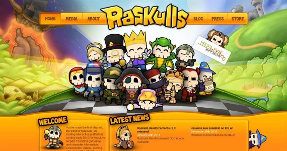
Check out the above header design from Raskulls. The website has done well to balance the looks of a dynamic header with a clean header image. The end result is a sleek looking header image that does justice to the niche of Raskulls. See, I am not asking you to give up on jQuery or Flash either. What I want you to understand is that it is high time that we start looking for header image designs that are sleeker and different from the rest. You’ve got to stand out to attract visitors.
Ditch the Rectangle
I won’t give you an example in this case as my first tip of submerging the header image with rest of the website design was almost similar to this. See, we are used to the usual rectangular looking header images. As I said before, they have become part of the default website design which is of no use. What if you ditch the rectangle shape of header images and look for something which is different. This is when you will attract attention and that is the sole purpose of your website. True?
Ditch the Header Itself!
OUCH! What was that?
Well, that was getting rid of something that confuses you the most. If you are not happy with your rectangular looking header image design and you are not sure of anything different then why not just ditch the header itself? Why can’t we start with the content directly and use a small square in the sidebar for the name of the website? What is the real problem? There isn’t any hard and fast rule suggesting that headers are a must for a website design, and if it isn’t a rule why do we actually have to stick with them?
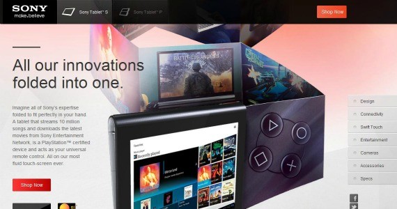
Have a look at Sony’s portal displaying its tablets. Sony has smartly left only a little amount of space on top for the name and menu while the rest acts as the place where content is displayed. Really, if you are not sure about the kind of header that you should use then you will be better off ditching the header. Try it!
Keep Thinking Different. Don’t Give Up!
This is supposed to be the usual tip of any inspiration pointers and it applies here too, but with a slight difference. The point that I want you to understand here is that if you keep trying the different looks for your header image then you are bound to come up with something which is a lot better than the rectangular looking header images. And, trust me on this one, any header shape will look better than a rectangular header image design.
Your hard work and your honesty should be reflected in your out-of-box header image design. This is when visitors understand the seriousness of your purpose and end up giving more time to your website. Also, keep changing your header images. Experiment with different looks and see what leads to a jump in your traffic. Try. Fall. Getup. Try. Succeed. Continue Trying.
Conclusion
Header images have come a long way. I know plenty of websites that have successfully experimented with header image designs, but I know so many who still go live without proper design plans. Please remember that you might be better off with a simple looking header image design if your website is old with huge visitor numbers. In that case, the visitors are aware of the quality of content that your website produces and this is when an attractive header image is not that important. But, if you are new in business then better take care of the looks of your website design otherwise be prepared to end up nowhere.
This post may contain affiliate links. See our disclosure about affiliate links here.


