There have been a lot of UI kits swarming around the market lately. Some include complete sets of User Interface elements and some focus on just one element. These kits often serve as a basis and template for web designers in creating wonderful web pages.
Because of these kits, web designers now don’t have to worry about running out of ideas. You can draw inspiration from these these UI kits and perhaps improve them. And this tutorial will hopefully add to that inspiration.
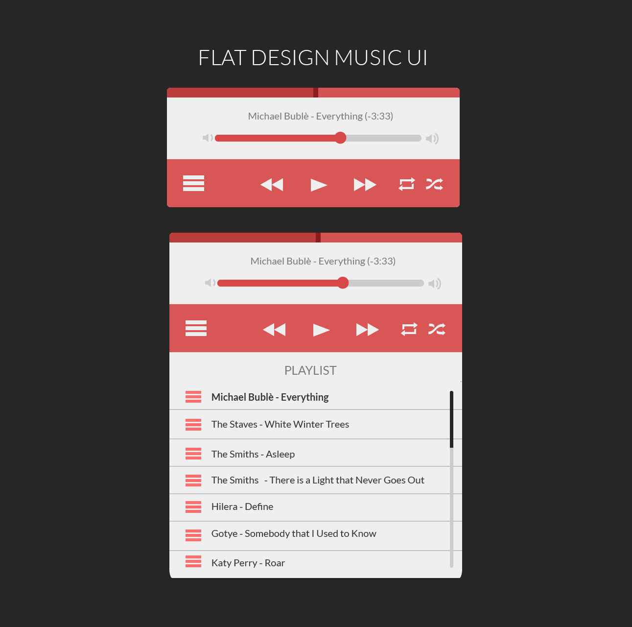
This is what we will be designing:
Your Designer Toolbox
Unlimited Downloads: 500,000+ Web Templates, Icon Sets, Themes & Design Assets
Table of Contents
- 1 Your Designer ToolboxUnlimited Downloads: 500,000+ Web Templates, Icon Sets, Themes & Design Assets
- 2 Resources You Will Need:
- 3 Unlimited Downloads: 500,000+ Fonts, Web Templates, Themes & Design Assets
- 4 Setting Up the Artboard
- 5 Mini Player
- 6 Creating the Controls for the Player
- 7 The Big Player (with Playlists)

DOWNLOAD NOW![]()
Resources You Will Need:
- The Adobe Illustrator software
- Lato Font
- This icon pack
- Some time and patience. (Less than 30 minutes)
Unlimited Downloads: 500,000+ Fonts, Web Templates, Themes & Design Assets
DOWNLOAD NOW![]()
Setting Up the Artboard
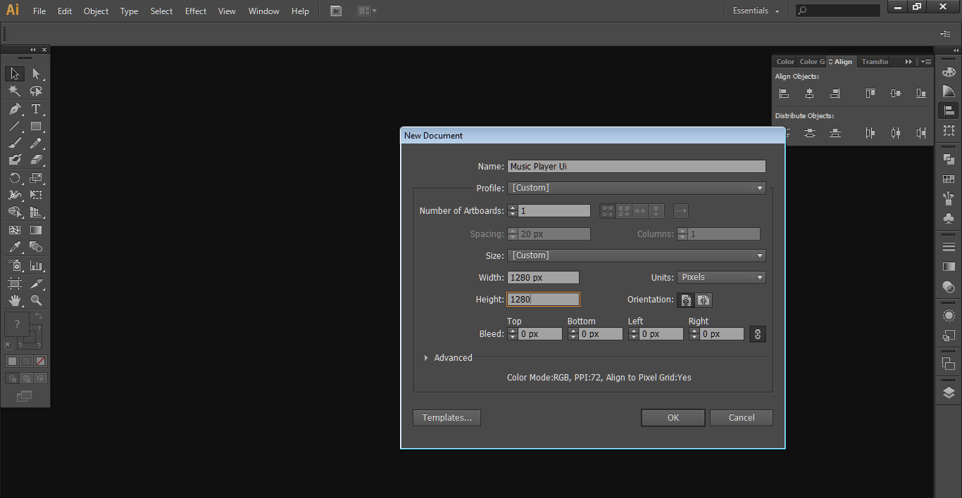
First, you need to open your Adobe Illustrator. Then, create a new document. For this tutorial, we will be using the file named Music Player UI (Or you can choose whatever you want to).
Make sure the profile you use is set for Web as you will be designing a web-based interface. You also need to indicate the number of artboards to use.
For this particular tutorial, I only used one artboard. Next, key in 1280 x 1280 for the size. Large scales in the designs so that it would still appear in high-quality even if you shrink it
Mini Player
1. Now, you have a blank square artboard. You can now proceed in creating the mini player.
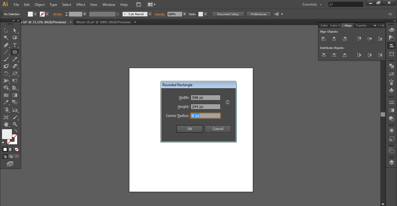
2. To do that, select the Rounded Rectangle Tool, double click any area in the artboard and draw a 598px by 244px rounded rectangle. Use 8px as radius. Color it #EFEFEF.
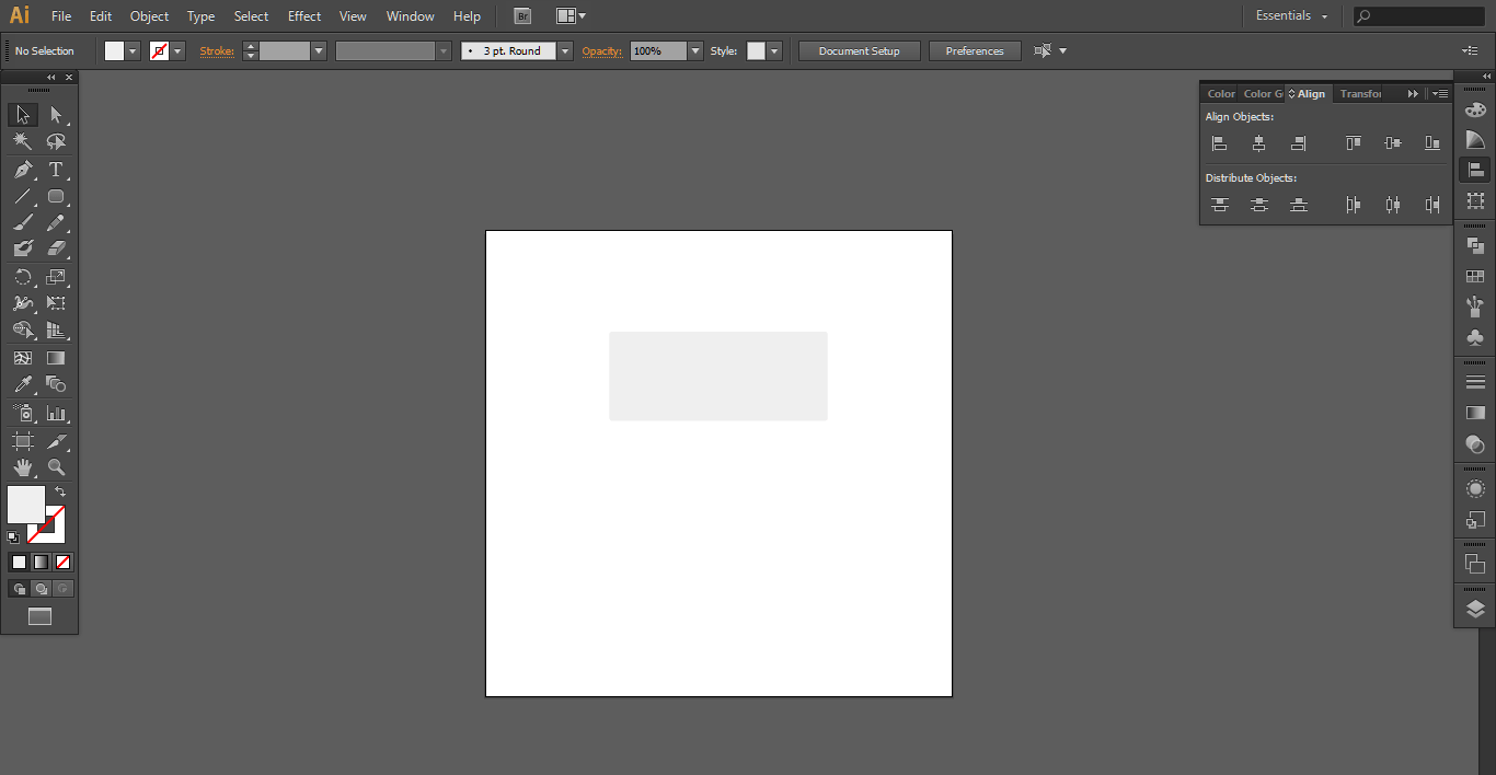
3. Now, create the track slider which is located at the top of the player. To do that, draw a rectangle tool over the gray rounded rectangle. Color it #D35353.
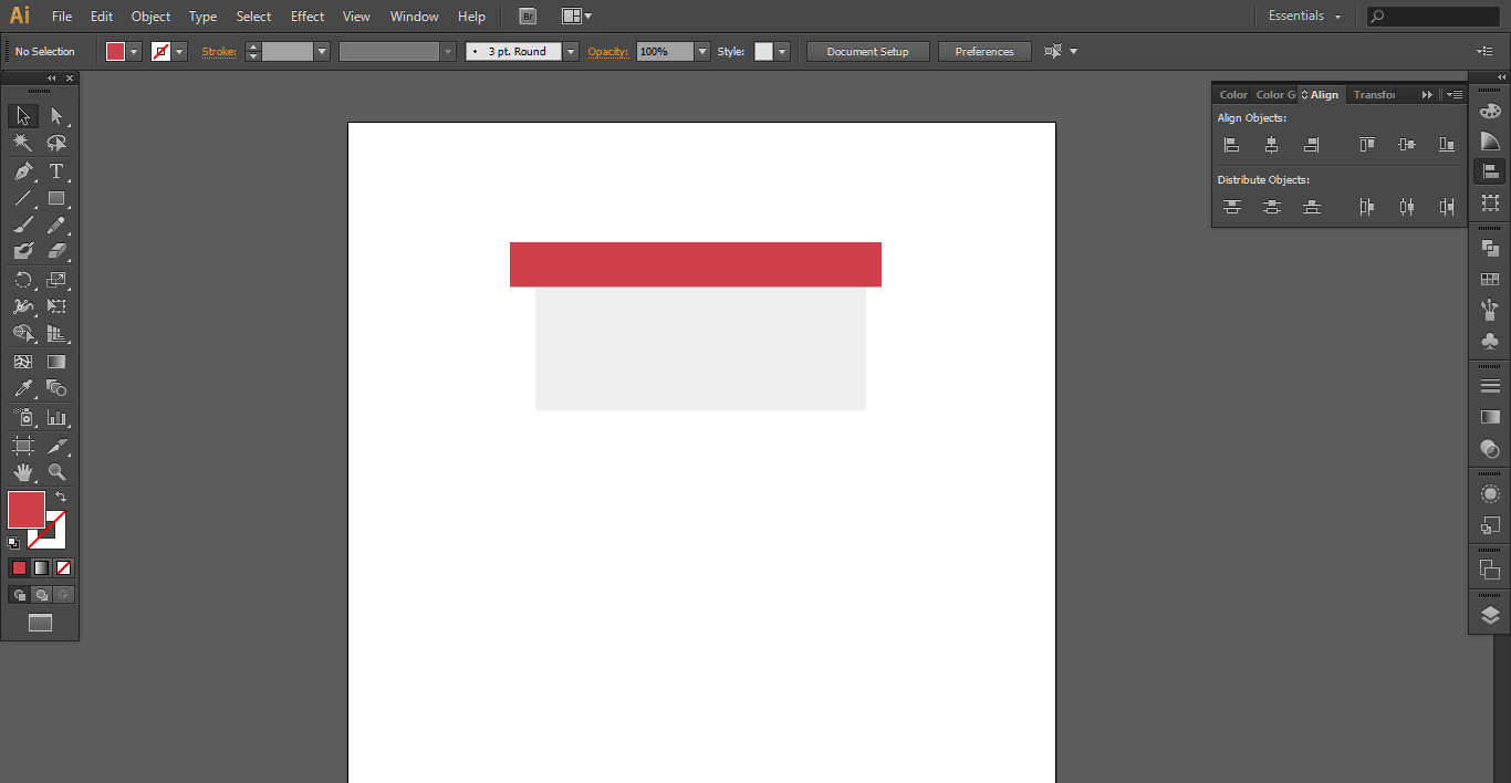
4. Next, select the two shapes. You can either press CTRL + A or click on the shapes while pressing CTRL + Shift.
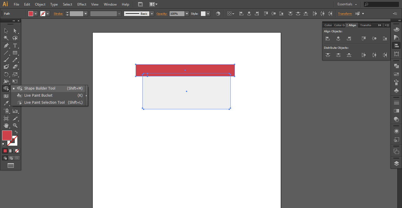
5. When you have selected the shapes, use the Shape Builder tool (Shift + M) to perfectly fit the pink rectangle inside the gray one.
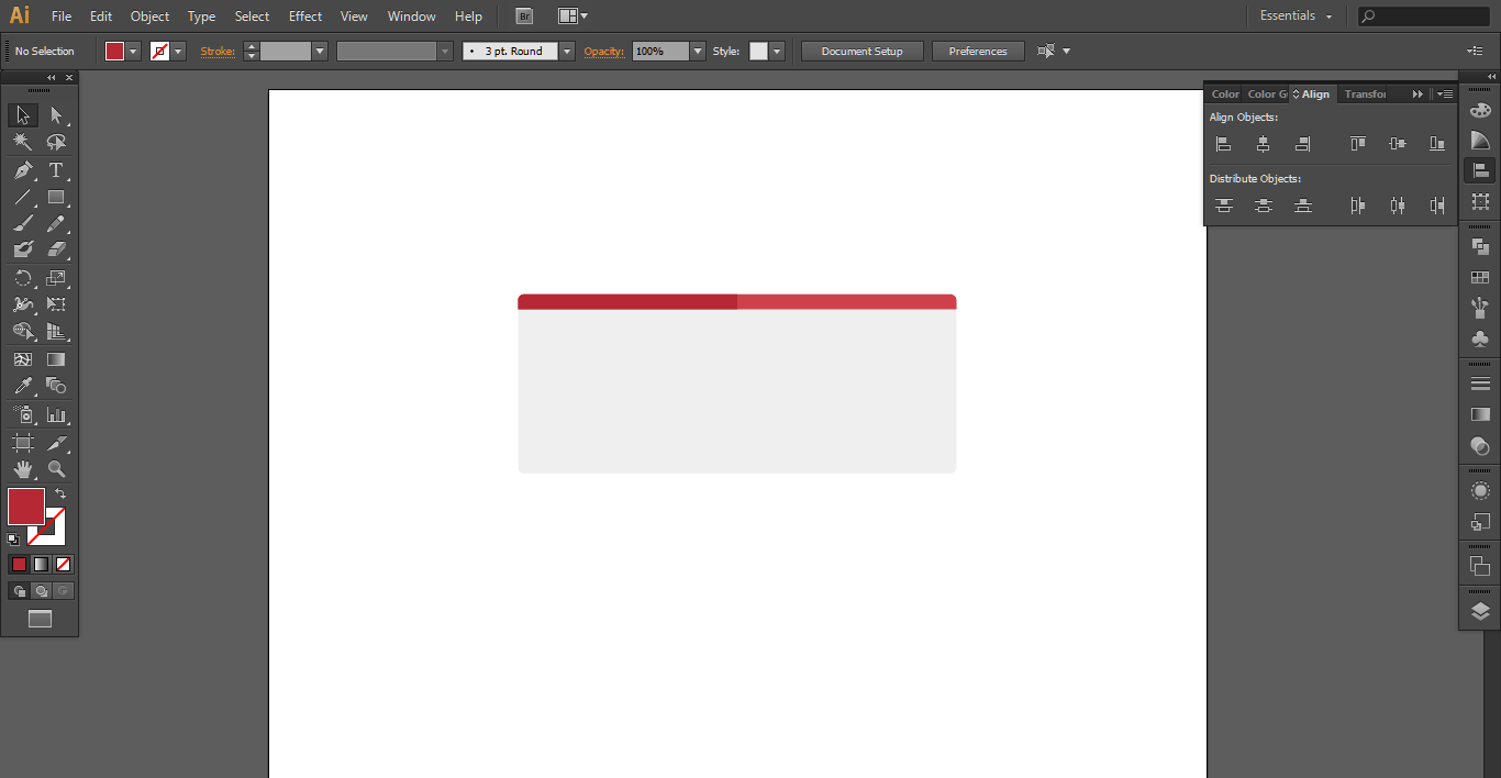
6. You can do this by clicking on the segment of the shape that you want to delete. After clicking on it, you will notice that the part of the shape that you have clicked now became an independent shape. You can now delete it.
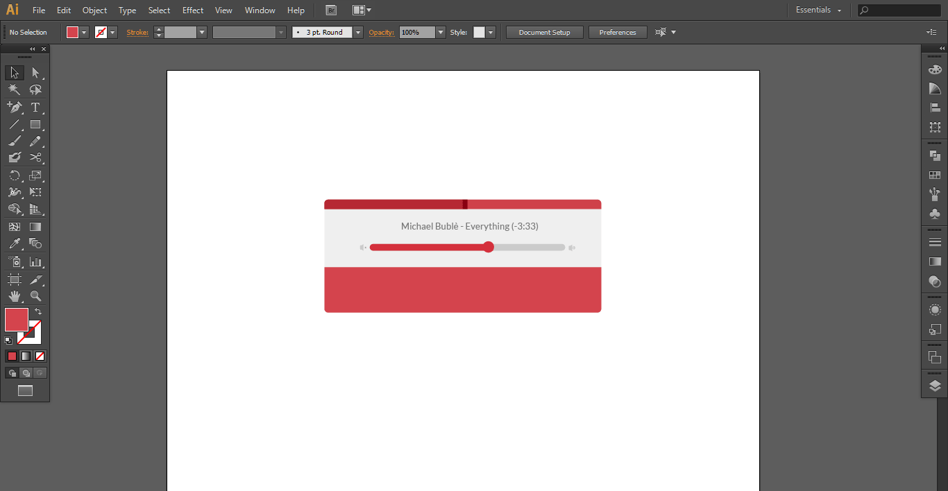
7. Repeat steps 4 to 6 to create a track indicator. Your work should look like this by now:

8. Next, put the title of the track currently playing. Also include the remaining time before the next track plays. Use Lato Regular font, 20pt, # 7C7C7C.

9. Then, move on to the volume indicator. Start by clicking on the rounded rectangle tool and create a 422px x 14px shape. Use the color # CCCCCC and add a 15px radius.
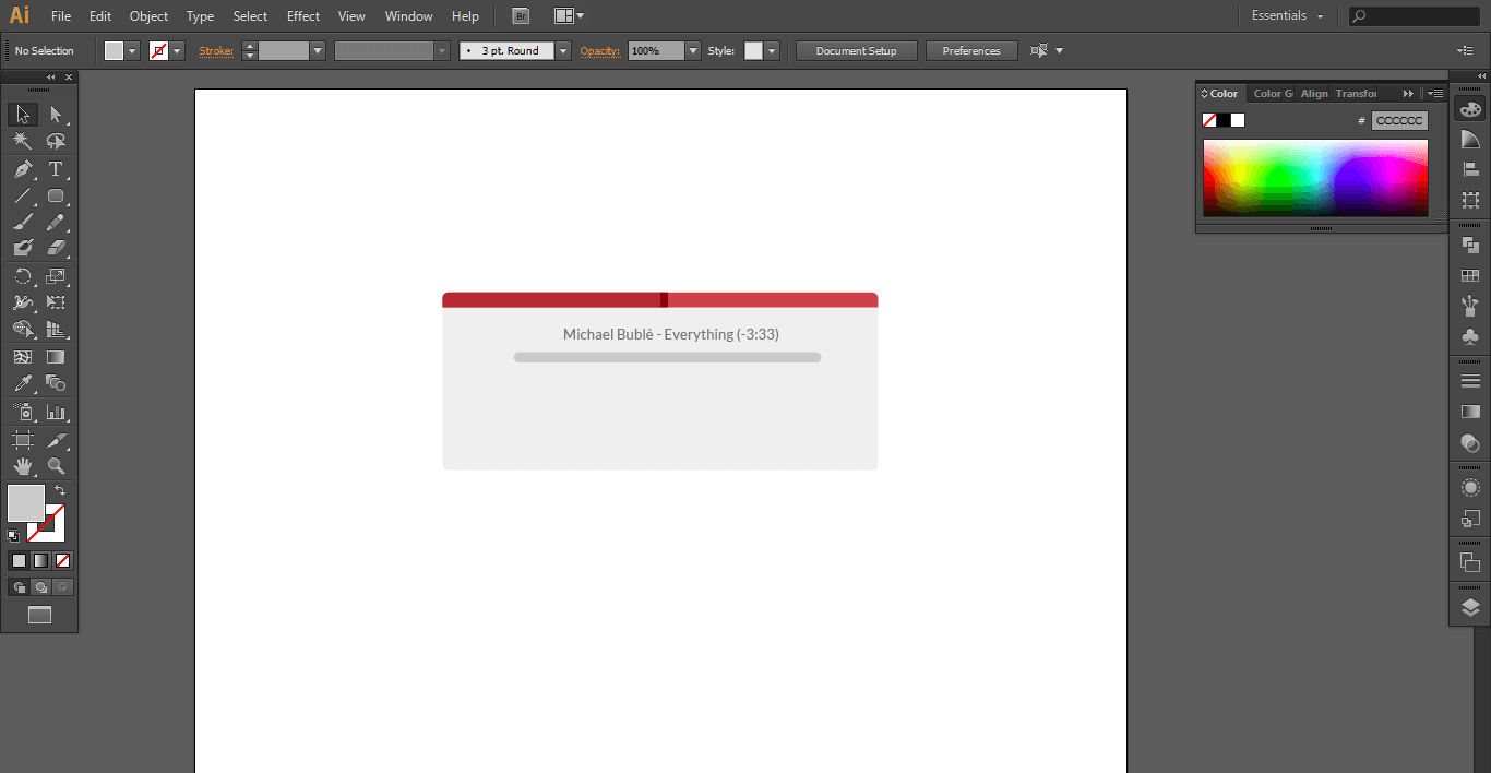
10. After that, create the volume indicators by drawing a rectangle over the previous rectangle. Color it #d84848. Select the path of the rounded rectangle and the rectangle above it and use the Shape Builder tool to cut the excess of the rectangle.
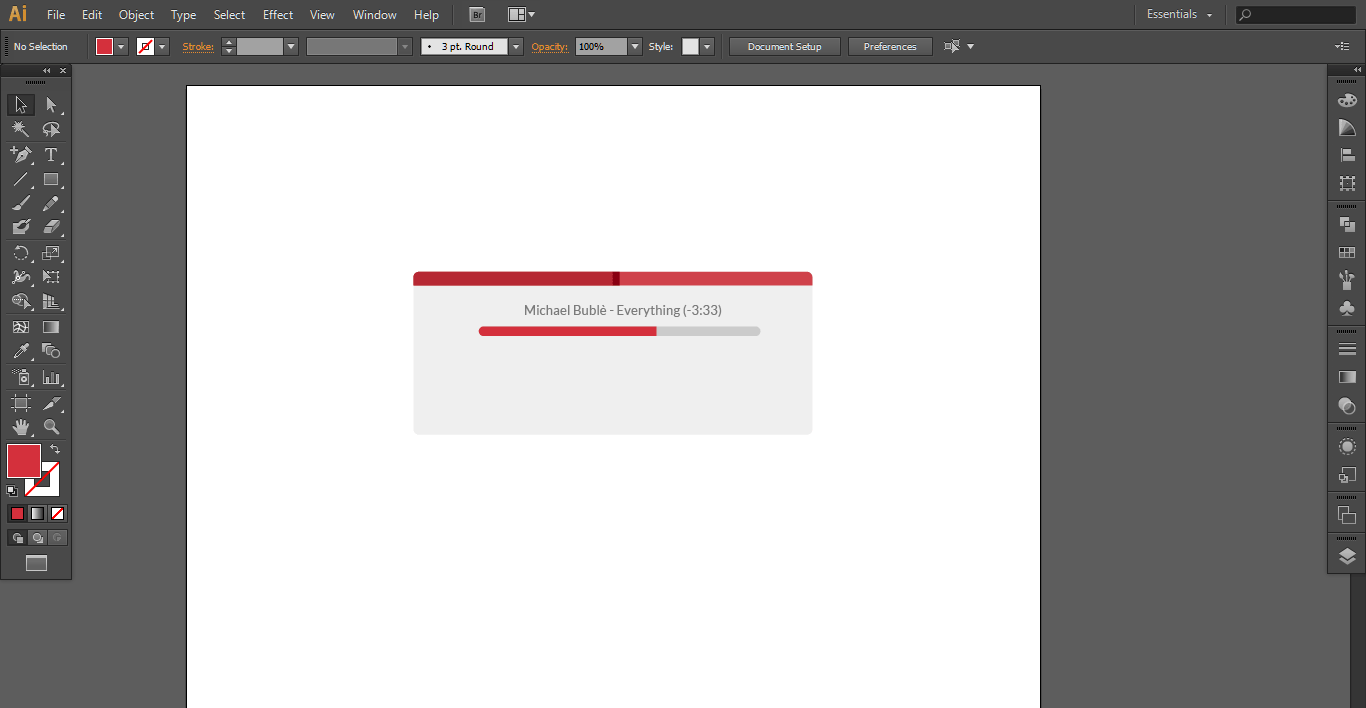
11. Now, draw a circle using the Ellipse tool (L) and color it # d74948. Add the volume icons located in the icon folder and place it in the ends of the volume slider.
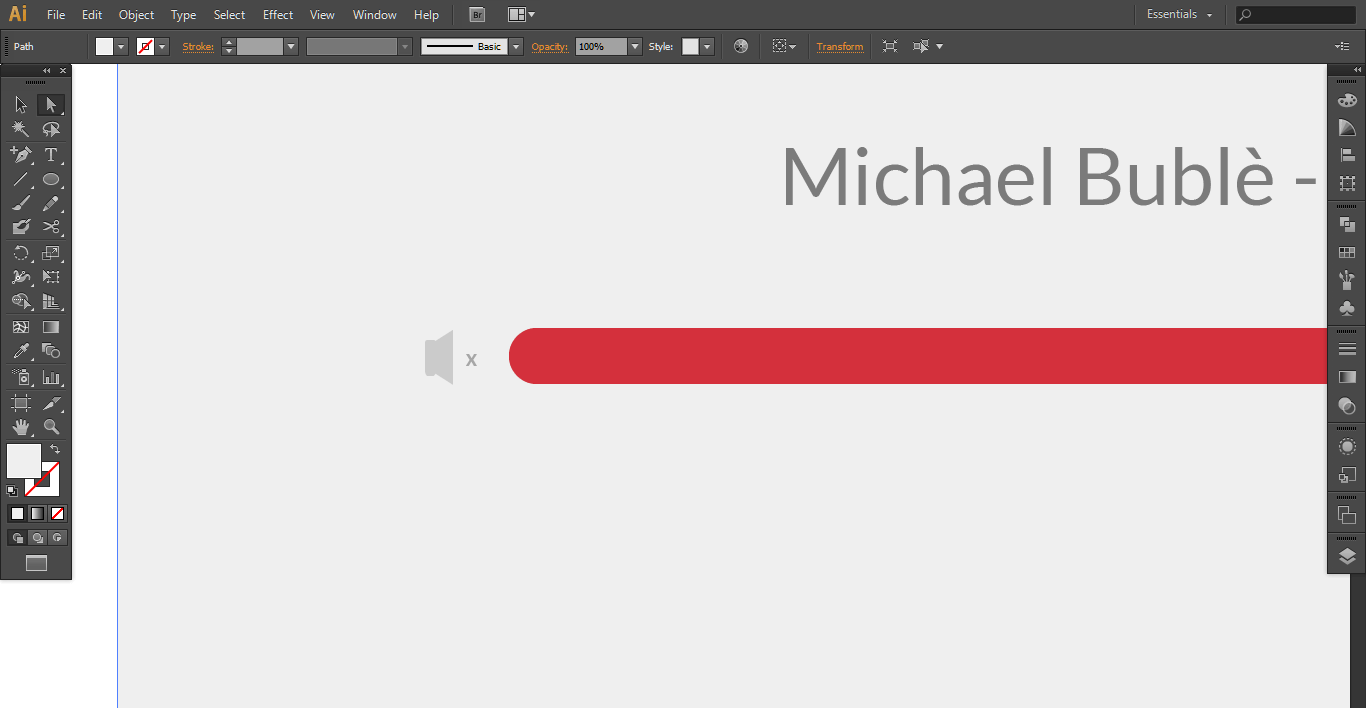
Creating the Controls for the Player
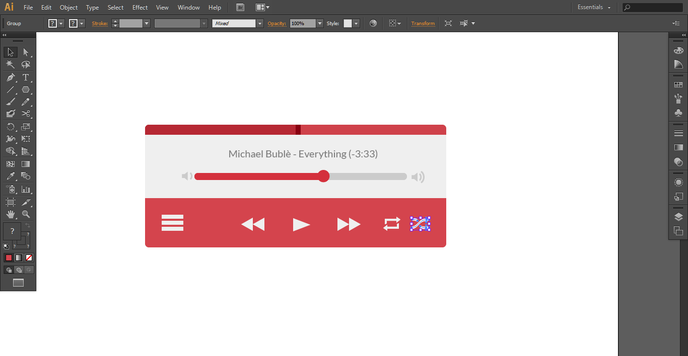
12. First, you need to create a placeholder for the controls. You can do that by drawing a rectangle tool over the main background of the player and color it #d85656.
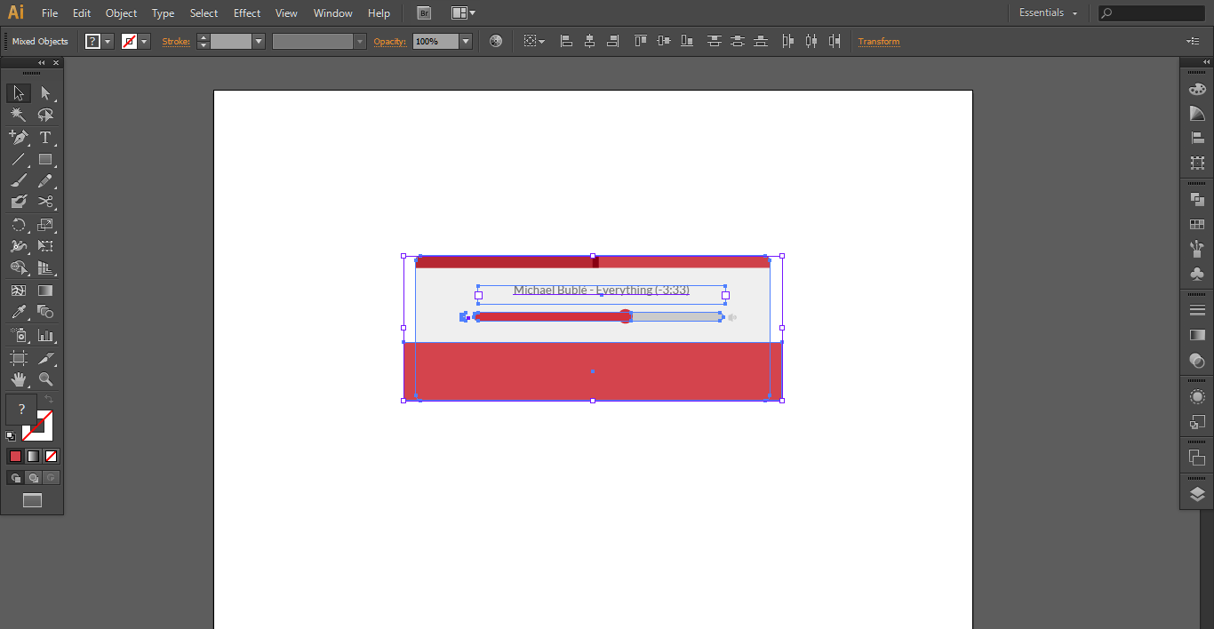
13. Cut the excess parts of the rectangle and make it look rounder using the Shape builder tool.
14. Next, add these elements.
The Big Player (with Playlists)
15. Start by copying all the paths from the mini player.
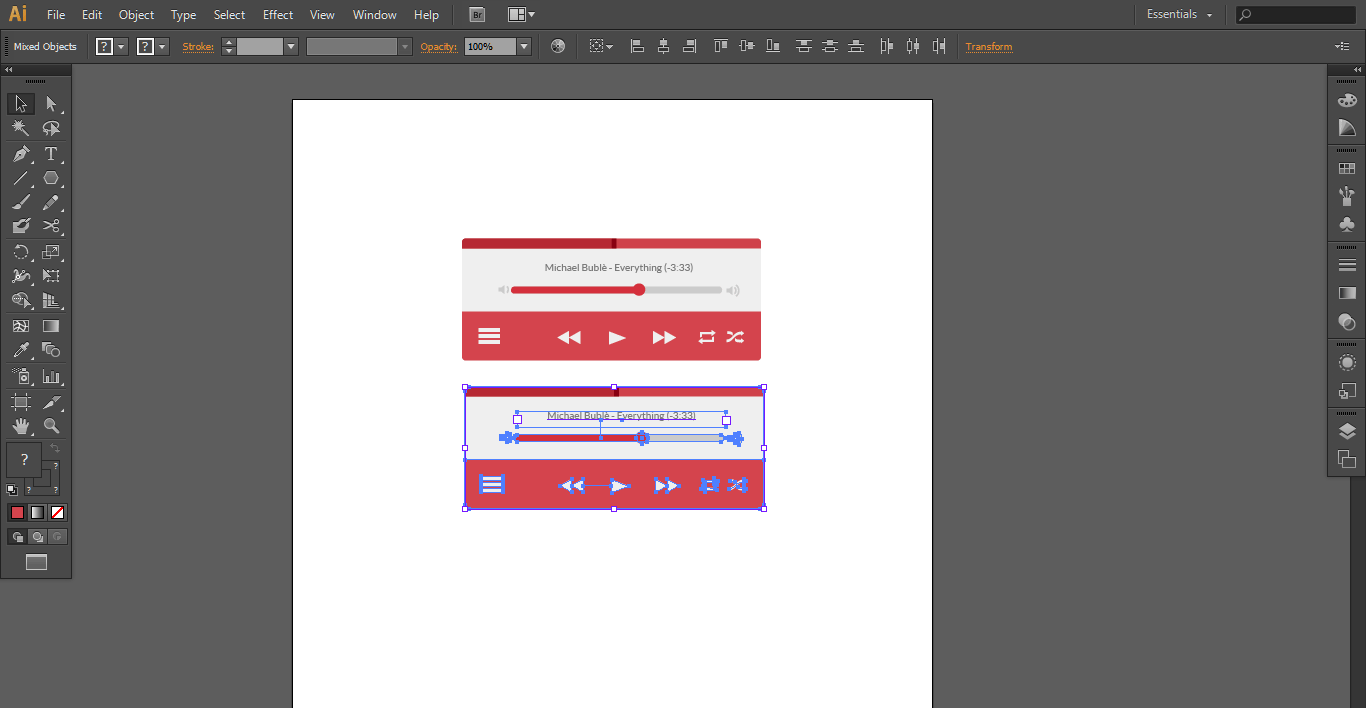
16. After doing that, extend the main background by around 460px (you can extend up to whatever size you want).
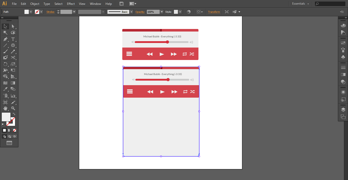
17. Next, extend the controls placeholder and let it go beyond the background of the miniplayer. Remove the excess using the Shape Builder too. Do this to make the placeholder look angular rather than its original rounded shape
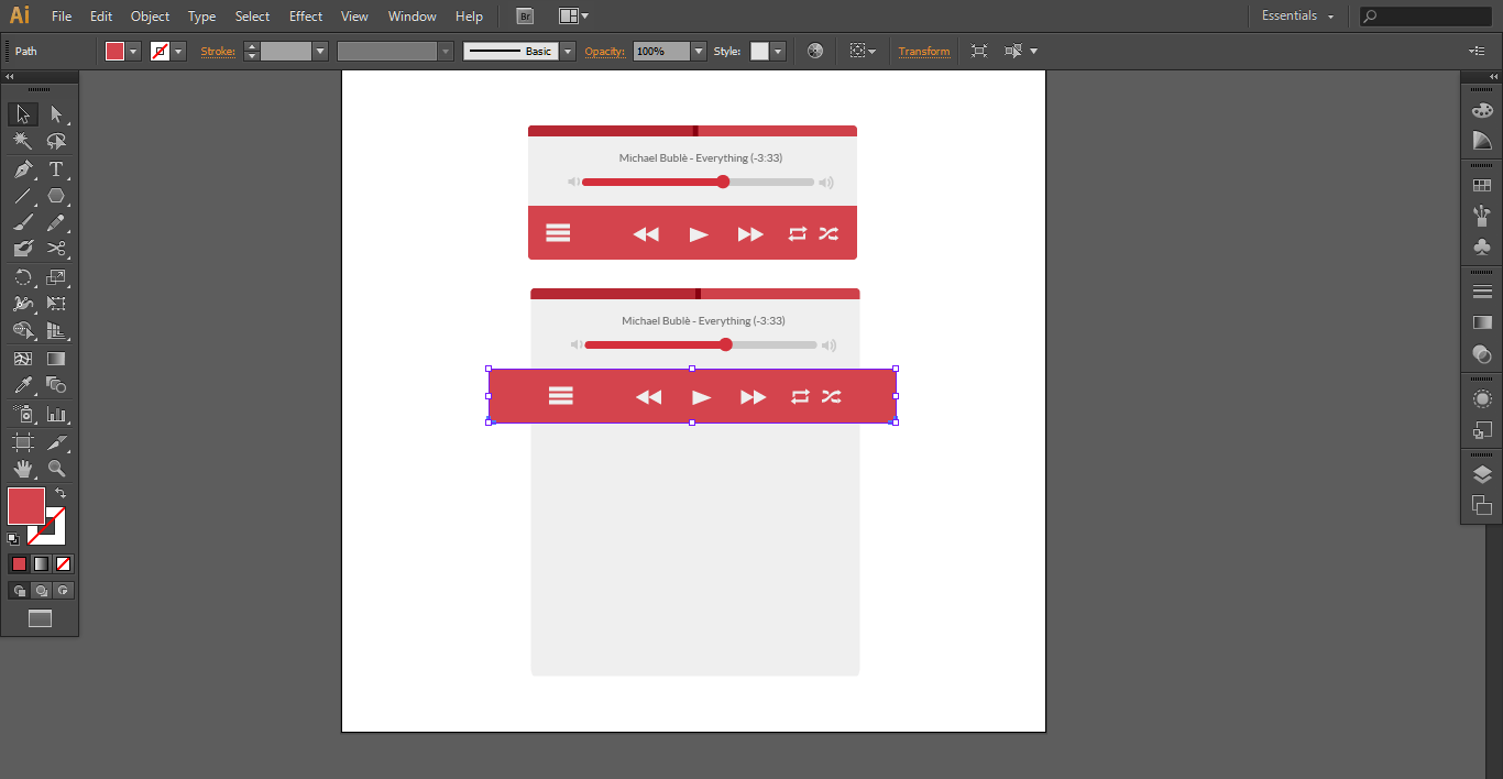
18. Next, add the playlist title.
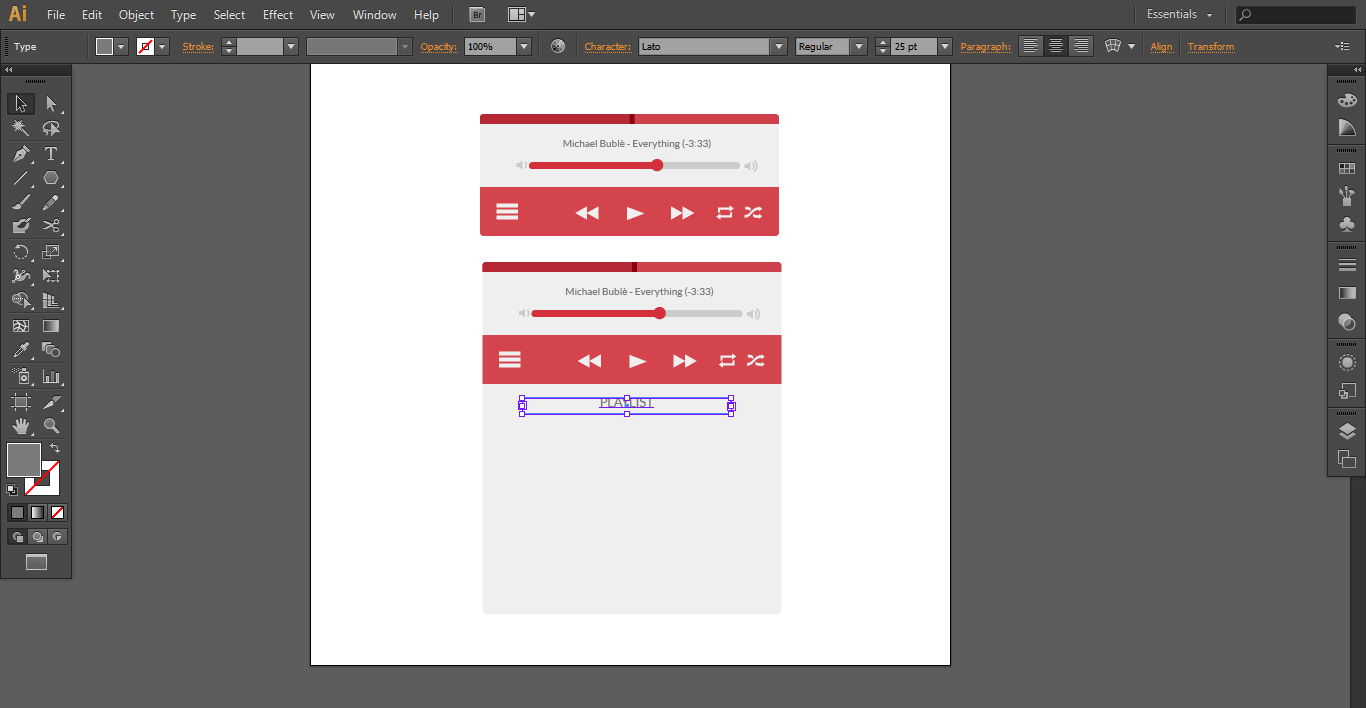
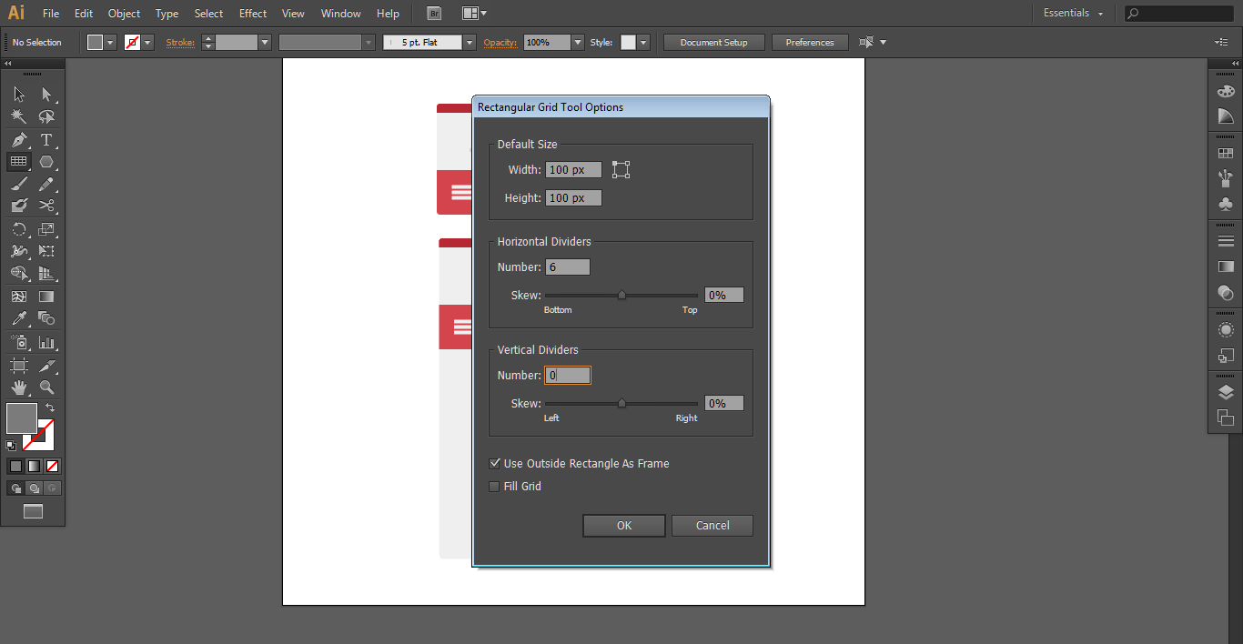
19. Using the rectangular grid tool, draw a grid of six horizontal divisions and zero vertical dividers.
20. Enlarge the grid and fit it into the player. Turn its opacity to around 20%. Remove the top horizontal line with by using the scissors tool (C).
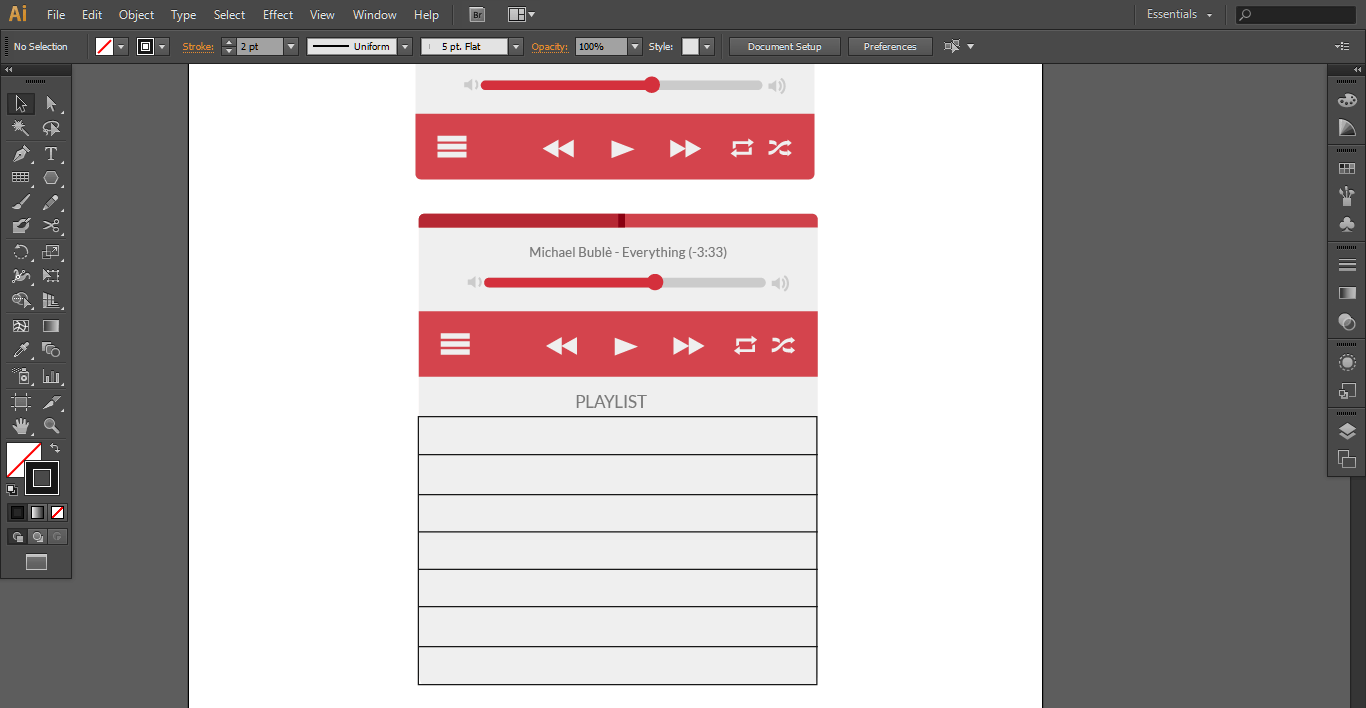
21. To use the tool, simply click on the portion of the path you want to delete, double click and press delete or backspace.
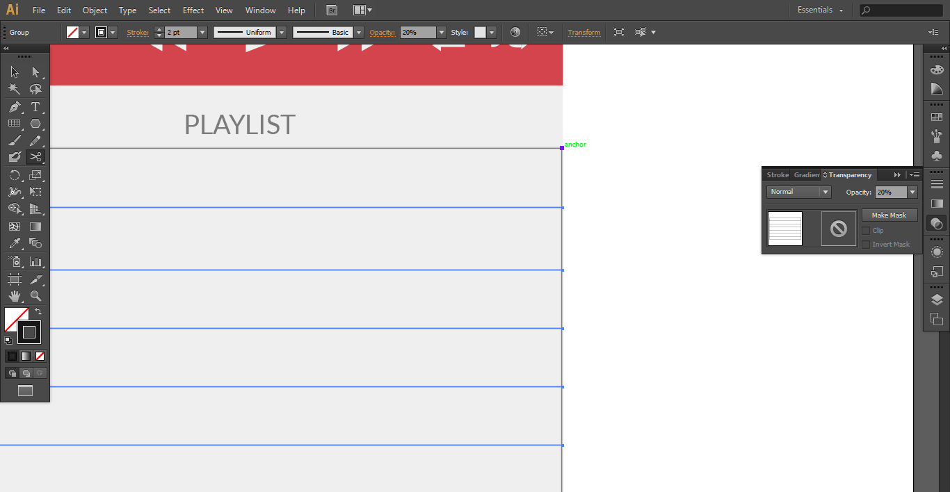
22. Now that the grids are ready, place the elements and titles.
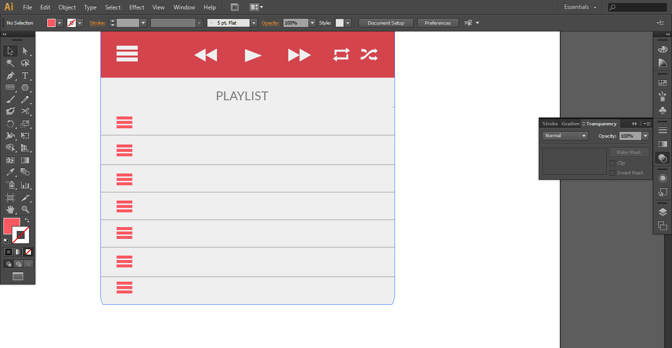
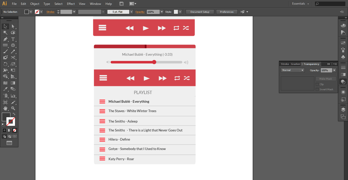
23. To cap off the kit, design a scroll bar. Using a rounded rectangle tool (#cccccc for the rounded rectangle and #262626 for the position indicator) and the Shape Builder tool, we would be able to create that easily.
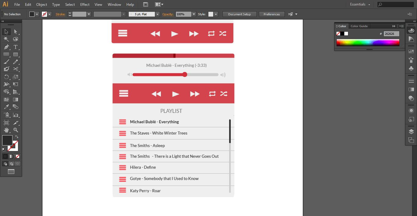
24. Now that you have the UI ready, save it. You can save it as AI, PSD, JPG, PDF or even SVG.
UI kits can help you boost your sales, especially if you are a designer with no experience. That is why, you should continue to develop your craft and become more creative. For now these bonus UI kits should do it to get you started. Enjoy!
This post may contain affiliate links. See our disclosure about affiliate links here.


