Knowing the difference between good and bad photography will help to make your design more appealing. Think of this: you are designing a website, some photos were given to you to choose from so you can attach one of them as a header image.
Because you don’t consider photography guidelines necessary, you could end up choosing that poorly taken photo. The result? A poorly designed end-product.
Your Designer Toolbox
Unlimited Downloads: 500,000+ Web Templates, Icon Sets, Themes & Design Assets
Table of Contents

DOWNLOAD NOW![]()
Of course, you would want to make your design better. To do so, you have to be capable of identifying which photo should be used and which one is not going to make the cut.
Let me just remind you that these are guidelines. Some of them may contradict each other. The best thing to do here is to understand each guideline and see how each works with the others.
Rule of Thirds
The Rule of Thirds is one of the most recognized photography guidelines. According to the rule, an image is divided into nine equal segments running through two vertical and two horizontal lines. The most important elements should be placed along those lines or where points intersect.
Have you ever wondered why your Instagram camera feature has grids? Those are for you to place your elements using the Rule of Thirds.
Applying this rule can make a pleasant looking and balanced image composition.
Here are a few other things you need to know:
- You can place the subject in the left or right. Centering the subject isn’t always beautiful.
- The subject doesn’t necessarily have to be in the guidelines. You still need to creatively place it, like placing great elements in a web design.
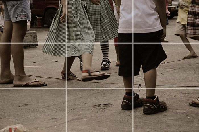
In this photograph, noticed how the subject falls on the imaginary grid:

The subject is placed on the right side of the image, just slightly nudged from the right grid. This becomes really effective because the subject becomes more emphasized, thus adding emotion to the photograph.
Horizon Line Placement
Horizons are great elements in landscape images. They beautify the composition because they tend to suggest distance and the fact that this can be a good background element. However, despite this, placing a great horizon line is often miss looked.
Most photographers place their horizon lines above or below the center point of a frame but never directly in the center. This is to properly emphasize the presence of the horizon. The only exception with this, perhaps, is when you shoot for reflections, which need to have equal elements at the top or bottom.
A good photographer knows where to place the horizon and use it to imply distance and perspective. It should also be straight. Askew horizons are often ineffective because they suggest chaos within the image and bad perspective.

Leading Lines
A leading line is an element in the photograph that draws your eyes deeper into the image, and most often, the subject itself. Leading lines are like imaginary sign boards that direct you by saying, “The subject is this way”. They lead you to a specific region in the photo that cannot be easily noticed.

Symmetry
Symmetry refers to the equality of both sides of the image. Basically, it’s saying what’s on the left is on the right as well. It means that there is balance on both sides, leading to powerful results.
Symmetry is one great way to break the Rule of Thirds because you don’t have to reason out why an image is at the center and does not run on the imaginary grid lines.

The example above shows a great use of symmetry. As you can see, the main subject of the image, which is the door, is not placed on either side of the photograph. Instead, it’s placed in the center, a position which the Rule of Thirds doesn’t identify as powerful.
However, despite being on the center the subject, the door turns to be powerful because it is symmetrical.
Viewpoints
If in the Rule of Thirds, we began to ask, “Where our subject is?” In this particular guideline, we ask, “Where are we?”
When taking photos, you need to take note where the image would look better. Will it become more dramatic when shot afar? When you’re above it, or on it? Will it look great if you will shoot it like how a bird sees the prey? Or how a worm looks up the sky?
Here are a few viewpoints to choose from:
- High Angle Shots – shots taken above the eye-line. It’s like the camera looks down on the subject. High-angle shots make the subject look powerless and vulnerable.

- Worm’s-eye View – are shots taken from below the subject but not on an angle where the camera is directly below the subject. Usually, in this shot, the subject has a vanishing point.

- Low Angle Shots – shots taken below the eye-line. It’s like the camera is looking up at the subject. This shot makes the subject look powerful and mighty.

- Bird’s-eye View – are shots taken from above the subject but not on an angle where the camera is directly above the subject. Usually, this shot is angled 40 degrees.

Notice the difference of this image from the high-angle shot. In the high angle shot, the camera appears to be directly above the subject. Also, the subject occupies a small space in the photography. On the other hand, this angle is taken on a higher ground but stands at a slightly tilted angle.
Point of View Shot – are shots taken on the eye-level. It’s like the camera is a person who is looking on the subjects.

Background
The background is one of the most rudimentary guidelines newbie photographers break. Remember that the background is as important as the subject.
Sometimes, backgrounds break the beauty of the photographs just because it isn’t too blurred. Here are a few things you need to keep in mind:
- When the background is full of distracting elements, widen the aperture and blur them.
- You can also change the angle or viewpoint if you don’t want a subject that stands out too much.

Framing
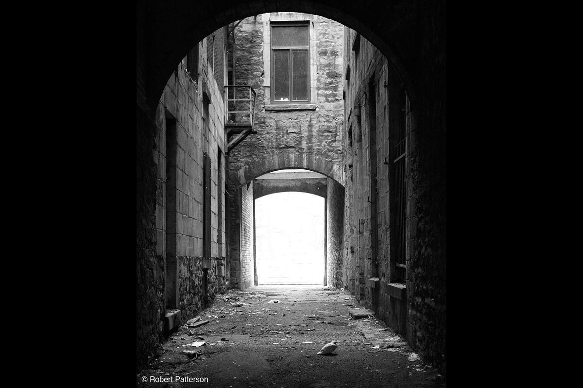
You can put frames within your photos by using trees, archways, and holes to isolate the subject from the other parts of the image. This will make the viewer focus more on the subject. The frame helps emphasize that the isolated one is always the subject.
Other things You can use as natural frames:
- Doorways
- Windows
- Mirrors
- Roots

Conclusion
Photography is also an enjoyable hobby to start on. Learning photography while you are designing websites can help you improve your designs. Understanding these important guidelines is the first step.
This post may contain affiliate links. See our disclosure about affiliate links here.


