Product photography is an integral aspect of any successful product marketing or eCommerce website. The quality and style of the photography serves to entice the visitor into buying the product as well as contributing to the overall visual design of the website.
Product photography varies tremendously from site to site, with each successful design tailoring the style to fit their brand. Some, like Apple, opt for a more minimal approach while others such as B&O look toward a slightly more aesthetically complex style with added elements and background visuals.
In this article we are going to look at ten of the most impressive websites currently using stunning product photography within their design.
Your Web Designer Toolbox
Unlimited Downloads: 500,000+ Web Templates, Icon Sets, Themes & Design Assets
Table of Contents

DOWNLOAD NOW![]()
You might also like to learn about the The Photography Guidelines Web Designers Should Know and Understand.
Le Labo Fragrances
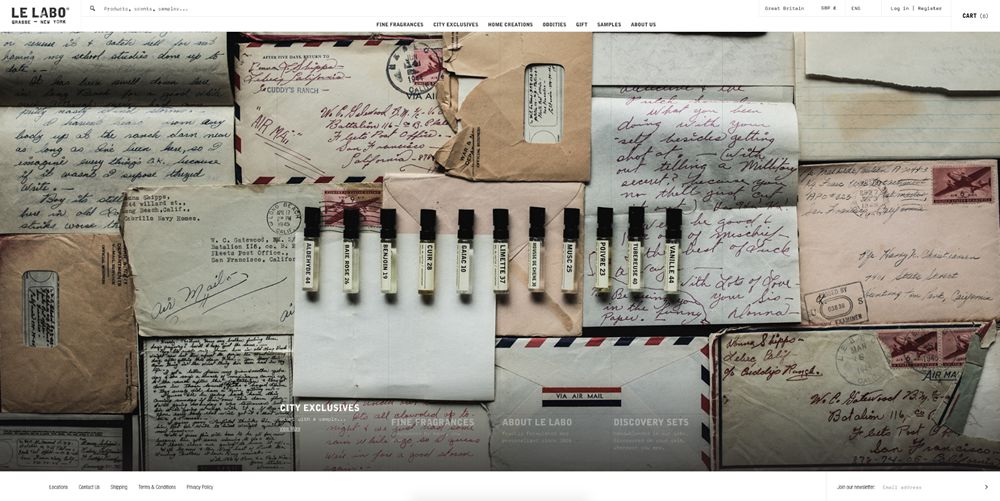
Le Labo enhances their vintage fragrance brand by including props such as old letters with beautiful script handwriting in the photograph background.
YIELD
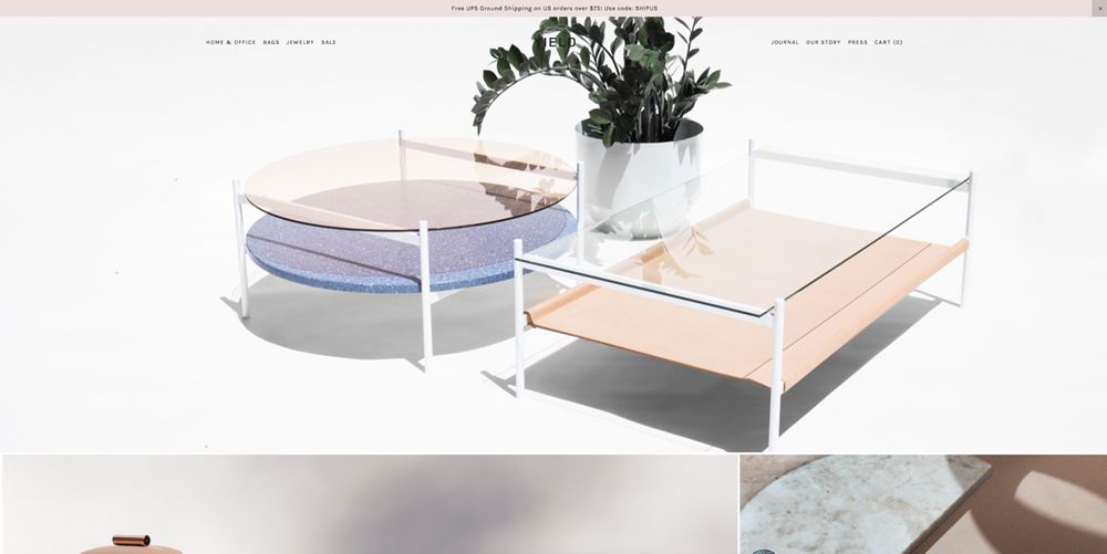
YIELD’s photography is wonderfully light and spacious. It utilises a simple white background to bring focus to the pastel colors and shadows of the furniture.
Helbak Ceramics
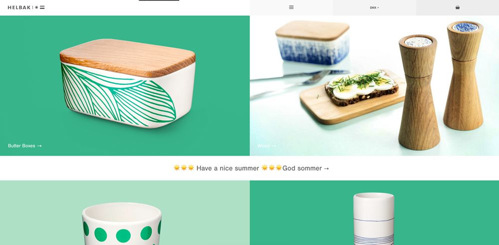
Helbak Ceramics emphasises cohesive green brand colors throughout its product photography. It uses a range of consistent angled shots and subtle shadowing to cast focus on the beautifully crafted ceramics.
Tomorrow Sleep
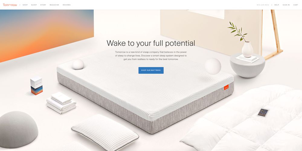
Tomorrow Sleep has engineered a mix of real photography with 3D mocks and digital photo effects. The result is a very structured and uniform product photography style which aligns perfectly with the simplistic design of their products.
Simply Gum
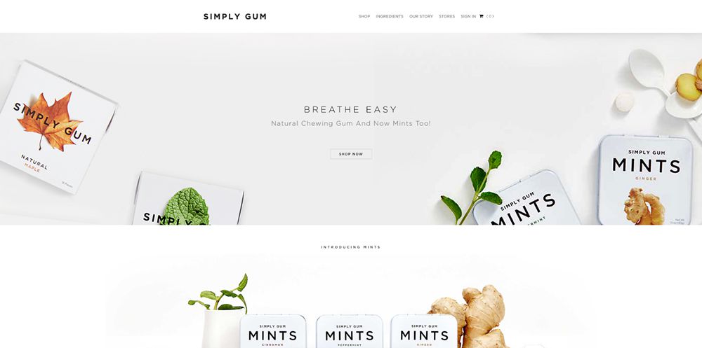
The product photography on Simply Gum’s website has a distinct focus around nature and natural produce. They include examples of their simple ingredients in many of the photos and this really helps to drive the message that their product is focused on wellbeing.
Kvell
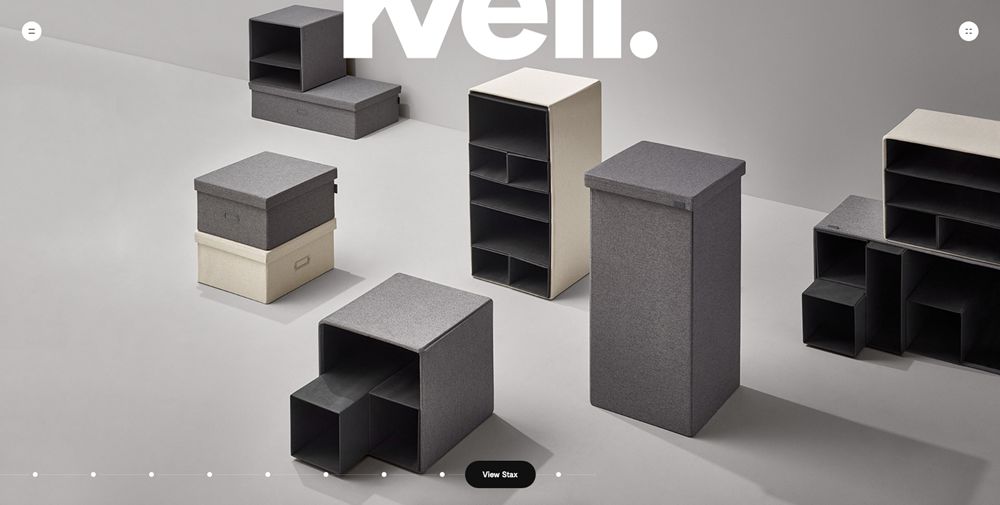
Kvell’s product photography is focused mainly on a two or three-color palette. It uses an abundance of lighting to create gradients and long drop shadows. The results is dynamic and effective in showcasing the simplicity of their products.
Ueno.store
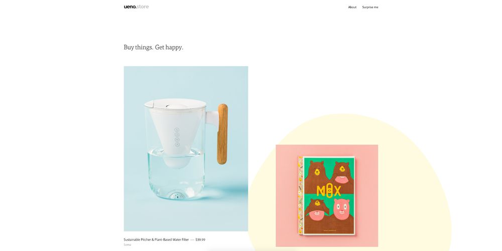
Ueno Store uses a simple one color background for its product photography. The beautiful pastel colors highlight the product perfectly and contribute to a very distinctive and minimal store design.
ETQ Amsterdam
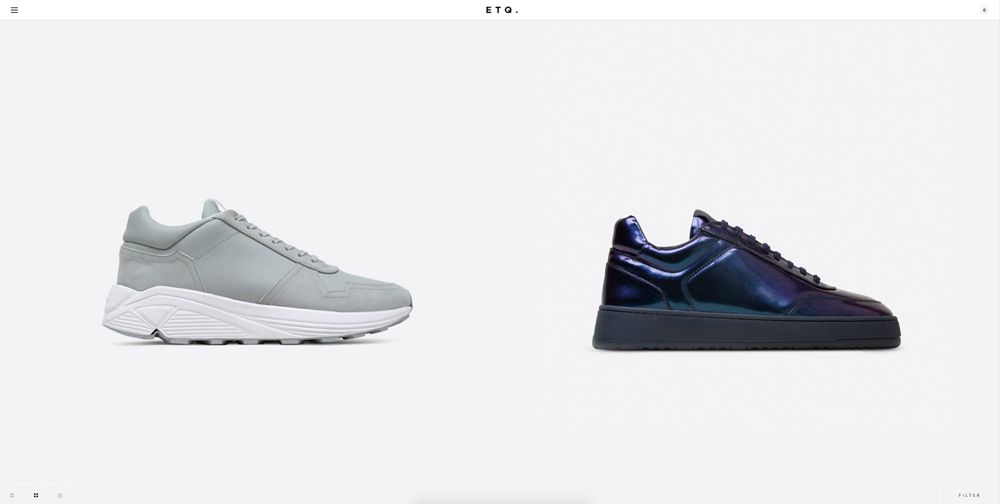
ETQ Amsterdam’s product photography is geared very much toward the most minimal of directions. The result is a wonderfully simple style which draws no attention away whatsoever from the products themselves.
KOIO
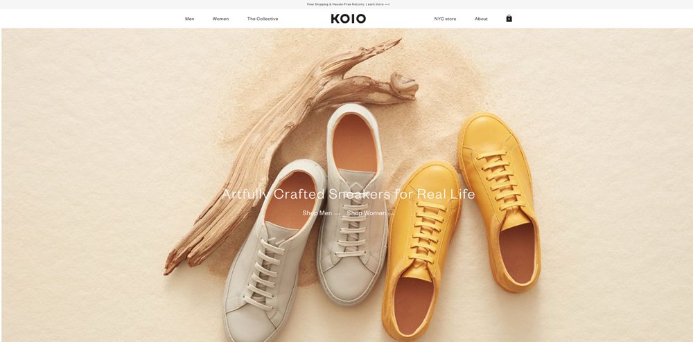
KOIO’s product photography is colorful, playful and positive. They have paid careful attention to selecting sneaker and prop colors to create a beautiful palette and composition which truly succeeds in showcasing the beauty of their products.
Allbirds
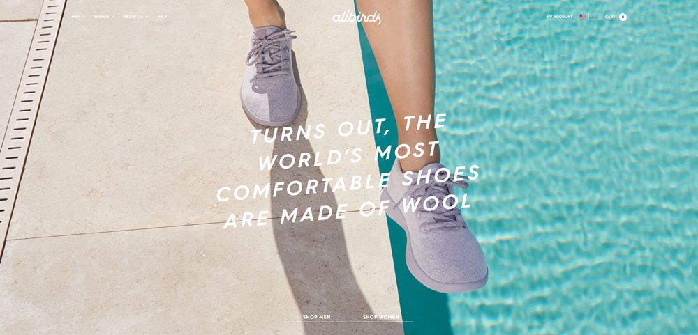
Allbirds uses photos of models wearing their shoes throughout the homepage. The warm, summer feel is aided by the lighting and colors of background elements including pools, palm trees and stone surfaces.
This post may contain affiliate links. See our disclosure about affiliate links here.

